Monthly Archiv: February, 2020
Over the past decade, I’ve worked with WordPress on a (pretty much) daily basis. It’s my go-to solution for building websites for clients of all sizes.
And, as I’ve gained more experience with the highly-popular CMS, I’ve advocated for building WordPress themes from scratch. These days, I use a fairly barebones starter theme based on Underscores. It’s set up just the way I like it and helps me get new projects off to a fast start.
But, just like everything else in the WordPress ecosystem, there are plenty of choices in how we do things. The approach that I prefer isn’t for every developer. Nor is it always the most realistic solution for certain clients (especially those on a tight budget).
Today, I’d like to share my experiences in building a website a different way: Using a WordPress page builder plugin and a companion “blank” starter theme. I’ll fill you in on the pros and cons of the process, along with some tips for getting the most out of it. Let’s get started!
Project Background
I was approached by a longtime client who wanted a redesign of their older HTML website. They wanted the benefits that go along with using WordPress, but didn’t have the budget for a full-on custom build.
The idea of purchasing an industry-specific commercial WordPress theme was mentioned. Now, there’s nothing inherently wrong with buying a theme and throwing some content into it. In many cases it will work just fine.
But it often seems that there are added costs associated with reworking the look and/or functionality to match a client’s specifications (or, worse yet, my expectations). Even then, there’s only so much you can do without completely destroying the theme, the client’s budget, or both.
With that in mind, I began looking into an alternative. I’d recently started playing around with Beaver Builder, a popular page builder plugin for WordPress (Full disclosure: they’re not paying me to say this, it just happened to be the tool I used. There are other, similar products on the market worth considering as well.)
They include a framework theme (and a related child theme) with some of their commercial packages, which allows you to essentially build an entire website – header, footer and content – using a combination of the WordPress Customizer and page builder.
How did it work? Read on to find out…
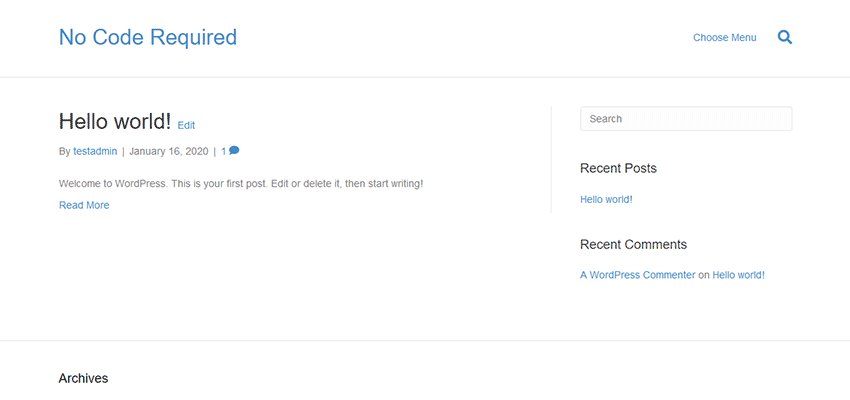
The Starting Point
The first steps of the process are pretty familiar to anyone who’s built a site with WordPress:
- Create a fresh install of WordPress;
- Install & activate the theme;
- Install & activate the page builder plugin;
From there, you get an essentially blank slate. It’s actually not much different from what I see upon activating my own Underscores-based starter theme.
The advantage of this is that the theme doesn’t have many preconceived notions about what you want to build. This means that a designer could, in theory, create a design mockup and subsequently bring it to life. So long as they understand what the theme can and can’t do, that is.
But, as we’ll find out, there are some options for those who do want something a bit more readymade.

Using the WordPress Customizer
The WordPress Customizer is a built-in tool that allows you to tweak various theme-related settings and see the results in real time. It was meant to bring a universal UI to theme setup, as opposed to the bespoke options panels many themes have implemented.
Here, the Beaver Builder Theme taps into the customizer and provides plenty of options. Among the highlights:
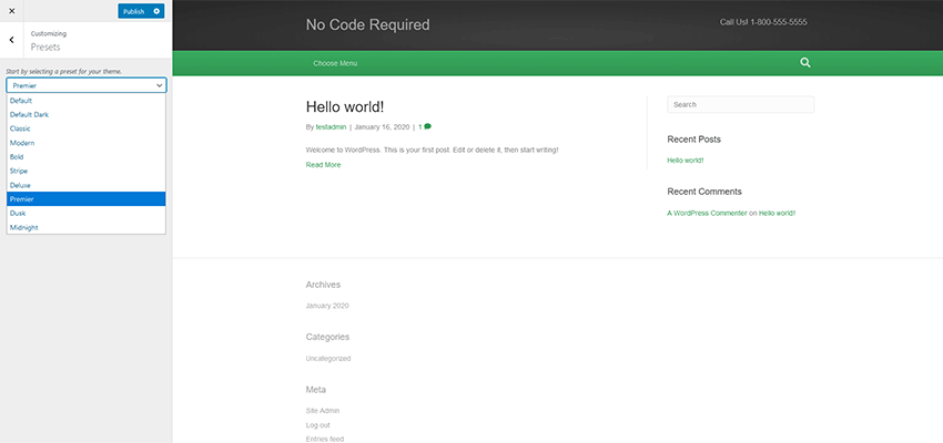
Presets
Choose from a selection of premade color schemes. These styles can be superseded via other Customizer options or CSS.

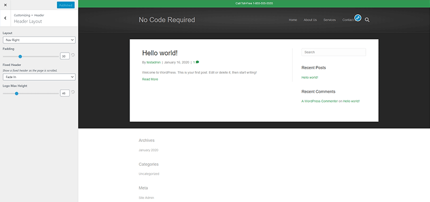
Header
There are a variety of settings here for layout, logo placement and navigation. The option for a “sticky” header is included, which is a nice touch. The layouts cover several common scenarios.

Content
Pick background colors and page layouts for your blog, individual post, post archive and WooCommerce templates.
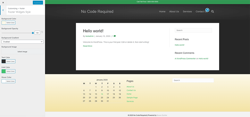
Footer
The site’s footer can be styled and widgets added to handle various types of content. By default, there are some limitations here. For example, I wanted to place built-in social media profile links up into the Footer Widget area (they are set to show up below the widgets) – which isn’t supported. Thankfully, a code snippet I found made it possible via a WordPress shortcode.

Code
If you want to inject specific CSS, JavaScript or other code into your site, you can do so here. This could be of use if you want to add Google Analytics or pixel tracking code.
The Verdict
In all, the Customizer had enough options to help me create the basic look and layout of my website. It’s not quite as robust as what I’m used to with a custom-built theme, but that’s to be expected. The whole point here is for rapid development and to avoid code.
The Beaver Builder Theme did just that, as I was able to get things set up the way I wanted within a half hour or so. Any shortcomings are kind of the price you pay with a lower budget project.
Building Pages
I won’t spend a ton of time going into detail here – for two reasons. First, my needs for the site’s various pages weren’t very complicated. Second, the page builder itself is sort of secondary to the theme. But there are still some items worth mentioning.
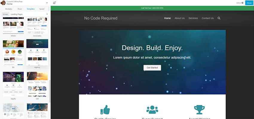
The home page was built rather quickly – and not from scratch. My client liked one of Beaver Builder’s prebuilt page templates. Setting it up was just a matter of importing the template and then hacking away to customize the things we wanted to keep and remove the things we didn’t. In addition, there were a few extra modules to add in via page builder. Features such as post carousels and on-scroll animation added some personality.
Secondary pages were extremely simple. I created a page title module that used a photo background and saved it for repeated use across other pages. From there, it was just a matter of adding the rest of the content and formatting it nicely.
The one sticking point I had was integrating Gravity Forms. Since the page builder uses neither the WordPress Gutenberg block editor nor the Classic Editor (both of which the popular form plugin supports), I had to manually place a shortcode into a Text Editor module. This wasn’t a huge problem, but might be tough for a client who is unfamiliar with the process.

The Verdict
Page building went pretty much as expected. Ease of use is the selling point of these plugins and this one fit the bill. Various modules were easy to drag-and-drop onto the page, and multicolumn layouts were simple to configure. Everything was responsive and could also be customized specifically based on screen size.
The number of modules included were solid and covered virtually everything the project required. If some more fancy features were needed, there are a number of available third-party add-on packs that can help.
Overall Impressions
In all, I have to say that this was a better experience than those I’ve typically had with readymade themes. The fact that I could start from something basic and build up to suit the project’s needs was more in line with my preferred workflow.
Truth be told, I did have to implement a few extra bits of code to achieve everything I wanted. The aforementioned shortcode for social media profile links and a bit of extra JavaScript helped me round out the site. Both were queued up via the child theme’s functions.php file, allowing them to avoid being overwritten during any future theme updates.
I found this to be a viable option for simple projects. There are some scenarios, like the use of custom fields or conditional content, where it may still make more sense to go with a full-on custom theme. But those types of features are often for bigger budgets anyway.
So, if you’re a developer who wants to quickly develop a thrifty new website – but without the trappings of a third-party theme, this may be the way to go. Just recognize that you’ll have to live within the parameters of what’s there. Otherwise, it will be time to fire up that code editor.
* Note: The images in this post are for illustrative purposes only – they don’t reflect the actual project described.
The post Thoughts on Building a WordPress Website from Scratch (Without Code) appeared first on Speckyboy Design Magazine.
I’ve arrived at the difficult decision to cancel the inaugural WordCamp Asia event, which was planned to take place in Bangkok on February 21st. The excitement and anticipation around this event have been huge, but there are too many unknowns around the health issues unfolding right now in the region to explicitly encourage a large public gathering bringing together over 1,300 people from around the world.
We’re going to explore if speakers — including myself — can do our sessions with the same content and at the same time that was originally planned, just online instead of in-person so we can achieve our goal of bringing the pan-Asian community closer together without putting anyone’s health at additional risk.
Regardless, I greatly appreciate the work everyone — from organizers to attendees, speakers to sponsors — put into making this a big success. So many people have come together to create an event to inspire and connect WordPressers, and I am confident that this passion will carry through into the event next year. Our thoughts are with everyone affected by the virus so far, and we sincerely hope that everything is resolved quickly so that this precaution looks unnecessary in hindsight.
Package:
Summary:
Retrieve details from a Manifold account
Groups:
Author:
Description:
This package can be used to retrieve details from a Manifold account...
Read more at https://www.phpclasses.org/package/11530-PHP-Retrieve-details-from-a-Manifold-account.html#2020-02-11-20:05:16

WordPress 5.4 Beta 1 is now available for testing!
This software is still in development, so we don’t recommend running it on a production site. Consider setting up a test site to play with the new version.
You can test the WordPress 5.4 beta in two ways:
WordPress 5.4 is slated for release on March 31, 2020, and we need your help to get there!
While the primary goal for 2020 is full-site editing with blocks, contributors to WordPress are working across every area of the project to ensure the software continues moving forward.
Testing for bugs is an important part of polishing the release during the beta stage and a great way to contribute. Here are some of the big changes and features to pay close attention to while testing.
Block Editor: features and improvements
WordPress 5.4 Core will merge ten releases of the Gutenberg plugin. This means there’s a long list of exciting new features. Here are just a few:
- Two new blocks: social links and buttons.
- More color options for Button, Cover, Group and Column blocks .
- A Welcome Guide modal.
- Tools for adding featured images in the Latest Posts block.
- Easier navigation in the block breadcrumbs.
Some additional changes to make note of:
- On mobile, the toolbar stays on top, so you can’t lose it.
- Easier image sizing in the Gallery block.
- Drag-and-drop images into the featured-image box.
- Several new APIs.
- Friendlier offline error messages on REST API request failures.
- Table block captions.
- You can now color just parts of the text in any RichText block.
Accessibility improvements
- Easier multi-block selection.
- Support for changing an image’s title attribute within the Image block.
- Easier tabbing. This had been one of the editor’s biggest accessibility problems, but now tabbing works with the block’s sidebar.
- Visual switch between Edit and Navigation modes and enable screen reader announcements.
To see all of the features for each release in detail check out the release posts: 6.6, 6.7, 6.8, 6.9, 7.0, 7.1, 7.2, 7.3, 7.4 and 7.5.
Continuing efforts to improve performance
The block editor team has achieved a 14% loading time reduction and 51% time-to-type reduction, for a particularly sizable post (~ 36,000 words, ~1,000 blocks) since WordPress 5.3.
Wait! There’s more
Site Health
When a project powers 34% of the world’s websites, there must be a focus on security. This is why contributors continue working so hard on the Site Health Project.
WordPress 5.4 adds a widget on the dashboard that warns administrators of potential issues that could affect their site’s performance or security. A call-to-action button directs them to the Site Health screen for details and suggested fixes.
Accessibility improvements
WordPress strives to improve accessibility with every release, and this release is no different. Version 5.4 will contain the following accessibility enhancements:
- Better focus management in Menu, Customizer and Site Health screens, to fix some existing keyboard navigation issues.
- Easier keyboard navigation for better semantics in the Media modal.
- An easier-to-read Privacy Policy Guide.
For Developers
5.4 also contains a bunch of developer focused changes.
Calendar Widget
The HTML 5.1 specification mandates that a <tfoot> tag must follow <tbody> tag (which was not the case in the calendar widget). WordPress 5.4 moves the navigation links to a <nav> HTML element immediately following the <table> element in order to produce valid HTML.
apply_shortcodes() as an alias for do_shortcode()
Instead of using do_shortcode(), apply_shortcodes() should be utilized instead. While do_shortcode() is not being deprecated, the new function delivers better semantics.
Better favicon handling
Now favicon requests can be managed with more flexibility. Administrators can choose a favicon in the Customizer, or upload a /favicon.ico file. The WordPress logo will always load as a fallback.
Other changes for developers
- Clearer information about errors in
wp_login_failed. - Site ID has been added to the
newblog_notify_siteadmin filter for multisite installs. - Support has been added for the required WordPress and PHP version headers in themes.
- Embed support has been added for TikTok.
Keep your eyes on the Make WordPress Core blog for 5.4-related developer notes in the coming weeks, breaking down these and other changes in greater detail.
So far, contributors have fixed more than 255 tickets in WordPress 5.4 with more to come.
How You Can Help
Do you speak a language other than English? Help us translate WordPress into more than 100 languages!
If you think you’ve found a bug, you can post to the Alpha/Beta area in the support forums. We’d love to hear from you! If you’re comfortable writing a reproducible bug report, file one on WordPress Trac where you can also find a list of known bugs.
Latest PECL Releases:
What do Amazon, Hershey’s, and The Wall Street Journal have in common?
They’ve all gotten named in lawsuits related to website accessibility and the Americans with Disabilities Act (ADA). They aren’t alone, either. In 2018, more than 2000 website accessibility lawsuits (a 177% increase from 2017) got filed, emphasizing the increased importance and focus on ADA compliance.
If you’re now wondering, “Is my website ADA compliant?” this article is here to help.
Keep reading to learn whether the Americans with Disabilities Act applies to your site, as well as how to check if a website is ADA compliant and how to make a website ADA compliant. If you need immediate help, contact us online or call us at 888-601-5359 to learn about our ADA compliance services!
What is ADA compliance?
ADA compliance refers to meeting the standards set by the Americans with Disabilities Act Standards for Accessible Design. This act covers the accessibility of electronic and information technology, like the Internet and its websites, versus physical locations.
Who does ADA compliance affect?
Almost every business needs to follow ADA, which applies to the following organizations:
- State and local government agencies
- Private employers with 15 or more employees
- Companies operating for the public’s benefit
Even if ADA doesn’t apply to your company (say you employ 10 team members), you should still make ADA compliance a part of your operations. You want to provide everyone, whether online or offline, with the same experience and level of accessibility.
Does ADA compliance apply to websites?
Yes! ADA compliance includes electronic and information technology, like websites. If ADA applies to your business and you operate a site for your company, you must make your website accessible to everyone.
What if my website isn’t ADA compliant?
A non-compliant website is a problem.
If your website fails to meet ADA standards, you risk lawsuits and hefty fines. First-time violations, for example, receive a $55,000-$75,000 fine, while repeat violations come with a $150,000 fine. Federally funded organizations can also lose funding.
No matter your company or customer base, you cannot afford to ignore ADA compliance.
Even if your business can afford the fines that come with non-compliance, you cannot afford the damage to your brand. When people see that your company doesn’t care about serving people with disabilities, it will impact their opinion and future purchase decisions.
How to check if your website is ADA compliant
You have a few options for assessing your site’s compliance with ADA, including:
Use free tools
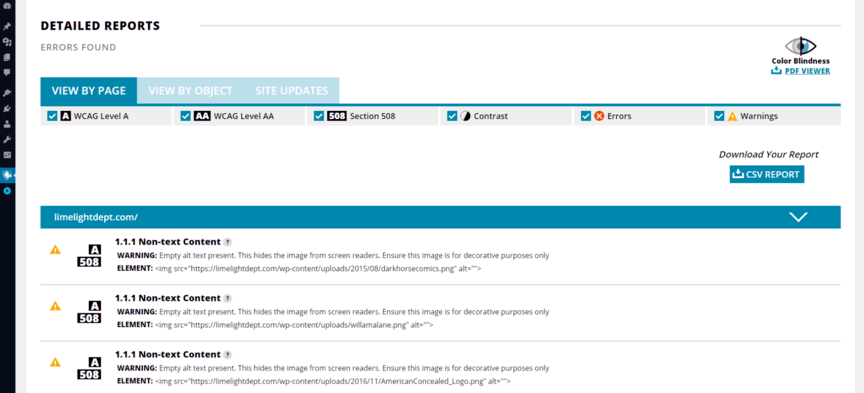
Companies can choose from plenty of free ADA compliance checker tools, like WAVE and Lighthouse, which look at your site’s color contrast, text size, image alt text, and more. The downside, however, is that these tools analyze one page at a time, versus your whole site.
Lighthouse and WAVE aren’t your only options, though.
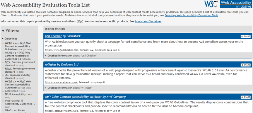
The World Wide Web Consortium (W3C) maintains an extensive list of web accessibility evaluation tools. If you want to check your site for ADA compliance, you can find a tool here that will work. You can also check for specific ADA compliance issues, like color contrast, with programs dedicated to these issues.
![W3C website tools for making website ADA compliant]()
If you have a WordPress site, you can even install an ADA compliance plugin.
Conduct a manual audit
You can also check your website for ADA compliance with a manual audit.
A manual audit involves evaluating every page of your site for accessibility, using the Web Content Accessibility Guidelines (WCAG). WCAG encompasses a massive checklist, but it’s the basis for ADA compliance.
Even if you use a tool like WAVE, it will assess and grade your site based on WCAG.
WCAG focuses on four fundamental principles, which break down into actionable items:
- Perceivable: Everyone that visits your website should have the means to perceive all its information, like text, images, and video, whether directly or through an alternative option, like a transcript for a video.
- Operable: All website visitors should have the ability to navigate your site and use its features. For example, no one should have issues using your main navigation, search bar, or additional tools, like a calculator.
- Understandable: No one should have difficulty understanding your website and its content. Adding instructions for how to use a tool, for instance, helps everyone take advantage of your site and its features.
- Robust: An ADA-compliant website must provide all site visitors with the same experience. For example, if you create a video transcript, that transcript should include the entire video versus bits and pieces.
In most cases, a manual audit isn’t practical for businesses — especially when you consider the repercussions of failing to meet ADA standards. Use a tool or invest in a professional audit to ensure your business builds the best plan for becoming ADA compliant.
Request a professional assessment
A professional ADA audit is another option when it comes to checking a website for ADA compliance.
“Investing in a professional audit will depend on your business. For example, if you don’t have the time or don’t feel comfortable auditing your site, it makes sense to hire an agency and let them do the work.”
With a professional audit, you hire someone (generally an agency) to evaluate your site’s accessibility. They’ll assess your website via WCAG and provide a recommended plan for making your website ADA compliant.
Depending on the agency, they’ll also have the capabilities to implement this plan.
Whether you invest in a professional audit will depend on your business. For example, if you don’t have the time or don’t feel comfortable auditing your site, it makes sense to hire an agency and let them do the work.
3 options for making your website ADA compliant
Like auditing your site, you have a few options when it comes to creating an ADA-compliant website:
1. Build an ADA-compliant website with your in-house team
Companies can also choose to create an ADA-compliant website in-house.
If your business has the resources and the talent, you could establish a design and development team to audit your site and ensure compliance with ADA standards. This option tends to require more from your organization, which is why it isn’t a typical solution.
Should you lead your ADA-compliance project, remember to follow these core WCAG standards:
- Add alt text to your images, audit, video, and controls
- Provide easy-to-access transcripts for audio and video content
- Include captions on all your website videos
- Disable auto-play for audio and video
- Use proper HTML
You view the full WCAG checklist to learn more about making your site ADA compliant in-house.
2. Install an ADA compliance plugin (for WordPress sites only)
If you have a WordPress site, congratulations! You have an easy solution to becoming ADA compliant.
Via WordPress, you can access several ADA compliance plugins, like Accessibility Suite and WP Accessibility Helper. These plugins can audit your site and add tools that visitors can use to make your website accessible.
![ADA compliance WordPress tool]()
Before you install a plugin, research its features, reviews, and cost. That way, you can pick the best one.
3. Hire an ADA-compliant web design agency
The easiest option (for most companies) is an ADA-compliant web design agency.
With a professional web design agency, you get a fast and trusted solution for updating your site. You don’t have to worry about establishing an in-house team for the project or finding the time even to complete this project.
Instead, you can outsource the task to a trusted partner.
While cost is a factor that every company should consider when thinking about hiring an agency, you must also think about the return on investment (ROI). Without an ADA-compliant site, your business risks severe fines and lawsuits.
An ADA-compliant web design agency helps you eliminate this risk.
How to make a website ADA compliant in-house
If you’re looking to make your website ADA compliant in-house, follow the WCAG checklist:
| WCAG Checklist |
| Checklist Item |
Action Item |
| Offer text alternatives for non-text content |
Add alt text to images, audio, and video
Add names to controls, like “Order”
Allow assistive technologies to ignore decorative non-text content |
| Provide alternatives to multimedia |
Upload transcripts for audio and video content
Place or link transcripts near the audio or video content
Record audio tracks and/or audio descriptions for videos
Add captions to videos
Provide sign language interpretation for multimedia |
| Allow the separation of information and structure |
Use proper and valid HTML
Add easy-to-understand labels to forms
Organize and divide content into subheadings
Ensure any information conveyed with color is visually evident without color
Prevent content understanding from relying on the content’s shape, size, or location |
| Distinguish foreground information from background information |
Achieve a luminosity contrast ratio of 10:1
Install a mechanism that turns off background audio that plays automatically
Remove background noise from audio
Make background noises 20 decibels less than foreground noises
Allow customization of background colors, foreground colors, text spacing, and text size |
| Allow website functions via the keyboard interface |
Disable features that use timed keystrokes
Remove instances that require a device besides a keyword |
| Give users time limit controls |
Allow the pausing of moving or animated text
Allow the delay of update frequencies
Give users the option to adjust, extend, or disable time limits except for real-time events |
| Help users avoid content that could cause seizures |
Delete content that flashes more than three times per second.
Add user controls to moving, blinking, scrolling, or auto-updating content
Remove pop-ups |
| Offer ways for users to find, use, and navigate content |
Add a “Skip to Content” link and make it visible
Upload an HTML sitemap
Allow site search
Build a logical navigation menu
Make your navigation menu consistent across your site
Use breadcrumb navigation
Save user data, like their shopping cart |
| Help users avoid and fix mistakes |
Allow elements, like forms, to spot input errors
Offer text suggestions to communicate errors
Allow users to reverse changes and correct errors
Use a confirmation page to summarize a user’s input and the website’s output |
| Publish readable and understandable text content |
Use HTML to add the page language code |
| Make content placement and functionality predictable |
Follow a logical order for content and elements
Write relevant headings for content
Remove idioms and jargon
Explain abbreviations
Add images or diagrams to explain the content
Write the phonetic pronunciation for words or link to pronunciation guides |
| Support current and future user agents, plus assistive technologies |
Use proper HTML and markup languages |
| Ensure content is accessible |
Allow users to visit and leave content via keyboard functions
Meet the guidelines for helping users avoid content that could cause seizures |
Check your website for ADA compliance with WebFX
ADA compliance is a critical issue that businesses can’t afford to ignore.
If you’re looking to make your website ADA compliant, but need help, ask WebFX. Our company offers automated ADA compliance services, which help your organization launch and maintain a site that everyone can access.
Contact us online or call us at 888-601-5359 to learn how our team can help yours!
The post Is My Website ADA Compliant? How to Check (and Update) Your Site appeared first on WebFX Blog.
Our web dev resources compilation for February comes packed with awesome React frameworks, tools for writing better tests, and much more!
Continue reading on Tutorialzine.
It makes perfect sense: If you want to design a compelling website, find other sites out there that inspire you. And, while this works, it’s not necessarily the best way to create something original.
Increasingly, the web is becoming homogeneous. This encompasses the tools we use and yes, the designs we implement. The result is that it can be hard to distinguish one site from another. Especially so when looking through the projects within our own portfolios.
Therefore, if we want something truly different, looking to other websites may not be the best source of inspiration. If that’s the case, then where should we look?
That’s our topic for today. Let’s explore some sources outside of web design that we can mine for inspiration.
The Web Designer Toolbox
Unlimited Downloads: 1,000,000+ Web Templates, Themes, Plugins, Design Assets, and much more!
Photography
As the old saying goes, a picture is worth a thousand words. But the right one can also provide a creative spark as well. That’s why photography is more than just something to embellish a great design – it can actually inspire one.
Like other sources of inspiration on this list, the subject matter may or may not be relevant. Perhaps a picture of a mountain can lead you to the perfect idea for a tech startup’s design. Or maybe an image of a sports car leads to an obvious layout choice for a mechanic’s site.
Creativity is funny in this way. A single image may conjure up thoughts that lead you to exactly the right place. Features such as colors, lines or even a facial expression can wield amazing power.
It’s also incredibly convenient. With the massive amount of photographic resources online, you don’t have to leave your couch to find something that gets those creative juices flowing.

Nature
Whether experienced through imagery or in person, the natural world is bursting with design possibilities. And they can be found anywhere from the most majestic tree to the tiniest insect.
The most obvious revelations here are color and texture. Maybe it’s the intricate pattern displayed by a bird or lizard. Or the magnificent color palette of leaves in the spring and fall. Virtually everywhere you look, there is something unique to fuel creativity.
What’s more, you don’t have to go off to some remote locale to find inspiration. Backyard nature can be just as influential – and maybe more so. Finding the previously hidden details in the things we see every day can be awe-inspiring.
While imagery alone can provide some of this, there are also huge benefits to being outdoors. In addition to seeing nature with our own eyes, we get the full sensory experience. Hearing a bird call, feeling a breeze or smelling a flower have long been sources of creative mojo.

Industrial Design
Here we have the very opposite of nature. Industrial design spans everything from the phone in your pocket to the tallest skyscraper. We can see it pretty much everywhere humans have made their mark.
It also provides an eclectic mix of styles. There are uniform structures that are reminiscent of the block-based design that is dominating these days. And then there is the controlled chaos of engines and assembly lines. They can lead us to employ design in ways we may not have thought of before.
This variety serves designers well, because it can be made to fit just about any need. Whether you’re looking to create something with stark minimalism or clever complexity, inspiration can be found here.

A Fresh Perspective
It stands to reason that, if you look at the same thing each and every day, what you see will stick in your mind. Web design is a little bit like that. Browsing through so many websites can lead us to stale ideas when it comes to building one of our own.
Of course, this isn’t always a bad thing. For example, predictability in UI design is always a welcomed feature. The idea here isn’t to make our creations more difficult on users. Usability and accessibility still need to be priorities.
That being said, originality counts for something. Finding it often means looking outside of the web design bubble. The sources above can offer a solid starting point.
The post Looking Outside of Web Design for Inspiration appeared first on Speckyboy Design Magazine.
Package:
Summary:
Set the PHP memory limit and check if is exceeded
Groups:
Author:
Description:
This package can be used to set the PHP memory limit and check if is exceeded...
Read more at https://www.phpclasses.org/package/11529-PHP-Set-the-PHP-memory-limit-and-check-if-is-exceeded.html#2020-02-10-21:01:23

Did you know that 75% of opinions on website credibility comes from design?
If you want people to look at your services and find you credible, you must invest in web design for services pages to provide your audience with a positive experience. By looking at some web design examples for service pages, you’ll get inspiration for building an impactful service page.
Don’t know how to create a service page? Don’t worry!
With over a decade of experience, our team of web designers will help you build a service page that works for your business. Contact us online or call us today at 888-601-5359 to speak with a strategist!
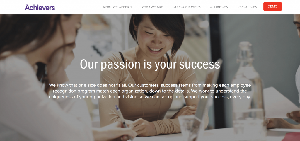
Achievers is an excellent example of a services page layout that works. Right at the top of the page, Achievers presents an engaging visual and short description of how they help you create a successful employee recognition program.
![]()
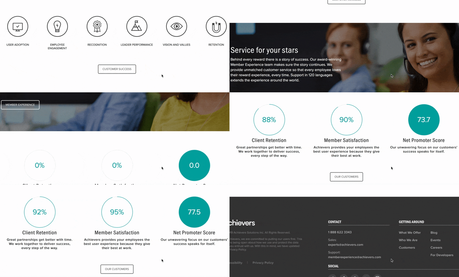
As you scroll down the page, you’ll see different visual elements.
You’ll see a statistic that focuses on typical user adoption of the programs they develop. Scroll further, and you’ll see icons loading on the page, one by one, that highlight the results of their services, like better employee retention.
![]()
If you continue scrolling, you’ll see stats about Achievers’ performance.
![]()
These visual elements draw users in as they count up to the right percentage.
Why it works
Achievers is one of the best service page web design examples for putting your customers first.
Their service page focuses on their clients and what Achievers can provide for them.
The design is simple, too.
Achievers’ uses a few visual elements, like the loading percentages and icons, to draw users in and get them interested. The design gets audiences excited enough to keep scrolling. It’s also simple enough to prevent users from feeling overwhelmed.
Overall, Achievers has a well-balanced and straightforward services page layout that focuses on the user and integrates small moving elements to catch the reader’s attention and keep them engaged.
Takeaways from this services page layout
A crucial takeaway from this web design example for a service page is the focus on the user. When you design your service pages, focus on providing users with the best possible experience. Make it easy for them to find information about your services.
Not only do you want to focus on the user in your text, but you also want to add elements that make your page more engaging. It will help keep leads on your page longer, so they can learn about your services and contact your business.
Arcurve’s service page layout is simple.
They have a Venn diagram that contains their full lifecycle services and technologies.
![]()
The user can see what services the company offers in an instant.
If they find a service that fits their needs, the user can click on the service, which will open a pop-up box that details what the service includes. If the service doesn’t meet the user’s needs, they can press the “X” button and return to the original services pages.
![]()
It’s a simplistic design that allows users to access the information they need without any frills or fluff. If users like what they see, they can click a contact button underneath the diagram and connect with Arcurve.
![]()
Why it works
Arcurve makes something as complicated and involved as software development simple.
They make it easy and straightforward for users to find relevant information.
Users see a list of their services, which they can click for more information. They can also quickly find their way back to the services page without clicking the back button or opening a new window.
This website is one of the best service page web design examples because of its simplicity. It helps users find what they need without having to dig around for information.
Takeaway from this service page layout
Simplicity is key.
While your service page doesn’t need to be as simple as Arcurve’s, it serves as an excellent example of a clean and simple web design for service pages.
By cutting out the fluff and focusing on providing users with the information they need, you’ll develop a better service page.
People will find your information faster and won’t need to comb through your entire service page to uncover what they need. When you provide users with information quickly, they’re more likely to choose your business.
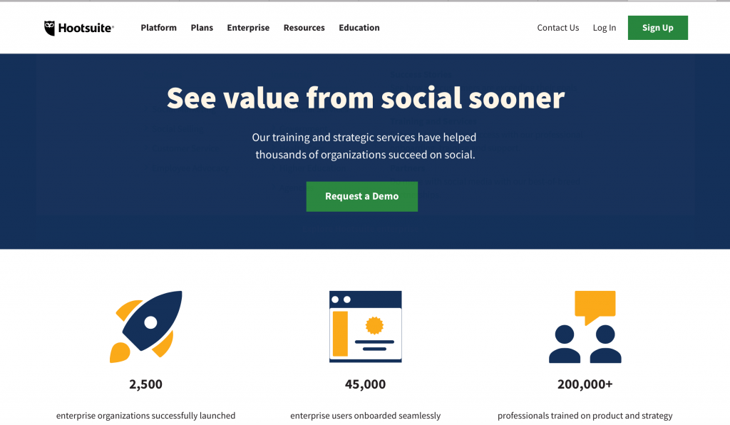
If you’re looking for service page web design examples with elements that pop, Hootsuite is one of them. Their service page uses images that pop on their page and draw users in to learn about their services.
![]()
The eye-catching visuals appear as you scroll down the page. When you move down their services page, you’ll see two types of services: For users getting started and for users needing ongoing help.
![]()
As you look at both service options, you’ll see the features and accompanying visuals.
This section is where Hootsuite provides a great visual experience.
![]()
These visual elements catch the user’s attention as they scroll. Each image includes one of the following colors: Yellow, orange, or purple. Hootsuite’s color choices make for bold visuals that draw users into the content.
Why it works
Color visuals help increase readership on your page by 80%. People love visuals, and seeing beautiful, colorful images catches their attention. It engages them and makes them more likely to interact with your content.
Hootsuite’s choice of bold images works because of users’ desire to have visual elements.
A study conducted on visuals showed that presentations with visuals are 43% more persuasive than those without visuals. If you think about Hootsuite’s service page as a presentation, they’re increasing its persuasiveness by adding bold images.
Takeaway from this services page layout
Visuals are a vital component to your services page. If you want to increase your persuasiveness and get more people to engage with your content, add colorful visual elements to your page. It will help keep your audience on your page longer.
If you want to know how to create a service page, look at Cart2Cart for inspiration.
Cart2Cart draws users in immediately with their moving selection feature.
![]()
This feature cycles through different places for migrating shopping cart tools, which makes it visually engaging for readers. If you click the drop-down menu for each box, you open a pop-up window that allows you to choose from different cart options.
![]()
So, immediately, Cart2Cart draws users in with this interactive element.
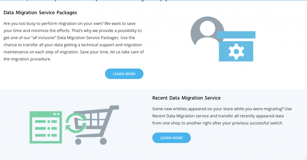
If you keep scrolling down the page, you’ll see more information about what you get with their services. It’s broken down into different sections, like data migration and migration insurance, with accompanying visuals for each.
![]()
This page is interactive, organized, and easy for users to follow, which makes it a great inspiration for how to create a service page that works for your business and your target audience.
Why it works
Cart2Cart’s service page works because it’s interactive but straightforward. The tool at the top of the page immediately draws users in and gets them to interact with the page. It makes people more likely to stay on their page and engage with their content.
Takeaway from this services page layout
Creating interactive elements on your page increases engagement.
Whether it’s something like Cart2Cart’s selection feature or a video, interactive elements draw users in and get them to stay on your page. You can use this example for inspiration when trying to create engaging features on your service pages.
Stortford Interiors is one of the best service page web design examples in terms of visual engagement. This service page draws users in with multiple elements. The design is fitting for an architectural contractor and highlights their stunning work.
When you get to their services page, a beautiful photo of the work they’ve done greets you.
![]()
As you scroll down the page, it gets even more eye-catching.
One of the unique features of this page is that the lines from the circle load as you scroll down the page. There’s text on one side and an image with a circle on the other side. The sides alternate as you scroll down the page.
This feature guides the user’s eye to the next section and gets them to continue scrolling.
Additionally, each section focuses on a type of service and the sub-services below it.
For example, the first section focuses on the core building services and lists drywall, suspended ceilings, and glass wall below. If someone is looking for core services, they can find all those services in one area.
![]()
This website is an excellent example of web design for services pages because it focuses on creating a simple yet visually appealing page.
Why it works
This website is a prime example of how to create a service page that engages users visually.
Stortford’s web design fits with its brand too. They focus on making a visually appealing service page that’s reflective of the simple and attractive rooms they create.
It also keeps users engaged.
Stortford uses the circles and lines to direct people to the next section of information and keep them scrolling.
Takeaway from this services page layout
Stortford’s services page layout is a prime example of how you should reflect your brand in your business’s service pages. They stuck to a simple, sleek, and modern design, just like the rooms they build.
Reflecting your brand in your service pages will help more people remember your business.
Domo is one of the best service page web design examples when it comes to organization.
When you visit their service page, you can choose solutions based on your company role, like sales, IT, or operations. As you hover over a position, you can see a tidbit of information about how their service will help someone in that role.
![]()
If you want to look by industry, scroll down and select your industry.
![]()
You can also choose solutions based on the source of your data.
![]()
Domo creates a smooth and visually appealing service page that helps users choose solutions based on what’s best for them. The page is organized and allows users to navigate to the right services quickly.
Why it works
Domo created an interactive and organized website that makes it easy for users to find what they need. Their audience doesn’t struggle and wade through information to find answers. It’s a simplistic design that allows users to get information fast.
Takeaway from this services page layout
Creating a functional and organized page is key to keeping people engaged. If users can’t find information quickly, they’ll leave your page. Users want information fast, and Domo’s design helps users do just that.
An important takeaway from this web design example is the organization. Having good organization will keep leads on your page longer and cause them to spend more time checking out your company.
Start creating your unique service page today
Your service page plays a crucial role in turning leads into conversions. You must invest time in developing a service page that provides your audience with valuable information and keeps them engaged.
If you want to know how to create a service page, WebFX can help. With a team of award-winning designers, we’ll help you create unique, brand-focused service pages that engage your audience and get them to learn about your services — and contact you about them.
Are you ready to get more people engaging on your service page?
Contact us online or call us today at 888-601-5359 to speak with a strategist about our web design services!
The post 6 Service Page Web Design Examples to Inspire You appeared first on WebFX Blog.
