Tag Archiv: cms
In life, there are certain situations where you probably shouldn’t press your luck. For example, if you see a cobra taking a nap, don’t poke it with a stick. And if you run across a busy web designer, don’t force them to change their workflow. In either case, you won’t like the reaction you get.
The industry seems to be going against the grain on that last one. New tools are continually being introduced – which is great. However, with them comes an expectation that designers will race ahead and dive in headfirst.
Or, at least it feels that way. It seems like we’re being pressured from all sides to adopt the “next big thing”, lest we be left in the dust.
In my thoroughly unscientific observation, many web designers appear to be frustrated with the state of things. Today, we’ll talk about why that is and how taking a step back could be the solution.
Trusted Apps Are Switching Gears
Nowhere is the seismic shift more visible than with WordPress. The massively popular content management system has undergone significant changes in the past few years. The Gutenberg block editor and its related features make for an entirely different experience.
Virtually every aspect of building websites and creating content has shifted. Depending on who you ask, these changes are either infuriating or the dawn of a new era. Regardless, there has been a great amount of pressure for web designers to adapt.
Whether it’s the editor itself or the introduction of block-based themes/Full Site Editing (FSE), there appears to be a good bit of sentiment that these changes are being forced upon web professionals.
That being said, there are alternative ways to use and build with WordPress. The Classic Editor is still supported, and the traditional methods of theme creation will continue to work. No one can fully predict the future, but it seems reasonable that they’ll be around for a while.
So, why would anyone feel forced into using something they aren’t very excited about? I think a lot of it has to do with how these new features are presented.
In the case of WordPress, Gutenberg became the default editor. It was front and center, whether you wanted it or not. And if you want to go back to the old way, you’re required to install a plugin.
Intended or not, this type of action establishes a narrative for users. It says, “The new way is here, and we want you to start using it immediately.”

Outside Pressure from Big Tech
Pressure doesn’t just come from software makers. It even goes beyond our peers and clients (as if that weren’t enough). Sometimes it can come from outside parties that have a vested interest in what happens on the web.
Take, for example, the various initiatives that Google has implemented over the years. Whether it’s a tweak to their search algorithm, the demands of its Core Web Vitals metrics, or the push for publishers to adopt Accelerated Mobile Pages (AMP) – the company holds a lot of sway when it comes to how we build websites.
It’s easy to see how web designers might feel at the mercy of this and other tech-heavyweights. We naturally want our websites to perform well and be easily found in search engines. Thus, it’s on us to integrate their recommendations and preferences into our work.
And it makes sense that we’d gravitate towards the companion products and services these companies offer. If we’re trying to satisfy a particular requirement, it’s logical to use tools that live within that ecosystem. They give us the best chance to succeed, even if we’re not thrilled at the prospect of using them.
Again, there’s a feeling of being forced into this type of arrangement. It’s especially relevant in client work, where your job is to provide the best path for achieving their goals. Sure, there are alternatives. But there is also risk in going a different route.

The Impact on Web Designers
What does this all mean for web designers? For one, it can lead to frustration. Among the root causes could be the great investment we make in these tools and technologies. A lot of effort goes into learning them, only to feel as though the rug is being pulled out from underneath.
There can also be a bit of uncertainty. When it comes to new features, things tend to evolve quickly. What counts as a best practice today might be very different tomorrow. The result is that designers are left wondering about the right time to make a move.
In addition, the disruptive nature of such changes tends to throw a monkey-wrench into the daily workflow. Whether it’s a new editing experience or a different coding language, it can be a struggle to get up to speed.
For some, the change is all too much. I’ve seen several instances of designers and developers leaving behind both tools and communities that they’ve contributed to.
One can make the argument that there will always be some level of attrition. And while that’s true, it’s also a negative when longtime contributors become disillusioned to the point of walking away.
That’s not to say everyone will come to this conclusion. However, it does speak to the issue.

Taking a Holistic View
The way we work isn’t just a professional concern. For many of us, it’s personal. We get attached to not only the tools we use but also to the routines we form along the way.
As such, some changes can be especially challenging. Add to that the prominent way new features or standards are thrust upon us and it’s no wonder there’s a sense of being forced to comply.
Yet it’s also worth taking a step back and looking at the situation holistically. Quite often, there are still options within the CMS, framework, or service provider you’re working with. They may require some additional action on your part, but they’re available nonetheless.
Unless there is a major security or functionality concern, it’s usually fine to stick with your current workflow. That “amazing” new way of doing things will still be there (or not) whenever you’re ready.
And that’s the great thing about being a web designer. No matter what changes, you have a say in how you work. That’s worth remembering as the web keeps on evolving.
The post Why Some Web Designers Are Feeling Forced into Change appeared first on Speckyboy Design Magazine.
A new open source script has been added to the
Free Content Management Systems (CMS)
PHP Scripts page. This is a CMS that does not depend on any database server but saves its
data in a text file. Amazingly, the entire download is only 48 KB and has only 7 files.
There are a number of reasons why WordPress has the biggest market share among content management systems (CMS). For some developers, it’s the massive ecosystem of available themes and plugins that draws them in. Others may cherish the opportunity to create their own custom addons.
The most common thread here is flexibility. WordPress is capable of powering virtually any type of website one imagines. Everything from a simple blog to an eCommerce shop and beyond are possible.
But, as with all technology, there is a certain level of responsibility that comes with using WordPress. It’s something to consider when choosing how you want to build a website. Because, while the CMS is capable of great things, there are scenarios where it may not be the right option.
Let’s take a closer look at some times when it may be wise to steer clear of WordPress – or any CMS, for that matter.
When There’s No One to Maintain the Website
As a designer who has inherited a number of WordPress websites, I’ve seen it before: a website was built several years ago and hasn’t been touched since. A client knows their website needs some work, but doesn’t realize the depth of the underlying problems.
There can be a myriad of issues involved. For one, severely outdated versions of WordPress core, themes and plugins. This is a potential nightmare in terms of security. And it’s not uncommon to find that a site in this situation has been compromised.
Upgrading the software isn’t always so straightforward, either. Some items may have been abandoned, or have to be updated a version at a time to avoid complications.
Unfortunately for the client, there could be a significant cost in cleaning this up. All because their website wasn’t properly maintained in the first place.
The trouble is, most website owners aren’t going to know about the importance of WordPress maintenance unless a designer informs them. Too often, designers simply hand over the keys without a whole lot of instruction. But even when they do, clients may either ignore the advice or forget about it.
The truth is that WordPress does need to be regularly maintained. For the sake of both security and functionality, updates need to be applied in a timely manner.
Therefore, if an organization doesn’t have anyone (or are unwilling to pay someone) to maintain their website, it may be better off not utilizing WordPress. In these situations, a static HTML website or even a managed proprietary CMS could be more sustainable options.
And yes, WordPress can be auto-updated. However, it’s still important to have someone knowledgeable regularly checking in on the site. Otherwise, something could break and be left that way indefinitely.

Your Project Doesn’t Need Content Management Functionality
Having new and ever-changing content is a great way to keep users engaged. Yet not every organization is going to make that commitment. Sometimes there’s no budget for original content, other times there simply may not be enough time to create it.
Of course, one of the key selling points of WordPress is the ability to create and organize content with ease. Whether that’s building a slick page layout in the Gutenberg block editor or adding an ongoing archive of recipes, this is what a CMS is built for.
But what if your project doesn’t require any of this? The traditional “brochure-style” website is still alive and well. Their purpose is to supply users with the information they need and way to get in touch. Beyond that, there may not be much call for the kinds of functionality a CMS provides.
In this case, implementing WordPress may be overkill. First, there’s the potential for higher startup costs – especially if a custom-built theme is involved. Then there are also the aforementioned maintenance requirements.
If there’s not much content and it’s not likely to change, a CMS is completely optional.
You (or Your Client) Have No Desire to Learn the Inner Workings of a CMS
Over its many releases, WordPress has made big strides in usability. It has had a keen focus on newcomers. But for some users the dashboard still offers a lot of clutter.
Even a website that looks simple enough on the front end can be complex behind the scenes. Users have to know where different types of content reside. Beyond pages and posts, there could be any number of custom post types implemented. Then there are plugins like photo galleries, sliders and shopping carts to navigate.
For a non-designer to manage content effectively within WordPress, it often takes some training. In most cases, I’ve found clients to be very receptive to learning. But there are also a few that have very little desire to dig in.
These folks may benefit more from a system that is dead-simple and more limited in scope. One that offers front-end content editing by default and has few settings to tweak.
WordPress offers users the world. However, it’s important to remember that some people prefer to stay within their own backyard.

With a Great CMS Comes Great Responsibility
In some ways, I feel a bit silly in discussing reasons not to use WordPress. After all, it’s a tool I use almost exclusively.
But I also think it’s healthy to talk about the responsibilities that come along with using it. While the software is free of charge, it does require a few things from us:
- Regular maintenance;
- A willingness to learn how to use it;
That may not seem like an awful lot. But in reality, it is a bridge too far for some people. And there are also times when the functionality WordPress offers just isn’t necessary. In those cases, there’s nothing wrong with adopting the simplest solution.
The ability to meet these minimum user requirements is a key to whether or not WordPress is right for your project. If they can’t be met, then you might want to look elsewhere.
The post Scenarios Where WordPress May Not Be the Best Option appeared first on Speckyboy Design Magazine.
There are a ton of content management system (CMS) options out there. And if you’re looking to find the perfect fit your website project, the search can be exhausting. Particularly if you don’t have a lot of experience with these systems.
But before you even choose a specific app, there’s another factor that needs to be considered. One that will have a major impact on your project in both the immediate and long term. Is the CMS you’re considering open-source or proprietary?
All too often, neither web designers nor website owners are fully aware of the differences. It’s only after they run into a roadblock that they realize the consequences of their choice. By then, it could be too late and too expensive to switch.
Today, we’ll fill you in on the differences between these two types of systems. The goal is to help you get the information you need to make the right choice from the very start.
The Web Designer Toolbox
Unlimited Downloads: 1,000,000+ Web Templates, Themes, Plugins, Design Assets, and much more!
Definitions
Before we get too far into the weeds, let’s attempt to define what open-source and proprietary software are.
It may sound complex, but what we’re really talking about is how a piece of software is licensed. This is important because licensing determines what you can and can’t do with a particular app. Also, there could be an impact when it comes to things like content ownership, web hosting, and the ability to add additional functionality.
With that, here’s a quick (non-exhaustive) guide to each license type:
Open-Source
An open-source license grants its users access to the underlying source code of an application. This means you can typically change or extend its code to suit your needs and even redistribute it if you want. There may be rules that require you to credit the original developers, but you can feel free to add your own flavor wherever you like.
WordPress is perhaps the best-known example of an open-source CMS. You are free to hack away at the source code, create themes/plugins or even fork the software (as ClassicPress did).
One thing to note is that open-source doesn’t always mean the software is free. Think of buying a commercial WordPress theme, for example. You purchase the theme and then have the ability to customize its code. Whether that’s the right path for your project is another subject – but the option is there.

Proprietary
On the other hand, proprietary software enables the vendor (owner) to exercise exclusive rights. In practice, this means that the app’s owner can restrict its usage however they see fit. A user likely couldn’t, for example, directly modify the source code. However, they may still be able to create add-ons that enhance the software. User rights can vary greatly depending upon the particular vendor.
There is any number of other terms a user might have to agree to. With regards to a CMS, that could mean agreeing to host your website only with a particular provider or utilizing plugins from a vendor-approved marketplace.
Notable examples of proprietary CMS include Squarespace and Wix.

Pros, Cons, and Considerations for CMS Licensing
Both open-source and proprietary CMS applications have their strengths and weaknesses. Thus, some projects are a better fit for one licensing structure over the other. Then there are also plenty of differences within specific apps in each category.
But generally speaking, some major factors are endemic to the licensing structure itself. Let’s look at some areas where open-source and proprietary apps typically differ the most:
Data Portability
The ability to move your data from one CMS to another – or even one web host to another – is a pretty big deal. A license that doesn’t allow you to do this can be problematic for some. What happens if you no longer want to use that system?
This is where you need to read the licensing agreement carefully. A vendor is under no obligation to help you export your site’s design, content, and media files. Proprietary software may even disallow some or all of this completely.
Open-source software will likely offer a way to export at least some of this data. Even if it’s not built directly into the CMS, a third-party tool might also be utilized for this purpose.
If you want to move to a different system, don’t expect much leeway when it comes to design. Since themes are often tied to a particular CMS, moving between systems is not a straightforward process – regardless of licensing.

Web Hosting
Many proprietary CMS applications are based on a software-as-a-service (SaaS) model. That means the software is only licensed to run on a single web host. If you want to use the CMS, you’ll have to do so within that centralized hosting environment.
Along with the aforementioned data portability, open-source systems can usually be hosted just about anywhere. There may be some minimum server requirements (MySQL, a specific version of PHP, etc.) but your site’s files can be moved again and again.
Maintenance Updates
Every actively developed CMS will require some form of maintenance. Bugs need to be fixed and security tightened. And there is always room for new features and UI enhancements.
Licensing can often tell you a bit about how system maintenance works.
With open-source software, website owners are generally responsible for applying updates – although strides have been made in automation. Typically, you have the choice to decide when or whether to upgrade (or automate). Some managed web hosts also provide this service.
Proprietary systems often differ in that they may not offer you a choice in the matter. Some updates may be applied in the background. In other cases, a vendor might allow you to defer an update for a specified period of time.

Customization
The final area we’ll look at is the ability to customize a website’s look and functionality. The CMS licensing structure often impacts what you can and can’t do here as well.
Proprietary systems can run the gamut. Some will allow the use of custom themes and/or plugins, while others are much more closed off. Also, the availability of an official or third-party marketplace could mean more opportunities to tweak a website to meet your needs. But this all depends on the vendor.
Meanwhile, open-source systems generally allow for complete customization. You can build your own themes or plugins. You can also source these items from third parties. The back end of the software is also fair game for tweaking. There are no hard limits as to what’s allowed.
Finding the CMS That Works for You
Here’s hoping that you found the above considerations to be helpful and objective. We understand that each camp has its devoted fans – and for good reason. The decision of whether to go with an open-source or proprietary CMS can be deeply personal and depends on the past experiences we’ve had.
However, if you’re not committed to one licensing structure over the other, picking a side can be difficult. How can you be sure you’re making the right choice?
While we can’t decide for you, we can offer some advice. Think about your website project as a whole. Consider how you want to build, maintain and customize it. How much freedom and responsibility do you need or even want?
If you’re looking for low maintenance requirements and aren’t deterred by restrictive licensing, a proprietary CMS may be a perfect fit. Open-source, on the other hand, is a wonderful choice for those who want more control over every aspect of their site.
Once you’ve defined what you’re looking for, you can figure out which type of system works best for you. Good luck!
The post Proprietary vs. Open-Source: How to Choose the Right CMS appeared first on Speckyboy Design Magazine.
We live in an era where web designers have become ultra-specialized. Many tend to have a narrow focus regarding the tools they use and types of projects they accept.
It didn’t used to be this way. Back in the late 1990s and early 2000s, the industry was a bit scattered. I certainly fit that mold. I tried a little bit of everything: building with static HTML, flat-file systems and a few assorted content management systems (CMS).
Eventually, I happily settled into a comfort zone with WordPress. In fact, things have gone well enough to where I generally don’t like to venture outside of this self-imposed bubble. Why? For me, that familiarity means I can work more efficiently. Plus, there really aren’t any limits as to what I can build with my favorite CMS.
That’s not to say that I don’t break free on occasion. For example, I might use HTML for a single-page or quickie project that doesn’t require much functionality. There have also been times when agency clients have asked me to work with a proprietary CMS: Miva (for eCommerce) and Wild Apricot (for membership sites) are two examples.
And, despite my own reservations, I believe branching out a little has been a positive experience. The following are a few reasons why I think learning multiple CMS can be a good thing for every web designer.
The Web Designer Toolbox
Unlimited Downloads: 1,000,000+ Web Templates, Themes, Plugins, Design Assets, and much more!
Compare and Contrast Methods for Building a Website
Probably the most obvious benefit to working with more than one CMS is observing their differences. That holds true for both open-source and proprietary systems. And the methods used to build a website can vary quite a bit.
Some systems, particularly proprietary apps like Squarespace or Wix, will be a more front-end focused experience. You pick a theme, then start adding content and bits of desired functionality. There may be some opportunities to dig into back-end development, but that’s not the primary aim of the system.
An open-source CMS, such as WordPress or Drupal, is going to provide a lot more options. You can go the readymade theme route, or opt for something completely custom. There’s less hand-holding, which can mean a more holistic approach is in order.
How is this beneficial? Well, working with the same system over and over can lead to a more rigid way of thinking. Utilizing different systems teaches us that there is more than one way to accomplish a particular task. That in itself encourages us to think about building sites in a more flexible manner.
Lessons in User Experience
Experimenting with multiple CMS is also a great way to learn about user experience. Whether it’s a drag-and-drop page builder or a dashboard interface, you’ll quickly gain an understanding of what does (and doesn’t) work.
For example, an unintuitive dashboard can make it difficult to create content or tweak settings. You may find that it takes more effort to train clients. And in some systems, important items could be buried and require several clicks to get where you want to go.
These kinds of experiences have the potential to positively influence your own design work. Knowing the difference between good and bad UX is invaluable when working with clients. It enables you to better guide them during the design process.
It also results in a bit of self-reflection. You may discover that you’re utilizing some of the very same techniques that drove you up a wall when navigating a particular CMS. Seeing this can help you realize what’s missing and provide you a path for fixing any shortcomings.
Sometimes, nothing sparks a change in your own work like seeing living examples of the good, bad and ugly of UX.

Develop a Better Understanding of Your Niche
Being stuck in a single-CMS bubble can mean losing perspective of where you are in your career. It’s harder to perform a self-evaluation when there’s not a lot of variety in what you do. Quite often, it’s easier to just keep forging ahead on the same path.
Unfortunately, that can lead to stagnation. That’s why it’s important to keep on challenging yourself and your knowledge. Doing so means asking questions, such as:
- Are you serving clients in the best possible way?
- What additional types of functionality would benefit your projects?
- How can you learn and grow?
Going on an adventure or two with different systems can be a big help in answering these questions. They run the gamut in terms of what they’re capable of. Each has their own distinct strengths and weaknesses as well.
Add it up and you may find some areas where you can expand and improve. That could mean moving more projects to a different CMS. Or it might be a matter of taking what you’ve learned elsewhere and applying it to your preferred system.
Regardless, it’s an effective way to see where you stand and look ahead to the future.

Stepping Into the Unknown
The longer you’re a part of the web design industry, the more likely it is that you’ll develop a list of favorite tools. A CMS is often part of that collection.
Of course, there’s nothing wrong with preferring a particular CMS and specializing in it. Having intricate knowledge of a system means you’ll likely accomplish more with less effort. That keeps costs down and enables you to take on more projects.
But there is also something to be said for gaining experience elsewhere. Leaving your comfort zone is an opportunity to expand your horizons. You’ll see how other systems work and gain some perspective when it comes your own methods for doing things.
The best part is that you don’t need to make a large commitment. It could be as simple as installing another CMS in a local environment and poking around. That alone will give you a taste of what else is out there.
So, no, you don’t have to replace your favorite CMS. But there are some real benefits to busting out of that bubble.
The post Why Web Designers Should Learn Multiple Content Management Systems appeared first on Speckyboy Design Magazine.
It started with some fancy Bose headphones being sent out to a select few people who were deemed “influencers” in the WordPress space. From there, it led to some bizarre videos purporting to be from WordPress which stated that competitor Wix was going to start a campaign “trashing” the market-leading content management system (CMS).
Of course, this was all a marketing ploy by Wix, the DIY website provider. The goal is a bit fuzzy, but perhaps it’s to demonstrate its developer-focused features. All the while, it also attempts to make WordPress look like a hot mess.
In response, WordPress co-founder Matt Mullenweg posted his own take on the shenanigans. He mentioned Wix-related customer service issues, alleged code theft and the fact that Wix doesn’t allow users to export their website content for use elsewhere. Subsequently, Wix CEO Avishai Abraham offered an open reply of his own.
Nothing like a good old-fashioned internet fight to get the CMS-wars going! But this isn’t exactly a Coke versus Pepsi type of rivalry. In terms of market share, it’s more like an ant (Wix) flicking a spec of dirt on Godzilla (WordPress).
The WordPress community has reacted with a mix of disdain, bewilderment and amusement. But what does it all mean? Allow me to try and make sense of this free-for-all.
The Attacks Make Wix Look Like a Bully
Competing products go after each other all the time. Everyone from automakers to retailers dig at each other. So, why is this any different?
For one, WordPress is an open-source project. It boasts a very large, active community of users and contributors. People from around the world volunteer their time to keep the project going. Or maybe Wix is talking about the Automattic-owned WordPress.com. But the campaign doesn’t seem to really differentiate between the two.
Wix is a corporately-owned, proprietary system. They sell a service. While they may be considered the “little” guy in the fight, they are far from a penniless or powerless organization.
And it’s the organizational difference that makes Wix look bad. The fact that a for-profit company is going after a free, open-source competitor could be seen as bullying. Almost like a grocery store attacking a food bank.
While Wix has every right to communicate and declare its self-described advantages, the manner in which they’ve chosen to do so seems unnecessarily abrasive. Perhaps it’s a way to get attention. Whether it’s the kind of attention that actually benefits them may be another matter.

WordPress Isn’t Immune to Constructive Criticism
I believe the WordPress community has a right to be on the defensive here. They’ve invested a lot of blood, sweat and tears into the software. That collective effort has created a strong bond amongst users and with WordPress itself.
Therefore, an attack on the CMS is seen as an attack on the community at large. The video portrayal of WordPress as an impersonal, error-prone platform goes against the views and pursuits of many in the community. It infers that the work people have put into the project isn’t good enough. As if contributions to something bigger than oneself is a fool’s errand.
That’s not to say that everything is perfect. WordPress has its own shortcomings and areas that could stand to improve. Like all software, it’s a continual work-in-progress.
If Wix wants to call attention to issues such as plugin conflicts, security problems or maintenance requirements – that’s fair game. A critical eye towards real issues should always be welcomed, whether it’s from a competitor or within the WordPress ecosystem itself.
Competition is often one of the best ways to bring about these types of moments. It provides a crucial opportunity for self-reflection and improvement. Running completely unopposed certainly doesn’t fuel the same kind of evolution.
What Could This Mean for the Future of Both Apps?
The immediate result of this kerfuffle is that Wix gets some attention, while WordPress fans become agitated. In some respects, that could be viewed as a win for the challenger.
Yet the long-term effects will be the true test. Will Wix be able to poach enough users away from WordPress to make this all worth their while?
The market share disparity (41% for WordPress, 1.5% for Wix as of this writing) is massive. This means that, even if a relatively small number of users make the switch, Wix can claim growth. For argument’s sake (and realistic or not), let’s say it’s 1 million websites did so. That number means a whole lot more to Wix (a million paying customers) than it does WordPress.
Meanwhile, it’s hard to imagine that any of these attacks put a significant dent into WordPress’ continued growth. It will stay the market leader by a large margin for the foreseeable future.
Still, when you look at it this way, it’s easy to see why Wix wanted to pick a fight. Will it actually pan out? Time will tell us the answer.
The post Wix Goes After WordPress: One User’s Take appeared first on Speckyboy Design Magazine.
A year “like no other” is about to come to a close. 2020 was certainly unique for everyone – web designers included. And it challenged us on several levels.
Our daily grind was complicated by shutdowns, kids invading the home office, and clients who needed our help in rapidly changing their business models. Even though many of us were stuck in the house, there was rarely a dull moment.
All of that aside, the year saw many developments that had nothing to do with pandemics or other chaos. New tools were brought to market, our favorite software saw important updates and the community was as creative and helpful as ever. In other words: 2020 had plenty of positives for designers and developers to celebrate.
Let’s take a look back at some important and interesting developments that impacted web designers this past year.
Modern CSS Thrives
While there were no revolutionary changes to CSS in 2020, that doesn’t mean it didn’t have a great year. Quite the contrary.
The language benefitted from the continued steady evolution of web browsers. As modern versions of Chrome, Edge, Firefox and Safari are released, support for newer CSS standards and specs grow.
In practice, this means web designers can adopt new techniques with confidence. CSS Grid layouts, for example, are a much safer bet than they were a few years ago. And while fallbacks are never a bad idea, they may not need to be as drastic.
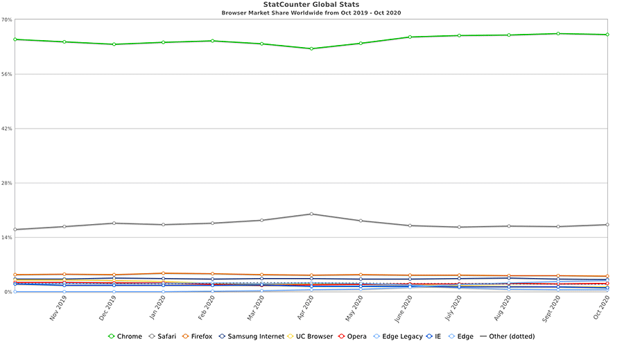
That’s due to the dwindling number of users for legacy browsers such as Internet Explorer. According to StatCounter Global Stats, usage of IE was down to a measly 1.05% of the market as of October 2020. Compare that with the nearly 2% it captured a year earlier.
The further IE and other outdated browsers are in the rearview, the easier it will be to bring the latest CSS developments to production websites. This allows the language to better fulfill its vast potential. 2020 was a big step in that direction.
Top CSS Articles for 2020
The Headless CMS Develops Its Niche
The utilization of “headless” or “detached” content management systems has continued to gain momentum. This practice involves employing a CMS (such as WordPress) to feed content to an outside application.
This leads to several interesting possibilities. You might send content out to a mobile application – allowing both your app and website to share the same blog posts. Likewise, you could leverage a static website generator such as GatsbyJS or 11ty to create a super-fast user experience – perfect for heavily-trafficked sites. All while keeping a familiar back end UI for your content creators.
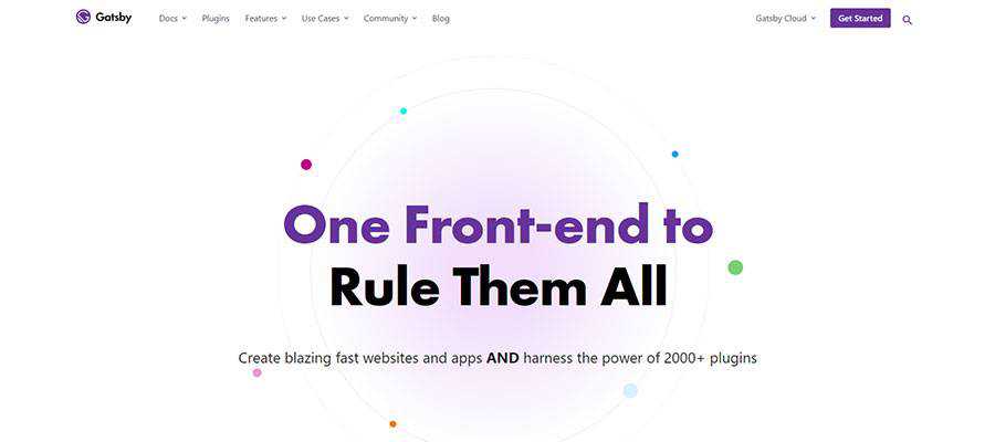
And, although this technology is still relatively young, you can see it starting to take hold. GatsbyJS, for one, has come a long way over the past year. GraphQL, its companion query language, is steadily maturing. It aims to be both efficient and high-performing.
Besides, a number of tools are being built to streamline the process of creating a headless configuration. This is vital, as it is not currently a beginner-friendly task. The easier this all becomes, the more widespread and creative its usage will be.
For now, headless CMS configurations are being deployed more and more. Still, unless you’re an expert, diving in head-first and adopting this technology for client projects may not be wise.
Therefore, it’s probably best to start small and experiment. Once you are on solid ground, going headless could be a great solution.
Top Headless CMS Articles for 2020
Prototyping Tools Improve and Evolve
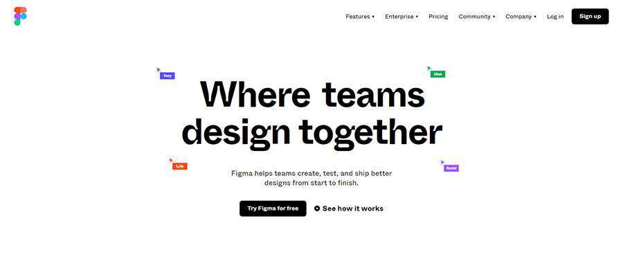
The way we build website and mobile application prototypes continues to change. Many designers are eschewing traditional tools like Photoshop in favor of niche apps like Adobe XD, Figma, and Sketch.
Each of these tools has been built with web and mobile applications in mind. Therefore, designers don’t have to settle for passing along static mockup images to clients. Rather, they can create something fully-interactive that better represents what the final product will do.
Of course, the tools themselves are not new – they’ve been on the market for several years. But in 2020 the argument for using any of these apps has become more compelling.
For one, each has robust developer communities that release helpful goodies such as plugins and UI kits. They help designers extend functionality and increase efficiency. And the apps themselves have released some exciting features, along with smoothing out rough edges.
However, another feature of prototyping apps also became very important: their built-in collaboration tools. They facilitate remote feedback from both clients and team members. With so many of us working from home this year, anything that makes the review process easier is a massive bonus.
Top Prototyping Tool Articles for 2020
The WordPress Gutenberg Block Editor Becomes More Polished
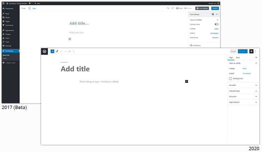
December 2020 marked the Gutenberg block editor’s second birthday. But, unlike most 2-year-olds, it seems like the fits and tantrums are (mostly) a thing of the past. Gutenberg is becoming quite mature for its age.
Looking at the editor’s UI, it’s lightyears ahead of where it was back at the beginning. A lot of development time went into making the interface more intuitive. Getting around is much easier, as is finding and selecting individual blocks.
Accessibility was also a big focus. This particular subject is important in all areas of web development but was also a major criticism of earlier versions of Gutenberg. So, improving both the UI and making it more accessible are big wins for 2020.
The year also saw the introduction of custom block patterns, which make it easier to use and reuse a specific layout. The ability to implement a custom layout anywhere it’s needed is no small achievement. This was one of the missing features that made the block editor a difficult sell for some use cases.
And, while not ready for prime time just yet, Gutenberg-powered full site editing (FSE) is in the works. This will enable users with a compatible theme to edit all aspects of their website through the block editor. The first such theme, Q, was made available for download earlier this year.
All told, WordPress now has a default editing experience that can be seriously considered for just about any project. There are still some advantages to page builders – not to mention the old Classic Editor. But blocks are catching on.
Top WordPress Gutenberg Block Editor Articles for 2020
In 2020, the Focus Was on the Bigger Picture
One thing you may notice about the items above is that they all involve evolutionary change. Nothing here appeared to be a watershed moment for web designers. In fact, posing this subject on Twitter didn’t result in any earth-shattering recommendations either.
Maybe that makes for less-than-compelling headlines. Yet it also means that, in a chaotic year, there was a comforting consistency for the web design industry. The tools and technologies we already use just got better. Nothing to complain about there.
When we look back years from now, a lot of historic events will stand out from 2020. But web designers may see it as a time that set the table for bigger things yet to come.
The post 2020 Web Design Year in Review appeared first on Speckyboy Design Magazine.
All content management systems (CMS) have their own strengths and weaknesses. Some are meant for very niche offerings such as eCommerce or membership sites, while others are a jack-of-all-trades. In addition, these systems range from open source to proprietary.
Beyond the market-leading WordPress, I have had the opportunity to dabble in a few other systems. The experiences have been uneven.
I won’t pretend to have in-depth knowledge of every software package out there. But I have enough experience to understand what makes for a good system. It’s about ease of use and putting users in the best position to do things the right way.
For the most part, there’s been a ton of improvement over the past decade. Still, not everything is where it should be. With that in mind, here are five things that no CMS should be doing in modern times.
Generate Non-Standardized and Inaccessible Code
It’s hard not to notice that the web has a lot of standards and best practices these days. Markup has to be structured semantically and content needs to be accessible. In addition, CSS should be used for styling elements such as containers and typography.
Yet, I still see content editing UIs that facilitate, and thus promote, doing things the wrong way. For example, take a proprietary, membership-based CMS I’ve worked with. Its content editor still utilizes tables for multi-column layouts as well as old school HTML font tags. Um, 1999 called, they want their markup back!
Now, there’s a difference between slight deviations from standards and an outright disregard for them. The fact that any software would still use such outdated techniques (by nearly two decades) is kind of bewildering – not to mention irresponsible.
The average person who creates content places a great amount of trust in an editor UI. We need the software to turn our text and images into clean, accessible code. It doesn’t have to be perfect, but it should never hinder anyone’s ability to consume it.
Allow for Unregulated Clutter in the Dashboard
For some of us, working at a cluttered desk is frustrating. It’s hard to be creative – or even concentrate – with various junk lying around. A CMS dashboard is much the same.
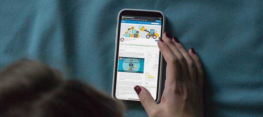
Dashboards should be both minimal and easily customized. The WordPress Dashboard starts off this way, but quickly becomes a heaping mess as you install more themes and plugins. Dashboard widgets can be turned off easily enough. But the many nagging notification messages shown throughout the back end aren’t so easy to jettison.
Part of the issue is that, as an open source system, WordPress doesn’t have much control over how these notifications are deployed. There have, however, been some efforts to wrangle notices in a more user-friendly way.
This is one area where some proprietary systems, especially those that don’t allow for third-party plugins, have an advantage. They can take complete control over the UI and decide what notifications are needed and how they will be displayed.
Then too is the need for distinguishing between legitimate system-related notices and cheesy upsells. It’s understandable that software developers need to make money. However, being bombarded with ads and forced to dismiss the same notification a hundred times crosses a line. There need to be strict guidelines regarding this type of behavior.

Restrict Content Portability
Just because your website was built using a particular CMS doesn’t mean it will forever stay in that system. You might eventually outgrow the platform you started out with or simply want to try something new. This is not always easy.
With some proprietary systems, the site you build either stays with the provider or it goes away altogether. Content and design can’t be natively exported for use elsewhere. In some instances, you can’t even export a copy of your site for internal staging purposes.
In that case, you’re left searching for a third-party tool to extract what you need. Fail that, you might be copying and pasting source code out of your web browser.
It’s reasonable that some functionality may not be exported – like, say, a shopping cart. But in this day and age, the content itself should at least be available to export as a CSV, JSON or XML file. Is that too much to ask?

Trade Stability for Features
All software evolves over time – that’s a given. Bugs are squashed, security holes are filled and new features are unveiled. And they are all rightly expected of a CMS.
However, there is also a great need for stability. When you deploy a website on your CMS of choice, you want to know that it will continue to work, version after version.
Big, sweeping changes can throw a monkey-wrench into the works. If all the “what-ifs” are not accounted for, any fundamental change to how a system works can have dire consequences. Specific features, or even an entire website, could break after the change is implemented.
New features are still important. They help to attract new users and ideally make life easier for existing ones. But they need to be carefully thought-out in order to minimize any negative impacts.
If an app gains a reputation for breaking websites, it’s not going to be around very long.

Fail to Communicate with Users
It seems like communication might be just as important as code. Because, while a system may have compelling features, users will need to know about them in order to take advantage.
Likewise, those behind the scenes at a CMS need to know what their users want and need. That information is key in deciding which features to implement and which bugs need fixed.
But communication is a big job. It encompasses areas like documentation, user support and building community. A lot of effort needs to be spent here, which is difficult even for industry giants. For smaller systems, it may stretch finite human resources to the max.
Still, it’s worth the effort. A failure to keep an open dialogue with users will erode relationships and may cause a mass exodus from the platform.
A CMS Must Keep the Focus on Users
Ultimately, a CMS will be judged on whether it fulfills the needs of its users. None are perfect in this area, but some are far ahead of others.
The best systems allow us to create content in an accessible manner. They’ll develop features that maintain stability and will provide at least some backward compatibility. In addition, these systems will respect a user’s right to their own content and facilitate portability.
Above all, a good CMS will keep an open line of communication with users. The open dialogue will benefit everyone and help to ensure a bright and productive future.
On the other hand, systems that fail in these areas will most likely cease to exist over the long term.
The post 5 Things a Modern CMS Shouldn’t Do appeared first on Speckyboy Design Magazine.
Squarespace has proven to be a widely popular website building platform that has helped millions of people (currently 1.9 million) launch personal blogs, online businesses, and eCommerce shops. As one of the leading SaaS-based content management systems in the market today, Squarespace offers people an inexpensive and easy way to build websites from the ground up, regardless of skill level.
Many people prefer Squarespace because of its comprehensive nature. It comes with a dedicated website builder, tons of beautiful pre-designed templates, hosting, eCommerce functionality, a blogging platform, and so much more.
Because of this, we wanted to share with you some of the most stunning Squarespace examples you can model your own website after.
So, let the inspiration begin!

Template: Brine family
Slow Travel Magazine leaves a great first impression thanks to the large homepage image slider that greets you once you arrive on its site. It also makes navigating the site, getting in touch, and following on social media a breeze. That’s because all of these elements are in the header section. There’s also a neatly organized blog section, complete with post title, excerpt, and a stunning featured image to spark interest.

Template: Avenue family
Lucia Balcazar is a creative that takes her skills and applies them to her website, earning her a spot in this roundup of Squarespace examples. She has created beautiful image galleries of her best work that open in using the Squarespace lightbox feature. She also connects straight to her Instagram account so people can immediately click and follow.

Template: Wexley family
Julie Harmsen is a wedding/family/lifestyle photographer that utilizes Squarespace’s grid layouts to ensure people focus on her photos and nothing else. To get a closer look at her photographs, hover over the image (notice the cool hover effect) and click. The gallery then turns into a paginated series so you can continue viewing – distraction free.

Template: Avenue family
Kismet is a group of Los Angeles restaurants. The homepage is designed for customers to access information about all three restaurants from one unique location. It uses a bold color scheme to grab people’s attention and three links that lead to each respective restaurant. When you click one of the links, you are immediately taken to a mini site. Each mini site is complete with menu information, reservation booking, open positions, and even an online shop.

Template: Aviator family
Salvage Solutions is one of the coolest Squarespace examples on this list. To start, they are a company dedicated to helping people make use of reclaimed materials. But beyond that, each webpage has a natural looking background image that pulls together the written text and is visually appealing. Recent projects come with images and the ability to like, share, or comment on. And since it has a dedicated contact page, visiting in person, calling, or sending a quick email is simple.

Template: Flatiron family
Darren Booth uses the Squarespace platform to create a grid-like portfolio displaying his best works. You can read his blog that showcases video content and shop online for your favorite pieces. Plus, you can even follow him on social media by using the convenient social media links. Lastly, check out previous clients, subscribe to a newsletter, and even catch a glimpse of Darren’s Instagram account thanks to the Squarespace sections added near the bottom of the homepage.

Template: custom designed
Active schools is the type of website that keeps you scrolling. As you move down the homepage, more information instantly lazy loads so site performance and the user experience is never sacrificed. Furthermore, mid-page there is a large video that explains what the website’s core message is. You can subscribe to the newsletter or donate by clicking on the CTA buttons. And if you want to share their message with others, you can follow them on Twitter, LinkedIn, Instagram, and even YouTube.

Template: Brine family
SJK Audio is one of those Squarespace examples you don’t forget. It’s the perfect blend of black, complete with pops of color to draw attention and encourage action, without distracting from the overall vibe. This one page website has a slick vertical slider that follows you as you scroll, so you always know where you’re at on the site. There’s also a testimonials section, audio clips you can listen to, and a services section complete with a CTA to get in touch.

Template: custom designed
Rodarte is an online retailer of stylish clothing that takes Squarespace and makes it fancy. The quickly changing, fullscreen slider gallery makes you stick around to see what’s coming next. Other than that, the homepage has a simple navigation menu that guides you through the rest of the site and social media icons so you can easily like, follow, or view their video content.

Template: custom designed
Bandsintown is a custom designed Squarespace site that uses dark, bold colors and material design to make its presence known. As each section on the homepage loads, you see simple effects revealing icons, text, and call to action buttons, making this a stand out website. The navigation menu is sticky, so you can always click away and explore other parts of the site if you want to. And to make the most of the footer section, Bandsintown adds menu links, social media icons, and a large logo that once clicked redirects you to the top of the site.

Template: Pacific family
The Dixie Chicks are a well-known country band that is no stranger to site traffic. And yet, Squarespace handles their popularity with ease. The stunning image below the header section lets you know right away you’re in the right place. There are audio clips so you can listen to their music before buying it, a gallery of Instagram photos that link out to their account, and even a fullscreen search bar in the footer if you’re looking for something in particular.

Template: Tremont family
Blue Dog claims to be an “eclectic healthy eatery” and their web design follows suit. The words eat, drink, and visit are links leading you to different locations and corresponding menus. But the neatest thing about this Squarespace site, is the hover effect when you place your mouse over these words. Each word has its own image attached to it and as you move over them individually, you are presented with a beautiful background image. On this site you’ll also enjoy a tasteful image gallery, a convenient way to make reservations, and social share icons for staying up to date.

Template: Brine family
A Fabulous Fete is one of our soft feminine Squarespace examples. Featuring a light pastel color scheme, cursive fonts, and lots of pretty things, the overall design matches the site owners reason for having a site in the first place: she creates, designs, and shares her knowledge with other creatives. Subscribe to her newsletter using the built-in subscribe box, read her latest blog post, follow her on social media, and of course, shop for stationery, cards, envelopes, stamps, and so much more.

Template: Pacific family
Freemans Restaurant is a solid example of what Squarespace offers restaurant owners by way of design and functionality. To start, this website leaves a lasting impression with its fullscreen header image. As you scroll down, you’ll see beautiful background images with text overlay conveying information about the restaurant’s menu items. But best of all, if you want to give someone the gift of dining at Freemans Restaurant, you can purchase gift cards online thanks to the simple Squarespace checkout page.

Template: Five family
Uppercase Magazine grabs your attention right away with the cute fullscreen animation that appears once you arrive. It also catches your attention after a little bit of activity with a popup subscribe box that invites you to sign up in exchange for a $15 off coupon. Follow the team on Instagram (after seeing the gallery of images), browse and buy books they’ve published, and even get involved by submitting your own work for publication in print, online, and on their site for others to see.

Template: Forte family
Architecture Information takes their Squarespace template and turns it into something truly unique. For instance, the homepage is covered from top to bottom with an ever-changing image slider that you can click on too. Navigate to other parts of the website, follow on social media, and even get in touch using the menu items. And if you’re curious about Architecture Information’s latest projects, view their beautiful image galleries that turn into sliders once you click on a single image.

Template: Bedford family
Elle & Co. takes advantage of whitespace and a sectional homepage to covey a lot of information at once without overwhelming site visitors. Check out Elle’s blog posts, podcast, and services by clicking on any one of the standout CTA buttons. In addition,you can see where Elle & Co. has been featured in the small section near the bottom of the homepage, click on the hamburger menu icon and view the vertical menu that slides in, and of course, follow Elle and her team on social media.

Template: Aviator family
Pat Blute is another one of our Squarespace examples that uses his homepage to display one large image that catches your attention right away. Other than a simple navigational menu, the only other element on Pat’s homepage are social media icons. That said, his portfolio has large and beautiful imagery and video content. And the About page has plenty of external links to show you just what he is capable of producing.

Template: Avenue family
Fotio is a simple and minimal Squarespace website that ensures site visitors know what they are all about. This is in large part to the large image slider that you see immediately upon arriving. Additionally, the mixture of color and black and white photography gives customers a sense of what their services can provide. Complementing the imagery is plenty of written text and a link to the reservation form for those that want to rent the photo “boothless” booth. Read up on some FAQs, check out upcoming events, and even read some testimonials to decide whether Fotio is something you want to use.

Template: Brine family
From Roses is another feminine Squarespace theme that uses soft color schemes, font pairings that are strong and subtle at the same time, and beautiful images to make you say “ooh.” Plus, this site also uses the large search bar at the bottom of the homepage that we’ve seen on previous Squarespace sites, similar social media icons, and a bold CTA button if you want to get in touch and work with this lifestyle photographer/blogger.

Template: Galapagos family
PICA Things We Love is the perfect example of how Squarespace gives you the tools to create a simple portfolio. The organized grid layout is appealing to the eye, and the use of whitespace ensures site visitors aren’t drawn to too many things at once. When you click on a portfolio item that you like, you are brought to its product page so you can buy it if you want. There’s also a distinct search bar, social media icons, and a subscribe call to action button site visitors can click on to sign up.

Template: Brine family
Edible Boston is a little different than most of the Squarespace examples up until now. For example, it focuses on content and takes advantage of the fact that Squarespace supports multiple authors with ease. It also has cool featured images and posts titles, lets you comment on your favorite content, and has delicious recipes to try for yourself. Plus, follow them on Instagram so you never miss a thing (thanks to the Instagram feed highlighting their best and latest images).

Template: Supply family
Mike Kelley is a serious photographer that monetizes his skill and uses Squarespace to showcase his work. There’s a dedicated FAQ page for those that need clarification and menu items linking to categories of work. There are also add to cart buttons (and a social share icon) to guide you through to the checkout page. Lastly, if you need to get in touch with Mike, there’s a simple contact form to fill out.
Conclusion
And there you have it! Some of the best Squarespace examples found on the internet today you can use if you’re in need of a little web design and functionality guidance.
If you’ve decided on a Squarespace template for your new website, but need help choosing a domain name, be sure to check out this roundup of the best domain name generators around. And if you aren’t sure Squarespace is for you, be sure to peruse our roundup of fantastic Wix examples and see if that platform has what you need instead.
Have you ever used Squarespace for your blog, online business, or eCommerce shop? Which template did you use? We’d love to hear all about it in the comments below!
The post 20+ Stunning Squarespace Examples to Model Your Site After appeared first on WebresourcesDepot.

Wix, founded in 2006 as an all-in-one platform designed to give people a simple way to build and manage websites, currently boasts over 148 million users. It hosts all your data, requires zero coding skills, and lets you launch both a blog and eCommerce shop.
But perhaps one of the most appealing features Wix offers website owners is the library of 500+ pre-designed templates. No matter what type of website you’re looking to launch, Wix has a template for you. You also have access to a drag and drop interface that makes site building a cinch. And while Wix doesn’t offer the same level of functionality and flexibility that a self-hosted solution like WordPress does, there’s no denying that Wix gives beginners an easy way to build a site from scratch with no technical knowledge.
If you’re thinking about using Wix for your website, or just need a little inspiration for your existing site, check out our roundup of some real-life Wix examples to see just what you can accomplish.

Monica Pack Pilates is a website dedicated to fitness and uses one page site design mixed with smooth parallax effects. It has a large background image to catch your attention right away. And as you scroll, you are met with a variety of beautiful pastels color schemes, relevant imagery, and links that lead you to additional information.
To make booking a Pilates session easier on clients, Monica Pack Pilates adds a convenient contact form not only in the navigational menu, but at the bottom of the page too. Not to mention, the navigational menu is sticky, so readers can easily see all the content they want with ease.

Seven Grams Caffe is one of the best restaurant websites and Wix examples around. It starts off by displaying a large, fullscreen image to give site visitors an idea what the site is all about. After scrolling to the bottom of this one page site, you’ll see an impressive footer section, complete with location information, social media icons, and sticky buttons for ordering online. And don’t forget the beautiful image gallery mid-scroll that shows off Seven Grams Caffe’s shops, food items, and of course, delicious drinks.
The eCommerce portion of the site is opened in a separate tab so as not to ruin the overall user experience. It includes product images, social sharing, variable product options, and more, all using the popular Square payment gateway that easily integrates with Wix.

Jordan Likes Birds is a simple Wix website that acts like a landing page for prospective clients. Click on illustration, vis dev, graphics, or stories/boards categories to be taken to extensive portfolios of Jordy Farrell’s best work. In addition, if you select the Books menu item from the dropdown, you’ll be taken to a list of Amazon affiliate books you might be interested in purchasing. Affiliate marketing is a great way to monetize your already successful Wix website.
Follow Jordy on Instagram by clicking the social media icon in the header section. And most unique of all, find a link to a secret portfolio by clicking on the custom icon in the header.

Calvin Pausania is a director, photographer, and designer that uses Wix to highlight his projects and give people a way to get in touch. To start, he makes a powerful statement by using a predominantly black color scheme with pops of color throughout to grab people’s attention and make them want to know more. And if you want to explore his website, all you have to do is click on the Menu button and navigate the lightbox that pops up.
The portfolio images found in this website are large and bold, and reading about Calvin’s story in the dedicated About page is more than captivating.

Jérome Studio is an online shop that sells elegant handbags. The team behind this chic Wix website provide site visitors with both a sticky header and footer section. In other words, there are two navigational menus at once, separated so as to not overwhelm the customer. In addition, you can check out which items are in your cart in the upper right hand corner, click your favorite product to learn more and buy, and even log in if you’re a registered user.
Want to create a sense of urgency in your own Wix shop? Do what Jérome Studio does and add a small banner on the top portion of your website. Here, you learn that Jérome Studio donates 5% of every purchase to children in need. This strategy not only helps the community, but generates more sales too. Your banner can be customized however you like so you garner more sales in less time.

Helena Krüger is an illustrator that seeks to showcase her best work to the public so that businesses and private clients alike will hire her for their own custom illustrations. Her use of whitespace causes her grid of illustrations to pop out in a clean and modern way. In addition, after getting to see a little bit of her best work, Helena presents site visitors with links to her best-selling products and online store for more.
She makes it very clear what type of work she does and how to get in touch for a quote. And if you aren’t quite sure exactly what you want, you can always link to her photo gallery modules and see each piece of work up close and personal in the lightbox popup.

Adam McCain has a beautiful website built on Wix that shows people who he is and what he does. There’s a large background image that shows Adam’s personality. In addition, he gives people a chance to connect on social media, link out to images in his gallery, and even book him as a speaker for your event.
Wix gives Adam a way to connect people to his YouTube channel. It’s powerful features even give Adam a way to highlight featured speakers that you can learn more about and reach out to on multiple channels such as Facebook, Instagram, and Twitter.

Marco de Haunt is part of our Wix examples roundup because it has a landing page like homepage and lets site visitors check out the music or graphic/photography categories. The large background image on the homepage is dark and brooding, which gives the impression that the work found here is darker and more serious than other artists.
Check out extensive photo galleries, complete with the ability to like or share via social media or email. And if you want to get in contact, all you have to do is click the contact CTA button and find the contact form to fill out. You’ll also find additional information, such as an email and address if you need to know that too.

Leandro Pedretti’s Wix website is a neutral one page site that shares with others the type of work he does, services he provides, and social networks he frequents so you can connect. Click on a link in the services module to view additional information and a stunning slider gallery.
In addition, notice how the imagery blends well with the text and standout video image that meets the eye once you click on the website. It’s details like this that Wix offers website owners that are trying to push ahead of the competition and encourage people to convert.

SoFlo Cake & Candy Expo does an excellent job of taking an overwhelming amount of information and displaying it to site visitors in an organized and easy to understand way. Plus, the color scheme they use is fun and bright, which is perfect for bakers that want to bring joy into the lives of others.
People can buy tickets to the next cake and candy event, check out their online shop and get the ingredients they need, and even advertise their own businesses in the ad sections offered throughout the website. Lastly, as a way to build a bigger email list and get more subscribers, the creators of the SoFlo Cake & Candy Expo offer 10% off tickets for signing up.

Eat Sleep Live is a food blog that caters to French cuisine. It makes use of Wix’s ability to handle image-heavy sites without sacrificing site speed or performance. In fact, after scrolling a bit down the homepage, you’ll notice a full width slider that shows exquisite detail on all the featured food recipes that loads fast and makes you hungry for more.
This food blog also makes connecting via social media, contacting the team for advice, and navigating the website easy thanks to the detailed footer section.

Tobias Becs knows how to introduce himself to the world at large, even when they are so many other people doing the exact same thing. He uses a bold image to showcase himself and his skills (as a football freestyler), takes advantage of the sticky navigational menu and social media icons, and most notably includes large images mid-scroll that link to his Facebook, Instagram, and YouTube channels.
Because Tobias uses Wix as his CMS, he is able to create a daily vlog section that his loyal followers can watch. And since video content is so popular these days, this approach to “blogging” increases site engagement and creates a stronger community.

Kome Waza is another wonderful restaurant site using the Wix platform as a CMS. To start, the fullscreen image seen on the homepage leaves a great first impression. Plus, it’s fading effect gives a different vibe than a traditional slider gallery.
If you scroll down to the bottom of the homepage, you’ll notice the site has creative footers. First, check out the restaurant’s address, complete with a small image section that continually changes. Next, view the restaurant’s physical location on the map module, and access the phone number, email address, and social media icons for staying connected.

BeardTamer is a website that showcases just how Wix lets site owners use parallax effects on their homepages to leave a lasting impression. There’s a stunning background image with text overlay that follows you as you scroll down this one page eCommerce site.
Adding to that, BeardTamer includes large imagery throughout their site to highlight their product and their message. Lastly, notice the use of creative fonts in the company logo, navigational menu, contact form, testimonial section. Though they are all different, thanks to the flexibility Wix offers, they also complement each other in a harmonizing way.

Lousie Whitehouse takes her artistry seriously, as you can read about in her About section. She takes a minimal approach to her web design and showcases her best work to convince people to buy. In addition, she loves to share stories in her blog that are not only heartfelt, but valuable. Plus, this site is an excellent example of a stunning black website.
A beautiful grid like layout is used in the portfolio section of this website. It comes complete with plenty of whitespace so there are zero distractions. Her blog posts have large featured images that pique interest before you even set out to read the post itself. And connecting with her via social media is easy thanks to the dark social media icons that appear throughout her website.

Stolen Goods is an online clothing store that uses simplicity to stand out. From the pale color palette to the vertically centered web design leading people to their online shop, Stolen Goods is the epitome of minimalism.
Once you enter the online shop, you are presented with organized product images. Not to mention, there’s a navigational menu that will take you to the category of your choice and social media links so you can stay connected. Buying from this online shop is super simple thanks to the PayPal payment gateway that Wix supports.

The Ancient Mariner is one of the truly unique Wix examples on our list. As a port side restaurant made to mimic being out on the open sea, The Ancient Mariner focuses on the user experience both on their website and in their restaurant.
To start, they use a map module to show you their exact location. Additionally, they provide links to external reviews on Tripadvisor and a link to the restaurant’s full menu. This menu is complete with large images, full descriptions, and prices. Because of this you get excited about the unique dining experience you’re about to sign up for.

Lera Mishurov(a) is the perfect example of a Wix website being used to sell a skill. Illustrators, animators, etchers, and other creatives can take inspiration from this website. For instance, the images found throughout the website are custom drawings by the freelance artist herself. This shows potential clients a bit of her work and her personality in an attempt to convince them to buy.
You’ll notice that each webpage has a Wix module displaying the number of Facebook likes the site has. This happens to be an effective form of social proof. Lastly, you can check out the clickable Contact menu item that takes you to the built-in contact form for staying in touch with prospective clients.

Stylists in Crime is a company that deals with advertising, fashion, magazines, brands, music, and television. They aim to reach a global audience, and have an extensive portfolio filled with editorials, video clips, commercials, and elite brand advertisements.
Get in touch via social media, even lesser-known ones like Behance, by clicking the icons that appear throughout the site. In addition, view the portfolio images, displayed in neat grid columns and get a feel for their work. Also, contact the stylists in crime that are responsible for such breathtaking work.

IAMEVE is a singer, songwriter, and storyteller that taps into geometry and surrealism. Bu doing this, she hopes to inspire people to learn to balance the masculinity and femininity in the world. She also works hard to express her deep desire to share heartfelt music with the world by using dark, mysterious imagery.
Subscribe to her newsletter using the subscribe box module and connect via social media by clicking the social network icons. Learn more about IAMEVE’s musings by reading her blog. You can even register for upcoming events and shop in the online store for merch and music. And lastly, make sure to check out IAMEVE’s video content modules that are nothing short of mesmerizing.

John Harris Wedding Films is a great website to take inspiration from if you’re a videographer or photographer. It uses a modern and clean font and light pastel color schemes that are reminiscent of wedding days. Plus, there are plenty of images and video content to showcase just what the team at JHWF can do.
This simple Wix website turns what could be a lot of information into organized chunks of text. For instance, there’s a portfolio, testimonial, contact form, and pricing section making it clear to people what to expect from JHWF.

Animal Music is an impressive portfolio that catches your attention from the start. To start, it has a fullscreen video module that occupies the entire header section of the homepage. From there, the grid layout of video clips make it easy for you to see individual pieces of work completed by the team at Animal Music. What’s more, you can also like and share the clips with others.
Want a neat way to get people to subscribe to your newsletter? Give out some free swag from your company like Animal Music does (free t-shirt anyone?) and get people to sign up. In addition, create a team specific webpage and put some faces to the names and set up a contact form for people to get in touch with your company.

Balloon Rouge is a Wix website that utilizes the format of a landing page to guide people around. On the homepage, you see a fullscreen image providing a glimpse into the creativity Balloon Rouge offers clients. You’ll also have access to contact information and links to the rest of the site in the footer section.
Once you enter the site, you are presented with a one-of-a-kind navigational menu in the shape of a tree. Just click on any one of the menu items to be lead to a portfolio of related works. And the best part about this website has to be the small, attention-grabbing animations that appear every time you click on a new page.

Thank God It’s Monday is a sleek and cool website that has a lot going on at once. For example, it has a variety of font styles, imagery, animations, and sections for site visitors to view. It also comes with a non-traditional vertical slider that lets visitors click through the homepage content.
When you click on the different types of branding work the creator of Thank God It’s Monday does, you are met with smooth parallax effects, stunning background images, and plenty of text overlay that are convincing enough to even the most skeptic marketer. And the cool thing is, you too can do the same with your Wix website.

Le Tigre Tents is a wonderful example of how a simple service can not only be lucrative, but exciting too. And after you take one look at this website, you’re sure to feel the same excitement. Fabulous custom imagery, inspirational font pairings, video content, and lightbox popups of the tents in action are the norm on this Wix site.
And don’t forget the staples site elements. For instance, social sharing, social media counts, a built-in contact form, and vertical sliders are all included in this website.

Amber Schormans take a minimal, subtle approach to promoting what they have to offer, which is portrait and fashion photography. Each portfolio section that highlights different works or events takes advantage of the Wix lightbox gallery. This way users can see beautiful photos up close and personal.
This website has no dedicated blog section, contact form (just an email), or eCommerce shop. Instead, the focus always remains on the message the photographer’s trying to portray and her related works.

Brown Owl Creative uses Wix to create a dynamic website full of colorful animations. Plus, it comes with grid layouts and smooth parallax effects as people explore portfolios, the blog, and the CTA button.
One way Brown Owl Creative keeps things consistent across their Wix website is with video content. Some people prefer video over written text. So, adding these clips help boost site engagement and your overall SEO efforts.
Final Thoughts
And there you have it! Over 25 of the best real-life Wix examples found on the internet today.
Wix is a powerful platform that offers poeple a great way to promote their products and publish their blog content. Plus, since it’s a comprehensive CMS, it eliminates the need to hire a professional developer.
If you need some more web design ideas, be sure to check out our roundup of stunning Squarespace websites and see if there is any design inspiration you can get from those too.
Have you ever had success using Wix to create a website? If so, we would love to hear all about it in the comments below!
The post 25+ Real-Life Wix Examples for Your Inspiration (2019) appeared first on WebresourcesDepot.