Monthly Archiv: January, 2021
Package:
Summary:
Wrapper to access SQL databases using PDO
Groups:
Author:
Description:
This class provides a arapper to access SQL databases using PDO...
Read more at https://www.phpclasses.org/package/11960-PHP-Wrapper-to-access-SQL-databases-using-PDO.html

Technically, there’s no limit to the amount of design and content elements you can place onto a website. But the reality is that the space for getting a user’s attention is finite.
That’s because a visitor typically reacts to what they see in the first few seconds after page load. Anything not visible within that timeframe will likely be missed. Designers and content creators alike have to carefully consider what is included.
While some items will be effective in getting the point across, others will fail. This is what I like to call “wasted” space. Unlike whitespace, the wasted variety takes up valuable screen real estate without adding any real value of its own.
How do you know what’s worthy and what’s not? Let’s take a look at some telltale signs that point to a waste of space.
The Web Designer Toolbox
Unlimited Downloads: 1,000,000+ Web Templates, Themes, Plugins, Design Assets, and much more!
Large Images That Distract from Your Content
Both designers and website owners alike are big fans of utilizing large photos. Whether they serve as the background to a section of content or the entire page – full-width photos are in fashion.
While this can add some real beauty to your design, the context in which these images are used is important. It’s worth considering how they impact the rest of your content.
For instance, a stunning photograph that fills up the screen may look cool. But, does it serve a specific purpose? Does it provide some context for visitors?
If the image isn’t directly accompanied by content, you’re forcing users to scroll down to look for what they need. And if the image is too busy, it may further distract from your content. Complex images that serve as a background to text and calls to action could negatively impact legibility as well.
It’s great to have images that stand out. But without purpose, they’re likely taking space away from something more important.
Hero Areas That Lack Actionable Information
A well-crafted hero area will draw a user’s attention. By using a photo, video or contrasting color background, this element naturally separates itself from everything else on the page.
This is why we often utilize hero areas for vital information. Within them, our most important sales pitches and messaging find a place to shine. These are the items that we want to be at the forefront of a visitor’s mind.
Unfortunately, there are times when this element isn’t so informative. The included text may be vague and fail to make a coherent point. The design itself could suffer from the same affliction, with no discernable places to click or actions to take.
No matter how compelling a hero area looks, the content must be every bit as detailed. It needs to provide a simple path for users to follow. In essence, it should include a clear message that motivates the user to do something. That could be contacting you, viewing a pricing page or adding a product to their cart.
Otherwise, the risk is in gaining a user’s attention without giving them anything to do. It’s the web equivalent of a bridge to nowhere.

Long Passages of Uninterrupted Text
A user’s time is precious. They tend to scan content in an effort to find something of interest. Thus, their attention spans aren’t conducive to long passages of text.
The shame of it is that, no matter how great your writing is, users may simply ignore it. In that respect, the content may as well not exist. The result is an expensive, time-consuming waste of space.
But don’t throw your hard work in the trash just yet. There are ways to spruce things up in a manner that is easier-to-digest:
Use Headings
Headings are perhaps the easiest way to break up a long passage of text. With sound use of typography, they instantly stand out to users. This makes it much easier to pick out a relevant section and scan it for more information.
Separate Content via Design Elements
The practice of sectioning off content with the use of design elements has become increasingly popular. It allows designers to create some visual separation and develop a rhythm. The idea is to place separate-but-related portions of text into dedicated containers that look differently. By using multiple background colors or text styles, this content can be both appealing and effective.
Add Smaller Details
It’s often the little things that make a design truly great. And they can be quite useful for helping to break down content into bitesize pieces. Elements such as dividers, images and blockquotes are all great methods to implement.

An Effective Use of Space = A Better User Experience
Design and content strategy are very much intertwined. When one fails, they both suffer the consequences. Therefore, it’s vital to think about both when building a website.
Part of the challenge is in making sound decisions. For instance, you’ll have to decide which elements should be front-and-center. What is it that users need to know right from the start? What can wait or be tossed aside? It’s a competition to determine what belongs and what doesn’t.
In practice, it’s about making the most of the space and time you have to make a good first impression. When users have a clear path to find or do what they want, they’re more likely to stick around.
The post Avoiding Wasted Space on Your Website appeared first on Speckyboy Design Magazine.
Technically, there’s no limit to the amount of design and content elements you can place onto a website. But the reality is that the space for getting a user’s attention is finite.
That’s because a visitor typically reacts to what they see in the first few seconds after page load. Anything not visible within that timeframe will likely be missed. Designers and content creators alike have to carefully consider what is included.
While some items will be effective in getting the point across, others will fail. This is what I like to call “wasted” space. Unlike whitespace, the wasted variety takes up valuable screen real estate without adding any real value of its own.
How do you know what’s worthy and what’s not? Let’s take a look at some telltale signs that point to a waste of space.
The Web Designer Toolbox
Unlimited Downloads: 1,000,000+ Web Templates, Themes, Plugins, Design Assets, and much more!
Large Images That Distract from Your Content
Both designers and website owners alike are big fans of utilizing large photos. Whether they serve as the background to a section of content or the entire page – full-width photos are in fashion.
While this can add some real beauty to your design, the context in which these images are used is important. It’s worth considering how they impact the rest of your content.
For instance, a stunning photograph that fills up the screen may look cool. But, does it serve a specific purpose? Does it provide some context for visitors?
If the image isn’t directly accompanied by content, you’re forcing users to scroll down to look for what they need. And if the image is too busy, it may further distract from your content. Complex images that serve as a background to text and calls to action could negatively impact legibility as well.
It’s great to have images that stand out. But without purpose, they’re likely taking space away from something more important.
Hero Areas That Lack Actionable Information
A well-crafted hero area will draw a user’s attention. By using a photo, video or contrasting color background, this element naturally separates itself from everything else on the page.
This is why we often utilize hero areas for vital information. Within them, our most important sales pitches and messaging find a place to shine. These are the items that we want to be at the forefront of a visitor’s mind.
Unfortunately, there are times when this element isn’t so informative. The included text may be vague and fail to make a coherent point. The design itself could suffer from the same affliction, with no discernable places to click or actions to take.
No matter how compelling a hero area looks, the content must be every bit as detailed. It needs to provide a simple path for users to follow. In essence, it should include a clear message that motivates the user to do something. That could be contacting you, viewing a pricing page or adding a product to their cart.
Otherwise, the risk is in gaining a user’s attention without giving them anything to do. It’s the web equivalent of a bridge to nowhere.
Long Passages of Uninterrupted Text
A user’s time is precious. They tend to scan content in an effort to find something of interest. Thus, their attention spans aren’t conducive to long passages of text.
The shame of it is that, no matter how great your writing is, users may simply ignore it. In that respect, the content may as well not exist. The result is an expensive, time-consuming waste of space.
But don’t throw your hard work in the trash just yet. There are ways to spruce things up in a manner that is easier-to-digest:
Use Headings
Headings are perhaps the easiest way to break up a long passage of text. With sound use of typography, they instantly stand out to users. This makes it much easier to pick out a relevant section and scan it for more information.
Separate Content via Design Elements
The practice of sectioning off content with the use of design elements has become increasingly popular. It allows designers to create some visual separation and develop a rhythm. The idea is to place separate-but-related portions of text into dedicated containers that look differently. By using multiple background colors or text styles, this content can be both appealing and effective.
Add Smaller Details
It’s often the little things that make a design truly great. And they can be quite useful for helping to break down content into bitesize pieces. Elements such as dividers, images and blockquotes are all great methods to implement.
An Effective Use of Space = A Better User Experience
Design and content strategy are very much intertwined. When one fails, they both suffer the consequences. Therefore, it’s vital to think about both when building a website.
Part of the challenge is in making sound decisions. For instance, you’ll have to decide which elements should be front-and-center. What is it that users need to know right from the start? What can wait or be tossed aside? It’s a competition to determine what belongs and what doesn’t.
In practice, it’s about making the most of the space and time you have to make a good first impression. When users have a clear path to find or do what they want, they’re more likely to stick around.
The post Avoiding Wasted Space on Your Website appeared first on Speckyboy Design Magazine.
Package:
Summary:
Create CodeIgniter based API and CRUD applications
Groups:
Author:
Description:
This package can be used create CodeIgniter based API and CRUD applications...
Read more at https://www.phpclasses.org/package/11949-PHP-Create-CodeIgniter-based-API-and-CRUD-applications.html#2021-01-31-07:18:20

A great restaurant website can help secure people’s attention—and their dinner plans. With millions of restaurant locations to choose from, how do you ensure yours stands out? You create an eye-catching website that draws people in.
Designing a worthwhile website for a restaurant requires more than vibrant colors and pictures of food. When a website is designed successfully it is easy for customers to navigate, aesthetically pleasing, and includes key details such as location, menu, hours, and any other key pieces of information.
If a person has never been to your restaurant before, then your website is their first impression. That’s why it’s so important for your website to highlight all the great qualities about what you offer.
We’ve put together a list of the best restaurant websites so you know where to start with yours.
The purpose of your restaurant website design should not only be to increase awareness of your restaurant, but to also give potential customers a sense of what they would experience.
If you need help creating a website perfect for your restaurant you can contact us today to talk to a design expert! You can also check out our website design tips for restaurants for additional guidance.
Below you’ll see lots of beautiful restaurant website designs for ideas and inspiration!
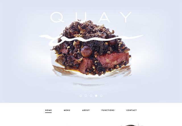
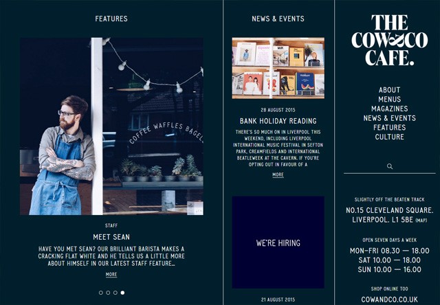
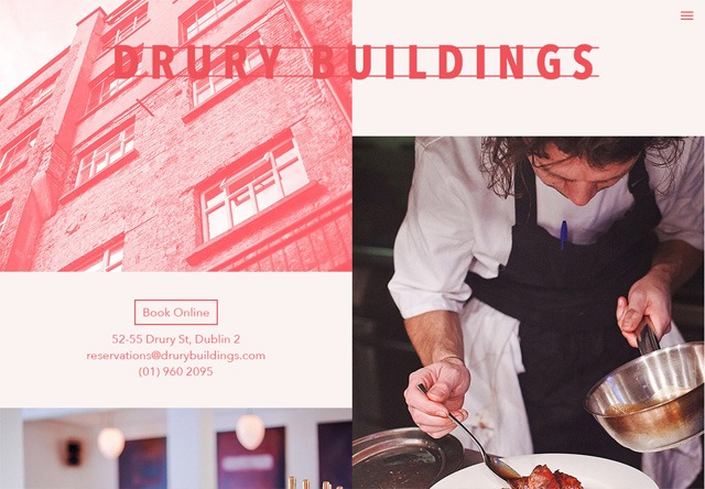
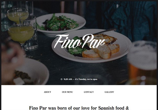
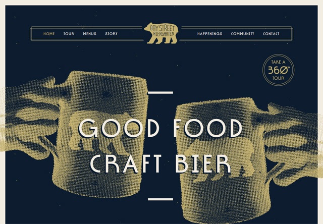
50 restaurant websites that demand attention
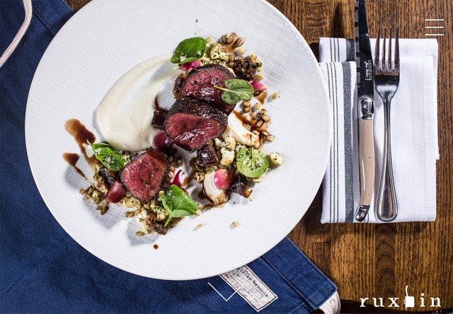
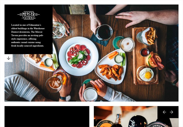
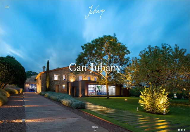
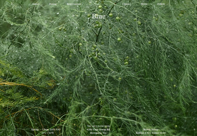
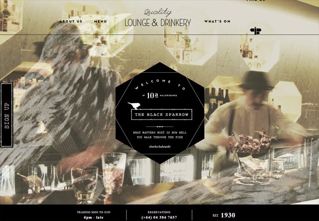
1. Ruxbin Chicago
![Image of a restaurant website: Ruxbin Chicago]()
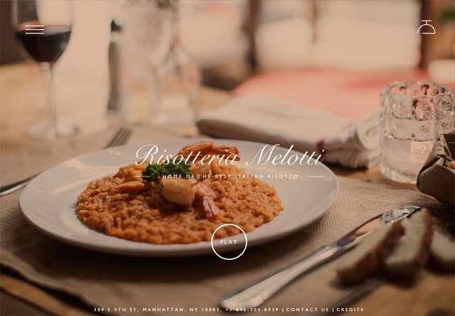
![Image of a restaurant website: Risotteria Melotti]()
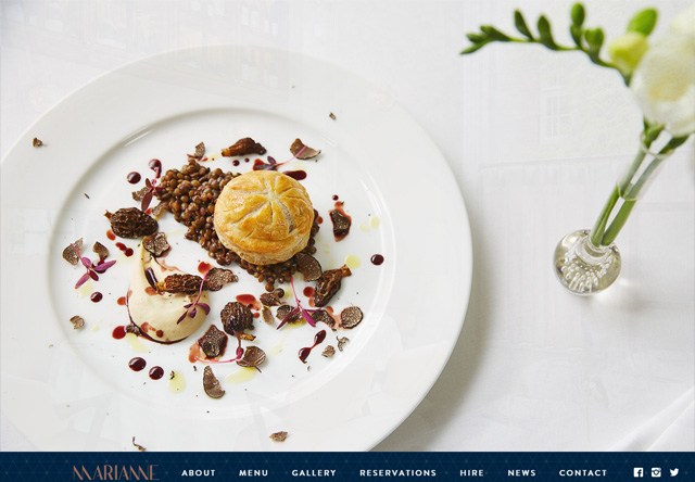
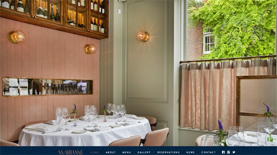
4. Marianne Restaurant
![Image of a restaurant website: Marianne Restaurant]()
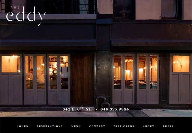
9. The Eddy NYC
![Image of a restaurant website: The Eddy NYC]()
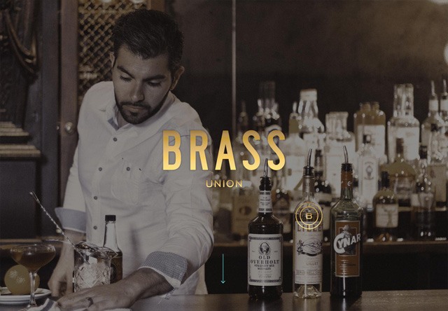
![Image of a restaurant website: Brass]()
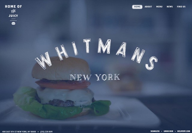
![Image of a restaurant website: Whitmans]()
![Image of a restaurant website: Drury Buildings]() 17. Fino Par
17. Fino Par
![Image of a restaurant website: Fino Par]()
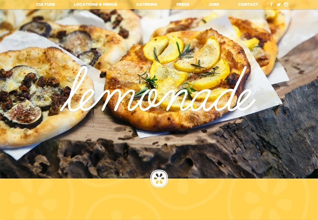
![Image of a restaurant website: Lemonade]() 20. Fuel Cafe
20. Fuel Cafe
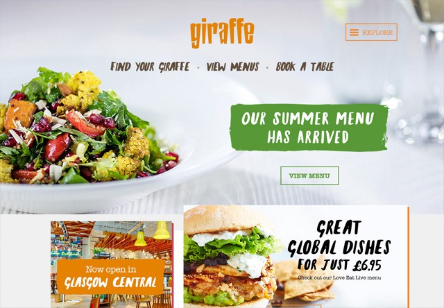
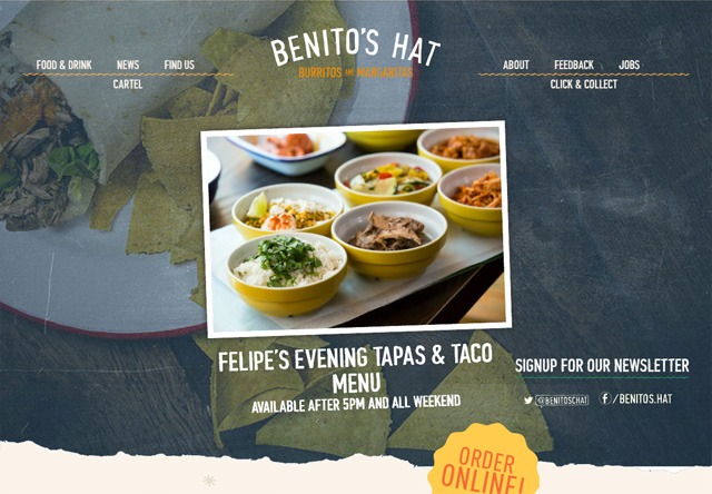
![Image of a restaurant website: giraffe]() 25. Benito’s Hat
25. Benito’s Hat
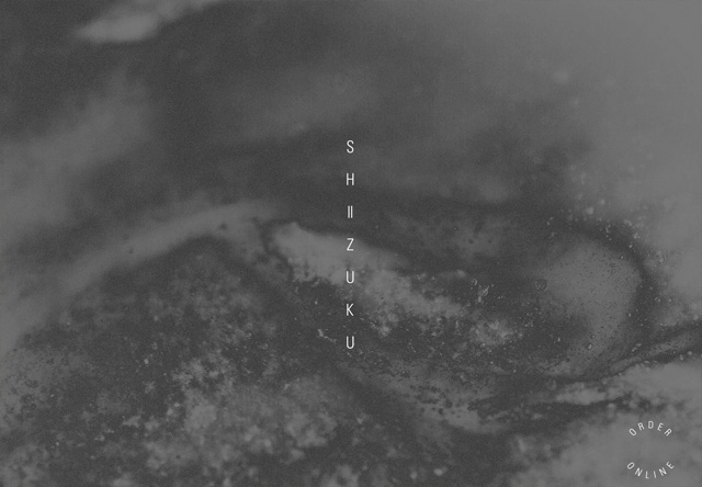
![Image of a restaurant website: Shizuku Ramen]() 29. Jaffle Jaffle
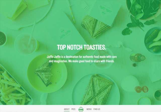
29. Jaffle Jaffle
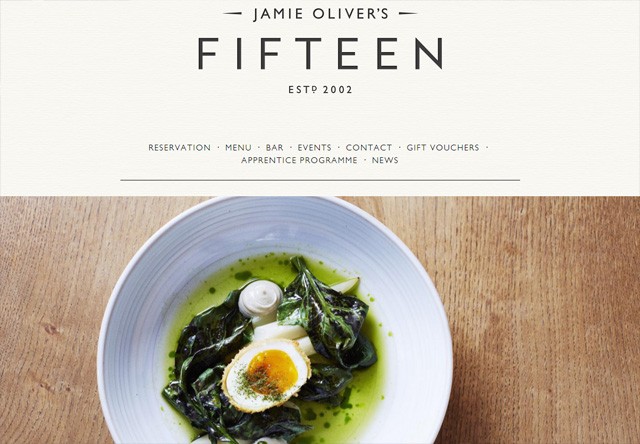
![Image of a restaurant website: Jaffle Jaffle]() 30. Jamie Oliver’s Fifteen restaurant London
30. Jamie Oliver’s Fifteen restaurant London
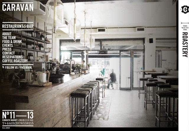
![Image of a restaurant website: CARAVAN]() 32. Wired
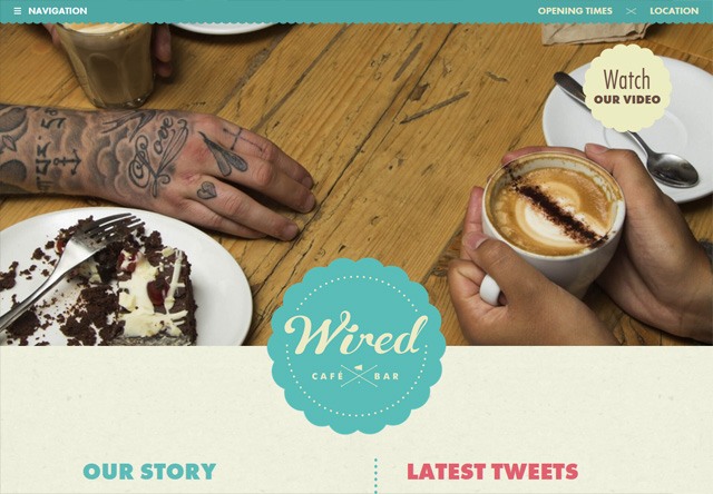
32. Wired
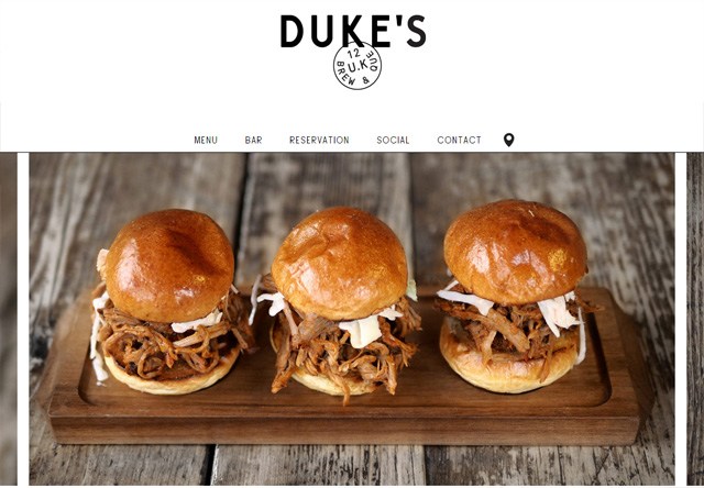
![Image of a restaurant website: Wired]() 33. Duke’s Brew & Que
33. Duke’s Brew & Que
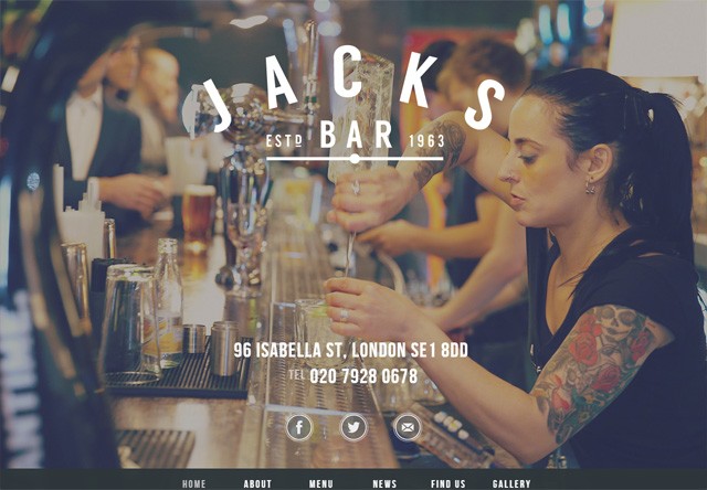
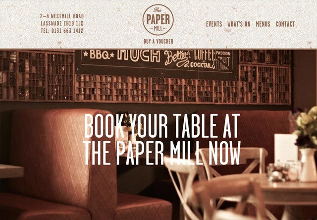
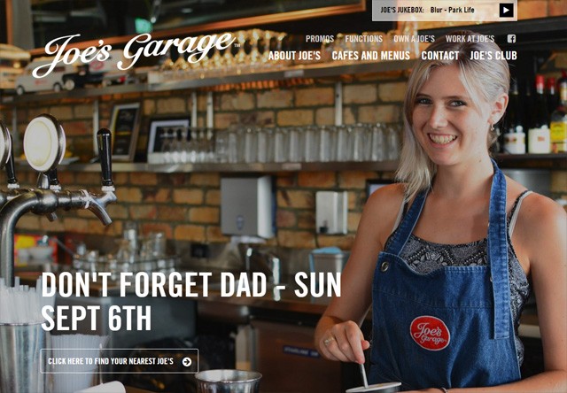
![Image of a restaurant website: Jacks Bar]()
![Image of a restaurant website: Joe's Garage]()
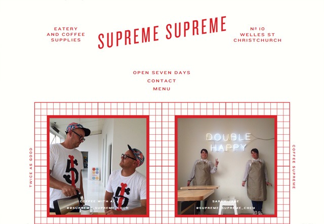
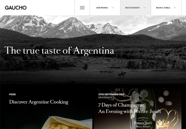
![Image of a restaurant website: Supreme Supreme]() 42. Gaucho
42. Gaucho
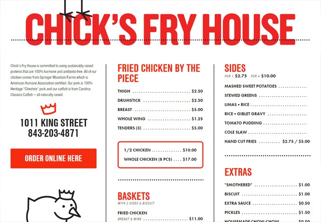
![Image of a restaurant website: Gaucho]() 43. Chick’s Fry House
43. Chick’s Fry House
![Image of a restaurant website: Chick's Fry House]()
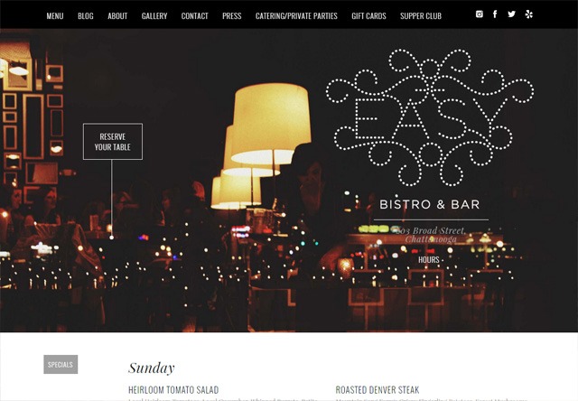
![Image of a restaurant website: easybistro.com]()
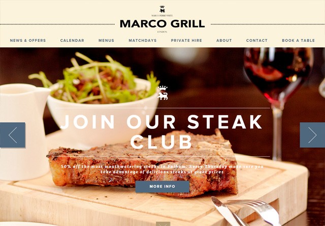
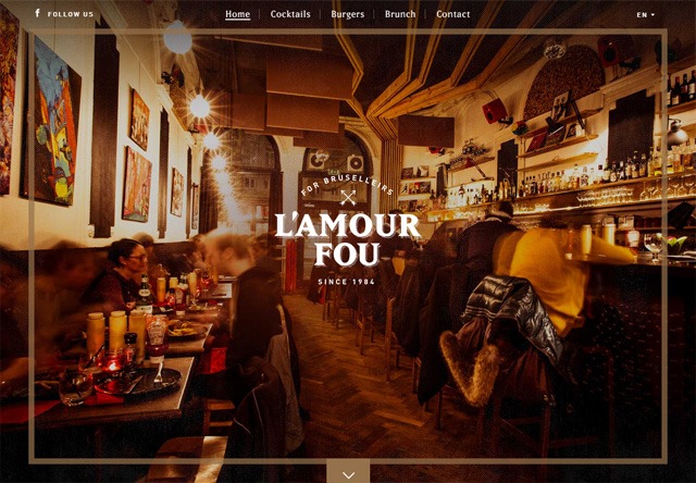
![Image of a restaurant website: Marco Grill]() 49. L’Amour Fou
49. L’Amour Fou
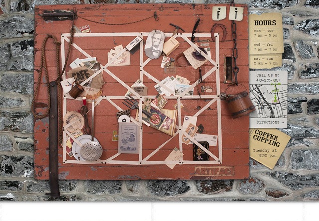
![Image of a restaurant website: Artifact Coffee]()
Your restaurant website is your introduction to potential diners, so you need to make a good first impression. Potential customers are more likely to dine at your restaurant if your website makes them feel engaged and informed. We hope these 50 best restaurant websites were enough to give you a spark of creativity and motivation for your own website.
Four in five restaurant operators agree that restaurant technology helps increase sales, makes their restaurant more productive, and gives their restaurant a competitive edge!
Do you need help creating a website for your restaurant or updating your current restaurant web design? Contact us today to speak with one of our design experts! With over 350 client testimonials and over $700m sales driven for our customers, we have the knowledge necessary to make your website successful.
![]()
Jacob Gube is the founder of Six Revisions. He’s a front-end developer. Connect with him on Twitter.
The post 50 Restaurant Websites for Web Design Inspiration appeared first on WebFX Blog.
Package:
Summary:
Display and validate digits for the user to enter
Groups:
Author:
Description:
This class can display and validate digits for the user to enter...
Read more at https://www.phpclasses.org/package/11932-PHP-Display-and-validate-digits-for-the-user-to-enter.html#2021-01-30-08:30:56

Package:
Summary:
Create GUI user interfaces using the UIP toolkit
Groups:
Author:
Description:
This package can be used to create GUI user interfaces using the FFI extension...
Read more at https://www.phpclasses.org/package/11961-PHP-Create-GUI-user-interfaces-using-the-UIP-toolkit.html#2021-01-30-06:35:54

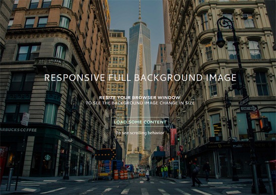
In this tutorial, we’ll go over the simplest technique for making a background image fully stretch out to cover the entire browser viewport. We’ll use the CSS background-size property to make it happen; no JavaScript needed.
![]()
View Demo
Download Source from GitHub
Examples of responsive full background images
Having a large photo that covers the entire background of a web page is currently quite popular.
Here are a few websites that have responsive full background images:
![]()
Sailing Collective
![]()
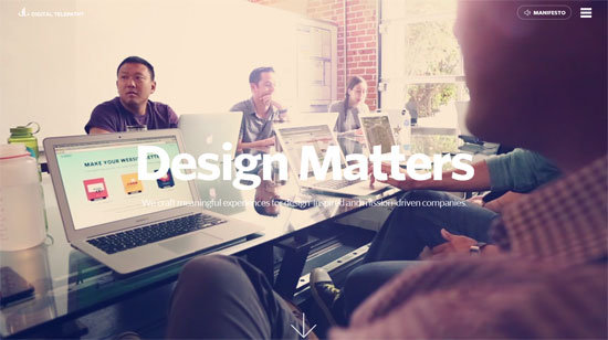
Digital Telepathy
![]()
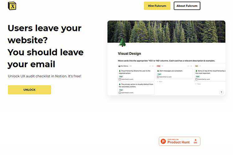
Marianne Restaurant
If you’d like to achieve a similar look in your next web design project, you’re at the right spot.
Core concepts for creating responsive background images with CSS
This is our game plan.
Use background-size property to cover the entire viewport
The CSS background-size property can have the value of cover. The cover value tells the browser to automatically and proportionally scale the background image’s width and height so that they are always equal to, or greater than, the viewport’s width/height.
Use a media query to serve a smaller background image for mobile devices
To enhance the page load speed on small screens, we’ll use a media query to serve a scaled-down version of the background image file. This is optional. The technique will work without this.
But why is serving a smaller background image for mobile devices a good idea?
The image I’ve used in the demo is about 5500x3600px. This dimension will have us covered on most widescreen computer monitors currently being sold in the market, but at the expense of serving up a 1.7MB file.
That huge of a payload just for a background photo is never a good thing under any sort of situation, but it’s exceptionally bad on mobile internet connections. And also, the image dimension is excessive on small-screen devices (more on this further down in this tutorial).
Let’s walk through the process.
HTML
This is all you need for the markup:
<!doctype html>
<html>
<body>
  ...Your content goes here...
</body>
</html>
We’re going to assign the background image to the body element so that the image will always cover the entire viewport of the browser.
However, this technique will also work on any block-level element (such as a div or a form). If the width and height of your block-level container is fluid, then the background image will always scale to cover the container entirely.
CSS
We declare a style rule for the body element like so:
body {
/* Location of the image */
background-image: url(images/background-photo.jpg);
/* Background image is centered vertically and horizontally at all times */
background-position: center center;
/* Background image doesn’t tile */
background-repeat: no-repeat;
/* Background image is fixed in the viewport so that it doesn’t move when
the content’s height is greater than the image’s height */
background-attachment: fixed;
/* This is what makes the background image rescale based
on the container’s size */
background-size: cover;
/* Set a background color that will be displayed
while the background image is loading */
background-color: #464646;
}
The most essential property/value pair to pay attention to is:
background-size: cover;
That’s where the magic happens. This property/value pair tells the browser to scale the background image proportionally so that its width and height are equal to, or greater than, the width/height of the element. (In our case, that’s body element.)
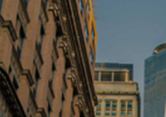
There’s an issue with this property/value pair though: If the background image is smaller than the body element’s dimensions — which will happen on high-resolution screens and/or when you’ve got a ton of content on the page — the browser will programmatically scale up the image. And, as we all know, when we scale up an image from its natural dimensions, the image quality degrades (in other words, pixelation occurs).
![When an image is scaled up from its natural dimensions, image quality is affected.]()
When an image is scaled up above its natural dimensions, image quality is affected.
Keep that in mind as you choose which image you’re going to use. The demo uses a huge 5500x3600px photo for larger screens so it’ll be a while before we run into trouble.
Let’s move on. So that the background image is always centered in the viewport, we declare:
background-position: center center;
The above sets the scaling axis at the center of the viewport.
Next, we need to deal with the situation where the content’s height is greater than the visible viewport’s height. When this happens, a scroll bar will appear.
What we want to do is make sure that the background image stays put even when the user scrolls down, or else we’ll either run out of image at the bottom, or the background will move as the user is scrolling down (which can be very distracting). To do this, we set the background-attachment property to fixed.
background-attachment: fixed;
In the demo, I included a “load some content” feature so that you can see the scrolling behavior when background-attachment is fixed. One thing you could do is download the demo and then play around with the positional property values (e.g. background-attachment and background-position) to see how it affects the behaviors of page-scrolling and the background image.
The other property values are pretty self-explanatory.
Shorthand CSS notation
I wrote the background properties in full notation to make the CSS easier to describe.
The equivalent shorthand CSS notation for the above is:
body {
background: url(background-photo.jpg) center center cover no-repeat fixed;
}
All you have to do is change the url value to point to the location of your background image, and you’re good to go.
Optional: Media query for small screens
For small screens, I used Photoshop to proportionally resize the original background image down to 768x505px and I also ran it through Smush.it to cut out a few more bytes. Doing this reduced the file size down from 1741KB to 114KB. That’s a 93% reduction in file size.
Please don’t get me wrong, 114KB is still quite big for a purely aesthetic component of a design. For a 114KB payload, I would normally only subject users to it if the file had the potential to add a significant improvement in UX, because of the huge mobile web performance trade-off.
Here’s the media query:
@media only screen and (max-width: 767px) {
body {
/* The file size of this background image is 93% smaller
to improve page load speed on mobile internet connections */
background-image: url(images/background-photo-mobile-devices.jpg);
}
}
The media query is set at a max-width: 767px breakpoint, which in our case means that if the browser viewport is greater than 767px, it will serve the larger background image file.
The downside of using the media query above is that if you resize your browser window from, for example, 1200px width down to 640px width (or vice versa), you will momentarily see a flicker while the smaller or bigger background image loads up.
In addition, because some small devices can render more pixels — for example, iPhone 5 with its retina display can render 1136x640px — the smaller background image will be pixelated.
Create your first responsive background image with CSS
You can get the most current source code of this tutorial from GitHub.
If I can say just one cautionary thing about this technique, it’s this: Please use it with care because large files can severely affect UX, especially when our user is not on a fast or reliable Internet connection. This is also the reason why you should set a good default background color so the user can read the content while the background image is loading.
Optimizing your Web images before putting them up on production is never a bad idea either; we’ve got some articles to help with this:
License: Public Domain Dedication
No need to ask permission if you want to use the source code included in this tutorial; I’ve placed the tutorial’s code in the public domain under CC0 1.0 Universal.
The source code in my GitHub repo is free of any copyright restrictions. You can use, sell, modify, and distribute the source code, all without asking permission, providing attribution, or any other requirement. (I don’t own the background image though, it’s from Unsplash.)
Related Content
The post How to Create a Responsive Full Background Image Using CSS [Tutorial] appeared first on WebFX Blog.
Package:
Summary:
Display the highlighted value of a given variable
Groups:
Author:
Description:
This class can display the highlighted value of a given variable...
Read more at https://www.phpclasses.org/package/11959-PHP-Display-the-highlighted-value-of-a-given-variable.html#2021-01-29-16:46:20

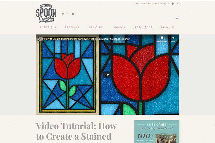
Video Tutorial: How to Create a Stained Glass Window Effect – Craft a stunning effect in Adobe Illustrator with this tutorial.
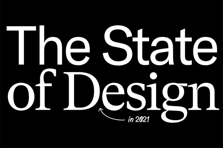
The State of Design in 2021 – A survey of over 1,000 designers, asking them how they work, what they value, and what kinds of challenges they’re facing.
8 Examples of Icon-Based Navigation, Enhanced with CSS and JavaScript – Some interesting examples of how icons can improve website navigation.
VISIWIG Vector Pattern Generator – Create seamless patterns and export them to your favorite editing software.

Doing Away With Bad Design Ideas and Moving on to the Good Ones – A few strategies creative professionals can use to quickly do away with all those bad design ideas, and move on to the good ones.
On-Scroll Letter Animations – A small set of examples showing how letters can be animated on scroll.
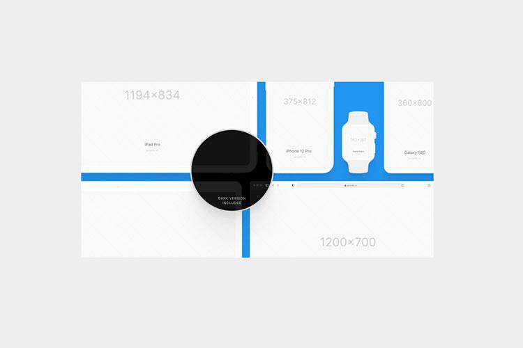
Vector Mockups Library 3.0 – A large collection of device mockups for Figma with light and dark versions.
How to Play and Pause CSS Animations with CSS Custom Properties – Learn the techniques behind controlling CSS animation with tutorial.
Create a Local WordPress Development Environment for Free with DevKinsta – A look at Kinsta’s new local WordPress development suite. Now available as a free download for Mac and Windows.
A comprehensive list of UX design methods & deliverables – Here’s a handy listing of the most common tools, methods, processes, and deliverables that designers use throughout the digital product design process.

The Blazor Component Library – Download this free and open source set of 60+ native Blazor UI controls.
SVG Tutorial: How to Code SVG Icons by Hand – Learn to create your own SVG icons and implement them into your projects.
Flagpack – A library of 260+ open source flag icons.

Dealing with the Isolation of Freelance Life – Freelancing can be lonely – especially during a pandemic. Here are some tips for beating those stuck-in-your-home-office blues.

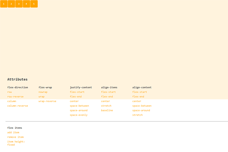
Flexbox-Guide – This interactive tool will help you master CSS flexbox layouts.
UX Audit Checklist – This handy tool will help you check for 100+ common UX issues.
The post Weekly News for Designers № 577 appeared first on Speckyboy Design Magazine.


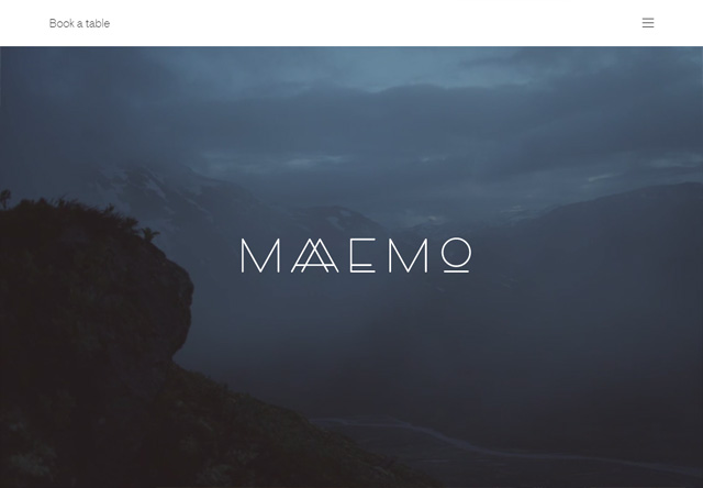
 12.
12. 

 21.
21. 
 30.
30.  31.
31. 
 33.
33. 

 42.
42.  43.
43. 
 49.
49.  50.
50. 

