In this post we want to share with you a collection of 20 useful conventions and best practices that are recommend by the CSS community. Some are tailored more towards beginners, and some are a bit advanced, but we hope everyone will find a cool trick they didn’t know about. Enjoy!
1. Beware of Margin Collapse
Unlike most other properties, vertical margins collapse when they meet. What this means is that when the bottom margin of one element touches the top margin of another, only the bigger of the two survives. Here is a simple example:
(Play with our code editor on Tutorialzine.com)
Instead of 70px between the red and blue square we have only 40px, the margin of the blue square isn’t taken into consideration at all. There are ways to battle this behavior, but it’s better to just work with it and use margins only going in one direction, preferably margin-bottom.
2. Use Flexbox For Layouts
The flexbox model exists for a reason. Floats and inline-blocks work, but they are all essentially tools for styling documents, not websites. Flexbox on the other hand is specifically designed to make it easy to create any layout exactly the way it was envisioned.
The set of properties that come with the flexbox model give developers lots of flexibility (no pun intended), and once you get used to them, doing any responsive layout is a piece of cake. Browser support nowadays is almost perfect, so there shouldn’t be anything stopping you from going full flexbox.
.container {
    display: flex;
    /* Don't forget to add prefixes for Safari */
    display: -webkit-flex;
}
We’ve featured a number of tips and trick with flexbox before on Tutorialzine. You can check them out here: 5 Flexbox Techniques You Need to Know About.
3. Do a CSS Reset
Although the situation has greatly improved over the years, there is still plenty of variation in the way different browsers behave. The best way to resolve this issue is to apply a CSS reset that sets universal default values for all elements, allowing you to start working on a clean style sheet that will yield the same result everywhere.
There are libraries like normalize.css, minireset, and ress that do this very well, correcting all imaginable browser inconsistencies. If you don’t want to use a library, you can do a very basic CSS reset yourself with these styles:
* {
    margin: 0;
    padding: 0;
    box-sizing: border-box;
}
This may seem a bit harsh, but nullifying margins and paddings actually makes laying out elements much easier as there are no default spaces between them to take into account. The box-sizing: border-box; property is another good default, which we will talk about more in our next tip.
4. Border-box for All
Most beginners don’t know about the box-sizing property but it’s actually quite important. The best way to understand what it does is to look at it’s two possible values:
content-box (default) – When we set a width/hight to an element, that’s just the size for it’s content. All paddings and borders are on top of that. E.g. a <div> has a width of 100 and padding of 10, our element will take up 120 pixels (100 + 2*10).border-box – The padding and border are included in the width/height. A <div> with width: 100px; and box-sizing: border-box; will be 100 pixels wide no matter what paddings or borders are added.
Setting border-box to all elements makes it so much easier to style everything, since you don’t have to do math all the time.
5. Images as Background
When adding images to your design, especially if it’s going to be responsive, use a <div> tag with the background CSS property instead of <img> elements.
This may seem like more work for nothing, but it actually makes it much easier to style images properly, keeping their original size and aspect-ratio, thanks to background-size, background-position, and other properties.
(Play with our code editor on Tutorialzine.com)
A drawback of this technique is that the web accessibility of your page will take a slight hit, as images won’t be crawled properly by screen readers and search engines. This issue can be resolved by the awesome object-fit but it doesn’t have full browser support yet.
6. Better Table Borders
Tables in HTML are not fun. They are quirky, almost impossible to be made responsive, and overall difficult to style. For example, if you want to add simple borders to your table and its cells, you will most probably end up with this:
(Play with our code editor on Tutorialzine.com)
As you can see, there are quite a lot of repeating borders everywhere and it doesn’t look good. Here is a quick, hack-free way to remove all doubling borders: simply add border-collapse: collapse; to the table.
(Play with our code editor on Tutorialzine.com)
Much better!
7. Write Better Comments
CSS might not be a programming language but it’s code still needs to be documented. Some simple comments are all it takes to organize a style sheet and make it more accessible to your colleagues or your future self.
For larger sections of the CSS such as major components or media-queries, use a stylized comment and leave a couple of new lines after:
/*---------------
    #Header
---------------*/
header { }

header nav { }


/*---------------
    #Slideshow
---------------*/
.slideshow { }
Details in the design or less important components can be marked with a single-line comment.
/*   Footer Buttons   */
.footer button { }

.footer button:hover { }
Also, remember that CSS doesn’t have single line // comments, so when commenting something out you still need to use the /* */ syntax.
/*  Do  */
p {
    padding: 15px;
    /*border: 1px solid #222;*/
}

/*  Don't  */
p {
    padding: 15px;
    // border: 1px solid #222;
}
8. Everyone Loves kebab-case
Class names and ids should be written with a hyphen (-) when they contain more then one word. CSS is case-insensitive so camelCase is not an option. A long time ago, underscores used to not be supported (they are now) which made dashes the default convention.
/*  Do     */
.footer-column-left { }

/*  Don't  */
.footerColumnLeft { }

.footer_column_left { }
When it comes to naming, you may also consider BEM, which follows a set of principles that add consistency and provide a component-based approach to development. You can read more about it in this excellent CSS-Tricks article.
9. Don’t Repeat Yourself
The values for most CSS properties are inherited from the element one level up in the DOM tree, hence the name Cascading Style Sheets. Let’s take the font property for example – it is almost always inherited from the parent, you don’t have to set it again separately for each and every element on the page.
Simply add the font styles that will be most prevalent in your design to the <html> or <body> element and let them trickle down. Here are some good defaults:
html {
    font: normal 16px/1.4 sans-serif;
}
Later on you can always change the styles for any given element. What we are saying is just to avoid repetition and use inheritance as much as possible.
10. CSS Animations with transform
Don’t animate elements by directly changing their width and height, or left/top/bottom/right. It’s preferred to use the transform() property as it provides smoother transitions and makes your intentions easier to understand when reading the code.
Here’s an example. We want to animate a ball and slide it out to the right. Instead of changing the value of left, it’s better to use translateX():
.ball {
    left: 50px;
    transition: 0.4s ease-out;
}

/* Not Cool*/
.ball.slide-out {
    left: 500px;
}

/* Cool*/
.ball.slide-out {
    transform: translateX(450px);
}
Transform, as well as all of its many functions (translate, rotate, scale, etc.) have almost universal browser compatibility and can be used freely.
11. Don’t DIY, Use A Library
The CSS community is enormous and there are constantly new libraries coming out. They serve all kinds of purposes, from tiny snippets to full-blown frameworks for building responsive apps. Most of them are open-source too.
Next time you are faced with a CSS problem, before you try to tackle it with all your might and hacks, check if there isn’t already a solution available on GitHub or CodePen.
12. Keep Selector Specificity Low
Not all CSS selectors are created equal. When novice developers write CSS they usually expect that selectors will always overwrite everything above them. However, this isn’t always the case, as we’ve illustrated in the following example:
(Play with our code editor on Tutorialzine.com)
We want to be able to add the .active class to any button and make it red. This won’t work here because our button has it’s background-color set with an ID selector, which has a higher selector specificity. The rule goes like this:
ID (#id) > Class (.class) > Type (e.g. header)
Specifity also stacks so a#button.active ranks higher than a#button. Using selectors with high specificity will cause you to constantly trump old selectors with even higher ones and eventually result in !important. This leads us into our next tip:
13. Don’t Use !important
Seriously, don’t. What is a quick fix now may end up causing lots of rewrites in the future. Instead, find why your CSS selector isn’t working and change it.
The only time when it’s acceptable to !important CSS rules is when you want to override inline styles from the HTML, which in itself is another bad practice to be avoided.
14. Caps Lock For Meaning, text-transform For Style
In the HTML, write upper case letters when you want to use them for their intended semantic meaning, like when you want to emphasize the importance of a word.
<h3>Employees MUST wear a helmet!</h3>
If you need to have some text in all caps for stylistic reasons, write the text normally in the HTML, and transform it to all-caps with CSS. It will look the same but your content will make more sense if taken out of context.
<div class="movie-poster">Star Wars: The Force Awakens</div>
.movie-poster {
    text-transform: uppercase;
}
The same goes for lowercasing and capitalizing strings – text-transform handles those just as well.
15. Em, Rem, and Pixel
There is a lot of debate whether people should use em, rem, or px values for setting the size of elements and text. Truth is, all three options are viable and have their pros and cons.
All developers and projects are different, so there can’t be any strict rules on when to use which. Here are, however, some tips and general good practices for each unit:
- em – The value of 1 em is relative to the
font-size of the direct parent. Often used in media-queries, em is great for responsiveness, but it can get really confusing tracing back the exchange rate of ems to pixels for each element (1.25em of 1.4em of 16px = ?).
- rem – Relative to the font-size of the
<html> element, rem makes it really easy to scale all headings and paragraphs on the page. Leaving the <html> with it’s default fontsize and setting everything else with rem is a great approach accessibility-wise.
- px – Pixels give you the most precision but don’t offer any scaling when used in responsive designs. They are reliable, easy to understand, and present a good visual connection between value and actual result (15px is close, maybe just a pixel or two more).
Bottom line is, don’t be afraid to experiment, try them all and see what you like best. Sometimes em and rem can save you a lot of work, especially when building responsive pages.
16. Use a Preprocessor on Large Projects
You’ve heard about them – Sass, Less, PostCSS, Stylus. Preprocessors are the next step in the evolution of CSS. They provide features such as variables, CSS functions, selector nesting, and lots of other cool stuff, making CSS code easier to manage, especially in large projects.
For a quick example, here is a snippet of using CSS variables and functions directly in a style sheet with Sass:
$accent-color: #2196F3;

a {
    padding: 10px 15px;
    background-color: $accent-color;
}

a:hover {
    background-color: darken($accent-color,10%);
}
The only real drawback of preprocessors is that they need compiling to vanilla CSS, but if you are already using a build script in your project this shouldn’t be too much of a hassle.
To learn more about preprocessors, check out our tutorials on two of the most popular systems – Sass and Less.
17. Autoprefixers For Better Compatibility
Writing browser-specific prefixes is one of the most annoying things in CSS. They aren’t consistent, you never know exactly which ones you need, and if you do the actual process of placing them in your style sheet is a boring nightmare.
Thankfully, there are tools that automatically do that for you and will even let you decide which browsers you need supported:
18. Use Minified Code In Production
To improve the page load of your websites and apps you should always use minified resources. The minified version of your code will have all whitespace and repetitions removed, reducing the total file size. Of course, this process also makes style sheets completely unreadable so always keep a .min version for production and a regular version for development.
There are many different ways to minify CSS code:
Depending on your workflow, any of the above options can be used, but it’s recommended to automate the process in one way or another.
19. Caniuse Is Your Friend
The different web browsers still have lots of compatibility inconsistencies. Use canisue or a similar service to check if what you are using is widely supported, if it needs prefixes, or if it causes any bugs in a certain platform.
Just checking caniuse isn’t enough though. You also need to do tests (either manually or through a service) as sometimes layouts break for no obvious reasons. Knowing the preferred browsers of your userbase also helps a lot, since you can see where good support is most crucial.
20. Validate
Validating CSS might not be as important as validating HTML or JavaScript code, but running your code through a CSS Linter can still be very helpful. It will tell you if you’ve made any mistakes, warn you about bad practices, and give you general tips for improving the code.
Just like minfiers and autoprefixers, there are plenty of free validators available:
AngularJS (commonly known as Angular) is an exceptionally powerful front-end development framework for building sophisticated JavaScript apps. Though learning Angular will be immensely rewarding, I’m certain many prospective initiates to Angular have had their desires of Angular mastery nipped in the bud due to the terrifyingly intimidating and complicated Angular documentation.
That’s a shame, because Angular has so much to offer:
- Modularity that allows a team of developers to work on specific parts of an app concurrently
- Testability and maintainability of your app’s various pieces
- A big, thriving community of developers and organizations who love Angular
- Clean separation of the app’s UI from its logic, while still keeping them in sync
- Two-way data-binding — it’s pure magic (or sorcery?) — that updates the UI whenever a model changes (and vice versa)
- Useful out-of-the-box (as well as third-party-developed) modules such as Filters and Services that take the complexity out of stuff like data-processing, templating of UIs, dealing with HTTP requests, sanitizing and validating user inputs, animation, and (much, much) more
And that’s just the tip of the iceberg!
Should you decide to learn Angular, you’ll be endowed with the skills required to develop cross-platform apps, and your newfound superpowers will prove to be valuable and profitable for years to come.
What follows is a guide (I call it a roadmap) designed to help you learn Angular effectively. My goal with this roadmap was to chart a carefully-crafted curriculum of free online resources that gently introduces you to the world of Angular. I wanted to create a self-learning guide that will motivate you to continue to pursue higher levels of Angular expertise.
After completing this learning guide, you can look forward to having a proficient-level understanding of Angular and the ability to use it to build JavaScript applications.
I’m not going to mince words, learning Angular will be hard work. Expect to encounter many roadblocks during this arduous undertaking. But I encourage you to stick with it. Your efforts and hard-earned battle scars will be worth it because Angular will ingrain so much value into your work and your repertoire of development skills.
Are you ready? Let’s get started!
First, You Need to Know JavaScript
Using Angular effectively requires that you understand the fundamentals of JavaScript.
What’s more, the value you derive from Angular will be proportional to how adept you are at JavaScript.
I don’t recommend learning Angular without at least a basic understanding of JavaScript. The task will be, to put it mildly, 100x tougher if you don’t know JavaScript.
Other web development frameworks are a little more forgiving towards people who don’t have a solid understanding of JavaScript. For example, jQuery conceals some of the more complicated JavaScript concepts from its users. Now, this isn’t a bad thing, it’s actually excellent for many developers and certain types of development projects.
(To further underscore my preceding argument, jQuery was built using the Facade software design pattern, defined by the renowned JavaScript developer and Google engineer Addy Osmani in his book as a design pattern that “provides a convenient higher-level interface to a larger body of code, hiding its true underlying complexity.“)
Angular, in contrast, exposes the powerfully potent and elegant — but often hard-to-understand/misused — features of JavaScript. Angular doesn’t shy away from JavaScript’s complexities; it embraces them and pushes them to their limits.
If you need to learn or brush up on JavaScript, start with these articles first:
Here’s the silver lining. Reflecting back on my own journey into the world of Angular, I can confidently say that it has helped me become a better JavaScript programmer. Using Angular has encouraged me to further my understanding of advanced JavaScript concepts, techniques, and design patterns.
Without further ado, what follows is my roadmap towards learning Angular.
A Roadmap to Learning Angular
Here’s a five-step process for learning Angular using free, online resources.
I’ve used these resources to gain a competent-level understanding of Angular. I admit that I still have a long way to go, but these resources have helped me get started on the right track.
If you want, you can begin with the resources that you personally find interesting. However, keep in mind that I intentionally structured this guide with the goal of helping you gently get on your way with Angular. Use the wrong resource at the wrong time, and you might get discouraged from continuing to explore Angular.
Goal: To get a gentle, hands-on introduction to the world of Angular.
Whenever I try to learn something, my initial objective is to get a bird’s-eye view of the thing I’m trying to learn, and to get hands-on with it as fast as possible. I want to avoid as much set-up and configuration as I can. There are two reasons for this objective. The first is so I can decide right off the bat whether it’s something I see as being a potentially worthwhile skill to acquire, without putting in too much time into it. The second reason is getting up and running quickly often makes the task more engaging, fun, and motivating.
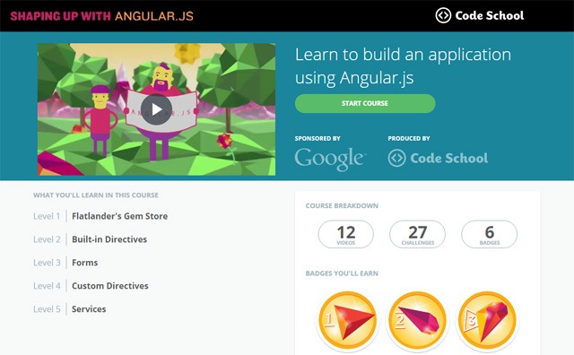
Shaping up with Angular.js — a free Code School video course sponsored by Google, the developer and maintainer of the Angular — fits the bill.
This online course is a well-structured and efficient intro to Angular. In this course, you’ll be building a simple Angular app. There are coding challenges interspersed throughout the course to help you review the key concepts being discussed. As you develop the app, you’ll learn about some of Angular’s powerful features, such as Directives, two-way data-binding, Services, and so forth.
Goal: To learn about the main Angular concepts and features.
The official AngularJS tutorials and documentation (which we’ll discuss later) is extremely detailed and thorough. For me, the problem with the official docs is it’s incredibly dry and intimidating. It’s especially uninviting to individuals like me who don’t have a formal academic background in computer science.
I understand the Angular team’s need to be detailed and thorough in the documentation of their project. By being comprehensive and technical with their docs, they sidestep ambiguity issues and allow its users to find all the information they need.
But for most people, my view is that learning Angular must start with third-party content. There are other learning resources out there besides the AngularJS docs that are more approachable for newcomers.
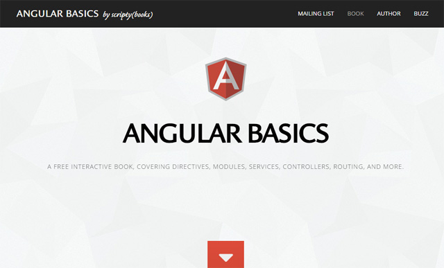
The free online book Angular Basics is one such learning resource.
Chris Smith, the author of the book, perfectly describes my initial experience trying to learn Angular via the AngularJS docs:
“[A]fter digging into the [Angular] API and its documentation, I found my progress blocked by an unfamiliar vocabulary that included terms like transclusion, directive, and isolate scope. As I read through the official documentation and tutorial, the prospect of easy mastery seemed to retreat into a fog.”Angular Basics – Introduction chapter
In Angular Basics, you’ll learn about the vital Angular concepts: Controllers, Directives, Services, scope, dependency injection, and so forth. This book is interactive — as you’re reading the book, you’re prompted to play around with the code examples — which makes it a fun and engaging read.
This online book won’t go over every single Angular feature. The author instead capitulates his book to the Pareto principle: “To give you access to a large part of Angular’s power, while burdening you with only [a] small part of its complexity.”
The next three steps will deal with completeness and Angular best practices.
Goal: To learn how to build apps the Angular way.
After the two Angular-learning resources above, you’ll be well on your way to developing Angular apps.
Nothing beats the official Angular documentation in terms of completeness. In my opinion, you simply can’t learn Angular properly without spending time in the official docs.
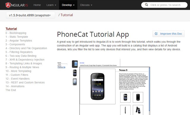
In the PhoneCat Tutorial App, you will be creating a smartphone directory app. You’ll learn intermediate- and advanced-level Angular concepts such as unit-testing, E2E tests, how to organize your app files and directories, templating, best practices for modularizing your app’s code, and more.
Take your time with this tutorial. Resist the urge to jump ahead whenever you reach a roadblock. (I encountered many of them when I went through this tutorial.) By persevering through the hard parts of this tutorial, you’ll guarantee yourself true Angular understanding.
The writer/s of the PhoneCat tutorial app says that you “can go through the whole tutorial in a couple of hours or you may want to spend a pleasant day really digging into it.” For me, it took a week to finish, putting in two hours of focused learning each day.

Goal: To gain a deep understanding of Angular’s foundational concepts, features, and terminologies.
At this point, you should now be well-equipped with Angular knowledge. It’s now time to dig deeper into the details. The official AngularJS Developer Guide is your next stop.
The AngularJS Developer Guide will dive into the nitty-gritty of Angular’s features and capabilities. Many AngularJS newcomers probably started with this guide (or the PhoneCat tutorial) and it might have dissuaded them from continuing to learn Angular because of the guide’s daunting demeanor. But after the previous steps, you should now be more confident tackling this guide.
In this guide, you’ll learn (or be pointed towards) all the stuff you need to know about Angular. The guide covers things like Providers, Decorators, interpolation, security, accessibility, running Angular in production, etc.
My advice with this guide parrots the one I gave you for the PhoneCat tutorial: Take it slow and easy. Resist the urge to skip sections.
Goal: To learn Angular best practices such as how to write, organize, and structure your code so that it’s maintainable and testable.
We can learn a lot by reading coding style guides, even if we don’t end up using them in our projects. A style guide is an opinionated documentation of guidelines and best practices for producing readable, high-quality code.
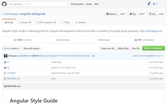
There are several excellent Angular style guides out there, but this one is worth highlighting because it’s endorsed by the Angular team.
This Angular style guide was reviewed by Igor Minar, the team lead of Angular and a software engineer at Google.
The Angular Style Guide espouses an extensive range of Angular (and JavaScript) best practices such as:
- Single responsibility of your components
- Using IIFEs to modularize your JavaScript’s scope
- How to write your directives, controllers, modules, services, etc. in a readable, testable, and maintainable way
- Suggested naming conventions
- How to comment your code
- Settings for JS Hint (a popular code-quality checker) to work effectively with Angular
After reading this style guide, I suggest choosing one of the following four courses of action:
- Apply this style guide as-is in your Angular projects.
- Tweak it (i.e. fork it and then modify it) so that it lines up with your personal style and philosophies.
- Look for an alternative style guide, such as Angular 1.x styleguide by well-respected developer and Google Developer expert, Todd Motto.
- Create your own Angular style guide.
In any event, before working on a major Angular app, it’s important to have a set of best practices that help guide the way towards the project’s completion and promote high-quality code-writing. Otherwise, your Angular apps will quickly get messy and hard to maintain.
If you’ve managed to go through the roadmap, congratulations are in order because you’re now well-equipped with the knowledge you need to build Angular apps!
In the next sections, I’ll talk about some general learning strategies, the next generation of AngularJS (Angular 2), and more excellent Angular learning resources.
Effective Learning Strategies
- Take your time. Some of the resources above will tell you an estimate of how long it will take you to complete it. Don’t be pressured by these estimates. Take as much time as you need, because we all have different ways of learning. In my experience, it almost always took me twice as long to finish them compared to the suggested completion times.
- Set aside time for distraction-free learning. To master something requires deliberate practice. Deliberate practice is a learning method conceptualized by psychologist K. Anders Ericsson during his research on elite performers. The results of Ericsson’s studies on deliberate practice suggest that maximum performance during a learning/training session can only be sustained for 1 hour. Consider setting aside several one-hour sessions of intense, focused learning per day, with sufficient rest periods in between the one-hour sessions.
What About Angular 2?
At the time of writing, Angular 2 is still in beta (release candidate stage).
This guide is for learning AngularJS 1. I know many people reading this will want to know if they should wait to learn Angular until Angular 2 is finalized.
First, I’d like to make it clear that you can use Angular 2 today, depending on your technology-adoption philosophy. If you feel comfortable relying on software that’s (in a fairly mature) beta stage of its life cycle, Angular 2 has many new features that makes it compelling to use today.
We’re in an awkward point in time where Angular 2 is developing quite rapidly. My view is that learning AngularJS 1 now will allow you to confidently use a stable, mature Angular version in your existing projects today, and will make it easier for you to move on to Angular 2 when you’re ready.
Above and Beyond: More Angular Learning Resources
Here are other excellent Angular resources. They’ll prove themselves useful throughout your journey towards Angular enlightenment.
- Angular 1.x Lessons by egghead.io
Learn about specific Angular topics such as using Gulp with Angular, and data-modeling with Angular in this high-quality set of video courses.
- Thinkster AngularJS Tutorials and Courses
Learn Angular-related subjects such as how to integrate Angular into your Rails projects by checking out Thinkster’s lineup of excellent online tutorials and courses.
- Made with Angular
See real-world examples of Angular apps created by major companies and organizations such as Amazon, PayPal, and Apple.
- AngularJS API Reference
Find detailed, definitive information on specific Angular features via the official API documentation.
- DevDocs Angular.js documentation
This is an alternative third-party user interface for Angular’s API docs.
- ng-newsletter
Subscribe to this newsletter to get notified of must-read Angular content.
- AngularJS-Learning
Find a massive amount of Angular tutorials, books, videos, articles, and other resources in this GitHub repo created and maintained by Jeff Cunningham.
What other learning resources and tips can you offer people who want to learn Angular? Please leave a comment below!
Related Content
 Jacob Gube is the founder of Six Revisions. He’s a front-end developer. Connect with him on Twitter.
The post How to Learn Angular appeared first on WebFX Blog.
