Paul’s PHP Form Class
Read more at https://www.phpclasses.org/package/12125-PHP-Compose-and-display-HTML-forms-in-Web-pages.html#2021-06-22-12:51:56
When it comes to increasing performance, web designers leave no stone unturned. After all, every kilobyte we can shave off of a page’s load time will make for a better user experience.
Images are an area of primary concern. Even basic optimization techniques can mean better performance. But with the advent of Google’s Core Web Vitals, designers are scrambling to squeeze out every bit of overhead while trying to maintain quality.
Not coincidentally, the very company pushing for better website performance has released an image format to help. Google’s WebP format offers a plethora of features that can benefit designers – including smaller file sizes.
If that sounds enticing, keep on reading as we take you on a tour of what WebP is all about. We’ll also perform some tests to see if the format really does live up to the hype.
Image optimization can often require some tough decisions. For example, how much quality should be sacrificed in the name of leaner file size?
That becomes a matter of choosing between a lossless (24-bit PNG) or lossy (JPG, 8-bit PNG) image format. Part of the conundrum is that PNG is generally better utilized with raster graphics, while JPG caters to photography.
WebP aims to be an image format that can do it all. It has built-in support for both lossless and lossy compression. Either way, you’re in for some savings. Google claims the format to be 26% smaller than comparable PNG files and 25%-34% smaller than a JPG.
In addition, image transparency is supported with both compression types. It’s like you’re getting the best attributes of both the JPG and PNG formats – with less bulk to boot.
So, how do WebP images perform in the real world? We ran a few basic tests to see just how much space we could save using lossless and lossy compression, along with an example that utilizes transparency.
All of our tests will be performed by saving images within Adobe Photoshop CC.
As of this writing, Photoshop doesn’t have native support for the WebP format. Therefore, we’ve installed Google’s free WebPShop plugin. This allows for both opening and saving WebP images in the venerable photo editing software. Default compression settings were used.
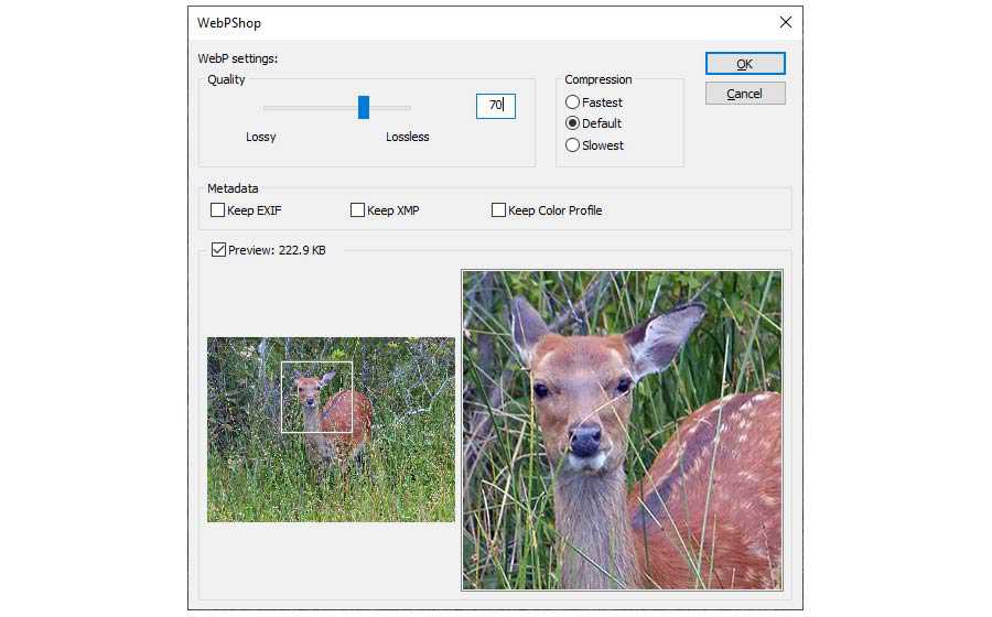
When saving images in older formats, we used Photoshop’s trusty “Save for Web” functionality. The same image quality setting was utilized where possible. You’ll find the image quality settings are in parentheses below.
Our first test involves a 1024×768 nature photo. Saved as a maximum-quality JPG file, it takes up 1.15 MB of space.
See the Pen WebP Image Demo – Nature Photo by Eric Karkovack
Winner: The lossy WebP image saves plenty of space while maintaining acceptable quality. It’s a bit surprising that lossless WebP increased in size over the original. But that goes to show it pays to experiment with compression settings.
Next up is a colorful, 640×356 vector illustration. The original is saved as a 24-bit PNG file and is 187 KB in size. Because it has so many colors, neither 8-bit PNG nor lossy WebP makes for a good comparison. Instead, we’ll use the JPG format to go up against lossless WebP.
See the Pen WebP Image Demo – Vector Illustration by Eric Karkovack
Winner: The lossy JPG image saves more space, but leaves noticeable artifacts. Lossless WebP maintains a razor-sharp look and still cuts down file size significantly over the original. That tips the scales in favor of WebP. Still, these sorts of images may require some tradeoffs.
Our final image is a 350×350 vector illustration. It’s saved as a 24-bit PNG file with transparency and weighs in at 64.09 KB.
See the Pen WebP Image Demo – Vector Illustration with Transparency by Eric Karkovack
Winner: Lossless WebP does what you’d expect – it maintains quality while shrinking the file size. It’s the clear winner here. However, lossy WebP is also pretty solid, provided you can live with some minor image artifacts.
Sure, the fact that WebP can save precious bandwidth is awesome. But how much browser and app support are out there?
According to Can I Use, WebP is fully supported in over 91% of web browsers, with partial support in another 3%.
The only major browsers lacking support are from Microsoft and Apple. Internet Explorer has zero support, and the same goes for versions 12-17 of Edge. Newer versions of Edge will work just fine with the image format, however.
Mac users must have Safari 14 or higher combined with the Big Sur version of the operating system. Safari users on iOS receive full support as of version 14.6.
Support coverage is pretty solid. But if you want to provide fallbacks on your web projects, a tool such as Modernizr can be used to detect WebP support.
When it comes to image editors, the aforementioned Adobe Photoshop requires a plugin to view or save WebP files. For other options, check out the supported software list on Wikipedia.
WordPress users have native support for WebP images as of version 5.8. Previous versions of the CMS can still serve up the images via third-party plugins.
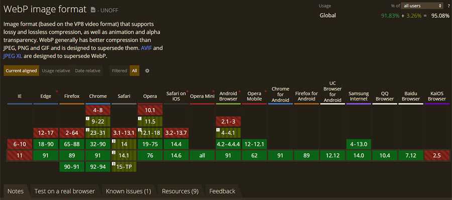
Overall, there’s a lot to like about the WebP image format. For the most part, it strikes a balance between lean file sizes and high visual quality. It’s a well-rounded option for image optimization.
Browser support is also quite good – just not universal. There’s always a concern about potentially leaving some number of users – no matter how small – out of the mix. Thankfully, tools are there to allow for creating and serving fallback options. Since images are a pretty big deal, that extra work is probably worth the effort.
If you’re thinking about jumping onto the WebP bandwagon, now’s the time to start experimenting. Master the compression settings, and you may just cut down your website’s load time by a significant margin.
The post WebP Images: A Primer appeared first on Speckyboy Design Magazine.
Rather than burdening you with a long list of free stock video sites, here’s a short list of the best ones I’ve found.

This site offers five free high-quality stock video downloads per week. The videos are in the public domain so you can literally use them any way you want. The catch? BRoll.io is just getting started so there aren’t a ton of videos available on the site yet. But the ones that are up there are truly top-notch.
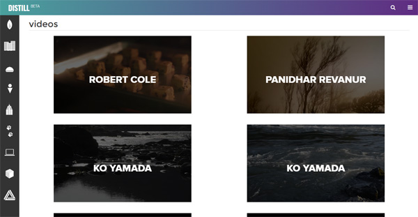
Distill puts out 10 free HD stock videos every week and they can be used for commercial purposes. The videos are organized in categories so you can easily navigate through their collection of free stock footage.

Videezy is a community site where members contribute free stock videos.
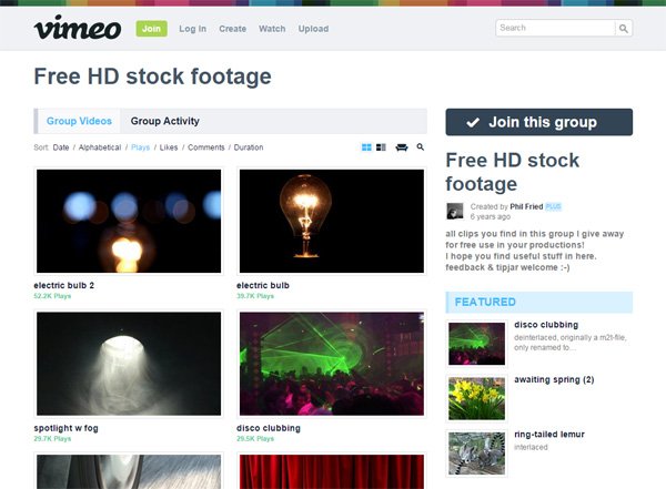
This Vimeo group has a collection free high-def stock videos that can be used in your video production projects.
If this list of the best stock video sites has been useful to you, these lists might interest you:
The post Where to Find the Best Free Stock Videos appeared first on WebFX Blog.
Latest PECL Releases:
When you’re building a website, images can be very useful resources. They help provide additional context for page content, break up text, add visual appeal to pages, and more.
But an unoptimized image is only useful to someone who can see it. What happens when a visually impaired person accesses your site, or when Google’s algorithms try to crawl it for information? That’s why it’s important to optimize your images with alt text.
What is alt text, though, and how can it benefit your website? We’ll answer both of those questions below, along with walking you through how to set up an alt tag.
Read on to learn more, and then subscribe to Revenue Weekly for more digital marketing tips from the agency with over 20 years of experience!
For even more digital marketing advice, sign up for the email that more than 150,000 other marketers trust: Revenue Weekly.
Alt text — also called alt tags or alt attributes — refers to text attached to an image to describe what it shows. This text is embedded in the website’s code and can usually be viewed by hovering your cursor over the image.
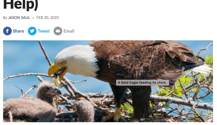
The purpose of an alt tag is to convey the content of an image. For example, if you’re a home repair company, you might use a picture of a damaged house somewhere on your site. A possible alt tag for that image would say something like, “house damaged by fallen tree.”
There’s a right and wrong way to write alt tags. You should aim to provide just enough information to help people visualize the image without actually seeing it. Here are some things you shouldn’t do:
Perhaps the best piece of advice for writing alt tags is to step out of your marketing mindset for a moment, and simply describe the image how you would if your friend across the room asked about it.
Using alt attributes for your images comes with several advantages. In particular, three benefits make it well worth your time to incorporate alt tags into the images on your website.
Here are three ways alt tags can benefit your business!
One of the most significant advantages of using alt tags is that they can improve your Google search rankings. The reason has to do with how Google ranks pages.
For Google to rank a page, it crawls it and adds it to its search index. When Google’s spiders crawl a page, they’re essentially scanning the page to understand the context.
Scanning images, on the other hand, is altogether different. Google’s crawlers can’t read images, meaning pictures on your site won’t contribute to your rankings.
But when you use alt tags, all that changes. The image now has descriptive text attached to it, meaning Google can see what it’s about and factor it into your rankings.
Another way alt text can benefit you is by helping your images show up in Google Images. Google Images operates by pulling images from sites in its index. Since it’s pulling those images in response to a specific search query, though, it needs to know what the images depict.
If you have an unoptimized image on your site, Google may have no way of knowing what it shows. As a result, it won’t show up in any Google Image results.
But if you give your image the alt tag “generic gold trophy,” Google now knows that your image shows a trophy. So, when someone searches for “gold trophy” in Google Images, there’s a chance of your image coming up, leading people to your site.
The final major advantage to alt attributes is that they can aid in accessibility on your website. Image accessibility is something many businesses neglect to implement, and it can do a lot to improve the overall effectiveness of your marketing.
Many visually impaired users use screen readers to interact with a web page. Like Google’s algorithms, though, the screen reader can’t read aloud the content of an image — unless you use an alt tag. That helps users understand what’s on the page.
Not only is image accessibility a basic courtesy to your visually impaired customers, it’s also a way to make users happier and inspire greater loyalty to your brand, enabling you to drive more conversions.
Creating alt tags is a simple process. All you have to do is insert a short snippet into the coding of your site.
If you’re working through a content management system (CMS), you may not even have to get into the code itself — many CMS’s will simply let you click the image and then type the alt tag into a box.
Even if that’s not the case, though, adding an alt tag into the code is a simple task.
To start, pull up your site’s HTML source code. Then find the image you want to add an alt tag to — it should look something like this:
<img src=”exampleimage.png”>
To add an alt tag, insert a snippet of code before the closing angle bracket. The code should take this format:
alt=”example description”
So, when you’re done, the full line of code should appear as a combination of the above two elements. Here’s an example:
<img src=”bookshelfproject” alt=”A newly handcrafted bookshelf”>
And that’s it! As long as you remember the format of the code snippet, it’s easy to add alt tags to all your images — and depending on your CMS, it might be even easier.
Over 90% of WebFX clients continue partnering with us into year 2 of their campaign.We Form Longterm Partnerships
Adding alt text to an image is simple, but it’s not the only way to optimize your images — or your website as a whole. If you’re looking for more ways to improve the user experience on your site, you could benefit from partnering with WebFX’s team of over 300 experts.
With our web design services, you’ll not only receive help setting up your alt tags and images — you’ll get a boost for your entire website, helping it look better and achieve higher rankings all at once. You’ll also receive a dedicated account representative to keep you informed of all we do.
To get started with us, just give us a call at 888-601-5359 or contact us online today!
The post What Is Alt Text and Why Should You Use It? appeared first on WebFX Blog.
In this episode, Josepha Haden Chomphosy does a mini deep dive into WordCamp Europe 2021, specifically the conversation between the project’s co-founder, Matt Mullenweg, and Brian Krogsgard formerly of PostStatus. Tune in to hear her take and for this episode’s small list of big things.
Have a question you’d like answered? You can submit them to wpbriefing@wordpress.org, either written or as a voice recording.
Editor: Dustin Hartzler
Logo: Beatriz Fialho
Production: Chloé Bringmann
Song: Fearless First by Kevin MacLeod
Matt Mullenweg in conversation with Brian Krogsgard
Josepha Haden Chomphosy 00:10
Hello, everyone, and welcome to the WordPress Briefing, the podcast where you can catch quick explanations of the ideas behind the WordPress open source project, some insights into the community that supports it, and get a small list of big things coming up in the next two weeks. I’m your host, Josepha Haden Chomphosy. Here we go!
Josepha Haden Chomphosy 00:40
A couple of weeks ago, we hosted WordCamp Europe and had the double pleasure of a demo that showed us a bit about the future of WordPress and an interview that looked back while also looking a bit forward. If you haven’t seen the demo, it was beautiful. And I’ve included a link to it in the show notes. And if you haven’t heard the interview, there were a few specific moments that I’d like to take the time to delve into a little more. Brian Krogsgard, in his conversation with Matt Mullenweg, brought up three really interesting points. I mean, he brought up a lot of interesting points, but there were three that I would particularly like to look into today. The first was about balance. The second was about cohesion. And the third was about those we leave behind.
Josepha Haden Chomphosy 01:24
So first is this question of balance. Brian brought this up in the context of the overall economic health of the WordPress ecosystem. And in that particular moment, he talked about companies that are coming together, companies that are merging. And in Matt’s answer, the part that I found the most interesting was when he said, “the point at which there is the most commercial opportunity is also the point at which there is the most opportunity for short-termism. He went on to talk about the importance of long-term thinking and collective thinking about what makes us, and us here means probably the WordPress project, more vibrant and vital in 10 or 20 or 30 years. One of the things that he specifically called out in that answer was the responsibility of larger companies in the ecosystem. For instance, like Automattic, to commit fully to giving back, there are many ways now that companies can give back to WordPress so that we all replenish the Commons. They can pay for volunteer contributors’ time; they can create and sponsor entire teams through the Five for the Future program. They can contribute time through our outreach program. And they can even contribute to WordPress’s ability to own our own voice by engaging their audience’s awareness of what’s next in WordPress, or whatever. And I know this balance, this particular balance of paid contributors or sponsored contributors, compared to our volunteer contributors or self-sponsored contributors; I know that this balance is one that people keep an eagle eye on. I am consistently on a tight rope to appropriately balanced those voices. But as with so many things where balance is key, keeping an eye on the middle or the long-distance can really help us get it right.
Josepha Haden Chomphosy 03:23
The second question was one of cohesion and specifically cohesion over the competition. Brian asked how, if people feel disadvantaged, you can foster a feeling of cohesion rather than competition? And Matt’s first answer was that competition is great. Specifically, he said that competition is great as long as you consider where your collaboration fits into the mission. And he also spent some time exploring how competitors in the ecosystem can still work from a community-first mindset. I personally cannot agree enough about some of the benefits of collaboration alongside your competitors. I remind sponsored contributors from time to time, and I think it’s true for any contributor that you are an employee of your company first and a contributor to WordPress second. However, once you step into contribution time, your main concern is the users of WordPress, or new contributors, or the health of the WordPress ecosystem as a whole or the WordPress project. So you get all this subject matter expertise from competitive forces, collaborating in a very us versus the problem way. And when you do that, you’re always going to find a great solution. It may not be as fast as you want it to build things out in the open in public. And so sometimes we get it wrong and have to come back and fix it but still, given time, we’re going to come out with the best solution because we have so many skilled people working on this.
Josepha Haden Chomphosy 05:01
And then the third question that I wanted to really touch on is the question of those we leave behind. Brian asked Matt if he thought mid-sized agencies and mid-sized consultants were being squeezed out with the block editor. Matt’s high-level answer was no, and I tend to agree with him. It’s not all mid-sized anything any more than it’s all small-sized anything. His answer continued to look at what stands to change for users with the block editor and who really can stand to benefit. It made me think back to my WordPress 5.0 listening tour. We launched WordPress 5.0, which was, in case anyone forgets, the first release with the block editor in it. I took a six-month-long tour to anywhere that WordPressers were so I could hear their main worries, what Brian is saying in there, and what Matt is saying to really came up all the time in those conversations. And basically, it was that this update takes all the power away from people who are building websites. And in these conversations, and Matt and Brian’s conversation, it was really focused on our freelancers and consultants. But at the same time, all of them heard that this update gives power back to all of the people who could build websites.
Josepha Haden Chomphosy 06:28
I could not shake the feeling at the time. And honestly, I can’t shake it now that no high-end consultants, or freelancers, or any other developer or site creator sit around just longing for maintenance work. After six months of talking to people, I didn’t hear anyone say, “you know, I just love making the same author card over and over and over.” Or, “updated the footer every week, this month. And that’s why I got into this business.” And more than the feeling that there just wasn’t anyone who just loved maintenance, I got a feeling that there were real problems that needed to be solved for these clients and that they wanted to solve them. And that they also would gladly trade updating footers for the much more interesting work of creating modern and stylish business hubs based on WordPress for the clients who trust them so much. All of that, I guess, is to say that, yes, the block editor does give power back to our clients again, but not at the expense of those who have to build the sites in the first place. I think it stands to restore everyone’s sense of agency more than we truly realize. So that’s my deep dive on WordCamp Europe; I included links to the demo and the talk below, just in case you haven’t seen them yet. And you want to get a little bit of insight into the full context of the conversations that I just did a bit of a deep dive into.
Josepha Haden Chomphosy 08:15
And now it’s time for our smallest of big things. All right, I have three things for you today. Number one, tomorrow, we package WordPress 5.8 beta three. If you’ve never had a chance to stop by the core channel in slack for the past packaging process, I really encourage you to stop by; we call them release parties. It’s a bunch of people who stand around and help get it done. So you can also see how it gets done. And if you’re feeling brave, you can even try your hand at testing out one of the packages as soon as it’s ready. The second thing is that a week from tomorrow, we reach our first release candidate milestone. So if you have meant to submit any bugs or patches or if you’ve been procrastinating on documentation, or dev notes, right now is the time so that we can have a chance to get everything into the release by the time we reach the release candidate milestone on the 29th. And the third thing is that we are currently right in the middle of WordCamp Japan. That is a great opportunity to meet some contributors and maybe even get started with contributions yourself. So stop by if you haven’t had a chance to check it out already. I will leave a link in the show notes. And that, my friends, is your small list of big things.
Thank you for tuning in today for the WordPress Briefing. I’m your host, Josepha Haden Chomphosy, and I’ll see you again in a couple of weeks.
There are currently over 58,000 listings in the WordPress Plugin Repository. Beyond that, there are likely thousands of free and commercial offerings available elsewhere on the web. Together, they cover a staggering number of functionalities and use cases.
But not all plugins are created equally. Only a relative few are labeled as “great” by their users. And that title doesn’t necessarily last a lifetime. One false move by a developer and those 5-star reviews can quickly turn into something significantly lower.
That got me thinking about the ingredients behind a great WordPress plugin. How do you quantify something so subjective?
Each person will judge a plugin based on their own needs and experiences. However, I do think that there are some guiding principles that go into building something great. An approach that, if closely followed, can bring lots of love from the WordPress community – whether a plugin has 10 users or 10 million.
The following is not an exhaustive list of attributes, but hopefully enough to get the ball rolling!
Perhaps the two most important questions a plugin developer should ask themselves are:
The answers should act as a sort of mission statement. A plugin needs to have a defined purpose and solve a specific issue.
The purpose can be defined in any number of ways. Perhaps it adds completely new functionality or compliments an existing plugin – such as a WooCommerce extension. It can also range in scope from niche to all-encompassing.
As a plugin’s user base grows, it’s also important to adhere to this mission. While it may evolve, it shouldn’t radically change for its own sake.
For example, a plugin that focuses on SEO functionality shouldn’t start adding unrelated features – like a shopping cart – to the mix. That’s more likely to frustrate users and lead to abandonment.
The great plugins tend to stick to their core principles and organically expand from there.
There has been no shortage of complaints with regards to plugin authors who implemented some dubious policies. By doing so, it’s often at the expense of users. We’ve seen several situations where questionable decisions have been made.
Some insist on littering the WordPress dashboard with all sorts of upsells and nagging messages. In other cases, developers have turned on automatic updates without bothering to tell users. And that’s only scratching the surface.
Even if well-intentioned, these tactics only serve to cause friction. Users generally don’t appreciate an invasion of their space nor having crucial functionality turned on without their consent.
A great plugin will put users first and take care to implement features respectfully. Mind you, this doesn’t mean a lack of upsells. It’s just that users can dismiss them, and they don’t pop up every time you log in.
And, most importantly, users will be informed of any functionality changes and allowed to choose what’s best for them. Everything should be out in the open.

Building plugins the “WordPress way” requires a focus on coding standards and accessibility. This helps to ensure that the underlying code is efficient, secure, and stable. In addition, the plugin’s UI can be utilized by everyone.
This is easy to say but difficult to put into practice. WordPress is an open-source platform. Therefore, any developer who wants to write a plugin can do so. That means people of all different skill levels and specialties are putting things out there for users to download.
Not everyone is going to adhere to best practices in these areas. Plus, the bigger and more ambitious the plugin, the harder it can be to manage. A little bit of sloppy code can make for a big mess in no time.
To achieve greatness, measures have to be put in place to ensure adherence to standards and accessibility. Consistency in this area is crucial. Somehow, the best plugins seem to pull it off.

It’s hard enough to develop a great WordPress plugin, let alone maintain one. While it may be a big responsibility, maintenance is a key factor for long-lasting success.
Even with the greatest of care, bugs will always be a part of the equation. But an effort should be made to fix them regularly.
What about implementing new features? They’re nice but not always necessary. A plugin that does the same thing in the same way over a long period can certainly be great – even without adding a bunch of bells and whistles.
Finally, when things do go wrong, some level of support should be offered. User expectations should vary based on the type and cost of the plugin. Thus, a free option shouldn’t have as high of a bar as a commercial product.

Yes, the term “great” is a subjective one. And, when it comes to WordPress plugins, it’s also not immediately apparent.
That’s because it takes some time to see how a plugin will work for you. Does it serve your needs? Is it well-maintained? Do you run into problems after every update? How good is the support?
It’s not until you’ve experienced these different aspects that you’ll get the full picture. If you’re fortunate, you may well have found yourself a great plugin. But don’t worry if that’s not the case. There is a whole world of options out there to explore.
The post The Ingredients of a Great WordPress Plugin appeared first on Speckyboy Design Magazine.