In this episode, Josepha Haden Chomphosy speaks to her role as the Executive Director of WordPress. Learn about the day-to-day of her role and how it supports the mission of WordPress.
Have a question you’d like answered? You can submit them to wpbriefing@wordpress.org, either written or as a voice recording.
Credits
References
Transcript
Hello, everyone, and welcome to the WordPress briefing, the podcast where you can catch quick explanations of some of the ideas behind the WordPress open source project and the community around it, as well as get a small list of big things coming up in the next two weeks. I’m your host, Josepha Haden Chomphosy. Here we go!
I’ve been asked many times what the day-to-day work looks like for the Executive Director of the WordPress project. I don’t really think I’ve done a great job of answering that question. My default answer is either too broad, and I say, “I helped turn the WordPress vision into reality by supporting the community of contributors,” or way too narrow, and I start telling people what’s on my calendar. Probably no one cares about each entry on my calendar, and almost every contributor is covered by “I get things done by helping people.” So today, I invite you to join me in exploring the type of work required and the balance it takes to keep WordPress working.
First, some context on the weekly activity I see in WordPress, on average, 1,800 to 2,000 contributors a week, participate in conversations and tickets across the entire WordPress project in our entire ecosystem. There are about 20 volunteer teams that are each led by two to three team reps. Each of those teams actually has smaller groups that work on specific things; all told, it’s probably about 50 distinct teams. And probably quite a few more if you are very generous in your counting about what makes up a team for us.
Among those teams, a minimum of about 35 meetings a week are held, plus more for working groups. That doesn’t take into account the things most people are aware of externally. It doesn’t take into account the big quarterly or annual activity things like WordPress software releases or any of our events. When those sorts of things do happen, there’s a bit of an increase in our activity.
I work 40 to 60 hours a week on WordPress, depending on what’s going on, to make sure that I know what’s happening now; so that I have insight into what the next three to five years will bring. All of that is in support of the WordPress community, which I define as anyone who has ever interacted with WordPress ever, regardless of whether they know it or not. In case you’re feeling a bit lost right now, we can shorthand that entire context as this is really big and really complex.
Given that giant scope, it makes sense that people wonder what the work looks like. So I’ll talk about it in three big chunks: what I focus my time on, what I focus my attention on, and what helps me balance my decisions.
So first, what I focus my time on. I spend about a quarter of my time in meetings, mostly with current contributors, project leadership, and community members. I spend another quarter of my time in WordPress community outreach, checking in with current folks, reaching out to future WordPressers, and checking in with people that I haven’t heard from in a long time to make sure that I know what they need and if there’s anything that I can do to help. After that, I spend a bit under 15% of my time each on writing/communications work or ad hoc project work. I then spend 10% of my time reviewing proposals, editing, communication drafts for others, and determining my stances on discussions that we’re having in tickets and elsewhere. I spend all of my remaining time planning for various goals, projects, initiatives and personally working to remove blockers for our volunteer contributors. So the bulk of my time, about 50% or more, is spent in calls with people, which makes sense if you’ve ever worked with me; personal connections with the community have been the best part of my job for a long time. Since the community is what makes WordPress so great, it’s only natural that I want to stay connected.
The second big chunk is what I focus my attention on. I pay attention to four big pillars of work in the project. The first one is the WordPress CMS itself. So that’s the core team, accessibility, design, and many, many others. The second one is the WordPress community. And that’s the training team, everybody who is working on the Learn initiative, and the actual community team as well.
The third big pillar that I focus on is the WordPress contributor experience, which is mostly the meta team but includes all of the teams they work with: plugins, themes, polyglots, etc. The fourth big pillar that I turn my attention to is our communication; what I am saying about the WordPress project to people outside of it and what I am helping our team reps to say about the work that we’re accomplishing for the WordPress project inside the project. In general, we have to make sure that we coordinate a big group of contributors around a common idea or a common practice as we move forward.
Now, the way I focus both my time and attention probably isn’t quite right if you’re focused on a single feature or team. And it’s definitely not right if you aren’t spending 40 hours a week in the project; what that probably looks like for you is more like an hour in a team meeting, 30 minutes or so on clarifying conversations, and any remaining time that you are able to contribute focused on the feature that you’re actually contributing to. And so, there you have it all my time and attention. That is WordPress in a nutshell.
This brings us to the third chunk, the balance part. You might be wondering, how do I make sure I am fair and balanced in decisions that I have to make. That is something that I think about all the time, and I take very seriously. It’s hard to make decisions that might affect 2,000 people. It’s even harder when those decisions might affect 40% of the web. I know that I don’t have all the answers. And I’m fortunate enough to have 50 or 60 people in the community who offer me advice and guidance every single week. I’m in constant contact with the project lead, of course, but I also prioritize messages and concerns raised from team reps. And I always strive to understand before I try to problem solve. I don’t always get it right, but I do always work to get better. And that is the day-to-day work of a WordPress executive director.
That brings us to our community highlight. I tweeted out into the community asking for excellent examples of Freelancer success stories, and today I’m going to share a story from Arūnas Liuiza. Their story goes like this:
“For almost a decade, freelance WordPress gigs allowed me to support myself and my family and keep my full-time teaching position at the local college, which was paying peanuts but was an awesome, meaningful, and fulfilling. I am sincerely grateful for that.”
That brings us to our final segment of this brief podcast. The small list of big things to keep an eye out for in the next two weeks in WordPress. I only have two things this week. The first one is daylight saving time. It is that time of year where daylight saving time starts or stops at various parts in the globe. If you are a team rep here at WordPress, don’t forget to talk to your teams in your meetings in the next few weeks to decide what you’re going to do. You can move your team meeting if you want, and you can keep it where it is and see what new voices show up when it moves around for various people. Either way, make sure that you chat it out with your team and make sure that everybody understands what is and isn’t moving on your calendar. That will also be relevant to any of our brand new work-from-home folks in the middle of this global pandemic.
The second thing to share is that there is a major release of WordPress coming up that’s going to happen on March 9th. It’s WordPress 5.7; it’s going to be a good release. We’ve been working on it since December or maybe a little bit earlier. So keep an eye out for announcements about that here on wordpress.org/news, or if you want to follow more about the developer details and the process details you can head on over to wordpress.org/core. That, my friends, is your small list of big things. Thank you for tuning in today for the WordPress briefing. I’m your host, Josepha Haden Chomphosy. I’ll see you again in a couple of weeks!
We can’t help but to love flyers, especially when they grab attention and entice from the very first glance. No matter your chosen medium, digital or physical, flyers are still one of the best ways to engage potential customers.
Even if you (or your clients) don’t want to print actual flyers, you can create gorgeous digital flyers. Then, use them to promote your business through social media posts or advertising campaigns.
Beautiful flyers will add a personal touch to your digital marketing efforts, and allow you to connect with your potential customers on a personal level. And if you do want to create physical flyers, you have to make sure they’re gorgeous enough for customers to hold on to them.
There are all kinds of things you can do with flyers; from increasing brand awareness, to offering discounts and promo codes, and stimulating word of mouth marketing. So no matter the stage of your business, or the state of your marketing strategy, a flyer always comes in handy.
And fortunately, with these 25 gorgeous Photoshop PSD flyer mockup templates, you no longer have to worry about the end result. Instead, you can focus on your design.
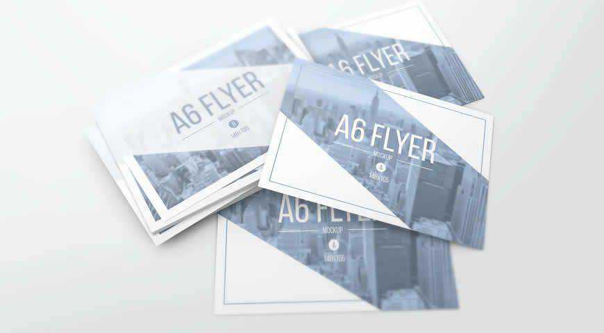
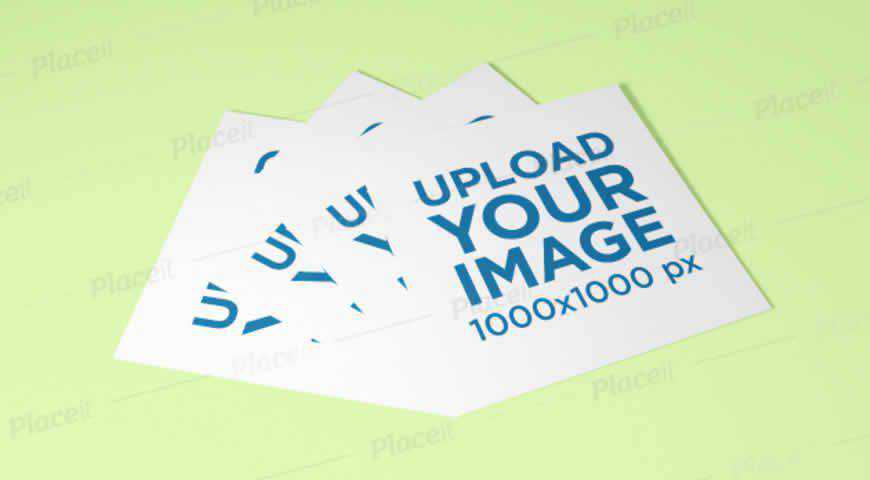
“Small, yet effective, these A6 flyer mockup templates are perfect for advertising promotions and discounts to your loyal customers. You’ll get 5 photo-realistic mockups of stacked A6 flyers, and you can even change the background color and field of depth. Visualizing your beautiful designs has never been easier!
“

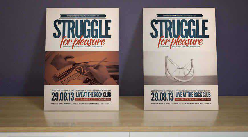
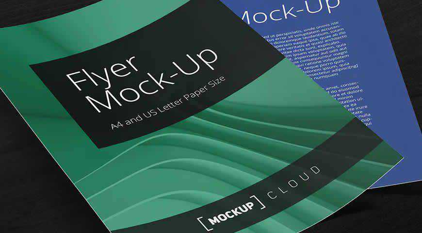
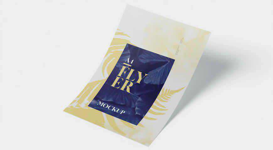
Realistic and placed in neutral settings, these A4 flyer mockup templates are great for promoting events or increasing brand awareness. You’ll get 4 separate PSD mockups and scenes, and well-organized layers for a smooth editing process. Visualize your materials and amaze your audience with these photo-realistic flyer mockups!

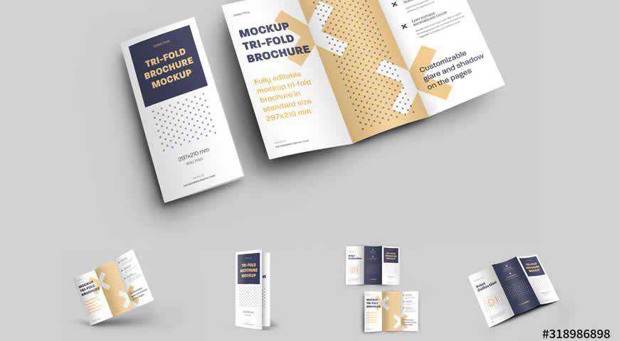
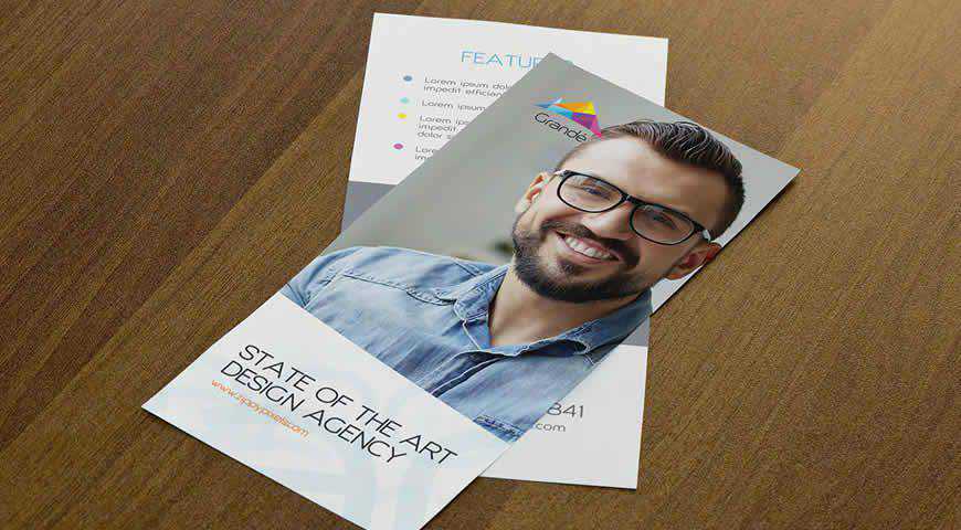
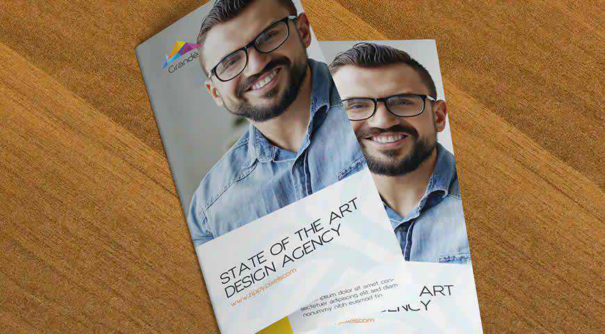
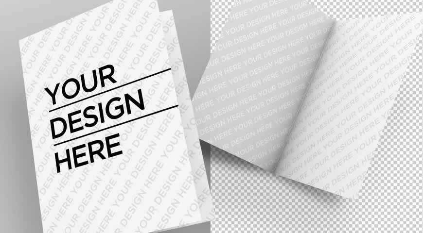
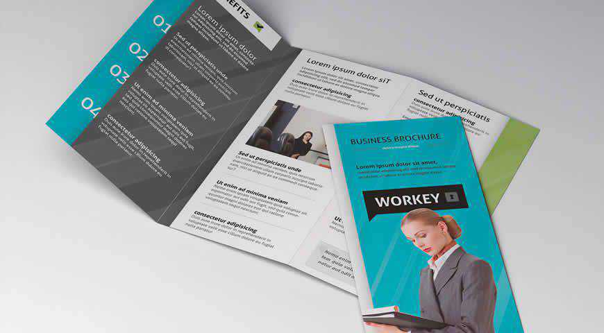
Visualize your tri-fold brochure with this gorgeous template! It’s perfect for making sure that both your brochure’s content and your brochure’s visuals convince and convert. With 4 design options, as well as customizable glares and shadows, you can create an incredibly photo-realistic brochure mockup.

Simple square flyers depicted on a monochrome background work perfectly for highlighting the intricacy of your designs. These flyer mockups are positioned as a grid, and you can upload one design, as well as change the color of 2 flyers, and the background. It is time for an amazing presentation!

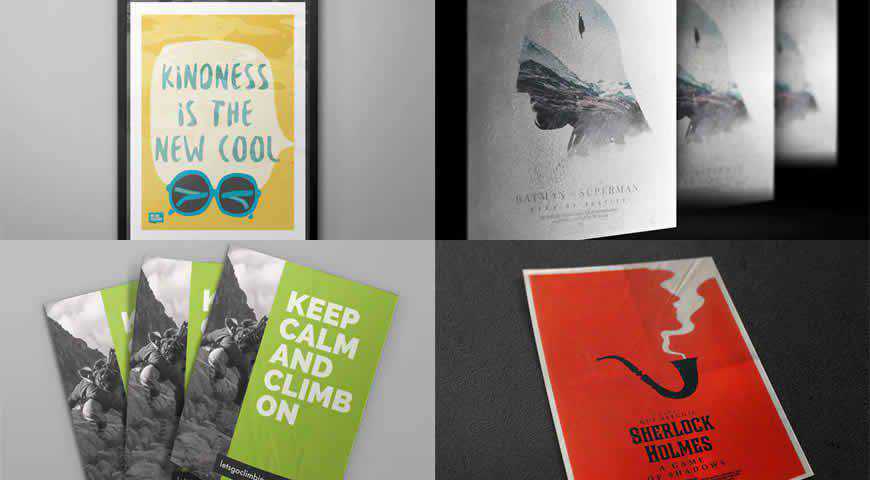
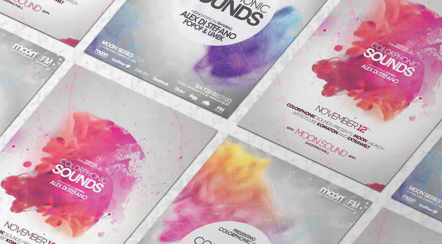
These poster and flyer mockups are the full package you need to promote your next project! Pick from 4 professionally-lit and diverse styles (poster, framed poster, and two flyer presentations), easily add your own designs with Photoshop smart objects, and get photo-realistic results that your clients and customers will adore.

Perfect for increasing brand awareness for elegant and refined brands, this flyer mockup set is everything you need to succeed! With 4 PSD files, changeable backgrounds, and photo-realistic presentation of flyers with marble in the background, this set is the full package. Easily customize it, and make your designs shine!

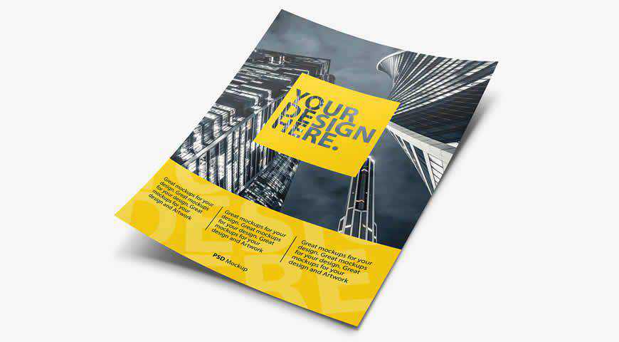
This dynamic flyer mockup is perfect for photo-realistically presenting your design. Positioned vertically, as though wind has blown it straight into your hands, this flyer mockup is perfect for making crucial branding decisions. You’ll also be able to change the background to suit your brand’s visuals!

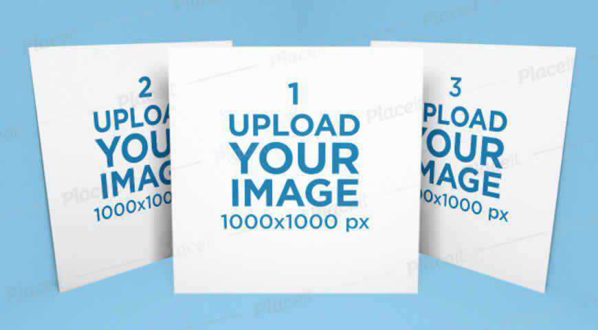
Minimalist and clean, this square flyer mockup template set is perfect for showcasing your designs. You can upload up to 3 different designs, as well as customize the colors of the background (monochrome works best), and the flyer colors. Use it to present diverse designs, or compare three different options!

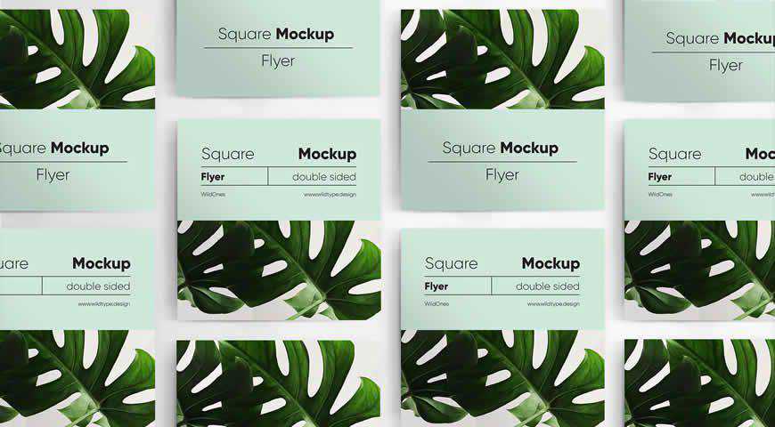
Clean and elegant, this square flyer mockup comes with 2 sides: front and back. This double-sided flyer mockup is perfect for presenting engaging flyers. You’ll also be able to pick from 5 different presentations, and easily change the background color. Your audience and clients will love your designs!

Simple and effective, this flyer mockup template for Photoshop is staged against muted industrial backgrounds, making it a perfect fit for both light and expressive designs. You can pick between 10 different views, and add selective varnish or change the backgrounds, which won’t change the automatic background perspective.

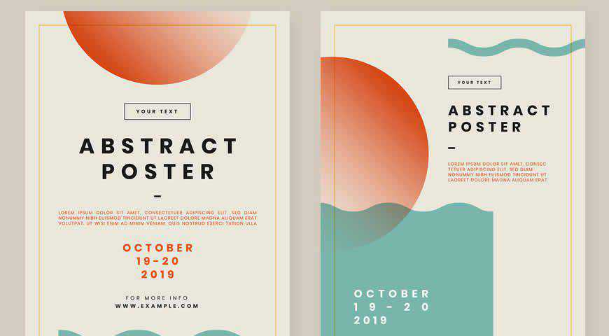
Simple and perfect for putting your designs in the spotlight, this abstract design flyer mockup template for Photoshop is just what the designer ordered! You’ll get 3 design options for showcasing your work, or helping a client pick the design they like the most out of 3 options.

Sometimes you just want to see the full glory of your design, depicted on a photo-realistic mockup. That is exactly what this square flyer template can do for you! Easily upload your flyer design, customize the background and flyer colors, and help your (or your client’s) business succeed!

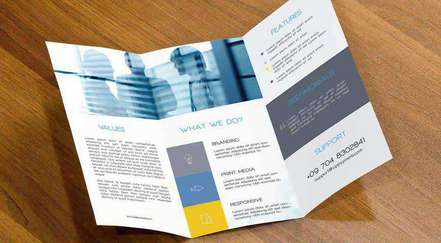
Professionally photographed and well-lit, these flyer mockup templates promise photo-realistic results you’re going to love. Pick from 5 diverse PSD mockups (single page, bi-fold, and tri-fold flyers and brochures), easily edit them in Photoshop with smart objects, and get ready to show the world how amazing you are!

Simple and elegant, this flyer mockup set helps you highlight your amazing design – and your content. You’ll get 6 PSD files, 6 background textures that you can change as you see fit, and an extremely easy way to replace the placeholders with your own designs in Photoshop.

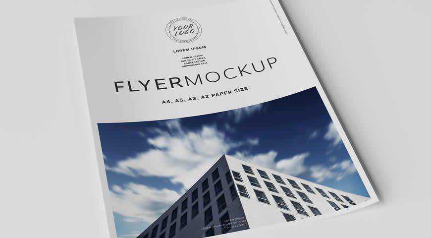
Depicting a paper on white background with realistic shadows, this flyer mockup is simple and effective. It’s perfect for corporate presentations and highlighting the content of your flyer. With 4 different paper sizes (A2, A3, A4, A5) and multiple layout options, you’ll get everything you need.

Entice your customers with this sleek flyer mockup set offering 5 different, bi-fold flyers. You can choose the poses and styles that suit your brand and visuals, adjust the shadows and effects, and replace the mockup’s background. Add your design, and you’ll receive beautiful, photo-realistic results.

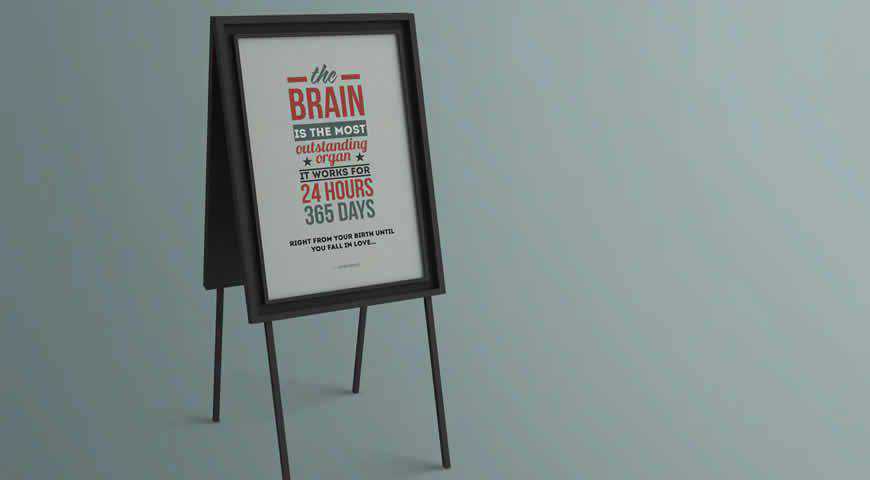
Showcase your poster, artwork, or flyer design with these photo realistic mockup templates for Photoshop! With 3 different styles, you can showcase your design on a stand – it’s sure to catch the attention of your customers! You can even change the background with a few hue/saturation adjustments.

Brochures never go out of style. And with mockups like these, your business will be getting much more traffic! Highlight your design with the closed brochure, and offer a glimpse into your content with the open brochure mockup. Set against a neutral background, these mockups work great for all designs!

Elegant and organic, these A4 flyer mockups are perfect for showcasing the beauty of your designs. You can pick from four different presentations (one A4 flyer, two stacked A4 flyers, a customizable photo-realistic flyer, close-up of two A4 brochures), customize the effects and the background, and absolutely delight your clients.

One mockup to rule them all! This realistic flyer and card mockup set is perfect for all your branding and advertising materials; from flyers, to posters and cards. You’ll get 9 beautiful styles (front view, close-up, 2 flyers), and incredible photo-realistic results when you add your own designs.

This mockup template set is perfect for B2B or corporate flyers and brochures! You’ll get 11 photo-realistic PSD files, so all it takes is a few minutes in Photoshop, and your designs will look beautiful and true to life. Showcase your cover design, as well as your content!

If you want to see what your customers will see once they receive your flyer, this is the perfect flyer mockup template set for you! Composed of 5 incredibly realistic mockups in professionally-photographed environments, and with both bi-fold and tri-fold mockups, this set gives you everything you need to succeed!

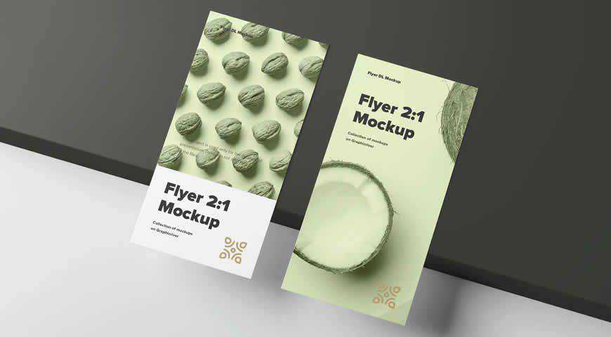
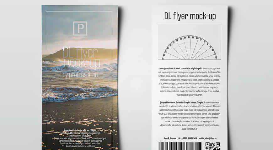
Perfect for client presentations, this simple and effective DL flyer mockup template comes with 13 photo-realistic PSD files for easy editing in Photoshop. You can also pick from 10 available backgrounds included in the package, and set up everything you need for a perfect presentation in just a few clicks.

Compare different designs during your presentation with these 2 square flyer mockup templates. Perfect for hashing out the specifics with your clients, this set lets you upload 2 designs, as well as customize the monochrome background color, and both flyers’ colors. It is time to pick the best fit!

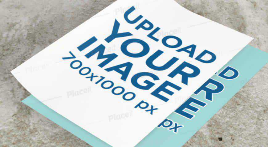
If you’re designing a flyer for a trendy brand, they’re going to love this industrial-style flyer mockup template! Two stacked flyers placed on a concrete surface help you easily visualize your design. You can also change the paper colors to make sure they fit your vision!

Ready to send your message flying? Share the news of your business and offer something extra to your customers with these stunning Photoshop flyer mockup templates! With 25 different options, there’s something for everyone.
If you’re promoting your own business, you’ll love all the brochure templates. And if you’re creating flyers for clients, make sure you bookmark this collection – there’s something for every kind of client; even the most demanding ones.
More Mockup Templates: Banners, Books, Booklets, Bottles, Box Packaging, Branding, Dresses, Frames, Hoodies, iPads, iPhones, Laptops, Logos, MacBooks, Magazines, Mobile Apps, Mobile Devices, Mugs, Packaging, Sweatshirts, T-Shirts, Tote Bags.
The post 25 Photoshop PSD Flyer Mockup Templates in 2021 appeared first on Speckyboy Design Magazine.

