Monthly Archiv: February, 2021
Package:
Summary:
Docker container Move replication events to Kafka
Groups:
Author:
Description:
This package can be used to move replication events to Apache kafka...
Read more at https://www.phpclasses.org/package/11962-PHP-Docker-container-Move-replication-events-to-Kafka.html#2021-02-01-21:25:24

Package:
Summary:
CodeIgniter based API and CRUD generator
Groups:
Author:
Description:
This package can be used create CodeIgniter based API and CRUD applications...
Read more at https://www.phpclasses.org/package/11949-PHP-CodeIgniter-based-API-and-CRUD-generator.html#2021-02-01-19:22:09

In this Revenue Weekly video from the WebFX YouTube channel, Will from the Internet Marketing team will cover choosing an ecommerce platform. He’ll explain some factors you need to consider when making a decision and two types of platforms you can choose from for your ecommerce website.
Transcript: If you have products to sell online and need help choosing an ecommerce platform, keep watching this video.
Oh!
With an online store, you can sell your products 24/7. So while you’re at home reading a book or cooking dinner, someone like me can be giving you their money.
Businesses that sell online are also better able to adapt to the changing retail environment.
I’m going to cover some things you need to know before choosing an ecommerce platform and compare a few different types of platforms so you know in which direction to go for your store.
What do you need to know before choosing your ecommerce store?
For starters, when it comes to how to choose an ecommerce platform, there’s really not one “best ecommerce platform for small businesses.” There may be pros and cons to each option, but the best ecommerce platform is the one that meets your business needs and capabilities.
One very important factor to consider is who will be managing your ecommerce site.
Different ecommerce platforms require different skill levels. Some can be updated without requiring a ton of work on the back end, meaning you don’t need to be a professional web developer to make changes to your website.
Other platforms are more complicated and require some understanding of code.
If you partner with an ecommerce web development agency — which I would recommend — you open yourself up to more options since you’ll have a team of highly-skilled professionals behind you.
Get it? Behind you? Okay, moving on.
Another major factor you need to consider is your budget.
How much can you afford to spend on an ecommerce platform?
If you spend $20,000 on your website and only make $19,000 in sales, you can probably choose a more affordable ecommerce platform.
You can take some action to boost sales, like implementing an SEO strategy or investing in ads, but that can potentially add a lot to your expenses.
Some ecommerce platforms are free to start, while others charge tens to hundreds of thousands of dollars, so knowing your budget can help narrow down your options.
A third factor to consider is how much inventory you sell — or plan to sell — in the future.
If you have a large catalog of items, you’ll need a more robust ecommerce platform, likely with many customization options.
Not every platform offers that, so you may hit a major roadblock if you make the wrong choice.
Speaking of choice, let’s go over a few different platform types.
Ecommerce platform comparison
First, I’ll explain two common — sort of overarching — platform types:
- Vendor-specific websites that are meant for only one business
- Online marketplaces that feature products from a number of different companies
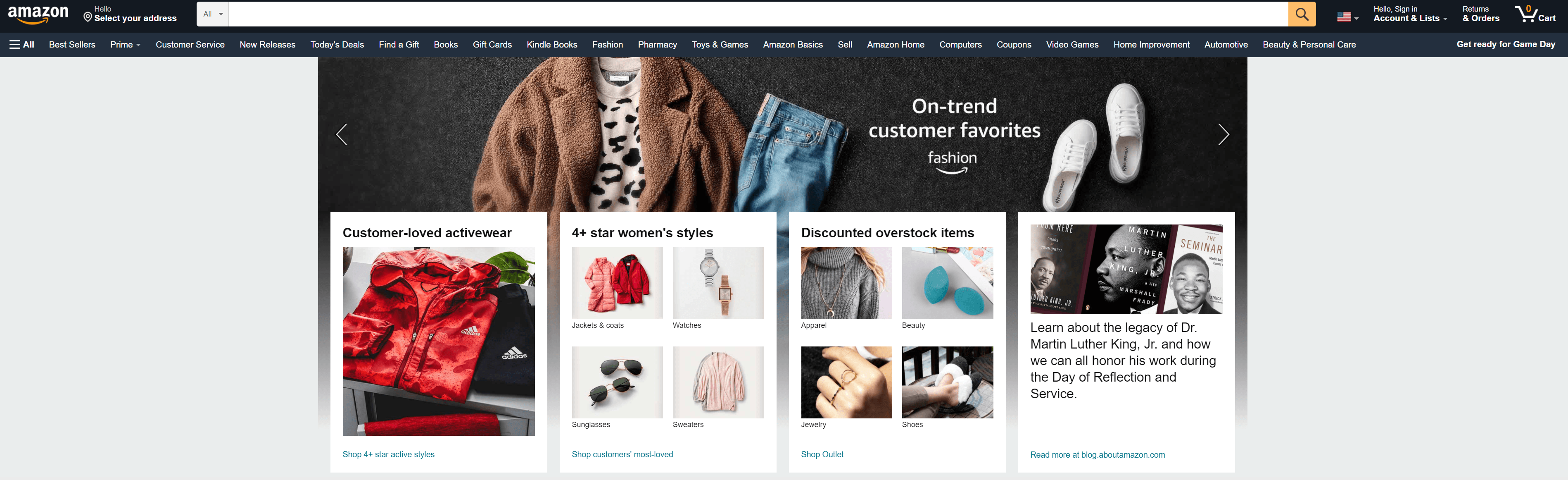
Your website with built-in ecommerce features would be considered vendor-specific, while a platform like Amazon falls under the online marketplaces category.
![Amazon homepage]()
You can certainly choose to have your own ecommerce site and also sell on a marketplace, but keep in mind that each platform you use costs money.
You can really break down the vendor-specific ecommerce platforms.
If you do a search for ecommerce platforms, you’ll see a lot of complex descriptions of each platform type. I’ll keep this simple…just like the platform type I’m going to talk about right now.
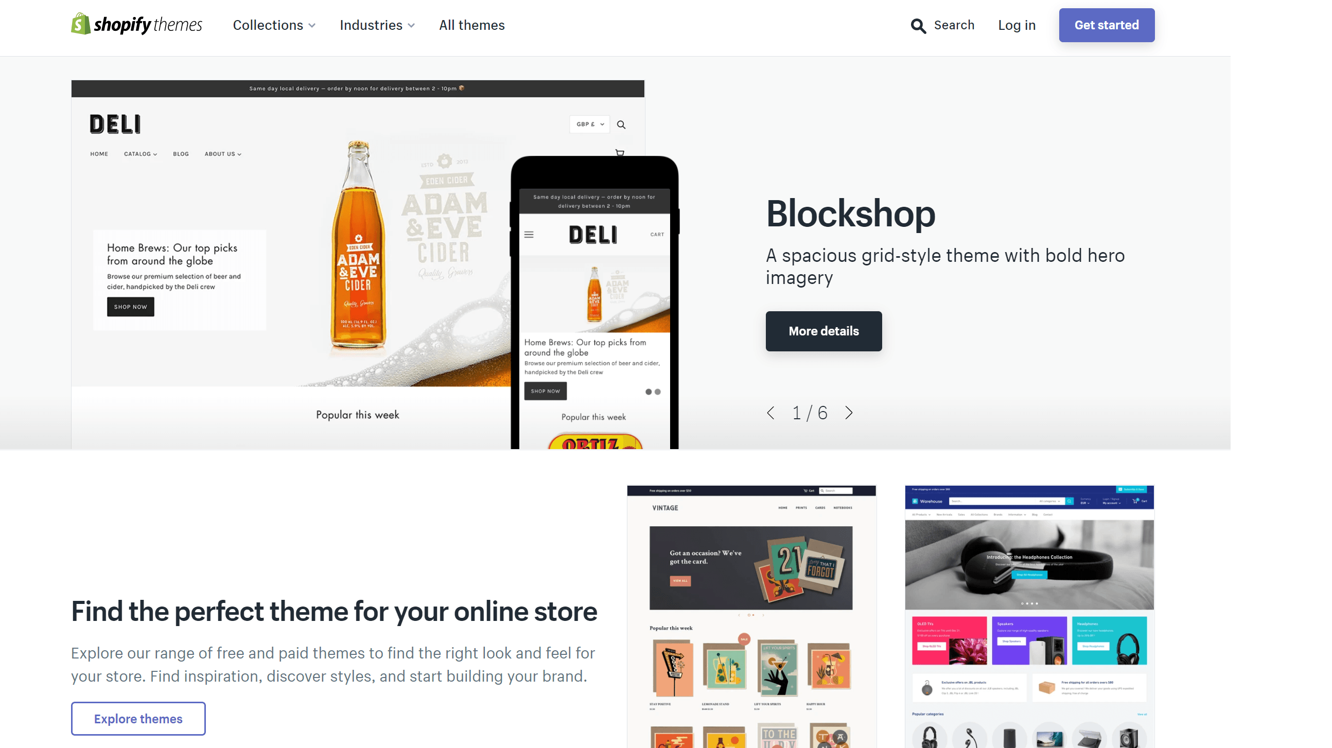
Probably the most user-friendly type of ecommerce platform is a website builder.
You might hear these sites referred to as SaaS ecommerce platforms, SaaS standing for software as a service.
These sites are meant to make setting up an ecommerce store easy.
You don’t need to have experience with code or a degree in computer science to create an ecommerce site with a website builder.
Basically, you can choose from a variety of themes, and then just drag and drop to make edits to the site.
![Shopify themes]()
Some examples of website builders are:
If you need your website to be completely customized with specific features, or you have a large number of products to sell, a website builder may not be right for you.
This leads me to the next type of ecommerce platform: One that requires you to know how to code.
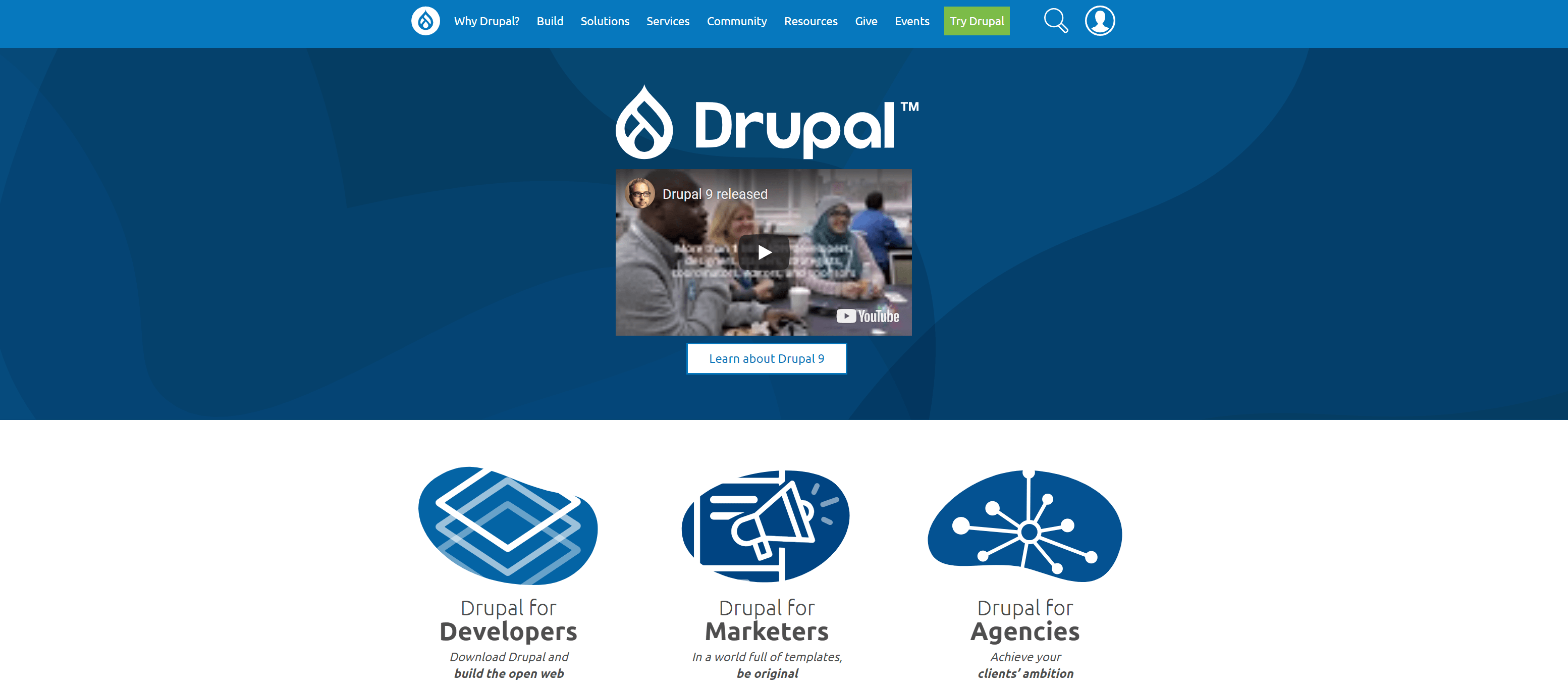
Okay, that’s not the official term. Usually, people call these open-source ecommerce platforms.
An open-source ecommerce platform gives you more flexibility with your site, but you also take on more responsibility in managing everything.
You may need to find a web hosting provider or handle site updates on your own.
Plus, making changes isn’t as simple as clicking a button.
Some popular open-source platforms are Drupal and Magento.
![drupal-platform]()
If you do choose to take on more responsibility, I’d definitely recommend checking out our ecommerce checklist on our blog so you don’t miss any important steps.
And also, you can always reach out to our team to learn how you can get a customized ecommerce site. It’s what we do.
Just use this video as a jumping-off point for your ecommerce website research. Take your time and make sure you consider what you need before you spend big money.
Oh! And don’t forget about ecommerce SEO. You want a platform that allows you to fully optimize your site for search engines so people can find your products in their searches. You can check out our video on ecommerce SEO (or reach out to our team) to learn more.
Before you skip to the next video, just a friendly reminder to sign up for our digital marketing newsletter, Revenue Weekly, and also hit that subscribe button so you never miss out on the latest in digital marketing.
Happy shopping!
The post Choosing an Ecommerce Platform That Will Wow Customers appeared first on WebFX Blog.
Ketting is the generic REST client for Javascript.
Version 7 is currently in beta, and will have support for Deprecation
and Sunset headers as well as deprecated links.
Deprecating Endpoints/Resources
There’s currently work done on a new internet standard:
draft-cedik-deprecation-header, a.k.a.:
“The Deprecation HTTP Header Field”.
The way this works is that the server may emit a header such as one of these:
HTTP/1.1 200 OK
Deprecation: Mon, 1 Nov 2021 00:00:00 GMT
Deprecation: true
If a server emits these, it tells the client that the endpoint should no
longer be used, or will be removed at a future date.
If specified, Ketting will now send warnings to the console via console.warn,
making it easier to spot reliance on deprecated endpoints.
The draft also defines the following additional headers:
HTTP/1.1 200 OK
Sunset: Wed, 1 Dec 2021 00:00:00 GMT
Link: </docs/update-2021>; rel="deprecation"
These headers allow a server to tell a client when the endpoint will stop
responding, and point to additional information about the deprecation.
If either of these are specified, Ketting will provide this information in
the console.
Deprecating links
Aside from entire resources being deprecated, individual links may also get
deprecated. Given a HAL document, this may look like the following:
{
  "_links": {
    "next": {
      "href": "/next-page",
      "hints": {
        "status": "deprecated"
      }
    }
  }
}
The format for ‘hints’ is documented in draft-nottingham-link-hint.
When you follow the next link with Ketting, Ketting will now also emit
a console warning.
// Emits warning
const nextResource = await resource.follow('next')
Want to give this a shot? Update to the latest Ketting with:

Someone stole the domain name Perl.com. They thought it was just a domain name snafu, but in fact it was stolen, transferred from one domain name registrar to another without the owner’s permission.
I am seeing more and more domain names get stolen recently, especially as the value of domain names goes up. After all, some domain names are selling hundreds of thousands of dollars. So, it’s imperative that you protect this valuable digital asset that you own. If you suddenly find that someone stole your domain name from you, then you need to act quickly. The longer you wait the more difficult it will be to recover. Here’s what you need to do if someone stole your domain name:
Is the Domain Name Really Stolen?
First, you need to figure out whether or not the domain name is really stolen or not. What determines whether or not it has been stolen is the status of the domain name. You must register your domain name and renew it every year. If you don’t pay the annual renewal fee, then it will expire. Once a domain name expires, it will be in a ‘holding period’ where you have a chance to renew it for an additional fee. After that period of time, the domain name will eventually “drop” and become available on a first-come first-served basis for anyone to register it. If someone else register it, the domain name is no longer “your domain name”.
Process for Expired Domain Names
A domain name, when it is not renewed by its current owner, goes through a process before someone else can register the domain name. Here is the process:
- Domain Name Expires, it was not renewed.
- Domain Name is on hold, owner can pay a fee to get it back.
- Domain name is in a “pending delete” status.
- Domain name “drops”, and is available for anyone to register.
That is the overall process, and it takes about 90 days to go through that process. If the domain name gets to the “drop” date, there is an actual date and time (and second) when the domain name is available for anyone to register. Some domain name registrars will sell the domain name to the highest bidder before it gets to the final stage.
Domain Name Theft
Theft of a domain name occurs when a domain name has been renewed, and is not currently expiring and has not expired. Someone, the domain thief, will somehow gain access to the account at the domain name registrar, where the domain name is registered. Let’s say you’ve registered your domain name for 5 years into the future (which is recommended), and someone gains access to your account, they transfer the domain name to another account, and then they transfer the domain name to another domain name registrar. Is the domain name stolen? Has someone stolen my domain name? Yes, it is stolen.
Domain Name Theft is On the Rise
In the past several weeks, I have witnessed several domain names that I can confirm were, in fact, stolen from their owners. These valuable domain names were stolen, and as of writing this post, none of them have been recovered and returned to their owners:
- Perl.com – stolen around Jan 27 2021
- Neurologist.com – stolen around Jan 27 2021
- Chip.com – stolen around Jan 27, 2021
- Patterns.com – stolen around December 8, 2020
- Piracy.com – stolen around December 8, 2020
All of these domain names were stolen by a domain name thief. They typically gained access to the domain name registrar account(s) involved and then transferred the domain names to another domain name registrar. In some cases, they will change the ownership record so that it shows that the domain name is under “privacy“, and the contact details are hidden. Then, once they transfer the domain name to another domain name registrar, they will un-hide the domain name ownership details and put the ‘old’ owner details in place of the private details. That way it “looks like” they original owner still owns the domain name, but the domain name is in the thief’s account. In all of the cases listed above, the domain name thief has tried to sell the domain names for about 10 percent of what they are actually worth. They’ll list them on websites such as Afternic.com and Sedo.com.
Why They Steal Domain Names
Why do thieves steal domain names? There are several reasons, but it’s mainly money. I believe they see it as a way to do something that they will profit from. They will hack into an account, transfer the domain name to themselves, and then sell the domain name. They’ll list it for 10 percent or 20 percent of the value of the domain name.
What To Do If Your Domain Name is Stolen
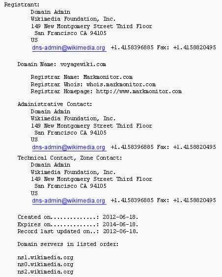
If your domain name is stolen, then, as I mentioned, make absolutely positively certain that you didn’t fail to renew the domain name. Log into your domain name account at the registrar and see if the domain name is still in your account there. Look in your email (such as your spam folder) to see if you have received any emails about renewing the domain name. If you haven’t, and you are certain that it has been renewed for at least a year in the future, then contact the domain name registrar. Check the WHOIS record. Make sure that you don’t still own the domain name. If you want to investigate what happened yourself, you can look at the whois archived records (several services offer this service, such as Domain Tools and DomainIQ). If it’s stolen, then you should contact your domain name registrar, and file a report of the domain name theft at DNProtect.com.
How to Check who Owns a Domain Name
You can check who owns a domain name currently, by looking up the of that domain name. There are several websites, including these, where you can find the current owner:
Stolen Domain Name Checklist
If your domain name is, in fact stolen, there are things that you need to do right away. Don’t wait, don’t even wait until “tomorrow” to do it. Here’s my checklist if your domain name is stolen:
- Check the WHOIS record to see who owns the domain name now.
- Make sure the domain name didn’t expire and just needs to be renewed.
- Log into your domain name registrar account. See if the domain name is there.
- If the domain name is not in your account, contact your registrar using their support system.
- File a stolen domain name report with DNProtect.
- Work with your current domain name registrar to see if they will help recover the domain.
It should only take up to a few days for the domain name to be properly restored in your account at your registrar if it was stolen. The domain name does need to be transferred back to your domain name registrar, so that can technically take up to 5 days for that to happen. But, if you’re not happy with how quickly it’s going, then you need to escalate it.
In the cases of the premium domain names I mentioned earlier that were stolen, a few things happened. A few of the domain names were part of a security breach that occurred at the registrar about a year ago, and the domain name owner(s) just noticed, months later, that they no longer owned the domain names. Someone had used the compromised data (user ID and password) to gain access to the account and transferred the domain name(s) to another registrar in China. With the other domain names, my understanding is possibly the domain names were socially engineered via web chat, and the registrar was presented with fake ID and documents to prove ownership. Those are two different ways that domain names can be stolen. I don’t know for certain that those are the ways that these domain names were, in fact stolen.
Protecting Your Domain Name
There are several ways to make sure that you protect your domain name from being stolen. Protect the domain name at your current registrar, move it to a more secure domain name registar, and take advantage of all of the domain name protections that the registrar offers.
- Register your domain name for at least 5 years in advance. This way there will be no question as to whether or not it expired or not. If expires soon, then it’s possible that a credit card won’t go through, you might not get a reminder, or another clerical issue could come up.
- Use Domain Lock, Executive Lock, or whatever the domain registrar calls that feature. The domain name cannot be transferred unless it is unlocked. Some registrars offer a service that allows you to give instructions. For example, you can tell them to call a certain phone number or you must give them a certain password before it can be unlocked.
- Implement 2FA (2 Factor Authentication) on the domain name. While this is not fail-proof, it can help secure the domain name. Someone cannot log into the account unless you get a text message with a code, for example.
- Move to a more secure domain name registrar. Some registrars keep getting their domain names stolen, and they are using 20-year-old technology and systems for their back processing. Some registrars are just more secure than others.
If someone stole your domain name, then you will lose access to email, your website will go down, and you’ll lose that digital asset that quite possibly be very valuable. Unfortunately I’m seeing more and more domain name thefts occur recently, and it’s time to make sure that your domain name is protected.

You’ve crafted the perfect ad content to entice your audience to click and check out your business. You paired it with a landing page inviting people to submit their information and take the next step. After a few months, you check back and see that it’s not driving the results you desire.
You’re generating clicks, but once people visit your landing page, they drop off. Why aren’t people filling out your form?
It may seem like a simple and easy task but optimizing your landing pages with forms is an intricate and detailed process. You need to craft compelling landing pages with easy-to-use forms to ensure that people don’t bounce from your site.
So, if your landing pages aren’t producing the results you desire, don’t panic! We have seven best practices that will help you create a landing page form that drives your desired results!
P.S. Want to take your marketing to the next level? Join 150,000+ marketers by subscribing to our newsletters!
1. Only ask for vital information
First on our list of landing page best practices is to only ask for vital information. When you get people to click on your ad, you know they’re likely interested in what you have to offer. It may seem like an excellent opportunity to capture as much information as possible, but the opposite is true.
People don’t want to spend time filling out long landing page forms. They want to submit their information fast and go on their way. If you’re asking for too much information, you’ll discourage people from filling out your form.
So, how do you determine what information to include in your form?
Think about the information you absolutely need to know about someone when they sign up. This information will vary depending upon your company and what you’re offering.
For example, let’s say you want someone to sign up for a free trial of your business software. In this case, knowing their name, email address, and company might be beneficial information to you. Knowing their gender or date of birth isn’t as important.
On the other hand, if you own a winery and you’re inviting people to sign up to attend your fall fest, asking their date of birth might be fundamental to your form.
So, when you’re crafting your landing page form, make sure you’re only asking for fundamental information so users don’t feel discouraged to fill out your form.
2. Don’t overcrowd your forms and landing pages
If you want to follow landing page best practices for your forms, make sure you don’t overcrowd your pages. Many companies will try to fill up their pages as much as possible to give their audience tons of information. Taking this approach, however, is detrimental to your landing page performance.
You don’t want to stuff your landing page forms with too much information, as it makes it appear cluttered and disorganized.
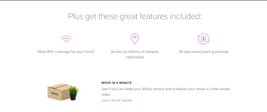
To help you keep your landing pages organized, utilize white space. White space ensures that you break up your text and images on your landing page to make it easier to look at your landing page.
On this landing page from Xfinity, you can see that they utilize whitespace to help people focus on their product’s important information.
![]()
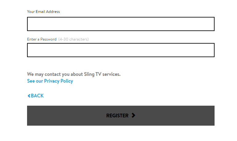
You’ll also want to ensure that your forms utilize whitespace too, like Sling did with their sign-up form.
![]()
When you keep your landing pages and forms organized, you make it easier for people to stay focused on filling them out.
3. Highlight the benefits of filling out the form
Next on our list of landing page best practices is to highlight the benefits of signing up. If you want people to fill out your landing page form, you need to tell them why they’ll want to fill it out. When you highlight the benefits of completing the form, they’re more likely to do it.
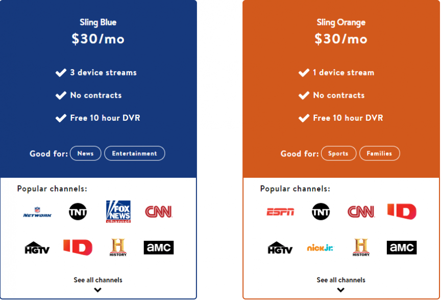
In this example from Sling, you can see that they highlight the benefits of the different packages they’re offering on their landing page.
![]()
Visitors can get all the information they need about their services and know the benefits of signing up for their services.
So, when you craft your landing page forms, make sure you show your audience why they want to sign up. Keep your benefits focused on how it helps them, rather than focusing on why your company is the best.
For example, if you’re trying to get people to sign up for your webinar, highlight some of the beneficial information they’ll learn from it. If it were a webinar on managing finances, you might tell visitors that they’ll discover helpful information like how to balance their budget and how to start a 401k.
By highlighting benefits, you’ll entice more people to complete your landing page form.
4. Craft a click-worthy call to action (CTA) button
When you design a landing page with a form, you want to ensure you craft a click-worthy call to action (CTA) button. If people like what they see and fill out your form, they want to know what happens next when they submit their information. Crafting the perfect CTA will help you earn more form completions.
When you craft your CTA button, you want to ensure it’s informative and tells your audience what happens when they click it. For example, using a generic CTA like “Start” doesn’t tell your audience what happens. A better CTA would be “Start your free trial today.”
Additionally, you want to ensure your CTA buttons stand out on your page so your audience can easily spot them and click on them.
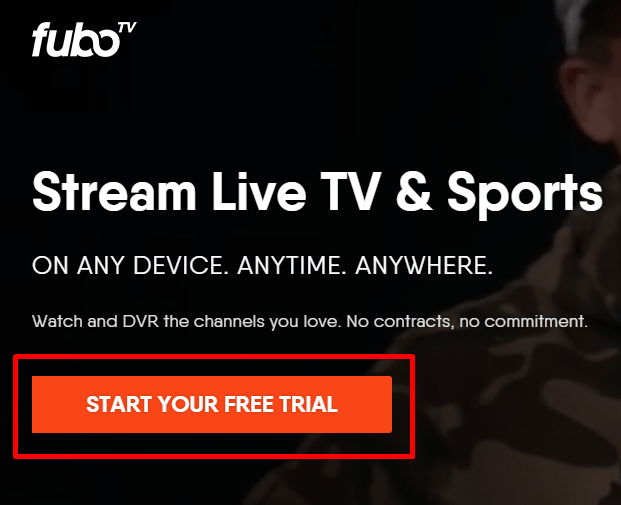
FuboTV has a great example of a CTA button on their landing page. Not only does the orange button pop off the page, but it also tells people what happens if they click the button.
![]()
Whether you’re using a CTA button on your page or at the end of your landing page form, make sure it stands out and informs your audience of the next step.
5. Integrate your brand into the landing page form
When you craft landing pages with forms, it’s fundamental that you integrate your brand’s unique style into the form. You want people to get to know your business, and many people do that through your design. Design helps convey your brand’s tone and style to your audience.
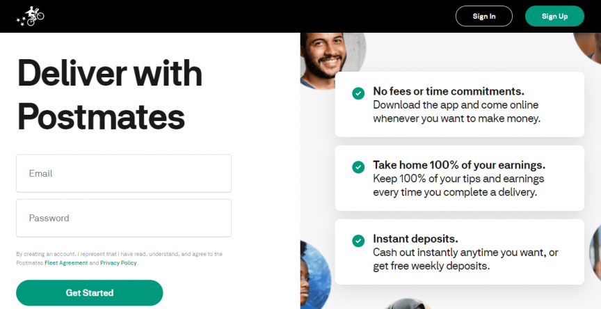
Your design should be consistent throughout the page. Postmates, for example, uses a green, white, and black theme throughout their form page design.
![]()
So, when you craft your landing pages, make sure you have a consistent design for your pages. It will help you create a better experience for people who visit your site and help them get to know your business better.
6. Use visuals to enhance your forms
Next on our list of landing page best practices is integrating visuals into your landing page. A landing page filled with text and submission forms won’t excite your audience. Adding visuals, on the other hand, can entice them to want to engage with your form.
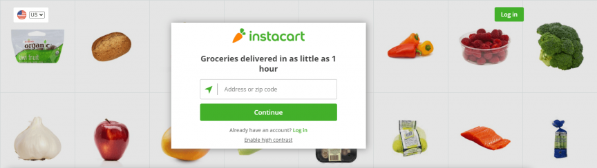
Take Instacart as an example. Their landing page incorporates visuals that make their landing page interesting for their audience.
![]()
You can take a similar approach with your landing pages. Try using engaging visuals that align with your branding and landing page’s message.
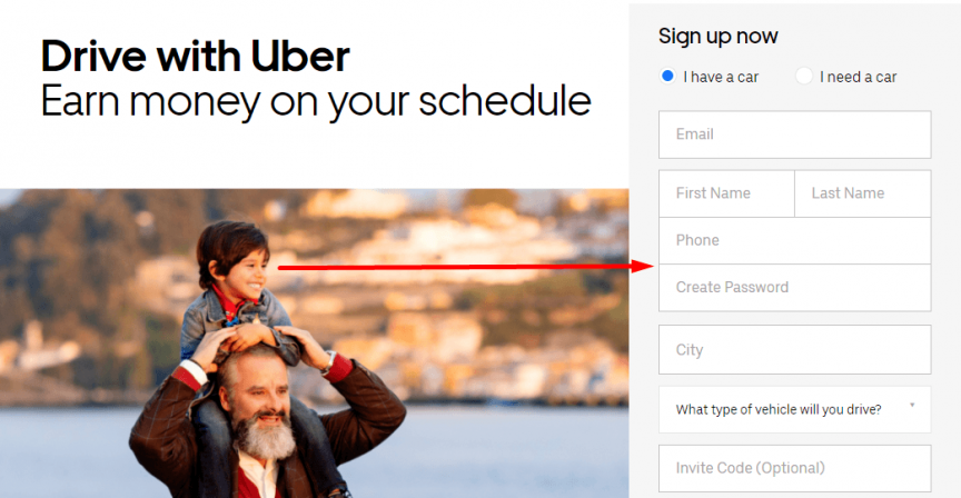
Additionally, you can use visuals that guide users to look towards your forms. In this example from Uber, the boy on the man’s shoulders directs your eyes straight to the form.
![]()
If you want to have impactful landing pages with forms, use visuals that engage and guide your audience to complete their form submissions.
7. Make sure forms are mobile-friendly
Last on our list of landing page best practices is making your forms mobile-friendly. People will access your landing pages from mobile devices. If you don’t have a mobile-friendly form, you’ll risk these leads going back to the search results.
To prevent them from bouncing, make sure you integrate responsive design into your landing pages. Responsive design ensures your site adapts to whatever device your audience uses. It provides them with the best experience and keeps them engaged on your site.
A great way to create mobile-friendly forms is to use stacked form submissions.
![]()
With stacked forms, all the form lines go vertically down the page. It makes it easy for mobile users to submit their information.
By creating a mobile-friendly landing page, you’ll keep more people engaged on your form.
Craft your landing page forms today
Crafting the perfect landing page with a form takes time, but WebFX can help. We have a team of over 250 marketing experts that know how to craft landing pages that drive results.
In the past five years, we’ve driven over $2.4 billion in sales and over 6.3 million leads for our clients. We’d love to drive results for you, too.
If you’re ready to start designing killer landing pages, contact us online or call us today at 888-601-5359 to speak with a strategist about our landing page design services!
The post 7 Best Practices for Crafting Landing Pages with Forms appeared first on WebFX Blog.
You’ve crafted the perfect ad content to entice your audience to click and check out your business. You paired it with a landing page inviting people to submit their information and take the next step. After a few months, you check back and see that it’s not driving the results you desire.
You’re generating clicks, but once people visit your landing page, they drop off. Why aren’t people filling out your form?
It may seem like a simple and easy task but optimizing your landing pages with forms is an intricate and detailed process. You need to craft compelling landing pages with easy-to-use forms to ensure that people don’t bounce from your site.
So, if your landing pages aren’t producing the results you desire, don’t panic! We have seven best practices that will help you create a landing page form that drives your desired results!
P.S. Want to take your marketing to the next level? Join 150,000+ marketers by subscribing to our newsletters!
1. Only ask for vital information
First on our list of landing page best practices is to only ask for vital information. When you get people to click on your ad, you know they’re likely interested in what you have to offer. It may seem like an excellent opportunity to capture as much information as possible, but the opposite is true.
People don’t want to spend time filling out long landing page forms. They want to submit their information fast and go on their way. If you’re asking for too much information, you’ll discourage people from filling out your form.
So, how do you determine what information to include in your form?
Think about the information you absolutely need to know about someone when they sign up. This information will vary depending upon your company and what you’re offering.
For example, let’s say you want someone to sign up for a free trial of your business software. In this case, knowing their name, email address, and company might be beneficial information to you. Knowing their gender or date of birth isn’t as important.
On the other hand, if you own a winery and you’re inviting people to sign up to attend your fall fest, asking their date of birth might be fundamental to your form.
So, when you’re crafting your landing page form, make sure you’re only asking for fundamental information so users don’t feel discouraged to fill out your form.
2. Don’t overcrowd your forms and landing pages
If you want to follow landing page best practices for your forms, make sure you don’t overcrowd your pages. Many companies will try to fill up their pages as much as possible to give their audience tons of information. Taking this approach, however, is detrimental to your landing page performance.
You don’t want to stuff your landing page forms with too much information, as it makes it appear cluttered and disorganized.
To help you keep your landing pages organized, utilize white space. White space ensures that you break up your text and images on your landing page to make it easier to look at your landing page.
On this landing page from Xfinity, you can see that they utilize whitespace to help people focus on their product’s important information.
![]()
You’ll also want to ensure that your forms utilize whitespace too, like Sling did with their sign-up form.
![]()
When you keep your landing pages and forms organized, you make it easier for people to stay focused on filling them out.
3. Highlight the benefits of filling out the form
Next on our list of landing page best practices is to highlight the benefits of signing up. If you want people to fill out your landing page form, you need to tell them why they’ll want to fill it out. When you highlight the benefits of completing the form, they’re more likely to do it.
In this example from Sling, you can see that they highlight the benefits of the different packages they’re offering on their landing page.
![]()
Visitors can get all the information they need about their services and know the benefits of signing up for their services.
So, when you craft your landing page forms, make sure you show your audience why they want to sign up. Keep your benefits focused on how it helps them, rather than focusing on why your company is the best.
For example, if you’re trying to get people to sign up for your webinar, highlight some of the beneficial information they’ll learn from it. If it were a webinar on managing finances, you might tell visitors that they’ll discover helpful information like how to balance their budget and how to start a 401k.
By highlighting benefits, you’ll entice more people to complete your landing page form.
4. Craft a click-worthy call to action (CTA) button
When you design a landing page with a form, you want to ensure you craft a click-worthy call to action (CTA) button. If people like what they see and fill out your form, they want to know what happens next when they submit their information. Crafting the perfect CTA will help you earn more form completions.
When you craft your CTA button, you want to ensure it’s informative and tells your audience what happens when they click it. For example, using a generic CTA like “Start” doesn’t tell your audience what happens. A better CTA would be “Start your free trial today.”
Additionally, you want to ensure your CTA buttons stand out on your page so your audience can easily spot them and click on them.
FuboTV has a great example of a CTA button on their landing page. Not only does the orange button pop off the page, but it also tells people what happens if they click the button.
![]()
Whether you’re using a CTA button on your page or at the end of your landing page form, make sure it stands out and informs your audience of the next step.
5. Integrate your brand into the landing page form
When you craft landing pages with forms, it’s fundamental that you integrate your brand’s unique style into the form. You want people to get to know your business, and many people do that through your design. Design helps convey your brand’s tone and style to your audience.
Your design should be consistent throughout the page. Postmates, for example, uses a green, white, and black theme throughout their form page design.
![]()
So, when you craft your landing pages, make sure you have a consistent design for your pages. It will help you create a better experience for people who visit your site and help them get to know your business better.
6. Use visuals to enhance your forms
Next on our list of landing page best practices is integrating visuals into your landing page. A landing page filled with text and submission forms won’t excite your audience. Adding visuals, on the other hand, can entice them to want to engage with your form.
Take Instacart as an example. Their landing page incorporates visuals that make their landing page interesting for their audience.
![]()
You can take a similar approach with your landing pages. Try using engaging visuals that align with your branding and landing page’s message.
Additionally, you can use visuals that guide users to look towards your forms. In this example from Uber, the boy on the man’s shoulders directs your eyes straight to the form.
![]()
If you want to have impactful landing pages with forms, use visuals that engage and guide your audience to complete their form submissions.
7. Make sure forms are mobile-friendly
Last on our list of landing page best practices is making your forms mobile-friendly. People will access your landing pages from mobile devices. If you don’t have a mobile-friendly form, you’ll risk these leads going back to the search results.
To prevent them from bouncing, make sure you integrate responsive design into your landing pages. Responsive design ensures your site adapts to whatever device your audience uses. It provides them with the best experience and keeps them engaged on your site.
A great way to create mobile-friendly forms is to use stacked form submissions.
![]()
With stacked forms, all the form lines go vertically down the page. It makes it easy for mobile users to submit their information.
By creating a mobile-friendly landing page, you’ll keep more people engaged on your form.
Craft your landing page forms today
Crafting the perfect landing page with a form takes time, but WebFX can help. We have a team of over 250 marketing experts that know how to craft landing pages that drive results.
In the past five years, we’ve driven over $2.4 billion in sales and over 6.3 million leads for our clients. We’d love to drive results for you, too.
If you’re ready to start designing killer landing pages, contact us online or call us today at 888-601-5359 to speak with a strategist about our landing page design services!
The post 7 Best Practices for Crafting Landing Pages with Forms appeared first on WebFX Blog.
Package:
Summary:
Verify and clean values to assure they are valid
Groups:
Author:
Description:
This is a simple class that can verify and clean values to assure they are valid...
Read more at https://www.phpclasses.org/package/11941-PHP-Verify-and-clean-values-to-assure-they-are-valid.html#2021-01-31-23:37:24