Monthly Archiv: February, 2021
Patterns are a great way to make your entire design cohesive as well as bring your finished project to life. Creating patterns in Illustrator is not hard, once you master a few basic principles.
In this roundup, you’ll find the best tutorials from around the web that will help you take your Illustrator skills to the next level and allow you to create custom, seamless patterns for all your current and future design projects.
You might also like: 50 free high-resolution seamless pattern sets.
Unlimited Downloads: 19,000+ Adobe Illustrator Templates
1,000,000+ Illustration & Vector Templates, Brushes, Logos, Icons, and much more!
With summer just around the corner, this tutorial is the perfect way to brush up your Illustrator skills and create a seamless pattern featuring an adorable underwater scene. Perfect for branding projects as well as for beachwear designs.

Mexican prints are known for their bold colors and floral imagery so they are a great way to create an impactful pattern for your design project. With the help of this Illustrator tutorial, you’ll be creating breathtaking Mexican-style patterns in no time.

Geometric patterns are great for any project that wants to reflect minimal and modern vibe. However, there might be times where you can’t afford to design a pattern from scratch. Use these beautiful geometric patterns from Envato Elements to save time in your design process.

Geometric patterns might look complicated but in reality, they are quite simple, usually consisting of a few basic shapes. Thanks to this tutorial, you’ll learn how to create an interesting cubical pattern in Illustrator.

Damask patterns are beautiful in their elegance. This tutorial will teach you how to create semi-symmetrical vector graphics in Illustrator and use them to create beautiful pattern designs.

If you’re working on a project that requires cool food-related patterns, don’t miss out on this template. This black and white chili pepper pattern is a great way to spice up your designs and it comes in high resolution of 5000x5000px.

Learn how to make this bold pattern in a detailed tutorial by London-based designer David Popov. Over the course of 4 hours, you’ll learn how to use color and pattern swatches to create a bold-looking pattern.

In this tutorial, you will learn how to apply a colorful pattern to your text and keep the text fully editable. The end result is truly spectacular and even though it sounds complicated, it only takes 12 steps.

Repeating patterns are a must if you want to make sure your pattern looks awesome and professional on a finished project. Use this tutorial to learn how to make the most of Illustrator tools and create a seamless repeating pattern.

If you need vintage patterns, be sure to check out this Envato Elements template. It comes with 16 high-resolution patterns in vector format that are perfect for wedding cards, stationery, wallpapers, and other projects.

Line patterns can make for some interesting effects and this tutorial takes you step-by-step through the process of creating a line pattern in Illustrator. The best part about this tutorial is that it uses nothing more than basic shapes and clever adjustments.

Learn how to use basic shapes to create tribal African symbols like the ankh cross and the cowrie shells, then combine them into a pleasant composition that makes up a beautiful pattern.

Sometimes, an ordinary pattern just won’t do. That’s when you need to create a quirky pattern instead. This tutorial shows you how to create an unusual pattern based on map-like imagery.

If you’re on the lookout for doodle patterns, be sure to check out this collection of 8 handmade patterns. They are done up in high-resolution and can be used as backgrounds or wallpapers.

In this tutorial you will learn how to use the Pattern tool in Illustrator to create a hexagon pattern. The tutorial takes you through the steps, one at a time and you will also learn how to use the Pattern mode to experiment with your pattern design.
Learn how to create a set of hand-drawn retro patterns in Illustrator with this tutorial. You’ll learn how to make use of the Pattern option tool to create a fun and bold pattern design.

Designing your own patterns is a fun learning experience that pushes the boundaries of your creativity and skill. Thanks to the tutorials listed here, you’ll learn how to create a variety of great-looking patterns that can be used in multitude of projects. Best of all, you’ll sharpen your Illustrator skills and be able to add another skill to your toolbox.
The post 10 Tutorials for Creating Seamless Patterns in Adobe Illustrator appeared first on Speckyboy Design Magazine.
Latest PECL Releases:
The continued growth of WordPress is something to behold. It seems like just yesterday that we were watching it surpass 30% market share (it was at 29.2% on January 1, 2018), according to the W3Techs survey. Now, the versatile content management system (CMS) has reached a whopping 40%.
While there is a wide array of CMS options on the market, WordPress continues to outshine the competition. As of this writing, Shopify occupies second place with a 3.3% share. From January 1, 2020 through February 15, 2021, WordPress usage grew by 3.7% to Shopify’s 1.3%. Even as some competitors grow, WordPress outpaces them.
It’s quite an achievement – and one that brings up a few key questions. How did WordPress gain such a massive market share? And what does it have to do in order to maintain its dominance?
I’m going to take a stab at answering these questions. However, note that I’m not what I would consider to be a WordPress insider. My perspective is that of a freelancer who builds websites with the CMS and writes about it. Therefore, my conclusions may be different from say, WordPress co-founder Matt Mullenweg or other major players.
Let’s get started!
People Want Established Tools and Technology
It’s no secret that the world of online technology has become homogenized. Google wields massive power over search and online ads – along with ruling the browser market. Facebook trades our personal information like kids trade Pokémon cards (that is, if those children had a really big collection). Complaints aside, they’ve implanted themselves right there into our daily lives.
Web development has taken a similar course. We tend to seek out established tools that are both reliable and familiar to us. WordPress fills this space so incredibly well.
Back in the early 2000s, it may have been acceptable to experiment with an immature CMS on client projects. The market was still searching for the right tool. One that offered up a measure of stability and was extensible enough for customization.
WordPress is the lone CMS to have proven itself on such a large scale and over a long period of time. It can power everything from a tiny landing page all the way to an enterprise network of sites. And custom solutions either exist in the form of plugins or can be built from scratch. The same can be said of themes as well.
Many of us who started out with one WordPress website have come back again and again. Eventually, that worked its way up from individual users to large companies and hosting providers.
The software is everywhere. Why? Because people trust it. I believe that has led both web designers and website owners to stick with WordPress year after year.

Community Matters
For an open-source project to grow to the size of WordPress, there needs to be a flourishing community around it. People must be willing to participate; giving their time and sharing expertise.
WordPress has as devoted a community as you’ll find. Whether it’s those who volunteer to build and maintain the core software or everyday users who attend WordCamps – there are no shortage of evangelists out there.
It’s fascinating that WordPress has been able build up and maintain such a high level of participation. While there have certainly been bumps in the road, there still seems to be a lot of enthusiasm. And I think the community itself is a big reason why.
Of course, the ability to monetize the software keeps plenty of entrepreneurs around. But at the grassroots level, it’s a culture of sharing for the benefit of all that drives people.
Through the exchange of code, tips and friendly conversation, relationships are built. Once established, those relationships give us a reason to stay engaged. As great as the software is, it couldn’t thrive nearly as well without this human touch.

How WordPress Can Stay on Top
One can make the case that WordPress has defied the odds (and maybe even logic) by grabbing a large market share over such a long period of time. For that, it should rightfully be mentioned alongside the other titans of technology.
But its continued dominance isn’t a given. WordPress has its vulnerabilities and imperfections – just like everything else on this planet.
So, how can it stay at the top of the CMS landscape? Here are a few ideas:
Continue to Innovate
Here’s where I have to give both Matt Mullenweg and those at the upper levels a lot of credit. They haven’t taken their collective foot off the gas pedal when it comes to innovation. Instead of resting on their laurels, there has been a big effort to keep WordPress both improving and evolving.
The Gutenberg block editor is a prime example. There was plenty of grumbling throughout the community during its development. Yet, this feature was seen as a means to keep the software relevant amongst modern competitors.
I think the strategy has paid off. New features such as full site editing (FSE) and compatibility with headless configurations will help WordPress keep up with the times.
Keep the Community Informed and Involved
New features aren’t as great if they create fault lines within the community. That’s one of the primary lessons from the Gutenberg experience – one that I hope leadership keeps in mind.
The idea isn’t to make everyone happy. That’s virtually impossible in a community of this size. Every decision made is bound to rub at least some people the wrong way. So be it.
But it should serve as an impetus for better communication. It should be clear, concise and open. And it needs to be available in a centralized and highly-visible space. Right now, so much of it is buried within various Make WordPress blogs or other sources that the average user can easily be left in the dark.
In my view, this has been the Achilles heel of WordPress. It’s as big of a threat to growth as any competing CMS on the market.
Don’t Raise the Barrier to Entry on Developers Too High
There was a lot of concern from the developer community when it was announced that Gutenberg was going to make heavy use of React. Those who were used to working primarily with PHP were now being told that wasn’t going to be a big part of the new editor.
While evolution is often necessary, it should be noted that the low barrier to entry has been a big part of the WordPress story. It was my first real introduction to using PHP and MySQL on a site-wide scale – I suspect that’s been the case for many others as well.
The more complicated things become, the less friendly it is to beginners. That could lead to them cutting their teeth with another CMS.
I’m not sure exactly what is possible in this area. But I think it’s important to keep in mind for the next generation of WordPress developers.

WordPress: A Remarkable Climb to the Top
As of this writing, there are 50+ CMS with at least a 0.1% market share. Still dozens more are being utilized in lesser numbers.
For one application to reach 40% in such a huge market is impressive. It’s also a bit of an artificial milestone, in that no one really aims for this kind of number. Really, it’s just another sign on the highway you pass on your journey.
But we humans love round numbers. And we also enjoy opportunities to look back at where we’ve been and how we got to this point. For WordPress, it truly has been fun to watch the software go from a small open-source project to something bigger than most of us could have imagined.
So, let’s clink our virtual glasses to 40%. See you again when we hit the next milestone!
The post Thoughts on WordPress Achieving 40% Market Share appeared first on Speckyboy Design Magazine.
Package:
Summary:
Find companies in the Companies House Database
Groups:
Author:
Description:
This package can be used to find companies in the Companies House Database...
Read more at https://www.phpclasses.org/package/11993-PHP-Find-companies-in-the-Companies-House-Database.html#2021-02-22-18:03:14

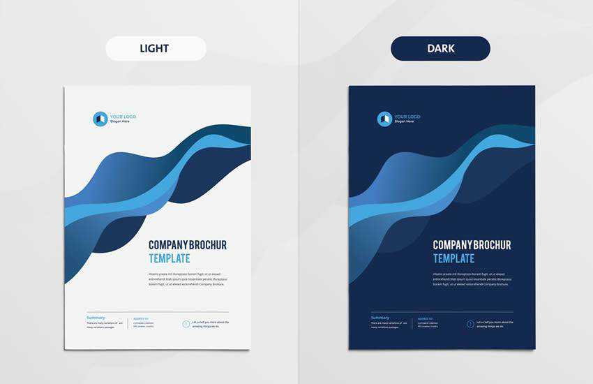
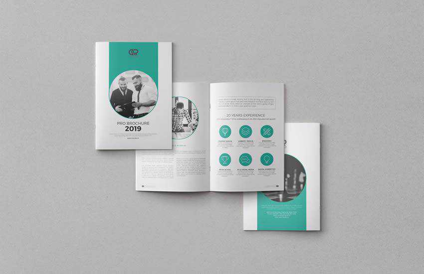
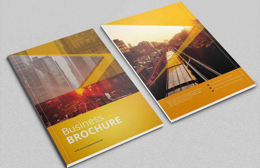
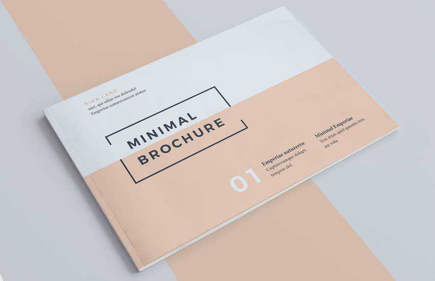
A business brochure is an important marketing asset that can help get your business noticed. You can hand them out during networking events and leave them in local cafes’ to raise awareness about your products and services.
In this post, we’ve rounded up the best business brochure templates that are easy to edit and customize. You can use them as a starting point, add your information, and customize the colors and fonts, or you can use them as an inspiration to create a unique business brochure design.
We also have collections of the best poster templates, social media kits, flyer templates, business card templates, stationery templates, and project proposal templates.
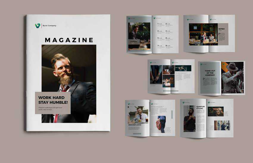
This Square Brochure template starts off the roundup strong with a modern and high-end design. It includes 16 unique page layouts and comes with defined character and paragraph styles.

This clean and modern multi-purpose brochure is a perfect choice for any type of business. The template comes with paragraph and character styles, swatches, styles for your spreadsheet / financial info, block quotes, key figures layout, and much more.
Consider the Royal Red Business Brochure if you’re looking for a cutting-edge design. This template for a creative business brochure is perfect for corporate or other business promotion with 22 pages, clearly defined character and paragraph styles, and premade color palette.

The Corporate Brochure template is a perfect choice if you’re looking for a clean and modern design. The template includes 20 pages and was designed in A4 and US letter size format. You’ll also find paragraph styles and a color palette that’s easy to customize.
This creative brochure template is perfect for any type of creative business such as designers, illustrators or artists. The template includes 12 pages and you can easily customize fonts and colors to match your brand.

Business Brochure (By Voltury, Adobe Photoshop Format)
The Business Brochure template features a modern and trendy design. With over 20 pages that include everything from company introduction to services overview and contact information; you’ll find everything you need to create a powerful brochure for your business.
Try the Minimal Brochure Vol 2 template if you’re looking for a minimal design style. This template was designed in A5 size and includes 18 pages. You’ll also find a defined character and paragraph styles and a pre-made color palette that’s easy to customize.
This 16-page portfolio and brochure template is perfect for designers working on interior design catalogs, product catalogs, product/graphic design portfolios, and other creative projects. Simply replace the information with your own, customize the visual styles, and the template is ready to print.
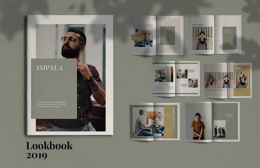
The Impala template is a modern brochure template that includes 16 pages in was designed in A4 format. It’s perfect for product catalogs or any other type of creative business brochure. You can easily add more pages or adjust the paragraph styles to match your brand.
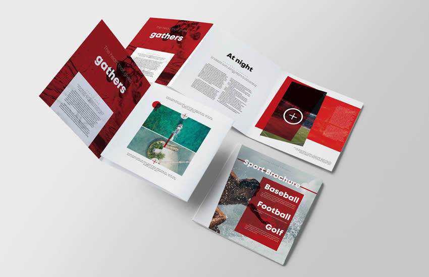
Sport Square Brochure (By Kahuna Design, Adobe Photoshop Format)
Try the Sport Square Brochure if you’re working on a sports brochure design. This template includes well-defined character and paragraph styles. It also includes a well-organized structure with images and text on separate layers.
Conclusion
You can easily design a gorgeous brochure for any business, thanks to creative and modern brochure templates. Start by browsing through our collection of best brochure templates and use them to get your creative juices flowing so you can design an attention-grabbing brochure for any industry.
The post The 10 Best Templates for Creating Business Brochures appeared first on Speckyboy Design Magazine.
In this video, Carly from the WebFX Interactive team will cover how to make websites mobile-friendly. Check it out.
Transcript: Mobile web traffic makes up over half of all web traffic.
If your website isn’t mobile-friendly, you’re basically turning people away from your business.
Plus, as of September 2020, Google prioritizes the mobile version of your website when crawling it. So if you don’t have a mobile-friendly website, you may even hurt your rankings in the search results.
That means even fewer people will visit your website.
What you should take away from this is that your website needs to work well on all devices so you can meet people’s needs, whether they’re using a desktop computer or a smartphone.
A key to making your website mobile-friendly is using responsive web design.
What is responsive web design?
With responsive web design, you set up your site so that it adjusts to different screen sizes.
Generally, the content on your responsive site stays the same between devices, but you may see differences in the layout and sizing of your site elements.
As an example, let’s say that on a desktop computer, your homepage has a paragraph of text on the left and a form on the right. A computer monitor is typically a lot wider than a phone screen, so when this page loads on a phone, the paragraph of text sits above the form.
You don’t want to have people pinching and zooming to view your website on their phones, so responsive design seeks to prevent that when it adjusts to different devices.
When you want to make websites mobile-friendly, responsive design is just the beginning. Many elements go into having a mobile-friendly site, which I’ll talk about in a bit.
How to check if your site is mobile-friendly
You don’t need 100 different devices to test your site’s mobile-friendliness.
You can check this in a few ways.
First, our SEO checker can analyze your site’s mobile-friendliness.
WebFX SEO Checker
- it's Comprehensive.
- it's Immediate.
- it's FREE.
Second, Google has a mobile-friendliness testing tool you can use. In fact, you can just Google “mobile-friendly test,” paste your URL in the box and start the test.
Third, another fun way to see if your site is responsive is to go to any page on your site, right-click, select “Inspect,” and then go through the device options at the top of the page to see how your site looks on different screens.
This will give you an idea of how much work you have ahead of you. Hopefully, it’s not a lot! Website design for mobile devices can seem like a lot of work.
What is the cost to make a website mobile-friendly?
Unfortunately, there’s not an exact number for how much you’ll need to invest in a mobile-friendly site. It really depends on the scope of your project and your needs.
If one website has 20 pages that need mobile optimization and another website has 200, the 20-page project will take less time and require fewer resources.
In general, the average website design project can cost anywhere from $12,000 to $150,000, excluding maintenance. But if you don’t need a total redesign or only require some smaller adjustments, you’ll probably spend a bit less.
If you take on responsive or mobile web design yourself, the cost depends on what tools you use and how much value you assign to your time.
What makes a website mobile-friendly? 5 key tips
Don’t focus on responsive design and ignore other elements of your website. You can do a lot to improve your users’ mobile experiences beyond having responsive pages.
1. Forget the mouse
When people use their phones or tablets, they likely don’t have a mouse to help them navigate through your pages.
You need to make sure your website is tap-friendly.
A thumb is a lot bigger than a cursor, so having “clickable” elements that are too close together or that don’t work when tapped can create a poor user experience and chase people away from your business.
2. Speed things up
People aren’t patient. If your website takes longer than a few seconds to load, you’re going to lose potential customers.
If you plug your pages into Google’s PageSpeed Insights tool, you can see how fast they load and what you need to do to make them faster.
![Google's PageSpeed Insights tool]()
You may want to consider using accelerated mobile pages (AMP), which can help your site load super quickly on mobile devices.
Make sure all images and graphics you use are compressed. You’d be surprised how much of a difference a compressed file can make.
If you use videos, make sure you’re not hosting them directly on your site. That can be a major reason your pages are slow.
Instead of self-hosting your videos, embed them through a third-party hosting provider like YouTube or Wistia. An added benefit is that you’ll have access to plenty of data to tell you how your videos are performing.
3. Ask fewer questions
On your forms, that is.
In general, it’s better to keep your website forms short. Cut out any unnecessary fields so people can quickly give you the information that matters.
But think about the mobile experience. Typing on a phone isn’t always fun. The keyboard is small. The letters are too close together.
The less you have to type on a phone, the better.
Stick with the most important information you need to communicate with your customers and cut everything else.
4. Watch out for popups
On a computer, you have plenty of space for a popup to enter the screen and not completely disrupt people’s reading.
On a mobile device, a popup may take over someone’s screen.
How would you feel if you were reading an article on your phone, and all of a sudden there’s a big pink box obscuring the text? The words “frustrated” and “annoyed” come to mind for me.
Even worse, if someone can’t figure out how to close the popup, they may abandon a site altogether.
You may want to avoid popups—or use them sparingly—on mobile devices to avoid creating a bad user experience.
5. Slice through large paragraphs
Break up with long blocks of text, because I’m bored.
While a four-sentence paragraph might look small on a larger monitor, it will take up much more space on a phone.
You don’t have to write less. Just break large paragraphs into smaller ones.
Shorter paragraphs can help make your content easier to read.
You can also break your content into smaller sections.
So start with a main heading and add subheadings throughout that correspond with different subtopics.
Adding multimedia elements can help break things up, but keep in mind that videos and photos can slow your pages down if not optimized properly.
If you update your content according to these five tips, you’re bound to make your website mobile-friendly.
If you need help with responsive web design or with making different elements of your site ready for mobile users, don’t hesitate to reach out to our web design professionals.
Two things before you go! Subscribe to our YouTube channel so you never miss the latest video, and sign up for our Revenue Weekly newsletter to keep up with the latest digital marketing topics.
Thanks for watching!
The post Make Websites Mobile-Friendly: 5 Astounding Tips appeared first on WebFX Blog.
WordPress 5.6.2 is now available!
This maintenance release includes 5 bug fixes. These bugs affect WordPress version 5.6.1, so you’ll want to upgrade.
You can download WordPress 5.6.2 directly, or visit the Dashboard → Updates screen and click Update Now. If your sites support automatic background updates, they’ve already started the update process.
WordPress 5.6.2 is a small maintenance release focused on fixing user-facing issues discovered in 5.6.1. The next major release will be version 5.7, currently scheduled for release on March 9, 2021.
To see a full list of changes, you can browse the list on Trac, read the 5.6.2 RC1 post, or visit the 5.6.2 documentation page.
Thanks and props!
The 5.6.2 release was led by @desrosj. Special props to @isabel_brison and @talldanwp for helping to prepare the block editor related fixes, and @audrasjb and @sergeybiryukov for helping with other release related tasks.
Props to everyone who helped make WordPress 5.6.2 happen:
aaronrobertshaw, Addie, André Maneiro, archon810, Ari Stathopoulos, bartosz777, Bernhard Reiter, Daniel Richards, David Anderson, dbtedg, glendaviesnz, hmabpera, ibiza69, Isabel Brison, Jason Ryan, Jb Audras, Juliette Reinders Folmer, Kai Hao, Kerry Liu, Konrad Chmielewski, Jorge Costa, magnuswebdesign, Marius L. J., Matt Wiebe, Mukesh Panchal, Paal Joachim Romdahl, Prem Tiwari, Q, Riad Benguella, Robert Anderson, roger995, Sergey Biryukov, Sergey Yakimov, Steven Stern (sterndata), Takashi Kitajima, tonysandwich, worldedu, Yui.
Web designers tend to learn something new with each project. It may be something minor (but helpful) like a new CSS property. Or it could be something more significant, such as a whole new content management system (CMS).
That is both exhilarating and just a tad bit scary. It’s great to gain knowledge that you can carry with you to other projects. At the same time, there is some anxiety in employing a tool or technology you haven’t used before.
It’s a big decision – one that can significantly impact you and your clients. That’s why it pays to consider things from every angle.
Want to know more? Check out our guide to choosing new tools and technologies.
The Web Designer Toolbox
Unlimited Downloads: 1,000,000+ Web Templates, Themes, Plugins, Design Assets, and much more!
Determine Project Needs
Tools and technologies should be implemented based on need. Therefore, it makes sense that creating a list of the project’s requirements is the first step.
In terms of technology, stakeholders will need to sort out exactly how the website or app should work. Look at both the front and back ends. From there, you’ll develop an understanding of where new or existing tools could be utilized.
But finding the right match for the required functionality is only half the battle. The other half consists of determining the project’s budget.
Cost is also a huge factor in which direction you ultimately choose. The lower the budget, the more likely it will limit your options. Even so, this information is vital to know from the very beginning.

Compare and Contrast the Options
Next, it’s time to do some comparison shopping. This involves gathering a list of potential solutions and taking a good long look at them. Depending on your particular needs, this step may even be a bit of fun.
Whether you’re hoping to implement an unfamiliar piece of software or even a different programming language, being thorough is a must. Here are a few aspects you’ll want to research:
Features and Functionality
Will this tool provide everything you need for your project? This might be the hardest thing to determine. And having a larger number of options doesn’t necessarily improve the odds of finding a perfect fit.
Oftentimes you’ll have to settle for something that gets you part of the way towards reaching your goals. When that’s the case, it’s important to choose a tool that is extensible. This will enable you to further customize things to match project requirements.
WordPress is a good example. While a default installation probably won’t do everything you need, there are plenty of opportunities to extend the CMS. Custom themes and plugins can be built to get exactly the kind of look and functionality you want.
Reputation and History
A product or technology’s reputation is (just about) everything. At least, when it comes to choosing it for a client’s project.
When a tool lacks a good reputation or a history of improvement, adoption becomes risky. You want to be sure that what you implement today will still be around a year from now. Bugs need to be fixed, security holes patched and existing features maintained. New features aren’t a bad thing, either.
That doesn’t necessarily mean newer tools should be completely avoided. Sometimes, a less-proven option is the one that does exactly what you need. But it’s still worth looking into how things have evolved over its existence.
As an aside, pay particular attention to bug reports and support forums. If the same issues languish for long periods of time, or if updates continually cause problems, that doesn’t bode well for reliability.
The ‘Lock in’ Effect
The ability to cut-and-run is an underrated feature. But some software ecosystems are incredibly difficult to leave. It might feel like a minor issue at the beginning, but could become a nightmare later on.
This is an important consideration. Experience tells us that, despite our best efforts, we can sometimes pick the wrong solution. Maybe that CMS didn’t end up being easy to maintain or our chosen shopping cart went belly-up. It happens.
Proprietary systems can be among the worst offenders. Take, for example, DIY website platforms. Some don’t offer a way to export your content – potentially leaving you to start from scratch if you move to a new provider.
If you value the option to change your mind, look for a tool that won’t lock you in for life.

Researching Website Tools Leads to Better Results
As in life, nothing in web design is guaranteed. But it’s possible to increase your chances of success by studying up on the tools and technology you want to use.
This empowers you to have an honest discussion with your clients regarding available options. Together you can review the pros and cons, along with the costs involved. Hopefully, it leads to making the right choice.
But there’s also a bonus. The information you’ve gathered can also be valuable down the road – either on your current project or another one.
So, the next time you have to implement something new, put in a little work ahead of time. It will be well worth the effort.
The post Choosing New Tools and Technology for Your Web Projects appeared first on Speckyboy Design Magazine.
Package:
Summary:
Describe a theme for the Kanboard application
Groups:
Author:
Description:
This class describes a theme for the Kanboard application...
Read more at https://www.phpclasses.org/package/11983-PHP-Describe-a-theme-for-the-Kanboard-application.html#2021-02-21-02:15:57