Monthly Archiv: November, 2021
The technologies web designers use today all had to start somewhere. The story of how they came to be is something that Richard MacManus wants to share with the world.
Located in New Zealand, MacManus has been involved in the industry since the 1990s. A writer and technology journalist, his latest project, Web Development History, is all about chronicling the history of the internet from a developer’s perspective.
Inside, you’ll find everything from web precursors dating back to the 1960s to the birth of JavaScript and beyond. They have all played a part in getting us to the present day.
I spoke with MacManus about the project, his beginnings in web design, and thoughts on the future of the web. His answers are lightly-edited for brevity/clarity.
How and when did you get started in web design?
I started out in the late 90s as first an “information developer” (a fancy name for a technical writer) and then a “webmaster” (not sure if this term is even used anymore!). I went on to be a “Web Manager” for a couple of New Zealand companies in the early 2000s, before starting up my tech blog ReadWriteWeb (RWW) in 2003.
I was a true web child of the 90s, in that I (am) self-taught (when it comes to) all the main web technologies. So, in those webmaster / web manager roles, I did a mix of web design, site architecture, and management, and even dabbled a bit in development. But it was when I began writing about the latest in web technology with RWW that I really found my niche.
What inspired you to start the Web Development History project?
A couple of reasons. Firstly, I’d read a lot of books and articles about the history of the web and the internet, but almost all of them (and certainly all the books) come at the subject from a business or cultural perspective.
I wanted to tackle web history from a technical point of view, and explain how the World Wide Web was actually developed and how it evolved — in a nuts-and-bolts way.
The second main reason is that, even though I spent nearly a decade covering the web technology industry with my tech blog turned media business RWW, I hadn’t necessarily delved deep into the technical foundations of the web during that time.
RWW began as one person’s exploration of the new web technologies coming out of Silicon Valley post-Dot Com boom and bust, but as RWW grew and became a proper business, it focused more on the revolutionary “Web 2.0” products and high-level trends that came along (e.g., social networking, cloud computing, the smartphone revolution, etc.).
So, with Web Development History (WDH), I wanted to return to my roots — as both a webmaster and a developer-focused blogger in the early days of RWW. My goal was to revisit the previous eras of the web and really dig into the technical foundations, to figure out how it evolved into this massive beast it is today.

Thinking of someone just coming into the industry – how can they benefit from learning its history?
I think it’s crucial for new web developers and designers to understand the foundations of what they’re building on — especially in this current era of abstracted frameworks (for JavaScript, CSS, etc.). The low-code tools available today also make it easier for people to build on the web, without necessarily understanding it.
So WDH is, I hope, a resource for people to learn the architecture of the web, how it began and then evolved over time, the most influential technologies, how web standards came to be, and so on.
Also, I think the industry is experiencing a renaissance of the web platform currently, with web standards and browser technology both at the cutting edge again — leading to Progressive Web Apps, cross-platform tools like Flutter, web components, and so on.
I cover all these new technologies, by the way, in my weekly column for The New Stack — so I see WDH as the perfect complement to the forward-looking column I also write. You have to understand the past first, before you build for the future.
Do you have a favorite facet or technology from the early web?
I love that Tim Berners-Lee invented the web browser as a read/write tool. It was an editor as well as a browser. The editing functionality, unfortunately, got stripped away as first Mosaic and then Netscape got popular, so the first era of the mainstream web (roughly 1993-2002) was ‘read-only.’
We had a term in the 90s, “brochureware,” that explains what many websites were — an extension of magazines, but they didn’t take advantage of the interactive functionality that Berners-Lee built into the web’s foundations.
Now with that said, as I’ve been writing WDH over this past year, I’ve looked more closely at technologies like CGI scripts and PHP that were being used to build early web apps in the 90s.
So, there was a lot of innovation happening with web apps. But writing to the web wasn’t something ordinary people could easily do from their browser. That was what Web 2.0 brought to the web, and indeed that was the thesis of my blog RWW.
You have a number of articles that cover the early browser wars. How do you think those events have impacted the web we use today?
It was a war that Microsoft decisively won by 1999, which unfortunately led to a period of low browser innovation — which lasted until Google Chrome came along. But there were a couple of major things that happened in the 90s in the first browser war, which influenced the direction of the web.
Firstly, Netscape introduced JavaScript in its browser in 1995 — which Microsoft promptly copied (jScript). Secondly, and perhaps less appreciated, was that Microsoft was the main influence behind the DOM (Document Object Model).
As I noted in one post, when Internet Explorer 4 was released in October 1997, it was the first browser to demonstrate a full-page object model — basically a prototype of the W3C DOM spec that would be released a year later.
So, both of those innovations, JavaScript and DOM, I think had major ramifications for our current highly interactive web.

You mentioned that the ultimate goal for this project is to publish a book. How will you determine when there’s enough content to go forward with it?
I’m still working out what might be the format for a book based on the blog. It may make sense to narrow the scope and choose a certain period (say, the 1990s) and develop a book proposal based on a particular theme. Or I might go all-in and write a full web development history.
So, I haven’t yet decided. Plus, it’ll also depend on what is attractive to book agents and publishers.
In terms of the blog, I do know that in 2022 I will be focusing on the 2000s — I’ve nicknamed this “season 2.” I may also change up the style of the posts; perhaps injecting more of my own personal story, since I chronicled this period for RWW and visited Silicon Valley a number of times. So, we’ll see how the blog evolves next year and whether I can continue to grow the audience.
Finally, as someone who has closely studied the web’s history, how do expect it to evolve over the next few years?
It’s an exciting inflexion point again. On the one hand, there are a bunch of very promising web platform technologies that I’ve been writing about for The New Stack. There are also potentially groundbreaking new technologies emerging — who knows how this metaverse talk will pan out, for example.
There’s also crypto and “Web3,” which I’m currently skeptical about — it’s just as likely to end in a Dot Com-like crash than become the next big thing. Again, time will tell, but I’m monitoring it.
Regardless of how it all shakes out, I think the web’s foundation is in a great place — web standards are healthy, browsers are innovating (although it’d be great if Apple got its act together and allowed other browser engines onto iOS), and there is a high level of functionality in web apps today.
I think there’s room for a move back to less complexity in the web frameworks of today, perhaps using things like web components more. But overall, I expect the web to continue to delight and surprise me over the next several years!
A big thank-you to Richard MacManus for taking time out speak with me! Be sure to check out Web Development History and connect with Richard on Twitter.
The post Exploring Web Development History with Richard MacManus appeared first on Speckyboy Design Magazine.
Package:
Summary:
Calculate the result of multiple math operations
Groups:
Author:
Description:
This package can calculate the result of multiple math operations...
Read more at https://www.phpclasses.org/package/12280-PHP-Calculate-the-result-of-multiple-math-operations.html#2021-11-08-12:01:15
Package:
Summary:
Calculate the result of multiple math operations
Groups:
Author:
Description:
This package can calculate the result of multiple math operations...
Read more at https://www.phpclasses.org/package/12280-PHP-Calculate-the-result-of-multiple-math-operations.html#2021-11-08-12:01:15

Are you looking at building an ecommerce site for your business? If so, you might be wondering which platform to use to help you create it. There are many options out there, but two of the most well-known platforms are Shopify and Wix.
Both Wix and Shopify are viable options for creating an ecommerce site. The question is, which one is better for your business?
The resolution to the Wix vs. Shopify debate isn’t a simple one, so below, we’ll talk about each platform and its specific benefits.
Read on to learn more, and then subscribe to Revenue Weekly for more digital marketing tips from the agency with over 775 client testimonials!
For even more digital marketing advice, sign up for the email that more than 190,000 other marketers trust: Revenue Weekly.
Sign up Today! 
What is Shopify ecommerce site-building?
When discussing Wix vs. Shopify, we should first take some time to familiarize ourselves with each, beginning with Shopify.
Shopify is an ecommerce platform that allows you to set up an online store, complete with everything from product listings to a secure checkout. Shopify also offers a point-of-sale (POS) app, and everything on all versions of the platform is cloud-based.
What is Wix ecommerce site-building?
Wix is a general website-building platform, like Weebly or WordPress. It allows you to choose from a wide variety of preexisting templates or start from scratch to create a website. Wix offers a free version, but it’s significantly limited and features prominent Wix advertising.
Unlike Shopify, Wix isn’t strictly ecommerce-oriented. You can use Wix to make anything from a food blog to a manufacturing website. Fortunately, ecommerce is included beneath that umbrella, as Wix has options for setting up an online store.
Shopify vs. Wix: Which is better?
Now that we know the basics of Shopify vs. Wix, it’s time to compare them. Which one is better?
Let’s look at several key elements of Shopify and Wix ecommerce site-building to see which platform stands out in each category.
1. Price
The price of each platform is one of the most important things to consider. A lot of factors contribute to pricing, including which plan you choose and how many extra expenses you have.
Shopify
Shopify’s starting price per month is $29. For its most costly plan, however, Shopify is far more expensive, sitting at $299 per month. Furthermore, Shopify tends to come with more additional fees for other features, such as a transaction fee every time a user orders from your store.
Wix
Wix has a starting price very similar to Shopify’s, at $28 per month. Its most costly plan, however, is far less expensive than Shopify’s, at $56 per month.
Winner: Wix
Wix’s top plan is far cheaper than Shopify’s, and it doesn’t come with as many extra fees. For that reason, Wix wins in this category.
2. Templates
Both Wix and Shopify provide an array of template options you can choose from.
Shopify
Since Shopify is more ecommerce-oriented, most of its templates are oriented specifically toward online stores. That makes it easier to find a template that fits your exact needs. But while its options are very precise, they’re also very limited, with only 73 available templates.
Wix
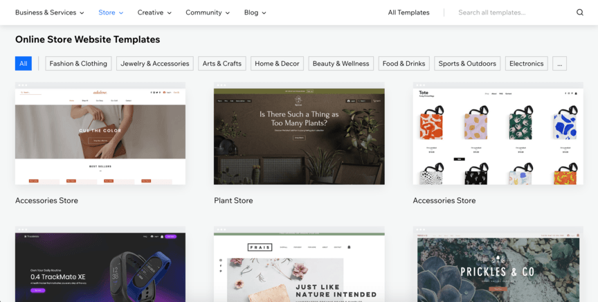
In contrast with Shopify, Wix offers a broad range of template options — to be exact, it has 114 templates dedicated to ecommerce alone, and around 700 others that aren’t specific to ecommerce.
![]()
Winner: Tie
The winner of this category depends on your individual needs. If you prefer precision in your templates, Shopify is your best option in this category. But if you’re looking for a wide variety of options, Wix is the way to go. It all depends on your priorities.
3. Ease of use
Another factor to consider is usability. Which platform makes it easier to build a website?
Shopify
Shopify, unfortunately, does not use an especially user-friendly editor. It requires you to do some back-end editing in addition to the front-end, which can be confusing. However, the final product tends to be easy to navigate since it’s built specifically for ecommerce rather than general web design.
It’s also worth noting that if you need help navigating Shopify’s editor, you can partner with WebFX for our web design services!
Wix
Wix uses a WYSIWYG (what you see is what you get) layout, meaning all you have to do is drag and drop the elements wherever you want to place them. That means it’s effortless and intuitive to use.
Winner: Wix
When it comes to building your site, Wix has the most straightforward layout, making it the clear winner.
4. Integrations and add-ons
Whenever you build an online store, you’ll likely want to integrate it with other platforms. For example, you might have inventory management platforms to keep up with your product stock, marketing platforms to assess user engagement, and more.
Shopify
Shopify allows for a broad range of integrations on its site. In addition to integrations, it allows for plenty of add-ons.
Wix
Unlike Shopify, Wix doesn’t let you integrate many outside platforms. Instead, it focuses more on add-ons — but even then, it still offers fewer add-ons than Shopify does.
Winner: Shopify
Shopify breezes past Wix in this category, making it easily the best choice when it comes to integrations and add-ons.
5. Mobile-friendliness
Finally, it’s critical to consider mobile-friendliness. Over 50% of all web traffic comes from mobile devices, and Google uses a mobile-first index, meaning it ranks sites based on their mobile format.
Shopify
Everything on Shopify is fully responsive, meaning pages restructure themselves to fit the screen where they appear. So, a Shopify page will look different on a computer screen than on a phone.
Wix
Wix, unlike Shopify, does not offer responsive design. Instead, to optimize for mobile, you must restructure your pages manually to ensure that they look good on all devices.
Winner: Shopify
Since Shopify automatically optimizes pages for mobile, it takes the win in this category.
Wix vs. Shopify — the final verdict
Having assessed each of the individual categories above, we can now return to the initial question: Which is better, Wix or Shopify?
If you want to look at the above list as a scoring system, it’s a tie — two decisive wins for each.
However, the winning website builder will depend on your company’s priorities. If you want a platform that’s highly focused on ecommerce and mobile-friendliness, choose Shopify. If you want a platform that’s cheaper and gives you more creative freedom, choose Wix.
We don't just want to tell you about the beautiful work we do
We Want to Show You!
We’ve built over a thousand
Websites in industries like yours
View Our Past Work 
WebFX can help you master your Wix or Shopify ecommerce
Ready to start building your Shopify or Wix ecommerce site? WebFX would love to assist you! We’ve been driving top-tier web design results for over 20 years, and with our web design services, you can avoid relying on preexisting templates or worrying about ease of use.
We can build you an ecommerce website from the ground up, making it fully responsive and visually appealing in the process. You’ll even receive a dedicated account representative to be your point of contact with us throughout the process.
To get started with us, call 888-601-5359 or contact us online today!
The post Shopify vs. Wix: Which Platform Should You Use to Build Your Ecommerce Site? appeared first on WebFX Blog.
Email newsletters are vital to keeping in touch with customers. And they can also serve various purposes, from sharing the latest news to providing helpful reminders. It’s still one of the best ways to reach your audience.
One of the keys to getting conversions (clicks, sales, etc.) is having a clean, easy-to-read newsletter template. But that’s not all. Your newsletters must also be responsive to account for the variety of mobile devices out there.
All told, the goal is to craft emails that are informative and look good on every screen. Thankfully, you don’t have to look far for inspiration. That’s exactly what the simple responsive email newsletter code snippets in today’s collection are for.
These sharply-designed snippets cover a variety of potential use cases. And they’d make a great starting point for your own project. Let’s get started!
Email Template Practice by Regina Catipon
This highly-visual email template provides the perfect look for showcasing your products. The mix of photos and short passages of text will help get the point across without overwhelming users. It encourages readers to click for more details.
See the Pen Email Template Practice by Regina Catipon
Simple Abandoned Cart Email Template by Maizzle
Sticking with eCommerce, abandoned cart emails offer an opportunity to casually remind customers about what’s waiting for them. In this attractive snippet, the message is simple and provides actionable information. It also leverages the popular Tailwind CSS framework.
See the Pen Simple Abandoned Cart Email Template by Maizzle
UI Guild / Email Template by Edmundo Santos
Email clients are still quite limited when it comes to compatibility with the latest CSS techniques. But here’s proof that you can still create something unique. The use of color and typography make this template stand out from the ordinary.
See the Pen UI Guild / Email Template by Edmundo Santos
Invoice email template by chetan
Some types of email messages should be as simple as possible – invoices are one of them. Some basic branding and a clear call to action are vital. It’s a solid example of a single-purpose message that provides users with exactly what they need to know.
See the Pen Invoice email template by chetan
VOH Facebook Live by Alisa Longoria
Event invitations are a great way to drum up interest in virtual or in-person happenings. This snippet not only looks great but also serves as a guide for content strategy. Recipients will instantly know what the event is, when it takes place, and how to register. That’s how you do it!
See the Pen VOH Facebook Live by Alisa Longoria
HTML Email Template – Blog by Josh Beard
Not everyone has time to check out your blog regularly. That’s where an email newsletter can help keep readers up-to-date. What makes this template sparkle is that it allows for effective branding and breaks posts down into bite-sized chunks. It’s easy for a reader to digest in a short period of time.
See the Pen HTML Email Template – Blog by Josh Beard
BMIC Newsletter Template by Tom Markart
Here’s another approach to a news-based email. It focuses on a single article while providing additional clickable headlines below. This might be a terrific option for non-profits who want to highlight a fundraising campaign, while also listing other relevant news. In addition, the typography in this snippet makes the newsletter very easy to read.
See the Pen BMIC Newsletter Template by Tom Markart
Welcome Email Template by Jude Francis
An onboarding email is a great way to welcome new users. Once again, simple is better. This snippet uses white space and clean typography to fill newbies in on the relevant details. Colorful icons also help to make specific items stand out.
See the Pen Welcome Email Template by Jude Francis
Email Templates for Every Need
In many ways, email template design lags in terms of available features. While that may be disappointing, it’s also an opportunity. Because email clients aren’t as savvy as modern web browsers, it forces designers to strip all the bells and whistles away.
This allows us to focus more on simplicity. It’s about promoting the message within rather than wowing readers with fancy extras. That’s something each of the snippets above does quite well.
Want to explore even more template options? Check out our CodePen collection and get inspired!
The post 8 HTML Code Snippets for Creating Responsive Newsletter Templates appeared first on Speckyboy Design Magazine.
Package:
Summary:
Display blog articles on Web pages
Groups:
Author:
Description:
This package can display blog articles on Web pages...
Read more at https://www.phpclasses.org/package/12278-PHP-Display-blog-articles-on-Web-pages.html#2021-11-07-15:57:28
Package:
Summary:
Display blog articles on Web pages
Groups:
Author:
Description:
This package can display blog articles on Web pages...
Read more at https://www.phpclasses.org/package/12278-PHP-Display-blog-articles-on-Web-pages.html#2021-11-07-15:57:28

Does your business book appointments for your customers? If so, giving users the option to schedule an appointment on your website is crucial. Whether you run a medical practice or a hotel, providing online booking is a handy marketing tactic.
But how can you set up booking on your website? If you have a WordPress site, the best route is to use a plugin. In which case, you might wonder: What are the best WordPress booking plugins for businesses?
Below, we’ll go over several booking plugins for WordPress that you can try. Read on to learn more, and then consider partnering with WebFX for our web design services. Just call 888-601-5359 or contact us online today to get started!
We don't just want to tell you about the beautiful work we do
We Want to Show You!
We’ve built over a thousand
Websites in industries like yours
View Our Past Work 
10 best WordPress booking plugins
There are numerous website booking plugins available for your business, but some are better than others. Of course, it depends on your specific needs. For that reason, we’ve compiled a list of top tier booking plugins for WordPress, along with what makes each one stand out.
Here are 10 of the best WordPress booking plugins to consider for your website!
1. Booking and Appointment Plugin for WooCommerce
Price: $119+
![]()
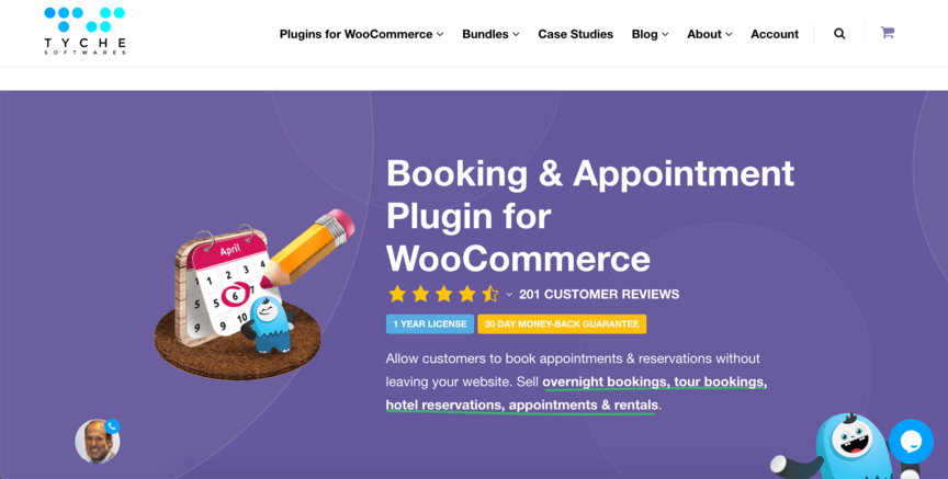
Does your website feature an online store? If so, the Booking and Appointment Plugin for WooCommerce might be the ideal plugin for you.
WooCommerce is a WordPress plugin that helps you set up and run ecommerce sites. If you use WooCommerce for your site, the accompanying Booking and Appointment Plugin is a fantastic additional tool.
When you integrate it with WooCommerce, you can coordinate equipment rentals based on your online store’s inventory.
2. Booked
Price: $49
![]()
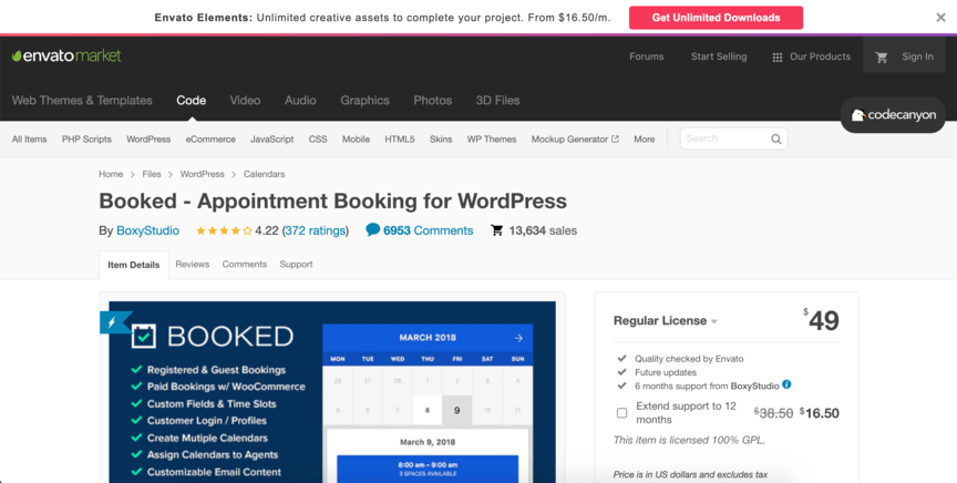
Booked is another website booking plugin, and its value is in its flexibility. While some plugins restrict you in many ways, Booked provides a variety of options.
For starters, you can set the plugin to several different languages. You can also choose from different types of bookings — paid, guest, and registered — and use either a calendar or a list view for your time slots.
3. Booking Calendar
Price: Free, or $60+ for an upgraded version
![]()
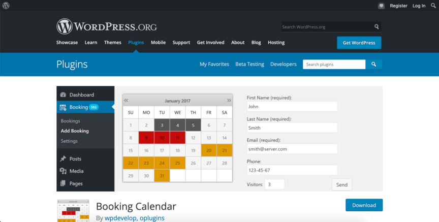
The WooCommerce booking plugin is an excellent tool for integrating with WooCommerce, but what if you want to integrate with a different platform? In that case, you might want to consider Booking Calendar.
Booking Calendar offers integration options with various websites and external calendars, including Google Calendar and TripAdvisor. That means you can keep using whatever booking platforms you’re already using and keep everything connected.
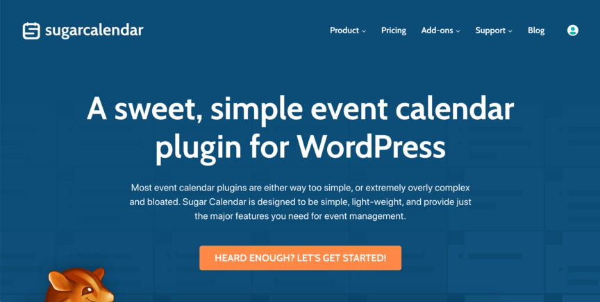
4. Sugar Calendar
Price: $49+
![]()
Many of the plugins on this list boast an extensive list of features on their respective websites. And if you’re looking for a plugin that can do everything, many features will be ideal. But what if you’re new to all this and want something basic?
That’s where Sugar Calendar comes in. Sugar Calendar still has all the necessary features of a booking plugin, including the ability to create schedules and collect payments. However, it’s lightweight and simple to use.
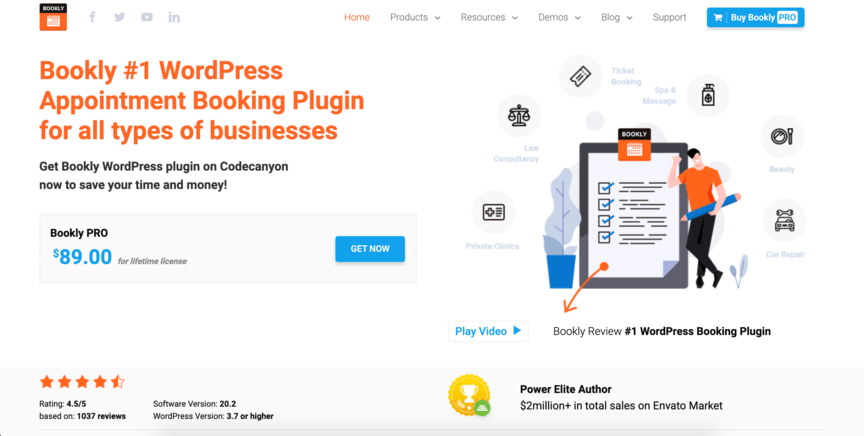
5. Bookly
Price: Free, or $89 for an upgraded version
![]()
Some businesses schedule appointments with different members of their staff. If that describes your business, you’ll want a way to assign appointments to your separate staff members — and Bookly is a great way to do that.
Bookly provides access by multiple people and lets you assign appointments to specific individuals. It even notifies your staff members whenever they’re assigned an appointment.
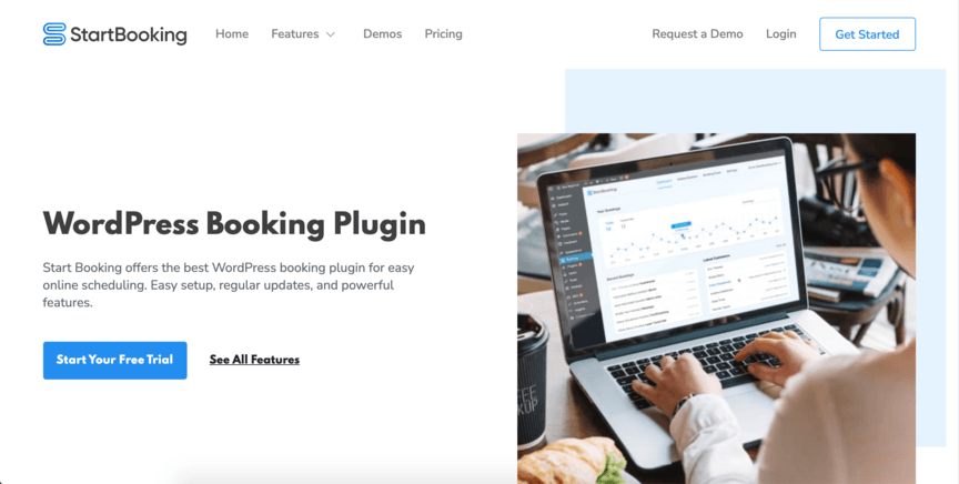
6. StartBooking
Price: $12–$28 monthly
![]()
If your business is trying to set up appointments for servicing, such as car repair, StartBooking is an optimal platform to look into. It presents a clean and easily navigable interface to users where they can set up appointments.
StartBooking lets you create set lists of specific services you offer so that users can choose from them when they set up their appointments. It also has programming to keep you from scheduling overlapping appointments by mistake.
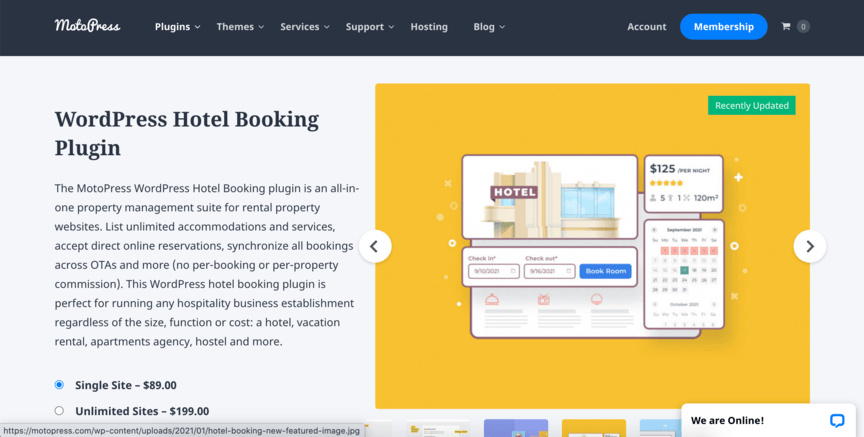
7. MotoPress Hotel Booking
Price: $89
![]()
MotoPress Hotel Booking is distinct from the previous entries on this list because it’s industry-specific. It exists specifically for booking stays at hotels or rental properties.
This plugin uses real-time availability calendars to show how many rooms are currently available, making sure you don’t overbook. It also allows you to list any amenities or special accommodations that come with your rooms.
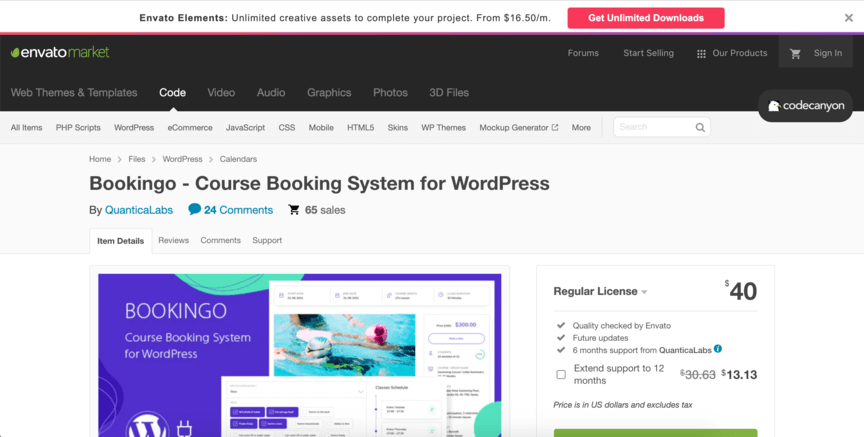
8. Bookingo
Price: $40+
![]()
It may be that your business doesn’t schedule appointments for service, reservations, or purchases, but instead for classes. Maybe the classes are what you’re selling, or maybe they’re part of a marketing campaign you’re offering to users.
Whatever the case, if class scheduling describes you, Bookingo is the perfect tool for your business. It’s built to schedule training or classes.
Unlike other types of appointments, classes are usually scheduled by you in advance, with users then signing up for them afterward. Bookingo accommodates that structure, letting you list all the information about your scheduled classes for users to see.
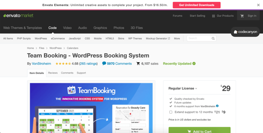
9. Team Booking
Price: $29
![]()
Different businesses have different priorities. Maybe you want a plugin that has tons of features, or maybe you want one that’s simple. But if your priority is affordability, Team Booking is a great plugin to try.
Team Booking provides the same basic function as other booking plugins, but for a considerably lower price. Of course, you may have noticed that a couple of the plugins on this list have a free version.
However, the free versions lack many of the features that make those plugins good to start with, so if you’re not going to pay for the premium version, it’s best to switch to a different plugin. As such, Team Booking is the cheapest paid option on this list, coming in at a low $28.
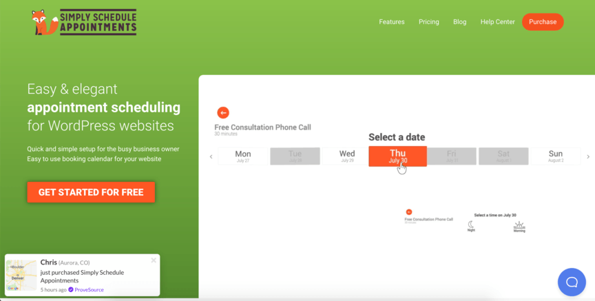
10. Simply Schedule Appointments
Price: Free, or $99+ for an upgraded version
![]()
The final entry on this list is Simply Schedule Appointments (SSA). SSA’s greatest strength is that it lets you schedule multiple types of bookings all in one plugin.
Maybe you offer a particular type of appointment-based service, but you also want to schedule marketing videoconferences. You could set up two separate forms, each with a different format, for those bookings.
Time To Level Up Your Sales
Our long list of services helps you make waves in your industry and increase metrics that matter most - like sales.
IN THE PAST 5 YEARS, WE'VE MANAGED MORE THAN 11.5 MILLION TRANSACTIONS ACROSS OUR CLIENT BASE.
Get a Proposal! 
Let WebFX help you master your booking plugins for WordPress
Ready to choose your WordPress booking plugin and put it into action? WebFX would love to help you out! We’re the experts in web design, and our team of over 300 experts can help you get your plugin fully integrated to drive high-quality results.
With our web design services, you’ll be able to make your website look appealing and function smoothly to create a positive user experience that will drive up revenue for your business.
To get started with us, call 888-601-5359 or contact us online today!
The post The 10 Best WordPress Booking Plugins to Use On Your Website appeared first on WebFX Blog.
Websites change every day. Sure, there are still some sites out there that are eternally frozen in 2010, but most websites — or at least, most business websites — change over time. They put out new content, create new pages, and update their layout to look fresher and more appealing.
Still, there may be a time when you want to go back and see what a page used to look like. When that happens, you may think it’s impossible without a time machine — but it’s not. All you have to do is go back and find a cached version of the page.
But what is web caching, and how can you view a cached page? We’ll answer both of those questions below as we explain how to use a web cache viewer.
Read on to learn more, and then subscribe to Revenue Weekly — our email newsletter — for more digital marketing tips from the agency with over 20 years of experience!
For even more digital marketing advice, sign up for the email that more than 190,000 other marketers trust:
Revenue Weekly!
Sign up Today! 
What is web caching?
Caching refers to the process of saving old versions of web pages.
Let’s say your website looks a certain way one day, and then the next day, you roll out a redesigned version with a whole different layout. You could still view the cached version of your site to see what it looked like before.
In most cases, you’d want to view the most recent version of a page, but sometimes you might even want to go back several caches to find the one you’re looking for. Whatever the case, caching makes it possible.
When might you want to view a cached page?
There are several situations where you might want to pull up a cached version of a page. Here’s a brief overview of the most common scenarios.
1. A page is down
One of the main times you would want to dig into an Internet cache is when a page on a website is down. This could happen for various reasons, including:
- A traffic spike has slowed the page down so much that it won’t load
- The page has been removed from the website
- The page is under maintenance
- The page requires a password where it didn’t previously
In any event, if a page is down that you could view previously, you can still see it by pulling up a cached version.
Keep in mind that you can’t necessarily use any of the functions on a cached page — think of it as a “read-only” version of the page. However, if you just want to view the information there, it can be a valuable resource.
2. Your site is running slowly
Loading a cached page is much faster for Google than loading the current version of a page. That means that when you visit a site for the first time, Google will load the current version — but on subsequent visits, it will use the most recent cache.
In this way, caching pages on your website can drastically improve your page load speeds. When your pages load faster, users will be more inclined to stick around, meaning caching is a way to improve your site traffic and search engine optimization (SEO).
3. You want to look back in time
Sometimes you might want to view a cached page for no reason other than curiosity. If you go far enough back in the archives, you can find versions of a page from years earlier.
This is the closest you can get to hopping in a time machine and traveling back to a site’s past. Maybe you want to see what the content of the page said a long time ago, or maybe you just want to marvel at the old visual design.
Whatever the case, an Internet cache allows you to see pages as they were a long time ago.
How to use a web cache viewer
Now that we know what web caching is and why you might want to use it, how can you view cached web pages? The solution is to use a web cache viewer, or a web cache tool that lets you pull up cached pages.
These web cache tools aren’t complicated or hard to access — on the contrary, they’re extremely accessible! Just try out one of the options below to start viewing previous versions of pages.
1. Find cached pages in Google search results
One of the simplest ways to view a cached version of a page is to pull it up in Google search results. When you find a page in search results, look at the URL listed there. To the right of it, you’ll see a drop-down arrow or three dots.
When you click on that symbol, you should see a button somewhere that says “Cached.” By clicking on that, you can view the most recent cached version of that page.
2. Use the address bar
Another method for viewing cached pages is to use the address bar in your browser. Copy the URL into the address bar as normal, but then type “cache:” at the very beginning. So, if you wanted to visit the most recent cache for webfx.com, you’d type “cache:webfx.com.”
This is the easiest method to use if you already have the exact URL for the page you want, since you can just paste it in and type “cache” to find the cached version in seconds.
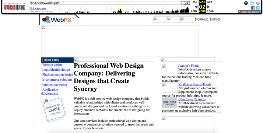
3. Visit the Wayback Machine
As helpful as the previous two methods are, they only allow you to see the most recent version of a page. If you want to go back further in time, the best method is to use the Wayback Machine.
The Wayback Machine is a web cache tool that’s been collecting snapshots of websites across the Internet for years. By typing a URL into its search bar, you can choose from multiple previous snapshots to see how the site used to look.
![]()
4. Try a Chrome extension
Finally, there are a few Chrome extensions that can help you access Internet caches. Web Cache Viewer, in particular, is a useful tool that will let you right-click on links to view their cached versions in either the Wayback Machine or the Google Cache.
This extension offers a quick and easy way to access cached versions if it’s something you plan to do regularly.
We don't just want to tell you about the beautiful work we do
We Want to Show You!
We’ve built over a thousand
Websites in industries like yours
View Our Past Work 
Let WebFX help you optimize your website
Want help caching your website and redesigning it to attract more traffic? WebFX would love to help! We offer top-tier web design services aimed at making your site look more appealing and function more smoothly for users.
When you partner with us, you’ll get help caching your site and more. You’ll also receive a dedicated account representative to keep you in the loop about everything we do for your site.
To get started with us, just call 888-601-5359 or contact us online today!
The post How to Use a Web Cache Viewer to View a Cached Page appeared first on WebFX Blog.
Package:
Summary:
Register event handlers to be loaded dynamically
Groups:
Author:
Description:
This package can register event handlers that are loaded dynamically...
Read more at https://www.phpclasses.org/package/12277-PHP-Register-event-handlers-to-be-loaded-dynamically.html#2021-11-06-15:54:15


