Monthly Archiv: October, 2021
Package:
Summary:
Application to manage schools in Indonesia
Groups:
Author:
Description:
This package provides an application to manage schools in Indonesia...
Read more at https://www.phpclasses.org/package/12242-PHP-Application-to-manage-schools-in-Indonesia.html

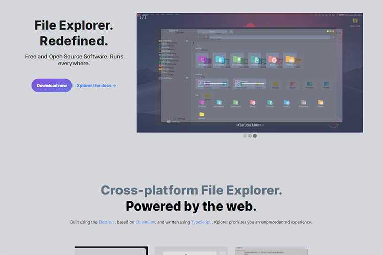
Xplorer – This cross-platform file explorer software works via web technologies.
Changing Hands: Should You Worry When a WordPress Plugin Has a New Owner? – Why a change in ownership can be a reason for cautious optimism.

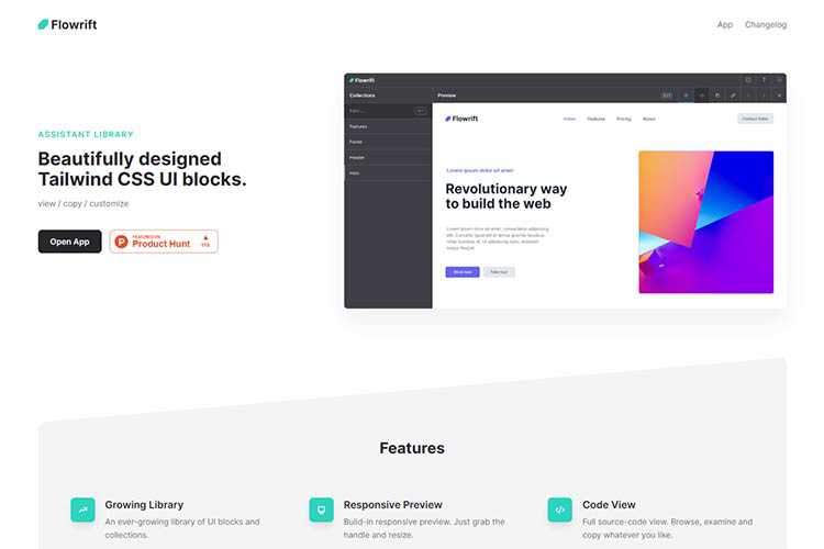
Flowrift – Check out this library made of beautifully designed Tailwind CSS UI blocks.
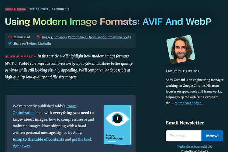
Using Modern Image Formats: AVIF And WebP – A compression and performance comparison of old-school and modern image formats.
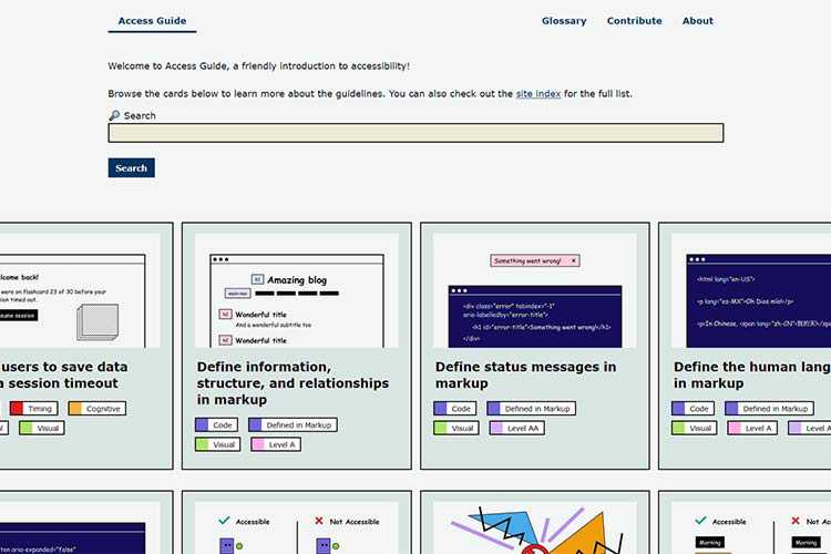
Access Guide – Bookmark this friendly resource that walks you through various accessibility guidelines.
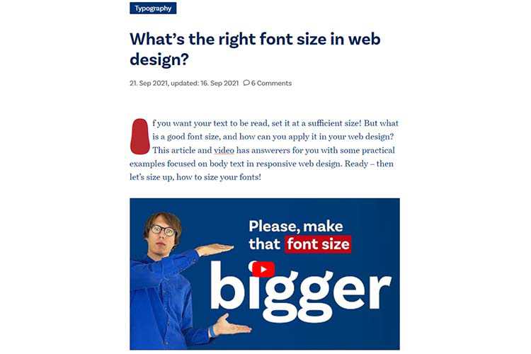
What’s the right font size in web design? – Things to consider when setting the size of your type.
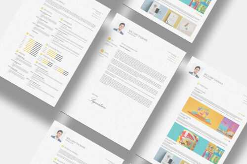
10 Free InDesign Templates for Creating Professional Resumes – Stand out from the competition by using one of these excellent resume templates.
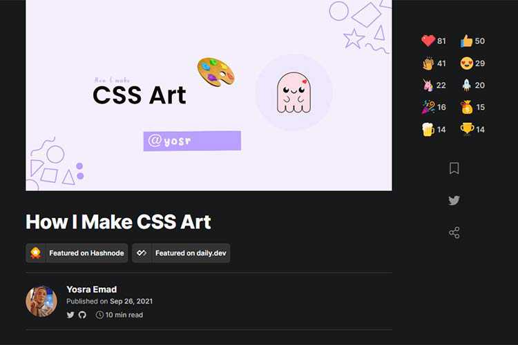
How I Make CSS Art – A look at how you can express your creativity through CSS.
10 Free WordPress Plugins for Adding jQuery Effects to Your Site – Leverage the power of jQuery on your website without having to write any code.

How a Designer Might Create Timeless Designs – Exploring what makes a design “timeless”, and how you might go about creating one of your own.
Kinetic Typography Page Transition – Build a UI where background letters come into the foreground and reveal a new content level.
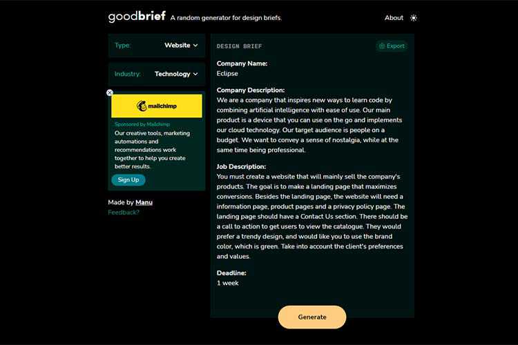
goodbrief – This design brief generator can help to get your creativity flowing.
The Impossible Question: How Long Does It Take to Build a Website? – Exploring some factors that can impact your project’s launch date, with tips for making more accurate projections.

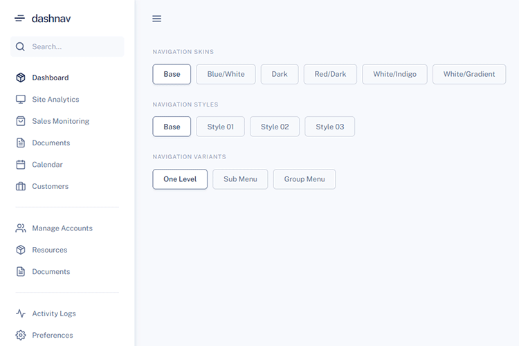
DashNav – Grab a copy of this free dashboard navigation kit based on Bootstrap 5.
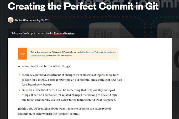
Creating the Perfect Commit in Git – How to make commits that are both clean and granular in focus.
The 15 Best Free eCommerce & Shopping Themes for WordPress – Take your online store to the next level with one of these free WordPress themes.
The post Weekly News for Designers № 613 appeared first on Speckyboy Design Magazine.
Package:
Summary:
Manage the content of a site that can be searched
Groups:
Author:
Description:
This package can manage the content of a site that can be searched...
Read more at https://www.phpclasses.org/package/12244-PHP-Manage-the-content-of-a-site-that-can-be-searched.html#2021-10-07-18:46:14

Package:
Summary:
Apply effects on images and convert their formats
Groups:
Author:
Description:
This class can apply effects on images and convert their formats...
Read more at https://www.phpclasses.org/package/12240-PHP-Apply-effects-on-images-and-convert-their-formats.html#2021-10-07-14:31:55

Mobile devices have taken over the web. Thus, so much designer attention has (rightly) gone towards ensuring that the websites we build are compatible. We are constantly refining how we implement responsive features so that they work flawlessly on small screens.
While this is a worthwhile endeavor, there are other screens to think about. Large viewports are also a pretty important consideration. It’s rare to find new desktop or laptop devices with screen resolutions below 1080p (1920 x 1080). And both 4k (3840 × 2160) and 8k (7680 x 4320) monitors provide even more screen real estate.
Taking advantage of large screens can be a challenge. The key is in creating a layout that is both usable and legible. In addition, care must be taken to avoid overwhelming users by placing too much in front of them.
If you’re looking to build a website that takes advantage of large screens, we’ve put together some general rules of thumb. They may not fit every situation but will provide you with some factors to mull over before you go big.
Scale Text and Parent Containers Accordingly
Full-width text on a 1080p or 4k screen is a big no-no. It takes too much effort to read and keep track of where you are within a passage. The more text you have, the more difficult it will be for users to digest.
Therefore, text works better when it’s within a limited-width container. Consider an ideal width to be no more than 900-1200 pixels. Whitespace is also important as it allows for some breathing room. Experiment with various container sizes, margins and padding to find what works best with your layout.
Font sizing is also a key factor when designing for large screens. Increasing the font size helps text to stand out and also limits the number of characters displayed on a given line.
Finally, consider increasing the CSS line-height property for adequate vertical spacing between lines. This improves legibility and adds some openness to the overall design.

The Atlantic limits article text to a narrow, easy-to-read container.
Take Advantage of Multi-Column Layouts
One of the big advantages of utilizing extra screen real estate is that it provides plenty of room for multi-column layouts. Perhaps that’s why this technique is often seen on news-oriented websites.
With a traditional 1,000-pixel grid and a layout consisting of three or more columns, the content within tends to get squeezed. A page width of, say, 1,800 pixels allows columns to be spaced with substantial margins. And there’s still room to add internal column padding while bumping the font size up as well.
A wider page can also enable the use of some advanced column configurations. For example, think of a “Latest News” area that takes up the left half of the page – complete with a featured image. Then, two 25% width columns show other text-based headlines to the right.
This may be the perfect type of layout for large screens. It avoids wasted space while potentially making it easier for users to identify content that interests them.
Even better is that a combination of CSS Grid and media queries allow you to cater to the biggest screen resolutions while gracefully adapting to smaller ones.
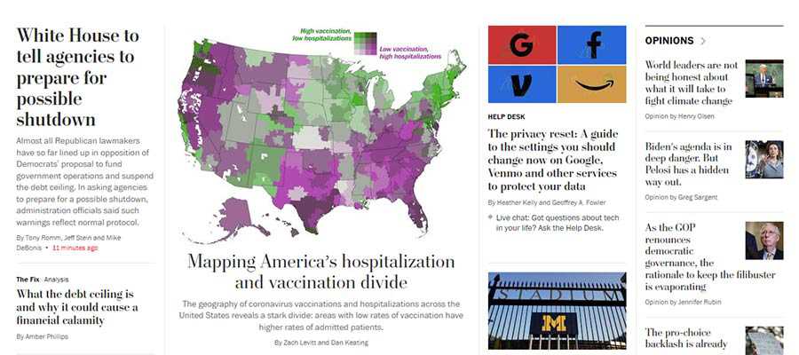
The multi-column home page of The Washington Post.
Keep Important Items within Reach
Among the potential pitfalls of a super-wide layout is that some key items may require the user’s cursor to travel quite a long distance. At the very least, it’s an inconvenience and poor UX. At worst, it might be considered a pretty big accessibility issue.
However, these concerns can be addressed through design. A top navigation bar can be horizontally centered on the screen so that it doesn’t require a ton of mouse movement. Making it keyboard-friendly can ensure it’s accessible for those who don’t use a pointing device.
The extra width also means that other important pieces could easily get lost in a forest full of content. Elements such as login forms and calls-to-action need to be placed in highly-visible areas.
Integrating them into the site’s header or a static sidebar are possible solutions. A “sticky” header may also provide a path for keeping the most important items consistently within reach.
There’s plenty of room for creativity. But the main idea is making sure that users don’t have to constantly traverse the width of their screen to get to where they want to go.
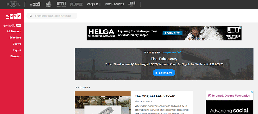
WNYC Radio utilizes a brightly-colored static sidebar to keep their website navigation in view.
Use Predictable Design Patterns
Taking all of the above into consideration, the overarching theme is in creating a predictable design pattern. This means that the website’s layout allows content to flow in an intuitive manner. While certain items can be designed to draw attention, they shouldn’t detract from the overall user experience.
How does this work in practice? One example is the aforementioned multi-column layout. There may be several sections on a page that utilize columns, each with their own unique number and positioning. That’s fine, so long as there are consistencies in spacing, typography and related styles.
On a news-oriented website, this might mean that the “Technology” and “Editorial” sections have different column layouts. The “Latest News” section could even utilize a different background color. If they are consistent in look, however, it helps to create a flow while also avoiding a monotonous browsing experience. Each section stands out, yet blends into the overall design.
As with any design project, a lot of planning and experimentation is needed when designing with large screens in mind.

LG utilizes an alternating pattern of column layouts on their home page.
Make Effective Use of Those Extra Pixels
The beauty of large, high-resolution screens is that they can be used to create an immersive experience. We see it all the time with games, movies and other media.
Accomplishing this with a website is a bit more of a challenge, though. It’s especially difficult with a text-heavy site. There are some definite risks when it comes to usability.
Still, a well-crafted layout can effectively take advantage of the extra screen real estate. It’s a matter of ensuring easy navigation, legibility and consistency in design.
However, these are the principles that web designers practice each and every day. Keep them in mind and you’ll create a website that looks pixel-perfect on everything from a handheld phone to a massive 8k monitor.
The post The Challenge of Designing Websites for Large Screens appeared first on Speckyboy Design Magazine.
Another open source program for Windows and macOS has been added to the
Free Video Converters
or Transcoders. Such software lets you convert video or movies between different formats.
Package:
Summary:
Apply effects on images and convert their formats
Groups:
Author:
Description:
This class can apply effects on images and convert their formats...
Read more at https://www.phpclasses.org/package/12240-PHP-Apply-effects-on-images-and-convert-their-formats.html#2021-10-06-13:31:15

Package:
Summary:
Create and expand short URLs in a custom domain
Groups:
Author:
Description:
This class can create and expand short URLs in a custom domain...
Read more at https://www.phpclasses.org/package/12241-PHP-Create-and-expand-short-URLs-in-a-custom-domain.html#2021-10-06-01:23:59

Package:
Summary:
urlshortner
Groups:
Author:
Description:
This class can create and expand short URLs in a custom domain...
Read more at https://www.phpclasses.org/package/12241-PHP-urlshortner.html#2021-10-06-01:23:59

Web designers are always looking for inspiration. Something that will jumpstart our creativity and lead us to reach new heights.
Quite often, we find what we’re looking for by studying other websites. And there’s certainly nothing wrong with that. Design communities such as Awwwards and Behance offer plenty of worthy examples. The very best of these websites is something we can learn from and aspire to.
But it can also be beneficial to explore other forms of design. Websites may be the most relevant, but they certainly aren’t the only creations that can inspire us.
Take classic video games, for example. Sure, they may not be much to look at in terms of graphics. Those pale by today’s standards.
But they do have something to say about usability and intuitive design. And those are lessons that web designers can take to heart.
Press Play for Hours of Fun
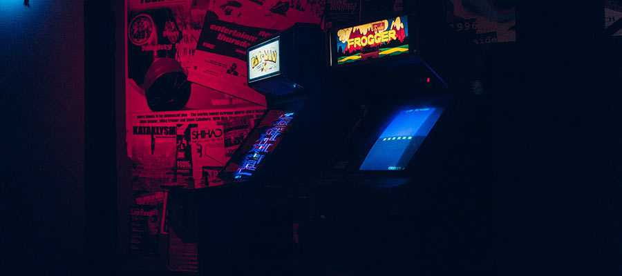
Some of my fondest childhood memories were made in the arcade. For a small-town kid, the arcade was a place to explore the world (along with a few outer galaxies).
By dropping my quarter into a game’s slot, I could be anything and everything. A pilot, racecar driver, athlete, or commando. The only limits were the number of coins in my mother’s purse (or those she was willing to part with, at least).
Much to the chagrin of dear old mom, I could turn just a few of those quarters into a whole lot of playing time. I can still recall her walking up to me in the middle of an intense game, tapping my shoulder and asking when I was going to be done.
My response? “Aw, can’t dinner wait? I’m winning!”
This brings a smile to my face – but also a thought. How was I able to make those coins last for so long? I wasn’t a particularly skilled player. For sure, there were other kids who stretched their minuscule allowances even further.
What was the secret to my hours-long gaming sessions? Maybe it had something to do with how those games were designed…
The Challenges of Arcade Game Design
One can imagine the challenges faced by game designers – especially in an era when technology wasn’t so advanced. Chief among them was creating a game that anyone can reasonably master within a few minutes.
This was vital in a fast-paced arcade environment. The machine not only had to grab a potential player’s attention, but it also had to quickly educate them in the quest to create a loyal customer.
Regardless of the game’s premise, there were a common set of usability concerns to think about:
- Instructions for play had to be minimal. They were either printed in tiny fonts directly on the machine or displayed on the screen. Either way, designers couldn’t expect players to spend a lot of time reading. Therefore, only the basics could be covered.
- Controller options were limited. In many cases, a couple of buttons and joysticks were the main instruments. Steering wheels, pedals, and trackballs were also possibilities. Designers had to work within these limitations without making things too complex.
- The game needed to guide players. Since there were no detailed instruction manuals or online resources, the game had to lead users in the right direction. This was often done through the demo mode that was displayed before players inserted a coin. It helped attract people to the game and show them how it was played. In-game helpers like arrows or other visual cues also played a role.
These could be monumental challenges for game designers. But the most enduring games seem to be the ones that got it right.
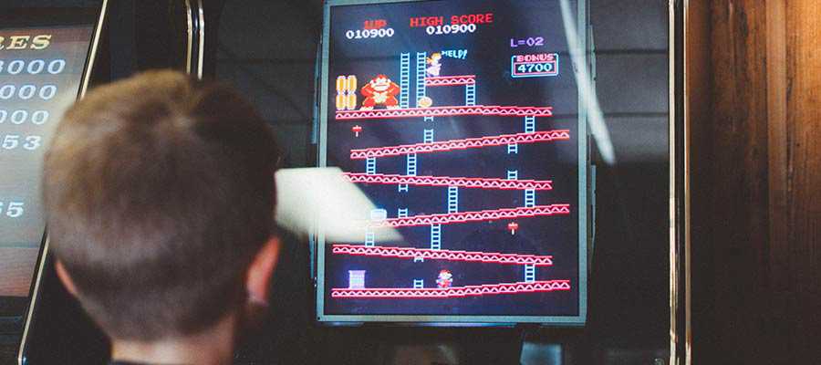
One shining example is the longtime favorite PAC-MAN. There’s no big secret as to why it has endeared itself to gamers for over 40 years.
By watching the game’s demo mode, a player could gain a clear understanding of what it was all about. The dead-simple joystick control required very little physical skill.
Within a couple of minutes, you could find your way around the maze, elude a few ghosts, and conquer that first level. Even as subsequent levels became harder, it always left you wanting more.
That sounds a little bit like what web designers strive to accomplish, no?

What Do Websites and Video Games Have in Common?
Perhaps websites and old-school video games are a few lightyears apart in terms of technology. But many of their end goals are strikingly similar.
In both cases, designers have very little time to make a first impression. If a website doesn’t provide users with an immediate path forward, it’s likely “game over.”
Games drew attention with flashing screens and loud noises. That was necessary for a busy, competitive environment. Websites have to be a bit more subtle. But the desired result is the same – to entice users to stick around and keep coming back.
And, just as with classic games, a simple UI tends to work better on the web. A website that is too hard to navigate or fails to meet accessibility standards will not become a fan favorite.
The worst games tended to be the most overwhelming to play. The same can be said for poorly designed websites. No one wants to waste their time and money on something that isn’t enjoyable to use.
Then there’s the challenge of educating users on completing specific tasks. In the world of web design, visual cues like onboarding UIs and microinteractions are the name of the game.
Learn from the Classics
Back when I first became a web user, I experienced feelings of awe and wonder. Never being one to pick up on the obvious, it took me a few years to realize when and where I’d felt that way before.
Just as the arcade could easily transport me into a scene from Star Wars, the web took me to all kinds of places I’d never been. Once again, it felt like the universe was at my fingertips.
And now, in the same spirit of game designers from back in the day, being a web designer means guiding users. It’s about building an interface that takes people where they want to go.
The details of the mission may be different. But the goal is still to get users on to that next level.
The post Want UX Inspiration? Look To Classic Video Games appeared first on Speckyboy Design Magazine.
