laravel-translatable (New)
Read more at https://www.phpclasses.org/package/12146-PHP-Provide-text-translations-to-use-in-model-classes.html
Your navigation bar is one of the most important parts of your website — that’s because it provides users with a roadmap of the most important pages you provide.
Not only that, but a well-designed UX navigation bar will also showcase the products and services you offer.
So, what are UX navigation best practices in 2021? On this page, we’ll talk about:
If you want to dive into your site’s UX navigation, but aren’t sure where to start, contact us online or give us a call at 888-601-5359 to learn more about our UX design services!
“UX” is a shortened version of “user experience.” When UX precedes a design element, like navigation, it means that you’re designing something with the user in mind to ensure that they have a fantastic experience.
That said, a well-designed UX navigation is created so that the user has the best experience traversing through a website.
There are a few reasons why your UX navigation is important to your website. Here are a few:
The purpose of a navigation bar is to serve site visitors your most important pages on a silver platter.
A well-done UX navigation design will serve users exactly what they’re interested in and keep them from bouncing from your website.
To determine the most important pages of your site, consider why you want users to visit your site in the first place — is it to sell a product, inform them about your business, beat out the competition?
If you offer products or services, those pages are crucial to your UX navigation. If your brand message and values are important to your product, you should consider adding that to your nav bar as well. If you’re looking to beat out the competition, don’t be scared to create a page called “What makes us better than the competition?” and add it to your navigation.
By giving users what they want in the navigation bar, they’ll have a fantastic experience on your website.
If you offer products or services, adding a tab in your UX navigation structure is paramount. Not only does this strategy teach site visitors what you offer, but it also creates a hub of product and service info for users — no matter where they are on your site.
Check out the way Hand and Stone Massage uses tabs to separate their services and outline what they offer.

The purpose of a homepage is to interest and engage users, and to do so, sometimes a product or service list appears below the fold. Above the fold is typically reserved for a flashy animation, a form, or a video of the agency at work.
That said, adding a product and service tab to your UX navigation structure is the perfect solution — enabling you to show site visitors exactly what you offer right off the bat, and as a resource on every page they browse.
If users can’ find what they need, they’ll bounce from your site. Bounce rate is a metric that measures how many people visit your site and then leave after only viewing one page.
A high bounce rate is a signal to Google that you don’t provide the information that users are looking for and could cause them to rank you lower in search.
Providing UX navigation also increases engagement with your site, which improves dwell time.
Dwell time and bounce rate are both metrics that Google considers when ranking your website.
Net Promoter Score is the leading metric for customer satisfaction.
WebFX clients score 394% higher than the industry average.
Below are some UX navigation design best practices that will ensure a successful navigation bar.
This sentiment holds true in baking, fitness, and your UX navigation.
A navigation bar should be consistent in two ways:
Your UX navigation should flow with the rest of your site’s design, and mesh well with every page. Your web designer can help you with this!
Speaking of every page, you should use the same UX navigation on every page — and we don’t just mean the tabs of your navigation. For example, you shouldn’t have a full mega navigation on your home page and then switch to a hamburger menu navigation on your other pages.
Be consistent with the placement and design of your UX navigation for the best results.
When you’re looking at a map, chances are you don’t want to see every restaurant and hotel within a five-mile radius of your destination — after all, that would clutter your map and make it difficult to find what you want.
That said, simplicity is best when it comes to UX navigation.
Of course, your navigation bar’s design should match the rest of your site, but it’s best to leave out patterned backgrounds and loads of graphics. You should design your navigation bar with two to three colors and fonts to promote consistency.
Have you ever visited a website that had a drop-down navigation bar that showed, seemingly, every page on their site? As a site visitor, a loaded navigation bar can be overwhelming, and may even deter a user from sticking around.
As a UX navigation best practice in 2021, opt for a short and sweet navigation bar that only outlines your most important pages. There’s no need to list every single product and service, but instead, batch them out into categories.
For example, if you sell platform heels, stilettos, and square heels, you can simply categorize these as “heels.”
Not only does it simplify your UX navigation, but you’ll avoid overwhelming site visitors.
When creating navigation for your site, you have to keep UX mobile navigation in mind as well. In fact, it should be at the top of your list of things to consider when designing your navigation bar.
That’s because your UX mobile navigation can make or break your site for mobile viewers. If done incorrectly, your navigation will make it difficult for users to find what they’re looking for, and it could even hinder their view of your website altogether.
As a UX navigation best practice, you should always ensure that you have a mobile version as well and keep UX mobile navigation top of mind.
We don't just want to tell you about the beautiful work we do.
We've built over
We create with the user in mind, and the design of your UX navigation is no exception. Not only can we create a UX navigation design that fits your brand, but we can build an entire website around your products and services.
Our web design services are customized based on your needs. We offer a web design cost calculator that allows you to plug in:
These numbers allow us to give you a custom quote based on your unique needs and vision for your new website.
We’ve won a variety of awards for our web designs, and we can’t wait to add yours to the list!
If you’re looking for a website design, redesign, or just need help creating an effective UX navigation structure, WebFX is here for you. Contact us online for a free quote or give us a call at 888-601-5359!
The post UX Navigation: Your All-In-One Guide to UX Navigation Design appeared first on WebFX Blog.
Schema API for the Semantic Web – Use this tool to view the web just like Google does, by fetching the structured data of any webpage.

How to Help Your Clients Overcome Fear of Commitment – Tips for keeping both your clients and projects on task.

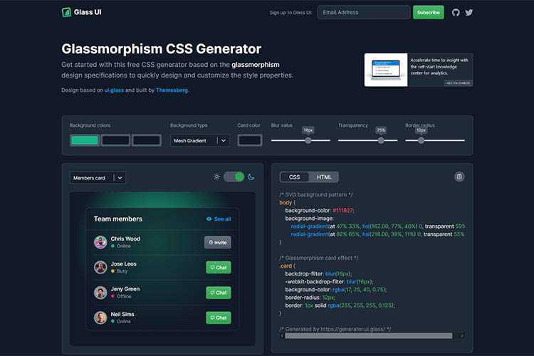
Glassmorphism CSS Generator – Create a beautiful glass effect with the help of this handy tool.
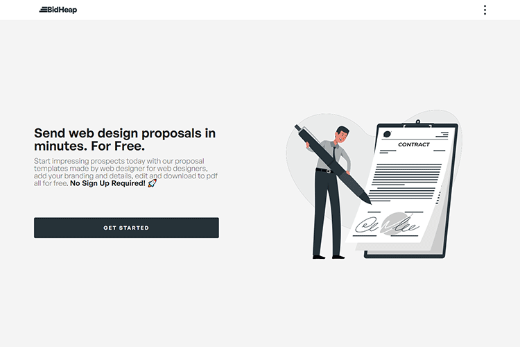
BidHeap – Download customizable web design proposal templates for free.
JS Is Weird – Take a quiz spanning 25 quirky JavaScript expressions and try to guess the output.

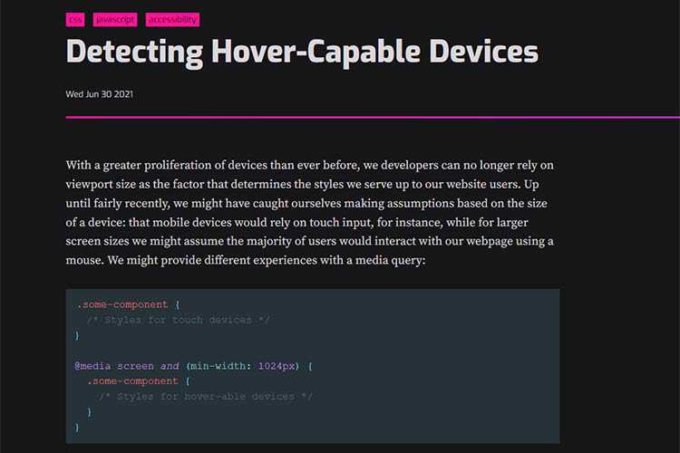
Detecting Hover-Capable Devices – Learn how CSS Level 5 Media Queries will allow developers to detect hover capabilities.
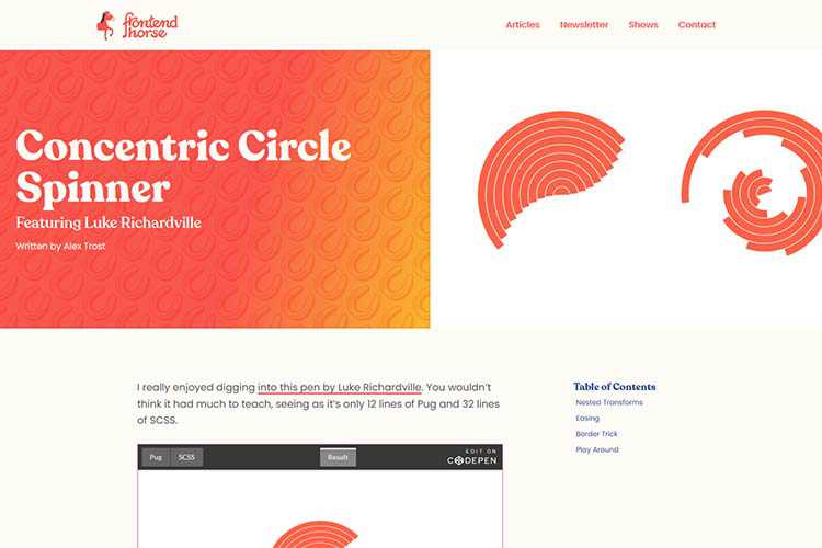
Concentric Circle Spinner – The ingredients of a surprisingly-robust loading animation.
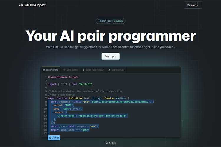
GitHub Copilot – This new feature will provide suggestions for whole lines or functions within your code editor.
10 CSS & JavaScript Snippets for Creating the Parallax Scrolling Effect – Stunning examples of parallax scrolling that you can implement on your own website.

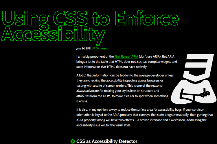
Using CSS to Enforce Accessibility – A look at ways CSS can be used in conjunction with ARIA states.
The 15 Best Free Calligraphy Fonts – Add a touch of elegance to your projects with these outstanding free fonts.

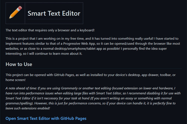
Smart Text Editor – This browser-based text editor can be opened via GitHub pages or installed directly on your device.
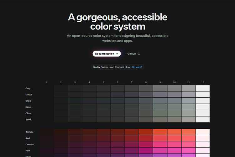
Radix UI – An open-source color system for designing beautiful, accessible websites and apps.
The WordPress Widgets Screen Joins the Gutenberg Era – Take a sneak peek at the new Widgets screen coming to WordPress 5.8.

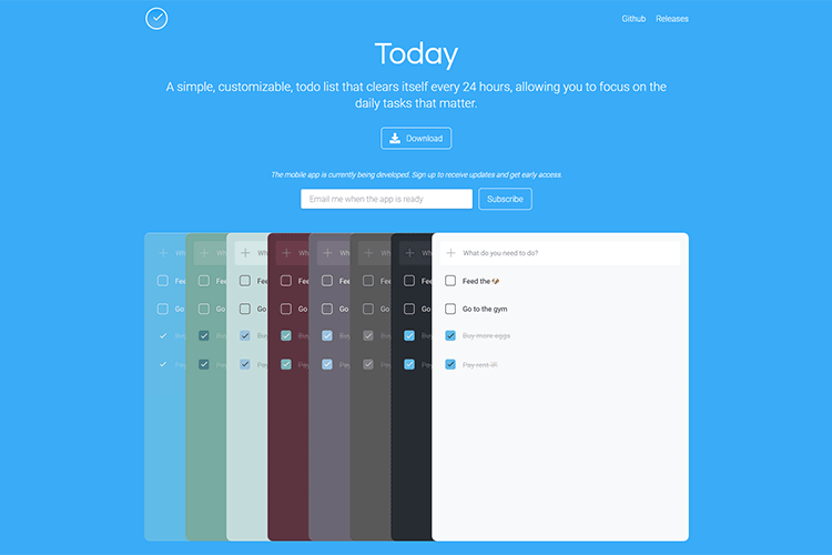
Today – This minimalist to-do list clears itself out every 24 hours.
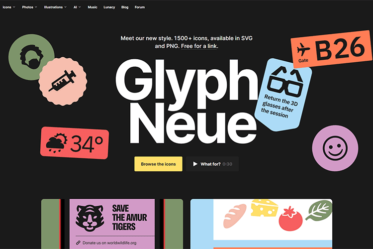
Glyph Neue – Check out this massive collection of 1500+ SVG/PNG icons.
Dealing with Terrible Business Ideas from Your Clients – Learn how to spot startup clients that may not last.

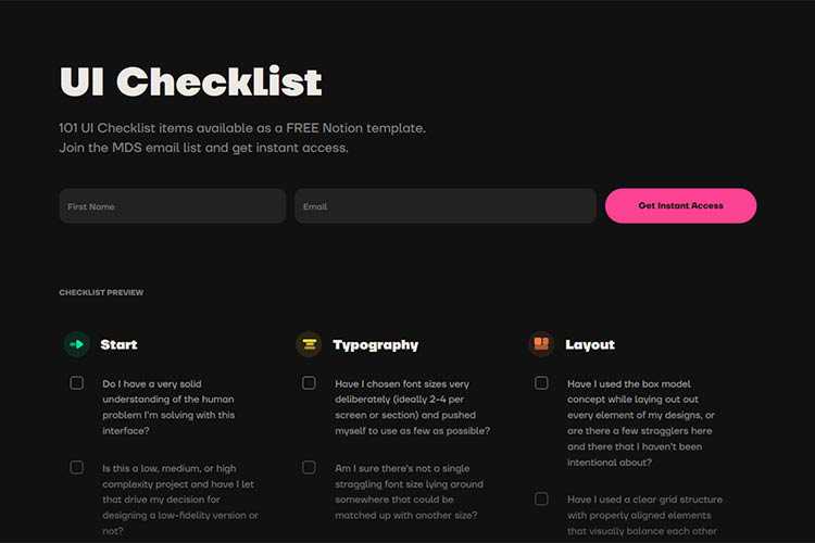
UI Checklist – Keep this handy checklist close at hand to ensure an awesome UI.
The post Weekly News for Designers № 600 appeared first on Speckyboy Design Magazine.
As a developer or designer, it is often helpful to have multiple monitors to increase the amount of screen real estate you have, which in turn can lead to higher productivity. For instance, you may have one screen as your primary monitor where you perform your work, and another one that has your email client, Skype, IM client, Twitter client, and other communication apps that you can easily monitor and switch to.
We’d like to share several freeware and open source tools available for download to help you harness the power of multi-display setups and get you up and running quickly. We hope that you might find the perfect dual monitor software free tools for you!
Synergy is free dual monitor software that lets users of multi-monitor workstations share a mouse and keyboard between several displays. All you have to do is move the mouse cursor off the edge of one display to have it on another adjacent display. It also creates a single virtual clipboard to allow the copy and pasting across the many displays. With Synergy comes a handy module for synchronizing your screensavers across multiple displays so that they run in tandem. If there is a password required after screensaver mode, you only have to type in the password into one monitor to activate all the others. There is also a fork of Synergy called Synergy+ that you can check out on Google Code.
Input Director is multi-display software that grants you the ability to use a single keyboard and mouse on a multi-computer set up, making it the ideal solution for networked computers, a common situation where professionals have more than one computer (such as a desktop and laptop). All you have to do is move the pointer off the edge of the display and it appears on the adjacent monitor on that side, making it the active monitor.
UltraMon is a great tool for multi-display computer configurations that can support up to 10 monitors. It allows you to set custom features for each monitor such as resolution, wallpaper, and taskbar settings. UltraMon allows for the moving of running programs from the primary display to the secondary (and vice versa). Each of the monitors will have their own taskbar showing you the applications running on them. You can predefine and save monitor settings, as well as position where a program opens from the shortcut menu to help speed up your workflow. It also has a feature for easily turning off secondary monitors to conserve electricity consumption when you don’t need them and to reduce distraction when they’re not in use.
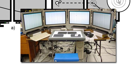
This app saves you from the hassle of having to drag your mouse off the desk as you try to get to the farthest monitor in a multi-monitor environment. It immediately warps your cursor across the borders of the display on demand and runs in the background to avoid taxing the systems resources. It is accessible from the system tray where you can change the settings at will. It also speeds up mouse targeting by an estimated 30%. The convenience that it creates makes it one of the best multi-monitor software choices.
MultiMon Taskbar lets you have unique taskbars for each monitor, helping you to easily organize your applications across multiple computer screens. It has a move-to-monitor button accessible from all Windows programs for convenience and ease of movement from one monitor to another. In addition, MultiMon has a clipboard extender module for synchronizing your clipboards across multiple displays, making copy and pasting between networked computers a breeze.
Do you use multiple monitors? Are you looking into using multiple monitors? Do you hate multi-monitor setups? Share your thoughts, opinions, and advice in the comments.
The post Five Free Tools for Multi-Monitor Computer Set-Ups appeared first on WebFX Blog.
In this episode of "PHP Internals News" I chat with Nikita Popov (Twitter, GitHub, Website) about the "Read Only Properties" RFC.
The RSS feed for this podcast is https://derickrethans.nl/feed-phpinternalsnews.xml, you can download this episode's MP3 file, and it's available on Spotify and iTunes. There is a dedicated website: https://phpinternals.news
Hi, I'm Derick. Welcome to PHP internals news, a podcast dedicated to explaining the latest developments in the PHP language. This is Episode 90. Today I'm talking with Nikita Popov about the read only properties version two RFC that he's proposing. Nikita, would you please introduce yourself?
Hi, Derick. I'm Nikita and I do PHP core development work by JetBrains.
What does this RFC proposing?
This RFC is proposing read only properties, which means that the property can only be initialized once and then not changed afterwards. Again, the idea here is that since PHP 7.4, we have typed properties. A remaining problem with them is that people are not confident making public type properties because they still ensure that the type is correct, but they might not be upholding other invariants. For example, if you have some, like additional checks in your constructor, that string property is actually a non empty string property, then you might not want to make it public because then it could be modified to an empty value for example. One nowadays fairly common case is where properties are actually only initialized in the constructor and not changed afterwards any more. So I think this kind of mutable object pattern is becoming more and more popular in PHP.
You mean the immutable object?
Sorry, immutable. And read only properties address that case. So you can simply put a public read only typed property in your class, and then it can be initialized once in the constructor and you can be... You don't have to be afraid that someone outside the class is going to modify it afterwards. That's the basic premise of this RFC.
But it also means that objects of the class itself can modify that value any more, either.
Exactly. So that's, I think, a primary distinction we have to make. Genuinely, there are two ways to make this read only concept work. One is like actually read only or maybe more precisely init once, which is what this RFC proposes. We can only set that once and then even in the same class, you can't modify it again. And the alternative is the asymmetric visibility approach where you say that, okay, only in the public scope, the property can only be read, but in the private scope, you can modify it. I think the distinction there is very important, because read only property tells you that it's genuinely read only, like, if you access a property multiple times in sequence, you will always get back the same value. While the asymmetric visibility only says that the public interface is read only, but internally, it could be mutated. And that might like be, you know, intentional, just that you want to like have your state management private, but that the property is not supposed to be immutable.
How's this RFC different from read only properties, version one?
Read only pr
Truncated by Planet PHP, read more at the original (another 15552 bytes)
It’s late in the day, and you’re working hard on a project. Hours have seemingly flown by in a flash. You haven’t eaten anything since this morning, but you don’t really feel hungry. The only time you’ve moved has been to refill your coffee, and even as you are pouring a cup, your mind is churning over the project – you can’t seem to get enough of it.
You rush back to the task at hand instead of rushing for freedom, even as the hour hand hits five o’clock and rolls on to six. But you don’t feel tired. You may even feel energized. You are super creative! You are at one with the project!
Congratulations, you have found flow!

First proposed by Mihály Csíkszentmihályi, flow is a mental state in which a person is fully immersed in a feeling of energized focus, full involvement, and enjoyment in the participation of an activity.
In essence, flow is characterized by complete absorption in what one is doing. Flow can happen with many types of activities: This positive psychology concept has been widely referenced across a variety of fields, from education to music to sports and even video games.
If you have the time, you should watch this video, and let Mr. Csíkszentmihályi tell you about ‘flow’ himself:
Flow is also a priceless state of mind when it comes to work-related tasks. When someone is in flow, they can get a lot of tasks accomplished, do it well, and often quicker than expected. It’s a time when self seems to fall away, while concentration, energy, and skill combine.
You can’t bottle it, and you can’t buy it. No, really, there’s no way to replicate flow. It happens when it happens.
It is something that happens organically when you enjoy what you’re doing, but what if you could will yourself into a feeling of flow? Think of how much you could get done if you could find a way to induce that state of mind when you needed it most.
While there are no sure-fire ways to put yourself into a true, hunger-ignoring, time-warping, creativity-magnifying state of mind, there are several things you can do to try to encourage your brain to start going with the flow.
This is a two-fold equation. First, you have to know what you’re working on and what is expected at the end. Second, you have to know that the project you’re working on is within your skillset and that you’re capable of carrying it out.
This requires you to know a lot about the task before you even start. I’d daresay you want to know everything you can: Stopping and starting to ask questions or track down materials puts a damper on flow.
The biggest disruptors of flow are distractions. Do your best to eliminate those within your control, like putting your phone on silent, closing down your email app, and ignoring your social media apps.
Some distractions may be harder to eliminate, though, especially if you work in an office. You could ask coworkers beforehand if they’ll need anything from you before you dedicate your time to the big project you’re about to start.
Once you know what they’ll need and when, let them know politely that you’d like not to be disturbed for the next few hours. Try blocking off the time on your calendar so people won’t try to schedule meetings. Do everything you can to grab a few solid hours to focus only on the project at hand.

Pain or discomfort will inhibit your ability to concentrate. Case in point, the writing of this article was delayed several times due to a headache and a shoulder injury. Though I could have written an effective article with either, I knew the pain would make it hard to get fully immersed in the project, which could lead to typos and grammar errors.
Wear clothing in which you can relax, sit in a comfortable chair with your tools (pen, paper, laptop, tablet, whatever), and everything else that you may need, at a comfortable level in front of you.
Like pain or discomfort, hunger and thirst will also pull you out of your concentration. Have something filling and healthy to eat before starting a big project.
Foods with beneficial omega fatty acids, like fish and eggs, as well as whole grains, fruits, and vegetables, are good for your brain. They help to supply energy and vitamins when you need to think clearly.

About 78% of your brain is made up of water. That’s a high percentage, which means even a little bit of dehydration can have a negative effect on your performance.,/p>
Keep some water close by and perhaps another beverage with electrolytes like juice or a sports drink. Be careful with sweet drinks, especially if you are susceptible to sugar crashes.
Make your surroundings as attractive as possible. If you have enough control over your space to paint walls and add decorations that inspire you. That’s perfect because you can turn your entire environment into the perfect place to work.
If you can’t do that, the very least you can do is to make the area clean and orderly. Add some inspiring personal items that you can, like photographs of loved ones.
The hustle and bustle of the office can energize some people while others find their best creative work is achieved when they can tune everything out. The silence of an empty house can even be disconcerting to some people. You can control the sounds you’re exposed to and find the level of quiet or noise that you need with headphones.
Pick music that you’re familiar with so that you won’t be tempted to stop and listen to something you’ve never heard before. Classical may also be a good choice, as some studies show that it can be particularly helpful for concentration and stimulating the mind.

Okay, it doesn’t necessarily have to be sweet, but smell is a powerful sense that can affect your mood and concentration. Think about it: The smell of your favorite meal cooking can make you instantly hungry; the stinky, greasy, fast food bag sitting in the wastebasket next to your desk can make you feel queasy. If you’re working at home, light some incense or a candle, or use any other sweet-smelling solutions.
The office is a little trickier, as some of your coworkers may be sensitive to smells. I like to wear a little lavender or lilac essential oil on the inside of my wrist. You could also keep a cup of fresh coffee on hand, as the smell of it may help you feel alert and energized.
Coffee or diet cola fuels some people’s creativity and stamina, while sipping on a beer sparks others’ imaginations. Both alcohol and caffeine have been shown to have different effects on the brain that may be beneficial to creative work for some people.
Obviously, coffee and beer while working isn’t for everyone, but as long as it’s okay with your workplace and as long you’re not consuming so much you get jittery or inebriated, you may want to consider having these things within reach.
And don’t forget the wise old adage commonly attributed to Ernest Hemingway: “Write drunk, edit sober.” Whether you’re amped, buzzed, or stone-cold sober, always come back to your work later with fresh eyes.

It’s hard to develop flow if you’re not already moving. If you spend all your time “setting the mood” and never actually dive into the work, none of this preparation is going to do you any good.
Eventually, you have to sit down and work on the project. Once you start working, trying to develop flow is a lot like trying to learn to meditate: Every time you notice your thoughts drifting away from the task at hand, take a moment to acknowledge it and then bring yourself right back to the task.
It might be hard at first, but if you can focus long enough, you’ll get into your work. You’ll start noticing it’s harder for you to turn away from the project. You might just look up to find that several hours have flown by.
Don’t feel bad if you’re not able to achieve that mystical state of flow even after putting in the efforts. If attaining flow were easy, everyone would be doing it, and all of the time. A whole workday just flew by? Sign me up.
It can be difficult to really immerse yourself in a project for a variety of reasons. Feelings of apathy, boredom, anxiety, anger, or sadness can all inhibit flow, but we often feel these emotions every day. You may have to find ways that work for you to get past those feelings before you can achieve a state of flow.
Even if you work hard on your project and time seems to drag, following the suggestions in this article can help you be more productive. Being comfortable, well-fed, and having everything you need at hand can help you work longer before you have to step away or take a break.
And the more you try to encourage a state of flow, the better chance you will succeed. Practice will always make you better, and at some point in the future, you will be able to recall that feeling of concentration when you need to use it again on your next big project.
The post Tips for Finding Flow in Your Creative Process appeared first on Speckyboy Design Magazine.
Another open source BASIC interpreter for Windows, Linux and Unix-like systems has been added to the Free BASIC Compilers and Interpreters page.