Mezon PHP MVP Presenter (New)
Read more at https://www.phpclasses.org/package/11895-PHP-MVP-design-pattern-presenter-classes.html
The 20 Best Photoshop Actions & Layer Styles for Creative Text Effects – Give your regular graphics an extra oomph with incredible typography! This collection includes a massive variety of styles to choose from.

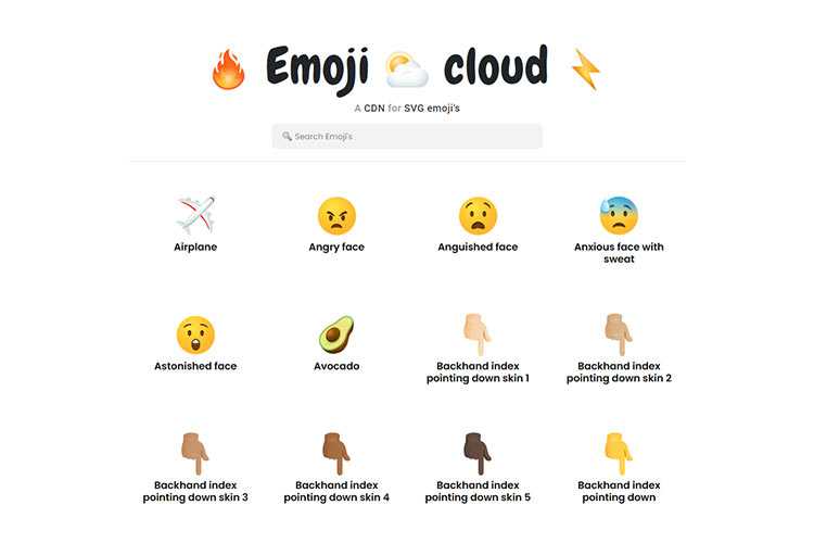
Emoji Cloud – Tell the world how you feel by using this CDN for SVG emoji.
Glassmorphism UI – Hop on board the glassmorphism trend with this CSS UI library.

Why should type be fluid, anyway? – A look at why viewport units aren’t going to fix your typography.

SmoothShadow – Use this online tool to generate incredibly smooth CSS box shadows.

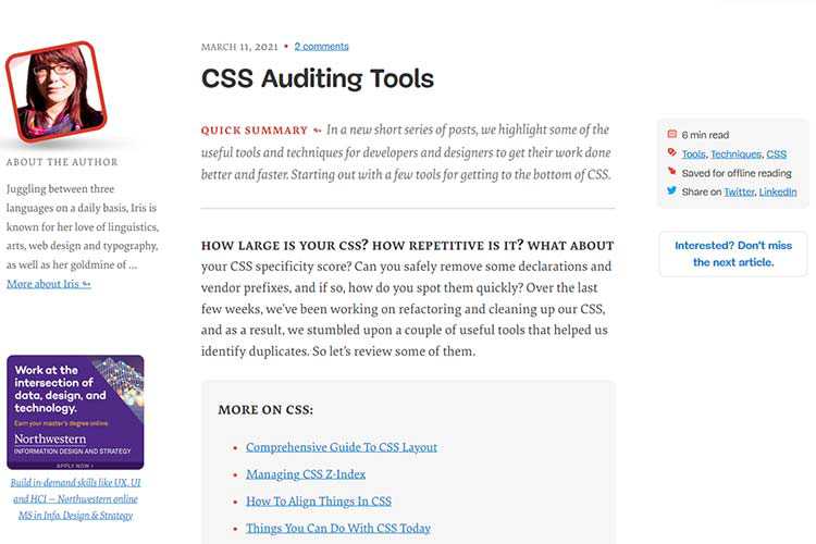
CSS Auditing Tools – Get to know your CSS with the help of this collection of handy tools.
Shape Slideshow with Clip-path – This tutorial experiments with some unique shape-based transition effects.

PrimeNG – An Angular UI component library that is both accessible and customizable.
The Personal Process of Choosing the Right Design Tool – A look at how the tools you select as a designer can help improve your creative process.

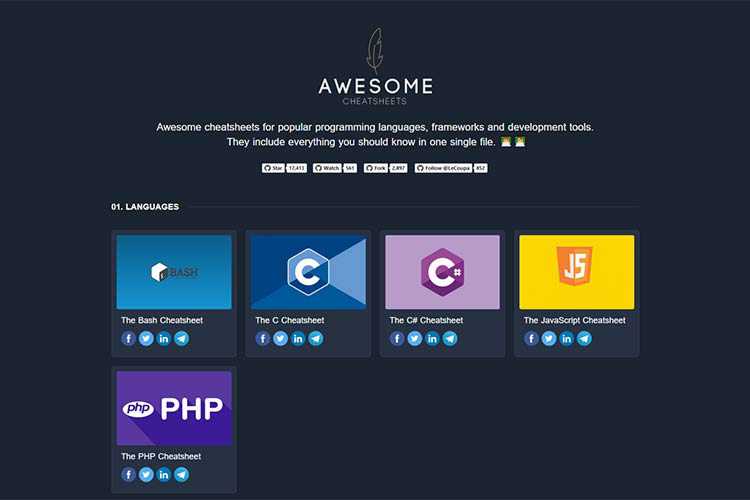
Awesome Cheatsheets – Here you’ll find cheatsheets for popular programming languages, frameworks and development tools.
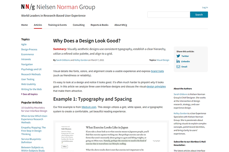
Why Does a Design Look Good? – Have you ever wondered what makes a design look “good”? This article aims to uncover the secrets.
8 Awesome Examples of CSS & JavaScript Polygons – Code snippets that demonstrate how incredibly useful and flexible polygons can be in web design.

Aurora UI — new visual trend for 2021 – A look at why blurred, organic gradient backgrounds will be big this year.

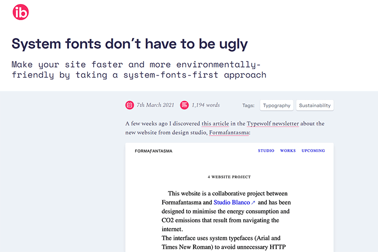
System fonts don’t have to be ugly – An interesting take on why using system fonts in web design can be a positive.
Your Web Design Business Has Grown: How Do You Manage Legacy Clients? – Tips for helping longtime clients evolve along with your business.

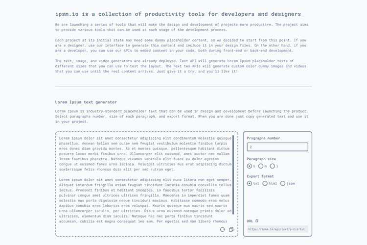
ipsm.io – Improve your efficiency with this collection of design and development productivity tools.
The post Weekly News for Designers № 584 appeared first on Speckyboy Design Magazine.
Your website is like a plant — if you want it to flourish, you need to take care of it. If you don’t take care of your website, it’ll wither away.
While you can’t give your website food, water, and sunlight to maintain it, there are other tasks you can do to help your site continually grow. We’ve created an all-inclusive website maintenance checklist that you can use to maintain the health of your site.
It’s broken down like this:
Keep reading to learn more!

For even more digital marketing advice, sign up for the email that more than 150,000 other marketers trust: Revenue Weekly.
The first part of this website maintenance plan will look at tasks you’ll want to complete weekly to ensure critical functions of your site are performing optimally.
First on our website maintenance checklist is fixing broken links on your site. When you craft content for your site, you link to other websites and pages on your site within that content. Not only do these links help you provide valuable information to your audience about specific topics, but they also help search engines like Google index your content.
However, when you have broken links, Google can’t index those pages, and users can’t see them.
Since this issue is critical to your business, you’ll want to check links on your site weekly. You can use a tool like Google Search Console to help you identify broken links on your site. Once you identify the broken links, you can fix them by:
If you use a site builder, like WordPress or Squarespace, you’ll want to add this to-do to your weekly website maintenance checklist: update software or plugins.
These site builders will often push out updates for their platforms. With WordPress, for example, many of the plugins you use will need updates as the developers continue to optimize them to make it better. So, to ensure your site functions correctly, you’ll want to update your software or plugins every week.
Check each week to see if you have the latest version of whatever you’re using. Once you update, verify that your site still functions appropriately and wasn’t negatively impacted by the update.
This step is significant as you update plugins. Some updates may alter your plugins’ compatibility, so you need to keep an eye on your site’s functionality and make sure that everything works properly.
Last in this weekly website maintenance checklist, you’ll want to focus on your forms. Forms are a critical component of your site because they help you capture leads for your business. So, you must check your forms every week to ensure they’re working.
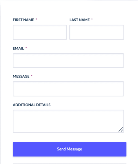
Submit information into your forms and test to see if you can go through the process on your own and that you can enter all the details into the boxes and submit them. Additionally, you’ll want to analyze the user experience of the form to ensure it’s simple and easy for your audience to complete.
You’ll also want to check the step after you submit the form, whether it’s being signed up for an event or joining an email list, to ensure that part is functioning too. People may submit their information in the form on your site but not get the follow up welcome email or discount coupon afterward.
Analyzing your form submission process will ensure that your site is actively capturing leads for your business.
Now that we’ve covered the weekly website maintenance checklist, let’s look at the monthly website maintenance checklist.
First on your monthly website maintenance checklist is to check your website’s performance. You want to analyze the pages on your site to see if you’re driving your desired results.
You can use a tool like Google Analytics to gain insight into your website’s performance. You’ll want to look at your most important pages, like your product pages, service pages, and contact pages, to ensure you’re driving leads and sales for your company.
Here are some critical things to look out for when analyzing your site metrics:
For pages with a high bounce rate or a decline in conversion performance, you’ll need to analyze the page to determine what’s causing your audience to bounce or not convert. You can use heatmaps, for example, to identify how users browse your webpage and identify problem areas.
If you have unusual spikes on your page, you’ll want to look more into what caused those spikes and if it’s something you can capitalize on to help increase traffic on your site.
The next item to check off your monthly website maintenance checklist is checking your site load time. Site load time is critical to your website’s performance because users don’t want to wait for slow-loading sites. In fact, users expect your site to load within two seconds.
So, each month, you’ll want to check your site’s load time to ensure your site loads quickly for your audience. You can use a tool like Google PageSpeed Insights to check your site’s current load time.
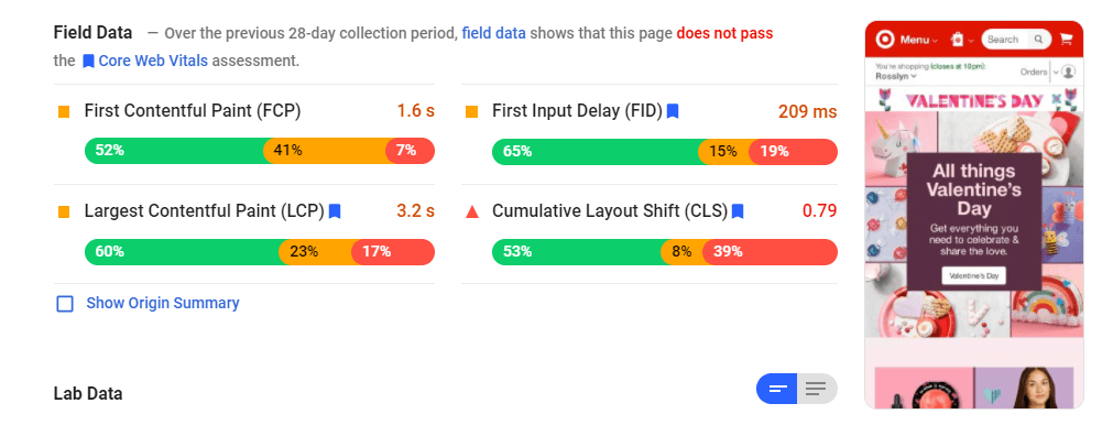
If your site isn’t loading quickly, you can look at the suggestions Google offers for improvement. Some ways to improve site load time include:
If you own an ecommerce business, this part of the monthly website maintenance checklist is critical for your company. Take time to analyze your checkout process to ensure that you’re providing a seamless customer experience.
This step is especially crucial if you look at your site metrics and find that your conversions are down.
Go through the checkout process yourself and see if you can complete the purchase. Take note of any struggles or problems that occurred when you were trying to check out. Chances are, if you find points of frustration in the process, your audience is frustrated by them, too.
By reviewing your checkout process every month, you ensure you provide a seamless shopping experience and continually improve your customers’ experience.
The next part of your website maintenance plan involves backing up your site data. You have tons of information on your site, and you need to back up that data to ensure you don’t lose it and have to rebuild your site pages.
There are dozens of online backup services available that you can use to back up your site files and database.
Depending upon how often you make changes on your site, you may want to backup your data weekly.
Next in this website maintenance plan, we’ll cover things you need to do quarterly for your website.
The first thing to look at in your quarterly website maintenance checklist is your website’s usability. You want to analyze your site’s current setup to ensure that you’re delivering the best experience for your audience.
When you analyze your site quarterly, look at aspects like your:
You can use tools like heatmaps from Hotjar to see how your audience sees your site, so you can see if they’re missing buttons, not scrolling to your video, or missing other essential parts of your site. You may find you need a design refresh or need to rearrange the placement of elements on your page to help it perform better.

Next in this website maintenance plan, we’ll look at updating your website content. The content on your site plays a fundamental role in helping you keep people engaged and get them to buy your products. As time goes on, though, you may find that some of the content you created previously is outdated.
So, every quarter, you’ll want to go through your webpages and see if there’s any outdated information on them. Whether it’s blog posts, services pages, or product descriptions, you want to ensure you’re providing the most accurate information.
Once you have a list of pages that need updating or reoptimization, you can start planning when you’ll update them.
The last item on this quarterly website maintenance checklist is to test your website in different browsers. Browsers like Firefox, Chrome, and Safari tend to update often. Sometimes these updates can impact how users see your site.
You’ll want to test your website in each of these browsers to ensure it’s delivering a positive experience. If your site isn’t compatible with the browser’s updates, you may need to tweak your site to ensure it looks good on these browsers.
After looking at this website maintenance plan, you may feel overwhelmed with everything you need to do to maintain your site. If you don’t have the time to dedicate to maintaining your site, don’t worry! WebFX offers website maintenance services to make your life a breeze.
We have a team of over 300 marketing experts that can help you maintain your site and ensure that it’s delivering a positive user experience.
To learn more about our website maintenance services, contact us online or call us today at 888-601-5359 to speak with a strategist!
The post Your Website Maintenance Checklist [Weekly-Quarterly Tasks] appeared first on WebFX Blog.
Recently, there has been an uptick in the number of domain names that are being stolen. I am not sure if it’s because of the worldwide pandemic and people are getting more desperate for money, or if domain name thieves are taking advantage of the changing digital and tech environment. COVID-19 is causing more of us to be online and conduct business online. But that also means that many don’t fully understand how to properly protect their digital assets, like domain names. This may be why we’re seeing more and more online scams, phishing, and online theft in general.
When I think of digital assets, I think of several different types. Our digital assets can include access to a bank account online, access to accounts such as cryptocurrency accounts, and payment transaction sites like PayPal, Masterbucks, and Venmo. Then there’s online shopping sites’ logins, such as Amazon, Walmart, Target, and eBay, where most likely you have an account where your payment information is saved. Apple Pay and Google Pay are others, as well as your website hosting account that handles your email (unless you use Gmail.com or Outlook.com), and, finally, your domain name. If your domain name goes missing, then you lose a lot: access to email, as well as your website most likely will go down, where you’ll lose visibility, online sales, and customers. Online thieves are hacking websites and anywhere there is a login, because they’re attempting to get to your digital assets.
Many of us are now used to protecting our online accounts by using a unique, secure password for each login that we have online. An important part of protecting digital assets, and domain names, is to make sure that you have a secure password and two-factor authentication set up for your login at your domain name registrar. In many cases, if a thief gains access to an account at a domain name registrar, the consequences can be disastrous if you don’t have additional protections in place to protect your domain name.
Hackers who gain access to your domain name registrar’s account can do several things that would disrupt your business:
Digital thieves know that domain names are valuable, since they are digital assets that can be sold for thousands, tens of thousands, hundreds of thousands, and even millions of dollars. Unfortunately, domain name crimes typically go un-prosecuted. In many cases, the domain thieves are not located in the same country as the victim. They all have the same thing in common: they wish to benefit monetarily from stealing the domain name. Here’s a few domain name crimes that I’ve seen recently:
All of these occurred in the past two to three months. And are just examples of where the domain name owner could have done something to stop the domain name theft. In the case of the domain name sale scam, the seller should have used a domain name escrow service, there are several reputable escrow services, such as Epik.com’s Domain Escrow Services, as well as Escrow.com that handles domain name sales.
So how can you minimize the risk of your domain name getting stolen?
Consider moving your domain name to a secure domain name registrar. There are registrars that have not kept up with common security practices, such as allowing you to set up 2-Factor Authentication on your account, Registrar Lock (which halts domain name transfers), and even setting up a PIN number on your account for customer service interactions.
Log into your domain name registrar’s account on a regular basis. I can’t really say how often you need to do this, but you should do it on a regular schedule. Log in, make sure you still have the domain name(s) in your account, make sure they’re on auto-renew, and nothing looks out of the ordinary. This less-than-5-minute task could literally save your domain name from being stolen.
Set up Registrar Lock or “transfer lock” on your domain name. Some registrars call it “Executive Lock” or something similar. It’s a setting that makes sure that the domain name cannot be transferred to another registrar without having it turned off. Some go as far as keeping it “on” unless they get verbal confirmation that it should be transferred.
Check the WHOIS data on the domain name. Check it publicly on a public WHOIS, such as at ICANN’s WHOIS, WhoQ, or at your registrar. Make sure it’s correct, even the email addresses. If the domain name is using WHOIS Privacy, send an email to the obfuscated email address to make sure you get the email.
Renew your domain name for several years. I recommend at least 5 years for valuable domain names (or ones that you don’t want to lose). You can get a “forever” domain name registration at Epik.com.

Ask the registrar if the account access can be restricted based on the IP address of the person logging into the account. Ask the registrar if the account can be restricted from logging in by a USB Device, such as a physical Titan Security Key, or a Yubikey. If you have Google Advanced Protection enabled on your Google Account, you will have two physical keys to access that Google Account (and some advanced protection in the Google back-end). You would then have those Advanced Protection keys from Google to protect the domain names on Google Domains.
Consider protecting your domain name(s) with a domain name warranty or service that protects these digital assets, such as DNProtect.com.
Some domain name registrars, especially those who take domain name security very seriously, have updated their systems “behind the scenes” so to speak. It’s more difficult for the fraudsters and thieves to steal domain names at those registrars. Some domain name registrars don’t have 24/7 technical support, they may outsource their customer service representatives, and their domain registrar software is outdated.
As I write this now, I have been informed of at least 20 very valuable domain names that were stolen from their owners in the last 60 days. As an example, of 2 cases I personally confirmed, the domain names were stolen from one particular domain name registrar, based in the USA. The domain names were transferred to another domain name registrar in China. Both of these companies who own the domain names are, in fact, based in the United States. So, it’s not logical that they would transfer their domain names to a Chinese domain name registrar.
In the case of both domain names, this same domain name thief kept the domain name ownership records intact, and they both show the former owners. However, in one case, part of the domain name contact record was changed, and the former owner’s address is present, but the last part of the address is listed as a Province in China, and not Florida, where the business whose domain name was stolen is located.
What tipped us off to these stolen domain cases is the fact that both domains names were listed for sale on a popular domain name marketplace. But, these are domain names where the general consensus of the value would be over $100,000 each, and were listed for 1/10th of the value. Remember the 1 year old $150,000 Porsche listed for sale on Craigslist for $15,000? It’s too good to be true, and most likely it’s stolen. The same goes for these domain names that are allegedly stolen. The price gives them away, and, in this case, the ownership records (the WHOIS records) also show evidence of the theft.
It has never been more important to take responsibility for your digital assets, and make sure that they are with a domain name registrar that has adapted and evolved with the times. A few minutes spent wisely, securing your digital assets, is imperative in times like these. It can be the difference between your valuable digital assets and web properties being safeguarded, or potentially subjected to theft and risk.
The difference between building a great website and a mediocre one is usually determined very early on. It’s often a matter of a web designer painting their project into a virtual “corner”. That’s where a design becomes inflexible and unable to accommodate various use cases.
This tends to happen in the prototyping phase. We spend lots of time and creative energy on an idea that looks awesome. Our clients might love it just as much as we do. But only when we actually start to build it do we begin to fully understand the consequences.
A design mockup serves as a compass for our website projects. If we fail to think ahead with regards to what certain elements require, it could mean being stuck in a bad situation. The end result is a site that has to make some serious compromises in order to work on different devices and browsers. That can negatively impact accessibility, performance and adherence to best practices.
Thankfully, some planning will help you avoid a messy build process. Let’s take a look at a few key items to consider before sharing your ideas with a client.
There’s a reason why there’s so much talk of a “mobile first” approach to web design. In essence, this allows us to start with the bare essentials of a website. From there, we can add and enhance as the viewport gets larger.
Still, each of us have our own preferences for building prototypes. For those still using a desktop-based approach, it’s important to think about how all of those fancy design elements will work on a phone.
If you plan on implementing CSS Grid or Flexbox, they’ll help a great deal in terms of making the best use of available screen real estate. But other elements may require more effort to get working.
Large sliders, for example, can become very difficult to use on small screens. Intricate images might not be as impactful and text may overrun boundaries. Performance may also lag.
In this case, you might have to decide if the slider is worth showing on mobile at all. Or perhaps it could be refactored to better adapt to work in all situations.

Design starts with picking the appropriate fonts and colors. They’re both deeply connected to branding and accessibility.
Fonts should be crisp and sized for legibility. While fancy script and decorative type can look beautiful, it needs to be large enough to read and restricted to usage in headings. If those requirements can’t be reasonably met, it may be best to drop them from your project altogether.
In addition, color contrast should also be a major concern. Background and foreground colors must achieve an acceptable contrast ratio in order to be considered accessible. Plus, it’s just good practice.
If you’re unsure about your palette, use an online tool to determine its suitability. Sometimes, even a slight adjustment is all that’s needed to pass WCAG AA standards.
Beyond those two items, it’s also good to have a plan for how you’ll display elements such as icons. Are they intuitive? Will they be accompanied by text?

Not every website has to be fully-compatible with, say, Internet Explorer 9. And legacy browsers shouldn’t necessarily deter us from using the latest CSS or JavaScript. But some thought should be put into backwards compatibility.
Of particular concern are design elements that will render a website completely unusable in older software. Even if a particular browser makes up a small percentage of your site’s visitors, that’s still leaving some potential conversions on the table.
It’s worth considering what effect design decisions will have on these users. The available fallbacks for a given technology might be enough to keep things looking decent and usable. Even better is that they can be fairly simple to implement.
It used to be that designers were expected to ensure elements looked and functioned exactly the same across all browsers. That may be too much of an ask these days. As long as a user can navigate and consume content on some of the more ancient software, that just might be enough.

Even the smallest websites will have a need to evolve over time. As new types of content are added, they’ll need to be accounted for in the design. If you’re not prepared, implementing these items could conflict with what’s already there.
Think of adding a series of videos, for example. While the process of adding that content may be easy enough – how will it fit into the look you’ve already established? Will you utilize a default browser UI or craft something to match your branding?
While you can’t always predict the future, you can plan for all sorts of possibilities. This is part of what a design system allows you to accomplish. By setting some default guidelines right from the start, you’ll have an easier time dealing with future additions.
The reality is that what we design today will likely change in the future. Therefore, it pays to be ready for that eventuality.

Crafting that first mockup is about so much more than just making things look good. It even goes beyond impressing your clients. Indeed, it’s an exercise that forces us to look at our project as a whole.
The aesthetics must be pleasing to the eye. But the design must also be accessible and able to adapt to various screens. Plus, it may have to accommodate different types of content as things evolve.
If that sounds overwhelming – take a deep breath. This is where your experience and expertise can come to the rescue. The right tools can also pitch in.
Think about what has worked (and what hasn’t) in your past projects. Look for ways to implement features that are resilient. Do that and you’ll be on your way to a successful project!
The post Why Thinking Ahead Is Crucial in Web Design appeared first on Speckyboy Design Magazine.
Even though WordPress is the most dominant CMS on the market, there are still powerful WordPress alternatives out there for you to choose from.
41% of websites run on WordPress, including both large corporations and family-owned companies, but that still leaves 59% of the market open.
In this blog post, we’ll list five alternatives to WordPress that help make up that 59% of the Internet.
Want the quick summary?
5 WordPress competitors you should know
These are certainly not the only other CMS platforms out there, but we’ll break them down in the remainder of this blog post.
There’s a lot of buzz in the web design community about other CMS options besides WordPress.
There is a lot of talk about flat-file CMSs, micro CMSs, and static site generators — fresh takes on the age-old content management problem.
For some, WordPress has become bloated and overly complicated, especially for small-scale sites that might be better served by simpler CMS options.
If you’re looking for the latest WordPress alternatives, the following options are some great ones to consider.
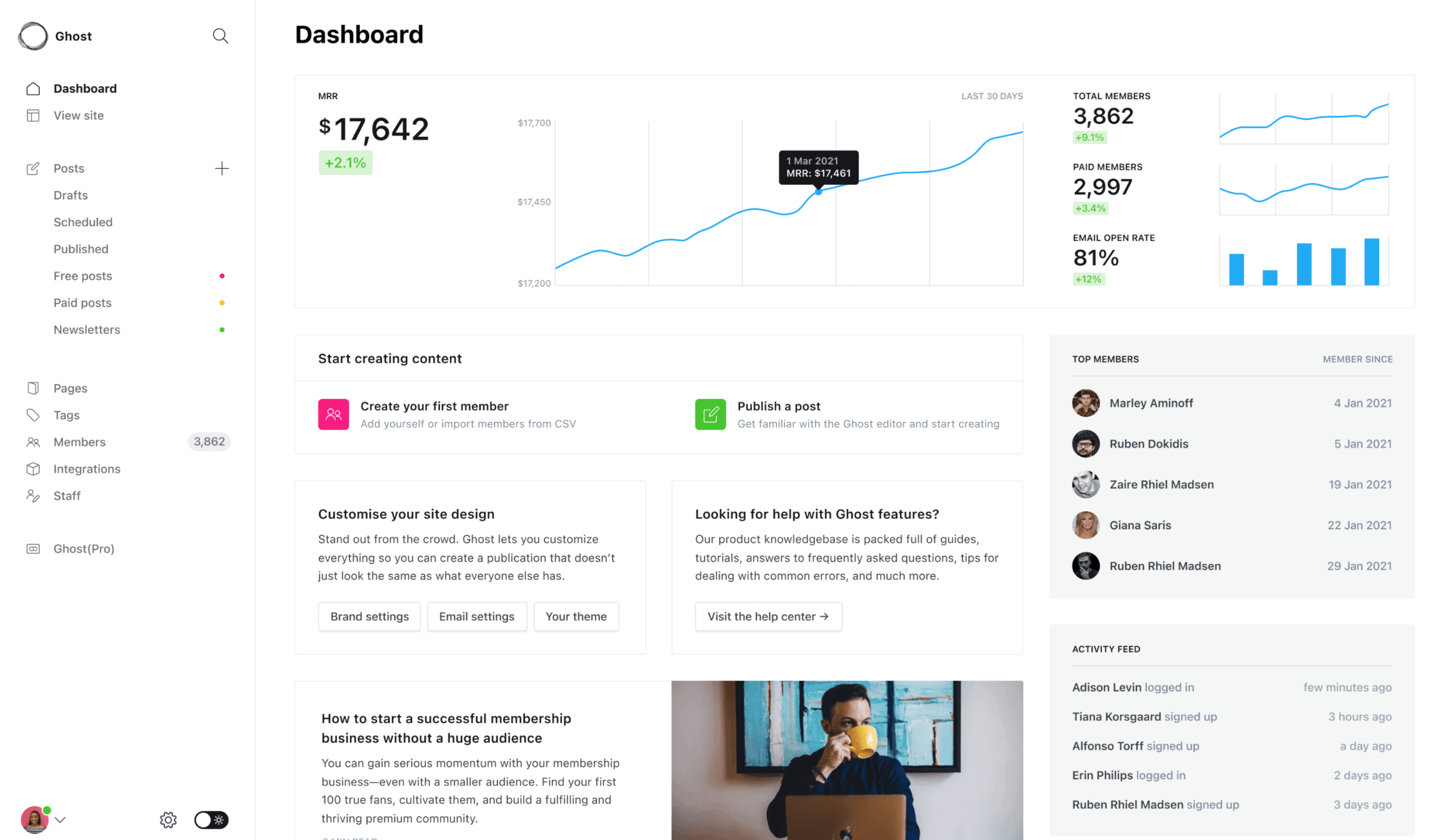
Historically, WordPress started out as blogging software. Now, it’s grown into a full-fledged CMS that can run any type of site — it’s capable of being the publishing platform of online stores, photo galleries, online directories, and any other variety of sites you can think of — which, for software, spells bloat, complexity and excess features you don’t need if you simply want to run a blog.
This is where Ghost comes into the picture.
This WordPress alternative’s beautifully simple UI allows bloggers to compose their posts without being distracted by menus, widgets, settings, and tools not related to writing.
Ghost is built with JavaScript using Node.js, a web development platform optimized for performance and scalability due to its non-blocking I/O model. This could offer Ghost huge speed improvements over the PHP-based WordPress, with one case revealing Ghost to be 678% faster than WordPress.
Compared to WordPress, however, it’s much harder to find a budget shared hosting service that can run Ghost due to its Node.js dependence. In contrast, WordPress and its required web server technologies PHP and MySQL are commonly available on a vast majority of web hosts.
But if you’re using a VPS, dedicated server, or shared hosting that has Node.js installed, then you’re good to go.
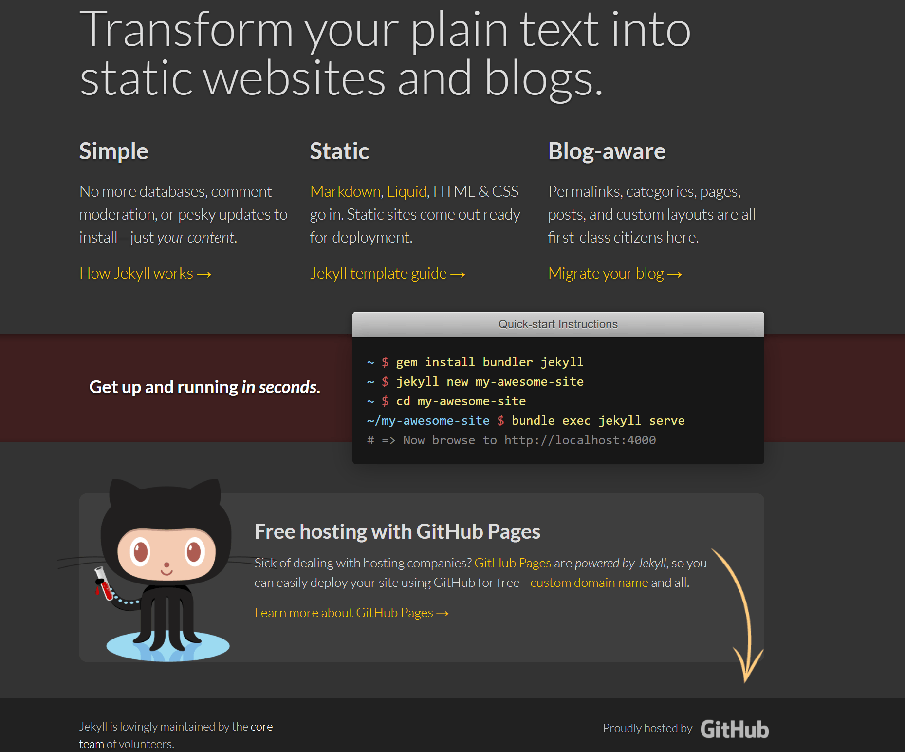
If you want a fast-loading site then you can’t do any better than serving plain static HTML documents. And if you want to do this more easily for content publishing, then Jekyll is the answer.
Jekyll is a static site generator — a system that takes text files and stitches them together to create a static HTML site.
Jekyll was created by Tom Preston-Werner, co-founder of GitHub.
To use Jekyll, you must be unafraid to get your hands dirty using the command line, so it’s best suited as a WordPress alternative for hackers.
You can host your Jekyll site for free using GitHub Pages, since Jekyll is static and doesn’t require server-side programming, unlike WordPress.
If you’re a developer who would rather work with pure code than mess around with a UI, if you want an extremely high-performance publishing solution and the option to host your site for free, Jekyll is definitely worth trying.
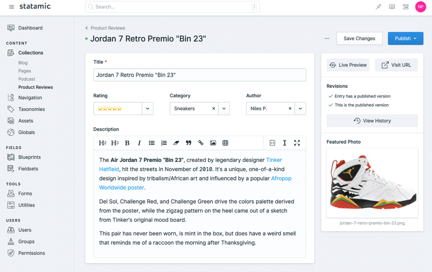
Statamic is a flat-file CMS that mixes static and dynamic elements. (The name Statamic comes from the words static and dynamic).
With Statamic, your pages are rendered on the fly just like WordPress, but it does so without a relational database management system (e.g. MySQL) by storing content in a simple directory structure using flat files.
Just because a site uses flat files doesn’t mean it can’t do dynamic things.
Besides Statamic, Kirby and Pico are worth checking out as well if you want to give flat-file publishing platforms a try.

Created by well-known ExpressionEngine add-on developers, Pixel & Tonic, Craft is a new CMS that aims to bring simplicity to managing content.
Craft was built from the ground up to focus only on the core features that a CMS truly needs. The software’s goal is to avoid the bloat that comes with trying to include every possible feature and fulfill every single use-case.
Craft has a unique business model where the core features are free, so you can get a basic site set up without having to purchase anything.
However, if you need additional functionality for your site, you can buy packages. An example of this is the Localize package, which you can purchase if your site needs multi-language capabilities. Another package you can add to your Craft site is the Cloud package, which provides support for popular cloud services like Amazon S3 and Google Cloud.
Craft has a growing community behind it, which is essential for any new CMS wanting to be a viable alternative to WordPress.

Perch describes itself as a “really little CMS”. With this publishing platform, you can build your site however you want and then add in CMS functionality and dynamic components later on. So you don’t need to build your site around Perch from the beginning, which is great for existing sites that just want a few pages to be editable and dynamic.
Perch has a control panel with a clean and simple UI that makes it an excellent CMS to hand off to your non-technical clients.
Company sites and “brochureware” sites managed by non-tech site owners seem to be the market for Perch. The platform has add-ons available that could make it a nice solution for larger sites as well.
If you’re already committed to WordPress and have no major issues with it, then it might not be a good idea to just dive into one of the above alternatives for your next big web project.
There’s no sign WordPress is on the decline. But if you have a small web project, if you have qualms with WordPress’s development direction out of being just a blogging platform, if you want a different approach to content management, or if you simply want to explore what else is out there, then spend a little bit of time playing around with Ghost, Jekyll, Statamic, Craft or Perch.
You might just discover your new favorite CMS in the process.
The post WordPress Alternatives: 5 Platforms to Keep an Eye On appeared first on WebFX Blog.