Monthly Archiv: March, 2021
Package:
Summary:
Send HTTP headers that implement security measures
Groups:
Author:
Description:
This class can send HTTP headers that implement security measures...
Read more at https://www.phpclasses.org/package/12019-PHP-Send-HTTP-headers-that-implement-security-measures.html

Package:
Summary:
Create class objects in a limited number of times
Groups:
Author:
Description:
This package allows to create class objects in a limited number of times...
Read more at https://www.phpclasses.org/package/12016-PHP-Create-class-objects-in-a-limited-number-of-times.html#2021-03-23-14:33:17

Google’s influence over web designers, website owners, and everyday users is undeniable. The company is hyper-aggressive in detailing what it wants to see from the first two groups in order to serve up relevant results to the third.
One of their more recent efforts in this area revolves around something called “Core Web Vitals”. These metrics are in place to measure user experience. Items such as how quickly a page can be interacted with, it’s responsiveness, and how much visual shift during loading are measured.
Keeping tabs on these factors sure seems like a worthy endeavor. However, it’s not just for convenience. Google is planning to integrate visual indicators of page experience into search results in May 2021. The move has the potential to affect both SEO and how a website is listed on the search engine results page (SERP).
This means websites that don’t meet Google’s benchmarks could see a negative impact on their ranking. There’s also a possible hit with regards to how it displays within results. With that, site performance is going to be more important than ever.
It’s not only a call for web designers to bleed every last millisecond of speed out of their sites. This is also an open question about what Core Web Vitals means to sites on a tight budget or even those running a content management system (CMS): Is Google asking too much?
Tougher Testing
There are a lot of tools out there to measure website performance. Each has their own methodology for generating a report. There will likely be some variance in how the included categories grade out. Thus, they should all be taken with a grain of salt.
That being said, Google’s PageSpeed Insights tool seems to grade on the lower end of the scale. For example, a test website that gets a glowing result on GTmetrix is much less flattering on Google’s offering. The site doesn’t pass the Core Web Vitals standards for mobile.
The point here is not necessarily to complain (although this is quite a bummer). It’s more of a friendly heads-up to web designers: Just because your website looks great in a non-Google testing suite doesn’t mean it will do well in these particular metrics.
Not surprisingly, Google wants you to use their tools to determine how well your site does with Core Web Vitals. As such, all of that tweaking you did to get a great performance grade elsewhere may not impress this particular search giant.

Top: A test site grades well in GTmetrix, while the same site struggles in PageSpeed Insights (bottom).
Who Might Core Web Vitals Potentially Hurt the Most?
If your website doesn’t pass muster when it comes to Google’s Core Web Vitals, some work will be required. First, there’s analyzing the PageSpeed Insights report and determining what needs done. Then it’s time for implementation.
But both budgetary and technological concerns could get in the way for some website owners. Let’s look at a few situations where Core Web Vitals may become extra burdensome:
Low-Budget Websites
Improving website performance costs time and money. Of course, if it helps with SEO, then it might be considered an investment. But it still may be out of reach for those on a tight budget.
When you think about it, there are multiple facets to better performance that need to be explored. That could include refactoring code, optimizing images and eliminating features that are dragging the whole site downward.
The costs for this type of work could easily add up. For an older or particularly slow site, it might end up being more cost-effective to start from scratch with a redesign.
Web hosting is also a potentially huge factor. Those on a lower-end shared hosting account may simply not have enough server resources. Once again, more robust hosting requires more cash.
Websites Running a CMS
A traditional CMS (WordPress, Drupal, etc.) that utilizes a database makes for a more complex case. The overhead from executing queries and other key functionality is generally going to slow down a website.
This is where features such as caching can help. But cache alone may not be enough to satisfy the likes of Google. It may take the use of a content delivery network (CDN) and higher-level web hosting to get things to an acceptable level of performance.
Even then, a bloated theme or plugin could also provide a setback. The WordPress commercial theme market, for example, is chock full of heavy options. Themes that need to load large frameworks and lots of custom code can be beyond the reach of developers.
In these situations, the only way to add enough speed may be switching themes, deactivating plugins or (possibly the most expensive of all) utilizing a headless configuration. These may not be realistic options for every website. At best, these measures are also an inconvenience.
Websites That Use Proprietary Software
Likewise, using a proprietary CMS (Squarespace, Wix, etc.) may leave website owners without a viable path to fixing each and every performance deficiency. While they may allow you to tweak certain bits and pieces of your website, other areas may be completely off limits.
As for server infrastructure, there’s not much to be done there, either. Perhaps an account level upgrade could provide more resources – but that’s up to the vendor to decide.
In general, website owners and developers could be left hoping that their service provider addresses these issues. Anything less will require living with the shortcomings or moving to a different platform.

Big Players vs. Everyone Else?
It’s fair to wonder if Google Core Web Vitals inevitably favors those with the most resources. Could a small-budget website with tons of great content be overshadowed by one that simply has more money to throw at performance?
At this point, we simply don’t know how Google would weigh one website against another when these metrics are included. And they aren’t likely to provide all of the details.
In some ways this is all reminiscent of the arguments over net neutrality. The fear being that, if an internet provider gives preference to certain types of traffic over others, it’s going to favor the well-heeled. Small startups could be at a major disadvantage and unable to compete with the big players.
Google may have no intention of favoring speed over quality. But, at the very least, Core Web Vitals seems to be raising the possibility.

Another Hurdle for SEO Success
It seems like every time we think we know what search engines want, they go and change the game on us. Regardless, the bottom line is that Google Core Web Vitals is going to impact every website that aims to be found in search engines. Naturally, some are going to avoid any potential negative effects better than others.
Great website performance should be on the top of everyone’s wish list – no argument there. But to earn a passing grade on these new metrics, it’s going to take resources. And that will sadly leave some people behind.
In this way, Core Web Vitals could indeed be asking too much. That leads one to wonder if a search engine should be able set such arbitrary requirements in the first place.
The post Are Google’s Core Web Vitals Metrics Unreasonable? appeared first on Speckyboy Design Magazine.
Package:
Summary:
Create automatic actions for sub-tasks in Kanboard
Groups:
Author:
Description:
This package is plugin to create automatic actions for sub-tasks in Kanboard...
Read more at https://www.phpclasses.org/package/11988-PHP-Create-automatic-actions-for-sub-tasks-in-Kanboard.html

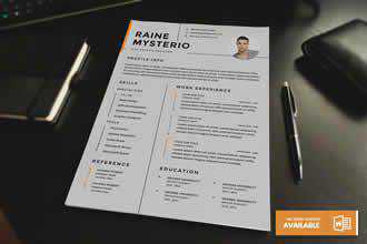
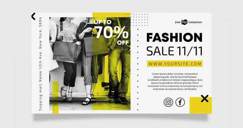
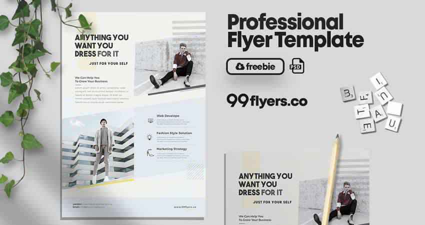
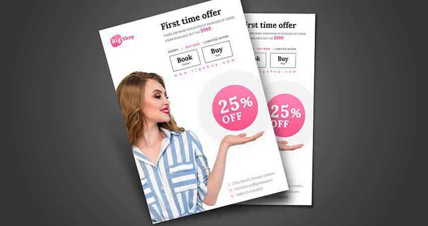
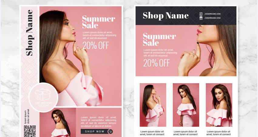
When you’re looking to put together a new flyer to announce a new fashion line or style event, it’s vital that you do so in a visually compelling way. If you lack graphic design skills, this can be quite a challenge. That’s why templates were invented, right?
If you’re stumped as to where to look for style and fashion flyer templates, we’ve got your back. We’ve put in the legwork to research this collection of templates. And you want to know the best part? They’re all free! Happy designing!
Unlimited Downloads: 49,000+ Print Design Templates
Brochures, Business Cards, Resumes, Documents, Powerpoint & Keynote Templates, Mockups & much, much more!
You might also like: Free Business Flyer Templates, Free Fitness Flyer Templates, Free Music Event Flyer Templates, Free Party Flyer Templates, Free Real Estate Flyer Templates, Free Restaurant & Food Flyer Templates, Free Travel Flyer Templates.
This fashion flyer features a minimal style that is as eye-catching as it is simple. This PSD file is fully editable, so you can add your own photos, graphics, and text with ease.
The Fashion Flyer Template is a print-ready template you can use to create a flyer for your next fashion week, brand launch, or store event. Add custom images and use the free included font if you wish. This PSD file is also easy to edit thanks to well-organized layers. Plus, it’s versatile and could be used in other industries besides fashion if you wish.

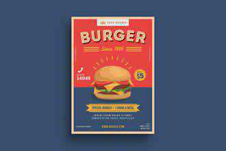
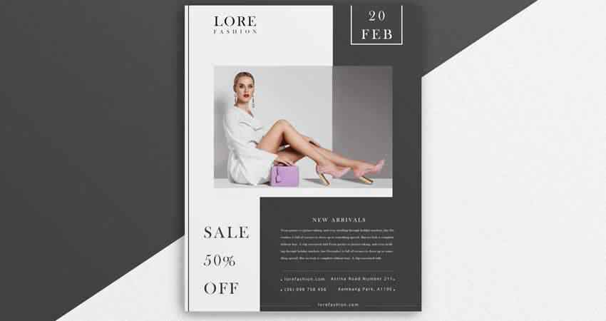
This fashion template is perfect for creating sale flyers. Use it to announce an online or in-store sale at your clothing store. Or, you can customize it to use in other ways as well. This flyer template is sized as a full-sized regular page, is print-ready at 300dpi in CMYK, and includes free fonts.
This Fashion Event Flyer template is stylish to the max, with interesting background graphics, framing, and font choices to make your chosen images pop and to convey your announcement so it makes an impact. The file is in PSD format, is fully editable and printable, and can be customized to suit any event style.

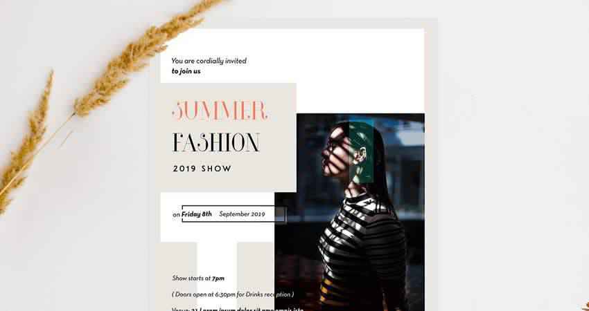
Announce your next fashion event with true style. This Fashion Week Show Flyer template is bound to make an impression with its color splash background and show dates highlighted with colorful circle designs. Edit the file in Photoshop then print it out. Easy as that.

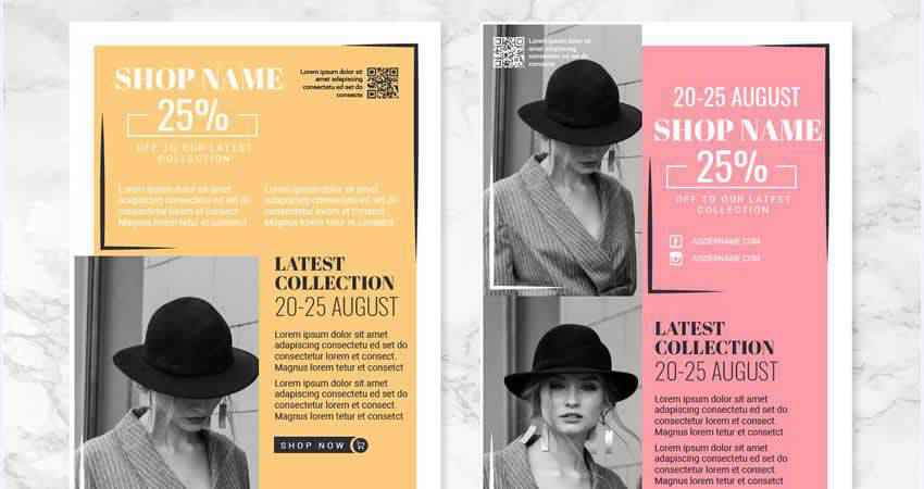
Another flyer template you’ll definitely want to check out is the Fashion Collection Vector Flyer Template. It’s editable in Illustrator and features bright and bold colors that catch the eye. Use it for both printed and online flyers to announce a fashion event or store sale.

The Minimal Fashion Event Flyer template is fully editable in Photoshop so you can customize it to promote your next fashion week or other style-related event. This template uses free fonts, you can swap out the images with your own easily, and it offers an edgy style that might be most suitable for streetwear brands.
The Fashion Collection flyer template makes a bold statement right upon first glance. It’s designed to feature your chosen photo prominently and offsets it with a thick, colorful border. and bold text boxes. This PSD file is fully scalable and printable as well.

The Fashion Week Flyer template offers an elegant take on the fashion flyer motif. It features a black and white design with geometric, almost constellation-like designs in the background. Highlight your own images plus textual information in this easy-to-edit PSD file.

This fashion flyer template allows you to showcase one chosen image plus sale prices, dates, company info, and anything else you might want to feature. This template is customizable in Photoshop and printable in CMYK and 300dpi. It includes a help file to guide your usage of the template as well.
If sophistication is what you’re looking for, the Professional Fashion Flyer template is a bold choice. With it, you can showcase multiple photos and call out key information with large text boxes and graphically appealing designs that pull your eye to the most important tidbits.

This template is a great choice for a fashion boutique. It’s in vector format, so you will need Illustrator to edit it. The sample flyer uses a lovely blush pink shade as the background color and call out headers in a dark gray. You can customize these colors, of course, but the sample gives you a good idea of how this template can be used.
Now this fashion flyer templates is quite minimal but it avoids looking bleak by giving ample space for you to insert a custom image of your choice. Include a few headers and text and you’ll be able to whip up a printable flyer in Photoshop in a matter of minutes.

This template is another sophisticated choice that just exudes elegance. Feature your best image right in the center and offset it with the half-tone background, interesting typographical choices, and practical information. This template is editable in Photoshop and is fully scalable and printable.
The Modern Fashion Sale Flyer just screams summer to me. It allows you to feature a bold fashion image front and center and accentuate with with large color blocks and background layers that draw the eye. This EPS file is editable in Illustrator and will give your next fashion campaign or sale the push it needs.

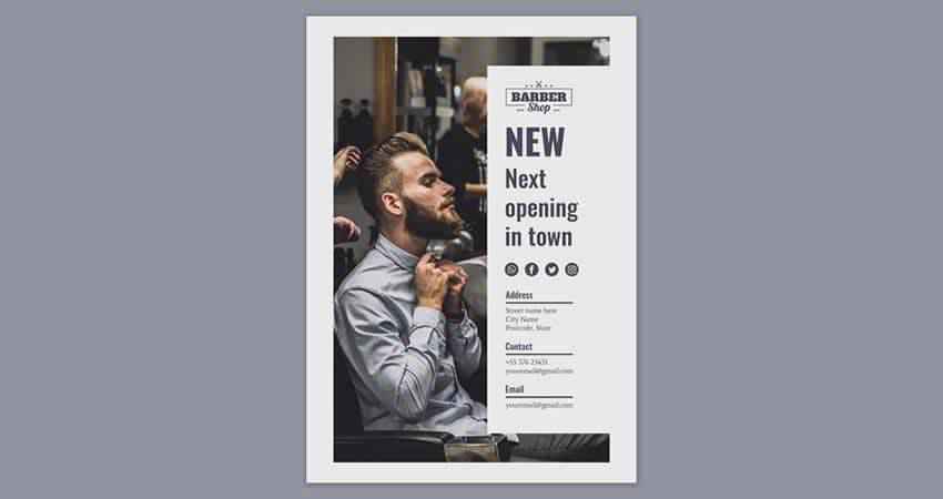
The Barber Flyer Template exudes style and class. Though you don’t have to use it for a barber shop, the example imagery paints a compelling picture: this would be the perfect template to showcase menswear. This PSD file is fully editable, well-layered, and printable at a high resolution.
The Vector Fashion Flyers template is a bit more chic and understated, but that can be a good thing. This flyer template is editable and printable in AI, EPS, and SVG formats. I could easily image this template being used to promote a clothing store sale online or at a brick and mortar shop.
At least one of these style or fashion flyer templates is bound to suit your needs. The end result is certain to be stunning and will work well to attract attention for your business, your brand, or your style event.
The post 12 Best Free Style & Fashion Flyer Templates appeared first on Speckyboy Design Magazine.
BigCommerce is one of the most popular platforms for creating ecommerce websites. It offers features that make building an ecommerce site more user-friendly while maintaining the flexibility that more advanced users want.
How does BigCommerce design work, and how can you create a successful ecommerce site using the platform? Keep reading to learn about the BigCommerce website builder and get our top ecommerce design tips.
Want more web design and digital marketing tips delivered to your inbox? Join 150,000 marketers in signing up for one of our email newsletters.
We don't just want to tell you about the beautiful work we do.
WE WANT TO SHOW YOU
We've built over
1000
Websites in industries like yours
How BigCommerce design works
BigCommerce has several features that make building a website much easier, even if you don’t have any experience with web design or code. There are also options more advanced users can use to achieve more customization.
Here’s an overview of how you can create an ecommerce website with the BigCommerce website builder.
Themes
There are lots of themes available for BigCommerce that give you an excellent starting point for your site. You can choose a free or premium theme and then customize it according to your needs. BigCommerce offers numerous themes in its Theme Marketplace, and you can also find third-party BigCommerce themes.
Page Builder
Page Builder is BigCommerce’s visual editor, which allows you to adjust your site’s layout and make simple customizations without using code.
All the themes available through BigCommerce are compatible with Page Builder.
With Page Builder, you can add, remove, and rearrange elements on your pages and adjust style elements such as colors and text sizes.
Edit Theme Files
BigCommerce also offers a way to make more advanced edits within your browser. This option, called Edit Theme Files, is available for BigCommerce Stencil themes. It’s recommended that you use this option to:
- Make relatively minor theme changes that you can’t make with Page Builder
- Add scripts to integrate apps that you can’t add using BigCommerce’s Script Manager tool
Using Edit Theme Files requires knowledge of HTML, CSS, and Handlebars.js. If you’re not comfortable with these languages, you may need to work with an ecommerce website developer.
Stencil Command-Line Interface (CLI)
BigCommerce’s Stencil Command-Line Interface (CLI) is a tool that developers can use to make larger changes to a theme without impacting the live website.
It provides a controlled environment for customizing your BigCommerce themes and testing your changes. Stencil CLI is perfect for making more extensive and advanced changes to your theme but requires web development knowledge.
Partner with Ecommerce masters!
Campaigns managed by WebFX have earned over
11550403
TRANSACTIONS IN THE LAST 5 YEARS
Read Case Studies
Tips for BigCommerce design
About 75% of visitors use a website’s design to judge its credibility. Appearing credible and professional is crucial for ecommerce businesses since users won’t give their payment information to a website they don’t trust.
So, your website’s design is essential to getting users to spend time on your site and convert.
Check out these BigCommerce design tips below to learn how to create a winning ecommerce website with BigCommerce.
1. Keep your design simple and uncluttered
The best ecommerce website designs tend to be simple and polished. Avoid over-stuffing your pages with content and use white space to separate elements.
Aim to make your pages scannable. Visitors should be able to determine what your page is about by quickly glancing at it.
Keeping your design simple and uncluttered will make your site easier to look at and navigate.
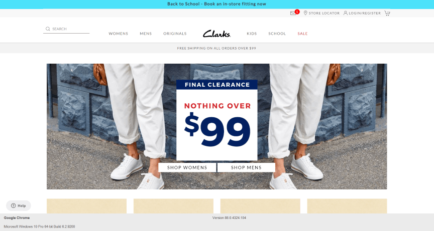
In this example from Clarks, you can see how the design includes a central image and an abundance of white space around it to keep the design looking clean and uncluttered.
![website design example - Clarks]()
2. Make your design responsive
As many as 90% of users have made a purchase on their smartphone, so ensuring your site looks good on mobile devices is essential. The best way to accomplish this task is with responsive design.
Responsive design enables your website to adjust to the device someone visits it on, so it looks professional and works correctly on all devices, including laptops, smartphones, and tablets.
Whichever theme you choose for your BigCommerce website, make sure it’s responsive. Today, there are plenty of responsive options available. If you customize your theme or build a custom theme, make sure you prioritize responsive design.
3. Keep your design consistent and incorporate branding
Use a consistent design across your website that matches your brand and includes important brand elements. A consistent, branded design will make your site look professional and help users feel confident they’re in the right place no matter where they are on your site.
Brand elements to use in your design include:
- Colors
- Logos
- Fonts
- Images
Your overall design should also match your brand’s personality. For example, if your brand is high-class and elegant, you’ll want a sophisticated, simple look. If your brand is fun and casual, you might use bright colors and eye-catching, lively images.
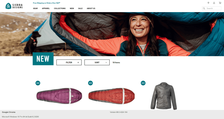
For an example of incorporating branding into your design, look at how Sierra Designs uses the color from its logo in its free shipping offer and its new product label.
![website design example - Sierra Designs]()
4. Add high-quality images and videos
Adding images, graphics, and videos to your pages is an excellent way to make your pages more eye-catching and engaging. In fact, users spend 88% more time on pages that have videos.
Visuals are especially important when it comes to product pages. Include multiple photos of your product so shoppers can see it from various angles. Videos are great for showing your product in action.
Make sure the videos you add to your pages are high-quality, so they make your site look more professional and visually appealing. Opt for original images and videos whenever you can. Also, ensure the visuals you choose fit with your brand aesthetic.
5. Prioritize easy-to-use navigation
Almost 90% of consumers will shop with a competitor if they have a negative user experience. Your website’s design, especially your navigation, plays a central role in your visitors’ user experience.
Your navigation is how users get around your site, and if they can’t do so easily, they’ll likely end up frustrated and leave without making a purchase.
Create broad menu categories that are easy to see from anywhere on the site and organize various subcategories under these items. This setup helps users to quickly navigate to the types of products they need.
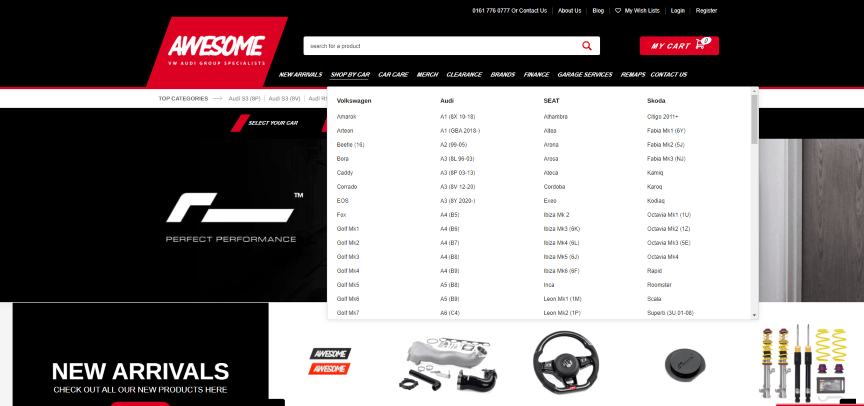
On Awesome GTI’s website, for example, visitors can shop for auto parts by car from the top navigation menu.
![website navigation example - Awesome GTI]()
Search bars are also hugely important on ecommerce sites. For shoppers who know exactly what they want, the search function saves a lot of time. Make your search bar easily visible in your top menu.
Easy and quick navigation is critical during the checkout process. Include as few steps as possible in your checkout process and make sure it’s clear to users what they need to do to complete their purchase.
6. Test and refine your design
Don’t stop improving your website’s look and functionality once you’ve created your initial design! Instead, use A/B testing to determine what works best for your site and continuously refine your site.
A/B testing involves testing two different versions of a page to see which performs best. For example, you might create two headlines and see which one keeps users on the page longer. You could also design two calls to action (CTAs) to see which version gets more clicks.
By continuously testing and refining your designs, you can substantially improve your site’s performance over time.
Ecommerce design services
Whether you’re using BigCommerce, opting for another ecommerce platform, or building a custom website, partnering with a professional ecommerce website design and development firm can help you make the most of your project.
The award-winning web design team at WebFX has created more than 1100 websites for our clients, and we’ve generated over $2.4 billion in revenue for our clients over the last five years.
To learn more about BigCommerce design and our other ecommerce services, contact us online or call us at 888-601-5359.
The post 6 BigCommerce Design Tips For Big Ecommerce Results appeared first on WebFX Blog.
Package:
Summary:
Create class objects in a limited number of times
Groups:
Author:
Description:
This package allows to create class objects in a limited number of times...
Read more at https://www.phpclasses.org/package/12016-PHP-Create-class-objects-in-a-limited-number-of-times.html#2021-03-22-04:35:03

Latest PEAR Releases:
Package:
Summary:
Create class objects in a limited number of times
Groups:
Author:
Description:
This package allows to create class objects in a limited number of times...
Read more at https://www.phpclasses.org/package/12016-PHP-Create-class-objects-in-a-limited-number-of-times.html

Among the many benefits of CSS Grid is its ability to create complex layouts with ease. You don’t need an excessive amount of code. No precarious hacks are required. A few relatively simple lines can help you quickly achieve something that used to take hours.
Of course, CSS Grid is also incredibly powerful. We’ve seen some developers experiment and push the limits of what it can do.
While that’s impressive, the real beauty of this specification is that it helps us accomplish everyday tasks. The common page and feature layouts that make up a typical website project. This is the biggest reason to jump on board and utilize CSS Grid.
We’ve put together a collection of 8 common website layout concepts. Each one demonstrates how CSS Grid can make life easier for web designers. And, if you’re concerned about browser support, some also include fallbacks for Flexbox and other layout techniques. Let’s get started!
The Web Designer Toolbox
Unlimited Downloads: 1,000,000+ Web Templates, Themes, Plugins, Design Assets, and much more!
Discovering the “Holy Grail” of Layouts
At first glance, this “Holy Grail” layout may not look too difficult. In fact, we’ve been seeing it for years. The issue has always been that the available CSS layout methods weren’t very effective at setting it up. It has traditionally taken any number of hacks to get it just right. Not so with CSS Grid. CSS-Tricks put together a companion article on the process.
See the Pen Holy Grail Layout with Grid by Chris Coyier
Pick a Card UI
Card layout UIs are kind of a big deal these days. And there are so many different ways to make them unique. This set of examples shows how CSS Grid can take the same HTML markup and create completely different looks.
See the Pen CSS Grid: Card Variations by Olivia Ng
Responsive Multi-column Blog
Here’s an attractive multi-column blog layout that nicely implements whitespace. Each article has its own room to shine. Plus, it adapts to small screens without a hitch. This layout is also easy to expand, with more columns and rows just a few attribute tweaks (grid-template-columns, grid-template-rows) away.
See the Pen Grid-Based Blog Index Page Layout 🌷 by Sheelah Brennan
Product Feature List
This layout is commonly seen in print, but is also a great choice for the web as well. A lovely product image is flanked by feature listings on either side. Each “feature” is a part of a UL element. Where CSS Grid really provides an extra boost is in its responsiveness. On smaller viewports the features are tucked neatly underneath the photo. Go a bit larger (say, a tablet) and the features are pushed over to the right.
See the Pen Center Focus Feature Section // CSS Grid by Brian Haferkamp
Nested Grid Page Layout
Perfect for an online magazine or news-based website, this nested grid layout is quite detailed. And we’re not just talking about its impressive looks. Scroll down and you’ll find a fantastic guide to how the layout was built, along with explanations of the different CSS Grid attributes that are utilized.
See the Pen CSS (SCSS) grid with grid layout and fallback to flexbox by Vincent Humeau
Variable Width Content
Here’s a common wish for designers: keeping text in a narrow column (great for legibility), while allowing other media to expand beyond those restraints. CSS Grid helps take the pain out of this layout by looking for specific HTML tags and setting them free.
See the Pen Article Layout with Varying Content Width Using CSS Grid by Philipp
Pretty Pricing Tables
Multi-column features such as pricing tables are often created with CSS Flexbox. So, why use Grid? For one, adjusting your styles for additional columns is a breeze. It’s a solid way to prepare for ever-changing content needs.
See the Pen Simple CSS Grid Layout Pricing Tables by darkos
Masonry Photo Gallery
Remember when building a masonry grid used to require the assistance of JavaScript? No need for the extra bloat here, as CSS Grid can do the job. This snippet shows you how to create a beautiful and responsive layout. In addition to housing images, it could also work well as a blog index page.
See the Pen CSS Grid Responsive Image Gallery by Stephanie
Create Beautiful Layouts with CSS Grid
CSS Grid was created not only to do extraordinary things – it was also built to easily solve more common layout challenges. For instance, none of the items in our collection is particularly exotic. They are all features you would see on blogs and corporate websites.
However, this specification does make them both easier to build and more flexible to maintain. Its properties allow you to quickly create them and make additions as necessary.
We hope these examples will help you on your journey to implementing CSS Grid into your projects. And, if you’d like to see even more layouts, check out our CodePen collection!
The post 8 Common Website Layouts Built with CSS Grid appeared first on Speckyboy Design Magazine.