Monthly Archiv: February, 2021
Potential employers are busy people. They have the time-consuming task of reading many applications and resumes before finally selecting the perfect person.
When you have the task of looking through so many resumes, you’re not only looking for those candidates that have the most experiences and best skills, you’re also looking for, especially when applying for jobs in the creative industry, something memorable and unique.
And that is where the design of your resume plays such a critical role in the application process.
There are plenty of web-based services for creating a resume, and yes, the internet is chock full of free resume templates, but not many of those have been built with much creativity in mind. They certainly don’t consider modern design trends, nor do they take into account the competitiveness of applying for a creative role.
The free resume templates we have for you have all been created by designers for designers. They’re all perfect templates for creating your own resume that will hopefully help you land your dream design job.
If you’re looking for HTML & CSS resume templates, take a look at this post: 10 Free Professional HTML & CSS CV/Resume Templates.
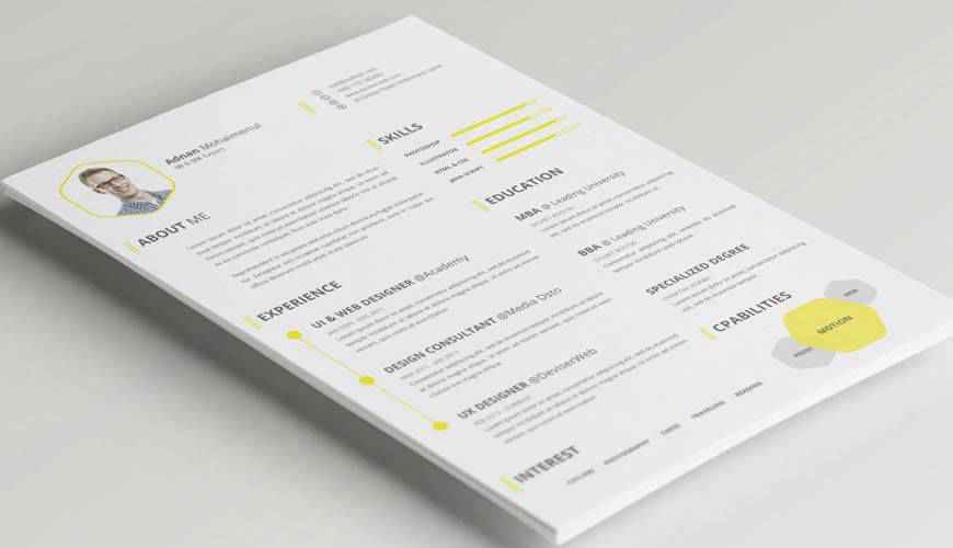
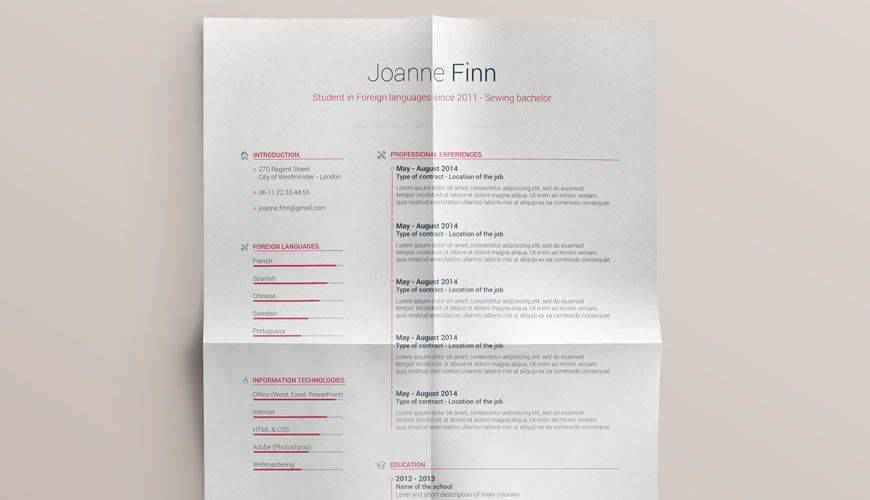
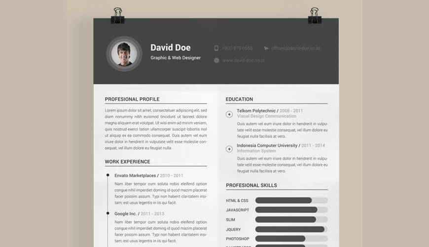
This clean resume template can be edited in Photoshop. The template has a minimalist design with pops of yellow that bring attention to different resume sections.

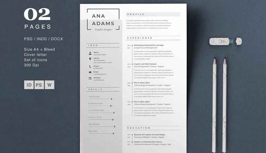
This resume template has an elegant design and features 2 pages for the resume which can be edited in Photoshop, InDesign, and Word. The resume also comes with a matching cover letter.

Make a great first impression with a resume that features beautiful and bold typography. This template can be edited in InDesign as well as in Microsoft Word.

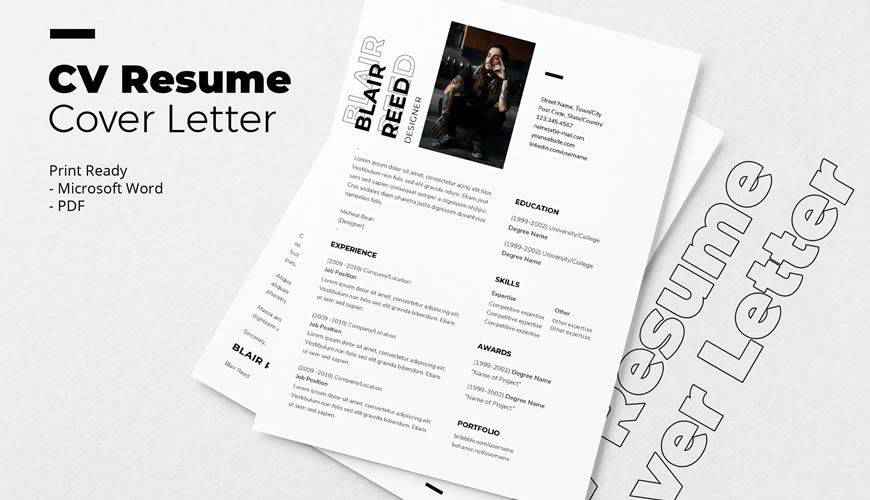
Blair Reed is a professionally designed and elegant resume template for Word that would be perfect for all creatives.

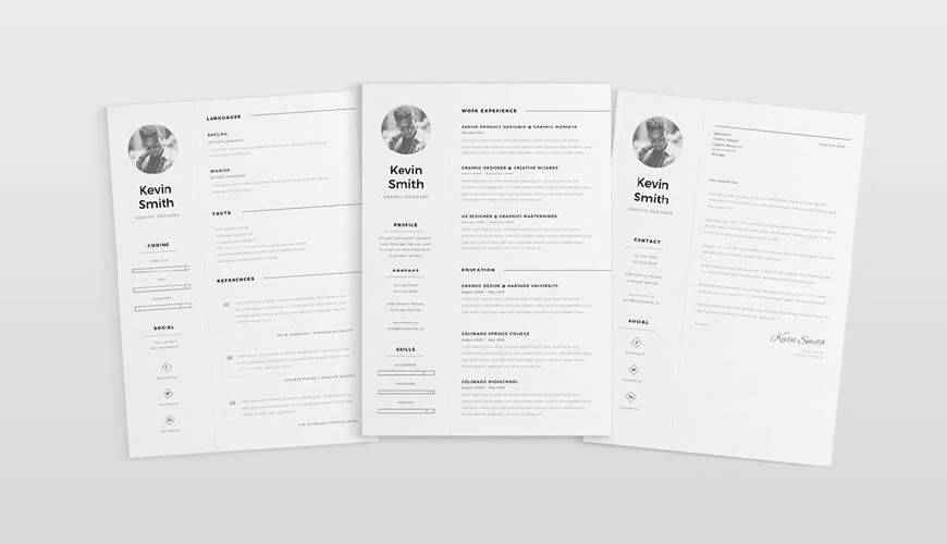
This minimalistic resume template has a clean design that’s neatly organized into two columns. There’s also room for your profile photo and the template can be edited in inDesign and Word.

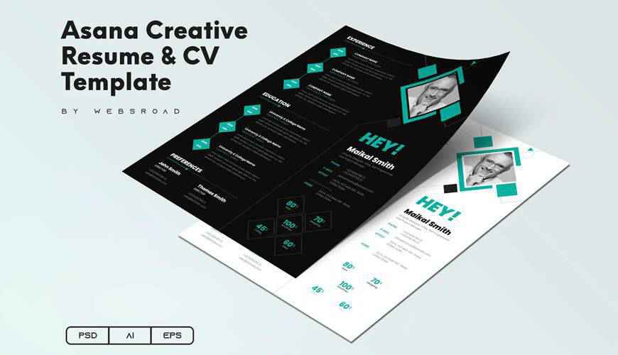
The Asana resume template and cover letter is perfect for showcasing your education, skills and accomplishments. It comes in Photoshop PSD and Illustrator AI formats.

This resume template has a bold and unique design that’s perfect for promoting your skills and projects. The template can be edited in Illustrator and features a two-page design.

This resume template is available as a part of your Envato Elements subscription and features a classic resume design. The template can be edited in InDesign and includes a matching cover letter.

If you want a more traditional design, be sure to take a look at this resume template. It uses a two-column layout and has enough space for your education, work history, and skills.

The Vanessa resume is a modern and creative resume template with a two-column layout. The template can be edited in inDesign.

Try this resume template if you’re on the lookout for an elegant resume design. The template comes in two paper sizes including US Letter and International A4 and can be edited in InDesign.

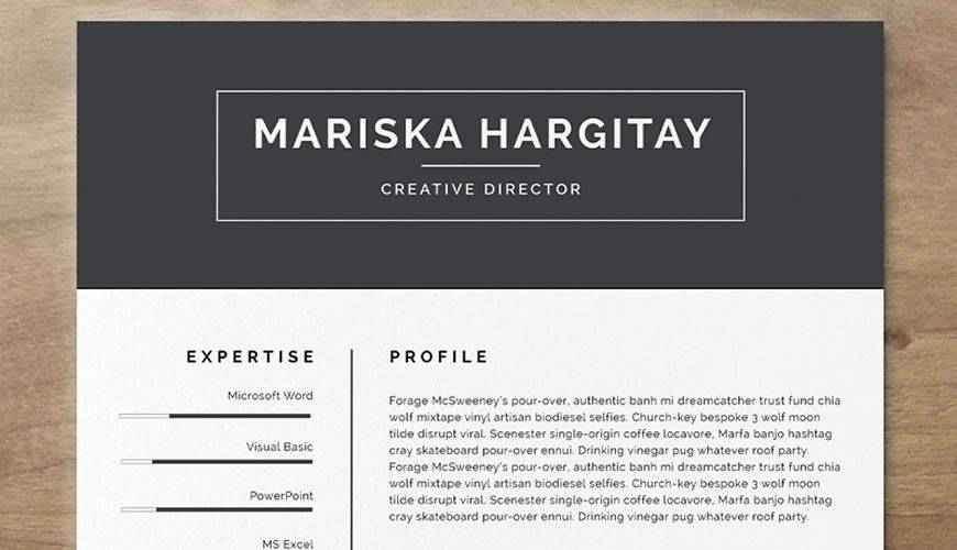
Use this resume template if you’re applying for a corporate position. The template has a two-column layout with a dark sidebar and has enough space to include your profile photo at the top.

This resume template can be edited in Illustrator, Photoshop, and Word so you have plenty of possibilities to customize the design. The template includes a single-page resume and a detailed help file.

This is another resume template designed in minimalistic style and is perfect for any type of job. The template can be edited in Illustrator.

When you download this resume template, you’ll get a complete package needed to impress your clients. The set includes a resume, cover letter, and a business card and can be edited in Photoshop.

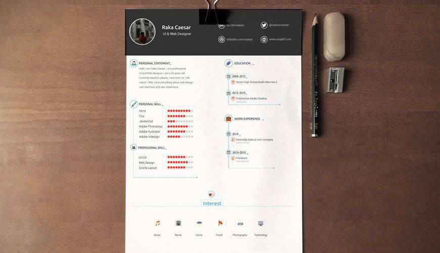
If you want a creative resume design, be sure to take a look at this resume template. You can edit it in Photoshop and use it to apply for a job in any creative field.

This resume template has a clean, two-column layout that’s easy to edit. The template was designed in Photoshop and comes with well-organized layers.

Check out this resume template featuring a modern and minimalist design. The template includes a one-page resume made with Adobe Photoshop and well-organized layers for easy editing.

This resume template was designed in Illustrator and contains a two-page resume along with a matching cover letter. Thanks to its minimal design, it can be used for any type of job application.

Capture the attention of any employer with this beautiful resume template. It has a beautiful header image and uses modern and clean typography that’s easy to read.

Thanks to this resume template, employers will be able to easily put a name to a face. The template features a two-column design and can be edited in Photoshop.

If you prefer to work in Sketch, don’t miss this template. It has a simple, one column layout and elegant section borders that add a touch of organization.

This resume template has a high-end design which makes it a great choice if you’re applying to work in a fashion, beauty or jewelry industry. The template can be edited in Word and InDesign.

Here’s a resume template that’s easy to edit in Photoshop. It has well-organized layers and a bold design that’s sure to capture the attention of any employer.

This clean resume template has the standard two-column layout where you can easily showcase your education and work history in the larger column and use the sidebar to share your contact information and skills. The template can be edited in Illustrator.

The post 20 Beautiful & Free Resume Templates for Designers appeared first on Speckyboy Design Magazine.
Package:
Summary:
Manage user groups and their access permissions
Groups:
Author:
Description:
This package can manage user groups and their access permissions...
Read more at https://www.phpclasses.org/package/11974-PHP-Manage-user-groups-and-their-access-permissions.html#2021-02-12-10:11:14

Package:
Summary:
Display the values of variables in HTML pages
Groups:
Author:
Description:
This class can display the values of variables for debugging...
Read more at https://www.phpclasses.org/package/11973-PHP-Display-the-values-of-variables-in-HTML-pages.html#2021-02-11-19:20:22

Designers often like to critique other designers. It’s just a natural side effect of being creative. We see a website or app and immediately start looking at how it all fits together. What challenges might have our brethren faced along the way? Would we have done anything differently?
Of course, no designer is perfect. We all have those projects in our portfolio that we’d like to forget. But let’s not dismiss the role clients play in this chaos.
More often, a questionable decision comes down to an opinionated client. No matter how much we try to sway them, they’re going full speed ahead towards a design disaster. I’ve experienced this more times than I can count. Eventually, it becomes pointless to continue pleading your case.
Today, we’re going to celebrate (or roast) the features that we implement in order to keep clients happy. No, they don’t meet our highest ideals. In fact, we’d probably rather hide under a blanket than have them tarnish our street cred. But we go along in the spirit of compromise (and wanting to get paid).
Home Page Sliders
Sliders and carousels have been used as a key component of home pages for years. Yet they are often lamented as ineffective and difficult to use. This doesn’t mean that they aren’t of some value – just not the perfect solution they’re made out to be.
Yes, you can place a lot of information into a limited amount of space. But it can get to the point where you’re expecting users to navigate through irrelevant options or (even worse) wait for the information they need. Not to mention the sometimes-overdone special effects and their impact on performance.
Still, it can be a challenge to steer clients in a different direction. I’ve had several experiences where a client overruled a static hero area in favor of a big old slideshow.
Why? It might be because you see sliders pretty much everywhere. And if the competition is using one, you may as well jump on the bandwagon. In these situations, all you can do is try to make the feature as unobtrusive as possible.

Multicolumn Text Passages
There are a number of print design staples that work nicely on the web. But some are geared towards dealing with the limited space on a printed page – a challenge that doesn’t impact websites so much.
Multicolumn text would fit into this latter category. You see it all the time in newspapers and magazines. Articles span across multiple narrow columns in a smallish font. It’s a great way to squeeze a lot of content onto a page.
But when you see this technique on the web, it generally makes content more difficult to digest. This particularly true on large desktop devices, where content widths could be well in excess of 1,000 pixels. Attempting to read anything of significant length is frustrating – particularly if scrolling is involved.
I recently encountered a long press release utilizing this format. The only thing I could do was mutter an exasperated “Why?” under my breath.

Inaccessible Color Schemes
Clients can be very insistent when it comes to their website’s color scheme. It’s easy to see why. After all, colors are a vital part of branding and public image.
Color also plays a huge role in website accessibility. We designers have had this concept drilled into our heads over and over. If you don’t implement acceptable color contrast ratios, your website won’t be accessible. Simple as that.
But you still see some really funky color combinations that give even those with 20/20 vision a hard time. Strangely, it’s not just outdated mom and pop websites that have their colors mixed up. You’ll also find the occasional big brand that has lousy contrast ratios.
However, there may be some hope in this area. With designers pushing accessibility harder than ever, and with so much at stake, clients will hopefully come to their senses. Besides, there are plenty of creative ways to use a brand’s color scheme while keeping accessibility at the forefront.

Modal Windows
Remember those old pop-up ads from the early 2000s? You’d visit a website and be inundated with little windows scattered across your screen. Common decency (or, more likely, browser technology) knocked them out of existence years ago – only to be replaced by modal windows.
Modals are certainly sleeker and can be effective under the right circumstances. But, like their popup ancestors, they can be easily abused. What users are left with is a barrier to entering (or leaving) a website and doing something useful.
Clients tend to think that modals are great attention-getters. Maybe so, but they are just as likely to annoy a potential customer. Therefore, you’d better have some killer content inside that little box.
The worst abuse? When you dismiss a window, only to have it show up the next time you’re on the site. That’s just plain cruelty.

Chatbots
I’m probably going against the grain on this one. But I can’t think of a single instance when a chatbot was actually helpful to me. Sure, they can be rather polite. At the same time, they tend to run users around in circles.
It has become the web equivalent of telephoning a large company. Only instead of feverishly dialing “0” to speak to a human, you now have to type in multiple phrases, hoping to elicit signs of intelligent life.
Beyond that, these contraptions can’t provide you with anything that you couldn’t already get by using a search feature. Only the trusty search bar is more likely to direct me to the right place – and without asking me how I am. Like they really care?
Clients tend to see this as a way to personalize their website. It’s like having a customer service representative on hand 24 hours a day. They only think this way because, well, they don’t have to actually communicate with the chatbot.

The Price of Keeping Clients Happy
Many of us in the web design industry like to think of ourselves as purists. We heed the instruction of knowledgeable peers and try to build projects that follow best practices. But the reality is not so simple.
Whether we realize it or not, web design is a service industry as well as a creative one. We serve our clients and work with them to produce a satisfactory result.
And no matter how much good advice we give, the final decisions still rest with the client. Sometimes, despite our efforts, they make a choice that goes against our wishes. So be it.
With the exception of accessibility, the items above may not be our taste – but they won’t lead to the end of civilization (there are plenty of other people working on that). In the end, it’s about making the most out of a project – no matter what obstacles we face.
The good news is that we still get to make those fun critiques. Doesn’t that make you feel better?
The post My Client Made Me Do It: True Tales from the Grumpy Designer appeared first on Speckyboy Design Magazine.
Package:
Summary:
CodeIgniter based API and CRUD generator
Groups:
Author:
Description:
This package can be used create CodeIgniter based API and CRUD applications...
Read more at https://www.phpclasses.org/package/11949-PHP-CodeIgniter-based-API-and-CRUD-generator.html#2021-02-11-07:27:33

PHP Internals News: Episode 75: Globals, and Phasing Out Serializable
London, UK
Thursday, February 11th 2021, 09:03 GMT
In this episode of "PHP Internals News" I chat with Nikita Popov (Twitter, GitHub, Website) about two RFCs: Restrict Globals Usage, and Phase Out Serializable.
The RSS feed for this podcast is https://derickrethans.nl/feed-phpinternalsnews.xml, you can download this episode's MP3 file, and it's available on Spotify and iTunes. There is a dedicated website: https://phpinternals.news
Transcript
- Derick Rethans 0:14
-
Hi I'm Derick. Welcome to PHP internals news, a podcast dedicated to explain the latest developments in the PHP language. This is Episode 75. In this episode, I'm talking with Nikita Popov about a few RFCs that he has been working on over the past few months. Nikita, would you please introduce yourself?
- Nikita Popov 0:34
-
Hi, I'm Nikita, I work at JetBrains on PHP core development and as such I get to occasionally, write PHP proposals RFCs and then talk with Derick about them.
- Derick Rethans 0:47
-
The main idea behind you working on RFCs is that PHP gets new features not, you end up talking to me.
- Nikita Popov 0:53
-
I mean that's a side benefit,
- Derick Rethans 0:55
-
In any case we have a few to go this time. The first RFC is titled phasing out Serializable, it's a fairly small RFC. What is it about?
- Nikita Popov 1:04
-
That finishes up a bit of work from PHP 7.4, where we introduced a new serialization mechanism, actually the third one, we have. So we have a bit too many of them, and this removes the most problematic one.
- Derick Rethans 1:19
-
Which three Serializable methods or ways of doing things currently exist?
- Nikita Popov 1:24
-
The first one, which doesn't really count is just what you get if you don't do anything, so just all the Object Properties get serialized, and also unserialized, and then we have a number of hooks, you can use to modify that. The first pair is sleep and wake up. Sleep specifies which properties you want to serialize so you can filter out some of them, and wake up allows you to run some code, after unserialization, so you can do some kind of fix up afterwards.
- Derick Rethans 1:52
-
From what I remember, if you use unserialize, where does the wake up the constructor doesn't get called?
- Nikita Popov 1:59
-
During unserialization the constructor, never gets called.
- Derick Rethans 2:03
-
So wake up a sort of the static factory methods to re rehydrate the objects.
- Nikita Popov 2:08
-
Exactly.
- Derick Rethans 2:08
-
So that's number one,
- Nikita Popov 2:10
-
Then number two is the Serializable interface, which gives you more control. Namely, you have to actually like return the serialized representation of your object. How it looks like is completely unspecified, you could return whatever you want, though, in practice, what people actually do is to recursively call serialize. And then on the other side when unserializing you usually do the same so you call unserialize on the stream you receive, and then populate your properties based on that. The problem with this mechanism is exactly this recursive serialization call, because it has to share state, with the main serialization. And the
Truncated by Planet PHP, read more at the original (another 22227 bytes)
PHP Internals News: Episode 76: Globals, and Phasing Out Serializable
London, UK
Thursday, February 11th 2021, 09:03 GMT
In this episode of "PHP Internals News" I chat with Nikita Popov (Twitter, GitHub, Website) about two RFCs: Deprecate passing null to non-nullable arguments of internal functions, and Deprecate passing null to non-nullable arguments of internal functions.
The RSS feed for this podcast is https://derickrethans.nl/feed-phpinternalsnews.xml, you can download this episode's MP3 file, and it's available on Spotify and iTunes. There is a dedicated website: https://phpinternals.news
Transcript
- Derick Rethans 0:14
-
Hi I'm Derick. Welcome to PHP internals news, a podcast dedicated to explain the latest developments in the PHP language. This is Episode 76. In this episode, I'm talking with Nikita Popov about a few more RFCs that he has been working on over the past few months. Nikita, would you please introduce yourself.
- Nikita Popov 0:34
-
Hi, I'm Nikita. I work on PHP core development on behalf of JetBrains.
- Derick Rethans 0:39
-
In the last few PHP releases PHP is handling of types with regards to internal functions and user land functions, has been getting closer and closer, especially with types now. But there's still one case where type mismatches behave differently between internal and user land functions. What is this outstanding difference?
- Nikita Popov 0:59
-
Since PHP 8.0 on the remaining difference is the handling of now. So PHP 7.0 introduced scalar types for user functions. But scalar types already existed for internal functions at that time. Unfortunately, or maybe like pragmatically, we ended up with slightly different behaviour in both cases. The difference is that user functions, don't accept null, unless you explicitly allow it using nullable type or using a null default value. So this is the case for all user types, regardless of where or how they occur as parameter types, return values, property types, and independent if it's an array type or integer type. For internal functions, there is this one exception where if you have a scalar type like Boolean, integer, float, or a string, and you're not using strict types, then these arguments also accept null values silently right now. So if you have a string argument and you pass null to it, then it will simply be converted into an empty string, or for integers into zero value. At least I assume that the reason why we're here is that the internal function behaviour existed for a long time, and the use of that behaviour was chosen to be consistent with the general behaviour of other types at the time. If you have an array type, it also doesn't accept now and just convert it to an empty array or something silly like that. So now we are left with this inconsistency.
- Derick Rethans 2:31
-
Is it also not possible for extensions to check whether null was passed, and then do a different behaviour like picking a default value?
- Nikita Popov 2:40
-
That's right, but that's a different case. The one I'm talking about is where you have a type like string, while the one you have in mind is where you effectively have a type like string or null.
- Derick Rethans 2:51
-
Okay.
- Nikita Popov 2:52
-
In that case, of course, accepting null is perfectly fine.
- Derick Rethans 2:56
-
Even though it might actually end up being different defaults.
- Nikita Popov 3:01
-
Yeah. Nowadays we would prefer to instead, actually specify a default value. Instead of using nu
Truncated by Planet PHP, read more at the original (another 13729 bytes)
Package:
Summary:
Manage application users stored in JSON files
Groups:
Author:
Description:
This package can be used to manage application users stored in JSON files...
Read more at https://www.phpclasses.org/package/11972-PHP-Manage-application-users-stored-in-JSON-files.html#2021-02-10-13:47:20

Package:
Summary:
CodeIgniter based API and CRUD generator
Groups:
Author:
Description:
This package can be used create CodeIgniter based API and CRUD applications...
Read more at https://www.phpclasses.org/package/11949-PHP-CodeIgniter-based-API-and-CRUD-generator.html#2021-02-10-11:08:36

The rise of open-source software has been one of the most impactful things to happen to the web design industry. Just think about all of the apps – large and small – that have made life easier for designers and developers. And perhaps none have had an impact quite as large as WordPress.
Many of us have used the massively-popular content management system (CMS) for our projects – and have made a living doing so. Then there are the countless theme and plugin developers who make up the WordPress ecosystem. And let’s not forget web hosts, marketing experts and individual bloggers. We’ve all leveraged the software for publishing and profit.
However, this doesn’t all happen out of thin air. It takes a lot of talented and dedicated volunteers to keep WordPress moving forward. They build the core software, ensure theme and plugin quality, offer tech support and share their knowledge. And that’s just the tip of the iceberg.
That’s why it was so disheartening to learn about what members of the Plugin Review Team (responsible for making sure plugins are secure and follow guidelines) have endured. Harassment, threats of physical harm and other improper conduct have forced team members to send communication with plugin authors anonymously. Just to ensure their own safety and peace of mind.
Odds are that this type of situation isn’t limited to just a single person or a particular team. This got me thinking about calling further attention to the matter and showing some appreciation for these volunteers. In many ways, their work goes unnoticed by the average WordPress user. Let’s change that.
Touching Every Facet of WordPress
Volunteers have a hand in virtually every aspect of the WordPress project. Some contribute on their own personal time, while others are sponsored by their employer as part of the “Five for the Future” initiative. Either way, they are responsible for an incredible amount of work.
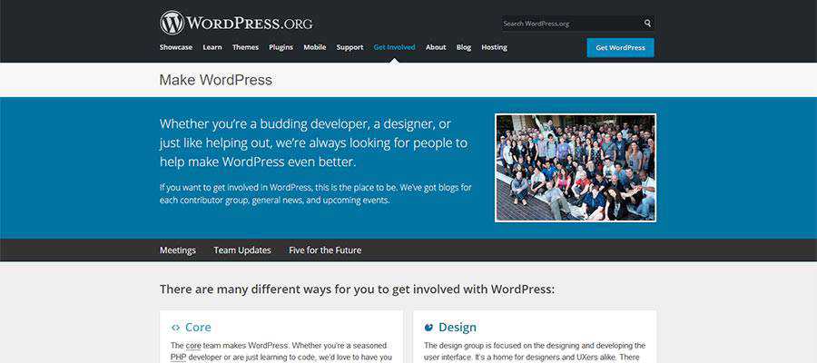
To get a sense of what types of tasks they handle, check out the Make WordPress website. It provides an exhaustive list of the places where volunteers spend their time and make an impact.
These folks work on everything from ensuring that WordPress is accessible to translating the software into just about any language you can think of. They also have a hand in documentation, testing, design and keeping the theme and plugin repositories running smoothly.
Skill-wise, WordPress contributors run the gamut. Some are expert designers or coders, while others may identify as everyday users of the software. Each brings their own unique skills, perspectives and life experiences to the project. Together, they help to make WordPress the success that it is.

Sharing with the Community
Just as importantly, you’ll see and hear from many of these volunteers at events such as WordCamps or local meetups. These are great opportunities to get to know them as people and benefit from their knowledge.
Personally, I’ve interacted with a number of contributors at events. Some, like Aaron Campbell and Joe Casabona, were even kind enough to do Q&A’s with me. Even those I haven’t directly spoken with have still made an impact via compelling presentations.
If you can’t get to an in-person or virtual event, many contributors are also active on social media or through their own personal blogs. It’s another great way to interact or simply watch and learn.
Of course, not every contributor has a large community or online presence. Thus, they may not be “household” names. But their efforts mean just as much and should not go unnoticed.

Thank You, WordPress Contributors!
Sometimes it can feel like the work we do is thankless. Whether you’re a web designer or a parent, you put in a lot of effort and don’t always feel appreciated. The same can be said for WordPress contributors.
Some may only hear from the larger community when there’s a problem or disagreement. Others toil in anonymity (chosen or not) without receiving public praise for a job well done.
To all of you who contribute to the WordPress project, I say a heartfelt “thank you”. Your efforts have helped me and so many others continue to thrive in this industry.
As for those of us who use WordPress each day, let’s take a moment to think about the people who make this software possible. They’re volunteers from all walks of life and are willing to share their talents for the greater good.
This is important to remember as we both use WordPress and interact with those working behind the scenes. A little appreciation and understanding can go a long way.
The post Appreciating the Unsung Heroes of WordPress appeared first on Speckyboy Design Magazine.
