OnTimeCore
Read more at https://www.phpclasses.org/package/11972-PHP-Manage-application-users-stored-in-JSON-files.html#2021-02-15-11:26:12
The multiple COVID-19 vaccines that have come out are nothing short of scientific miracles. The speed and efficacy of these life-saving, pandemic-squashing shots are a testament to human achievement.
That being said, getting these vaccines into the arms of everyday people has been a challenge. That’s especially true here in the United States, where each state has its own rollout strategy. Some have been more effective than others.
Nevertheless, much of the burden for distributing the vaccine has been placed upon online scheduling apps. Health clinics and pharmacies have put these systems in place, allowing people to snap up any available appointments.
As someone who has been on the hunt for an appointment, I’ve used several different types of these schedulers. What I’ve found has been a messy and evolving array of experiences. Here’s a closer look at the ups, downs and frustrations involved. And, just as importantly, the lessons they can teach designers.
First, I’d like to note that the purpose of this post is to point out what’s happened and what needs to improve. It’s not meant as a slight to individual companies, designers or developers.
Collectively, they were put into a difficult situation. The process for putting together online scheduling apps fell into the lap of many a vaccine distributor. For some, they had to build an app that was usable within a very short period of time.
It seems fairly easy to pick out the distributors who already had some form of online scheduling in place before the pandemic. They tend to have a more polished UI and a higher level of intuitiveness.
The rest of the pack? Well, they’ve struggled to put forth systems that are both stable and easy to use. For those of us trying to get vaccinated, this has made the process even more difficult.
Appointment booking and other online scheduling software has been around for quite some time. But one can imagine the challenge of getting these packages to co-exist with more traditional offline schedulers – something I’m certain a lot of vaccine distributors have faced. And to do so within days or weeks? That can’t be easy.
The results have been literally all over the map. My home state of Pennsylvania has put together a slick interactive feature that allows you to zoom in on your town and find all available vaccine locations. This is the easy part.
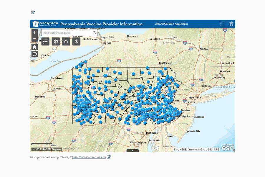
But once you click on a respective provider’s URL, the chaos begins. Here are a few examples of what I found:
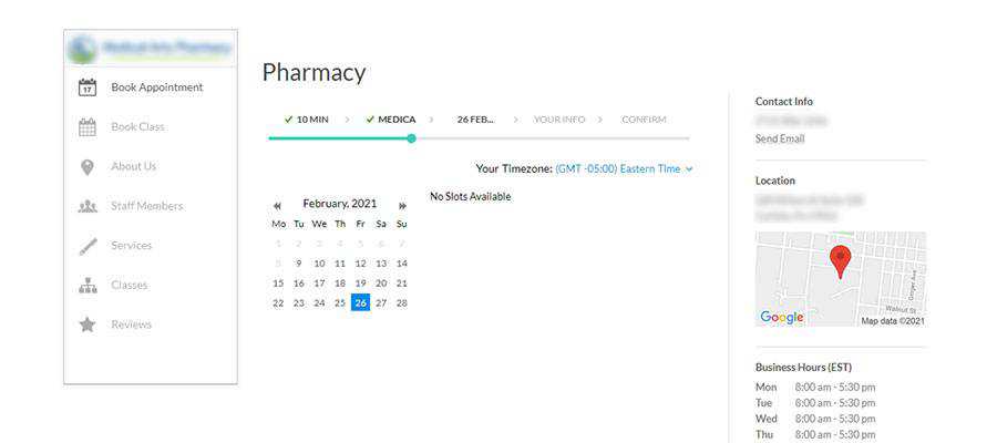
Among the more infuriating schedulers out there, this one requires you to click on each day within a calendar. It takes anywhere from about 2-10 seconds to let you know if there are any available appointments on that particular day. Thus, you’ll spend a lot of time clicking around and hoping for a good result.
A small tweak that could have a positive impact would be blocking out days that have no availability. This would save users a lot of time, while saving server resources as well.
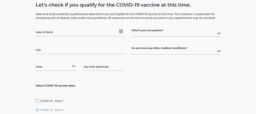
One of the big pharmacy chains in this area really broke my heart. Initially, their scheduler asked for some basic contact and medical information – fair enough. From there, you select a store location and move on to a calendar.
This one looked just beautiful, with highlighted days and a listing of available appointment times. But this vaccine oasis turned out to be a mirage.
After selecting an available day and time, I was asked to provide even more medical detail. OK, I’m hurrying! Next, all you have to do is verify that your info is correct and book your appointment. Yay, I’m almost there!
The bad news? After submitting the appointment, you get a message explaining that the time slot has already been booked. I repeated this countless times over a period of several days. Returning later often showed the exact same open times – and again a failure to book.
Thankfully, they’ve since streamlined the process. The calendar is skipped completely if appointments are not available. It’s a much more user-friendly experience.
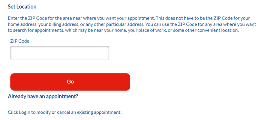
Another somewhat humorous example shows why loading animations can be so important. Here, a scheduler asks for your postal code so that it can determine if a location near you has the vaccine.
You type it in, submit the form and…crickets. The screen isn’t refreshing – did I not hit the button? I don’t see any sort of loading graphic – maybe the system isn’t working today?
Eventually, you do get a result. But there is absolutely no way a user can tell that the query is being run. I can imagine that some people may have up and left before even seeing what the search had to say.
One of the key takeaways from this is experience is how important design is for achieving a desired result. It is also a prime example of why a coherent strategy is vital to the success of a project.
When this is lacking, we make it harder for users to get what they need. This is bad enough on an ordinary eCommerce website – but the impact it has on getting millions of people signed up for a crucial vaccine is potentially massive.
Just imagine someone who is so frustrated by an online scheduling app that they give up on getting vaccinated altogether. Or even a provider who has supplies that are quickly becoming outdated because people aren’t signing up. It would be a waste of very precious time and resources.
Thankfully, there are some positive signs on the horizon. I’ve seen some changes in various schedulers that improve the user experience. And as more feedback comes in, further improvements can be made.
In many ways, the world was caught flat-footed when the pandemic first struck. Time and again, designers have had to react with quick solutions.
We can’t change the mistakes that have already happened. But this experience can provide valuable lessons for the future. Hopefully, that means a smoother, more intuitive process for all.
The post What COVID-19 Vaccine Scheduling Can Teach Designers appeared first on Speckyboy Design Magazine.
Just like in most other professions, a web designer’s set of tools is what brings a concept into fruition. There are many applications available to our disposal, but there are some that just stand out from the crowd. The tools in this article are what’s regarded as the most popular and best web design tools.
Keep reading to learn more about the webpage designing tools that made this list, which include:
Adobe Dreamweaver is a commercial application for web development that’s available for the Mac and Windows operating systems.
This webpage designing tool is featured-packed with a suite of tools and options that include: syntax highlighting and very smart Code Hinting, a built-in FTP client, project management and workflow options that make teamwork effortless, and Live View – which shows you a preview of your source code. Dreamweaver tightly integrates with other popular Adobe products such as Photoshop, allowing you to share Smart Objects for quick and easy updating and editing of graphics components.
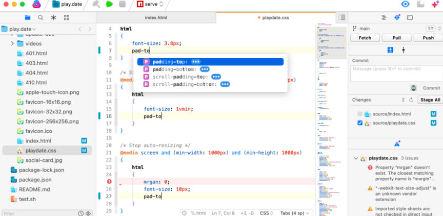
Nova is a new and improved version of Panic, a web development application for the Mac OS X operating system. This web designing tool seeks to reduce the amount of applications (such as an FTP client, CSS editor, a version control system, etc.) you need to develop websites and to improve your team’s workflow. Nova’s one-window web development philosophy uses a tabbed interface for text editing, file transfers, SVN, CSS, and even “Books” which embeds web books that are searchable (it comes with The Web Programmer’s Desk Reference but you can add your own).
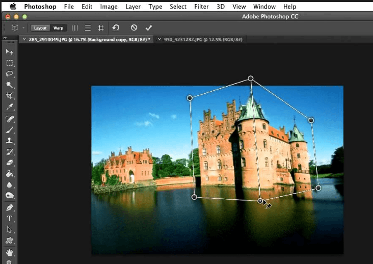
Adobe Photoshop is a very popular commercial graphics editor available for the Mac and Windows operating system. Created for professional photographers and designers, it is the ideal application for manipulating images and creating web graphics. Photoshop has all the necessary tools and options you need such as: Filters – which automatically adds effects to your image or a selected section of your image, extensibility and automation with Brushes, Actions and Scripting, and workflow enhancement features like Layer Comps and the Revert option.
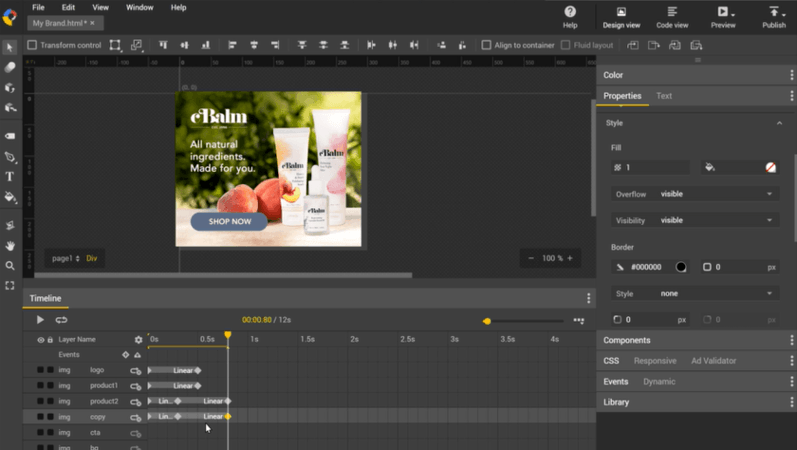
Google Web Designer is a free webpage designing tool that makes creating interactive and engaging HTML5-based designs easy. Even better, the tool ensures your designs (and motion graphics) will run and display on any device, from desktops to smartphones. You can also edit HTML, CSS, and JavaScript directly with Google Web Designer.
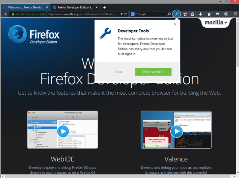
Firefox Developer Edition is a version of Firefox specifically for web developers. As a developer, you have access to all their DevTools. This web design tool’s many features include: Analyzing and debugging, building and designing with CSS Grid, HTML inspector, style editor among many other tools to provide the greatest assistance with your web development needs.
Here are other tools that were voted as some of the best webpage design tools that are worth a quick mention.
The post Top 5 Web Design Tools & Software Applications appeared first on WebFX Blog.
One of the best ways to measure how far technology has come is to use a legacy product. It’s true of devices like computers and smartphones. And it also applies to websites as well.
For instance, compare a WordPress website you built recently with one from a decade ago. You’ll likely notice a lot of differences – both cosmetically and under-the-hood. It can certainly lead you to better appreciate the progress that has been made.
This is a process I’ve found myself doing a lot lately. A few websites that I built way back in the early 2010’s are still in use. Beyond keeping those installs updated, part of my job has been to replace abandoned plugins and retrofit for newer features.
The experience has been interesting. Not only have these past projects offered perspective, but they’ve also been challenging. Figuring out what I did, why I did it and how to keep things moving forward. It’s akin to keeping a classic car running.
Maintaining a legacy WordPress website takes a keen eye and attention to detail. With that, here are some tips to make sure your old site is humming along.
One of the most common issues you’ll find with older WordPress websites is the use of abandoned software. Plugins and themes that were acceptable solutions back in the day may no longer be in active development. That’s a risk to both functionality and security.
How do you know if an item has been abandoned? If it originates from the official WordPress theme or plugin repository, you’ll usually see a message stating that it “hasn’t been tested with the latest 3 major releases of WordPress”. That’s not a guarantee that the developer has completely let go of the project, but it can be a solid indicator.
If the item doesn’t come from an official repository, it may require some extra snooping. Search around for changelogs (that hopefully have release dates included) or support forums. Anything that hasn’t seen an update or author forum response in a year or more is likely gathering dust.
Most times, an abandoned plugin should be replaced. It’s not always a huge emergency, though. A simple niche plugin that doesn’t do a whole lot may be able to stick around longer than a complex one. Use your best judgement and look for potential alternatives.
Themes can also vary. Sometimes it’s a matter of replacing or disabling old scripts that won’t pass muster.
Regardless, it’s important to know where these items stand. Even if they work today, tomorrow could be a different story.

WordPress comes bundled with the jQuery JavaScript library. This is great for leveraging special effects and other UI-related goodies on your website. But as new versions are included, some older scripts become obsolete.
This can be a problem. For example, a change in jQuery versions that came with WordPress 5.6 led to a large number of JavaScript errors – particularly with older plugins and themes. Certain code that had been deprecated was no longer supported. Thus, developers had to hunt down and fix each instance.
Leaving these items unfixed could cause a buggy experience on both the front and back ends. jQuery errors tend to interfere with how other plugins function and may even prevent them from working at all.
It always pays to stay on top of impending WordPress library changes. But it’s truly essential when dealing with a legacy site. Any item that hasn’t seen an update in a while is susceptible to breakage.
Therefore, it’s important to check the changelogs for WordPress core and for jQuery itself. Additionally, test out updates on a staging environment before applying them to a production site. This could save you from some serious usability issues.

Whether you built a website years ago or inherited it from another developer, chances are you’ll run into some questionable code. It might be a snippet inside a theme template or even an ambiguous plugin.
This is all the more reason to document your projects. But if there’s no documentation, you might be left to wonder why a particular item was included. Was it just poor practice or does this code still serve a purpose?
While it may seem safe to deactivate a plugin or remove code – do some research first. I can’t tell you the number of times I’ve jettisoned something I thought was useless only to find that it facilitated some obscure function. That resulted in putting things back the way they were (be sure to keep backups, too).
The research all depends on the item itself. If it’s a plugin, a web search can be a big help. For snippets, analyze the code and try to figure out what it does. Either way, don’t touch anything on a production site until you know for sure and have done some testing.

Things change quickly on the web. Thus, an older website might be missing some crucial features. Things that could leave you lagging behind or worse.
Perhaps the two biggest items on this list are accessibility and responsive styling. A website built in 2010 may not have taken these things into account.
For instance, I found that a few older projects were using a plugin to serve up a separate mobile theme. There wasn’t anything particularly bad about this practice – and it worked well enough. But even aging desktop themes can be retrofitted to work nicely on smaller screens. It takes some CSS and maybe even reconfiguring of templates, but it’s worth doing if a redesign isn’t in the budget.
Bringing accessibility up to snuff may require a lot of manual and automated testing. You’ll want to ensure that the website covers the basics like color contrast ratios, legibility and keyboard-friendly navigation. Utilizing the ALT attribute on images is also important.
Even if you have limited resources to work with, a little effort in these areas can have a positive impact.

It’s a credit to both WordPress and its ecosystem that websites built many years ago keep on working. Much of the code and styling involved is more resilient than one might think.
Still, time marches on. Themes, plugins and scripts will eventually break if not maintained. We can certainly hope that the developers of these items are keeping up with the latest standards. But sometimes that job falls to us.
If a legacy site is in your care – don’t worry. By doing some homework and being on the lookout for potential issues, you can still provide a great experience for users.
The post Tips for Maintaining a Legacy WordPress Website appeared first on Speckyboy Design Magazine.
There’s just something about boxes that instantly delight. The notion of receiving a gift, the entire experience of unwrapping it, and then seeing what is hiding between the four corners. And it all starts with a single cardboard box.
Just as we all turn into kids on a Christmas morning when we see a box, audiences and clients love seeing box packaging mockups. So if you add your design to this specific mockup type, you can rest assured that your audience will be more willing to consider it.
In fact, a box packaging mockup template can be a great way to convince your clients that your designs are the absolute best. These templates go on to show a plethora of possibilities, and the box is perfect for imagining their own products in it.
From there, you can easily understand what the end customers might think. Remember: the post-purchase experience starts with a box. And if the box is enticing, people will be more inclined to love the product, as well.
So today, we’re bringing you 25 cardboard box packaging mockup PSD templates. They’re easy to customize in Photoshop, and offer numerous options.
From gift boxes with pretty ribbons to food pastry carrier boxes, there are plenty of templates you’ll love. So no matter the project you’re currently working on, you’ll definitely find something for yourself in our collection.
Wake up and smell the pepperoni! With this pizza box mockup set, you actually can. These 5 cardboard pizza box mockup templates allow you to put your design at the front of your presentation. The mockups are also set in a realistic restaurant environment, so your results will look amazing!
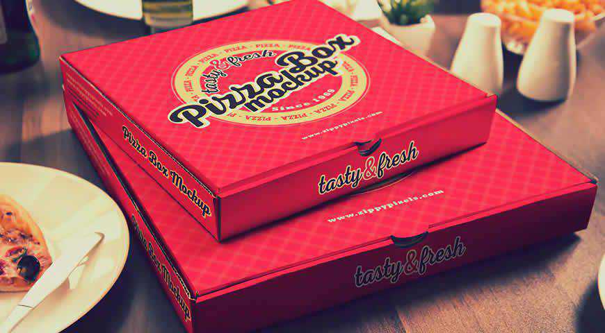
Simple and clean, these box packaging mockup templates come with 2 different variations, as well as changeable background color. There’s not much going on in the background which is perfect for presenting more complex designs and wowing your audience. Customizing them is as easy as 1, 2, 3!

This stunning blue box with sliding drawer mockup template for Photoshop is perfect for elegant designs and projects! With a signature Tiffany blue and pink color palette, this box mockup is easy to customize with Photoshop, and offers photo-realistic results for your next project. It’s time to shine!

Your design is the best gift, so show it with this beautiful mockup depicting a gift box with a ribbon! Customize the design, ribbon color, box color, and the background color to make it your own, and amaze your clients. It’s perfect for products which come as gifts!

Simple and photo-realistic, these cardboard box mockup templates are perfect for packaging design. You’ll get 3 different box mockup styles, and you can add your designs to every box side thanks to Photoshop smart objects. The background is customizable, and you can play with shadows and effects, too!

Unique designs deserve unique box mockups, and Cipuk’s box mockup template for Photoshop is the best in class! You’ll get 4 premium mockup templates with 4 different angles. You can add your design to open and closed box mockups. Not even the sky is the limit!

Perfect for presenting software and tech design, these 3D product box mockup templates are exactly what the dev ordered! You can easily add your design wherever you’d like, and this mockup will help it shine. You’ll get beautiful, photo-realistic results that your clients will absolutely love!
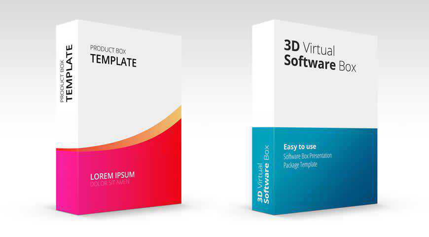
When your design is spectacular, you need a minimalistic box mockup to highlight it. Fortunately, this minimalistic box mockup offers plenty of options. With unique box design, this mockup is perfect for designing packaging and refining branding ideas. You can also customize the package color, as well as the background!

Simple and clean, this takeaway pizza box mockup set is perfect for packaging design. With 5 different mockups in the set, you can assure your customers that their packaging will look phenomenal. With changeable background, as well as realistic effects and shadows, you’ll love using these box mockups!

A stunning box mockup template collection, this set offers versatile mockups for your next project. With 6 different carrier mockups, including long box and trapezoid carriers, you’ll have plenty of options for design presentations. You can customize everything from gold foil effects, to box die cuts and materials.

If you’re looking for a fun way to present your exciting design, go with these rectangular box mockup templates for Photoshop! With 2 mockup options, as well as realistic shadows and effects, you’ll get stunning results that will show your design in the best possible light.

If you want to highlight the complexity of your design, or you’re actually designing puzzles, you’ll love this puzzle and packaging mockup template! You can separately upload the puzzle design and the logo, and customize the box, puzzle, and background color. Unique designs deserve unique presentations!

Choose your own adventure, AKA: create your own box mockup! This box packaging mockup set is the perfect opportunity to go wild and really emphasize the intricacy of your design. Choose from different options such as gold print, and mix and match to create hundreds of beautiful box mockup combinations!

If you want to up the ante during your presentation, and breathe life into your designs, choose this box mockup set with 7 gorgeous, photo-realistic square boxes. With different layer styles, floor textures, photo filters, and background images, you’ll get plenty of options for creating a phenomenal mockup!

Simple and sleek, this cardboard postal box mockup template for Photoshop is perfect for envisioning what your brand’s logo will look like once the package is shipped. Minimalist, this postal box mockup lends itself perfectly to your branding, and helps you see what your happy customers will see.

If you’re looking for a simple and photo-realistic mailing box mockup, this template is the perfect option! This box template comes without fuss; you can easily add your own designs (one on top, the other on the front), as well as customize the box colors and the background.

Who doesn’t like gifts? Your clients will adore your design once it’s presented with this gorgeous gift box mockup template set! You’ll get 4 PSD mockups in different poses, realistic effects and shadows, as well as the option to change the background. Happy photoshopping!

No matter the style of your designs, you’re going to find the right mockup with this beautiful set of box and packaging mockup templates. With 5 box mockups, options to adjust the background, shadows, and colors, there’s plenty to work with and get beautiful, photo-realistic results.

If you’re serious about branding your boxes and packaging, first test your ideas with this open cardboard mailing box mockup template. With three places to showcase your logos and designs, as well as minimalist setting and presentation, this box mockup for Photoshop puts your design in the spotlight!

If you’re looking for an upright, thin box in a minimalistic setting, then this box mockup template is the perfect fit! This mockup offers unique box size, as well as plenty of customization options: upload up to 3 different designs, change the box color, and adjust the background.

If you need mockups so realistic that your clients will try to touch the screen, then this box mockup template for Photoshop is just what the designer ordered! With 7 different mockups, selective varnish, and automatic and customizable background perspective, your design will look stunning, polished, and true to life.

A kraft cube box mockup with 4 different templates, this set is the perfect choice for ultra-realistic presentations. The mockups are super easy to edit in Photoshop, and you can mix and match different presentations to showcase your design in all the right lights. The results will wow your clients!

Perfect for elegant brands, these 2 box packaging mockup templates offer numerous customization options. Change the design, colors, background, shadows, and more! You can even opt for foil stamping to make your design look even more realistic. And since the boxes were professionally photographed, you’ll get photo-realistic results!

Does your milkshake bring all the clients to the yard? If not, check out these juice and milk box mockup templates for Photoshop. Easy to customize, these 3 mockups are organized, well-lit, and incredibly realistic. Adjust the colors, shadows, and the background, and you’ll be good to pitch!

Clean and minimalist, this template set offers everything you need to realistically showcase your design. You’ll get 3 PSD box mockups (design close-up, small box with the top and the front, box with 3 side), realistic effects and shadows, and you can even play around with the background.

Plenty of boxes for plenty of gifts! And your design is on top of it all!
No matter what you’re planning to promote, a box mockup template is always a good way to turn your vision into a reality. Once you’ve placed your designs on one of these gorgeous cardboard box mockup templates for Photoshop, it will be much easier to convince your clients.
More Mockup Templates: Banners, Books, Booklets, Bottles, Branding, Dresses, Flyers, Frames, Hoodies, iPads, iPhones, Laptops, Logos, MacBooks, Magazines, Mobile Apps, Mobile Devices, Mugs, Packaging, Sweatshirts, T-Shirts, Tote Bags.
The post 25 Cardboard Box Packaging Mockup PSD Templates appeared first on Speckyboy Design Magazine.
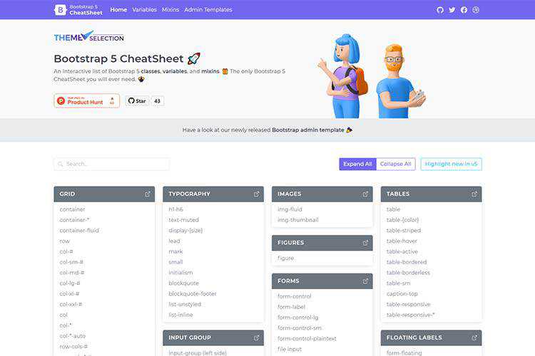
Bootstrap 5 CheatSheet – This interactive reference will help you navigate the latest version of Twitter’s CSS framework.
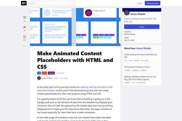
Make Animated Content Placeholders with HTML and CSS – Add user-friendly placeholders with this tutorial.
Why Is Focusing on Long-Term Goals So Difficult? – Ways to help you home in on the future of your design business.

Exploring the Complexities of Width and Height in CSS – A look at how CSS computes the width and height dimensions of elements.

Rotating Loading Animation of 3D Shapes with Three.js – An example of rubber-like 3D shape rotations that are perfect for loading animations.
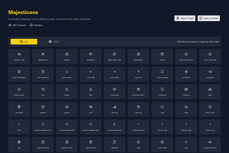
Majesticons – Check out this free collection of 200+ scalable SVG icons.
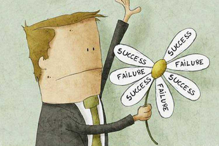
As a Designer, Is Failure a Necessary Part of Success? – Failure isn’t fun. But it can provide you with valuable life experience.
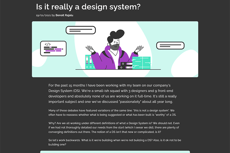
Is it really a design system? – One company’s journey in building a design system (or not).
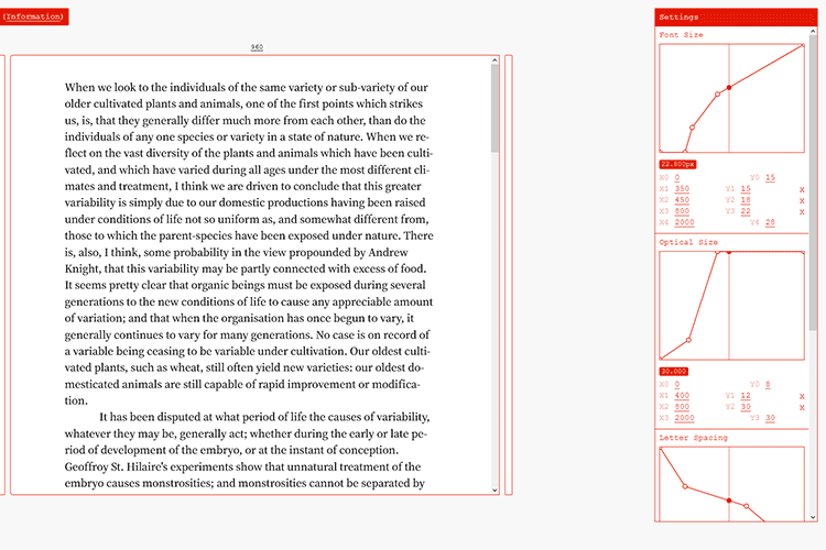
Continuous Typography Tester – This tool will help you see how type changes at different viewport sizes.
Trispace is now on Google Fonts – Use this free, versatile font with a whopping 40 styles in your projects.

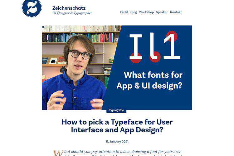
How to pick a Typeface for User Interface and App Design? – Helpful tips on choosing the right fonts for your UI.
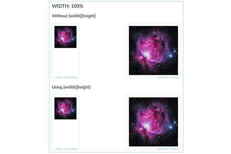
Barebones CSS for Fluid Images – An in-depth look at ensuring your images scale on every screen size.
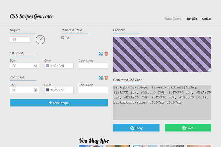
CSS Stripes Generator – Use this browser-based tool to create beautiful striped patterns.
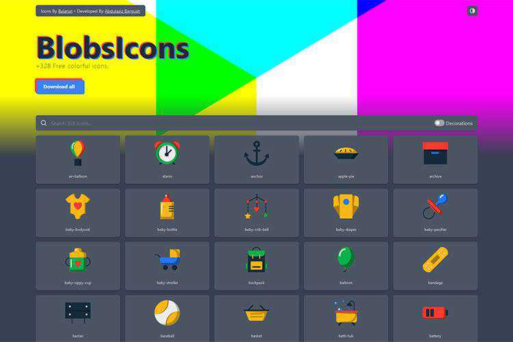
BlobsIcons – A colorful collection of 300+ free icons.
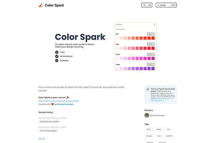
Color Spark – An open-source color scheme library for Figma.
The post Weekly News for Designers № 579 appeared first on Speckyboy Design Magazine.