How to Help Your Clients with Website Content Strategy – How to get the processes of creating and organizing content moving in the right direction.

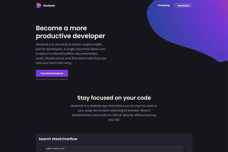
Devbook – A new kind of search engine made just for developers.
What Makes CSS Hard To Master – Thoughts on what frustrates some developers about CSS.
The Grumpy Designer Looks Ahead to 2021 – The definitive tongue-in-cheek look at how the new year will impact the web design community.

10 new rules of design – Leading experts say that it’s time to move past “Eurocentric” ideas. Do you agree?

Adobe just released the last Flash update ever – The last update for the venerable app. Official support will stop at the end of 2020.
Horizontal Smooth Scroll Layouts – Some ideas for horizontal smooth scrolling layouts powered by Locomotive Scroll.

How to generate a webfont – Craft your own webfont out of custom SVG icons.

How To Design A Simple UI When You Have A Complex Solution – Even the most complex projects can benefit from a simpler UI.

Our 50 Favorite Web-Based Tools for Web Designers from 2020 – Whatever the web design time-saver you’re looking for, the chances are you will find it here.

Web Almanac – Browse this comprehensive report on the state of the web, backed by real data and trusted web experts.
Improve Page Rendering Speed Using Only CSS – Use this collection of tips to achieve faster page rendering.

The Rules of Margin Collapse – Learn how CSS margin collapse works and some ways to get around it.

25 Free Light Leaks & Effects Photoshop Brush Packs – Take your artwork to a new level the easy way with these free brushes.

Shotr – Download this free screenshot tool for MacOS.
Temp.media – Use this web-based tool to create temporary/placeholder images and videos for your prototypes.
Mango – Grab this free geometric lowercase font for use in your projects.
The post Weekly News for Designers № 571 appeared first on Speckyboy Design Magazine.
Did you know that over half of all Internet traffic comes from mobile devices? That means that if your website isn’t optimized for mobile, you’re missing out on a lot of potential traffic.
On top of that, Google ranks websites based on their mobile format using their mobile-first index — so without a mobile-friendly website, you won’t rank well. These are both reasons you need to optimize your company’s website for responsive design — that is, a design that works on multiple devices.
But how can you improve your mobile-friendliness to stay on top of rankings? Below, we’ll look at eight top-notch tips for how to use responsive design.
Read on to learn more, and then consider partnering with WebFX’s team of over 200 experts for our responsive design services. Just call us at 888-601-5359 or contact us online to get started!
8 tips for how to use responsive design effectively
Creating a mobile-friendly website doesn’t have to be a difficult process. With a few simple steps, you can ensure that your mobile site is driving traffic for your business.
Here are eight tips for how to use responsive design on your website.
1. Use accelerated mobile pages (AMPs)
In addition to a normal responsive design format, you can set up certain pages on your website as accelerated mobile pages (AMPs). AMPs are stripped-down versions of pages that keep only the essential elements.
Here’s an example of a web page that practices normal responsive design:
![]()
And here’s the same page in an AMP format:
![]()
AMPs come with a couple of different advantages. The first advantage is visual — with less information and fewer graphics packed into the small screen, AMPs are easier on people’s eyes. The other advantage is that the minimalism of AMPs helps them run faster and use up less data.
2. Optimize page load speed
Page load speed is always important to get right. Most users expect pages to load within two seconds, and even on a desktop, you need to make sure your site meets that expectation. But on mobile, it’s even more important than usual.
Mobile searches often take place while people are out and about, and they want answers faster than they would at a desktop computer.
Here are some ways you can improve your page load speed:
3. Scale everything appropriately
When you design your website, you’ll probably do it on a computer, and that includes the mobile format. But when you’re working on a computer monitor, it can be easy to forget how much smaller that content will be when it appears on people’s phones.
To compensate for this, you need to scale everything differently. This starts with text. Anything that you want users to read should be large enough for them to see without using a magnifying glass (though still small enough to fit within the screen!). You don’t want anyone to have to squint at the screen, or pinch-and-drag to zoom in.
The same goes for buttons. Everything you want people to click should be big enough for their thumbs to easily tap. We’ve all had the experience of trying and failing to hit the ‘X’ on a popup because it was too small, and you don’t want that to happen on your site.
Not everything should be bigger, though — images, for example, should be scaled down to keep them from taking up the entire screen.
4. Avoid popups
When it comes to popups, you should avoid using them altogether if you can. On a computer, it’s easy enough to display a popup that doesn’t take up the entire screen, and it’s also easy for users to click the ‘X’ and move on if they’re not interested.
But that’s not the case on a phone.
It can be very hard to close mobile popups. Even when you make the ‘X’ large enough to click, it’s not always easy to find it on that small of a screen, and users often inadvertently click the popup itself instead.
In general, mobile popups tend to cause far more frustration for users than anything else. With the exception of popups that users specifically ask for by clicking on something, try to eliminate them from your site.
5. Simplify forms
Popups aren’t the only thing users can have a hard time with on mobile devices. Online forms can also cause problems if not used properly. Unlike popups, though, you can’t just eliminate forms altogether — you often need them to generate leads or help users make purchases.
The solution, then, is to make your forms as simple as possible. Don’t create forms that require tons of information or include many different boxes to fill out. Make them as minimalistic as possible, with large buttons and text boxes, so users will have an easy time using them.
6. Eliminate large blocks of text
Yet another thing that mobile devices make it harder to get away with are large blocks of text. Huge text blocks aren’t great for web design, even on a computer, but they’re particularly bad on mobile.
Don’t try to cram hundreds of words into a small phone screen at once. Instead, aim to use as little text as possible to get your point across. If you absolutely must convey a lot of information, break it up as much as you can to make for easier reading.
Here are some ways you can break up your text:
- Keep your paragraphs short
- Intersperse images and videos
- Incorporate bulleted and numbered lists
7. Simplify menus and navigation bars
Another way you can simplify things on your website is by optimizing your menus and navigation bars. On computers, you can stretch a long line of tabs across the top of the screen — but not on mobile, where the top of the screen is often under three inches wide.
The first way you can reformat your navigation bars is to use the common technique of relying on hamburger menus, which users can click on to expand. But even once a menu is expanded, make sure you don’t list too many tabs. Give users a small handful of options to keep things simple.
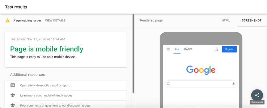
8. Perform frequent mobile testing
The final way to ensure mobile-friendliness on your website is to frequently test it. You can do this with Google’s mobile-friendly test tool, which will rate the mobile-friendliness of your website and make suggestions for how to improve it.
![]()
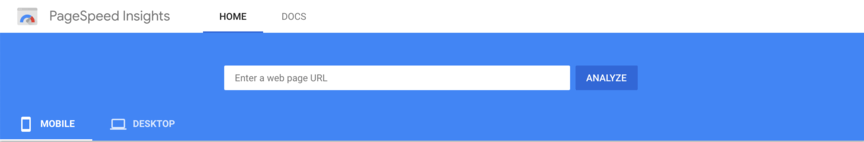
You can also test individual elements of your web design if you want to get a more detailed look at things. For example, you can test your page load speed in Google’s PageSpeed Insights, which will rate your site’s load speed for both desktop and mobile.
![]()
Get help improving your site’s mobile-friendliness with WebFX
Ready to get started creating a mobile-friendly website? We can help! At WebFX, we’ve been driving results in digital marketing for over 20 years, and we’d love to help you optimize your business’s website.
When you partner with us, you’ll have full access to all our responsive design services. You’ll also receive a dedicated account representative to work closely with you throughout the entire optimization process.
To get started with us, just call 888-601-5359 or contact us online today!
The post 8 Tips for Developing a Fantastic Mobile-Friendly Website appeared first on WebFX Blog.
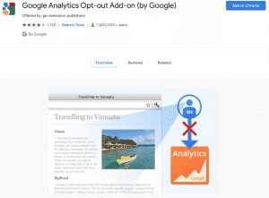
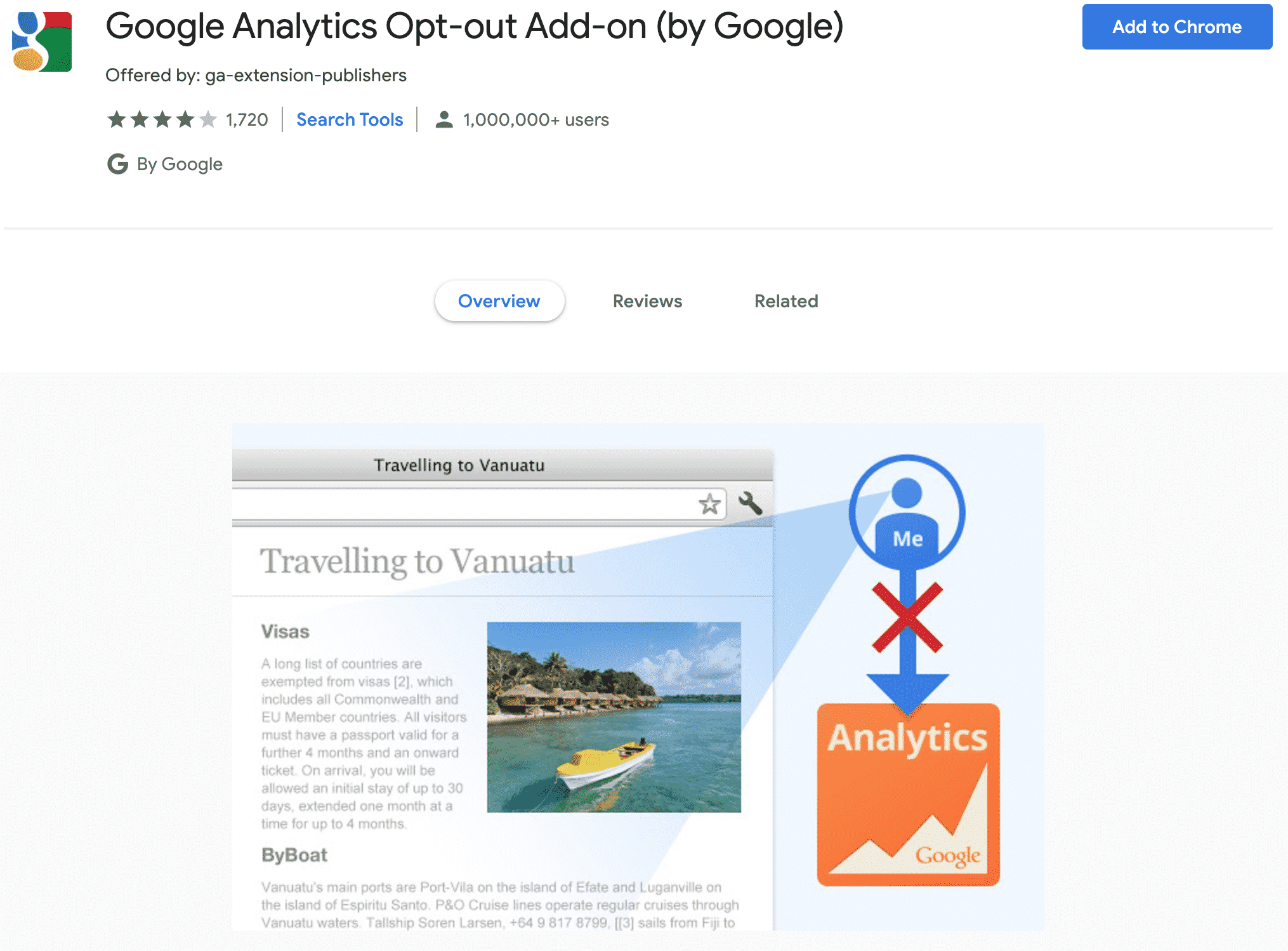
There is a browser add-on that, once installed in your web browser, allows you to opt out of Google Analytics. That essentially means that if you use the add-on when visiting websites that are using Google Analytics, your visit(s) won’t be recorded. This is the Google Analytics Opt-Out Browser Add-On.
If you aren’t using the Google Analytics Opt-Out Browser Add-on, your visits to sites suing Google Analytics will be recorded and logged as a visit. When the website’s webmaster or site owner looks at their Google Analytics data, they may not be able to tell where you came from (your visit might show as a direct visit with no referrer). Or, they certainly will most likely not be able to see what keyword you used to visit their website. Most keyword data is now scrubbed, and the site owner cannot see it. It’s ‘not provided‘.
But this goes one step further. Your visit is not recorded at all.
If you’re concerned about privacy, then you can use this Add-on and your visits won’t be recorded at all. I can see this actually being helpful, especially as an alternative to excluding your own visits from being recorded on your own website. For example, a large company that has many employees who may visit their own site could install this add-on on web browsers and they won’t be recorded when they visit their own website.
From the tool:
“To provide website visitors the ability to prevent their data from being used by Google Analytics, we have developed the Google Analytics opt-out browser add-on for websites using the supported version of Google Analytics JavaScript (analytics.js, gtag.js).”
This is an official browser add-on created by Google, and it appears that there are about 1,000,000 users who have installed it. I tested it just now, and the add-on does, in fact, work. I was able to go to Hartzer.com and had the ‘real time’ analytics open, and didn’t see visit. However, since I have a chat function on my website, I was able to confirm that I was on the site, as I can see myself through the admin of the chat.
Right now I don’t see this being a concern for site owners using Google Analytics, as there aren’t enough users using this add-on to make a difference. But, keep in mind that there are users who use it, so you’re going to see all of the visitors.
Since the beginning of the World Wide Web, the venerable hyperlink has been a crucial feature. Remember the amazement when you found out that a single click could take you anywhere in the world?
OK, maybe that gee-whiz moment has passed. But links are still as important as ever. And they’re something designers need to make both obvious and accessible.
Though simplistic, the default behavior of underlining text links works well enough. Yet, modern CSS and JavaScript allow us to do so much more. Not only can links look prettier than ever, they can also provide greater context and fit into your overall branding.
Today, we’ll show you some examples of link styles that go beyond the ordinary. They stand out and make for a better (or more interesting, at least) user experience.
The Web Designer Toolbox
Unlimited Downloads: 1,000,000+ Web Templates, Themes, Plugins, Design Assets, and much more!
How to Subtly Stand Out
Link underlines that offer contrast from the text itself can be a great solution. They’re intuitive for users without being over-the-top with styling. Here, the blue underline separates itself nicely from the dark text. And the nifty hover animation only adds to the experience.
See the Pen Link hover w/ line by Aaron Iker
Accounting for Descending Characters
Descending characters (like the lowercase g, j or p) can sometimes look awkward when underlined. But this animated “guitar string” demo provides a consistent look. It’s a little thing, but brings a uniform neatness to the overall design.
See the Pen Guitar String Link Underlines by James Almeida
Coming up Short
Check out the underlined links in the following body text. Margins on either side result in an underline that doesn’t quite cover the full width of the linked text. Upon hovering, the underline smoothly transforms to cover the empty space. This microinteraction is again subtle, but very user friendly.
See the Pen Link Style Tests by Nick Ciliak (@nickcil)
Wired for Style
Thickly-underlined links were initially made popular by Wired.com. And while the publication has since moved on in styling, their legacy is still worth considering. It’s hard for users to miss these hyperlinks – yet the impact of the style isn’t too overwhelming. This is the kind of balance designers should aim for.
See the Pen Wired.com Huge Underlined Link Style by Mike Mai
Animated Highlights
Hover effects are a great way to add some personality to your site’s hyperlinks. Take this CSS keyframe example. It transforms basic text and produces an attention-grabbing highlight effect upon hover. It both looks cool and helps guide users at the same time.
See the Pen CSS3 Keyframes Animation Link Style by auginator
Marginal Context
By themselves, links don’t always provide full context. Sure, some of it depends on the content itself. But there’s only so much text you can realistically hyperlink. That’s where this example comes in handy. It adds citational content that is shown off to the side. Hovering over a link will also highlight the relevant citation. This could be a perfect fit for academic work or even tutorials.
See the Pen Links with Marginalia Notes by Amelia Bellamy-Royds
Moving Tooltips
If citations aren’t a great fit for your project, perhaps tooltips could do the job. With this jQuery script, you can add tooltips to virtually any element – links included. What’s more, they’ll move right along with your cursor.
See the Pen Moving tooltip on anything – mouse tracking by Eric Porter
Take Your Pick
Hover animations can help ensure that users know when their cursor is in the right place. If you’re looking for an animation that is both compelling and lightweight, this collection of effects is worth checking out. There are a number of attention-getters to enhance your links.
See the Pen SCSS link hover animations by Jens Lettkemann
Link up with Compelling Style
Dressing up your site’s hyperlinks is one of the easiest ways to improve usability. A few lines of CSS could be all that stands between better engaging users and maybe even increasing conversions.
The examples above demonstrate a variety of different approaches. Some are a bit more complex, while others are dead simple. That’s great, because these effects aren’t one-size-fits-all. The key is in picking the solution that fits your site and will appeal to your particular audience.
Links are too important to ignore. Hopefully these examples will inspire you to do more than the bare minimum. And if you’re looking for even more snippets, check out our CodePen collection.
The post 8 Ways for Bringing Creativity to Hyperlinks with CSS & JavaScript appeared first on Speckyboy Design Magazine.