Monthly Archiv: November, 2020
The last post talked about how PHP 8.0 makes PHP faster. Today, we’ll look at a way that it will make you faster.
Perhaps the largest quality-of-life improvement to PHP 8.0 is Constructor Property Promotion. The syntax has been borrowed largely from Hack, Facebook’s PHP fork, although it exists in other languages like TypeScript and Kotlin with various syntaxes.
It’s easiest to explain with an example. Consider your typical service class in a modern application:
Ecommerce accounted for over 14% of retail sales in 2019, and that percentage is projected to increase over the coming years. If you’re looking to get in on the ecommerce action, you need to make sure your website has the ecommerce essentials it needs to succeed.
That’s why, in this post, we’ll go over 11 ecommerce website essentials!
Want expert assistance building your ecommerce website, driving site traffic, or increasing conversions? Explore our ecommerce web development and marketing services and request a free quote today.
Partner with Ecommerce masters!
Campaigns managed by WebFX have earned over
9000000
TRANSACTIONS IN THE LAST 5 YEARS
Read Case Studies
1. Mobile-friendly design
Did you know that more than half of all website traffic now comes from mobile devices, and 61% of consumers are more likely to buy from mobile-friendly sites? That means making your ecommerce website mobile-friendly can increase both your traffic and conversions!
To make your site mobile-friendly, use responsive web design. Responsive websites adjust to the screen on which someone views them, so your site looks great and works correctly on laptops, tablets, and smartphones.
2. User-friendly navigation features
If users can’t quickly find what they need on your ecommerce site, they’re unlikely to stick around long and even less likely to make a purchase. Helpful, easy-to-use navigation is one of the most essential ecommerce website features.
Have clear menus that allow users to browse different product categories. Make sure these menus are in easy-to-find locations, such as across the top of every page.
![Horizontal ecommerce menu on Overstock.com]()
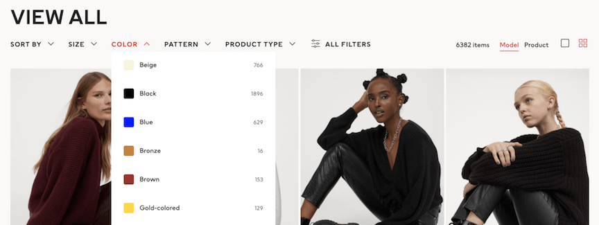
You can also allow users to filter and sort products by price, style, size, manufacturer, and other characteristics. The features you include depend on the products you offer and the characteristics that are important to your customers.
![Ecommerce navigation filters on H&M's website]()
3. Security features
One of the most important ecommerce website essentials is adequate security. You need to protect your customers’ data, and you need to show visitors that your site is secure and trustworthy.
If shoppers don’t trust your site, they likely won’t make a purchase. Insufficient security also opens your business up to significant financial and legal risks.
Some of the most vital site security steps include:
- Purchasing a Secure Sockets Layer (SSL) certificate, which enables your site to transmit data securely
- Using an address verification system (AVS) and credit card verification value (CVV) at checkout
- Creating secure passwords and updating them regularly
Read through our entire site security checklist to learn more.
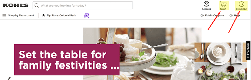
4. Prominent shopping cart and checkout buttons
Easy-to-use cart and checkout features are two more essential ecommerce websites features. To encourage conversions, make sure your ‘add to cart’ and ‘check out’ buttons display prominently on your site.
When the user clicks into their cart, show them all the relevant details, such as the name, price, and quantity of each product in their cart. Shoppers should also be able to remove items or change item quantity directly from their cart.
Also, allow customers to save their cart so they can come back to it later.
![Kohl's ecommerce cart checkout button]()
5. Several payment options
The way you accept payment is crucial for every business, including ecommerce websites. Allowing as many popular payment options as possible improves your customers’ experience and can encourage conversions.
In addition to major credit cards, consider accepting payment methods such as PayPal and Apple Pay. Display icons of accepted payment methods on your site so shoppers know in advance what they can use to buy your products.
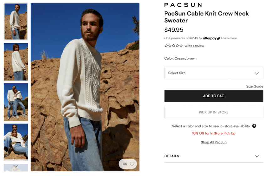
6. High-quality photos and videos
Visual content gets users’ attention, keeps them engaged, and helps them make purchase decisions. Using high-quality photos and videos on your site makes you look professional and improves user experience.
Studies have even suggested that product videos make shoppers 85% more likely to purchase a product.
Don’t just settle for one image of your product either. Include photos from multiple angles, let shoppers zoom in on the image, and show people using the product in different situations.
![Sweater product images on PacSun's website]()
Make sure, though, that your visual ecommerce website elements don’t cause your pages to load slowly. Page speed optimization techniques and services can help you avoid this issue.
7. Detailed shipping and return information
Providing detailed shipping and return policy information can help shoppers feel more comfortable about making a purchase, which increases conversions.
Make your shipping information and return policy easy to find and easy to understand. Your website’s footer is an excellent place to put links to this information.
Offering a generous return policy and free or low-cost shipping can increase your conversion rate.
8. Ratings, reviews, and other social proof
Do you read online reviews before you make a purchase? So do 95% of customers. And, more than 70% of users won’t make a purchase until they’ve read reviews, making ratings and reviews one of the top ecommerce website essentials.
Including user-generated ratings and reviews on your website can help keep shoppers on your site and encourage them to make purchases. To get reviews, build review functionality into your site and encourage customers to leave reviews on third-party sites like Google My Business, Facebook, and product review websites.
Other kinds of helpful social proof include user-created social media content and testimonials.
9. Item availability
Few things in online shopping are more frustrating than deciding on a product — or even making a purchase — only to discover that the item you want is out of stock. You must reevaluate your purchase decision or wait an unspecified amount of time for the company to restock.
Help your customers avoid this frustration by making the availability of each product prominent on its product page. If an item is out of stock, include information about when it will be available again.
10. A frequently asked questions (FAQ) page
A well-thought-out and easily accessible FAQ page can help make users’ experience on your website much more convenient. If users have a question, a FAQ page can help them find the answer quickly.
When first creating your FAQ page, brainstorm questions users may have, think about questions you often get, and consider whether there’s anything you want users to know that would fit well on the FAQ page.
Later, if you find customers often ask a question that isn’t yet on your FAQ page, add it in.
comcast
-9
industry average
16
apple
72
webfx
76
11. A contact page with multiple contact options
If users can’t find the answer to a question on your FAQ page, they may want to contact you. An easy-to-find contact page with several contact options makes your site more user-friendly and helps your business appear trustworthy.
On your contact page, include contact options such as a phone number, an email address, and social media profiles. You can also use a chatbot to answer users’ questions and help them get in contact with the right members of your team.
Ecommerce website essentials and beyond from WebFX
Does your website have all the ecommerce essentials? If not, add these ecommerce website elements to your site so you can start pulling in more customers and driving more sales.
For more ecommerce tips, check out our other ecommerce resources.
If you’d like help getting your ecommerce website up and running or taking your ecommerce business to the next level, consider our ecommerce website development and ecommerce marketing services. Request a free quote online or call us at 888-601-5359 to get started.
The post Ecommerce Website Essentials: Does Your Site Have All 11? appeared first on WebFX Blog.
As the Node.js 14.x release line enters the list of versions in Long Term Support under the name ‘Fermium’, Node 15 brings fresh features and changes: new npm version, V8 upgrade, AbortController, and more.
It’s hard to keep up with the latest JavaScript features without ending up relying on polyfills or transpilers. Adding extra steps to your pipeline and making your codebase larger is the price to pay for cutting-edge JavaScript applications.
The overall quality of a website’s design is often in the details. Those seemingly-small elements such as microinteractions, typographic spacing and color accents can be real difference makers. They have the potential to transform the mundane into something that stands out.
In these cases, being picky about design is a good thing. Whether that trait comes from you or your client, the goal is the same. It’s all about improving the look, the intuitiveness and, ultimately, the user experience.
As honorable as that may sound, it’s worth wondering: is there a point in a given project where pickiness becomes a liability, rather than a benefit? Can obsessing over every last detail actually cloud the bigger picture?
In my opinion, design focus can indeed be done to death – or at least to the detriment of a project. Let’s outline a few situations where the process can get in the way.
The Web Designer Toolbox
Unlimited Downloads: 1,000,000+ Web Templates, Themes, Plugins, Design Assets, and much more!
When Design Elements Turn Overly Complex
Sometimes the focus on detail can take us to a bad place – one where bells and whistles overtake usability. The result is a feature that may look really cool, yet be difficult for the end user to figure out. In some cases, it may not even be relevant to what you’re trying to accomplish.
This is one of those classic cases of web design gone too far. We saw it a lot in the days of Flash, where high-tech splash animations were used by everyone from gas stations to law firms. Once the novelty wore off, these sorts of features were merely obstacles for users to navigate.
The modern web has its own vices. Distracting video backgrounds and purposeless hero images take up valuable screen real estate and can make it more difficult for users to get the information they need. That’s not to say these features have no place in web design – just that there’s the potential to go over-the-top with them.
Plus, pouring a lot of time and effort into these elements doesn’t guarantee effectiveness. They still need to have a purposeful existence and be easy to use. Design should be there to help simplify them.

When Time and Budget Are Limited
Web designers are often saddled with the responsibility of getting projects done within tight budgets and deadlines. We’re pros at putting it all together. But a micro-managing client can stall progress significantly.
Make no mistake, clients are entitled to make changes – and their opinion counts. Still, there are occasions when one gets so hung up on a particular item that it throws the entire project status into question.
This is certainly understandable when it comes to major features. All stakeholders want to make sure that things look and function according to plan – and good things do often take time. It’s part of the due diligence that comes with building a website.
But these issues also tend to pop up over the most minute details. And they are often a matter of personal preference. For example, insisting that a button look and function exactly as it does on a competitor’s site, if only for the sake of one person’s ego.
In a perfect world, we’d have all the time and budget needed to go down this rabbit hole. But in reality, this can take valuable human resources away from other critical areas that need to be addressed. Things must be prioritized in order to ensure progress.

When It Leads to Constant, Counterproductive Change
The design process can often be iterative, where things are improved upon over time. This happens as we become more aware of how visitors are actually using the things we create. They help us to understand their pain points so that we can refine them.
Therefore, change is to be expected. But if things change too dramatically it can backfire. A sudden change to the UI, for instance, might confuse visitors. They have to relearn their how to do what they want – or simply move on to a different site.
Amazingly, this strategy seems to be employed by some big brands. As of this writing, PayPal is a prime example. Their account management UI changes more often than the weather. It seems like every time I log in things are significantly different. Maybe there’s a method to this madness, but it feels more infuriating than useful.
Of course, techniques such as A/B testing are very much viable. But there’s a difference between making slight changes for the sake of conversions and obsessing to the point where you can’t make up your mind. Without at least some consistency, the user experience is bound to suffer.

Attention to Detail Is Great. Obsession? Not as Much.
Every website needs to have an end goal. Perhaps it’s making an eCommerce sale or getting a user to reach out and contact you. Whatever it is, the site’s design should be focused on achieving the desired result.
But, as we are only human beings, that laser-like focus can be incredibly difficult to attain. Instead, stakeholders can obsess over design to the point where it does more harm than good. That could mean missing out on deadlines or busting the project’s budget. It might even result in an end product that’s not as user-friendly as it could be.
With that, there’s certainly a case to be made for slowing down the design process. Ideally, it gives everyone room to breathe and create the best possible outcome. That is, as long as the time is used wisely.
All stakeholders should focus on the details – just not at the expense of the stated goals.
The post At What Point Does Obsessing Over Design Become a Liability? appeared first on Speckyboy Design Magazine.
Package:
Summary:
Query values from data structures like XPATH
Groups:
Author:
Description:
This package can query values from data structures like XPATH...
Read more at https://www.phpclasses.org/package/11860-PHP-Query-values-from-data-structures-like-XPATH.html#2020-11-03-11:02:21

Package:
Summary:
Query and extract data structure like XPATH
Groups:
Author:
Description:
JSONPath is an XPath-like expression language for filtering, flattening, and extracting data...
Read more at https://www.phpclasses.org/package/11860-PHP-Query-and-extract-data-structure-like-XPATH.html#2020-11-03-11:02:21

Latest PECL Releases:
- win32service 0.4.2
* Add contact information for send feedback
The binary is also available here: https://github.com/win32service/win32service/releases/tag/v0.4.2
- swoole 4.5.6
New APIs
---
+ Added swoole_substr_unserialize and swoole_substr_json_decode (#3762) (@matyhtf)
Enhancement
- Modified CoroutineHttpServer::onAccept to private property (#dfcc83b) (@matyhtf)
Fixed
- Fixed coverity issues (#3737) (#3740) (@matyhtf)
- Fixed some bugs on Alpine (#3738) (@matyhtf)
- Fixed swMutex_lockwait (#0fc5665) (@matyhtf)
- Fixed PHP-8.1 build error (#3757) (@twose)
Kernel
- Added check_liveness for Socket::read/write/shutdown (#3735) (@matyhtf)
- Changed the type of session_id and task_id to int64 (#3756) (@matyhtf)
- event 3.0.0
- Added PHP8 support.
- Introduced strict type hinting.
- Removed deprecated EventBufferEvent::sslFilter method.
You probably know that putting too much food on your plate is usually a bad idea. Since research indicates that you’re more likely to overeat if you fill your plate, it’s not a good thing for your waistline. It’s also not a good thing for your eyes. If there’s no focal point, the food can overwhelm you, and you’ll find yourself lost in a vortex of scary, calorie-filled nightmares.
You’re not going to process your eating experience; you’re simply going to start at the least offensive corner and chow down until it’s all gone and your stomach’s about to burst. That’s why, when you go out to nicer restaurants, the chef portions out your food in small amounts, so that you can take your time and absorb not just the actual eating, but also the sensory experience – the sights, the smells, even the sounds. Yes, people. Food is complicated.
Today, I’m going to talk about simplifying your designs using the very same principles a chef uses to ensure that you have the most pleasant eating experience possible. And just like you’re much more likely to return to a restaurant that serves you an experience, rather than a mess, your users will be more likely to do the same when your designs are clean, strong, and simplified.
Focus In
We humans are programmed to make things complex. In the field of cultural anthropology, there’s overwhelming evidence of this fact, as societies around the world have progressed over the millennia from simple (think ‘hunter-gatherer’ type societies) to complex (modern “post-industrial” countries). It’s in our DNA to want to add on rather than take away, which can make the average designer’s job pretty difficult.
From your end as a designer, it’s generally quite hard to be objective about which information or design elements are “necessary,” versus which are not. Getting a second opinion can help sometimes, but if the person you’re asking is not a seasoned designer, they might not have the experience to tell you what’s not working and why.
When I’m working on a project that’s gotten too out of hand, I usually stop and take out the notes I took at the beginning of my process. The mind maps, diagrams, and lists that illustrate precisely what my main focus was supposed to be for the project. It’s inevitable that you’ll lose sight of your main focus at least once during the design process.
That’s okay, as long as you refer to your notes and refresh your memory. Designing around your main focus helps you to be more discerning about the content you include in your design, as it makes it clear what’s directly related to that main focus and what isn’t.

Use the Pareto Principle
The Pareto principle is something that’s been getting quite a bit of attention in recent years, thanks to personal development gurus like Tim Ferriss. But just in case you haven’t yet heard the basic idea behind it, here’s a quick run-down.
The Pareto principle, or the “80-20 Rule,” as it’s sometimes known, basically states that 20% of any given element is responsible for 80% of the results, and vice-versa. Designers love the 80-20 rule, since it’s so applicable to the design process, particularly in those areas where information or sales are at the heart of the design goals.
While you’re designing your product, website, or other deliverables, here are two important questions to ask yourself so that you don’t “over-design” those elements that don’t need it, and so that you can keep your focus on the 20% of the elements that are the most important:
- Who, specifically, is most likely to benefit the most from this design element?
I’ve talked at length about narrowing down your career focus to zero in on one or two specific markets. This question is one you can ask yourself at any time during your creative process.
If you devote time to researching exactly the target markets you’re best equipped to serve, you’ll have a much easier time finding and understanding the needs of clients. And when it comes time to simplify your designs for this target group, you’ll know exactly what they’re looking for, how they look for it, and how to provide it to them simply.
- How can I deliver the most value to this group of people using the least number of steps?
As an extension of the above idea, your process will become much simpler when you begin focusing on the number of steps it will take your users to get from your design to the information or product they’re looking for.
It’s helpful to write it out in a literal list; start with the key action step on your website, brochure, poster, etc., and document exactly what needs to happen from there to make the sale. Once you’ve done that, the path usually becomes very clear in terms of what’s actually needed to get the user to his or her destination, and what’s not.

Smart It Up
A lot of the advice you may read about simplifying your designs might make it seem like designers think their users are the stupidest people in the world. Skim a few articles and you’ll see what I mean – everything is concerned with making the important elements as obvious as they can possibly be, so that the user doesn’t have to use their brain for anything.
It can actually make you start to feel a bit sorry for the average user at first, since designers seem to think so little of them. But if you understand the underlying principles behind this philosophy, you’ll begin to realize that, not only do designers not think their users are stupid, they’re actually being very smart about creating an experience that caters to the needs of the very top of the user “hierarchy.”
It’s not that you should automatically assume that people are stupid. Rather, your assumption should be that everyone is smart – each of your users is far too busy living productive, interesting lives to waste time where they don’t need to.
Once you embrace this mentality, it will become easier for you to zero in on exactly what makes these smart, productive, interesting people tick, and how you can help them absorb the exact information they need to go on about their awesome lives. This has the added effect of allowing you to go on about your awesome life as well.
Your users should be able to get to the specific information they need with as little effort as possible. Whether that involves less reading, scrolling, or interactivity, make sure you keep your focus on the actual steps required to encourage the biggest results from the least amount of action.
The post Simplifying Your Designs for the Smartest User appeared first on Speckyboy Design Magazine.
WordPress 5.6 Beta 3 is now available for testing!
This software is still in development, so we recommend that you run this version on a test site.
You can test the WordPress 5.6 beta in two ways:
The current target for the final release is December 8, 2020. This is just five weeks away, so your help is needed to ensure this release is tested properly.
Thank you to all of the contributors that tested the beta 2 development release and provided feedback. Testing for bugs is an important part of polishing each release and a great way to contribute to WordPress.
Some Highlights
Since beta 2, 20 bugs have been fixed. Here is a summary of a few changes included in beta 3:
- Added block patterns for Twenty Twenty (see #51098) and Twenty Nineteen (see #51099) themes.
- Added theme support for navigation-widgets (see #51445).
- Fixed incorrect slashes in the URL if the parent is empty for REST API (see #44745).
- Added a test to Site Health to verify that the
Authorization header is working as expected for Application Passwords (see #51638). - 10 additional bugs fixed in the block editor (see #26588).
To see all of the features for each Gutenberg release in detail, check out the release posts: 8.6, 8.7, 8.8, 8.9, 9.0, 9.1, 9.2, and 9.3.
Developer notes
WordPress 5.6 has lots of refinements to the developer experience as well. To keep up, subscribe to the Make WordPress Core blog and pay special attention to the developers’ notes for updates on those and other changes that could affect your products.
How to Help
If you think you’ve found a bug, you can post to the Alpha/Beta area in the support forums. We’d love to hear from you!
If you’re comfortable writing a reproducible bug report, file one on WordPress Trac, where you can also find a list of known bugs.
Props to @hellofromtonya for help and @chanthaboune for final review.