Monthly Archiv: October, 2020
5 Small Business Website Essentials You Need for Your Site
As a small business owner, you want to build a website that provides your audience with a great experience and helps you earn more revenue online. If your website is missing essential features, you lose out on potential customers and revenue without even knowing it.
So, what do you need on your site for it to succeed? Here are five small business website essentials you need to know to help your company succeed online.
Let’s dive in!
Net Promoter Score is the leading metric for customer satisfaction.Unmatched WOW Services
WebFX clients score 394% higher than the industry average.
Feature #1: Critical company information
First on our list of small business website essentials is critical company information. When people visit your website, they’re often looking for important details about your business, so you need to include this information on your site.
So, what type of critical company information should you have on your site?
Location
If people want to visit your small business in person, they need an address to get there. Including this information on your site can help you drive customers to your brick-and-mortar store (if you have one). Include a map on your site, too!
Hours of operation
Let your customers know when your physical location is open if they want to visit you in person. If you have separate customer service hours, make sure you note those, too.
Business description
If someone discovers your business for the first time, they may not know what sets you apart from everyone else. Make sure you include a description of your business on your site — an “about us” section is a great place to put this information.
Contact information
Include contact information, like your phone number and email address, so people can reach out to your small business. You should also have a contact form to provide future clients another way to connect with your company.
Including this information on your small business website will help your audience get all the essential information they need about your organization.
Feature #2: User experience (UX)-focused elements
Next on our list of small business website essentials is UX-focused elements.
The user’s experience on your site is critical because it determines if people stay on your site or return to the search results. You need to build a site that engages users and makes it easy for them to find what they need on your site.
Here are a few UX elements you can add to make your site more enjoyable for your audience:
Simple navigation
Make it easy for your audience to find the information they need with simple and consistent navigation. Use broad headings and categorized subheadings to create organized navigation that’s easy to use and understand.

High-quality multimedia
Multimedia is a critical component of creating an interactive and engaging website. Include multimedia like photos, graphics, and videos to make your site engaging for your audience. These visuals add points of interest and break up the text, too.
Fast load speeds
Users don’t want to wait for information to load on your site. Use a tool like Google PageSpeed Insights to find out how you can improve your website’s load time. You can also invest in page speed services to get help with making your site load faster.
Helpful call to action (CTA) buttons
You need clear, actionable, and noticeable call to action (CTA) buttons to guide visitors to the next step. Design these buttons to stand out on the page while also telling your audience precisely what happens if they click.
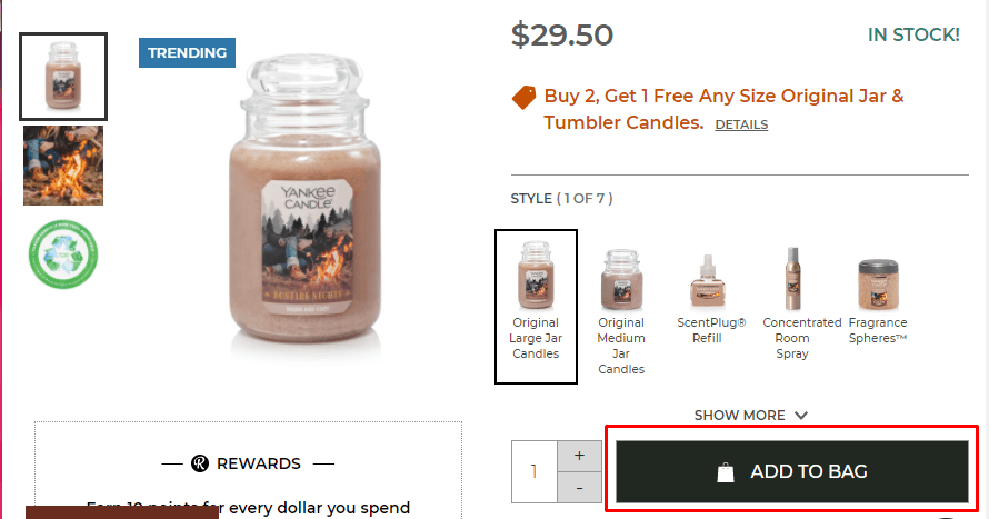
Adding these user-friendly elements will help you create a site that’s easy to use and engaging for your audience. It will help you keep leads on your site longer, while will increase leads and revenue for your small business.
Feature #3: Search engine optimized pages
If you’re wondering what to put on a website, the answer is: Whatever it is, make sure it’s search engine optimization (SEO) friendly.
Did you know that only 33% of small-to-midsized (SMBs) have optimized websites? If your site isn’t optimized for SEO, you’re not alone, but it’s time to act!
Users will find your site by searching on search engines like Google — 93% of all online experiences start with a search engine. If your site isn’t optimized for search engines, you won’t drive valuable traffic to your site.
SEO is one of the most critical elements for your small business website because, when used properly, it helps you rank in search results to drive more traffic and revenue for your business.
So, how do you optimize for search engines?
Conduct keyword research
If you want to rank in search results, start by integrating relevant keywords on your site. Conducting keyword research, like with a tool like KeywordsFX, will help you find applicable terms that you can incorporate into your site to rank in search results.
Optimize for long-tail keywords
Long-tail keywords contain three or more words, like “blue insulated water bottle.” These keywords are best because they’re specific, so you know that they’re looking for something relevant to what you offer when people search these terms.
Make your site mobile-friendly
Not everyone will access your site through a desktop. You need to have a responsive website design to ensure that your site adapts to the user’s device. It ensures your site scales to their screens so they can have an enjoyable experience.
Optimize your meta tags
Optimizing your title tag and header tags helps you rank in search results. Google (and users) look at these elements to determine your page’s relevancy. So, by creating an engaging, keyword-driven headline, you can rank better and drive more traffic.

When you optimize your site for search engines, you’ll help more people discover your small business website and learn about what you offer.
Feature #4: Informative content
Next on our list of elements for your small business website is informative content. Content plays a critical role in helping you drive relevant traffic to your site. People want information, and you can provide it.
When you create content, you establish yourself as an authority in your industry. People will see you as a reliable source of information, building trust with these leads. Not to mention, content helps boost traffic and engagement on your site!
Content comes in numerous formats, including:
- Blogs
- Videos
- Infographics
- Ebooks
You can use numerous content formats to help you drive traffic and engage your audience.
Here are some essential things you need to know to create top-notch content:
Write for humans, not search engines
Search engines focus on ranking content that searchers engage with and spend time reading. If you focus on creating content that your audience enjoys and spends time reading, search engines will pick up on this behavior and rank it higher.
Try different content formats
Don’t limit your content to one type. Your audience is diverse, so you want to deliver content in various forms to appeal to your audience’s different members. It will keep your content fresh and exciting for your audience.
Create content often
Frequent content creation creates new avenues for people to discover your business. You want to create content often to drive a steady stream of traffic to your site. Use a content calendar to help you stay on top of content creation and publication!
Informative content will help your small business website rank better in search results so that you can drive more traffic and credible leads to your page.
Feature #5: Trust elements
When someone discovers your small business for the first time, they won’t feel comfortable buying your products or using your services immediately. They want to know that they can trust your business before they buy — that’s where trust elements come in to play.
Trust elements help you establish your reputation and build your leads’ confidence in your business, which is why they’re on this list of small business website essentials.
Here are some trust elements to include on your small business website:
Testimonials
If you have brand lovers that rave about your products, you’ll want to publish those experiences on your site. Testimonials can help you highlight all the positive features of your brand and business so that new customers can get a sense of your company.
Reviews
Reviews are critical because they help shoppers get an unbiased view of your company. You can have positive and negative reviews on platforms like Google, Facebook, and Yelp. Include these reviews on your site to show new visitors what people say about your brand.
User-generated content
User-generated content is a great way to provide insight into how someone enjoys your small business. It enables you to share a first-hand account, with an accompanying visual, so new visitors get a feel for your brand.
Certifications
If you have any industry-specific qualifications, it’s great to include them on your site. If you own a salon, you might have stylists with color certifications. Either way, including this information can help you build trust and confidence with customers.
Trust signals will go a long way in helping you boost revenue for your small business. When visitors trust your brand, they’re more likely to become customers for your company.
We don't just want to tell you about the beautiful work we do.
WE WANT TO SHOW YOU
We've built over
Websites in industries like yours
Build your small business website today
Now that you know what to put on a website, you can start optimizing your site to create a better experience for your audience. If your website is missing any of these small business website essentials, it’s time to act!
WebFX has been working with small businesses for over 20 years. We know what your site needs to grow online. In the past five years alone, we’ve driven over $2.4 billion in sales and over 6.3 million leads for our clients.
You can rely on our knowledge and expertise to help you build a website that drives powerful results.
To learn more about improving your website, contact us online or call us today at 888-601-5359 to speak with a strategist about our web design and development services!
The post 5 Small Business Website Essentials You Need for Your Site appeared first on WebFX Blog.
8 Ecommerce Homepage Best Practices to Keep Leads from Bouncing From Your Site
Did you know that 94% of first impressions relate to web design?
Your homepage is often the first page your audience sees when they discover your business, so, if you don’t have a well-designed ecommerce homepage, you may not make a positive first impression.
But with these eight ecommerce homepage best practices, you’ll be fast on your way to creating a homepage that keeps people browsing on your site longer!
P.S. Want to get the latest tips and tricks for marketing your business online? Join 150,000 subscribers by subscribing to our email list!
Campaigns managed by WebFX have earned overPartner with Ecommerce masters!
TRANSACTIONS IN THE LAST 5 YEARS
Ecommerce homepage design tip #1: Integrate your brand’s style
Your homepage is the face of your website. It can be what keeps your audience engaged or causes them to return to the search results. That’s why integrating your brand’s style is first on our list of ecommerce homepage best practices.
You should have a consistent design for your website throughout, but especially on your homepage. Your ecommerce homepage should immediately give your audience insight into your brand, the products you offer, and how you can address their pain points as a customer.
For example, when you enter Lego’s site, you immediately notice their yellow and red brand colors at the top.

On top of that, you see Lego’s iconic symbols, like their mini figure head, at the top of the page to further solidify their branding.

As you can see, Lego establishes its brand immediately, and you should take a similar approach with your ecommerce homepage design. First, start by establishing your brand’s color scheme.
Your color scheme typically contains three to four colors. You’ll want to carry that color scheme throughout your site to ensure brand consistency.
It’s also crucial that you decide on other design elements like font style and image style to have a cohesive brand image.
Ecommerce homepage design tip #2: Share your value proposition
If you want to create the best ecommerce homepage design for your business, you need to share your value proposition. The value proposition is what you offer that’s attractive to customers.
When people discover your business for the first time, they want to know why they should pick you and what you have to offer.
You need to be clear and upfront with your value proposition. Billie, a women’s beauty company, immediately highlights their value proposition on their homepage by sharing how they offer clean beauty products.
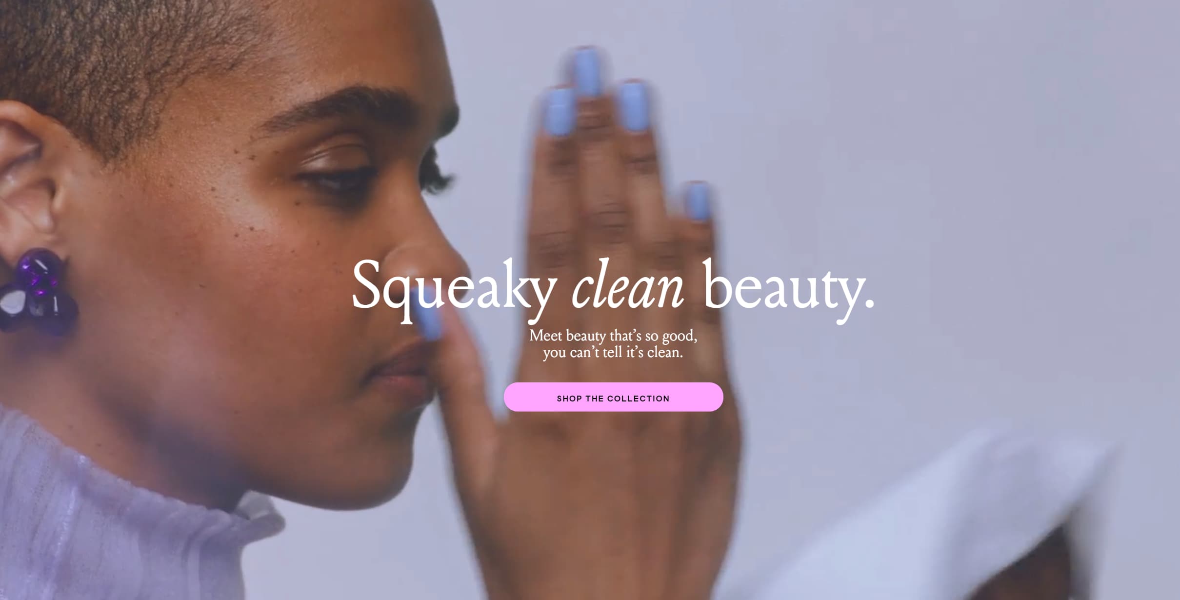
They present their value proposition directly and concisely. You can follow a similar approach with your value proposition. You don’t need to post two paragraphs worth of information about the value of your product. If you can show your value in one sentence, do it!
When you integrate your value proposition into your site, make sure that you’re writing it in a way that focuses on your audience.
Notice how with Billie, they say, “Meet beauty that’s so good, you can’t tell it’s clean.” Billie addresses their audience directly when they highlight their value — you want to take a similar approach.
By highlighting your value proposition, you immediately tell your audience why they should be interested in your brand and learn more about your business.
Ecommerce homepage design tip #3: Keep your homepage clean and organized
Next on our list of ecommerce design best practices is to keep your homepage clean and organized. If shoppers visit your site and are immediately overwhelmed with everything on your page, they will bounce from your site.
To keep leads on your page, you need to organize your homepage so that it doesn’t look cluttered or overwhelming.
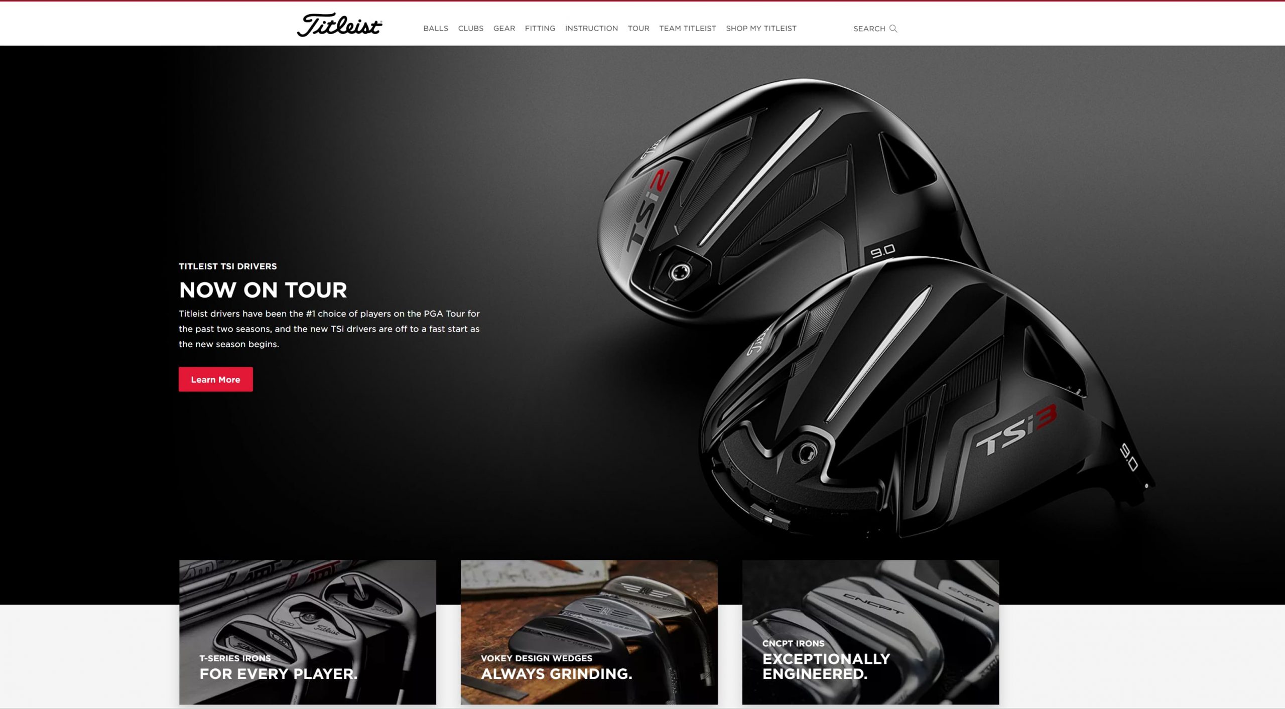
A great way to keep your homepage organized is by utilizing white space. White space is a negative space with no text or visual elements, like photos or videos.
You can see a great example of white space from Titleist. As you scroll through their homepage, you’ll see numerous areas with no text or images. It makes it easy for visitors to scroll through their homepage.
Ecommerce homepage design tip #4: Use high-quality visuals
Using high-quality visuals is next on our list of ecommerce homepage design tips. You don’t want to overwhelm your audience with walls of text, and visuals, like photos and videos help break up text on your site and make your homepage more visually appealing.
You don’t want to use just any visuals, though. Your visuals must be high-quality and clear, like this example from Hydro Flask.
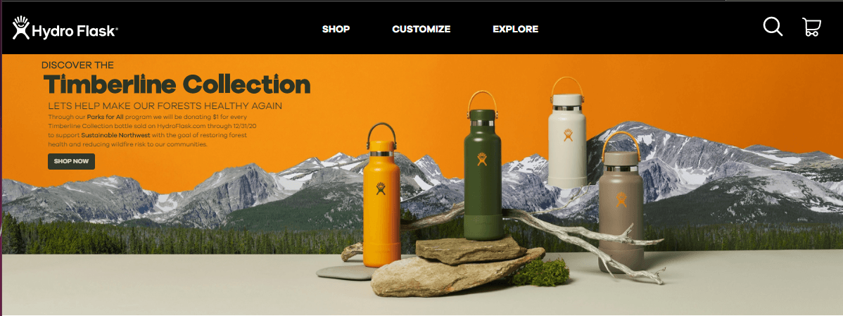
The featured image on their homepage is high-quality, colorful, and on-brand.
You can add numerous types of visuals to your site’s homepage, including:
- Photos
- Videos
- GIFs
- Infographics
- Graphics
Ecommerce homepage design tip #5: Create an easy-to-use navigation
One of the first things your audience sees when they enter your site is your navigation. If they can’t easily find the products they want, they’ll feel discouraged and bounce from your site.
Your navigation should be organized and straightforward. You’ll want to use broad headings and create subcategories beneath these more general headings to help organize your product.
Chewy’s navigation is an excellent example of one way you can organize your navigation. They chose broad category options like “shop by pet” and “shop by brand” to help their customers find what they need fast.

You could also take an approach like Famous Footwear and use broad headings based on customer bases, like “women,” “men,” and “kids.”

The type of headings you use will depend upon your business and what you offer. Generally, keeping your headings broad will enable you to have more organized navigation that helps shoppers more easily browse your products.
Additionally, make sure you add a search bar to your navigation, so users can search for the products they need and find them fast.

Ecommerce homepage design tip #6: Make sure your homepage is mobile-friendly
If you want to have the best ecommerce homepage, you need to ensure your site is mobile-friendly. If someone visits your ecommerce homepage on a smartphone and isn’t mobile-friendly, they’ll quickly bounce back to the search results.
You need a site that looks great on mobile because 76% of consumers shop on a smartphone. Without a mobile-friendly site, you won’t keep these leads engaged.
Take VYNL for example. Here’s what their site looks like on the desktop:
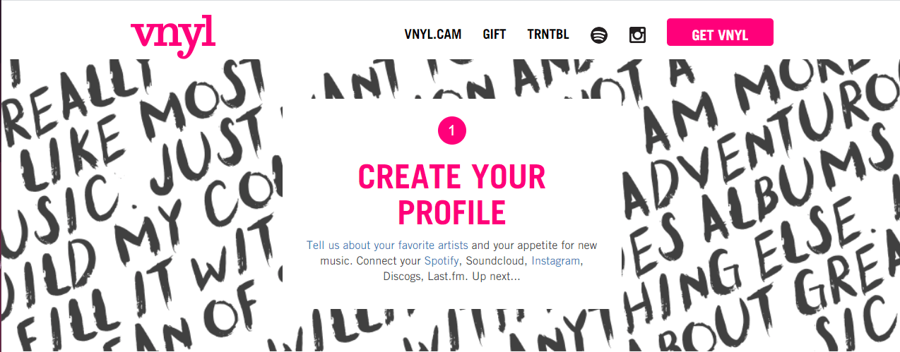
When you access their mobile site, you get the same great experience scaled down to your device.

To create a mobile-responsive site, you need to integrate responsive design. Responsive design will enable your site to adapt to whatever device a user uses. You can invest in responsive design services from a digital marketing company to help you get your site mobile-friendly!
Ecommerce homepage design tip #7: Make sure your homepage loads quickly
Next on our list of ecommerce homepage best practices is to ensure your site loads quickly. Your audience expects your page to load within two seconds, so if it doesn’t, they may bounce from your site.
To ensure your page loads quickly, use Google PageSpeed Insights to see how quickly your site currently loads. This tool will provide you with information on how to improve your site’s load time so people can shop on your site faster.
Ecommerce homepage design tip #8: Test everything
When you create your ecommerce homepage design, you want to ensure you’re delivering the best experience for your audience. That’s why we’re rounding up this list of ecommerce homepage best practices by talking about testing.
The first version of your homepage won’t always be the best. You may need to tweak some elements to drive better results for your business.
You can test multiple elements on your site, including:
- Your headings
- Your photos
- Your call to action (CTA) button color and style
By testing elements on your site, you’ll produce the best ecommerce homepage design for your audience.
Put these ecommerce homepage best practices to work
Now that you have this list of ecommerce homepage design tips, you can start building an ecommerce website that drives more leads and traffic to your site. If you need help creating an ecommerce site that drives results, look no further than WebFX.
In the past five years alone, we’ve driven over $2.4 billion in sales and over 6.3 million leads for our clients. We’ve also managed over 11.6 million transactions for our clients, too. You can feel confident that our team of 250 marketing experts can help you grow online.
Ready to get started? Contact us online or call us today at 888-601-5359 to speak with a strategist about our ecommerce web design packages!
The post 8 Ecommerce Homepage Best Practices to Keep Leads from Bouncing From Your Site appeared first on WebFX Blog.
Take the 2020 WordPress Annual Survey (and view the 2019 results)!
For many years, WordPress enthusiasts have filled out an annual survey to share their experiences and feelings about WordPress. Interesting results from this survey have been shared in the annual State of the Word address and/or here on WordPress News.
This survey helps those who build WordPress understand more about how the software is used, and by whom. The survey also helps leaders in the WordPress open source project learn more about our contributors’ experience.
To ensure that your WordPress experience is represented in the 2020 survey results,
You can also take the survey in French, German, Japanese, Russian, and Spanish! The survey will be open for at least 6 weeks, and results will be posted on this blog.
2019 Survey Results
The 2019 survey included some new questions to better understand why people continue to use WordPress as their preferred CMS, as well as a section directed toward WordPress contributors. For the first time in 2019, this survey was translated into 5 different languages: French, German, Japanese, Russian, and Spanish.
The first WordPress Contributor Survey was conducted in 2015, but unfortunately the results were never published. This report includes Contributor Survey results from both 2015 and 2019.
Survey Segments
Major groups in the survey included: WordPress Professionals, WordPress Users, and Others.
The WordPress Professionals group consists of those who: work for a company that designs/develops websites; use WordPress to build websites and/or blogs for others; design or develop themes, plugins, or other custom tools for WordPress sites; or are a designer, developer, or other web professional working with WordPress.
This WordPress Professionals group is further divided into WordPress Company Pros (those who work for a company that designs/develops websites) and WordPress Freelancers/Hobbyists (all other professional types) subgroups.
The WordPress User group consists of those who: own or run a blog that is built with WordPress; own or run a website that is built with WordPress; write for or contribute to a blog/website that is built with WordPress; use WordPress for school as a teacher; use WordPress for school as a student, or are learning to build websites using WordPress.
The Others group consists of those who did not self-identify with any of the options provided for the question, “Which of the following best describes how you use WordPress?”
2019 Survey Results Summary
WordPress remains the platform of choice for future projects among those surveyed. Overwhelmingly, the reasons cited for this are that WordPress is the CMS people already know, and that the community supporting it is valuable. Professionals and users report similar levels of frustration with updates and Gutenberg. Both groups also love the ease of use they find in WordPress.
The number of professionals who report providing a heavily customized experience to clients has increased substantially, while at the same time the amount of time reported on creating those sites has decreased. Regardless of frustrations felt with various features, this seems to indicate that ease of use has been on the rise.
More details on sentiment, usage, and other interesting topics are available in the report: check it out!
Before you go: take the 2020 Survey!
Knowing why and how people use WordPress helps those who build WordPress to keep your needs and preferences in mind.
The survey will be open for at least 6 weeks, and results will be published on this blog. All data will be anonymized: no email addresses or IP addresses will be associated with published results. To learn more about WordPress.org’s privacy practices, check out the privacy policy.
Like last year, the 2020 survey will be promoted via a banner on WordPress.org, as well as by WordPress enthusiasts. Each of the translated surveys will be promoted through banners on their associated localized-language WordPress.org sites. Please encourage your WordPress pals and social media followers to take the survey too!
To ensure your WordPress experience is represented in the 2020 survey results… don’t delay!
(Also available in French, German, Japanese, Russian, and Spanish!)
WordPress 5.6 Beta 2
WordPress 5.6 beta 2 is now available for testing!
This software is still in development, so we recommend that you run this version on a test site.
You can test the WordPress 5.6 beta in two ways:
- Try the WordPress Beta Tester plugin (choose the “bleeding edge nightlies” option).
- Or download the beta here (zip).
WordPress 5.6 is slated for release on December 8, 2020, and we need your help to get there!
Thank you to all of the contributors that tested the beta 1 development release and provided feedback. Testing for bugs is an important part of polishing each release and a great way to contribute to WordPress.
Some highlights
Since beta 1, 53 bugs have been fixed. Here is a summary of a few changes included in beta 2:
- 6 additional bugs have been fixed in the block editor (see #26442).
- Unified design for search forms and results across the admin (#37353).
- Exposed the
embedGutenberg block to Core (#51531). - Updated Twemoji (#51356), React (#51505), and Akismet versions (#51610).
- Added accessibility improvements (among other things) to Application Passwords (#51580).
- Added indicator to image details for images attached to a site option (#42063).
Developer notes
WordPress 5.6 has lots of refinements to the developer experience as well. To keep up, subscribe to the Make WordPress Core blog and pay special attention to the developers’ notes for updates on those and other changes that could affect your products.
How to Help
If you think you’ve found a bug, you can post to the Alpha/Beta area in the support forums. We’d love to hear from you!
If you’re comfortable writing a reproducible bug report, file one on WordPress Trac, where you can also find a list of known bugs.
PHP Device Info Details
Read more at https://www.phpclasses.org/package/11851-PHP-Get-the-details-of-device-using-the-php-mk-API.html#2020-10-27-13:41:54
Interview with Dave McLoughlin
BEH Basic PHP Error Handler Class
It can register class functions as error handlers that will be called when it happens a regular PHP error, an exception or when the a PHP script exits...
Read more at https://www.phpclasses.org/package/11849-PHP-Handle-PHP-errors-displaying-them-using-templates.html#2020-10-27-08:34:57
Community News: Latest PECL Releases (10.27.2020)
Latest PECL Releases:
- ip2proxy 3.0.1
fix description and files - timezonedb 2020.4
Updated to version 2020.4 (2020d) - ip2proxy 3.0.0
first release - redis 5.3.2
This release containse some bugfixes and small improvements. You can find a detailed list of changes in Changelog.md and package.xml- Sponsors ~ Audiomack - https://audiomack.com ~ BlueHost - https://bluehost.com ~ Redis Cache Pro for WordPress - https://wprediscache.com ~ Avtandil Kikabidze - https://github.com/akalongman ~ Oleg Babushkin - https://github.com/olbabushkin
phpredis 5.3.2
- Use "%.17g" sprintf format for doubles as done in Redis server. [32be3006] (Pavlo Yatsukhnenko)
- Allow to pass NULL as RedisCluster stream context options. [72024afe] (Pavlo Yatsukhnenko)
phpredis 5.3.2RC2
- Verify SET options are strings before testing them as strings [514bc371] (Michael Grunder)
phpredis 5.3.2RC1
- Fix cluster segfault when dealing with NULL multi bulk replies in RedisCluster [950e8de8] (Michael Grunder, Alex Offshore)
- Fix xReadGroup() must return message id [500916a4] (Pavlo Yatsukhnenko)
- Fix memory leak in rediscluster session handler [b2cffffc] (Pavlo Yatsukhnenko)
- Fix XInfo() returns false if the stream is empty [5719c9f7, 566fdeeb] (Pavlo Yatsukhnenko, Michael Grunder)
- Relax requirements on set's expire argument [36458071] (Michael Grunder)
- Refactor redis_sock_check_liveness [c5950644] (Pavlo Yatsukhnenko)
- PHP8 compatibility [a7662da7, f4a30cb2, 17848791] (Pavlo Yatsukhnenko, Remi Collet)
- Update documentation [c9ed151d, 398c99d9] (Ali Alwash, Gregoire Pineau)
- Add Redis::OPT_NULL_MULTIBULK_AS_NULL setting to treat NULL multi bulk replies as NULL instead of []. [950e8de8] (Michael Grunder, Alex Offshore)
- Allow to specify stream context for rediscluster session handler [a8daaff8, 4fbe7df7] (Pavlo Yatsukhnenko)
- Add new parameter to RedisCluster to specify stream ssl/tls context. [f771ea16] (Pavlo Yatsukhnenko)
- Add new parameter to RedisSentinel to specify auth information [81c502ae] (Pavlo Yatsukhnenko)
- gRPC 1.33.1
- gRPC Core 1.33.1 update - timezonedb 2020.3
Updated to version 2020.3 (2020c)
Interview with Steve McDougall
Audio
This episode is sponsored by
RingCentral Developers
The post Interview with Steve McDougall appeared first on Voices of the ElePHPant.


