Layoutit Grid – Build your ideal CSS Grid with this online tool.
Web Layout Best Practices: 12 Timeless UI Patterns Analyzed – A look at UI patterns that are both user-friendly and adaptable to changing trends.
Developing For The Semantic Web – Why now is the perfect time to make sure you’re utilizing semantic markup.
The Deadly Communication Sins Freelance Designers Commit – A designer can be technically excellent, but if they fail to communicate with their client, they will not continue to get work.

How to Create a Realistic Motion Blur with CSS Transitions – Learn the secret behind creating a motion blur without the help of a photo editor.
Coded Mails – Check out this collection of responsive HTML email templates.
Butter Slider – A smooth drag-and-hold slider that’s lightweight and has zero dependencies.
Why Web Design Client Referrals Aren’t a Slam-Dunk – While it’s great to receive a referral, it doesn’t mean the project is right for you.

iPhone 12 Pro – Mockups for Sketch & Figma – Hurry up and grab these free mockups of the latest iPhone (before Apple releases another new model).
50 Free High-Resolution Seamless Pattern Sets – Enhance your projects with these beautiful seamless patterns, available in multiple formats.

Say Goodbye to Pesky Overflowing Text With the text-overflow CSS Property – A simple trick that can make a big difference in your web typography.
Tips for a Great Dashboard UI – Building a dashboard? You’ll want to check out this guide for best practices.
50 Free High-Resolution Texture Packs for Designers – We’ve put together a vast selection of free high-resolution textures that are just shouting out to be used in your next design project.
The Complete CSS Grid Tutorial – Everything you need to know about building CSS Grid layouts.
Phosphor Icons – A flexible icon family for interfaces, diagrams, presentations and more.
Top 50 Free Web UI Kits & Templates – Get your next web project off to a quick start with these awesome UI kits and templates.
Loader generator – Build a custom loader for your React app with this tool.
aladar – Add a personal touch to your creations with this free handwritten font.

The post Weekly News for Designers № 563 appeared first on Speckyboy Design Magazine.
Did you know that 75% of opinions on website credibility comes from design?
You need a beautifully designed and user-friendly site to give your audience a positive first impression of your business. But how do you start?
To help you get started, check out these six ecommerce design best practices!
P.S. Want to get the latest tips and tricks for marketing your business? Join more than 150,000 marketers by subscribing to our email list!
Partner with Ecommerce masters!
Campaigns managed by WebFX have earned over
9000000
TRANSACTIONS IN THE LAST 5 YEARS
Read Case Studies
1. Utilize white space to keep your site clean
If you want to know how to build a successful ecommerce store, start by utilizing white space on your site. White space helps you keep your site clean and organized.
When you use white space, you help your audience stay focused on what matters most. A cluttered site distracts your audience and makes it difficult for your audience to concentrate on important information.
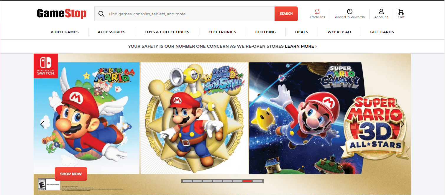
In this example from GameStop, you can see a lot of space, allowing users to focus on the crucial information on the page, like the products highlighted.
![]()
GameStop doesn’t cover every inch of their site with information or visuals. They utilize white space to direct the user’s attention to the vital information on their site.
This tip is one of the most essential ecommerce website tips because it impacts how users interact with your site. When you have a clean website like GameStop’s, users are more likely to stay on the page and engage. If your site has content on every inch, your audience will likely get overwhelmed and leave.
So, for ecommerce design success, focus on integrating white space to keep your site presentable and engaging.
2. Make your site mobile-responsive to appeal to all shoppers
People will shop on your site from all platforms, especially mobile. In fact, 76% of consumers shop on smartphones, and 90% have made a purchase on a smartphone. If you don’t have a mobile-friendly site, though, you’ll miss out on potential sales for your business.
To follow this ecommerce design best practice, you need to integrate responsive design. Responsive design enables your site to adapt to whatever device a user uses. Your website will adjust to the device’s screen, so your audience gets the best experience.
Having a mobile-friendly site is also critical for ranking in search results too. Since Google moved to a mobile-first indexing system, you need to have a mobile-friendly design to rank in search results. So, if you want people to find your products when they search, you need to use responsive design.
Here’s a great example of responsive design from HydroFlask.
First, you can see what their site looks like on a desktop.
![]()
Now here’s the same site on a mobile device.
![]()
As you can see, the site adjusts beautifully to the mobile device to provide the same experience scaled to a different device.
3. Make your navigation easy to use to keep visitors shopping
Next on our list of ecommerce website best practices is your site’s navigation. Shoppers use your navigation to browse your site and find relevant products. If you don’t have a navigation that’s simple and easy to use, your audience will struggle to find what they need on your site.
Take this example from Nike.
They use broad categories for their products, like Men’s, Women’s, and Kids, and then expand on them under each tab. Within each category, there are subcategories organized by product types, like Shoes, Clothes, and Accessories.
![]()
This organizational structure makes it easy for shoppers to find what they need.
So, when you create your navigation for your ecommerce store, try to make it easy for your audience to find what they need. Use broad category titles and have organized subcategories beneath each. You may want to test different setups with your audience to see what works best.
Besides organizing your navigation correctly, you also want to ensure that you add a product search bar to your navigation.
![]()
A product search bar helps your shoppers find specific products fast, so they don’t have to waste time browsing through products that aren’t relevant to their needs.
4. Optimize your site to rank in search results
If you want to know how to build a successful ecommerce store, start by optimizing your site for search engines. Search engine optimization (SEO) is critical if you want your products to rank in relevant search results.
Without SEO, your audience may never find your products and will shop with a competitor instead.
So, how do you optimize for search engines?
Integrate relevant keywords into product listings
To help your products appear in front of the right leads, you need to integrate relevant keywords into your product pages. You can find the right keywords by conducting keyword research. Use a keyword research tool, like KeywordsFX, to help you find relevant terms.
When you conduct keyword research, focus on long-tail keywords. Long-tail keywords contain three or more words, like “men’s black running sneakers.”
If someone searches a term like “men’s black running sneakers,” you know exactly what they want to find.
On the other hand, a term like “running sneakers” is a little more challenging to know the user’s search intent. Are they looking for men’s or women’s? What color shoes do they want?
Long-tail keywords are better overall because you’ll attract more qualified leads searching for the products you offer.
Ensure your site loads quickly
Slow sites cause $2.6 billion in revenue loss annually. Slow websites deter people from shopping on your ecommerce website. You need to ensure your site loads quickly, so you keep people engaged.
To check your site’s load time, use Google PageSpeed Insights. This tool will help you see your site’s current load time, as well as suggestions for improving your page speed. Some common tactics for boosting site load time include:
- Compressing heavy image files
- Enabling browser caching
- Reducing redirects
- Minifying CSS, JavaScript, and HTML
If you’re feeling overwhelmed with trying to improve your site’s load time, you can always invest in page speed services from a digital marketing company.
Create content
If you want to rank higher in search results, create valuable content that will drive relevant traffic to your page. Content helps you share your knowledge and expertise with your audience, so they see you as an expert in your industry and want to learn more about your business.
Content comes in numerous formats, including:
- Blogs
- Videos
- Infographics
- Ebooks
- Guides
- Podcasts
You can choose numerous content formats to share valuable information about your industry.
To find content topics, you can use a tool like Google Trends or search keywords on Google to see what people are already writing about in your industry. Do some brainstorming to think about everyday topics in your industry or information that people would want to know.
When you create content, you want to make it regularly to ensure it has an impact. You can use a content calendar to help you stay on track when you’re creating, editing, and publishing content.
If you continuously publish content and optimize it for SEO, you will repeatedly drive relevant traffic to your site, which will help increase your rankings in search results.
5. Eliminate steps in your checkout process for faster checkout
Another essential ecommerce design best practice involves optimizing your checkout process.
When shoppers add products to their cart, you don’t want to miss out on those sales. While shopping cart abandonment is expected, its rate can be much higher if you have a complicated checkout process.
When you create your checkout process, don’t add unnecessary steps to the process. You want to make the checkout process as painless as possible so that customers will convert.
One of the biggest mistakes companies make is forcing shoppers to make a profile to checkout. Making users create a profile creates an extra step requiring them to input some of the same information they would for their order.
Also, some people may not want to make an account right away. They may be first-time shoppers who want to see if they like your products first before they create a dedicated account.
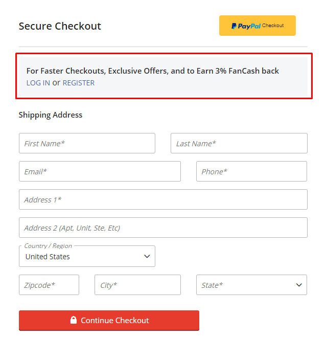
In this example from Fanatics, you can see that they offer the ability to login to your account or register by making a subtle mention at the top. You can continue checking out as a guest, however, by filling out the shipping information.
![]()
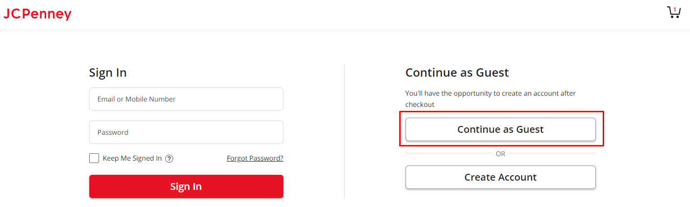
With JC Penney, they give you the option to sign in, continue as a guest, or create an account.
![]()
Regardless of the approach you take, it’s always great to give shoppers this option, so they continue with their order.
Additionally, make the checkout process as painless as possible.
So, for example, instead of requiring shoppers to fill out the shipping information and billing information, give them the option to select a box that says, “same as shipping address.” It saves shoppers from having to fill out the information twice.
Another great way to eliminate steps in your checkout process is to add multiple payment options. For example, offering PayPal is a quick and easy way for people to checkout. Shoppers don’t need to grab their wallets — they just need to log in to their account.
Revise your checkout process to ensure you’re creating the fastest checkout process for your shoppers so you can earn more sales.
6. Test everything to build the best website
When you look at ecommerce design best practices, you’ll find that one of the most critical best practices involves testing. If you want to create the best ecommerce website design for your business, you need to test regularly.
The first version of your site will never be the best. Even if you follow these ecommerce website tips and optimize your site correctly, there will always be room for improvement. You may even find that things you thought would work don’t end up working at all!
When you test elements on your site, you help your business create the best version of your site and continuously improve.
You can conduct A/B testing on different site elements to see what works. When you perform these tests, test one part at a time. If you test too many features, you’ll muddle the results and make it challenging to know which changes impact your site’s performance.
Try testing elements like:
- Call to action (CTA) buttons
- Headline text
- Image choice
- Image placement
- Font color, style, or size
Testing and experimenting will help you create the best ecommerce web design for your business.
Put these ecommerce design best practices to work
Now that you know how to build a successful ecommerce store, you can start putting these best practices to work on your website. If you’re feeling overwhelmed or don’t know where to start, WebFX is here to help.
We have a team of over 250 experts that know how to drive results for our clients. We’ve driven over $2.4 billion in sales and managed over 11.6 million leads for our clients. We can help your business thrive online.
Ready to build your dream ecommerce website? Contact us online or call us today at 888-601-5359 to speak with a strategist about our ecommerce web design services!
The post Ecommerce Design Best Practices: 6 Ecommerce Website Tips appeared first on WebFX Blog.
Among the reasons so many people choose WordPress is that it can run on just about any web server. The requirements are fairly basic and something that most web hosts and local servers can handle.
But simply installing WordPress in its default state is far different from running a high-performing website with it – especially one with numerous plugins. So much depends on the size of your website, its functionality and the quality of the code it utilizes.
Growth is also a big factor. A website that starts out relatively small and grows exponentially will likely burn through its hosting resources rather quickly. With that can come a need to upgrade your web hosting package or potentially move to a new service provider.
How do you know when a change is needed – or at least something you should consider? Today, we’ll share a few telltale signs that can clue you in.
Slow Performance on the Back End
Admittedly, the WordPress dashboard isn’t always the snappiest performer. Even on VPS and dedicated servers it can make you wait a little longer than you’d like.
But while a little lag here and there isn’t always a big deal, consistent slowness is. It is particularly concerning when it comes to tasks that rely on the database, such as loading or saving content. This could be an indicator that the web server doesn’t have enough horsepower to get the job done.
One way to measure performance in these scenarios is by utilizing the Query Monitor plugin. Once installed and activated, Query Monitor will provide a breakdown of a given task. You can see which queries and code are being run, listed by load times.
It may be that your site is running out of allotted memory, or that the database has grown to the point where it no longer runs efficiently. Poorly-written code or a failure to load third-party resources could also be culprits.
The good news is that sometimes it’s just a matter of disabling a troublesome plugin to speed up your site. That would save you the hassle of upgrading your web hosting arrangement. However, you might just as well find that the server no longer meets your needs. Just make sure you have all the necessary data before taking action.

Lots of Internal Server Errors
What starts out as lagging performance could eventually become the dreaded “500 Internal Server Error”. Once again, consistency is the key here. If you’re frequently seeing these errors when trying to navigate your website or perform tasks in the WordPress back end, something’s wrong.
The exact cause can vary. If you recently made a change to your site’s .htaccess file, for example, a buggy line of code may have done it. Another possibility is that your website ran up against the PHP memory limit and timed out.
Memory issues can be traced with the aforementioned Query Monitor. Learning the cause of the error is vital. You might find that it’s a poorly-written plugin that is bleeding you dry, or it may simply be a case of too much traffic and not enough resources.
If you do find that your server doesn’t have enough memory, and you can’t boost it further, it may be time for a move. Just be sure that your new server has more RAM than the old one.

Storage and/or Bandwidth Limitations
Perhaps this one seems a bit obvious – but still worth mentioning. A busy WordPress website can eat through storage space and bandwidth rather quickly. If you’re constantly wrestling with your hosting account’s limit, a change is probably in order.
Beyond the standard WordPress install, certain plugins and themes can be quite large. But the real challenge can be media files. Put enough audio, video, images and PDF documents on your site and they’ll take up significant space.
The other issue with media files is that you can’t just replace old versions with new ones – at least not without a plugin such as Enable Media Replace. This can lead to a lot of clutter in your media library. While you may be able to stay on top of it (or use a plugin to do it for you), not everyone’s going to make that effort.
Plus, sites with big files and numerous visitors may also exceed allotted bandwidth for a given period of time. This can result in extra charges on your bill and lots of warning emails from your hosting provider.
A full move to a new account may not always be necessary, though. Some hosts will gladly sell you a bit more storage or bandwidth if you need it. But you’ll have to judge whether or not it will be enough to allow for future growth.

Has Your WordPress Website Outgrown Its Hosting?
Part of maintaining a WordPress website is ensuring that it has enough server resources for stability and performance. And while you can certainly cut out unnecessary media files and plugins, that may only be a temporary fix. Eventually, you may find yourself running into the same issues once again.
It’s when you face persistent problems that you’ll want to consider leveling up your web hosting. When doing so, be sure an upgrade gives you the amount of resources you’ll need. A boost to storage, bandwidth, RAM and processing power should be at the top of your list.
How much will you need? One way to better understand your site’s requirements is to look at your current resource usage. If, for example, you’re running out of memory with 2GB of allotted RAM, then doubling up may make sense. The main goal is to allow for some breathing room so that you won’t find yourself in the same situation a few months from now.
It’s a challenge that requires constant attention. But on the bright side, growth is good! If you find that your site has outgrown its current hosting arrangement, you might just consider it a badge of honor.
The post Signs Your WordPress Website Has Outgrown Its Hosting appeared first on Speckyboy Design Magazine.
WordPress 5.6 Beta 1 is now available for testing!
This software is still in development, so we recommend that you run this version on a test site.
You can test the WordPress 5.6 beta in two ways:
The current target for final release is December 8, 2020. This is just seven weeks away, so your help is needed to ensure this release is tested properly.
Improvements in the Editor
WordPress 5.6 includes seven Gutenberg plugin releases. Here are a few highlighted enhancements:
- Improved support for video positioning in cover blocks.
- Enhancements to Block Patterns including translatable strings.
- Character counts in the information panel, improved keyboard navigation, and other adjustments to help users find their way better.
- Improved UI for drag and drop functionality, as well as block movers.
To see all of the features for each release in detail check out the release posts: 8.6, 8.7, 8.8, 8.9, 9.0, 9.1, and 9.2 (link forthcoming).
Improvements in Core
A new default theme
The default theme is making its annual return with Twenty Twenty-One. This theme features a streamlined and elegant design, which aims to be AAA ready.
Auto-update option for major releases
The much anticipated opt-in for major releases of WordPress Core will ship in this release. With this functionality, you can elect to have major releases of the WordPress software update in the background with no additional fuss for your users.
Increased support for PHP 8
The next major version release of PHP, 8.0.0, is scheduled for release just a few days prior to WordPress 5.6. The WordPress project has a long history of being compatible with new versions of PHP as soon as possible, and this release is no different.
Because PHP 8 is a major version release, changes that break backward compatibility or compatibility for various APIs are allowed. Contributors have been hard at work fixing the known incompatibilities with PHP 8 in WordPress during the 5.6 release cycle.
While all of the detectable issues in WordPress can be fixed, you will need to verify that all of your plugins and themes are also compatible with PHP 8 prior to upgrading. Keep an eye on the Making WordPress Core blog in the coming weeks for more detailed information about what to look for.
Application Passwords for REST API Authentication
Since the REST API was merged into Core, only cookie & nonce based authentication has been available (without the use of a plugin). This authentication method can be a frustrating experience for developers, often limiting how applications can interact with protected endpoints.
With the introduction of Application Password in WordPress 5.6, gone is this frustration and the need to jump through hoops to re-authenticate when cookies expire. But don’t worry, cookie and nonce authentication will remain in WordPress as-is if you’re not ready to change.
Application Passwords are user specific, making it easy to grant or revoke access to specific users or applications (individually or wholesale). Because information like “Last Used” is logged, it’s also easy to track down inactive credentials or bad actors from unexpected locations.
Better accessibility
With every release, WordPress works hard to improve accessibility. Version 5.6 is no exception and will ship with a number of accessibility fixes and enhancements. Take a look:
- Announce block selection changes manually on windows.
- Avoid focusing the block selection button on each render.
- Avoid rendering the clipboard textarea inside the button
- Fix dropdown menu focus loss when using arrow keys with Safari and Voiceover
- Fix dragging multiple blocks downwards, which resulted in blocks inserted in wrong position.
- Fix incorrect aria description in the Block List View.
- Add arrow navigation in Preview menu.
- Prevent links from being focusable inside the Disabled component.
How You Can Help
Keep your eyes on the Make WordPress Core blog for 5.6-related developer notes in the coming weeks, breaking down these and other changes in greater detail.
So far, contributors have fixed 188 tickets in WordPress 5.6, including 82 new features and enhancements, and more bug fixes are on the way.
Do some testing!
Testing for bugs is an important part of polishing the release during the beta stage and a great way to contribute.
If you think you’ve found a bug, please post to the Alpha/Beta area in the support forums. We would love to hear from you! If you’re comfortable writing a reproducible bug report, file one on WordPress Trac. That’s also where you can find a list of known bugs.
Props to @webcommsat, @yvettesonneveld, @estelaris, @cguntur, @desrosj, and @marybaum for editing/proof reading this post, and @davidbaumwald for final review.