Interview with Oliver Davies
Audio
This episode is sponsored by
RingCentral Developers
The post Interview with Oliver Davies appeared first on Voices of the ElePHPant.
The post Interview with Oliver Davies appeared first on Voices of the ElePHPant.
Have you ever asked yourself why you became a freelance web designer? As funny as it sounds, it may be one of those questions that we don’t ask ourselves until well after we’ve started a business.
Odds are that your initial answer has something to do with freedom. That makes sense, as it is an enticing concept. Yet it’s also a bit broad.
If you dig a little deeper, you might just find that individuality is at the very core of freelancing. It’s the need to do things your own way – without interference from the outside world. Sink or swim, you want to be the captain of your own ship.
But, how do you get to that point in both your business and life? Let’s take a look at some ways you can pave your own path.
Web design is not a one-size-fits-all type of career. Compare it to, say, a grocery store. While you’re likely to find similar goods from one store to another, the services web designers provide can vary greatly from firm to firm, person to person.
That’s a great thing, because it gives you the power to make your business exactly what you want it to be. You don’t have to work with clients in specific industries or price ranges. The same goes for the technologies you use.
Sometimes we lose sight of that. Instead of specializing in what we do or like best, we simply take every opportunity that comes our way.
There’s nothing inherently wrong with that approach. However, there is the possibility of getting stuck in undesirable situations. Clients you can’t stand, projects that drive you crazy (and don’t pay nearly enough) – this probably isn’t the independence you were looking for.
Instead, position yourself for the type of clients and projects you really want. It may be a little scary at first. But as you start to find success, your confidence will grow right along with your business.

Among the biggest misconceptions about owning a business is that you have to morph into a cheesy salesperson. While some sales-related skills are useful, they don’t require a change in personality.
Sales gimmicks and buzzwords are more likely to come off as forced, depending on your nature. They don’t capture your knowledge or give a potential client a reason to choose you over competitors. You might find that the opposite is true.
Authenticity is a key in booking clients and keeping them. That’s just another way to say: be yourself. That in itself is freeing.
No, it’s not a license to tell inappropriate jokes. But it does allow you to speak honestly in an effort to help clients achieve their goals. Even better, you don’t have to have an immediate answer to every question. You can take the time to research and follow up.
After all, clients won’t be working with that carefully-crafted version of you. They’ll be spending their time and money on the real you. Might as well introduce them right from the start.

You don’t have to run your business like the web designer down the street or on the other side of the planet. The decisions regarding how you work, where you work and how much you charge are in your hands.
Sure, you should carefully weigh each of those items. But the decisions are still yours to make. And, for better or worse, it’s part of what will make you stand out.
For example, if you have no interest in working with a particular JavaScript framework, there’s no law that says you have to. If you don’t want to be at your desk after 5pm, that’s on you, too.
When it comes to pricing, it can be difficult to gauge at the beginning. But the goal should be to develop a structure that you’re comfortable with and that clients are willing to pay. It may require some experimentation – which you can do in a way that suits you best.
And you’re also in the driver’s seat when it comes to the projects you take on. This is how you find your niche in the industry.
What’s more, part of following your own path is reserving the right to change your mind. If an aspect of your business isn’t working or even satisfying, you can make adjustments.

By becoming a freelance web designer, you’ve made it clear that you want to control your destiny. You don’t want to rely on a boss or some corporate mandate to keep you fulfilled at work.
Instead, you’ve chosen to make your own way in the world. It’s a bold choice, and one that comes with some risk. But that’s true for just about anything worth doing in life.
Most likely, you didn’t start your own business to be like everyone else. So, embrace who you are and do your own thing. Envision the future you want and go make it happen!
The post How to Pave Your Own Path as a Freelancer appeared first on Speckyboy Design Magazine.
Latest PEAR Releases:
I used PHP's file_get_contents() to fetch the content of an URL:
$content = file_get_contents('https://username:password@example.org/path');This worked fine until that URL redirected to a different path on the same domain. An error was thrown then:
PHP Warning: file_get_contents(http://...@example.org): failed to open stream: HTTP request failed! HTTP/1.1 401 Unauthorized
The solution is to use a stream context and configure the HTTP basic auth parameters into it. Those parameters are used for redirects, too.
$user = 'user';
$pass = 'pass';
$opts = [
    'http' => [
        'method' => 'GET',
        'header' => 'Authorization: Basic ' . base64_encode($user . ':' . $pass)
    ]
];
file_get_contents($baUrl, false, stream_context_create($opts));Architecture is one of the most instantly-recognizable artforms. Show a picture of a famous structure and odds are that a plurality of people will immediately identify it.
It also serves as a source of pride and inspiration. For example, people from all over the world dream of visiting the Eiffel Tower. But the experience is about more than just standing in front and snapping a selfie. Architecture also represents a specific time and place – making it even more special.
We shouldn’t be surprised, then, that web designers are big fans of architectural design. Just as a structure can both look and function beautifully, so can a website. They’re more related than one might think at first glance.
Today, we’ll introduce you to some compelling examples of web designers paying homage to the world’s most famous structures. In many cases, the attention to detail is remarkable – making them a proper tribute indeed.
Completed in 1643, the Taj Mahal is known for its intricate beauty and lush landscape. This CSS and JavaScript rendering is decidedly minimal, yet still instantly recognizable. The silhouette of the structure against a golden sky, along with the gently moving waterway in the foreground are all one really needs.
See the Pen
Taj Minimal by Chris Gannon
The sight of Disney World’s fairytale castle draws kids of all ages – and from all corners of the world. Here, we have a pure CSS replica that captures its essence. Looking through its 500+ lines of styles, this one was clearly a labor of love.
See the Pen
Magic castle by Alvaro Montoro
For many, the Eiffel Tower represents romance in the City of Lights. It’s a can’t-miss attraction, both literally and figuratively. This CSS animation stands out as well, providing a slick 360-degree view.
See the Pen
Peace for Paris by David Khourshid
An awe-inspiring sight in Western Desert in Egypt, the pyramids are included among the seven wonders of the ancient world. This artistic take on the pyramids is also interactive. Hover over the scene to watch the sun rise.
See the Pen
Desert Sunrise (Hover on Image) by Karen
The world’s tallest buildings define a city skyline like nothing else. You see the Empire State Building and New York City immediately comes to mind. Want to see how your favorites stack up against each other? This beautifully-designed chart will help you compare the Burj Khalifa to the Taipei 101.
See the Pen
amCharts 4: Pictorial column chart by amCharts team
At nearly 22,000 kilometers in length, the Great Wall of China is probably too big to fully recreate with CSS. Therefore, it’s understandable that this snippet provides just a peek of its jaw-dropping scenery. We get the picture.
See the Pen
CSS Puns – Great Wall of China by Katarzyna Marcinkiewicz
Seattle’s Space Needle towers above the western US city and affords visitors to some spectacular views. Much of the world may also recognize an animated version that was famously used in the minimalist opening to the 1990s TV show, Frasier. This super-tall CSS rendering straddles the line between realism and simplicity.
See the Pen
Space Needle CSS by Alyssa Williams
Want to travel to the world’s most famous landmarks in mere seconds? This gorgeous morphing animation will take you to places such as Rio, Pisa, Paris and Beijing. Again, the usage of silhouettes demonstrates how recognizable these places are – even without all the minutiae.
See the Pen
Landmarks morph by Mikael Ainalem
Whether you’re designing a building or a website, some of the same universal themes apply. Take beauty, for example. Outstanding looks have to be supported by a carefully-thought-out underlying structure. Ignoring that critical component will lead to certain failure.
In addition, complexity isn’t necessarily a guarantee of success. The most complex code isn’t always the best path, and the same holds true for a structure. Simplicity can often be the most effective approach.
We hope these renderings of some of the world’s most famous architectural landmarks has inspired you! If you’d like to see even more examples, check out our CodePen collection.
The post Famous Architecture Recreated with CSS and JavaScript appeared first on Speckyboy Design Magazine.
Recently at work I had to analyze a problem in a Laravel application that I was not familiar with. The problem: When calling a specific URL, it wrongly redirected to another URL.
The route that I expected to be called was not, and routes/web.php was huge; too large to find the matching route quickly.
The solution was to adjust public/index.php and add the following line before the response was sent back to the browser:
$response->header('X-Route', Route::currentRouteName());
$response->send();
Now I could look at the redirect's HTTP headers to find the route that had been used:
$ curl -I http://app.example.org/en/explanatory-videos/test-510/
HTTP/1.1 302 Found
Date: Wed, 16 Sep 2020 11:45:26 GMT
Server: nginx/1.10.3 (Ubuntu)
Content-Type: text/html; charset=UTF-8
Cache-Control: no-cache, private
Location: http://app.example.org/en/products
X-Route: en_product_detailWhat if there was a way to stop your clients from saying: “Yeah, the logo looks good. But how’s it gonna look once we add it to our branding materials?”
Let’s be honest: working with design clients isn’t easy. Chances are, you deal with a lot of edits and convincing. Unfortunately, that’s pretty normal with work that produces virtual results. Clients find it hard to imagine your logo designs on their actual items if they only see them on screens.
That’s exactly what Photoshop mockup templates for showcasing logo designs help with! Instead of just presenting your design in Photoshop or llustrator, you can easily add it to various logo mockups to convince your clients:
No matter the client, you can use these logo design mockups to turn your artistic vision into a reality, and show your clients how amazing your work is, so you finally hear them say: “Yes, this is exactly what we had in mind!”
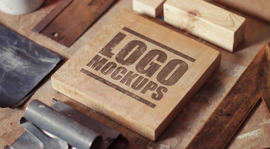
Shot from an interesting perspective, this logo mockup template set for Photoshop allows you to add your design to a square wooden block. You’ll get 6 diverse mockups with realistic perspectives and depths of field – no need to worry about your clients questioning the tangible end result!

Rustic and diverse, these hand lettering logo mockup templates for Photoshop help you easily add your own logo designs to a variety of items: pen caps, rulers, office supplies, matches, and more. You’ll get incredibly photo-realistic mockups with 11 PSD items for a gorgeous presentation of your designs.

Designing logos that will be placed on plastic packaging can get tricky, but not with these mockups. This plastic logo mockup set for Photoshop helps you assess and present your logo designs on 7 different items. And thanks to realistic shadows and lighting, the results will look true to life!

If you’re working with a trendy and stylish brand, they will love seeing their logo on this outdoor store banner sign mockup. Since the sign is black, this logo design mockup works perfectly for bright and minimalist designs. Simply open it in Photoshop, and add your own designs!

This premium logo mockup set is perfect for showcasing your designs on a variety of textures. From cardboard, to fabric like linen, you will get plenty of options. You’ll get 11 files in total, all of them perfect for showcasing everything from logo and label design, to art.

Showcase your stellar label or logo designs with these gorgeous mockup templates for Photoshop. You’ll get 10 layered and well-organized PSD files for easy customization with Photoshop smart objects, featuring diverse textures and applications. Your clients will adore the photo-realistic end results that perfectly fit their brand identity!

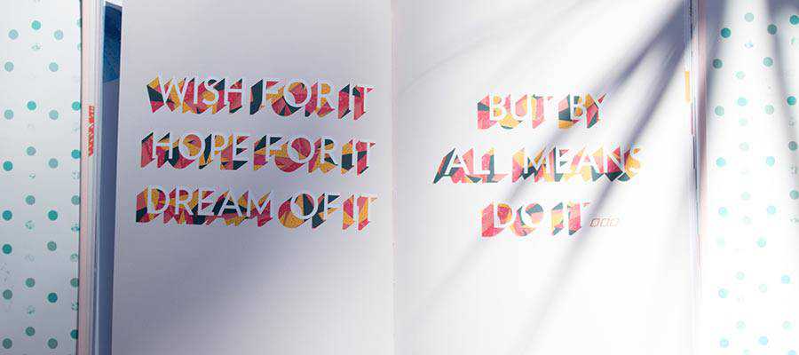
A gorgeous logo mockup collection, this template set will help you show your art from another perspective. Posed as art in the making in a creative environment, these mockups help you emphasize the details of your logo designs. You’ll get 6 high-res PSD files, and numerous customization options.

Sleek and simple, this hanging square sign mockup template is perfect for presenting your logo designs to your audience. If you want to emphasize your design’s uniqueness (that’s sure to catch the attention of everyone who sees it), go with this gorgeous mockup template for Photoshop.

Photo-realistic and intriguing, this logo design mockup template set for Photoshop is a great fit for all kinds of projects in your portfolio. From grungy backgrounds for modern brands, to embossed print for intellectual clients, there is plenty to pick from. Have fun with 7 mockups and 7 versatile styles!

Hot-foil emboss, cut-out, pressed… These logo mockup templates offer so many options that you will keep them in your presentation kit for years! With 6 PSD mockup files and 6 different effects, there is something for all kinds of clients. Go fancy with the gold foil, or keep it simple.

Add a dash of tradition and vintage aesthetics with these beautiful vintage letterpress mockup templates for logo designs. You can apply your designs to labels, tags, business cards, and more. You’ll get incredibly photo-realistic results that your elegant and refined clients won’t be able to resist!

Leave a mark with your designs! This carved wood logo mockup template is perfect for brands that want to become timeless with a little help from you. Presented as an actual wood carving, this mockup lets you easily add your own concept to the template, and leave your audience breathless.

Write your clients’ names in big and bold letters. Or simply test out an interesting way to present your work! These wall text and logo mockup templates are perfect for showcasing the exclusiveness of your work. You will get 6 photo-realistic mockups, and 6 stunning effects for perfect results.

Premium products require premium logo presentations, and there’s nothing more elegant than these leather logo mockup templates. Add your designs to 5 PSD mockups styled as the application on leather. You can also customize the leather color and effects to completely take your audience’s breath away.

Present your logo or typography design work with these metal pin logo mockup templates. You’ll get 9 cool Photoshop templates with 3 views, 3 metals (silver, rose-gold, and gold), as well as 5 color paints. If you have innovative, avant-garde clients, they’ll love seeing these mockups!

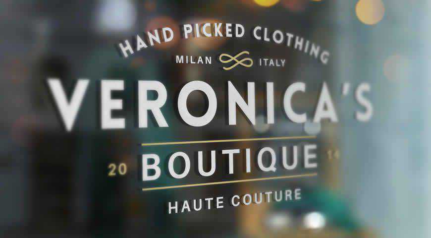
Turn window shoppers into loyal customers with these window signage mockup templates, perfect for boutiques, cafes, and other businesses that rely on foot traffic. You can easily add your own designs to these gorgeous templates through Photoshop, absolutely wow your clients, and help them do the same for their customers!

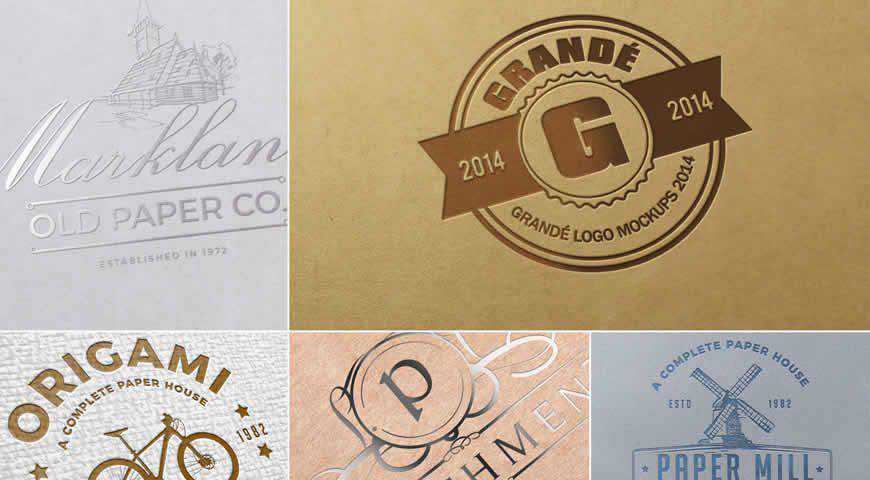
Present your logo designs for exclusive clients with these sleek and elegant paper logo mockup templates for Photoshop featuring realistic lighting. With these 5 astonishing PSD mockups (from luxurious silver print, to timeless paper emboss), you’ll get everything you need to charm your clients during your next presentation.

Unique and with a premium feel, these metallic logo mockup templates are perfect for clients with high standards. You will get 6 customizable PSD logo mockups; from application to concrete, to engraved typography. All the textures and results are incredibly realistic, and help your clients build a respectable brand identity.

Effortless with a premium effect, this wood logo mockup template is perfect for timeless brands, or brands that prize the quality of their materials above all else. Professionally photographed, this wood logo mockup offers photo-realistic results. It’s easily customizable; simply start up Photoshop, and add your own designs.

Show how awesome your clients’ labels will look, or simply add a trendy feel to your clients’ branding by presenting your logo design on these denim label mockup templates. Photographed on jeans, and incredibly easy to customize, this logo mockup template will take your clients’ breath away!

Present your logo design in a trendy and interesting way with this logo mockup set for Photoshop. With 5 different mockup styles, including a logo/branding identity sticker, this template set offers incredibly photo-realistic results. And since they’re professionally photographed, they’ll please even the most demanding clients!

Emitting an aura of timelessness, these branding logo mockup templates come in a wide variety of styles to charm the socks off of even the pickiest clients. With 7 PSD scenes photographed in different settings (buildings, labels, and more), these logo mockups are easy to customize and promise beautiful results.

A simple logo or sketch mockup, this template helps you show the art behind the process to clients, or charm your customers by giving them a BTS peak. With 7 different PSD files featuring people holding the paper with your logo on it, this mockup set is a great choice!

Pristine and luxurious, this black stamp logo mockup is perfect for clients who don’t just want a logo, but a visual foundation for their legacy. Featuring real background and texture, this mockup template is incredibly easy to customize and offers photo-realistic results to help you convince your clients.

If you’re looking for a versatile logo mockup set to use for different clients, you’ve just found it! This set offers 7 PSD mockups photographed in unique locations; from 3D logos on buildings, to CDs and gift bags. You’ll get plenty to pick from!

Turn your vision into reality with versatile logo design mockups for Photoshop! From carved wood, to denim labels, there is plenty to pick from!
All you have to do is boot up Photoshop, replace the placeholders with your own designs, and you’ll be good to go!
More Mockup Templates: Banners, Books, Booklets, Bottles, Box Packaging, Branding, Dresses, Flyers, Frames, Hoodies, iPads, iPhones, Laptops, MacBooks, Magazines, Mobile Apps, Mobile Devices, Mugs, Packaging, Sweatshirts, T-Shirts, Tote Bags.
The post 25 Photoshop PSD Mockup Templates for Showcasing Logo Designs in 2021 appeared first on Speckyboy Design Magazine.