One of the most overlooked aspects in designing a website that we often brush off is web accessibility. There’s a misconception that web accessibility requires sacrifices to aesthetics, or that it’s not worth the effort.
With a growing number of ways that users access the web, however, creating highly accessible and universal designs that can be viewed in as many ways as possible is critical to the success of a website and even a company.
The good news about making a website accessible is that it isn’t as hard as you think.
Most web accessibility guidelines already go hand-in-hand with website development practices. Just read this blog post, which explores 10 quick and easy ways for how to make a website more accessible in 2020 and beyond.
If you’re looking to make your website accessible and want help, ask WebFX. With our website accessibility design services, as well as our award-winning design team, we can help your business launch and maintain a site that everyone can use.
Contact us online or call us at 888-601-5359 to learn more!
What is website accessibility?
Website accessibility focuses on making every website on the Internet accessible to everyone. Nearly one in five people in the U.S. lives with a disability, emphasizing the need for sites to become accessible for users with impairments or disabilities.
While technologies like screen readers, Braille terminals, and alternative keywords make it possible for people with disabilities to browse the Internet, companies can go a step further with their site’s design. Quick design changes can help make your website more accessible to people across the world.
Why make a website accessible?
You want to make your website accessible for a few reasons, including:
- Give your target audience equal access to your site, services, and content
- Protect your company from fines and lawsuits resulting from an inaccessible website
- Demonstrate your brand’s commitment to serving everyone in your target audience
- Grow your business by reaching and serving a larger market within your target audience
Companies rarely make their website inaccessible to people with disabilities intentionally. Many, in fact, want to make an accessible website but want to do the research when it comes to investigating the cost and resources needed for this kind of project.
How to make your website accessible
If you’re ready to learn how to make your website accessible, then get started with these 10 tips:
1. Use meaningful title attributes
Think of title attributes as short summaries that describe where the hyperlink will take the user who clicks on it.
It doesn’t help if the title attribute is the same as the link text, such as in the following example:
<a href="portfolio.html" title="Portfolio">Portfolio</a>
Why is that? Because for screen reader users, it’s redundant and gives them no added value.
In the above example, even though web accessibility and Section 508 validators won’t let you pass their automated tests without it, it’s actually better to leave out the title attribute.
A better title attribute to the example above is:
<a href=" portfolio.html" title="Some artwork of the artist">Portfolio</a>
2. Place important interactive elements higher up the web page
Here’s a simple web accessibility exercise for you: identify important hyperlinks and user interface controls that your users need access in one of your web pages. Then count how many times you have to press the Tab key to get to it.
Did you get to it fast enough? Or did you have to press the Tab key like crazy? Were you able to see which hyperlink of interface control was currently focused on when you pressed the Tab key?
Now imagine yourself in the situation where you can’t use a conventional point-to-interact device like a mouse; a situation where, in order to get to a desired interactive element, you have to traverse the ones the come before it on the web page. This gives you a partial picture how people who have limited or no hand functions interface with a web page.
Easy enough: place important links and other interactive elements higher up your web pages. It’s good practice anyways since most website users, regardless of physical or mental ability, expect important items closer to the top of a web page.
3. Don’t begin title attributes with the same text
You’ll often see hyperlink elements with title attributes that look like this:
<a href="/" title="Link to home">Home</a>
<a href="/products" title="Link to products">Products</a>
<a href="/contact" title="Link to contact">Contact</a>
This can be a result of default content management system configurations, or someone who did not want to take too much time with title attributes.
Users who use screen readers such as JAWS often rely on title attributes to find web links on a page. JAWS, for instance, has a feature for pulling together a list of links on a web page sorted in alphabetical order. If title attributes begin with the same text, it’s harder to use search functions that are built into screen readers.
4. Use headings correctly
Heading tags allow screen reader users to jump to the sections they’re interested in. Headings on a web page is an outline of the web page; using an <h2> right after an <h1> element denotes a section that is a subsection of the preceding <h1>.
Many of us neglect headings, including me. In every single instance where I’ve misused heading elements, I couldn’t find a reasonable explanation for doing so – and neither will you.
This simple web accessibility guideline can do wonders for people with vision deficiencies that use screen-reading technology.
Breaking up a long web page into logical subsections with headings makes it easier to get to your location of interest. Imagine that while reading the first paragraph of an article, that you immediately wanted to leave a comment, and the comment form is located somewhere at the bottom of a web page. For sighted users, this would be a snap: you just need to scroll down and visually locate the web form.
But on content-heavy sites such as the one you’re viewing now, the comment form is actually somewhere in the middle of the HTML structure even though visually, it’s right at the bottom of the web page. Without section headings that indicate where the web form begins, screen reader users would have to wade through a lot of content in order to get to the form. On Six Revisions, the level 3 heading “Leave a Comment” will allow screen reader users to quickly jump to it.
5. Use distinct and meaningful page titles
The first thing a screen reader user will encounter right after the web page fully loads is the text in between your <title> tags. The worst thing you can do, aside from not having the <title> tag, is having them all the same in all of your web pages. This makes it difficult for users who rely on your HTML markup to determine what page they’re on, or if the link they clicked on is the same web page they were previously on or not.
If your page titles are the same, or if you don’t have page titles, screen reader users will always have to read the content before determining that they’re on web page they want to be on. Keep page titles succinct and meaningful.
Good page titles to use that include repeating text are:
<head>
  <title>About Us - Our Store</title>
</head>
<head>
  <title>All Articles: Our Store</title>
</head>
<head>
  <title>Our Store: Home</title>
</head>
6. Use skip navigation
Screen reader users have to read HTML documents from top to bottom, without the ability to scan the web page for the information they’re interested in.
Skip navigation allows screen reader users and persons who can’t use a mouse to skip long lists of links, such as the primary navigation on a website.
Skip navigation is simply a link right at the top of your web page that, when clicked, positions you to the content section. You can hide this link from able-bodied users by moving the link outside of the browser viewport using CSS.
Here’s an example: let’s say that you have the HTML structure below and you want to have a skip nav that positions the reader on the main content area (div#content).
<ul id="nav">
  <li><a href="home.html" title="">Home</a></li>
  <li><a href="about.html" title="">About</a></li>
  <li><a href="blog.html" title="">Blog</a></li>
  <li><a href="portfolio.html" title="">Portfolio</a></li>
  <li><a href="contact.html" title="">Contact</a></li>
</ul>
<div id="leftCol">
  <h1>My friends</h1>
  <ul>
    <li><a href="http://blogofafriend.com/" title="">Blog of a friend</a></li>
    <li><a href="http://friendofablog.com/" title="">Friend of a blog</a></li>
  </ul>
</div>
<div id="#content">
  <h1>Page  Title</h1>
  ...
</div>
You would place your skip navigation link right above your unordered list, like so:
<a id="skipnav" href="#content" title="Jump to content">Skip Navigation</a>
<ul id="nav">
  <li><a href="home.html" title="">Home</a></li>
  <li><a href="about.html" title="">About</a></li>
  <li><a href="blog.html" title="">Blog</a></li>
  <li><a href="portfolio.html" title="">Portfolio</a></li>
  <li><a href="contact.html" title="">Contact</a></li>
</ul>
<div id="leftCol">
  <h1>My friends</h1>
  <ul>
    <li><a href="http://blogofafriend.com/" title="">Blog of a friend</a></li>
    <li><a href="http://friendofablog.com/" title="">Friend of a blog</a></li>
  </ul>
</div>
<div id="#content">
  <h1>Page  Title</h1>
  ...
</div>
Some sites decide to keep the skip navigation link visible, but if you’d rather hide it from sighted users, you can use CSS to indent the link outside of the web browser viewport:
#skipnav {
  position:absolute;
  top:-10000px;
}
The downside of the above technique is that, although it will work for screen reader users, it won’t help users who can’t use a mouse since they won’t be able to use the Tab key to navigate to the skip navigation link. An improvement to the method above can be found on WebAIM: Links that become visible with keyboard focus.
Skip navigation is easy to implement, but very useful to have in web pages with a lot of content above the primary content area.
WebAIM has a very thorough discussion of skip navigation that includes several techniques (and their pro’s and con’s) that you should read.
7. Label your form elements
HTML web forms are the primary way of interacting with a website. Because of the importance of web forms, making sure that you use correct markup is crucial for universal design.
Label your input elements with meaningful and descriptive text. This makes it clear to the user what information they should be providing.
<label for="searchbox">Enter key words to search:</label>
<input id="searchbox" name="searchbox" type="text"  />
With CSS, you can style that label element into an icon or hide it from plain view by pushing it out of the browser viewport, if you really must.
8. Test your web pages with CSS and JavaScript disabled
One of the simplest ways to determine how access-friendly a website is to users that can’t see content in a computer monitor, is to turn off CSS and JavaScript. Why?
With CSS, we can position elements wherever we want, regardless of where they are in the actual document object model.
With JavaScript, we can manipulate page elements by hiding, removing, and showing them, based on a user’s action.
Disabling these two web technologies allows you to see whether or not all of your web page content is accessible. It also shows you whether your web pages are organized in an optimum manner.
9. “See” what it’s like to use assistive technologies
Perhaps the best way to fully understand universal design on the web is to see an actual person use a website with assistive technologies. If you don’t know of a person with a form of disability that affects their ability to use the web, there are many simulators online that will help you at least get a partial picture of how assistive technologies render and interface with a website.
For screen reader simulations, try out WebAnywhere, a web tool created through a collaboration between University of Michigan and University of Rochester. If you want to feel how it’s like to be blind and interacting with a website: memorize a few keyboard shortcut keys the WebAnywhere uses. Navigate to your site using WebAnywhere. Turn off your monitor and unplug your mouse. Finally, try to read and interact with the web page you’re on.
To see if the colors you’ve chosen are universally accessible to individuals with vision impairments, check out the list of tools for evaluating colors I’ve put together a while back.
Additionally, there are many tools out there that will help you validate your work against common web accessibility standards and guidelines. There are many of them, and most of the good ones are free. See the article: 10 Tools for Evaluating Web Design Accessibility.
10. Web accessibility is not about degrading the overall user experience
The final tip I’d like to share is more of a philosophical viewpoint to designing with web accessibility in mind.
Many of us think that reaching a high level of web accessibility means that it’s at the cost of the general/average user experience. It’s not. It’s about offering multiple access points with varying levels of complexity.
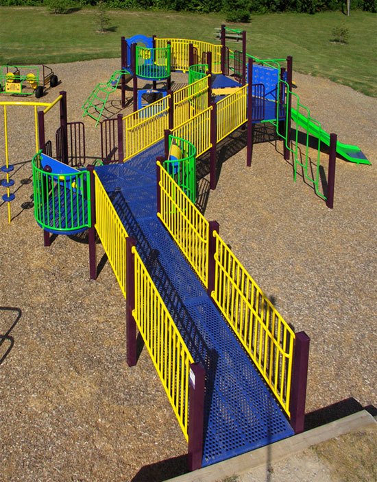
I learned this lesson while looking at all-inclusive playground equipment.
I noticed that it’s not about lowering the difficulty of obstacles in a playground equipment (such as the one featured below), but that it’s about giving several point of access with varying levels of difficulty.
Study the Jungle Jim below that provides its users several points of access.
![Photo of an accessible playground equipment.]() Photo from APE
Photo from APE
There are several potential points of access to the play equipment. Able-bodied children who want a higher level of challenge can use the more difficult routes, while children with mobility impairments can use the access route.
What’s the implication of this concept to web design?
It means that it’s not about not using Flash content because of it’s notoriety for being inaccessible, it’s about making sure that users that have difficulty interacting with Flash content have an alternative way of getting the same information.
It’s not about not using Ajax because screen readers can’t parse asynchronous DOM manipulation by client-side scripts (e.g. content changes without a page reload), it’s about providing an explanation to the user that the page will update upon performing a certain action and they may not see it, or offering an alternative experience for them (just like the Jungle Jim).
Keeping in mind these tips will ensure at least partial access to your websites and webapps. If there’s one thing you should take away from reading this, it’s that web accessibility isn’t that hard to integrate with your processes, and most, if not all of these tips, should already be a part of your web design and web development best practices.
Learn more about how to make a website more accessible
There are many methods involved in making websites universally-accessible, with varying levels of difficulty for integration. The above tips touched on only a few of them. Even if you take just a few hours of your time today to read the following resources, you’ll learn a lot about web accessibility.
Browse the following resources to learn more about how to make a website more accessible:
The W3C Web Accessibility Initiative group has an introductory level document for those who want to learn about web accessibility, but don’t know where to start.
WebAIM (Web Accessibility In Mind) promotes universal design on the web and has plenty of articles on web accessibility; just studying the site’s design and HTML/CSS source code can give you an idea of what a web accessible site is.
This online book was designed as a 30-day course that educates its readers about one accessibility technique per day, but you can read it all in one sitting, and an average reader can probably get through it in about a few hours.
A document on W3C that gives readers an overview of how persons with handicaps use the web.
Make your website accessible with WebFX
An accessible website is crucial for businesses today. If you don’t make an accessible website, your company risks not only lawsuits and fines but also the chance to connect with everyone in your target audience. Allow your business to grow by creating an accessible, user-friendly site.
Contact us online or call us at 888-601-5359 to learn how our accessible web design services can help!
The post 10 Helpful Tips for How to Make Your Website More Accessible appeared first on WebFX Blog.
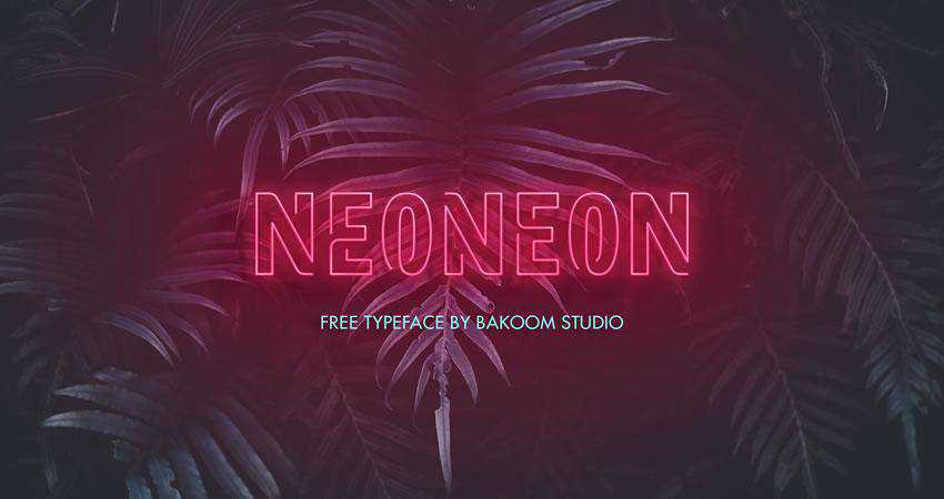
If you want your design to immediately grab attention and stand out, consider using an outline font. You can use these fonts for headers in ads or on websites as well as logo or branding projects.
In some cases, you can even apply the neon text effect to them and create beautiful and attractive posters, business cards, signage, and more.
There is no shortage of outline fonts available online. What’s even better, you can find high-quality outline fonts for free and use them in both commercial and personal projects.
In this roundup we’ve gathered the best outline fonts that you can download for free. They can be used in a variety of professional, branding, and business graphic designs.
Browse through our selection and download as many of these fonts as you like. Don’t forget to check their license terms to make sure they can be used in your intended project.
You might also like our free collections of graffiti, Disney, hand-drawn or retro fonts.
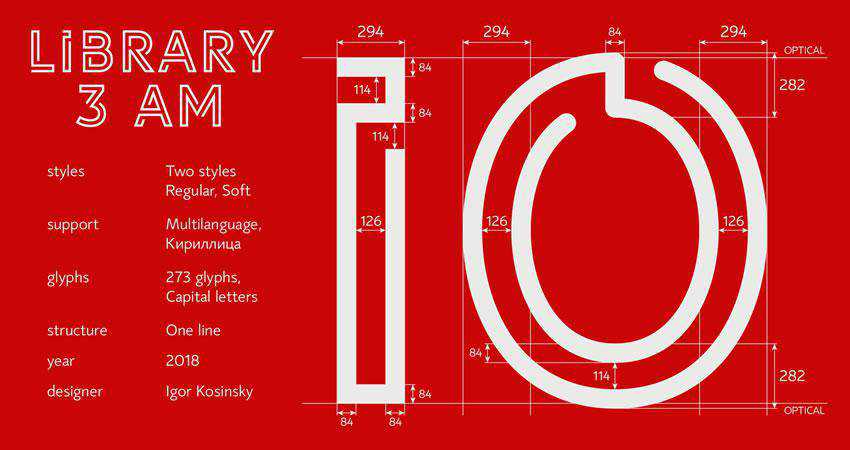
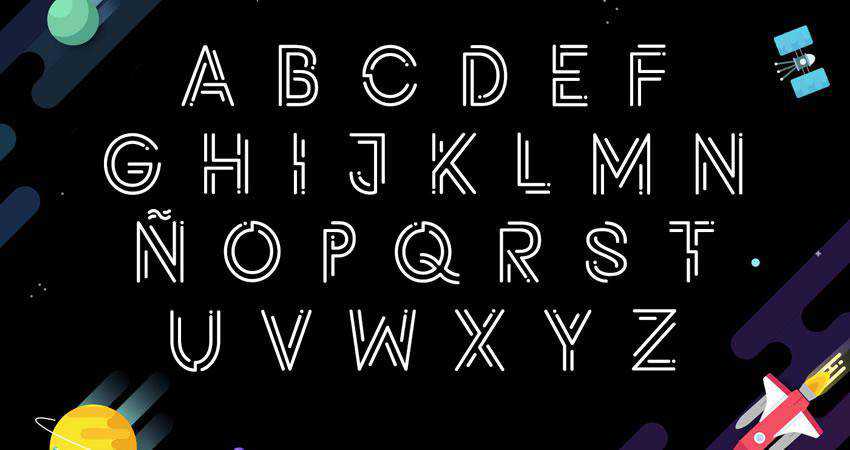
The Library 3am has two styles and a total of 273 glyphs. It comes with multilingual support and contains uppercase letters, symbols, and numbers. The font is free for personal and commercial use.
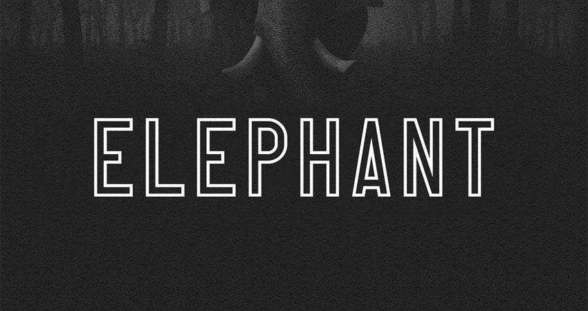
The Elephant font is a bold sans-serif typeface with uppercase letters, numbers, and symbols. It can be used for both personal and commercial projects without any restrictions.
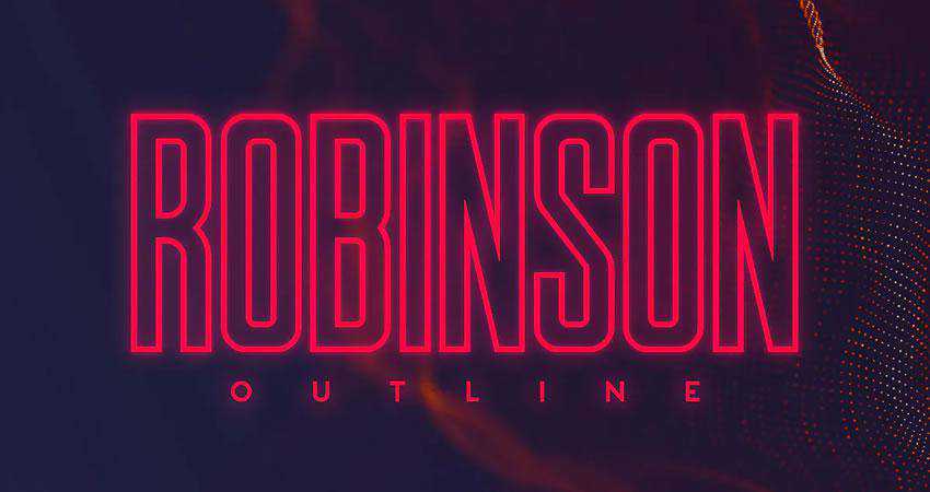
The Robinson font was inspired by vintage newspaper titles. It’s an all-caps font made specifically with magazines and posters in mind. The font also includes the oblique variant.
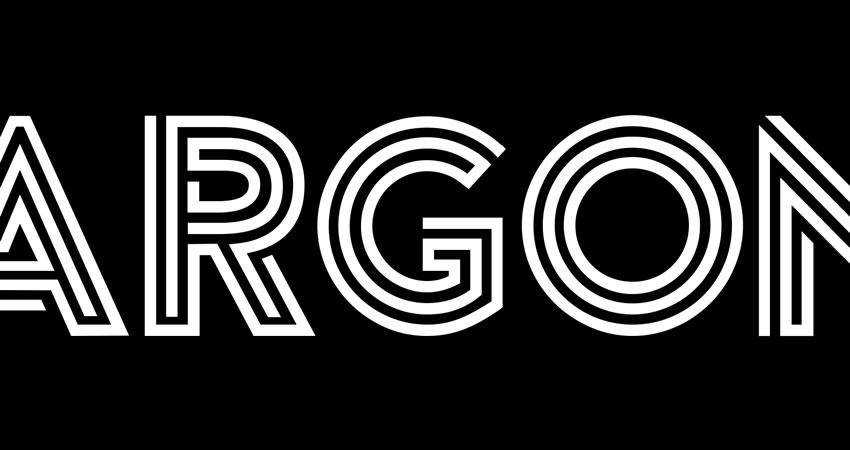
The Argon font is a modern and creative font whose letters resemble a labyrinth. The font includes uppercase letters and numbers. The free version can be used for personal projects.
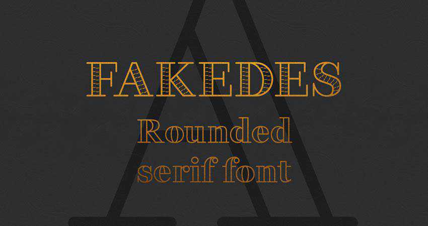
The Fakedes is a rounder serif font that’s perfect for logo or branding projects that require a bolder look. The font includes uppercase and lowercase letters, symbols, numbers, and includes multilingual support.
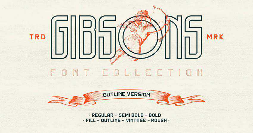
The Gibsons font family includes 20 fonts and three weights. It’s suitable for a range of projects and 4 different styles. This font comes as a part of your Envato Elements subscription.
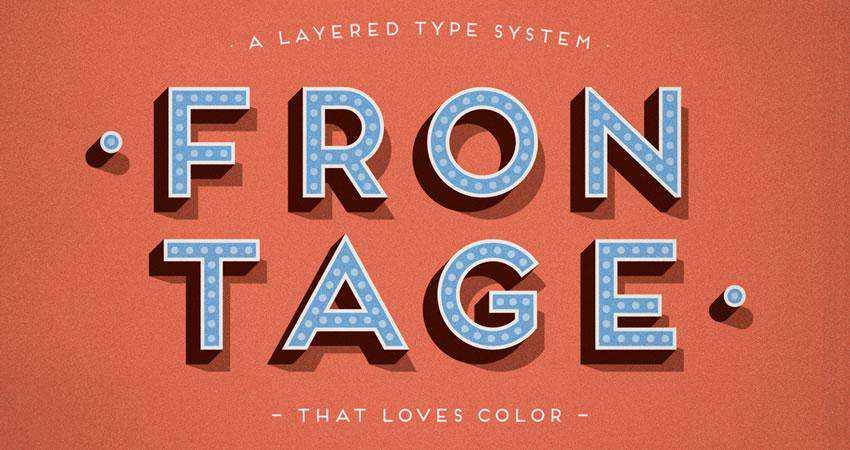
The Frontage is a layered typeface system with 5 different styles. The font can be used in a variety of projects and you can mix and match different styles to create a unique design.
This outline font can be used freely in any personal project. The font features a heavy, blocky look and comes in 4 different styles.
Brixton Sans comes in two versions fill and outline. The outline version is a great choice for any branding or design project that requires a unique and sophisticated look. The font is available as a part of your Envato Elements subscription.

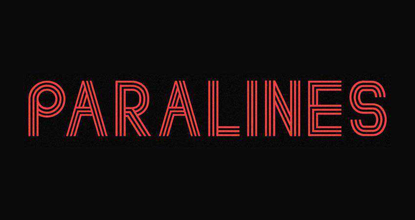
The Paralines font is an all-caps font with a retro-futuristic vibe. It can be used in both commercial and personal projects.
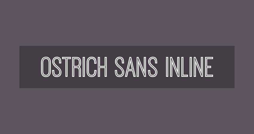
The Ostrich Sans font can be used in personal and commercial projects. The font has uppercase letters, symbols, and numbers.
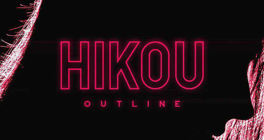
If you’re looking for a font that would look good with a neon effect, the Hikou font is the perfect choice. The font can be downloaded from Envato Elements and includes multilingual uppercase letters, numbers and punctuation.
The Neon font is another font that works well with the neon effect applied to it. The font is free for personal and commercial use. It comes in two styles and includes uppercase letters, numbers, and punctuation.

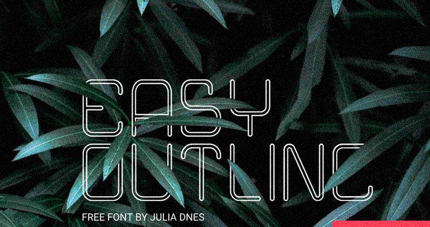
The Easy Outline font can be used for personal and commercial projects. It has a thin and tall look so it’s perfect for fashion or beauty design projects.
This font is a great choice for neon signage. It can be downloaded for free as part of your Envato Elements subscription.
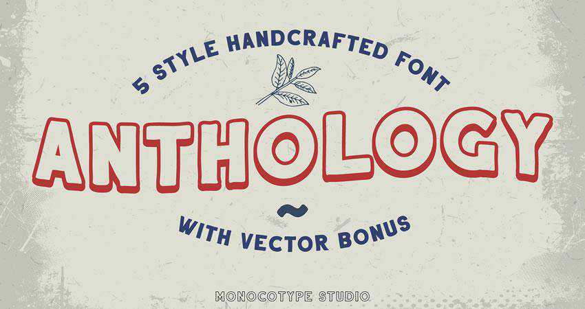
The Anthology font comes in 5 different styles and has complete multilingual support. The font can be used freely in personal projects. You will also get bonus vector icons that work great with this font.
This is a futuristic sans-serif font that can be used in personal and commercial projects. It contains uppercase and lowercase letters, numbers, and punctuation symbols.

For any project that requires a rustic and weathered look, this font will be a perfect choice. You can download it as part of your Envato Elements subscription. The font includes 20 font files and 3 different font styles.
The Potra font has uppercase letters, numbers, and punctuation symbols. It can be used in personal and commercial projects and has a rounded look.
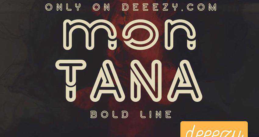
The Montana is a rounded typeface suitable for display purposes. It comes with both uppercase and lowercase letters.
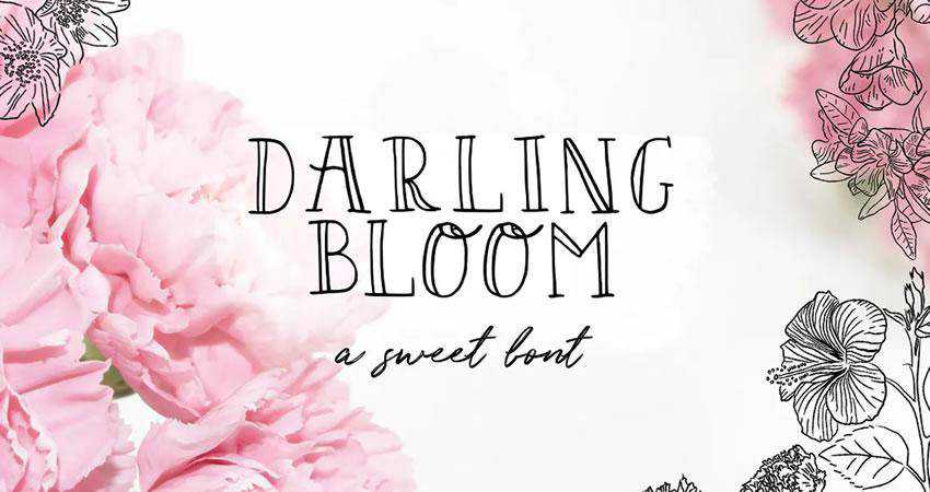
Try the Darling Bloom font if you’re looking for a hand-drawn outline font. It’s perfect for any elegant project or feminine branding. The font is a part of Envato Elements subscriptions.
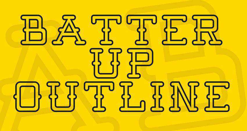
If you need a simple outline font, the Batter Up will do the trick. It has a unique look and contains only uppercase letters. The font is free for personal and commercial use.
This display font can be used in personal and commercial projects with no restrictions. The font has a retro look and comes in three different styles.
This font duo contains a regular sans-serif font and an outline sans-serif font. The font can be downloaded once you sign up for Envato Elements. It comes in 4 weights.
As the name suggests, this font has a geometric, hand-drawn look. It’s a great choice for any retro project. The font is free for personal use.
This font family contains 4 fonts and includes uppercase and lowercase letters, numbers, and symbols. The font is free for personal use.
This is another great choice whenever you need a neon look. The font is perfect for large headers, posters, and even signage. It’s free for personal and commercial use.
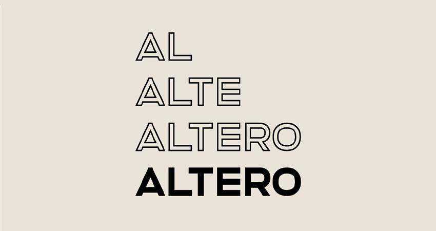
The Altero is another font duo with a solid and an outline font. It’s free for personal and commercial use. It comes with uppercase letters, numbers, and punctuation symbols.
If you need to add a special touch to your designs, an outline font might be just what you need. Outline fonts are versatile. Pick a tall and thin outline font and you can use it in any design that requires a sophisticated look. Choose a font that would look great with a neon effect and you can make effective posters and signage. Expand your resource library with the help of the outline fonts featured in this article.
The post The 20 Best Free Outline Fonts appeared first on Speckyboy Design Magazine.
So often, I write about the details and observations I’ve had while running a freelance web design business. It seems like so many web designers have taken this path that I tend to forget about those who haven’t.
The truth is that being a freelancer isn’t all rainbows and unicorns. And it’s not necessarily the right fit for everyone. The lifestyle is very different compared to having a steady job with a traditional employer.
A lot of people have found this out the hard way. Freelancing can seem like an ideal career and a sign that you’ve made it. Yet, that depends greatly on your personality and how you like to work.
Today, I’m going to share some reasons why you might not want to jump onto the freelance bandwagon. Don’t worry – this isn’t intended to be a downer. It’s more like a realistic look at what it takes to live this life.
The Freelance Designer Toolbox CYBER MONDAY SALE: 40% off - 24 hours only!
Unlimited Downloads: 500,000+ Web Templates, Themes, Plugins, Design Assets, and much more!
There Can Be a Lot of Uncertainty
Whether you’re just starting out or are a grizzled veteran of working for yourself, uncertainty is often the only thing you can count on in a given day. Steady clients can be hard to come by and it seems like you are always at the mercy of someone else.
That dependence on others may seem a bit counterintuitive. But when people ask me about being my own boss, I tell them I’m not. Rather, I have dozens of bosses who I need to keep happy. Each one with their own personality, taste and monetary value to the bottom line.
It’s a constant juggling act – one in which you never know when one or more objects will fall from the sky and knock you in the head. Depending on how your business is set up, uncertainty can be spread throughout every aspect. It affects your daily schedule, when you get paid and how aggressive you need to be in booking new clients.
Yes, it is possible to reach a certain level of stability. But it can take several years of making the right connections and building a great reputation to get there.

You’re Responsible for Everything
One of the true advantages of working for someone else is that, ideally, you are responsible for a specific set of tasks and nothing more. In web design, that could mean you are a front-end developer who works exclusively on the UI, while your back-end developer colleagues put together custom code.
As a business owner (especially a solo entrepreneur) you are ultimately responsible for every part of a project. And that goes well beyond the design and code. It also encompasses all of the grunt work that goes along with running a business.
Tasks like accounting, marketing, sales and support are all on your plate. Maybe you can hire help for some tasks, but freelancers often work on tight budgets. Therefore, you might be stuck doing things that have nothing to do with web design.
If you’re not prepared for the great responsibility that comes with the job, freelancing may not be for you.

Taking Time off Can Be Difficult
Want to get away? It’s not easy for those of us who work on our own. Yet, taking time off is important for both physical and mental well-being.
There are multiple challenges involved. First, working alone often means not having someone to take your place during an absence. This means that, even if you do manage to get out for a bit, you are likely lugging a laptop along and are glued to your phone for the duration.
Then, just because you’ve left the office doesn’t mean that your clients will stop sending you work. From my experience, most people respect the fact that you are away. But there are always one or two that don’t.
And there is always a chance of something breaking. Such an emergency can lay waste to your plans of rest and relaxation.
Put this all together and you may have a hard time getting out of the office.

It’s Hard to Keep up with New Technology
Both the responsibilities and uncertainties of freelancing tend to result in a lack of time. We’re not only talking about time away from the office, however.
The busy schedule of a freelancer can also make it very difficult to keep pace with new developments in the industry. Whether that’s testing out a new tool, learning a JavaScript library or filling yourself in on the latest WordPress release, it can be hard to gain more than a cursory knowledge in these areas.
In web design, things change rapidly. Thus, it’s important to learn new skills. This often requires a time commitment that extends past regular office hours. Nights, weekends or early mornings may be the only opportunities to expand your horizons.
And, if you’re interested in taking a formal online or in-person class, there’s also the matter of cost. Some employers will willingly pay for continuing education. Freelancers aren’t so lucky. This means either paying for it yourself or making due with whatever free resources you can find.

The Freelance Life Is Not Universal
If the scenarios above don’t sound attractive, not to worry. When it comes to our careers, each one of us has different wants and needs. What works for some may not be the best fit for you.
Sure, being a freelance web designer can be very rewarding. But it also means taking some real risks. Depending on your life situation, going off on your own may not be worth the potential pitfalls. And the stress involved with running a business can be a major turn-off as well.
Thankfully, our industry provides several different paths for us to choose from. It’s up to us to determine where we’ll be happiest and then make the most of the opportunities we have. For some, that will be as a freelancer. For others, a different, yet equally rewarding journey is the better option.
The post Being a Freelance Web Designer Isn’t for Everyone appeared first on Speckyboy Design Magazine.