Monthly Archiv: October, 2019
Part 1 - How to Implement Yajra Datatables in Laravel 6Are you looking for web tutorial on Laravel 6 framework, then you have come on the right place, because in this post, you can learn how to make Single page Crud application in Laravel 6 framework by using Yajra Datatables package and Ajax. This ...
One of the nice things about Slim 4 is that it's easier to customise the HTML generated on error without having to worry about the rest of the error handling mechanism. This is because we have separated error rendering from error handling.
Slim's default ErrorHandler maintains a list of renderers, ...
Last year, the web development community was obsessed with vertical lines and vertical rhythm. This year, we see some interesting solutions that have originated from that tendency. The use of ultra-thin lines throughout the interface is one of them.
This is an incredibly small and elegant trend. Sometimes it can be difficult to notice at first glance, yet it becomes evident after spending some time on the project. It does not jump out at you; it waits to be discovered and charms spectators with a delicate, exquisite nature.
Let us consider some prime examples to see how artists play with it and how it can benefit a website.
The Web Designer Toolbox
Unlimited Downloads: 1,000,000+ Web Templates, Themes, Plugins, Design Assets, and much more!
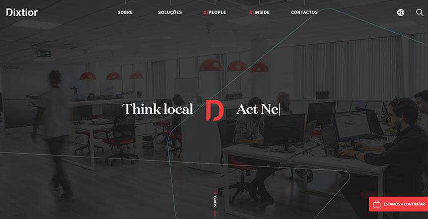
We are going to start with Dixtior, a digital agency where ultra-thin lines lie at the heart of the overall aesthetics.
They meet you right out of the gate. After loading, you stumble upon the continuous ultra-thin line that stretches from right to left. It is also set in motion. Note there is nothing extraordinary in the hero area. It is just a regular section with an image background that demonstrates the workflow in the office. However, thanks to this tiny trend, it looks creative and techy.
What’s more, ultra-thin lines can be seen in various corners of the website as well. Each section has its dose of the tendency. In some cases, they are used in tandem with the headings as though they are pointing at them. In such a way, they give them an extra focus.
In others, they are used to enrich blocks with text and images or even hover states, giving essential elements a subtle twist. And of course, they are used as pure decorative details. As a result, here, the theme runs across all the sections creating a consistent and harmonious experience.

Zajno is another point in case. Much like in the previous example, the team leverages ultra-thin lines in every part of the interface. The website even opens with a splash screen, where the vertical line foreshadows the hero area. There are both vertical and horizontal ones.
Whereas the latter is used mostly in tandem with headlines, the straight-up strokes are used to create visual paths that naturally guide visitors from one section to another or from one text block to another.
What’s more, the website has a unique background. It is an interactive canvas that features a globose grid. It perfectly matches the trend, thereby making the project feel even more sophisticated.

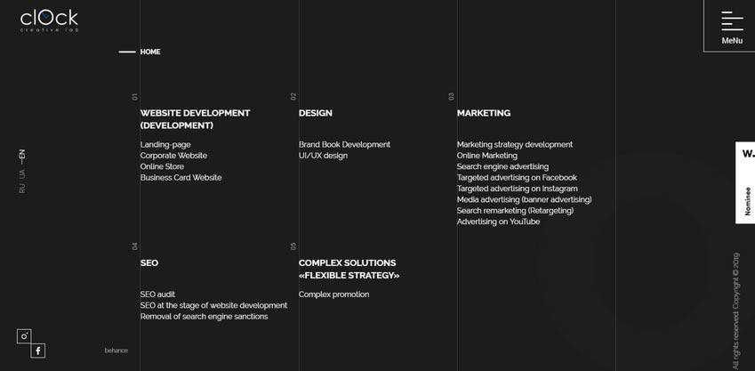
Clock Lab is the official website of the creative agency from Ukraine. Here, you can feel the power that is hidden in the vertical rhythm: It ably benefits various aspects of the user interface. And since the upright direction is in charge, it comes as no surprise that the team has used lots of lines in the design.
They are used to finish off sections as well as add a subtle zest to the experience. Note, it’s not only vertical lines that populate the design, but also horizontal ones. As you may have already guessed, they accompany titles, thereby naturally directing viewers’ attention towards the names of the sections and content.

The creative team behind the front page of Homecult has opted in favor of an iconic line style that is just an ideal partner for the ultra-thin lines. Here, the huge hollow circle marks the home screen. However, it does not stick out like a sore thumb.
On the contrary, it fits like a glove. And a bunch of short lines that are carefully scattered throughout the design assists in this matter. They underline navigation and call-to-action buttons as well as serve as decor for the background, thereby supporting the theme in every corner of the UI. As a result, the website feels elegant, stylish and modern in every section.

Much like in the previous example, this website presents a company that deals with interiors. Once again, the trendy solution perfectly blends in. It provides the interface with a touch of fragile intricacy that brings about elegance and refinement. You can see the straight, short marks mostly horizontal in direction, in various components of UI. For instance, the ultra-thin line connects “previous” and “next” controls, thereby saving them from looking too dull or trivial.
There is also a very long line that underlies the title of each slide. Although it does not add any visual weight to the latter, it still serves several purposes. First, it indicates the shifting between slides in the carousel. Secondly, it adorns the overall look, nicely echoing with the navigation, graphics, and even the logotype. And finally, it ties everything together.

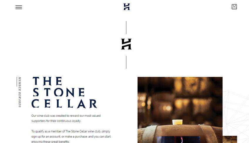
The team behind Head Wines employs the trend without overdoing it. Though, that is enough to add elegant traits and make the overall design feel tasteful. As usual, you can find short strokes near the titles and vertical lines that visually connect the sections. This creates a feeling of never-ending content that gently flows from top to bottom.
What’s more, note several things. First of all, there is a generous amount of white space. Secondly, vertical rhythm occasionally emerges from the shadow. Third, the background itself is not as primitive as it may seem at first sight. Some sections include outline illustrations that contribute to the overall theme. Finally, the graphics, as well as logotype, are made with an outline style in mind.
To make a long story short; the website is an example of compositional harmony where ultra-thin lines set the mood and skillfully interplay with other design features.

Using Thin Lines to Enhance Web Design
The use of ultra-thin lines in website design is further proof that even the tiniest details of the user interface make a difference. They are valid players that help to create aesthetics as well as user experience. As a rule, they benefit various parts of the UI. However, most often they can be found:
- near the headlines to give them an extra focus;
- as a part of buttons or icons to separate them from the content flow;
- near the navigation;
- in sliders;
- as regular décor used either on the background or the foreground near the main content;
Use the trend either alone or in unison with line styles to give your projects a stylish and exquisite edge.
The post How Ultra-Thin Lines in Web Design Can Create an Impact appeared first on Speckyboy Design Magazine.
Package:
Summary:
Manage circular job queues stored in Redis
Groups:
Author:
Description:
This package can manage circular job queues stored in Redis...
Read more at https://www.phpclasses.org/package/11389-PHP-Manage-circular-job-queues-stored-in-Redis.html

Garcinia cambogia extract is non-toxic, tasteless, odorless powder and found to be very effective herbal alternate for controlling obesity and cholesterol by inhibiting lipogenesis in our body. Garcinia Cambogia has been used for thousands of years in the Orient as a food supplement. It is used as an appetite suppressant and to inhibit the absorption and synthesis of fat, cholesterol and triglycerides.
Access Report Details at: https://www.themarketreports.com/report/global-garcinia-cambogia-extract-market-research-report
The global Garcinia Cambogia Extract market is valued at xx million US$ in 2018 is expected to reach xx million US$ by the end of 2025, growing at a CAGR of xx% during 2019-2025.
This report focuses on Garcinia Cambogia Extract volume and value at global level, regional level and company level. From a global perspective, this report represents overall Garcinia Cambogia Extract market size by analyzing historical data and future prospect. Regionally, this report focuses on several key regions: North America, Europe, China and Japan.
Key companies profiled in Garcinia Cambogia Extract Market report areXi’an Lyphar Biotech, Shaanxi Fuheng (Fh) Biotechnology, Shaanxi Guanjie Technology, Wuhan Vanz Pharm, Hunan Kanerga Pharmaceutical Sales, Two Blue Diamonds, Maruti Futuristic Pharma, Kinal Global Care, Nutra Graceand more in term of company basic information, Product Introduction, Application, Specification, Production, Revenue, Price and Gross Margin (2014-2019), etc.
Purchase this Premium Report at: https://www.themarketreports.com/report/buy-now/1418191
Table of Content
1 Garcinia Cambogia Extract Market Overview
2 Global Garcinia Cambogia Extract Market Competition by Manufacturers
3 Global Garcinia Cambogia Extract Production Market Share by Regions
4 Global Garcinia Cambogia Extract Consumption by Regions
5 Global Garcinia Cambogia Extract Production, Revenue, Price Trend by Type
6 Global Garcinia Cambogia Extract Market Analysis by Applications
7 Company Profiles and Key Figures in Garcinia Cambogia Extract Business
8 Garcinia Cambogia Extract Manufacturing Cost Analysis
9 Marketing Channel, Distributors and Customers
10 Market Dynamics
11 Global Garcinia Cambogia Extract Market Forecast
12 Research Findings and Conclusion
13 Methodology and Data Source
Article source: http://marketresearchnewspaper.com/2019/10/15/global-garcinia-cambogia-extract-market-industry-a-latest-research-report-to-share-market-insights-and-dynamics/
The first release candidate for WordPress 5.3 is now available!
This is an important milestone as we progress toward the WordPress 5.3 release date. “Release Candidate” means that the new version is ready for release, but with millions of users and thousands of plugins and themes, it’s possible something was missed. WordPress 5.3 is currently scheduled to be released on November 12, 2019, but we need your help to get there—if you haven’t tried 5.3 yet, now is the time!
There are two ways to test the WordPress 5.3 release candidate:
What’s in WordPress 5.3?
WordPress 5.3 expands and refines the Block Editor introduced in WordPress 5.0 with new blocks, more intuitive interactions, and improved accessibility. New features in the editor increase design freedoms, provide additional layout options and style variations to allow designers complete control over the look of a site.
This release also introduces the Twenty Twenty theme giving the user more design flexibility and integration with the Block Editor.
In addition, WordPress 5.3 allows developers to work with dates and timezones in a more reliable way and prepares the software to work with PHP 7.4 to be release later this year.
Plugin and Theme Developers
Please test your plugins and themes against WordPress 5.3 and update the Tested up to version in the readme file to 5.3. If you find compatibility problems, please be sure to post to the support forums so we can figure those out before the final release.
The WordPress 5.3 Field Guide will be published within the next 24 hours with a more detailed dive into the major changes.
How to Help
Do you speak a language other than English? Help us translate WordPress into more than 100 languages! This release also marks the hard string freeze point of the 5.3 release schedule.
If you think you’ve found a bug, you can post to the Alpha/Beta area in the support forums. We’d love to hear from you! If you’re comfortable writing a reproducible bug report, file one on WordPress Trac, where you can also find a list of known bugs.
Package:
Summary:
Generate form inputs to allow user voice control
Groups:
Author:
Description:
This class can generate form inputs to allow user voice control...
Read more at https://www.phpclasses.org/package/11383-PHP-Generate-form-inputs-to-allow-user-voice-control.html#2019-10-15-13:59:05

In our first article in this series, we highlighted the WordPress mission to democratize publishing. WordPress introduced a tool to independent and small publishers who did not have the resources of the larger publishing platforms. Access to a free content management system to create websites has empowered thousands of people to find their voice online. People have been able to share their enthusiasm for hobbies, causes, products and much more. Through these different voices, we can encourage understanding, spark creativity, and create environments where collaboration can happen. But as we build more digital communities, it’s easy to forget that online safety is a group effort.
Digital literacy is also part of being a good digital citizen, but it’s more than just being able to do basic actions with your mobile device. Digital literacy refers to the range of skills needed to do online research, set up web accounts, and find solutions for fixing devices among other things. But to be able to enjoy more of the digital world safely and responsibly – to be a good digital citizen – we need to be able to:
- navigate vast amounts of information without getting overwhelmed;
- evaluate a variety of perspectives;
- connect with people with respect and empathy;
- create, curate and share information.
We will need our offline analytical and social skills to make that happen.
Here’s some best practices our community members have shared!
Online or offline, let empathy be your compass
The hardest part about all of this is the anonymity of online interactions. Without that face-to-face feedback of saying something mean to another person’s face, it’s easy to upset the people you’re trying to communicate with.
In our daily lives in the offline world, comments may be more tempered and slow to anger in disagreements. Visual cues will help us determine how a remark is perceived. That, in turn, helps us adjust our behaviour Action, reaction, it’s how we learn best.
Online, however, the experience is different. A keyboard does not protest if we type angry, hate-filled messages. A screen does not show any signs of being hurt. The lack of physical human presence combined with the anonymity of online alter-egos can be a formula for disrespectful and unfriendly behavior. It is good to remind ourselves that behind the avatars, nicknames and handles are real people. The same empathy we display in our in-person interactions should apply online as well.
Critically evaluate your sources
We all have times when we consume information with limited research and fact-checking. For some of us, it feels like there’s no time to research and compare sources when faced by a sea of online information. For others, there may be uncertainty about where to start and what to consider. But, without a bit of skepticism and analytical thinking, we run the risk of creating narrow or incorrect understanding of the world. With a little effort we can curb the sharing of fake news and biased information, particularly on topics that are new to us or that we’re not familiar with.
Misinformation can spread like wildfire. Ask these simple questions to evaluate information online:
- who is the source of the information?
- is it plausible?
- is the information fact or just an opinion?
Own our content
In this day and age, it’s never been easier to just copy, paste and publish somebody else’s content. That doesn’t mean that we should! Publishing content that is not truly ‘yours’ in wording and tone of voice is unlikely to build a connection with the right audience. But, just as important, using someone else’s content may breach copyright and potentially intellectual property rights.
For more information about intellectual property, visit the World Intellectual Property Organization website.
Don’t breeze past terms and conditions
Have you ever signed up for an online service (to help you distribute published content or accept payments) that was offered at no cost? In our fast-paced digital lives, we tend to want to breeze past terms and conditions or warning information and often miss important information about what will happen with our data.
When we are given a contract on paper, we tend to read and re-read it, giving it a greater priority of our time. We may send it to other people for a second opinion or seek further review before signing. Remarkably, we rarely do that with online agreements. As a result, we may be putting our online privacy and security at risk. (WordPress uses a GPL license, and only collects usage data that we never share ever.).
Keep your website safe and healthy
If you would like to own your voice online, you also need to protect your reputation by securing your publishing platform. Websites can face security attacks. Hackers may seek to obtain access through insecure settings, outdated plugins and old software versions, and in extreme cases can try to scam your visitors. And leaking customer data, may even lead to legal consequences.
On top of that, websites ‘flagged’ for security issues, can lead to high bounce rates and eventual loss of search rankings. This can all affect how search engines rate or even block your site.
Good practices to keep your website safe include changing your safe password regularly, installing security software, an SSL certificate and keeping the core software, plugins and themes up to date. This will not guarantee that you will keep hackers out, so always keep several backups of your site, ideally both offline and online.
That is just website security in a tiny nutshell. If you would like to learn more about keeping websites safe, you may want to check out some of these resources and many more videos at WordPress.tv.
Join in and help make the web a better place!
As part of Digital Citizenship Week, we would like to encourage you to learn and share skills with your colleagues, friends and family members. That way, we all become more informed of potential issues and how to reduce the risks. Together we can make it easier to navigate the web more effectively and securely!
Additional resources
Site health check
WordPress 5.2 introduced pages in the admin interface to help users run health checks on their sites. They can be found under the Tools menu.
Security and SSL
Contributors
@chanthaboune, @yvettesonneveld, @webcommsat, @muzhdekad @alexdenning, @natashadrewnicki, @oglekler, and Daria Gogoleva.
                            The Laravel team announced the immediate availability of Laravel v6.1.0 with a new eager() method added to Lazy Collections along with the latest updates for Laravel 6.

            The post Eager Lazy Collections Added to Laravel 6.1 appeared first on Laravel...
        Contributed by Konstantin Myakshin
        in #31334.
In the Messenger component, middleware is used to configure what happens when
you dispatch a message to a message bus. In Symfony 4.4 we've added a ne...

