Monthly Archiv: October, 2019
If you’re building web applications, it’s quite likely that you’ve heard of Laravel. It’s a popular PHP framework that streamlines the development process and includes its own, developer-friendly syntax. In addition, there are a number of premade modules available that can help you tackle tasks such as server deployment, debugging and cloud computing. And that’s just scratching the surface.
On its own, Laravel simplifies application development quite a bit. But it still takes a lot of time to get things right. Today, we’ll introduce you to Buddy, an automation platform that works in conjunction with Laravel and will greatly improve your workflow.
And, oh yeah, it saves you a ton of time. In fact, Buddy’s own measurements show that users deploy an average of 46 more times than those without automation, and seven more among those who use other CI/CD (Continuous Integration / Continuous Delivery) tools. Not only that, but a single developer saves an average of 37 minutes a day.
Use Case: Automatically Trigger Application Testing
Now, it’s time to see how Buddy can turn Laravel application testing into an automated process. But first, let’s set the scene.
Assumptions
First, we’ll assume that you have some knowledge of how Laravel works. If you don’t know much about Laravel and want to learn – not to worry. There’s a helpful resource to get you started.
Next, we will also assume that you have a Laravel application that you want to test. If you’re looking for an example, check out this guide on Buddy’s site, which features a calculator app.
Now that we have that out of the way, let’s start automating!
A Better Way to Test
Testing is a vital part of application development. Unfortunately, it can also become quite tedious. Manually running tests after each and every change bogs down the process. This is where automation can step in and increase efficiency.
Using Buddy, each type of Laravel testing method (see them below) can be fully automated to run at a time or situation of your choosing. You have a lot of flexibility with regards to what tasks you run and when you run them.
For example, you might want to trigger a specific set of tests to run whenever you push changes to a repository. This is exactly the type of thing Buddy was built to do. Simply write your testing scripts, include them in your repository and Buddy will run them automatically. That’s all there is to it.
Of course, you could spend hours writing some automation scripts to achieve the same thing. However, with Buddy, you’ll knock this out in just a few clicks. Just watch:
In addition to saving you time, this type of workflow also provides peace of mind. You no longer need to remember to test after each and every push – Buddy takes care of it for you.
Types of Testing
Buddy supports all types of testing, including unit tests, feature tests and browser tests:
- Unit Tests: Used for checking small snippets of code, such as an individual method. Example »
- Feature Tests: This type of test will look at larger collections of code, such as a website. Example »
- Browser Tests: As the name suggests, this launches a browser and interacts with website content. Learn More »
*Note that the examples use the aforementioned calculator app as a reference.
Make Faster, More Frequent Deployments
Buddy has been built to make DevOps easier for everyone – including developers, designers and quality assurance teams. Taking just minutes to set up, it can significantly speed up the build, testing and deployment processes. Best of all, this can all be achieved within a highly-visual UI.
You can automate pretty much anything related to web development. Tasks such as SSH commands, generating static websites, site monitoring, along with building and pushing changes are just a few examples.
In addition to Laravel, Buddy also works with several popular tools and platforms. Staples such as React, WordPress, Shopify, MySQL, Google Cloud, Docker, AWS, Kubernetes and a whole lot more – over 100 in total.

Start Using Buddy for Free
Buddy is aptly named, as automation is every developer’s best friend. It takes the pain out of monotonous tasks so that you can focus on more important things.
Sign up for free to start building apps more efficiently and effectively.
This post has been sponsored by Syndicate Ads.
The post Automating Laravel Tests with Buddy <span class="sponsored_text">Sponsored</span> appeared first on Speckyboy Design Magazine.
September has been a particularly busy month in the WordPress community—a lot of important work has been done as everyone in the project works towards an upcoming major release. Read on to find out more about this and everything else that has been going on over the past month.
WordPress 5.2.3 Security and Maintenance Release
Early in September, version 5.2.3 of WordPress was released as a security and maintenance release. Sixty-two individuals contributed to its 29 fixes and enhancements.
The security issues fixed in this release owe thanks to numerous people who disclosed them responsibly. You can read more about the vulnerability reporting process in the Core handbook.
Want to get involved in building WordPress Core? Follow the Core team blog, and join the #core channel in the Making WordPress Slack group.
WordPress 5.3 Enters Beta
WhileWordPress 5.3 is slated for release on November 12, it has already entered the beta phase with the second beta release being made available at the end of September. As this is a major release, it will feature a number of new features and enhancements, including significant improvements to the block editor, updates to the Site Health component, new block APIs, accessibility updates, and much more.
You can test the 5.3 beta release by installing the WordPress Beta Tester plugin on any WordPress site, although as this is software that is currently in development, we don’t recommend installing it on a live site.
Want to get involved in building this release? Test the beta, follow the Core team blog, and join the #core channel in the Making WordPress Slack group.
Date/Time Component Improvements
For over a year, contributors involved in the Date/Time component of WordPress Core have been working hard on the “wp_date” project. The goal of this project is to fix and streamline the way that Core handles times and dates throughout the platform.
This ambitious project has seen incremental changes over the last few Core releases. The upcoming 5.3 release will include the final and most significant changes to the component, bringing much-needed stability to time handling in WordPress Core.
Want to get involved in the Date/Time component of WordPress Core? Learn more about it, follow the Core team blog, and join the #core-datetime channel in the Making WordPress Slack group.
New Theme Review Team Structure
After recent discussions around the goals of the Theme Review team, some changes have been made to the leadership structure of the team. The team leads are now ‘representatives’ of different areas of the work that they do. This flat structure allows for representatives to work in more loosely defined areas so they contribute to the team in more diverse ways, and helps the team to be more focused on setting and achieving their goals. The new structure is outlined in the team handbook.
Want to get involved in reviewing themes for WordPress? Follow the Theme Review team blog, and join the #themereview channel in the Making WordPress Slack group.
New Default Theme: Twenty Twenty
The upcoming 5.3 release will also include a new default theme for WordPress, Twenty Twenty. This theme will have a strong focus on readability and accessibility while being optimized for the block editor that first shipped with WordPress 5.0.
Development of Twenty Twenty has been going quickly, with a recent update showing more of the design and layouts that you can expect when the theme is released with WordPress 5.3 in November.
Want to get involved in building Twenty Twenty? You can contribute on GitHub, follow the Core team blog, and join the #core channel in the Making WordPress Slack group.
Further Reading:
Have a story that we should include in the next “Month in WordPress” post? Please submit it here.
Package:
Summary:
Generate form inputs to allow user voice control
Groups:
Author:
Description:
This class can generate form inputs to allow user voice control...
Read more at https://www.phpclasses.org/package/11383-PHP-Generate-form-inputs-to-allow-user-voice-control.html

Most Popular PHP Magic Methods
PHP features the concept of magic methods : methods that have a special function. They are related to other PHP features, and are automatically called on an object, when available.ÂÂ
For example, the __toString() method is called whenever an obj...

 It’s time to test the Garcinia Cambogia.
The first day of taking the diet pills and I have not dropped a pound, I am already thinking refund…just kidding. You are required to take two pills per day. I will try to stay on the same schedule as much as possible, taking one in the morning and one in evening.
I want to let people know, this is not a gimmick or publicity for this brand. It has been a product that I saw on Dr. Oz and read about in Women’s Health Magazine where one of their editors tested it out as well.
So far, I haven’t felt anything out of the normal such as headaches or nausea but feel somewhat hazy an hour after taking one.
Also after the first pill while I was driving on my way to work, I saw a McDonald’s sign and instantly craved a cheeseburger. Now I haven’t wanted to eat a burger since my college days which has been quite some time ago. I am beginning to wonder, am I the anti-dieter?!
We will see next week, if I shed any weight from a week of taking the pills or this is will turn into the documentary “Super Size Me.”
Disclaimer: these are my own thoughts and feeling about the pills, it does not reflect the station. I do enjoy making fun of myself to get a laugh.
Article source: https://fox43.com/2013/07/11/what-do-you-have-to-lose-week-1-garcinia-cambogia/
@tommcfarlin
Show Notes
Tom McFarlin's Blog
Audio
This episode is sponsored by Using the WordPress REST API
The post Interview with Tom McFarlin appeared first on Voices of the ElePHPant.
Luckily, the array_filter function not only has the default functionality to filter out everything that converts to a Boolean false value, but it offers a very helpful callback function. This means we can essentially do whatever the mind can see with the data at hand.
In this tutorial, filtering by...
Latest PECL Releases:
- scoutapm 0.0.4
- Fixed test failing because differing behaviour of sqlite in some versions
- Define i/j etc to follow c89 rules (thanks @remicollet)
- vips 1.0.10
* Add vips_image_write_to_array() [jcupitt]
* Update links for new home [jcupitt]
* Fix win32 build [TBK]
- gRPC 1.24.0
- gRPC C Core 1.24 update
- xlswriter 1.3.0
- FEAT read numeric
- FEAT column index from string and string from column index
- swoole 4.4.7
Enhancement
---
+ Support thread context (9214411c) (@matyhtf)
+ Generate a warning if the channel has producers or consumers when the program exits (b9f37d9c) (@twose)
Fixed
- Fixed reactor send bug (a1dc95f5) (@matyhtf)
- Fixed event init bug (907c84b3) (@matyhtf)
- Fixed crash on Cygwin (cfb74793) (@matyhtf)
- Fixed wrong length of string (c4f97993) (@twose)
Your website serves several important purposes for your company — attracting customers, generating leads, and making sales, just to name a few. And as your home on the Internet, it also needs to explain who you are to the world and why they should choose you over your competitors.
However, creating an “About Us” page that accurately describes your company can be easier said than done. You can probably think of hundreds of things you want people to know, from your history to your successes to your values, but cramming all of that information on one page is overwhelming for you and your visitors.
So how can you create a compelling “About Us” page that will show customers who you are and what you do? There’s no one-size-fits-all solution, but here are seven examples of companies who got it right.
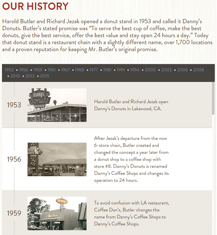
Denny’s
Many companies with long histories use them as the foundation of their identity, and Denny’s does a great job of displaying theirs in an interactive timeline:
![dennys]()
They offer a brief summary of their history, then allow visitors to click through various company events over the past 62 years. The best part of the design, though, is the inclusion of photos with each piece of information. Although many companies prominently display the year the company was founded, words just can’t convey the same feeling as an authentic photo of a 1953 diner.
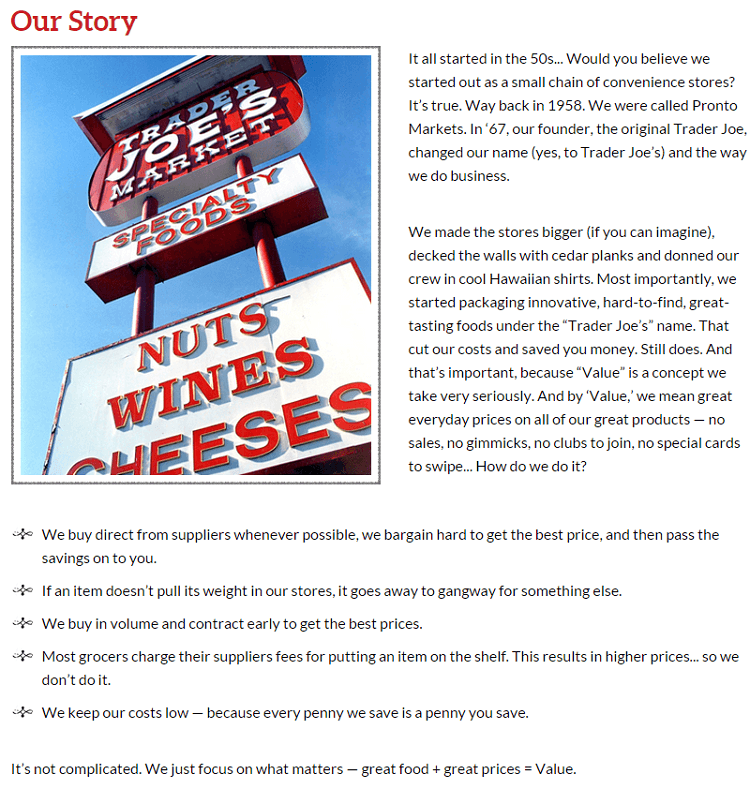
Trader Joe’s
Much like Denny’s, Trader Joe’s was also founded in the ‘50s and includes their history on an “Our Story” page. But unlike Denny’s, they choose to explain their method of bringing value to shoppers:
![trader joes]()
Considering that the chain’s main draw is high quality food at low prices, it makes sense that customers might question how Trader Joe’s can afford to charge less than other brands. This short explanation answers that question, and it’s easy to see how it could be very effective at drawing new customers to their local store.
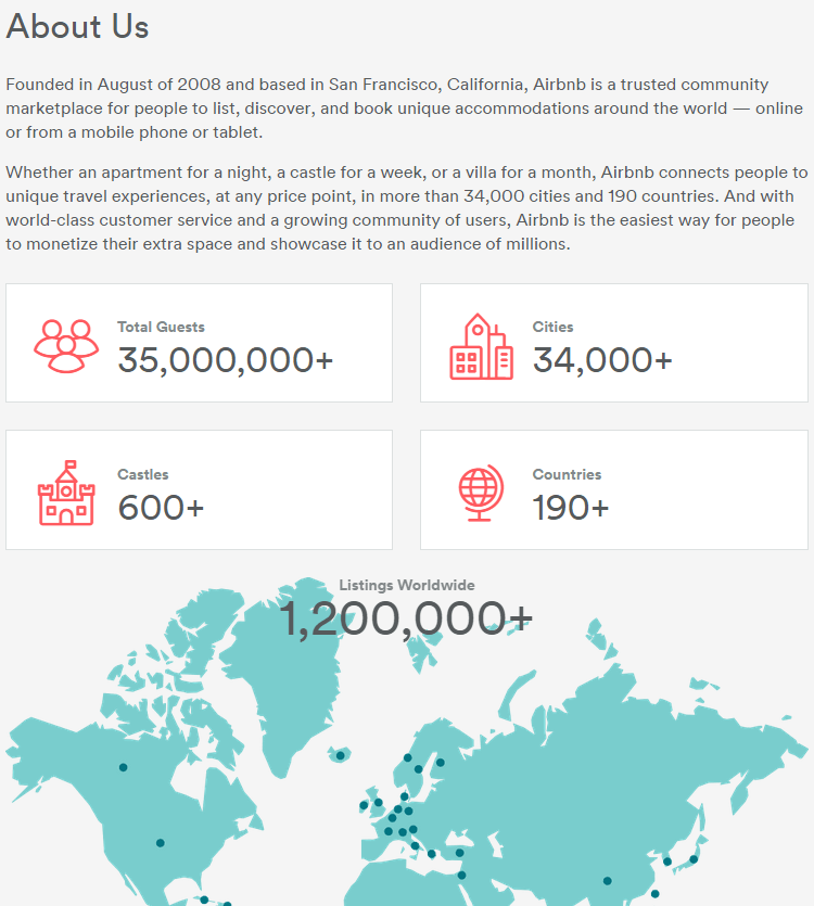
Airbnb
After the first two examples, you may think that older, more well-known businesses have an advantage when creating introduction pages. But as Airbnb demonstrates, a long history isn’t necessary:
![airbnb]()
Their stats are impressive by any standard, and the map of countries could spark potential customers to check out what’s available in the areas they want to visit. Plus, who wouldn’t want to patronize a company that has listings with over 600 castles?
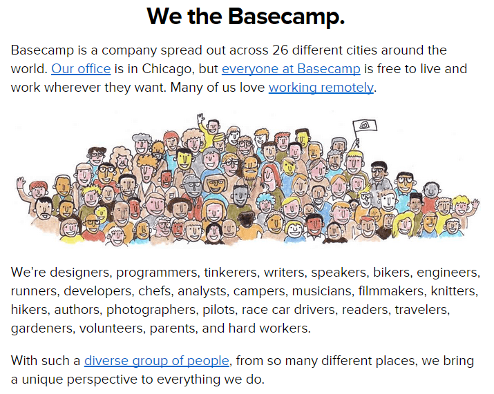
Basecamp
products are designed to make working together easier, so it makes sense that their about page is focused on their team:
![basecamp]()
Highlighting their diversity and various locations is a testimony to the effectiveness of the project management tools they make. If it’s possible for this successful company to work out of 26 different cities, they’re certainly doing something right.
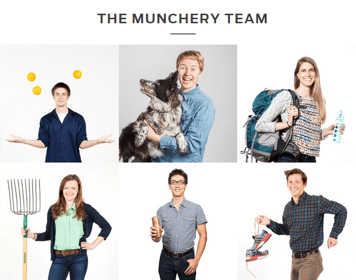
Munchery
Another company that chooses to focus on their team is Munchery. But instead of describing them as group, they highlight individual employees with fun photos:
![munchery]()
Many companies have employee photos on their sites (, but very few rival the originality of Munchery’s. By allowing each person to pose with something that represents their hobbies or interests, they bring a dose of personality to the site. And considering that their entire ordering system is online, that could certainly help customers feel more at ease while making a purchase.
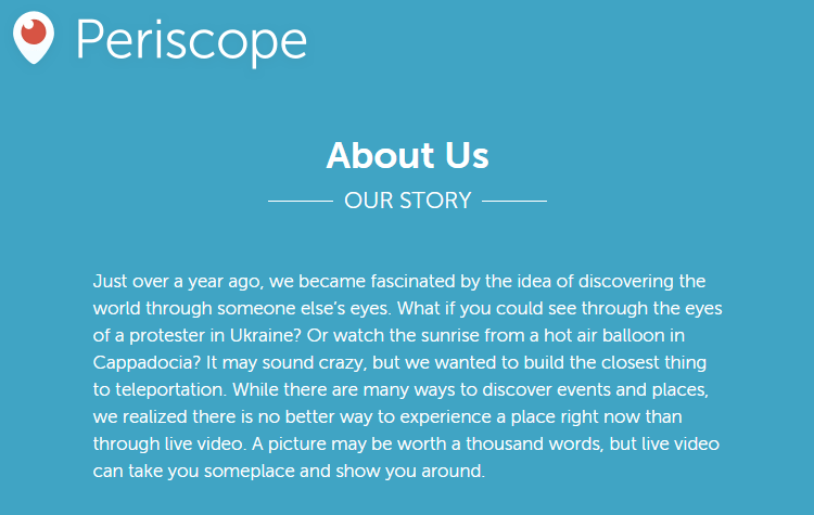
Periscope
Video-streaming app Periscope has only been around for “just over a year,” so it’s important that their “About Us” page explains why their app is useful to people who may have never even heard of it:
![periscope]()
Although the explanation is short, the examples it uses (watching a sunrise from a hot air balloon in Cappadocia!) are compelling, and so is the idea of experiencing new places in real time. And even though it’s kind of unusual to provide so little background, my guess is that this page is effective in generating downloads of the app.
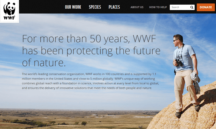
WWF
Another organization that takes a simple approach is WWF (World Wide Fund for Nature):
![wwf]()
As an organization that works to protect the environment, it’s hard to imagine that anything could be more effective at demonstrating their mission than a photo of the land they conserve. And while they go into more detail lower on the page about their goals and strategies, the bold headline they chose is an accurate and succinct summary of what they do.
The takeaway
If you’re in the process of writing or revising an “About Us” page, the way to start is by figuring out what makes your business unique. Is it your story? Your mission? Your employees?
Visitors and customers aren’t going to be impressed by generic facts and figures, so it’s important that your page is not only accurate, but also sets you apart from the millions of other businesses online. And as the seven very different examples above demonstrate, there’s no “right” approach — so feel free to have a little fun with this part of your site!
If you have any questions about creating an “About Us” page, or know of any other great examples, let me know in the comments below!
The post 7 Examples of Great “About Us” Pages appeared first on WebFX Blog.
In life, many of us crave comfort. Whether it’s a favorite food, warm blanket or our ideal work environment, we feel at our best when comfortable.
Yet, there is a case to be made that we can become too comfortable. OK, maybe not when it comes the food or blanket (there can never be too much snuggling up and eating pizza, am I right?). But definitely so when thinking about our careers.
In web design, getting too comfortable inevitably leads to becoming stale. If you do things the exact same way day after day, year after year, you’ll fall behind the times. A continual evolution is necessary to find long-term success.
So, how do we fight this menace? By doing the opposite, of course. There are some great benefits to putting ourselves into uncomfortable territory once in a while.
Today, we’ll look at why this works and even suggest some things you can do to shake up your career (in a good way).
The Freelance Designer Toolbox
Unlimited Downloads: 500,000+ Web Templates, Themes, Plugins, Design Assets, and much more!
Being Uncomfortable and Miserable Are Not the Same Thing
On the surface, we may associate a lack of comfort as a really bad thing. That may be true in certain instances, like sitting on a couch with a spring poking you in the backside. But that doesn’t hold up for every situation.
For web designers, we might be made to feel uncomfortable by a number of things:
- Working with a tool we don’t like or know much about;
- Using a different programming language;
- A client that requests a feature you haven’t built before;
- Collaborating with a colleague you deem to be better skilled;
Of course, there are other scenarios, but you get the idea. The great thing about each of the above uncomfortable situations is that they also serve as a terrific opportunity to expand your horizons. And, with the right attitude, any misery they cause will be only temporary.
Unlike the aforementioned faulty couch, these types of situations can actually get better with time. Often, it requires getting past some initial fear or uncertainty. Do that and things suddenly become more palatable. The skill that once was beyond your grasp is now a valued part of your repertoire.

Ways to Be Uncomfortable
Now, it’s time to become better a web designer by letting yourself feel just a wee bit uncomfortable. Let’s take a look at some activities and situations that, while challenging, can help us be our best selves. Of course, we’re all individuals, and what brings discomfort to one of us may be just fine for others. Therefore, the suggestions below aren’t one-size-fits-all. But hopefully, one or more will do the trick.
Dive into Your Weakest Link
Are you struggling to learn JavaScript? Or maybe one of those new-fangled CSS layout techniques (like CSS Grid or Flexbox) has you perplexed.
Whatever part of your design and development toolbox makes you cringe the most – dedicate some time to improving. However, don’t feel like you need to become a full-on expert, either. So often we put off learning because of how vast a particular subject is. There might be a fear of not measuring up to others, as well.
Every skill has its own unique learning curve – not to mention our own individual learning styles. Regardless, even incremental progress can make a positive difference in your career.
Socialize (In Person)
Web design can be a bit of a lonely profession, especially for freelancers who work at home. Thus, getting out can be a big deal. And there can be great benefit to getting to know others in the industry.
Where you go doesn’t matter so much. It might be a small meetup or a large design conference. The point is in simply interacting with fellow web professionals in a different sort of environment.
For many, meeting people can be stressful. But it’s an important step in breaking out of your own echo chamber and learning about others. You can gain new perspective, find out about different tools and commiserate with those who have faced the same types of challenges.

Conduct an Experiment
This one can be both a bit scary and, at the same time, fun. Think of a project that you haven’t attempted before – maybe one you’ve never even considered – and build it. It can be related to your niche or not – it’s totally up to you.
For instance, if you’re a WordPress developer who wants to stay in that lane, try to use it in a new way. Perhaps you could build a “headless” install to generate a static website. Want to go completely the opposite direction? Craft a fancy JavaScript UI with a library such as React.
The process of creating something in a whole new way can be intimidating. But it can also be the great motivator you need to get those creative juices flowing.
Put Yourself out There
Want to really shake things up? Share something with the design community. This can take a number of forms, including:
- Posting your design work on a community site such as Behance or Dribbble;
- Building an open source software tool;
- Blogging about your thoughts and experiences;
To a degree, this makes you a more vulnerable person. With that comes the risk of not liking all of the feedback you receive. But the experience can still be very rewarding.
You’ll have the opportunity to interact with some interesting people and it might even spark a desire to keep on contributing.

Keep Moving Forward
It’s important to keep in mind that the whole point of making yourself uncomfortable is to inspire progress. This doesn’t mean that you have to spend every day doing something that makes you squeamish, though.
The types of activities mentioned above can be done within any timeline you choose. Even if you only tackle one or two of them a year, it can provide you with a much-needed break from the everyday grind.
This, in turn, will help to keep your skills, creativity and enjoyment of web design at its peak.
The post How Being Uncomfortable Can Make You a Better Web Designer appeared first on Speckyboy Design Magazine.