Using Typography to Establish Brand Identity
The great thing about typography is that it always makes sense. You do not need to read between the lines to get the point of an idea. Everything lies just on the surface. But, even though it’s self-explanatory, type is still able to provide our designs with a compelling, story-like feel.
And when typography is the driving force behind brand identity, it always catches an eye. Even though it does not possess all of the same qualities as other types of art, it is still very flexible. It can be minimal or, on the contrary, wildly extravagant. It can be monochromatic or packed with bright colors. It can feature common type families or custom ones.
Indeed, typography-centric designs can be incredibly creative, exquisite and multi-faceted. To prove this in practice, we have put together a roundup of splendid examples where typography plays the first fiddle. Each and every masterpiece in our collection will delight you with not only realization, but also an idea that is simply brilliant.
The Product Mockup Toolbox
Unlimited Downloads: 1,000,000+ Mockups, Brushes, Actions, Templates & Design Assets

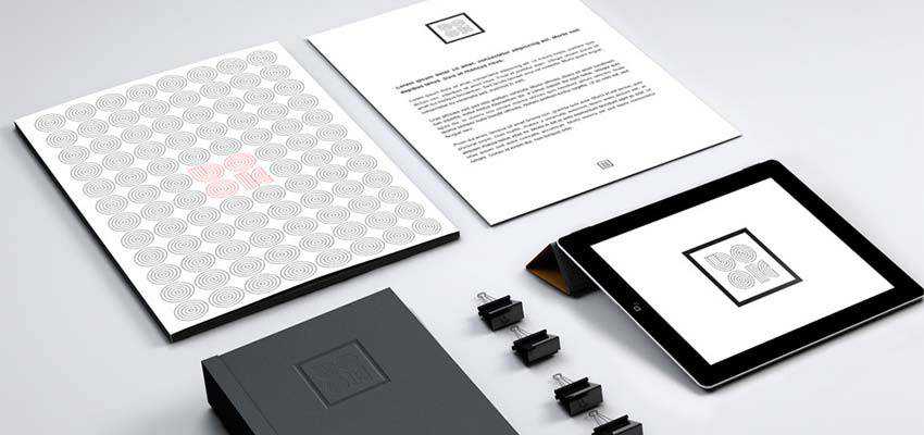
Publishing House by Maurizio Pagnozzi
The name of the project speaks for itself. Publishing is widely associated with books; therefore, the author has used the word “book” set in an eccentric custom font as a basis for the design. Not only is it featured in the logotype, but also in the background and decorative elements. Concentric circles that can lead eyes wherever you need them to stand behind the beauty of this unique design. Although Maurizio Pagnozzi may have taken it a little too literally, the result is fantastic.
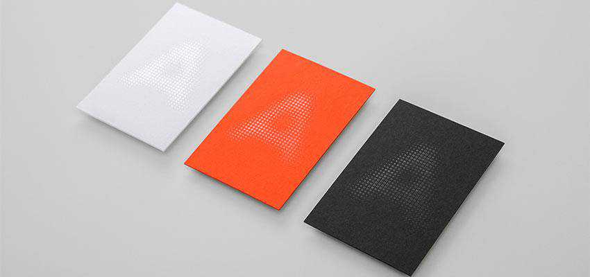
archAssist by Pop & Pac Studio
Letter “A” is the heart and soul of this project. The idea is simple yet clever. The team of the creative studio Pop & Pac shows us how the minimal approach can shine when in the right hands. Inspired by beautiful the “rotational” designs of Frank Lloyd Wright and some other famous artists, they managed to demonstrate their unique take on reinterpreting geometry.
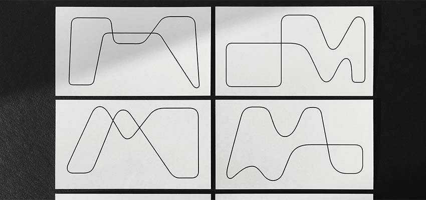
Materia by Paprika
This project falls into the group of artworks that stick to the “less is more” principle. The design is incredibly oversimplified. This does not mean that it is boring or primitive. On the contrary, it charms with the complexity of forms and intricacy of an idea. Smooth curved lines that do not have any beginning or end form each letter as well as decorative details.
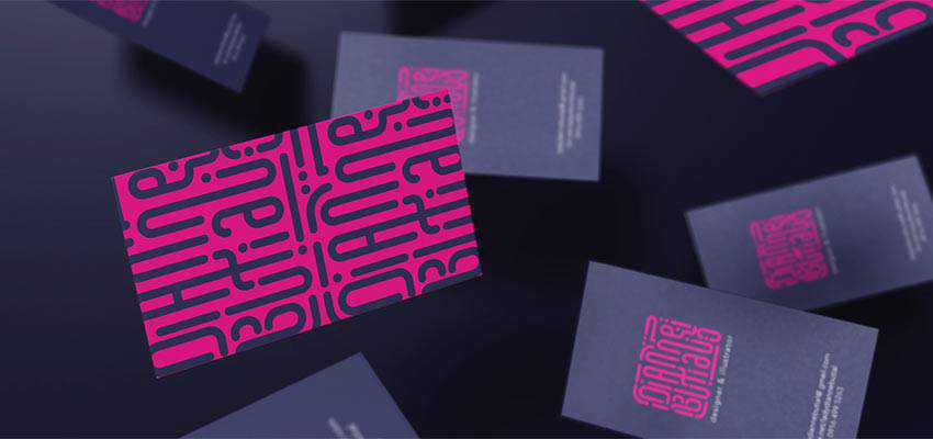
Personal Branding by Dianne Butial
The personal branding of Dianne Butial screams out the eagerness of the artist to create bold ideas. Without a doubt, her current project made a statement, and a skillful play with typography helped her to do this. The beautifully elongated letterforms have transformed a simple word into a decorative tool. It is used as a logotype as well as the pattern for prettifying the back side of the business card, along with some other stationery items.
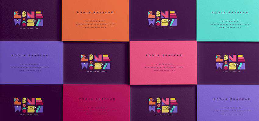
Linewise – Personal Branding by Pooja Bhapkar
Pooja Bhapkar and her branding project naturally catch an eye with its whimsical design. The beautiful, hand-crafted typography aims to tell readers a colorful story. It is so expressive that you do not need any other decorative elements. The typographic centerpiece is bold, multifaceted, bizarre and truly unique.
Project by Tariq Yosef
If you find yourself trying to guess what this is, then you might be unfamiliar with the Arabic language. I highly recommend you to dive in because you are missing something interesting and inspiring. The Arabic alphabet, as well as the East Asian alphabets, have a unique charm and a powerful personality that are difficult to resist. And this concept created by Tariq Yosef is a vivid proof of that.
Using the simplest geometric shapes, the artist has created fantastic letterforms. They are bold, playful and just inspiring. Although the concept was created to please the eyes of visitors to Amman design week, it is hard not to notice its enormous potential for enriching brand identity.
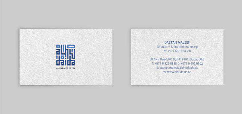
Al Hudaida Hotel Brand Identity Design by Yogas Andrian
Much like in the previous example, a beautiful Arabic alphabet occupies the center stage here. It is used to create the logo as well as the pattern for decorating other elements of brand identity. Simple geometric forms and a gorgeous blue color easily convey a lovely atmosphere of the hotel for which the concept was created.
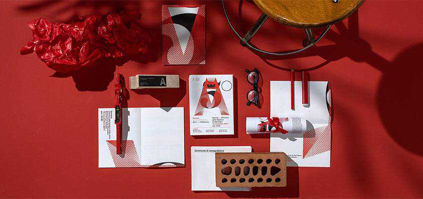
Premio AV 5th edition by Happycentro Design Studio
This concept by Happycentro may look a bit like archAssist by Pop & Pac Studio, featured at the beginning of our article. Here, the team also bets on lots of space, primitive geometric shapes, and a halftone effect for spicing things up.
However, they are different. In the case of Premio AV 5th edition, there are two symbols: “A” and “5”. Together they represent the fifth anniversary of the magazine «AV». And, there is no mystery – the design is clear and explicit.
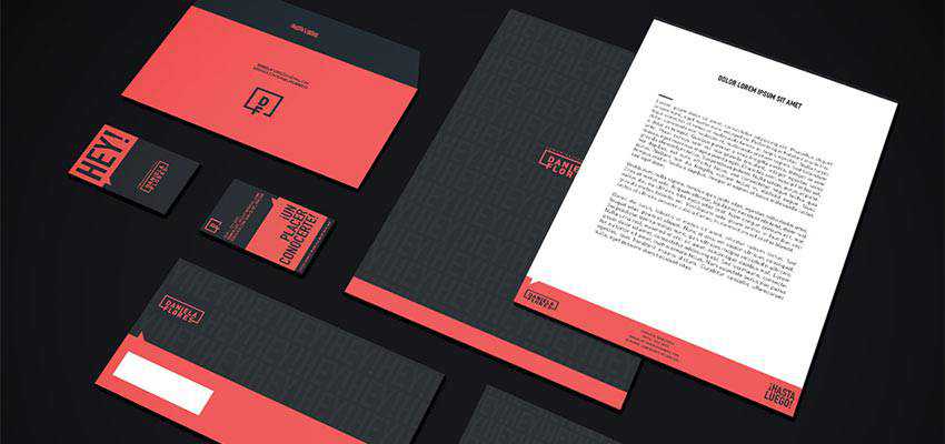
Personal Branding by Daniela Flores Chacón
Typography and a well-thought-out color palette are the two main components of personal branding created by Daniela Flores Chacón. Note, it does not look girlish or schmaltzy. On the contrary, it looks serious and businesslike, making it a strong player in the masculine world as well. Taking the word “hey” as a central element of the design, Daniele has created a pattern that is used for enriching the background. It is also featured on the back side of the business card, serving as a welcoming message.
Chalkboard Lettering Stationery Set by Lisa Nemetz
Our collection wouldn’t be complete without Chalkboard Lettering Stationery Set by Lisa Nemetz. It is an entire direction that has both its fans and haters. The project feels rustic, authentic and hipster-like. The most inspiring aspect lies in an intricate combination of words and decorative details. It is here where typography blossoms.
Even though this kind of lettering demands a chalkboard-like surface to reveal its beauty, nevertheless, grainy surfaces of various colors as well as non-uniform backgrounds will do the trick – giving you lots of room for creativity.

Creating a Strong Identity
When it comes to business cards, notebooks and other types of stationery that are seen in brand identity projects, you need to be rational, reasonable and conservative. After all, you are limited by space. However, even though you are obliged to fit your idea onto a small sheet of paper, you aren’t restricted by your imagination.
Using typography as a tool for creating the entire entourage is a way out. With a selection of custom type families, you can go for a minimalistic approach like Pop & Pac Studio did with their concept “archAssist” or highly-decorative one like Pooja Bhapkar did with her branding.
Not only will it stand behind the overall beauty, but it will also support the message and communicate the story behind the brand. Typography was, is, and always will be a valid option for your design projects – regardless of their scale.
The post Using Typography to Establish Brand Identity appeared first on Speckyboy Design Magazine.