Anti-CSRF (New)
Read more at https://www.phpclasses.org/package/11005-PHP-Generate-tokens-to-protect-against-CSRF-exploits.html
WordPress 5.0.2 is now available!
5.0.2 is a maintenance release that addresses 73 bugs. The primary focus of this release was performance improvements in the block editor: the cumulated performance gains make it 330% faster for a post with 200 blocks.
Here are a few of the additional highlights:
For a full list of changes, please consult the list of tickets on Trac or the changelog.
You can download WordPress 5.0.2 or visit Dashboard → Updates and click Update Now. Sites that support automatic background updates have already started to update automatically.
Thank you to everyone who contributed to WordPress 5.0.2:
Alexander Babaev, Alex Kirk, allancole, Andrea Fercia, Andrew Ozz, Anton Timmermans, David Binovec, David Trower, Dominik Schilling, Eduardo Pittol, Gary Pendergast, Greg Raven, gziolo, herregroen, iCaleb, Jb Audras, Joen Asmussen, John Blackbourn, Jonathan Desrosiers, khleomix, kjellr, laurelfulford, Jeff Paul, mihaivalentin, Milan Dinić, Muntasir Mahmud, Pascal Birchler, Pratik K. Yadav, Riad Benguella, Rich Tabor, strategio, Subrata Sarkar, tmatsuur, TorontoDigits, Ulrich, Vaishali Panchal, volodymyrkolesnykov, Weston Ruter, Yui, ze3kr, and のむらけい.
Waves in web design? It seems unlikely. I bet the first thing that comes to your mind are websites dedicated to travel – especially by sea. Or, sites with nautical themes that are quite hard to find.
How many waves have you seen across the web? It looks like there aren’t many. That was once true, and waves were rare. However, times have changed. WebGL, GSAP and others alike have given developers an opportunity to easily reproduce the wavy effect.
Just take a look at this snippet by deathfang that features a classic effect, realized with the help of Three.js. It is not rocket science anymore.
The wavy effect is a perfect instrument for adding a “wow” factor to a website, establishing a serene atmosphere and most importantly keeping user interest. It kills two birds with one stone. On the one hand, it enriches the overall impression. On the other, it does not make it all about itself. Though, it is undoubtedly something that you can watch forever.
In the majority of cases, developers use wavy effects on the home page. The reason is simple: Although the effect can be easily recreated, it still “eats” a lot of system resources and may cause some discomfort for regular visitors.
All in all, not everyone has a supercomputer at home to successfully process these graphics. Even more so, digital waves have different “faces”. It means that some of them are lightweight and fragile while others are heavy and overwhelming.
Today, we are going to explore different approaches starting with the classic water surface and ending with a barely perceptible ripple.
Let’s start with the classic: Water surfaces. There are many ways to recreate a water surface in the digital world, and high-end solutions are not the only ones to do that.
For example, you can go for time-proven methods like a properly looped GIF or, like in case of Nuclear Dissent, a video background spiced up with some virtual reality features.
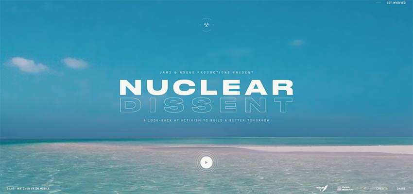
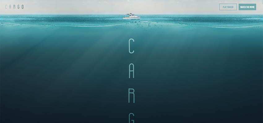
That’s all good when you have a project where reality lies at heart, like the above example. But when it comes to fictional UIs, you need more serious stuff. Take a look at the official website of Cargo. It is an award-winning movie in which events are closely linked to the sea. So, it is not surprising that the team opted in favor of a nautical theme. The promo website opens up with beautiful deep-sea scenery where the water surface is skillfully reproduced with the help of high-end techniques. It gives the project a lovely lifelike behavior. These details are so tiny, but they make the whole difference.
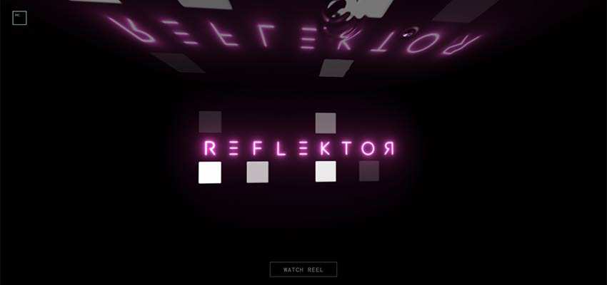
In the hero screen of Reflektor Digital, you will find everything: Drops, ripples and a glossy surface. All of these are placed on the “ceiling” that is a skillful imitation of a water surface. Surprising, isn’t it? The idea is brilliant and the realization is exceptional.
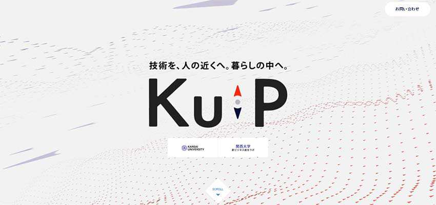
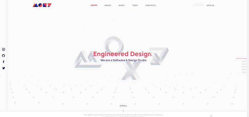
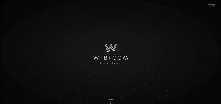
These three examples are quite similar. All of them feature animation of scattered particles with a wavy behavior. The teams of Moxy Studio and Wibicom use just one layer, skillfully complementing the minimalist hero screen. However, the team behind Ku P dares to employ it both at the top and the bottom – teetering on the brink of scaring visitors away.
Here the animation is not just a nice touch to the background, but a viable tool for drawing attention.
Unlike the previous three examples, the animated background on Earth Science Analytics’ homepage can be called a wave of particles. It is huge and almost overwhelming. It goes perfectly well with the website’s ideology, establishing the proper atmosphere from the get-go.

This approach is exciting and even ground-breaking. In comparison to the previous ones, it feels a bit like magic.
Consider 60 fps. There is a relatively small animation that occupies just a part of the background. However, believe me, that’s enough. It is constructed from thousands of tiny particles. The team lets the audience play with the animation by using their mouse cursor. To some extent, it can be considered a previous concept taken to the next level.
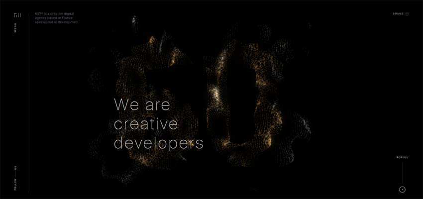
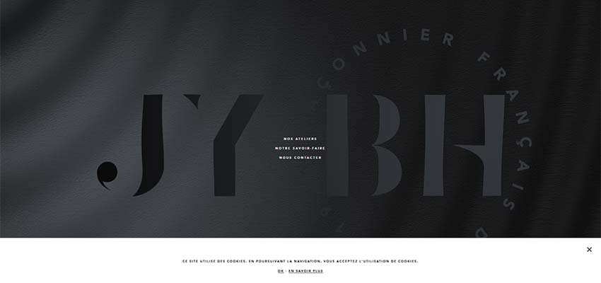
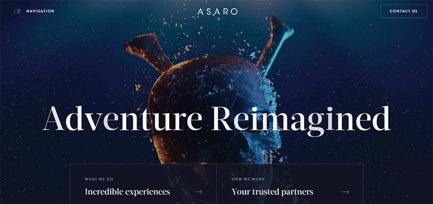
There are some other exceptional examples made with this same idea in mind. Consider JY BH and Asaro, whose teams are reasonably cautious with this solution.
In both cases, the effect is used as an overlapping layer that smoothly disturbs the serenity of the surface, bringing about a delicate-yet-distinctive touch. On the front page of JY BH it is used in tandem with the canvas, resulting in a material feel. However, within the hero area of Asaro, the solution remains true to the techno-digital spirit, feeling artificial.
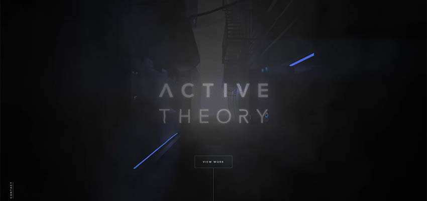
The developers behind Active Theory use wavy behavior as an instrument for distorting virtual reality. It perfectly adds to the mysterious atmosphere on the front page, playing a vital role in the user experience.
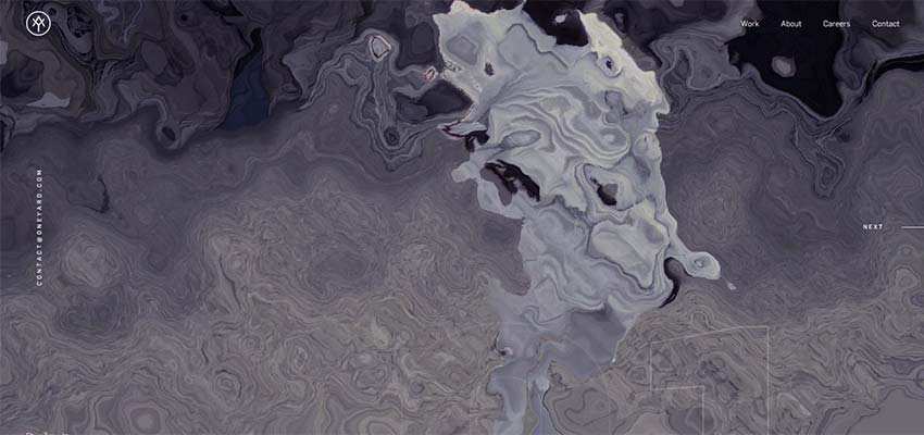
The team behind Yard Agency takes a unique approach with the wavy effect on their homepage. Here, it is used as a transition between the slides in the hero slider. It makes the initial image dissolve into the next one. The solution ingeniously glues together two parts. Thereby it creates not only a coherent, but also a one-of-a-kind user experience.
In the past, wavy effects were seen mostly in websites with sea themes. These days they are a viable instrument for creating an exceptional user experience in any web project.
It can be seen in personal portfolios, promo websites, corporate websites and so on. And it can be used not just for backgrounds, but also for transitions. The smoothly flowing nature of the solution lets it collaborate with various techniques, bringing about fantastic results.
The classic wave behavior, ripples, water surfaces and even particle animations are inspired by waves. It feels like anything is possible when this sort of animation is involved.
The post Rocking the Boat: Examining the Use of Waves in Web Design appeared first on Speckyboy Web Design Magazine.
The post Interview with Josh Holmes appeared first on Voices of the ElePHPant.