13 Inspiring Testimonial Pages
Testimonials are a very powerful, yet underutilized, internet marketing tool that helps businesses build credibility, alleviate concerns, and convert prospects into clients. Adding client testimonials to your website can be an extremely effective way to establish trust and strengthen your company’s reputation.
The traditional layout, structure, and design elements of a testimonials page usually consist of customer reviews arranged in a list style that is redundant and unattractive for users. This is because a lot of companies don’t view client testimonials as being an integral part of achieving success on the web. We have compiled 13 great testimonial page examples to show you how useful these pages can be when designed appropriately for your website.
Don’t get me wrong: including testimonials anywhere on your website is better than having none at all. However, they may prove to be a lot more valuable to your web strategy if you step outside of the traditional formats used for client reviews and create a custom-tailored approach.

Why You Should Display Testimonials Throughout Your Site
If your company worked hard over the years and earned a collection of awards and certifications, would you display them on a shelf that very few people see? Hopefully the answer is no. I’m not saying that you should dust off every single award your company has ever received and pack them into your waiting room, but it certainly doesn’t hurt to put one or two of your proudest achievements on display.
Rather than hoping that your site’s visitors are going to click on your testimonials page and read about the great work you’ve done, put some of your most prestigious achievements at the bottom or in the sidebar of every page. For example, we display the following bar at the bottom of some of the pages on our site:
We opted to display this particular testimonial because we think it shows potential clients what we can do, and they can click to read more if they choose.
By putting testimonials on each page, you can ensure that a large percentage of your site traffic knows how trustworthy your company is, even if they don’t go to your testimonials page. When you site traffic does go to your testimonials page, though, keep in mind that this page is a great place to think outside the box and showcase more than an otherwise dull and monotonous list of customer reviews.
In today’s fast-paced world, it’s no longer the job of the consumer to research brands and products before making a commitment. They expect companies to provide that information for them. This isn’t because consumers are lazy or unable to gather the information on their own, it’s because consumers now have the ability to navigate from website to website, evaluating and comparing brands with the click of a mouse rather than traveling from store to store.
Word-of-Mouth: The Most Persuasive Way to Sell Your Brand
The primary function of a website is to promote your brand or products on the web so that you can expand your reach and increase conversions… but wouldn’t you rather have other people promote your brand instead? The best way to sell your brand to potential customers is to let your current and past customers do the selling for you.
An excellent way to accomplish this is to integrate client testimonials and customer reviews into the central theme and layout of your website. Testimonials aren’t something to hide – they are something to be proud of and share with others. Modern websites use seamless web designs to flaunt their customer reviews via live social media streams, content sliders on the homepage, video testimonials, case studies, and much more.
Below is a list of 13 websites that demonstrate a variety of attractive, persuasive and creative applications for testimonials. I’ve also included highlights of sections or design elements that I found particularly unique and useful.
1. xero.com
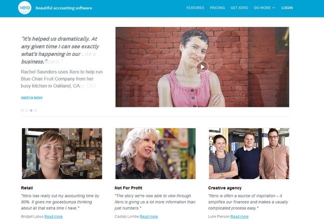
The full package! Xero’s website includes testimonial snippets on the homepage with customers’ photographs, the testimonial page includes videos, quotes, client names, industry, testimonial content slider, and read more buttons that take you to a full Q&A page for that individual case study.
2. desk.com

Desk.com does a phenomenal job using typography, color and balance to create a layout that’s extremely clean & structured. There are three types of testimonials here: featured testimonials (logo, quote + video), regular testimonials (logo + quote) and case study testimonials (summary, quote + read more button that links to a newsletter-type PDF for each client).
3. cloversites.com
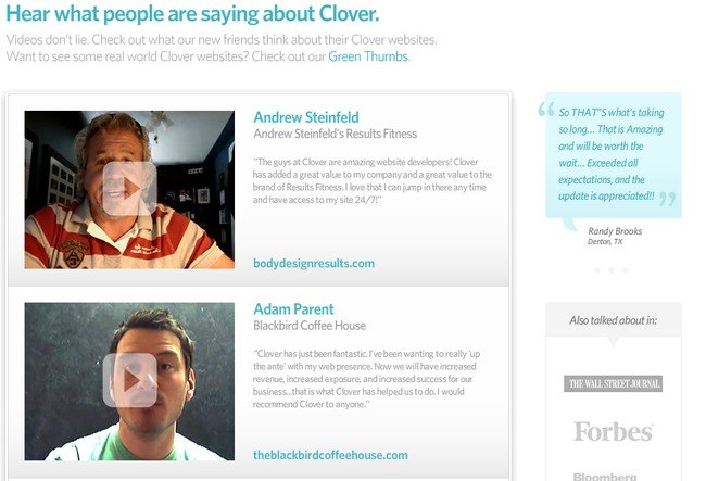
Another great use of color and fonts. Clover’s testimonials include client names, company names & client reviews along with video testimonials, an attractive sidebar quote bubble and additional PR sources.
4. freeagent.com

FreeAgent does a nice job segmenting the types of reviews into multiple tabs. These tabs include a Buzz tab (overview of quotes + video), User Testimonials tab (headline snippet for each testimonial, detailed testimonial, client name, photograph, company name + “Twitter Love” section with Twitter reviews), Case Studies tab (challenges, solutions & results for each company, photograph, additional company information) and a Press Reviews tab (reviews featured in magazines + links to additional reviews on the web). Personalizing testimonials with photographs is a great way to let your audience know that your testimonials are credible.
5. thesocialagency.ca
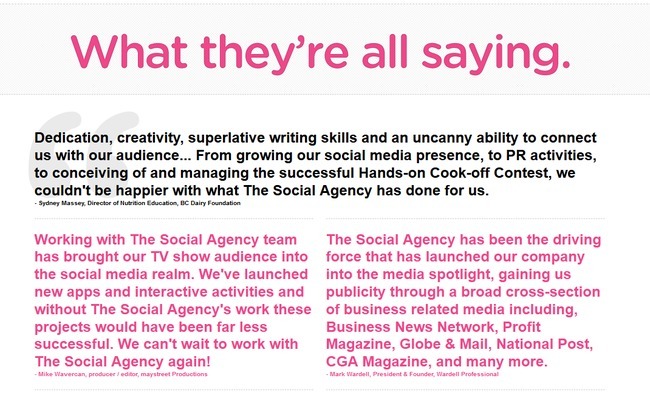
The testimonials page has a simple layout with blockquotes, but the homepage is what I’m really impressed with…the reviews are the center of attention! The Social Agency has a simple, yet attractive content slider with graphics, quotes, company names and employee’s names & positions.
6. shoeboxed.com

Most of the time, people don’t like reading through paragraph-long testimonials to get to the meat of what past clients are saying about you. That’s why Shoeboxed.com has such a great testimonials page – it’s short and sweet. By fitting short client quotes in a neat layout, Shoeboxed makes it easy for potential customers to read through a lot of testimonials in just a little bit of time.
7. postmarkapp.com
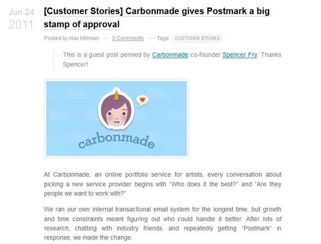
You may not need to display all of your client testimonials if you are receiving a lot of positive feedback. Rather, you can be more selective in which testimonials you want to display. A good strategy to implement at this point is to feature testimonials that incorporate a realistic client perspective.
For example, Postmark’s testimonial above discusses the realistic way that people ask around for coworkers’ and friends’ recommendations. Potential customers reading this testimonial could think to themselves, “I’ve done that before,” and realistically believe that Postmark is a good company to work with.
8. psd2html.com
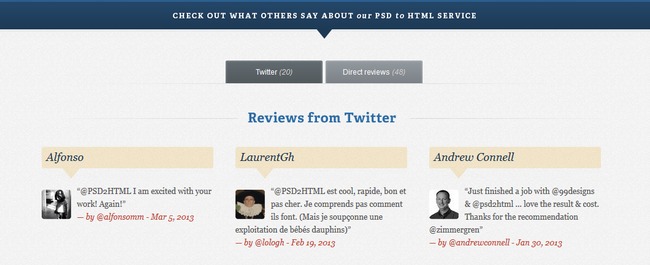
PSD2HTML’s testimonials demonstrate why a certain knowledge of color contrast is beneficial when it comes to designing your client reviews page. The navy blue and beige colors of PSD2HTML contrast well together, without hurting site visitors’ eyes. Also, as you may have noticed, these reviews are coming straight from a live feed to Twitter. This feature allows the testimonial to update quickly, keeping them current and further establishing PSD2HTML’s credibility.
9. shopify.com
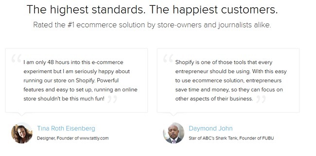
Shopify’s client testimonials go the simple and elegant route. Using minimal color and focusing more on a few select font sizes, Shopify allows readers to focus all of their attention on the past customers’ words, rather than the design that encapsulates them. To keep the reviews from being too dull, though, they personalize them with pictures of the customers who provided the reviews.
10. studiopress.com

StudioPress, as a designer of themes for the blogging site WordPress, incorporates a more design-oriented atmosphere to its testimonials page. Not only can StudioPress show off its excellent customer reviews, but it can do so in a way that also shows off the site’s designing abilities.
11. picplum.com
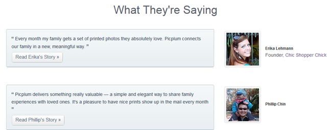
PicPlum also incorporates the main service of its website into its client testimonials page. As a photography-centered business that prides itself on the high-quality images it can deliver to individuals and families alike, PicPlum chooses to incorporate high-quality images into its testimonials page. This shows potential customers that not only do past clients like using PicPlum, but also that PicPlum has the skills to deliver what the website promises.
12. mediatemple.net
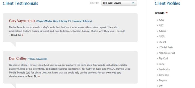
MediaTemple.net is another great example of how well a minimalist approach to a testimonials page can work. While it seems that these past customers have a lot of good things to say about MediaTemple, the testimonials only snapshot a few lines of the customers’ reviews. However, a “Read Bio” link is included to allow interested readers to learn more about how MediaTemple helped out these past clients.
13. cloudflare.com

CloudFlare.com has a little bit of everything as far as customer reviews go. By implementing a minimalist approach, but also using lengthy quotes and videos of customer reviews, the site portrays a lot of information in an unintimidating way. CloudFlare has also divided the testimonials into categories based on the kinds of services the customers received. This can be a great strategy for websites that offer a wide variety of services.
What Have We Learned from the Examples of Testimonials?
Testimonials are important! By presenting reviews of past customers you show potential customers that others have been grateful for your service in the past. Testimonials can be a great way to present your expertise in your field. If you are a photographer, include high-quality images next to your client reviews. If you are a design firm, include some artistic and intriguing design elements in your testimonials layout. Don’t just view your testimonials page as a place for words. View it as its own sphere of influence.
You can even include the general locations of your previous customers so prospective clients can see how broad your company’s customer base extends. If your business prides itself on being a mom-and-pop shop, include the locations and testimonials of local area residents. If your company is expanding to international locations and you want to attract business from a wide range of geographical areas, include that information too! Potential customers like knowing where your past clients have lived. It helps them feel like they know more about the places you have influenced.
Don’t forget – you should include testimonials throughout your website and not limit them to your testimonials page. Don’t hope prospective customers will see your reviews. Make them see your reviews.
And lastly, always remember to think like your site’s visitors. Would you buy your product if all you had to go off of was your testimonials page and existing customer recommendations? I hope so. If not, consider redesigning how your testimonials are presented, how lengthy the reviews are, and how your testimonials are connected to your social networking sites. If any page on your site is worth the time and money to redesign, it’s this one.
The post 13 Inspiring Testimonial Pages appeared first on WebFX Blog.
