Category Page Design Examples: 6 Category Page Inspirations
Dozens of people find your business when looking for a type of product but aren’t sure which product fits their needs best. With a well-designed and organized category page, you’ll help people browse products easier and find what they want.
To help you get inspired, let’s take a look at some excellent category page design examples that showcase how you can design and develop these pages.
On this page, we’ll explore six inspirational category page design examples to help you get started with your product category pages. Want to get more tips and tricks about web design? Sign up for our newsletter, Revenue Weekly, to stay in the know-how!
1. HP
HP offers many category pages that provide users with a positive experience.
Let’s look at their desktop computer category page.
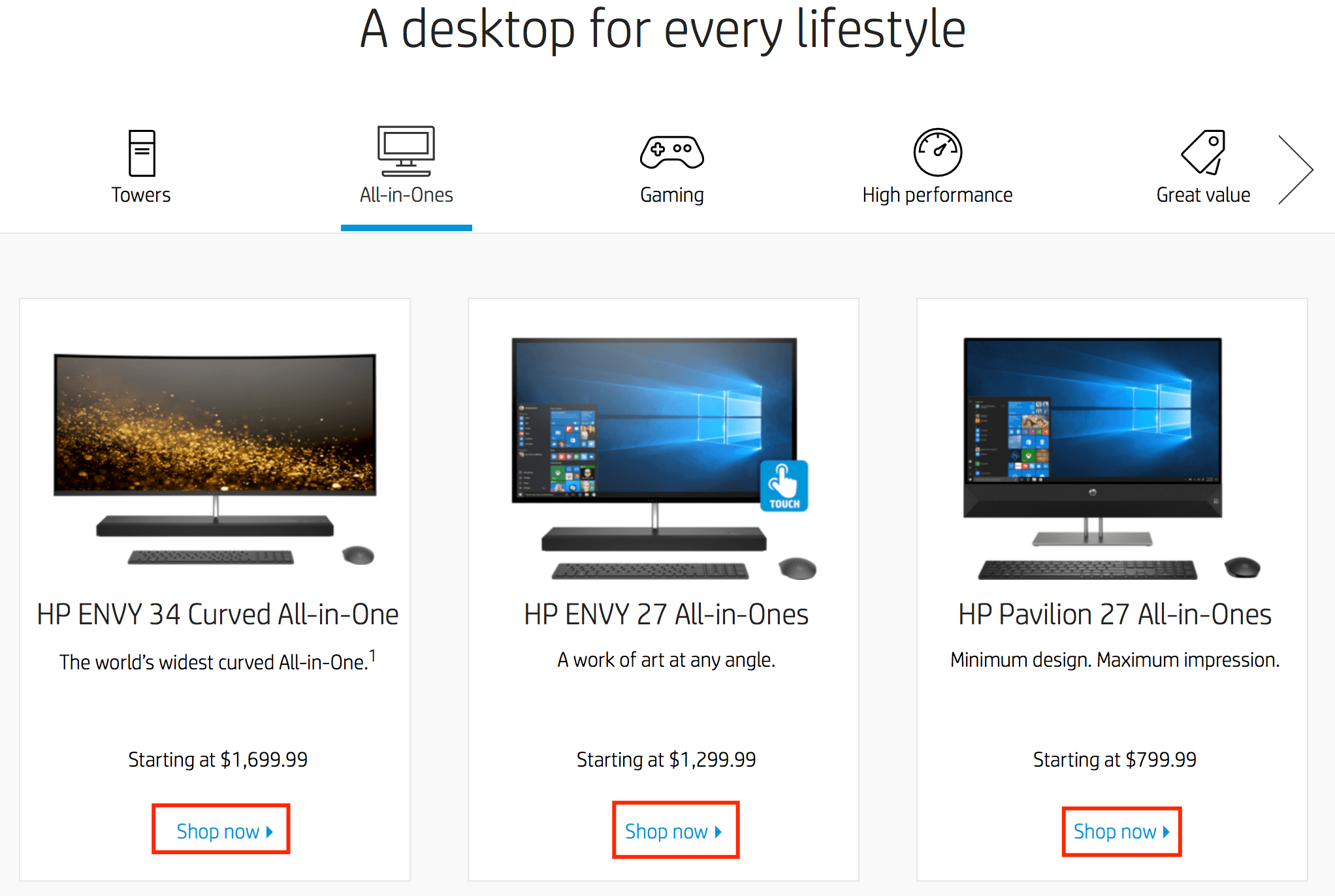
On this page, the user immediately sees a collage of desktop computers and accessories HP offers. When a user looks at this page, they can see high-quality photos of the desktop computers HP offers.
From gaming computers to all-in-one computers, users can choose different categories to explore different options.
If you scroll down the page, you’ll see a bar with icons for the different computer categories.
When users click on these different categories, they’ll see options for different desktop computers. If they see something they like, they can click the “Shop Now” button and explore that product.
Why this category page design works
The design is simple and visually appealing.
Users can easily find their options in one place in a visually appealing format.
Having the option to choose each category and see some products in that category also makes for an A+ shopping experience. This feature streamlines the buying process and guides users to their next click.
Overall, HP provides a great user experience for people just starting to browse computers.
How you can use this category page design for inspiration
When you’re doing category page design, you must think about your audience and how they’ll browse your products. Like HP, you’ll want to use high-quality photos to catch your audience’s attention and get them interested in your products.
Make it easy for people to browse products in a category too. Creating sub-categories within your category pages makes it easy for your audience to focus on what matters most to them.
2. Costco
Costco makes it simple and easy for you to browse products within a specific category.
You can easily see the different types of products they offer within each group.

Users can look at each category to figure out where they want to shop first. It makes it simple and easy for users to find the products they need in the right category. People also have the option to browse products based on same-day delivery or two-day delivery options.
Why this category page design works
This layout works well for people looking to browse products in different categories. It helps users find the category they need and get straight to the products they want.
How you can use this category page design for inspiration
Creating categories with photos is a great way to guide people to the right product listing pages. By creating a “Shop by category” section, you make it easy for your audience to get straight to what they need.
3. Staples
Staples takes a visual approach to their category page design.
Let’s take a look at their office supplies category page.
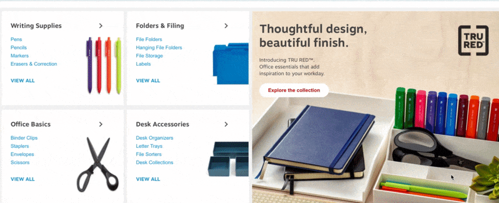
When you look at their product category design for office supplies, you immediately see a visual.
This visual element features numerous office supplies that Staples offers. As you scroll down the page, you see categories for different types of office supplies, like writing supplies, desk accessories, and folders.
Within each of these categories, you’ll see different types of products.
For instance, the writing supplies category features pens, pencils, and markers.
If you scroll down the page more, you can see categories for brand names.
This setup makes it easy for people to browse by brand name if they want a specific brand.
Why this category page design works
This category page works because it’s easy to find the information you need. People can find the right category and look at the products underneath it. It makes for a positive user experience that enables people to find products quickly.
How you can use this category page design for inspiration
Creating organized category pages will help your audience navigate your site better. You can break up your category pages into boxes, like Staples, to keep information separated and make it easy for your audience to browse your products.
4. Kohls
Kohl’s category page design allows users to browse the way they want to browse.
We’ll use their bedding and bath page as an example.

On this page, users see a bedroom filled with different bedding items. It has a slogan, “Create your comfort zone,” on the photo. This visual immediately draws users in and gets them to browse the page.
As you scroll down the page, you see categories for different bedding options.
From comforters to pillows, users can click on the product based on their interests. If you keep scrolling down the page, you can select bedding based on the size of your bed, making it easy to get to relevant products.
Why this category page design works
This product category design works because it allows users to get directly to the products they need. It helps them browse by product type or size. The page contains excellent visuals, so people know what they’re looking at, without reading the category name.
How you can use this category page design for inspiration
One of the best features of this category page design is the ability for users to browse sheets based on size. When you’re creating category pages, consider how you can build a better browsing experience based on this design example.
Think about how users shop for products and create a way to make it easier and faster.
5. Lowes
If you’re looking for simple, yet practical, category page design examples, Lowes’ category pages fit the bill.
Their category pages are organized, clean, and cohesive.

Lowes’ category pages for bathroom vanities and vanity tops are great examples. The beginning of the page lures people in by showing one of their vanities in a bathroom setting. As you scroll down the page, you see different countertop and vanity options available.
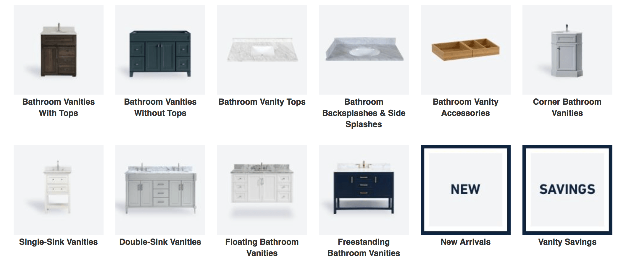
As you move down the page, you can shop for vanities by color or size. This setup creates a great shopping experience. It allows people to start browsing based on what they need, whether they’re looking for a specific vanity size or color.
Why this category page design works
This category page design example works because it fits with Lowes’ brand and keeps the brand image consistent. All the photos are the same style, creating a cohesive product category design. Additionally, Lowes created different ways to shop (color, size, look), that make it easy for users to find the right product.
How you can use this category page design for inspiration
Similar to Kohls, it’s great to offer multiple ways for your audience to shop so they can find the right product.
When you set up your category page design, think of the different ways people will look for your products.
Create different categories, like “by color,” “by style,” or “by brand,” to help organize your page and build a better browsing experience.
6. Apple
Apple is a pioneer of great design. From their phones to their commercials, every aspect of Apple is sleek, modern, and eye-catching.
Their category page design is no different.
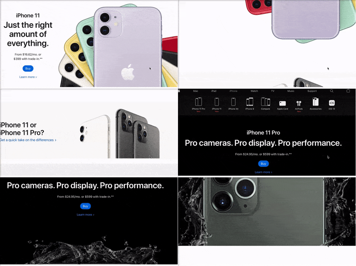
One of the best category page design examples is their iPhone page. Right at the top of the page, you see icons that allow you to view phone options, as well as accessories that go with their iPhones.

This design makes it easy for users to see their options for the right product on this product listing page. As you scroll down the page, you see bold, high-quality photos of the iPhone. These visuals get people to stay on the page and browse more.
If you scroll further down the page, you’ll get to a section called “Which iPhone is right for you?”
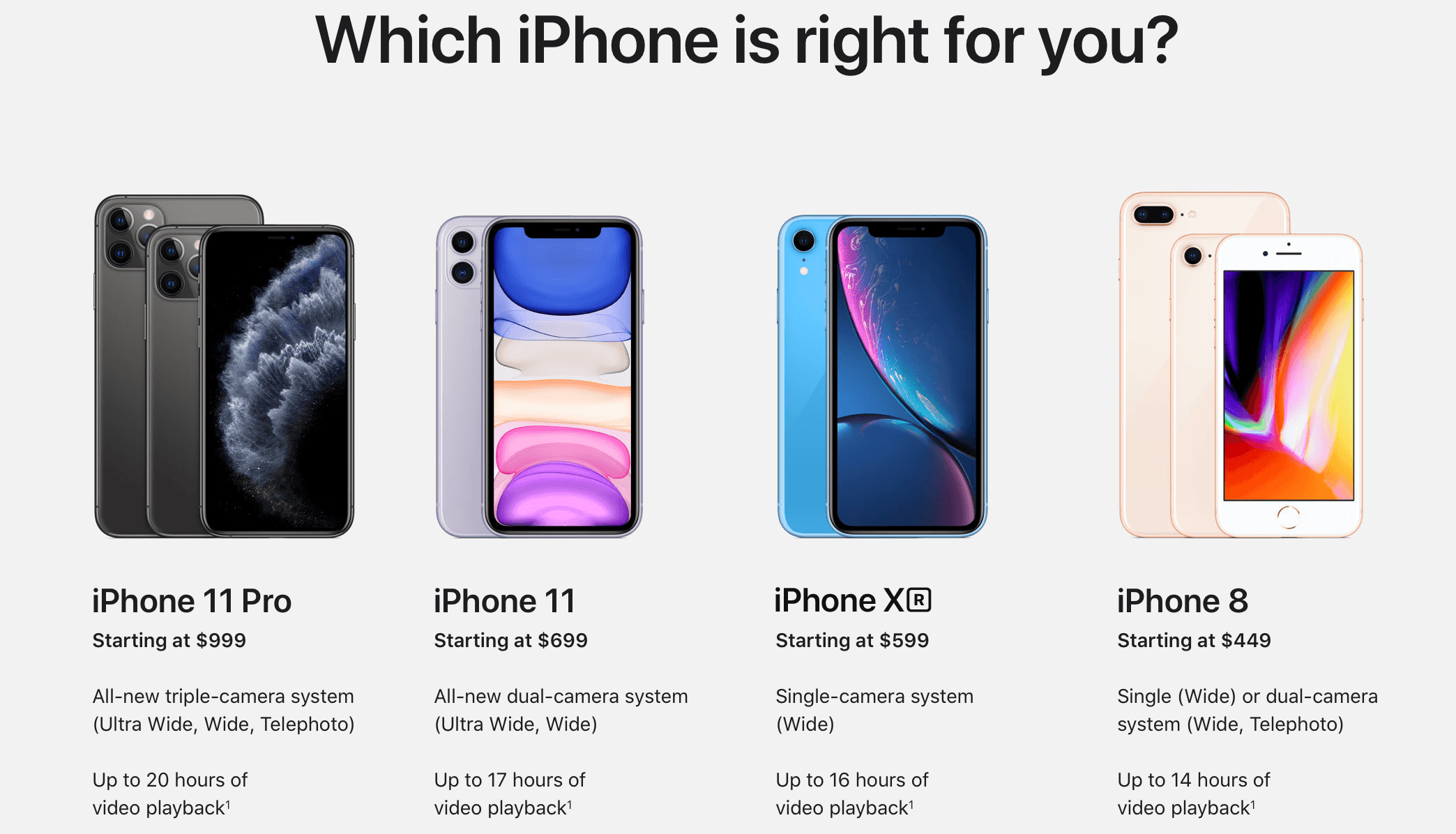
This feature makes Apple’s design one of the best product listing pages because it allows users to see and compare the different types of phones before deciding which one is the best option for them.
Overall, Apple’s category page design is clean, attention-grabbing, and focused on the user.
Why this category page design works
Apple’s product category design ticks all the boxes. It reflects their brand style, provides stunning visuals, and makes it easy for users to weigh their options. It’s a visually dense product page, which keeps people engaged and gets them to learn more about the iPhone.
How you can use this category page design for inspiration
You can learn a lot from Apple’s approach to their category page design. From using high-quality images to creating product comparison features, there are many opportunities for you. Use this example to create product category pages that offer a better user experience.
Take these category page design examples to inspire your own
Your category page design is an integral part of your website.
Category pages play an essential role in helping guide people to the right products from your business. You’ll keep more people browsing on your site when you invest in designing category pages for your audience.
If you feel overwhelmed by this monumental task, WebFX is here to help.
We have an award-winning, in-house design team that can help you build a category page that wows your audience. Check out our portfolio to see how we can help you create a category page that works for your business!
To learn more about our web design services, contact us online or call us today at 888-601-5359 to speak with a strategist!
The post Category Page Design Examples: 6 Category Page Inspirations appeared first on WebFX Blog.