8 Beautifully Illustrated Onboarding Screens in Mobile Design
To understand the value of your application and enjoy its features, modern web programs need to have an onboarding process. It is not just a whim. It is a crucial element that provides a solid foundation for good user experience and ensures the success of the entire venture.
You can have the best product ever. However, if your audience does not understand how to use it, all your efforts will be in vain. Therefore, onboarding should be well thought out, vigilantly crafted and live up to its name.
The task of onboarding is to teach users how to operate the interface and get the most out of the product. Therefore, you can use various old-school tricks to deliver messages effectively. You can go for guided animations, short tours, interactive interfaces, and even content-heavy approaches.
Whatever method you are going for, do not forget about one of the most effective tools for enlightening the crowd: accompanying visual material. It always saves the day.
Let us explore some representative examples where art assists the user’s integration.
ClusterTruck
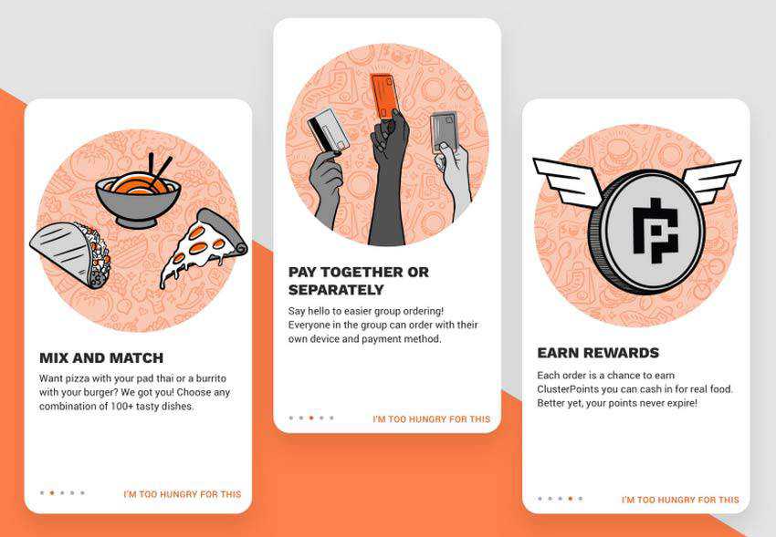
The onboarding process of ClusterTruck is exactly what we are talking about. Here, each screen has two parts: the content, where the functionality is described and an illustration that supports this statement with the proper visual cues.
What is interesting here is that these two complement and reinforce each other. Without the pictures, the screens would feel boring and insipid, even though the carefully highlighted headlines deliver the proper message. And without the content, it won’t be apparent at once what the author wants to tell us. Therefore, these two create a perfect symbiosis that makes the onboarding process comply with the audience’s needs.
Grooming Onboarding
The second stop in our exploration of artistic onboarding examples is Grooming Onboarding.
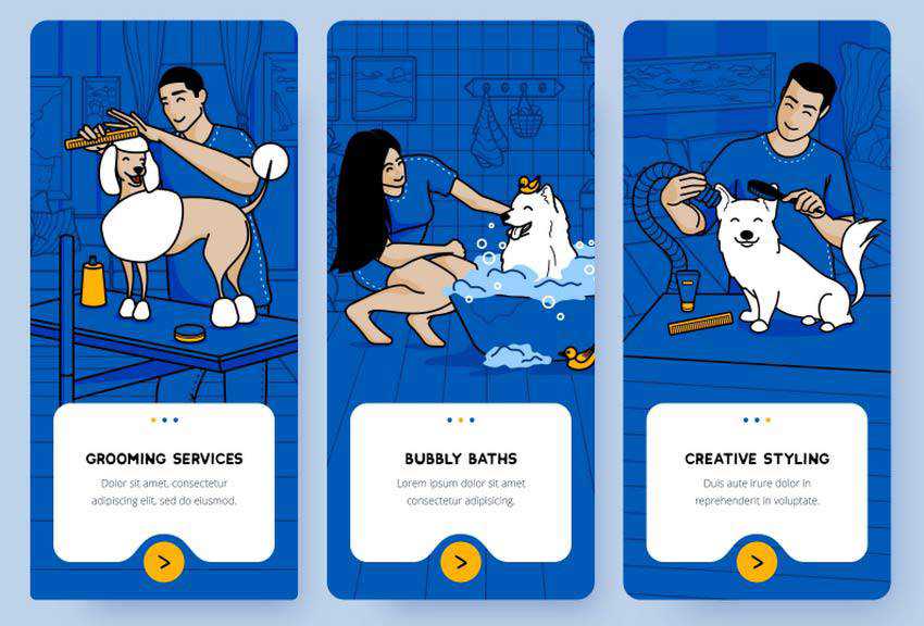
Although the nameplate speaks for itself, isn’t it nice to see it for yourself? In addition, not everyone is aware of all the modern ways of taking care of their pets. Therefore, this onboarding can be quite enlightening.
Marta Więckowska has created several outstanding illustrations that reveal the primary grooming services. You do not even have to read the content here since the visual material says it all.
Note how the info boxes smoothly blend into fully-illustrated screens. They are integral elements of the picture and not just standalone units. The onboarding looks like a true masterpiece.
Readmind
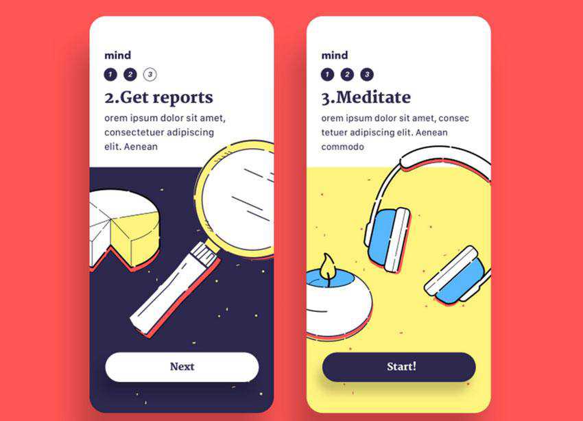
Much like in the previous example, here, illustrations and content go hand in hand. The text, as well as navigation, are so skillfully worked into the picturesque background that it feels like you are interacting with a piece of art.
The hand drawing is quite simple and even rustic in some sense. However, it is truly impeccable. Although the application was created to deal with mental health issues, nevertheless such a pleasant and soothing kind of welcoming message lightens the atmosphere and certainly brings the audience to your side.
POS Onboarding Screen by Ardias Elga Kurnia
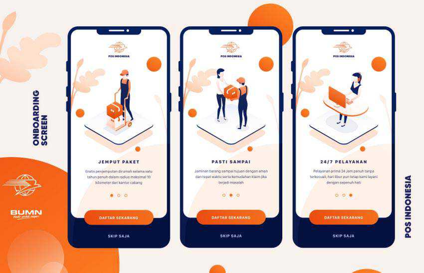
The team behind POS Onboarding Screens uses illustrations – not just for enhancing the message – but also for establishing the proper atmosphere. Here, the vector drawings perfectly meet the company’s philosophy, exuding serious and formal vibes.
Every detail, starting from the graphics and ending with navigation, sticks to this theme, building up trust from the doorstep.
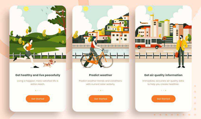
Onboarding Screen for Air Quality App by Erfan Rohmat Arif
The first thing that strikes an eye here is that the illustrations are highly-detailed. I would even say excessively so. While the majority of similar solutions prefer to stick to more schematic approaches, these vector drawings are accurate and elaborate. They will undoubtedly steal some of your precious time since you cannot just take your eyes off them.
Much like in the case of ClusterTruck, here, both illustrations and content are two integral elements of the screens that form the entire picture. The more so, each one occupies its part following the traditional patterns of dividing the screen into digestible, functional portions.
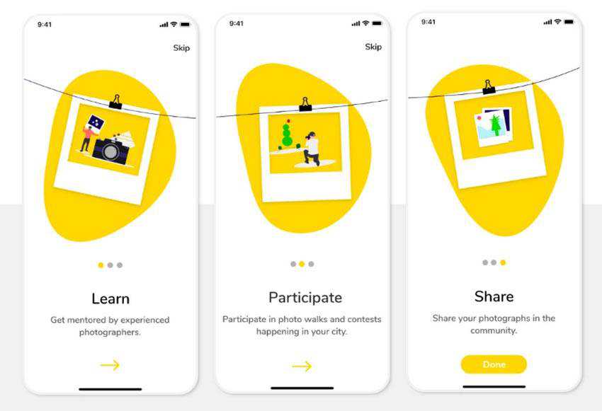
Onboarding Screens by Shilpa Shree MV
What instantly sets these screens apart from the others is that here, the illustrations are interconnected. I mean literally interconnected – since one screen leads to another through the clothes-line.
It feels like you are engaged in a story. There are just three pages and the illustrations are quite primitive and schematic – especially in comparison with the previous example. However, it is enough to get our attention, enhance the message and make an impression count. Simple but brilliant.
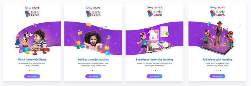
Onboarding for One of Disney’s Applications
To show you that this approach does have some real-life foundation, we have also included an onboarding for one of Disney’s applications. Although there are no clothes-lines whatsoever, the creative team has skillfully used the background to connect the dots for us. And thanks to smooth shapes, this connection feels flowing and effortless.
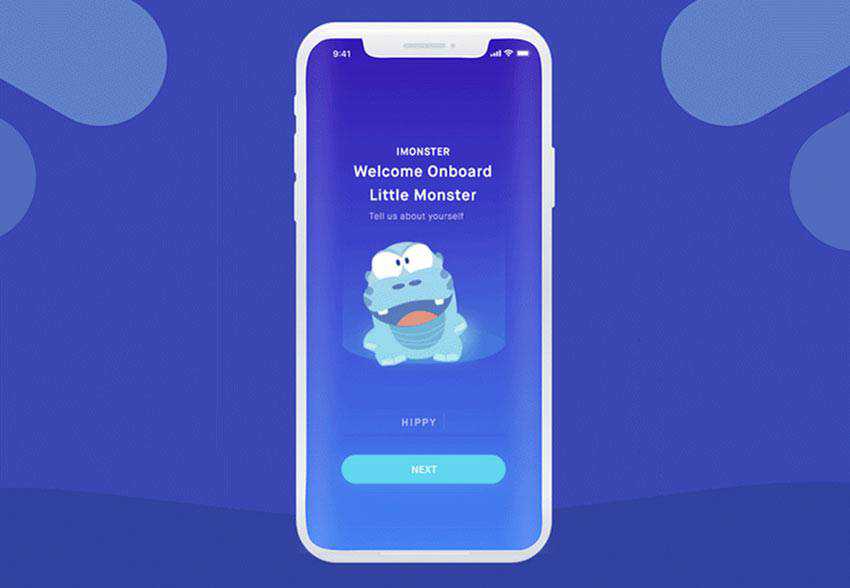
Onboarding Flow by Mingg
There is one area where onboarding can’t survive without the artistic approach, and it is applications created for children. Do you expect your young crowd to read all the info boxes? Even if they can, they certainly would not do it. Moreover, no one can make them. Therefore, a well-thought-out illustration that attracts interest is a must-have.
A child’s span of attention is quite short, and even the tiniest things can easily distract them. So, be ready to make these illustrations absorbing. Consider Onboarding Flow by Mingg to see how it is done these days.
Using a lovely cartoonish style, the team has created a funny mascot that follows children on their path to finish the onboarding process. It is fully animated and interactive.
When a child chooses the option, he or she can see what it means. Of course, they still have to read questions. Nevertheless, they are a part of a play that promises to bring some action. Who can resist that?
Get on Board
The great thing about an artistic take on onboarding is that designers treat information like a piece of art. Every example in our collection is a masterpiece that is a real feast for our eyes.
In some cases, they are pure decorations, while in others, the entire aesthetic and overall atmosphere are hinging on them. Sometimes they are just simple schematic drawings that support the headlines. Or they can be highly-detailed pictures that are worth a thousand words by themselves.
What’s more, you can use static pictures or go for something that’s fully animated and interactive. The sky is the limit.
The post 8 Beautifully Illustrated Onboarding Screens in Mobile Design appeared first on Speckyboy Design Magazine.