Ideas for Making the WordPress Back End More User Friendly
Building a website with WordPress for your clients opens them up to a whole new world of possibilities. Just about any sort of functionality they need can be installed with a few clicks.
But, when it comes to introducing them to the all-powerful WordPress dashboard, all of that possibility can be a bit overwhelming. The sheer number of menu items, options and assorted litter make the back end difficult to digest.
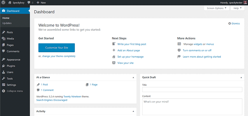
For example, put yourself in the place of a brand-new user, logging in for the first time. Visually, there is a lot to take in – even with a default installation. And a typical website is anything but default. Themes and plugins add all sorts of goodies that, while often useful, are also liable to send a newbie running for a remote cabin in the woods.
Therefore, it’s up to us to try and improve this experience for our clients. Here are a few simple ways to do just that.
Take Advantage of User Roles
Not every user needs full administrative access to the WordPress dashboard. While it’s always a good idea to provide an admin account to your client, it doesn’t necessarily have to be the one they utilize on a daily basis.
WordPress has a wonderful Roles and Capabilities feature that offers various levels of access. Why, just logging in with an “editor” account, as opposed to administrator, will take away a lot of advanced menu items. It’s not perfect, but does make for a less-cluttered experience.
Of course, a lower level of access may mean that some necessary functions aren’t available. In that case, an administrator account can be used or you might even create a custom role via a plugin.
This will allow clients access to the things they need, while keeping them away from what they don’t. As a bonus, this also benefits security as well.

Use Custom Fields and Post Types
The ability to customize WordPress is one of its most powerful features. While we often think of customization in terms of themes or plugins, it goes well beyond those areas.
Through the use of custom post types and/or custom fields, you can make the task of managing content much more intuitive:
Custom Post Types
On the surface, a custom post type is really just a set of traditional pages or posts – but with a different name. As developers, we know that they are capable of a whole lot more. But from a client’s perspective, the cosmetic benefits alone are huge. And that is one of the most compelling reasons to use them.
By default, WordPress uses traditional posts, categories and tags to organize content. It certainly works, but it also has the tendency to become a tangled mess as more types of content are added.
Plus, clients (or whoever was responsible for adding content) have to remember several steps to ensure that a post ends up in the right spot. Forgetting to click a category, for example, may mean a new post is nearly impossible to find on the front end.
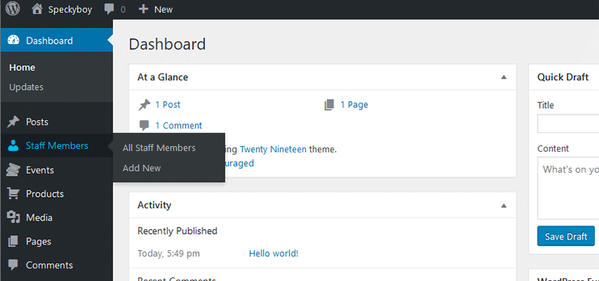
With a custom post type, each type of content can be clearly labeled on the dashboard’s menu. Whether it’s “Events”, “Press Releases” or “Staff”, it takes the guesswork out of where something should go. Sure, categories and tags may be used within, but at least content managers will know where to start the process.

Custom Fields
Whether your website is using the Gutenberg block editor or the Classic flavor, content starts out as a blank slate. In an opposite-of-the-dashboard sort of way, this can also lead to a feeling of being overwhelmed. Where does one even start?
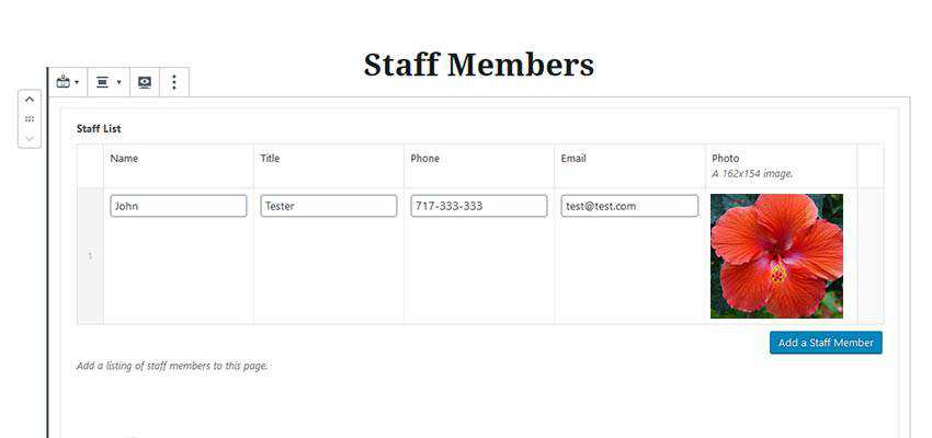
So, when it comes to helping users on a micro-level, custom fields are a great way to make content creation a more intuitive experience. Seeing, for example, a set of fields that make up a staff member’s profile removes doubt. Users can see what they need to fill in and will have a better understanding of the final result.
However, neither custom post types nor custom fields fix everything by themselves. You still need to have a plan and take care to implement them in a way that really does make things easier.

Going Further
Tidying up the dashboard for your clients doesn’t have to end with the measures above. If you want to really dive in, there are some highly-custom possibilities that go the extra mile. I’m going to introduce you to one I’ve been personally utilizing on some recent projects.
The “Handy Links” Widget
While we can trim off some of the unnecessary menu items, the back end of a WordPress website can still be too cluttered. So, when thinking of clients who aren’t necessarily comfortable with technology (or just crave efficiency), I wanted to create a little “safe space” that acts as a guide to their site.
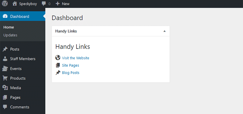
The solution was a fairly simple (and admittedly rudimentary) dashboard widget called “Handy Links”. To be clear, there’s nothing fancy about it. It’s an amalgamation of code from various places. But it does aim to serve two purposes:
- Display links to both common and site-specific places, like pages, products or custom post types;
- Deactivate the default dashboard widgets that come with WordPress, thus reducing clutter;
Most importantly, it provides users with something to focus on when logging in. They can click to get to where they need to go. And as new things need added, it’s just a matter of adding a new bullet to the list within the plugin’s code.

Feel free to take it and experiment! Just grab a copy of the file and place it in your site’s /wp-content/plugins/ directory. Then, login to WordPress and activate the “Handy Links Widget for WordPress” plugin.
From there, you can add your own custom links using the example code (you’ll just need to save changes and re-upload to your plugins folder). Also note that the widget is set to display only to users with the administrator or editor roles. But again, that can be customized to fit your needs.
Beyond the Default Installation
If nothing else, the ideas above are really just the tip of the iceberg in terms of how the WordPress dashboard can better serve clients. Smart implementation of features makes the experience more intuitive and hopefully reduces the time you spend on training and support.
For clients, a clean, well-thought-out dashboard brings a higher level of comfort and confidence. They’ll know where to go, what to do and can get things done faster. That alone makes it worth your effort.
The post Ideas for Making the WordPress Back End More User Friendly appeared first on Speckyboy Design Magazine.