Striking Examples of the Glitch Effect in Web Design
Distortion effects are incredibly popular among web artists these days. Throughout the year, we saw their dominance. However, one particular effect separates itself from the others and stands on its own. And it is the glitch effect.
Once considered undesirable, this short-lived fault in a system has skillfully transformed into a modern feature that everyone wants to have in his or her project. From the ugly duckling to the beautiful swan, it has taken the long path. And now it can be called a real treasure in the web designer’s arsenal.
The great thing about the glitch effect is that, in our eyes, it has turned into a viable instrument. But in fact, it has remained true to its roots. It is the same distortion effect that interferes with the ideal picture. Nevertheless, we have grown to like it and have even found ways to benefit from it.
Let us consider some exceptional examples, where the glitch effect improves the user experience rather than ruins it, giving the website a unique appeal.
Chafik Design
Chafik Design is an exceptional example that reveals the entire beauty of distortion effects. It shows us what can be done with smart usage of glitches.
This personal portfolio of Moucharaf Chafik impresses online visitors from the get-go. It feels high-tech and even a bit extraterrestrial, standing out from the crowd without a doubt. Here the glitch effect plays a vital role in creating a beautiful user experience.
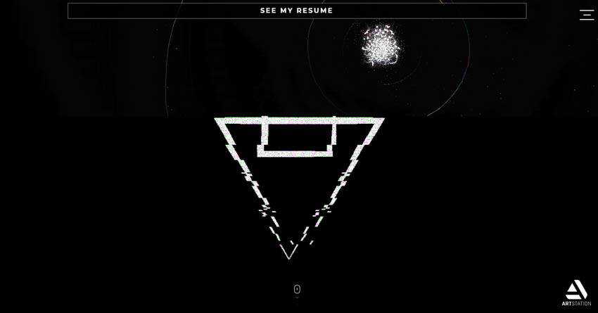
It is the heart and soul of the project that can be seen literally everywhere. It even benefits the aesthetics of such remote corners of the website as the page that includes nothing more than just a download button.
Of course, it hints about its potential on the front page. Here, the solution enhances the logotype, 3D centerpiece, taglines and navigation. In all, every aspect of the hero area has its corrupting, yet striking touch.
The artist uses a combination of various types of glitches. There is a bit of a digital effect, a glassy effect that adds cracked and shattered elements and modern ones that add stripes and pixels in a chaotic way.
The website is a sheer source of inspiration.
If this glitch domination is not your cup of tea, then there are some other fantastic examples where its usage is more subtle. The websites listed below employ it just like an icing to top off the overall aesthetic.
Meet the Fly
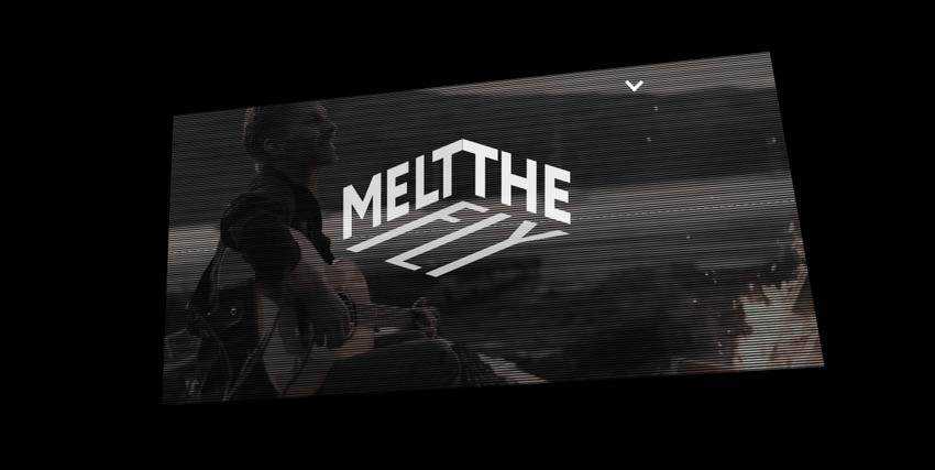
Meet the Fly is a perfect case in point. Here, the glitch effect is just an accompanying tool. It is an analog kind of solution that distorts the ideal picture, feeling like an old TV.
While it can easily evoke nostalgia, here it joins forces with a sophisticated surrounding – meeting another range of emotions. Therefore, it is just a part of the performance whose task is to grab the attention and make the video player look exceptional.
Note, once again, the analog-style glitch effect perfectly cooperates with a high-end tech atmosphere.
The European Fashion Map
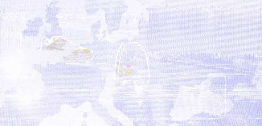
Here the glitch effect is featured only in the introductory section that precedes the main website. Much like in the previous example, this pixel distortion effect brings to mind analog TV sets that were famous for such errors. Along with a noisy background, it creates a proper anticipation that certainly ignites interest.
24 Hour Ace
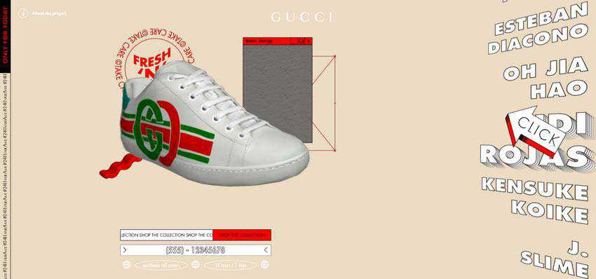
24 Hour Ace is a typical example of a website that gets the most out of the powerful side of brutality. The site feels rustic, a bit crude, yet undoubtedly epic. The team has skillfully played with 3D to recreate a bizarre environment where the products are the star of the show. Here, glitch effect goes well with the entourage, finishing off the composition.
Francesco Michelini
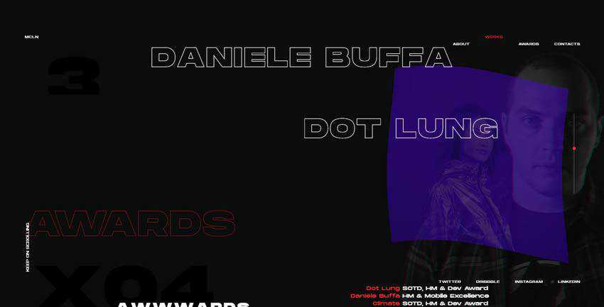
The personal portfolio of Francesco Michelini skillfully embraces chaos, making maximum use of layered aesthetics. There are many things to marvel at: elegant line-style typography, moving backgrounds, image-based hover effects, and of course, the glitch effect.
Unlike the majority presented in our collection, here the distortion is used as a transition that accompanies shifting between the slides. However, it affects not the entire screen, but only a small part of it. It occurs right where the portrait of the artist is placed, giving it an extra focus. Simple and clever.
Project Obsolete
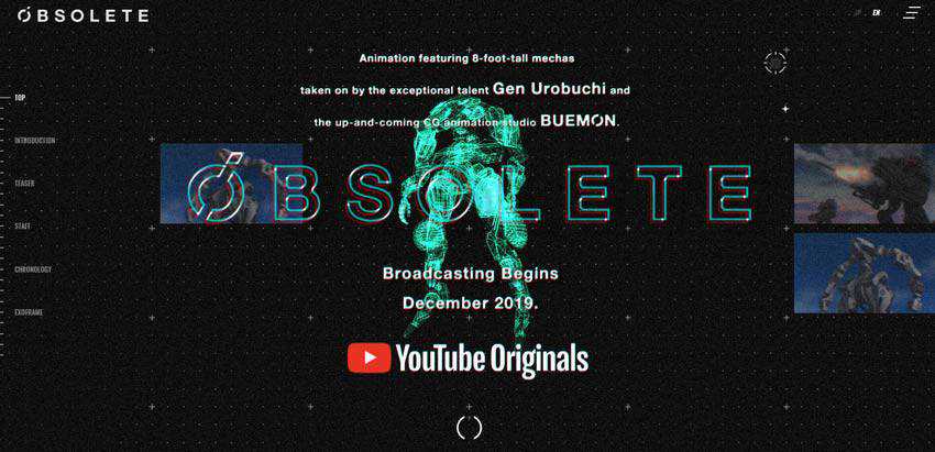
The team behind Project Obsolete has used a digital kind of glitch effect. It is here where you can see an edgy and mechanical feeling. Although it is scarcely applied, showing itself from time to time, it is enough to catch an eye and make itself heard.
Note the trend ideally blends into the high-tech atmosphere of the project, reinforcing the entire theme.
Whoamama Design
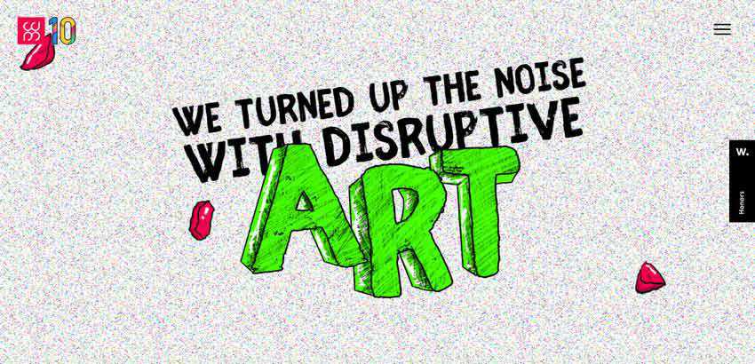
Noise and glitch are just destined to work together. When used in tandem, they produce quite a powerful impact. It feels like the picture is complete.
Whoamama Design shows this in practice. Here, we can see a solution that meets our expectations and certainly separates the website from the others.
Dino Balliana
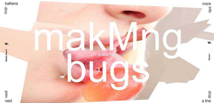
Throughout the rest of our collection, the glitch effect interferes with the overall design. But here it is used in tandem with only one component: typography. This is another popular way to utilize the trend.
The team employs the distortion effect to finish off the play with letters. It adds to realistic appeal and makes switching between symbols look attractive and intriguing.
The Glitch as a Feature
The use of distortion effects, especially the glitchy ones, is an absolute trend these days. There are different flavors, such as noise, stretch and pixel variants. The great thing about this solution is that it fits like a glove in all of those techy and cosmic-inspired designs, as well as in ones that come from the ‘80s and ‘90s. It feels like it stands above both the trends and eras.
However, it is worthy to note that even though it seems to be a universal tool, one should remember that it is not neutral whatsoever. Therefore, it should be used with caution since it upsets the entire harmony. Overdoing it may lead to poor user experience and drastic outcomes. So, tread carefully.
The post Striking Examples of the Glitch Effect in Web Design appeared first on Speckyboy Design Magazine.


