How Close-Up Portraits Bring Humanity to Web Design
Let’s be honest. Sometimes, we are missing the human touch on the web. No one is arguing with the fact that the modern user interfaces are a feast for the eye. Everything is so polished and well-thought-out. Starting with small transition effects that enrich scrolling through the sections and ending with literally massive solutions that transform hero areas into unforgettable pieces, we enjoy the whole variety of solutions. However, these are all artificial.
The world of digits always borders with solitude. After all, we enjoy websites alone. This is not a game for two. As a rule, web projects hold a lavish banquet for one. That’s why, sometimes, we are so glad to see a pair of human eyes that look back at us. Sometimes even the clichéd use of close-up portraits emerge as a trend. And today is that day.
Along with human illustrations that are increasingly popular now, close-up pictures are gathering momentum as well. Let’s consider some excellent examples.
The Complete Toolbox for Web Designers
Unlimited Downloads: 500,000+ Web Templates, Themes, Plugins & Design Assets
Zitsticka
When it comes to creating portraits, as a rule, we are accustomed to thinking that people look down the lens. This is a rule of thumb. However, why not to break this law for our own good – much like the team behind Zitsticka did? They have skillfully played with the eye contact, making the subject look off the camera. As a result, we can witness a candid, happy face that oozes positive vibes on all fronts.
What’s more, it is just fascinating how much the direction of the subject’s eyes can impact the regular reading flow. Even though the first thing that gets noticed here is a beautiful girl, our primary focus of attention lies on the left side – where the content is located. The girl’s eyes naturally leads us. This is a nice trick for those who want to manipulate the user’s reading behavior and set unobtrusive focal points.

The Avener
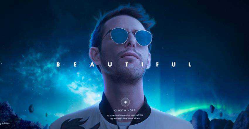
This is another example where the subject was captured looking off camera. The team behind The Avener has altered the perspective to make the artist in the picture feel stately and even a bit pompous. This idea goes perfectly with the website’s overall design and main purpose. Of course, this has not been without some photo manipulations, yet still the pose of the subject says it all.
Note, just a small twist with an angle lets the team create a powerful overall impression.
Mike and Jen’s Cocoa Mix
While the previous examples feature posed and coordinated pictures, this one gets its beauty from a lovely candid photo shoot. The girl with a cup of cocoa was photographed at ease, and we, regular online visitors, can feel this relaxed atmosphere as well. This portrait evokes some positive feelings in us. It appeals to our inner child, and this calling is quite difficult not to follow.
Note, photographing children is a real challenge. However, in the case of Mike and Jen’s Cocoa Mix, the team has done an outstanding job. The homepage feels incredibly natural and friendly.

GDW
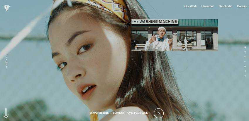
Did she wink at you and touch your arm for two Mississippies? That look is difficult to resist without doubt. It lures you in, and there’s nothing that you can do.
The homepage slider features several more portraits, yet this one that is set to meet and greet the audience is certainly a winner.
Marc Kuiper
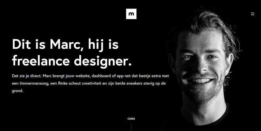
For his portfolio, Marc Kuiper goes for a traditional portrait. And, it definitely paid off. Admit it, when the subject on the picture looks right at your eyes, you feel like there is some sort of connection between you. And when this subject is posed in a clean dark environment where you can distinguish only the face, it is imprinted on your memory right away.
The homepage feels incredibly personal and charismatic. The artist has put a piece of his soul inside, thereby starting a soulful conversation with the audience.
Ali Rifai
Much like Marc Kuiper, Ali Rifai has opted in favor of a direct portrait, yet with a small twist. He has added a playful constituent to break the ice and start a dialogue with the audience on a happy note. This hilarious picture, where he is fooling around, not only lightens things up but also meets the tagline in the center.

LaventLaw
There are some spheres where portraits never go out of fashion. And the official website of a law firm is one of them. So it comes as no surprise that the team behind LaventLaw’s design has opted in favor of a corporate portrait.
They have managed to create a special combo of seriousness and friendliness by featuring a man in a traditional suit, yet with a smiling face. Such an approach naturally supports the theme and benefits the project.

Trinity Audio
Like any representative of visual material, close-up pictures allow you to conduct experiments and come up with original solutions like the creative team behind Trinity Audio did.
This musical platform uses half of the portrait to derive its human constituent and instill it into the hero area composition. They also have used its emotional component to give the project vibrancy and energy. And that’s not all. The portrait has got some Photoshop treatment that makes it an integral part of brand identity.

Stimmt AG
If you want to step away from photographs but still stick to close-up views of people, you can always go for an illustrated approach. It is a vast area that gives you freedom of expression.
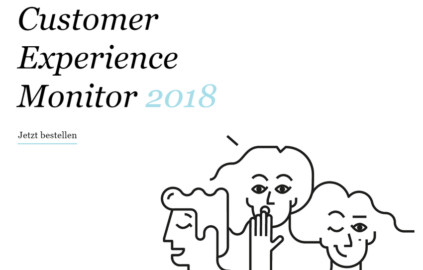
Stimmt AG is a perfect case in point. Here you will find a hand-drawn artwork that features three cartoonish characters. Each character brings its own emotions that, together, make the project feel friendly and appealing to the audience. This original take gives a serious project a positive mood.
Upon Closer Inspection
Close-up portraits are a great way of adding a human touch to web pages. They help to build a connection between the project and the audience. They can also lead users by naturally creating focal points in the reading flow as well as set a mood that can quickly transfer to readers, thereby adding empathy and appeal to the project.
However, the solution can be a very bold step for a website’s overall look and a true challenge for a designers’ team. Every such photo hides a personality inside and a gamut of emotions that you need to handle properly. Nevertheless, when done right, it certainly makes the interface look one-of-a-kind.
The post How Close-Up Portraits Bring Humanity to Web Design appeared first on Speckyboy Design Magazine.
