Beautiful Websites: 6 Tips for Attractive Website Design
Did you know that 48 percent of people say that a website’s design is the number one determining factor for the credibility of a business?
Your audience’s first impression comes from your website’s design. Beautiful websites are crucial for making an impactful and positive first impression for your audience.
On this page, we’ll provide you with six tips for creating beautiful websites. Keep reading to learn more about how to create a visually appealing and functional website for your audience.
1. Only add necessary elements that add value to your site
When you’re designing your site, it’s easy to get caught up in adding too many elements to your pages. You want your site to be visually appealing, so you continually add elements to add another dimension of visual interest to your page.
This can lead to your site getting cluttered or overwhelming. The other issue is that, if certain elements don’t have a purpose on your site, it can leave your audience confused.

Every element on your site should have a purpose. Imagine putting a call-to-action (CTA) button that doesn’t lead to a new page. People would constantly try to click on the button, and it would leave them confused as to why it doesn’t take them somewhere.
Every element on your page needs a purpose. Don’t put something on your site solely because it adds to the aesthetic of your page. Create elements that are functional and enhance the user experience on your site.
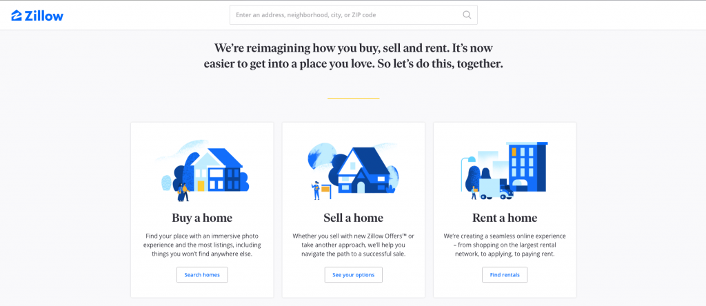
Example: Zillow’s website design is a prime example of only including elements that add value to your site. With their site, they keep it simplistic and easy to navigate with clean headers.

2. Design for the user first
When you’re designing beautiful websites, you want to focus on designing for the user. Your audience will be engaging on your site and learning more about your business. It’s important that you build a site that works for them.
As you construct your awesome website design, think about how to create a design that provides your audience with the best experience. Look at elements like your design format, navigation, and visual elements.
When you design for the user first, you create a better experience for them on your site. They will engage on your site longer, which will help you earn more valuable leads for your business.
Example: Again, we turn to Zillow’s website as a prime example of good design.
Zillow’s website is a strong example of a user-friendly site. It’s very simplistic, but it focuses on helping people get to what they need to the most. For example, Zillow’s homepage has three different sections for buying, selling, and renting a home.

This makes it fast and efficient for users to get straight to the information they need. They don’t need to search around to find the type of home they’re seeking.
3. Choose colors that align with your brand
Beautiful websites have colors that align with the business’s brand. When you design your site, you want to ensure that you choose the right colors. Your color choices impact how people perceive your brand.
Different colors have different meanings. It’s important that you understand what different colors mean and how they impact your audience’s perception of your business.
If you already have colors for your brand, integrate them into your site. For brand consistency, make sure you use the same core colors in all of your marketing materials.
When you choose colors for your beautiful website, you’ll want to stick to three to four colors. You will have a main color, one to two accent colors, and a font color. With every page you create, you’ll want to use these colors consistently in the same place.

You’ll want to use colors consistently in the same place. Your CTA buttons should all be the same colors and titles should all be the same colors. Build consistency with all of your pages to give your audience a positive experience.
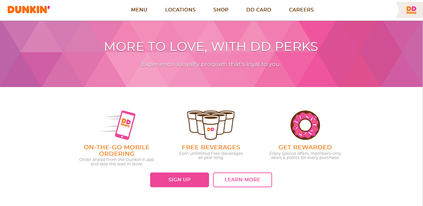
Example: Dunkin’ is a prime example of utilizing the same color scheme on its website. Dunkin has a distinct pink and orange color scheme that they use for their brand. They carry this color scheme on to their website.

This company is very good at building brand consistency across all their mediums. When people see the distinct pink and orange, they know what business they’re seeing. This is a prime example of how you want to keep your colors consistent and representative of your brand.
4. Add visual elements to make your website beautiful
When users come to your site for the first time, they want to see elements that catch their attention. Beautiful websites have visuals that draw users in and get them to check out a business. They add balance to your page and help break up the text.
There are many types of visual elements you can use on your page, including photos, videos, and infographics. Many companies will use an abundance of photos and integrate videos intermittently as points of engagement. You can use any number of visual elements to help design your site.
When you integrate visual elements into your website, they should have meaning to your business. Don’t place images for the sake of adding images to your page. Your images should have meaning and be reflective of your business and industry.
You can include photos of your team, your office, your products, or people in action doing your services. You’ll want to use original images to give a more authentic experience on your site. If you use too many stock photos on your site, it will make your page seem stiff or fake.
As for videos on your site, you can share an abundance of information in these videos. You can give your audience a tour of your facility, showcase a product, or provide them with valuable knowledge on a topic.
Overall, using visual elements helps make beautiful websites. By adding visual elements, you’ll make your site more visually appealing for your audience.
Example: Airbnb has an extremely visual site that gets users to engage on their page.
Considering their focus is on getting people to stay at different Airbnb rentals, they focus on showing photos of different destinations and types of homes you can book for your trip. This gets people to engage with Airbnb’s site and look at all their options.

This company is a great example of how you can use visuals to engage your audience and get them to stay on your website.
5. Choose the right font
Beautiful websites aren’t just focused on the right colors and visual elements. The text on your page places a big part in the beauty of your site, too. Not only does the content matter, but it also matters whether your audience can read the content.
Your typography will impact how your audience interacts on your site. If you have too many competing fonts or fonts that are difficult to read, it will cause your audience to have a negative experience on your site. They won’t be able to read your information and your pages will be difficult to browse.
If you want to know how to make attractive website design, make all elements of your site appealing to and easy on the eye. Choose fonts that work well together and ensure you use font styles in the right place.
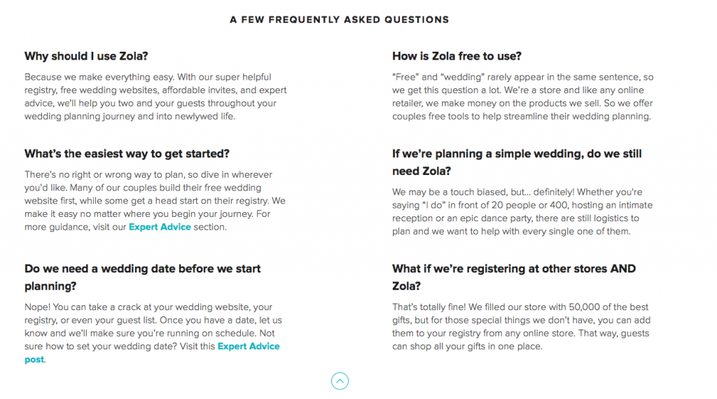
Example: Zola’s website is an example of using font consistently on your page. If you look at this example excerpt from their site, you can see that they bold their headings, keep the rest of their text normal, and link their content with a light blue color (consistent with their logo colors).

This is a great example of keeping font consistent across your site. It makes Zola’s site look more uniform and composed, as well as more visually appealing.
6. Test your website
When you’re making beautiful websites, it’s important that you test your awesome website design. Your first design isn’t going to be your best design. You’ll need to test different elements on your site to see how they impact your audience and improve your site.
Testing elements on your site will allow you to see how changes can impact your audience’s experience on your site. You can see if they add to the user experience, do nothing, or make it worse. This gives you great insight as to how to make your site the best version possible.
When you A/B test elements on your site, you’ll want to test them one at a time. If you try to change too many elements, you won’t know how each individual change impacts your site. To get the clearest results, focus on testing individual parts of your website to see how the change impacts your site.

It doesn’t need to be big changes, either. Something as small as changing the color of a CTA button can have a huge impact on getting people to click on that button. You may make multiple small changes, but they’re big enough to impact your audience’s experience on your site.
The key to creating beautiful websites is putting out the best version of your site. You can figure out the best version by testing elements on your site to constantly improve them.
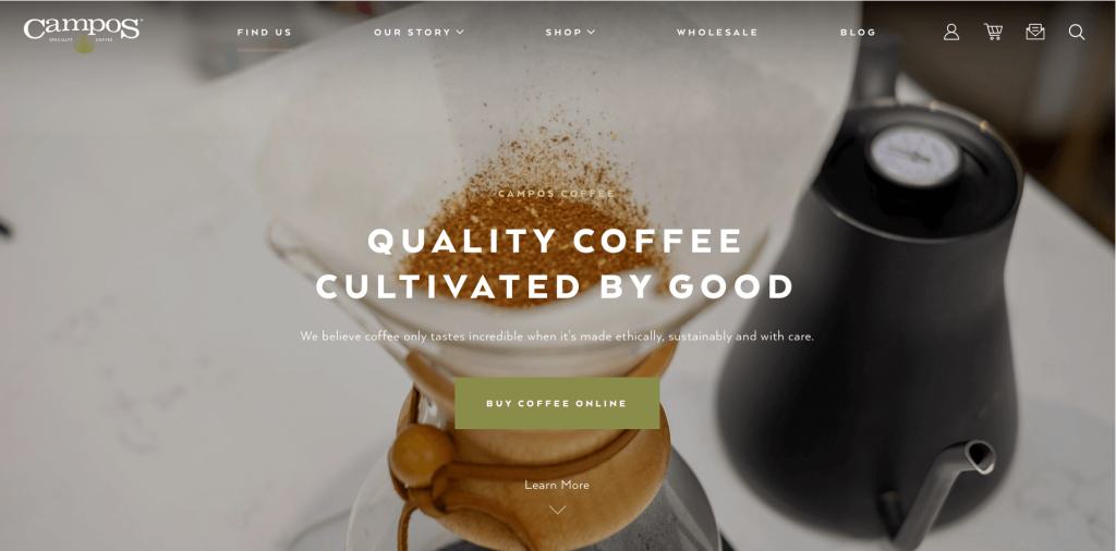
Example: Campos could test numerous page elements to see how they impact site performance and business metrics. For example, they could test the color of their CTA button. They could try a different color to see how the color change impacts their audience.

They could also test the icons on their website to see if people respond better to the icons or written words. Some icons may work better for their page, like the shopping cart or search eyeglass, but other elements might be better as plain text.
Start creating your beautiful website today
Beautiful websites attract valuable traffic and get people to interact with a business’s site. If you want to attract valuable traffic to your page and keep those people engaged on your site, you must invest in your website’s design. Making an awesome website design will keep people on your page as well as drive new traffic to your site.
At WebFX, we create custom, responsive websites for our clients. Our team of 200+ experts will help you create a web design that is unique to your business. If you need a website fast, we can help you create a beautiful web design in as little as 30 days with our program RainmakerFX.
If you’re ready to start creating the website of your dreams, contact us online to see how we can help you create your customized website.
The post Beautiful Websites: 6 Tips for Attractive Website Design appeared first on WebFX Blog.