The Use of Cursor Effects in Web Design
When it comes to the tiniest trends in website design, the manipulation of the cursor is an absolute winner. It lives up to the title as well as makes a vital contribution to the experience.
The great thing about mouse tricks is that you can be certain that they won’t go unheeded or stay overlooked, as visitors will certainly drag their cursor along the screen. Whatever you choose for entertaining your audience, chances are the hand of a user will slip and the mouse cursor will move at least to close the browser tab. And, your ingenious solution based on mouse interaction will be exposed to the world, giving you an extra opportunity to strengthen the effect or win users over.
The Web Designer Toolbox
Unlimited Downloads: 500,000+ Web Templates, Themes, Plugins & Design Assets
Lonely, Yet Eye-Catching Effects
We have already witnessed several exciting and most importantly well-received trends related to the mouse. With pioneering libraries that add fuel to the fire in a good way, it is a sin not to seize the opportunity.
At first, this may seem like an unlikely place to let your imagination run wild due to its diminutive size and other limitations. But in fact, you can do lots of things. The brand-new trend in this area is clear proof of this.
A Story About Trusts
Just consider A Story About Trusts. It is a spectacular web experiment that allows users to explore data pleasantly. It is a remarkable and bright representation of the modern hipster “fauna.”
You will find WebGL features, a smart navigational menu, inspired gesturing, beautiful transitions, particle animation and more. However, even though the project is packed with action and powered by the most pioneering of solutions, for newcomers the first few seconds decide everything.
And when you stumble upon the black screen (like one that can be seen in the screenshot below), you might think of leaving. The only thing that stands between your leaving and never coming back is this little mouse interaction. Yes, it is small. Yes, it is just a circle. And yes, it saves the day with its playfulness and easiness.
It buys time and gives the website a few extra seconds to pull itself together and show the best it has to offer. It is a simple and elegant solution that makes a world of difference, to say nothing about adding to the user experience.

Yukie Nail New York
In the case of Yukie Nail New York, the cursor not only has been transformed into a hollow, mid-sized circle, but also has been provided with an opportunity to interact with the canvas. Moving the cursor leaves ripples all over the place, significantly adding to the realistic water surface.

Flixxo
Flixxo is a website dedicated to video distribution. Here, a triangle with smooth edges that reminds us of a “Play” button was chosen as a decorative element. It can be seen everywhere, and the mouse cursor is no exception. It also has a three-sided shape. The problem is that this tiny elementary polygon perfectly blends in and is difficult to notice. To help it stand out, the team has added a bright mid-sized circle that naturally draws attention.

BLKOUT
The team behind BLKOUT uses the same trick. Here, the homepage is a bit overwhelming. There is a noisy video background, parallax effect and shaky tagline. Everything is gathered under the roof of a home screen – I myself lost sight of the mouse cursor at first. However, thanks to its orbicular friend, I managed to find it. The solution is a lifesaver.

Niccolo Miranda / Sarto Bikes
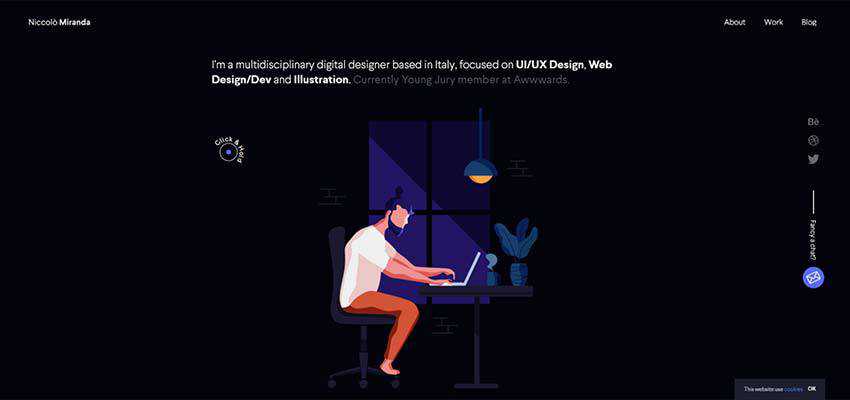
In the first example, the mouse cursor guides visitors throughout the dark interface – looking like a dancing fleck of sunlight. It also complements the entire aesthetic, adding a creative zest.

The team behind Sarto Bikes employs two types of mouse tails. The first one greets the audience. It is a relatively big circle with instructions written inside. The second appears when the user enters the website. It has a diamond shape and coloring that changes its tone from white to black, depending on the surface. In this way, the mouse always stands in contrast to the background.

Cursors as Pure Décor
While in the previous examples cursor manipulations perform an essential role in creating a comfortable environment for users, there are cases when it is just a purely decorative element that adds to the general design.
Ambitious Zevenbergen / Denton Design / Icone
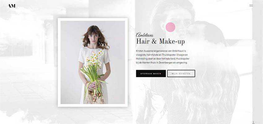
Ambitious Zevenbergen has beautiful feminine aesthetics. It strikes a balance between the content and graphical filling. Here, the lovely big pink circle that constantly tries to catch a small dot is just a charming detail that completes the design.

In Denton Design’s website, the cursor has the shape of an egg that goes perfectly well with the big picture of a bird placed on the front. Also, the coloring echoes with the general scheme – nicely playing with the design.

The team behind Icone eschews the original mouse cursor shape, aka arrow. Here, it is a ring with distinctive borders made in a secondary tone. The hollow design of the cursor goes along with the line style graphics and outline typography, achieving design harmony. You can certainly do without it here, but it has its charisma.

Make Your Point(er)
The developers’ community is unstoppable when it comes to making web projects interactive. Not only does mouse interaction help to maintain a user’s interest while they are waiting (like in the case of A Story About Trust) but it also assists in establishing an effective communication mode between the UI and the user.
The post The Use of Cursor Effects in Web Design appeared first on Speckyboy Web Design Magazine.
