CLI Math ML PHP Table Formatting (New)
Read more at https://www.phpclasses.org/package/12211-PHP-Show-structured-datasets-as-tables-in-a-terminal.html
A personal blog can go a long way towards establishing your thought leadership and authority in a certain niche. It can also be a great place to showcase your skills and promote your services.
However, you will need a personal blogging theme packed with the right features and attractive design that will help you stand out. Finding the right personal blogging theme can be time-consuming. That’s why we’ve done the research for you and compiled the best free personal blog themes for WordPress.
If you’re looking for free magazine-layout WordPress themes, take a look at this round-up.
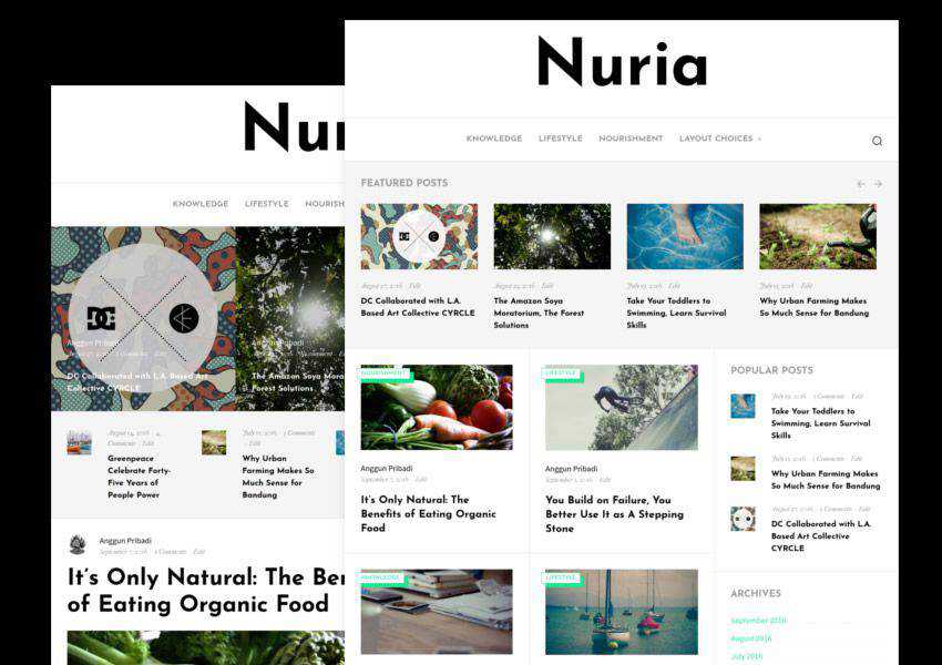
The Nuria theme is suitable for a variety of personal blogs. It features a minimal design paired with gorgeous typography. It’s easy to customize and comes with built-in SEO optimization, loads fast, and several widget areas.
The Ocean is a elegant theme for personal blogs with a feminine design. The homepage features a grid layout that displays your blog posts and you can easily add an Instagram widget. The theme is fully responsive and translation-ready.

The Bootstrap Blog theme is a lightweight, minimal, and free WordPress theme. You will find plenty of customization options, several layout options which include a slider layout as well as a standard blog layout, WooCommerce integration, and more.

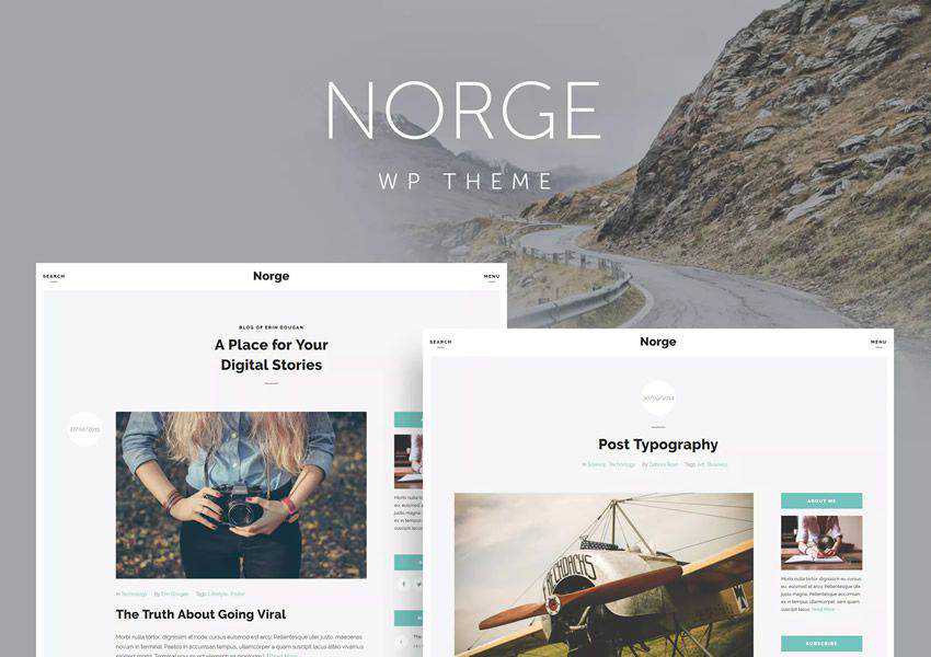
The Norge theme combines minimalist design with clean typography which makes for a very pleasant reading experience on all devices. The theme with sidebar and full width layouts, numerous widgets, shortcodes and support for different post types.
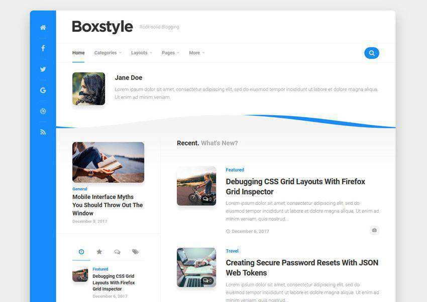
If you’re looking for a personal blog theme that has a unique design, consider the Boxstyle theme. It features a unique boxed layout with social media icons in a colorful sidebar so it’s sure to make your blog stand out.
The Ezy blog theme is compatible with Elementor and Gutenberg which means you will have no problems creating a unique layout for your pages. On top of that, the theme includes features such as modern and creative design, SEO optimization, slider section, featured post columns, footer options, and plenty of customization options.

The Lightly theme is a perfect choice if you want your blog to look like an online magazine. It has a grid based layout and bold typography that makes your content pop. The theme is also fully responsive and easy to customize.

The Lovecraft theme comes with a stunning header image which allows you to easily give your readers an immediate glimpse into your personality. The theme has a standard two-column layout and allows you to customize the colors, upload your own logo, and more.

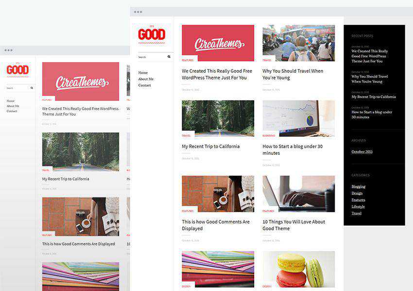
The Good theme has an interesting grid-based layout on the homepage. It allows you to upload your own logo and set your own brand colors. The theme is SEO-friendly and loadst fast.
Try the Olsen Light theme if you’re planning on launching a fashion or a beauty blog. With an elegant and feminine design, paired with custom widgets, customization options, and SEO-friendly code, the Olsen theme has everything you need to create a captivating blog.

This premium theme has a unique curvy design on the homepage and includes additional page layout for your portfolio. You can customize the theme using the built-in Live Customizer.

Eighties is a bold, one-column theme that’s perfect for personal blogs. The theme supports various post formats and you will also find large featured images that make it easy to share your stories in a visual way.

The Stylizer theme is perfect for anyone looking for a unique design. The theme is responsive so it will look great on all devices and it also comes with features such as related posts and post navigation, dark and light color switch, and more.

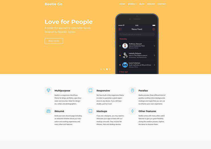
Consider the Beetle Go theme if you want a blog and the ability to showcase your portfolio and past projects. You can also use it as a resume theme. The theme comes with a plethora of customization options and elegant parallax scrolling.
The Hoffman theme is a beautiful minimal WordPress theme that’s best suited for personal bloggers or authors. The theme has a strong focus on typography and offers a responsive design and beautiful galleries.

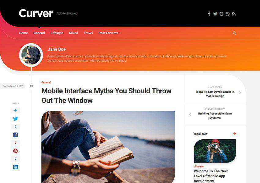
As the name suggests, the Curver is a personal blog theme with a unique colorful and curved look. The theme includes featured post slider, standard or list blog layout, and a unique author header profile.
Arba is a free WordPress theme for personal blogs. It has a minimal design and simple layout. The theme is also fully responsive and uses gorgeous typography for a much better user experience across all devices.

The Risa theme features a clean and classy look. It offers a number of different customization options and is SEO-friendly and translation-ready. On top of that, the theme includes support for different post formats: Standard, Aside, Image, Link, Gallery, and more.

Try the Signy theme if you’re a freelancer or creative professional that wants the ability to showcase your past projects on top of a blog. The theme comes with 4 different homepage layouts and 6 unique portfolio layouts.

The Invenio theme mimics the look of Tumblr blogs so it’s a great choice if you’re going for a more unique design. Invenio is also responsive and has support for multiple post formats.

The Upright theme is a grid-like theme with a strong focus on bold imagery., It supports a variety of content. You can create galleries and showcase past projects, and allow your visitors to enjoy your content on all devices thanks to the responsive design.

The Hemingway theme features beautiful typography and a standard two-column layout. The theme is fully responsive and has a minimal and clean design. You can easily customize the colors and fonts.

The Editor theme is geared toward personal bloggers and photo bloggers. It includes big typography and images, plus a tab-based sidebar with a place for a social links menu, featured posts, and a site logo.

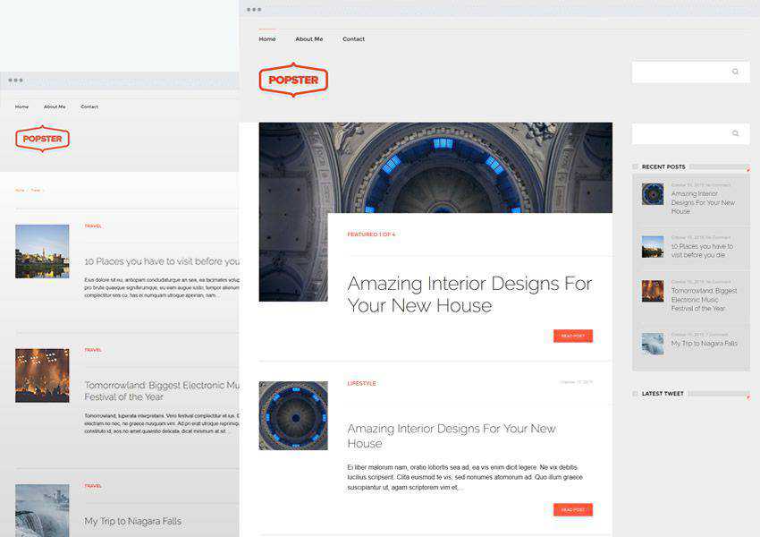
The Popster theme has a elegant layout and design that’s focused on beautiful typography. The theme is SEO-friendly and optimized to load fast. It’s also responsive and translation-ready.
The Vito theme is sure to grab the attention of your readers thanks to stunning animations and a minimal design that lets your posts stand out. The theme has a standard, two-column layout.

The Justread theme focuses on improved reading experience across all devices and fast loading times. It features an elegant blog layout and sticky sharing buttons so your readers can easily share your content.

The right personal blog theme will make it easy for your visitors to enjoy your content on any device. With features such as improved typography, responsive design, and stunning featured images, the themes on this list are a perfect starting point for your personal blog design.
The post The 20 Best Free Personal Blog Themes for WordPress appeared first on Speckyboy Design Magazine.
Twitter’s div Soup and Uglyfied CSS, Explained – Making sense of Twitter’s “ugly” source code.

README Gen – Use this tool to generate a README file for your GitHub projects.

10 WordPress Plugins for Email Marketing Management – Combine the power of WordPress with your favorite email service.

Surface Sampling in Three.js – Learn how to use the MeshSurfaceSampler in Three.js to create interesting effects.

You want enabling CSS selectors, not disabling ones – This quick tutorial will take you inside the world of “enabling” CSS selectors.

Taking Inspiration from the Humble Shopping Cart – The history and lessons behind this everyday object.

A Deep Dive Into The Wonderful World Of SVG Displacement Filtering – Dig into SVG animated displacement maps with this exampled-filled tutorial.

AI movie posters – This collection of movie posters was generated by AI, based on a brief description. Can you guess what they are?

An Interactive Guide to Keyframe Animations – Learn the various quirks behind CSS keyframe animations.

How to Help Your Clients Choose the Right eCommerce Payment Gateway – Things to consider before selecting this vital piece to an eCommerce website.

Week 19: Backflip 2 – A look behind the scenes of the Backflip font.

10 Best Stationery Templates for Creating Professional Documents – Make sure your print documents are immaculate by using one of these outstanding templates.

Icon Horse – This tool will help you access the favicon from any website.

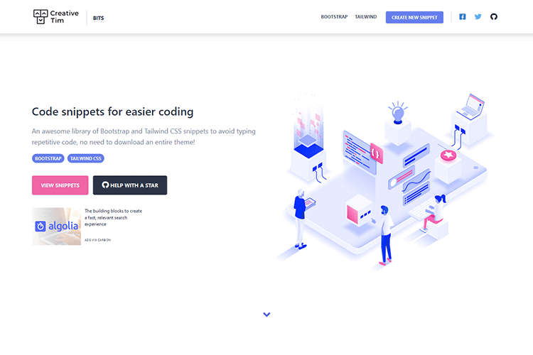
Bits – Check out this library of useful Bootstrap and Tailwind CSS snippets.
40 Free Photoshop Actions for Adding Vintage Effects to Your Photos – Easily add a vintage feel to your images with these handy Photoshop actions.

Styler – This CSS builder will help you build a hashnode blog with flair.

Basement Grotesque – Grab a copy of this new, extra-bold font inspired by 19th-century grotesque typefaces.

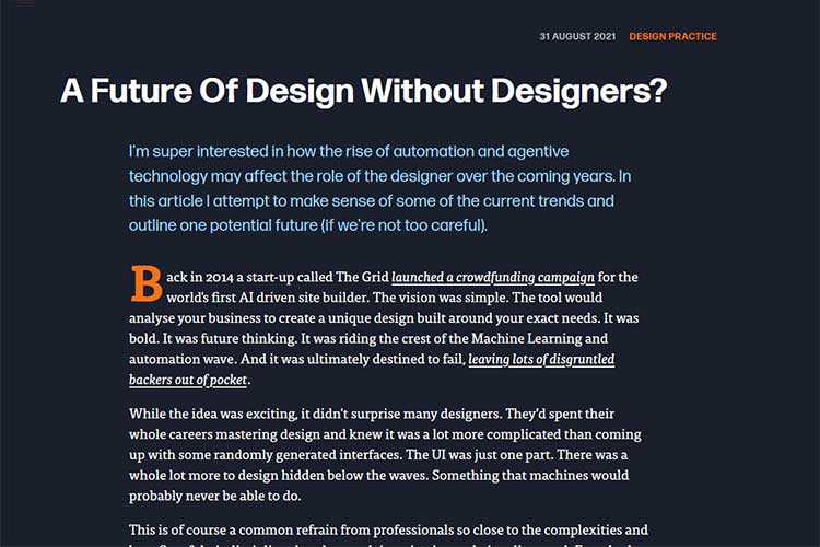
A Future of Design Without Designers? – The rise of automation and one of its potential outcomes.
Bootstrap Turns 10: A Look at Its Impact on the Web – A look at how the design framework has managed to continue its growth a decade in.

The post Weekly News for Designers № 609 appeared first on Speckyboy Design Magazine.
WordPress 5.8.1 is now available!
This security and maintenance release features 60 bug fixes in addition to 3 security fixes. Because this is a security release, it is recommended that you update your sites immediately. All versions since WordPress 5.4 have also been updated.
WordPress 5.8.1 is a short-cycle security and maintenance release. The next major release will be version 5.9.
You can download WordPress 5.8.1 by downloading from WordPress.org, or visit your Dashboard → Updates and click Update Now.
If you have sites that support automatic background updates, they’ve already started the update process.
3 security issues affect WordPress versions between 5.4 and 5.8. If you haven’t yet updated to 5.8, all WordPress versions since 5.4 have also been updated to fix the following security issues:
In addition to these issues, the security team would like to thank the following people for reporting vulnerabilities during the WordPress 5.8 beta testing period, allowing them to be fixed prior to release:
Thank you to all of the reporters for privately disclosing the vulnerabilities. This gave the WordPress security team time to fix the vulnerabilities before WordPress sites could be attacked.
For more information, browse the full list of changes on Trac, or check out the version 5.8.1 HelpHub documentation page.
The 5.8.1 release was led by Jonathan Desrosiers and Evan Mullins.
In addition to the security researchers and release squad members mentioned above, thank you to everyone who helped make WordPress 5.8.1 happen:
2linctools, Adam Zielinski, Alain Schlesser, Alex Lende, alexstine, AlGala, André, Andrei Draganescu, Andrew Ozz, Ankit Panchal, Anthony Burchell, Anton Vlasenko, Ari Stathopoulos, Bruno Ribaric, Carolina Nymark, Daisy Olsen, Daniel Richards, Daria, David Anderson, David Biňovec, David Herrera, Dominik Schilling, Ella van Durpe, Enchiridion, Evan Mullins, Gary Jones, George Mamadashvili, Greg Ziółkowski, Héctor Prieto, ianmjones, Jb Audras, Jeff Bowen, Joe Dolson, Joen A., John Blackbourn, Jonathan Desrosiers, JuanMa Garrido, Juliette Reinders Folmer, Kai Hao, Kapil Paul, Kerry Liu, Kevin Fodness, Marcus Kazmierczak, Mark-k, Matt, Michael Adams (mdawaffe), Mike Schroder, moch11, Mukesh Panchal, Nik Tsekouras, Paal Joachim Romdahl, Pascal Birchler, Paul Bearne, Paul Biron, Peter Wilson, Petter Walbø Johnsgård, Radixweb, Rahul Mehta, ramonopoly, ravipatel, Riad Benguella, Robert Anderson, Rodrigo Arias, Sanket Chodavadiya, Sergey Biryukov, Stephen Bernhardt, Stephen Edgar, Steve Henty, terraling, Timothy Jacobs, tmatsuur, TobiasBg, Tonya Mork, Toro_Unit (Hiroshi Urabe), Vlad T, wb1234, and WFMattR.Web design is a field that requires both technical knowledge and a sense of style. We not only have to envision the perfect page; we also have to build it.
This Yin and Yang is a challenge. How do you create a website that looks beautiful while also maintaining peak performance?
Over the years, it seems like the balance has been tilted toward the former. I’ve faced it in my own journey. For example, even though I know that massive image is going to bog down load times, it just looks so good.
But, on the modern web, is any visual enhancement worth implementing if it means taking a significant performance hit? Given the right approach, you shouldn’t have to.
It feels a bit ironic. Hardware continues to evolve in more powerful ways. Even mobile phones have multiple processor cores and tons of memory. Not to mention that broadband has become increasingly widespread.
Yet, we’re still told to eke out every possible millisecond of load time. Why?
It comes down to two reasons: short attention spans and Google. First, users don’t tend to stick around for a slow website to load. They’ll just find whatever they’re looking for elsewhere.
And with Google’s Core Web Vitals now influencing search rankings, well, performance is a pretty big deal. It could be the difference between getting found or forever lost in the nether regions of search engine results.
Plus, the web is no longer a novelty. To think that users will wait around for your fancy intro presentation (#RIP Flash) is unrealistic.
People visit your website for a specific purpose. Therefore, anything that gets in their way is probably not worth implementing.

As a designer, it’s easy to get into the habit of using bulky media files to enhance the look of a website. This has been the way of doing things for decades. Whether it’s a full-screen image or a video background, these items can be transformative. However, they can also hamper performance.
Thankfully, modern CSS and JavaScript can offer better alternatives. Each has features that can either replace media or make these files easier for browsers to digest.
Visual effects like CSS gradients and blend modes are great examples. They look just as good as anything you can whip up in Photoshop, yet without all the excess bloat.
If you’re looking to add movement, CSS animation and JavaScript libraries such as GSAP can fit the bill. Not only can they produce jaw-dropping looks, but these techniques are also lightning-quick.
In addition, lazy loading offers a nice compromise – at least for media that isn’t within the initial viewport of your page. Elements including images and iframes will only load when needed. This saves on load time while still enabling the use of these assets. Native browser support makes implementation easier than ever.
Smart use of these techniques can help you avoid dragging down performance for the sake of looks. Instead, you’ll achieve a more sustainable balance.

A website is more than just its looks, content, or functionality alone. It’s a cohesive user experience. That means each of these facets must come together to serve users.
In order to effectively do so, a website must also prioritize performance. Years ago, it might have been easier to get away with a great-looking site that was slow to load. Before powerful devices and fast internet, speed wasn’t necessarily a user expectation.
That’s changed dramatically. We now live in an on-demand world, one where everything we need is just a click away. If your website doesn’t deliver on that promise, it’s going to be difficult to build a lasting relationship with visitors.
Web designers need to change along with those expectations. In practice, it requires us to think long and hard about what visual elements we create and how we implement them. Doing things as we’ve always done them may no longer be viable.
Instead, everything must be done with an eye towards optimal performance. It’s a challenge, for sure. The good news is that we have the right tools and technologies to make it happen.
The post Web Designers No Longer Need to Sacrifice Performance for Beauty appeared first on Speckyboy Design Magazine.