Monthly Archiv: June, 2021
The WordPress plugin marketplace is seeing quite a bit of consolidation lately. And, even if you aren’t a close follower of the business side of things, it’s likely some of these moves will impact you.
For example, the recent sale of the wildly-popular Advanced Custom Fields plugin is a pretty big deal. The free version of the plugin is active on over a million websites. And that doesn’t even include those utilizing the commercial “PRO” version. It spent 10 years as a project of solo developer Elliot Condon. Now, it’s in the hands of the team at Delicious Brains.
Other plugins changing hands include GiveWP, Kadence Blocks and Kanban for WordPress. Then there was the controversial move in which WP User Avatar was purchased and rebranded into a completely different plugin. We could go on, but you get the idea – there has been a lot of movement.
What does this flurry of activity say about the state of WordPress and its future? The following are a few thoughts on what it all means. At least, according to this user’s perspective.
The WordPress Ecosystem Is Maturing
WordPress has been around since 2003 and has grown to dominate the market. During its rise to the top, many developers jumped into the surrounding ecosystem by releasing plugins.
In some cases, these plugins were a hobby or intended as a way to give back to the open-source project. Others looked at plugin development strictly as a business opportunity. Regardless of intent, the door was wide open for anyone with an idea.
Along the way, the growth of WordPress brought with it an explosion of use cases. What started out as simple blogging software became a full-fledged content management system (CMS). WordPress is now as likely to power a large enterprise site as it is a mom-and-pop business.
This has completely changed the game for a lot of plugin authors. User expectations are high. Stability and new features are paramount to success. Not to mention having to keep up with the massive changes to WordPress core.
Frankly, it’s becoming a lot harder for solo entrepreneurs or small development shops to manage a popular plugin. Supporting a large userbase while also focusing on the future could become overwhelming.
Thus, it’s not surprising to see that some of these products are being sold off to larger firms. We saw something similar happen with internet providers back in the early 2000s. The more mature the market, the harder it became for a small company to carry out its mission. Pretty soon, they were just about all bought up by corporate interests.
While that may not fully reflect the case here, it seems to at least be trending in that direction.

For Better or Worse, Large Developers Will Hold More Sway
It stands to reason that the more popular plugins a developer acquire, the more users they have access to. This provides companies with plenty of opportunities to upsell premium products and collect user data.
A company such as Automattic, owned by WordPress co-founder Matt Mullenweg, already had an edge in this area. They were humming along thanks to their do-it-all Jetpack plugin, among other offerings. But their 2015 acquisition of WooCommerce only added to their cachet.
The amount of product movement we see now makes it looks like more companies may join the party. It will take some time. But there might come a day when a typical business website runs plugins from perhaps only a few big development houses.
This may cause a bit of concern for some observers. Seeing the likes of Google, Facebook and Amazon push their weight around leads to thoughts of something similar happening with WordPress. A few big players simply set the rules for everyone else to follow.
However, there’s reason to believe things won’t become quite that dystopian. WordPress is, after all, an open-source application. Anyone with the talent and desire to build a plugin can still do so. It just may become more difficult to gain traction.

The Good and Bad of Consolidation
Consolidation is always going to be a part of business. With regards to WordPress, both themes and plugins will continue to change ownership for a variety of reasons. It’s something we should be used to by now.
But as some of the more widely-used plugins are bought and sold, we’re seeing more than just software changing hands. The entire ecosystem has the potential to change along with these moves.
On the one hand, user confidence and stability can (theoretically) be enhanced when a solo entrepreneur sells to a multi-person company. Web designers and website owners won’t have to worry quite so much about a plugin becoming extinct.
New ownership often means more resources to maintain, support, and extend the software. This could be a great thing for the WordPress community.
The potential downside is that consolidation will do to WordPress what it has traditionally done in other industries. That entails massive amounts of market share being gobbled up by a few large players, with everyone else hunting for scraps. The fear is that competition will shrink and that we may become too reliant on a small number of developers for the bulk of a site’s functionality.
Here’s hoping that a proper balance can be struck. In the long term, it’s in everyone’s best interest that the WordPress ecosystem be diverse, stable, and affordable. That will keep the CMS and its surrounding community both thriving and sustainable.
The post WordPress Plugin Acquisitions: What They Say About the Future appeared first on Speckyboy Design Magazine.
The PHP team is pleased to announce the first testing release of PHP 8.1.0, Alpha 1. This starts the PHP 8.1 release cycle, the rough outline of which is specified in the PHP Wiki.For source downloads of PHP 8.1.0 Alpha 1 please visit the download page.Please carefully test this version and report any issues found in the bug reporting system.Please DO NOT use this version in production, it is an early test version.For more information on the new features and other changes, you can read the NEWS file, or the UPGRADING file for a complete list of upgrading notes. These files can also be found in the release archive.The next release will be Alpha 2, planned for 24 Jun 2021.The signatures for the release can be found in the manifest or on the QA site.Thank you for helping us make PHP better.
Apple computers are known for their simplicity in design and excellence in performance. These are the two basic reasons that entice web designers and developers to use Macs as their work computer.
There are oodles of third-party applications out there for web designers and web developers who use Macs. In this article, we share with you the top ten web design apps for Mac that web designers/developers will find useful.
Though not all of them are exclusively for Macs, they are all built with Mac users in mind (and not haphazardly ported over for compatibility).
1. Seashore
![Seashore]()
Seashore is an open-source image editor that utilizes the Mac OS X’s Cocoa Framework. It’s a full-fledged image editor that gives Photoshop a run for its money. Seashore provides a ton of features for its end-user including various textures, gradients, and anti-aliasing for its text and brush tools. Along with those great options, it also supports editing over multiple layers and alpha channels. It’s an awesome image editor for Mac users on a budget.
![Coda]()
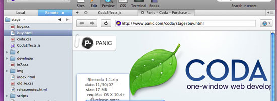
Coda can be the sole reason for switching to a Mac as a web designer; it is an extremely well-done and intuitive application that makes the web development workflow a breeze. It was designed to compartmentalize website-building processes and for team collaboration. Coda isn’t free, but at less than a hundred dollars, you get a lot of bang for the buck.
![TextMate]()
TextMate is an comprehensive text editor application designed exclusively for the Mac computer; it is the premier example of how text editors should function. A premium application, a MUST have for all web designers.
![Paparazzi!]()
Paparazzi! is a basic tool for the Mac OS X which enables the user to take screenshots of entire web pages without any external editing. This tool relies on the Cocoa API and WebKit framework, written in C. A great tool for designers who need to capture entire web pages for design mockup presentations or as web graphics on a site they’re making.
5. Nvu
![Nvu]()
Nvu is a high-performance WYSIWYG (What You See Is What You Get) editor built around Gecko (the rendering engine for Mozilla-based browsers). This application runs on Mac OS X 10.2.8 or later which makes web designing a cinch even to beginning-level web builders.
![Think]()
Think is an excellent application for making you focus on the task at hand. This application creates an ‘Illumination Panel’ that replaces the Mac OS dock by creating a list of applications that you use to select the application you want to ‘Focus’ on. This is an essential application for those that are easily distracted by other things such as Instant Messaging, Twitter, and emails.
![Aquamacs Emacs]()
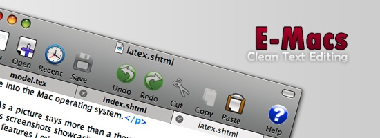
Aquamacs Emacs is an extended version of the original and robust Emacs text editor with an addition of the new Aqua look-and-feel making the application blend right into the Mac OS X user interface. This editor is perfect for people who work with HTML, LaTeX, C/C++, Java, Python, Perl, Ruby, PHP and much more.
8. Xee
![Xee]()
Xee is a straightforward application for browsing your images. This app can be considered as a replacement for Preview or any other default image viewer pre-installed on the Mac OS X. It’s sleek, fast, and uses very little system resources. Loads of shortcuts and a nice streamlined user interface add to its list of features.
![Scribus]()
Scribus is an open source application for creating high quality page layouts for Mac and Linux users. Scribus has an intensive feature set under its clean and impressive GUI. Some of its publishing features include: CMYK Color, Separations, ICC Color management, and flexible PDF Authoring and Editing.
![Smultron]()
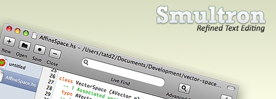
Smultron is a gratis text editor which can be considered as a replacement for the default text editor that comes along with the Mac. Smultron is quite versatile and easy to use. It is meant to be used on the Mac OS X Leopard 10.5. The editor can be used as a basic text to a complete HTML & Script editor.
What are your favorite web design applications?
Do you have a favorite Mac application that you can’t live without? Do you have experience with the above list of applications? Please share your thoughts in the comments – we’d love to hear them!
Related Content
The post 10 Apps for Web Designers Using a Mac appeared first on WebFX Blog.
WordPress 5.8 Beta 1 is now available for testing!
This software is still in development, so it is not recommended to run this version on a production site. Instead, we recommend that you run this on a test site to play with the new version.
You can test the WordPress 5.8 Beta 1 in two ways:
The current target for the final release is July 20, 2021. This is just six weeks away, so your help is vital to ensure this release is tested properly and as good as it can be.
Keep your eyes on the Make WordPress Core blog for 5.8-related developer notes in the coming weeks, breaking down these and other changes in greater detail.
So what’s new in this 5.8? Let’s start with some highlights.
Highlights
Powerful Blocks
- Discover several new blocks and expressive tools, including blocks for Page Lists, Site Title, Logo, and Tagline. A powerful Query Loop block offers multiple ways for displaying lists of posts and comes with new block patterns that take advantage of its flexibility and creative possibilities.
- Interacting with nested blocks has been made easier with a permanent toolbar button for selecting a parent. Block outlines are shown when hovering or focusing on the different block type buttons. Block handles are now also present for drag and drop when in “select” mode.
- Introduces the List View, a panel that can be toggled and helps navigate complex blocks and patterns.
- Reusable blocks have an improved creation flow and support for history revisions.
- A cool new duotone block adds images effects which can be used in media blocks or supported in third-party blocks. Color presets can also be customized by the theme.
Handpicked Patterns
Patterns can now also be recommended and selected during block setup, offering powerful new flows. Pattern transformations are also possible and allow converting a block or a collection of blocks into different patterns.
New collection of Patterns and an initial integration with the upcoming Pattern Directory on WordPress.org.
Better Tools
- New template editor that allows creating new custom templates for a page using blocks.
- Themes can now control and configure styling with a theme.json file, including layout configuration, block supports, color palettes, and more.
- New design tools and enhancements to existing blocks, including more color, typography, and spacing options, drag and drop for Cover backgrounds, additions to block transformation options, ability to embed PDFs within the File block, and more.
- Includes improvements to how the editor is rendered to more accurately resemble the frontend.
Internet Explorer 11
Support for Internet Explorer 11 is ending in WordPress this year. In this release, most of those changes are being merged so use the Beta and RC periods to test!
Blocks in Widgets Area
Looking for a change and can’t find it? There are more improvements listed after the break.
How You Can Help
Do some testing!
Testing for bugs is an important part of polishing the release during the beta stage and a great way to contribute.
If you think you’ve found a bug, please post to the Alpha/Beta area in the support forums. We would love to hear from you! If you’re comfortable writing a reproducible bug report, file one on WordPress Trac. That’s also where you can find a list of known bugs.
Thanks for joining us, and happy testing!
Props to @audrasjb, @cbringmann, @youknowriad, @annezazu, @matveb, and @desrosj for editing/proof reading this post, and @chanthaboune for final review.
Full Site Editing
Coming at the end of year
But first, Beta 1
Improvements in this Release
- Improvements to Reusable blocks, Cover block, Table block, List View, Rich text placeholder, Template Editing Mode, Block Inserter, and Top Toolbar
- Query loop block that uses a query/filter to create a flexible post list based on templates. Best used with patterns.
- Parity refinement between editor and frontend, Standardization to block toolbars organization
- Block widgets in the Customizer
- Introducing the Global Styles and Global Settings APIs: control the editor settings and available customization tools and style blocks using a theme.json file.Template editor opens inside an iframe to more accurately resemble the front end.
- Ability to transform Media and Text into Columns
- Embedded PDFs within File block
- Spacing options for Social Links and Buttons, Spacer block width adjustments
- Twemoji has been updated to version 13.1, bringing you many new Emoji.
- Editor performance improvements
- Hide writing prompt from subsequent empty paragraphs
- More descriptive publishing UI
- Added capability to set the default format for image sub-sizes as well as WebP support
- Added widgets block editor to widgets.php and customize.php
- Added block patterns to default themes
- Added ability to mark a plugin as unmanaged
- Enable revisions for the reusable block custom post type
- Enqueue script and style assets only for blocks present on the page
- Abstracted block editor configuration by deprecating existing filters and introducing replacements that are context-aware
- New sidebars, widget, and widget-types REST API endpoints
- Added support for modifying the term relation when querying posts in the REST API
- Site Health now supports custom sub-menus and pages
- Themes now display the number of available theme updates in the admin menu
- Speed cached
get_pages() calls - Underscore updates from 1.8.3 to 1.9.1
To see all of the features for Gutenberg release in detail check out these posts: 10.0, 10.1, 10.2, 10.3, 10.4, 10.5, 10.6, and 10.7. In addition to those changes, contributors have fixed 215 tickets in WordPress 5.8, including 88 new features and enhancements, with more bug fixes on the way.
Testimonials are a very powerful, yet underutilized, internet marketing tool that helps businesses build credibility, alleviate concerns, and convert prospects into clients. Adding client testimonials to your website can be an extremely effective way to establish trust and strengthen your company’s reputation.
The traditional layout, structure, and design elements of a testimonials page usually consist of customer reviews arranged in a list style that is redundant and unattractive for users. This is because a lot of companies don’t view client testimonials as being an integral part of achieving success on the web. We have compiled 13 great testimonial page examples to show you how useful these pages can be when designed appropriately for your website.
Don’t get me wrong: including testimonials anywhere on your website is better than having none at all. However, they may prove to be a lot more valuable to your web strategy if you step outside of the traditional formats used for client reviews and create a custom-tailored approach.
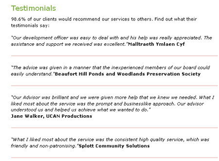
![traditional-testimonials]()
Why You Should Display Testimonials Throughout Your Site
If your company worked hard over the years and earned a collection of awards and certifications, would you display them on a shelf that very few people see? Hopefully the answer is no. I’m not saying that you should dust off every single award your company has ever received and pack them into your waiting room, but it certainly doesn’t hurt to put one or two of your proudest achievements on display.
Rather than hoping that your site’s visitors are going to click on your testimonials page and read about the great work you’ve done, put some of your most prestigious achievements at the bottom or in the sidebar of every page. For example, we display the following bar at the bottom of some of the pages on our site:
![testimonial bar]()
We opted to display this particular testimonial because we think it shows potential clients what we can do, and they can click to read more if they choose.
By putting testimonials on each page, you can ensure that a large percentage of your site traffic knows how trustworthy your company is, even if they don’t go to your testimonials page. When you site traffic does go to your testimonials page, though, keep in mind that this page is a great place to think outside the box and showcase more than an otherwise dull and monotonous list of customer reviews.
In today’s fast-paced world, it’s no longer the job of the consumer to research brands and products before making a commitment. They expect companies to provide that information for them. This isn’t because consumers are lazy or unable to gather the information on their own, it’s because consumers now have the ability to navigate from website to website, evaluating and comparing brands with the click of a mouse rather than traveling from store to store.
Word-of-Mouth: The Most Persuasive Way to Sell Your Brand
The primary function of a website is to promote your brand or products on the web so that you can expand your reach and increase conversions… but wouldn’t you rather have other people promote your brand instead? The best way to sell your brand to potential customers is to let your current and past customers do the selling for you.
An excellent way to accomplish this is to integrate client testimonials and customer reviews into the central theme and layout of your website. Testimonials aren’t something to hide – they are something to be proud of and share with others. Modern websites use seamless web designs to flaunt their customer reviews via live social media streams, content sliders on the homepage, video testimonials, case studies, and much more.
Below is a list of 13 websites that demonstrate a variety of attractive, persuasive and creative applications for testimonials. I’ve also included highlights of sections or design elements that I found particularly unique and useful.
1. xero.com
![Customer Case Studies I Xero Accounting Software - www_xero_com_customers]()
The full package! Xero’s website includes testimonial snippets on the homepage with customers’ photographs, the testimonial page includes videos, quotes, client names, industry, testimonial content slider, and read more buttons that take you to a full Q&A page for that individual case study.
2. desk.com
![www_desk_com_customers]()
Desk.com does a phenomenal job using typography, color and balance to create a layout that’s extremely clean & structured. There are three types of testimonials here: featured testimonials (logo, quote + video), regular testimonials (logo + quote) and case study testimonials (summary, quote + read more button that links to a newsletter-type PDF for each client).
3. cloversites.com
![www_cloversites_com_clover-reviews]()
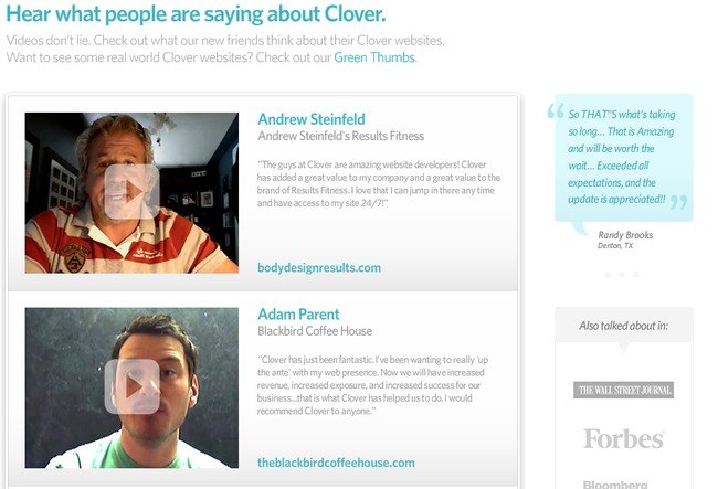
Another great use of color and fonts. Clover’s testimonials include client names, company names & client reviews along with video testimonials, an attractive sidebar quote bubble and additional PR sources.
4. freeagent.com
![www_freeagent_com]()
FreeAgent does a nice job segmenting the types of reviews into multiple tabs. These tabs include a Buzz tab (overview of quotes + video), User Testimonials tab (headline snippet for each testimonial, detailed testimonial, client name, photograph, company name + “Twitter Love” section with Twitter reviews), Case Studies tab (challenges, solutions & results for each company, photograph, additional company information) and a Press Reviews tab (reviews featured in magazines + links to additional reviews on the web). Personalizing testimonials with photographs is a great way to let your audience know that your testimonials are credible.
5. thesocialagency.ca
![www_thesocialagency_ca_testimonials_html]()
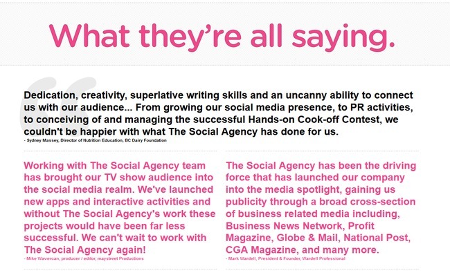
The testimonials page has a simple layout with blockquotes, but the homepage is what I’m really impressed with…the reviews are the center of attention! The Social Agency has a simple, yet attractive content slider with graphics, quotes, company names and employee’s names & positions.
6. shoeboxed.com
![www_shoeboxed_com_sbx-home_1]()
Most of the time, people don’t like reading through paragraph-long testimonials to get to the meat of what past clients are saying about you. That’s why Shoeboxed.com has such a great testimonials page – it’s short and sweet. By fitting short client quotes in a neat layout, Shoeboxed makes it easy for potential customers to read through a lot of testimonials in just a little bit of time.
7. postmarkapp.com
![blog_postmarkapp_com_tagged_customer_stories]()
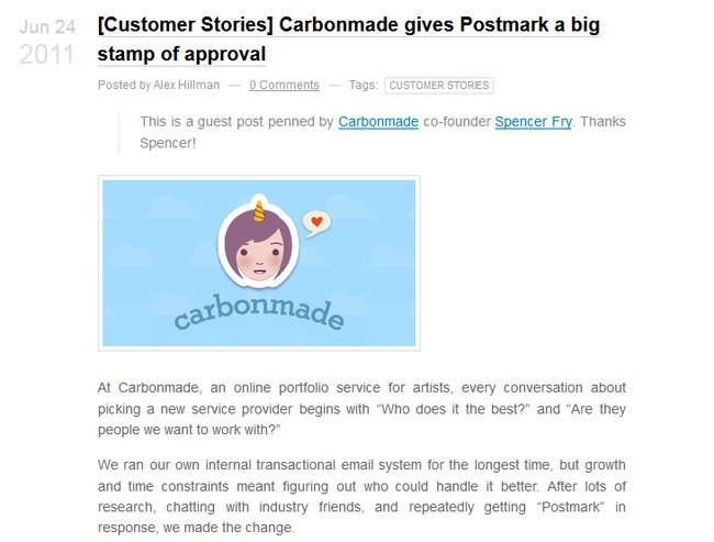
You may not need to display all of your client testimonials if you are receiving a lot of positive feedback. Rather, you can be more selective in which testimonials you want to display. A good strategy to implement at this point is to feature testimonials that incorporate a realistic client perspective.
For example, Postmark’s testimonial above discusses the realistic way that people ask around for coworkers’ and friends’ recommendations. Potential customers reading this testimonial could think to themselves, “I’ve done that before,” and realistically believe that Postmark is a good company to work with.
8. psd2html.com
![www_psd2html_com_testimonials_html]()
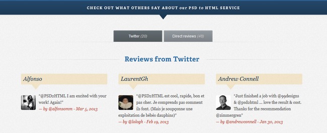
PSD2HTML’s testimonials demonstrate why a certain knowledge of color contrast is beneficial when it comes to designing your client reviews page. The navy blue and beige colors of PSD2HTML contrast well together, without hurting site visitors’ eyes. Also, as you may have noticed, these reviews are coming straight from a live feed to Twitter. This feature allows the testimonial to update quickly, keeping them current and further establishing PSD2HTML’s credibility.
9. shopify.com
![www_shopify_com]()
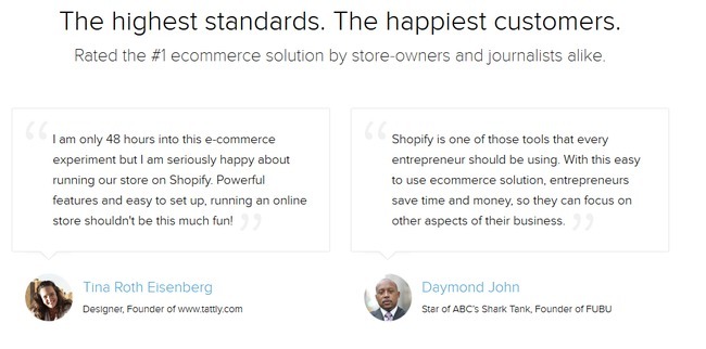
Shopify’s client testimonials go the simple and elegant route. Using minimal color and focusing more on a few select font sizes, Shopify allows readers to focus all of their attention on the past customers’ words, rather than the design that encapsulates them. To keep the reviews from being too dull, though, they personalize them with pictures of the customers who provided the reviews.
10. studiopress.com
![www_studiopress_com]()
StudioPress, as a designer of themes for the blogging site WordPress, incorporates a more design-oriented atmosphere to its testimonials page. Not only can StudioPress show off its excellent customer reviews, but it can do so in a way that also shows off the site’s designing abilities.
11. picplum.com
![www_picplum_com_tour]()
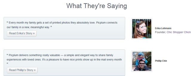
PicPlum also incorporates the main service of its website into its client testimonials page. As a photography-centered business that prides itself on the high-quality images it can deliver to individuals and families alike, PicPlum chooses to incorporate high-quality images into its testimonials page. This shows potential customers that not only do past clients like using PicPlum, but also that PicPlum has the skills to deliver what the website promises.
12. mediatemple.net
![rsz_mediatemple_net_company_clients]()
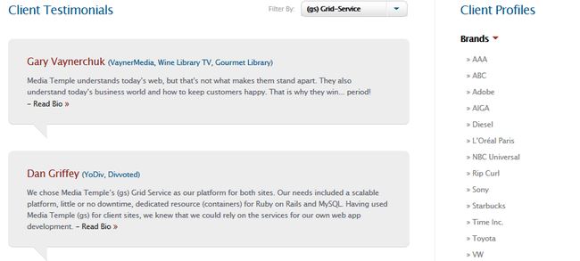
MediaTemple.net is another great example of how well a minimalist approach to a testimonials page can work. While it seems that these past customers have a lot of good things to say about MediaTemple, the testimonials only snapshot a few lines of the customers’ reviews. However, a “Read Bio” link is included to allow interested readers to learn more about how MediaTemple helped out these past clients.
13. cloudflare.com
![rsz_www_cloudflare_com_testimonials]()
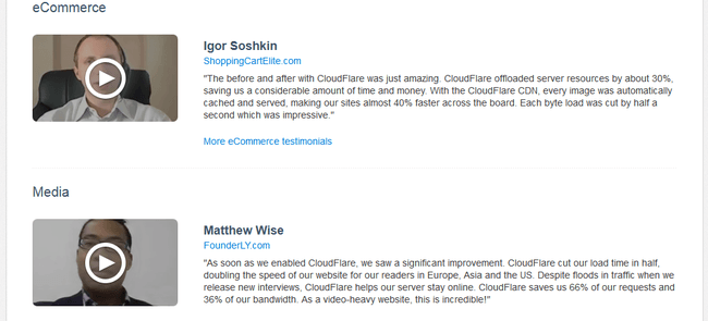
CloudFlare.com has a little bit of everything as far as customer reviews go. By implementing a minimalist approach, but also using lengthy quotes and videos of customer reviews, the site portrays a lot of information in an unintimidating way. CloudFlare has also divided the testimonials into categories based on the kinds of services the customers received. This can be a great strategy for websites that offer a wide variety of services.
What Have We Learned from the Examples of Testimonials?
Testimonials are important! By presenting reviews of past customers you show potential customers that others have been grateful for your service in the past. Testimonials can be a great way to present your expertise in your field. If you are a photographer, include high-quality images next to your client reviews. If you are a design firm, include some artistic and intriguing design elements in your testimonials layout. Don’t just view your testimonials page as a place for words. View it as its own sphere of influence.
You can even include the general locations of your previous customers so prospective clients can see how broad your company’s customer base extends. If your business prides itself on being a mom-and-pop shop, include the locations and testimonials of local area residents. If your company is expanding to international locations and you want to attract business from a wide range of geographical areas, include that information too! Potential customers like knowing where your past clients have lived. It helps them feel like they know more about the places you have influenced.
Don’t forget – you should include testimonials throughout your website and not limit them to your testimonials page. Don’t hope prospective customers will see your reviews. Make them see your reviews.
And lastly, always remember to think like your site’s visitors. Would you buy your product if all you had to go off of was your testimonials page and existing customer recommendations? I hope so. If not, consider redesigning how your testimonials are presented, how lengthy the reviews are, and how your testimonials are connected to your social networking sites. If any page on your site is worth the time and money to redesign, it’s this one.
The post 13 Inspiring Testimonial Pages appeared first on WebFX Blog.
Package:
Summary:
Run PHP scripts in parallel using the CLI version
Groups:
Author:
Description:
This package can run PHP scripts in parallel using the CLI version...
Read more at https://www.phpclasses.org/package/12108-PHP-Run-PHP-scripts-in-parallel-using-the-CLI-version.html#2021-06-08-05:41:25

Latest PECL Releases:
- PAM 2.2.3
Fix minimum version of php and pear installer
- PAM 2.2.2
Add missing globals init and other minor fixes
- PAM 2.2.1
PHP 8.0 support with other features
- pcov 1.0.9
- Fix #67 huge memory consumption to generate coverage
- zip 1.19.3
- Fix #80648 Fix for bug 79296 should be based on runtime version (cmb, Remi)
- Fix #80863 ZipArchive::extractTo() ignores references. (cmb)
- Tensor 3.0.00
- No changes
- protobuf 3.17.2
* No new changes in 3.17.2
Xdebug Update: May 2021
London, UK
Tuesday, June 8th 2021, 08:56 BST
Another monthly update where I explain what happened with Xdebug development in this past month. These will be published on the first Tuesday after the 5th of each month.
Patreon and GitHub supporters will get it earlier, around the first of each month.
You can become a patron or support me through GitHub Sponsors. I am currently 51% towards my $2,000 per month goal. If you are leading a team or company, then it is also possible to support Xdebug through a subscription.
In May, I worked on Xdebug for about 25 hours, with funding being around 30 hours.
Xdebug 3.1
I'm continuing to track PHP 8.1's development and have now added support for Fibers in the debugger. I have not spend time adding support for the new Enum yet, but that should happen soon. I suspect that more work to make Xdebug PHP 8.1 compatible is going to be required in the future too.
After meeting with a developer of the PHP Debug Adapter for Visual Studio Code, I've started to work on some of the things that he raised. For example, there is now a new protocol feature that makes Xdebug include information about the breakpoint that was hit.
He also raised a bug where Xdebug truncates log messages and with UNC paths. I have fixed the first one, but the second one requires more investigation and a "clever solution".
Xdebug Videos
I have published another videos on how to use Xdebug on my YouTube channel.
This one deals about Debugging the Symfony Demo App in Docker with VS Code.
I have been working on another animated video where I explain how to activate Xdebug's features with triggers and settings. This should come out in the next few weeks.
If you would like to see a 5 to 10 minute long video on another specific topic, feel free to email me at derick@xdebug.org.
Xdebug Cloud
Xdebug Cloud is continuing to operate as Beta release, and provides an easy way to debug your PHP applications with Xdebug, without having to deal with complexities with regards to networking.
Packages start at £49/month, and revenue will also be used to further the development of Xdebug.
If you want to be kept up to date with Xdebug Cloud, please sign up to the mailinglist, which I will use to send out an update not more than once a month.
Business Supporter Scheme and Funding
In May, no new supporters signed up.
If you, or your company, would also like to support Xdebug, head over to the support page!
Besides business support, I also maintain a Patreon page and a profile on GitHub sponsors.
Package:
Summary:
Manipulate matrices with Lapack and Blas libraries
Groups:
Author:
Description:
This package can manipulate matrices with Lapack and OpenBlas libraries...
Read more at https://www.phpclasses.org/package/12105-PHP-Manipulate-matrices-with-Lapack-and-Blas-libraries.html#2021-06-07-23:09:22

Package:
Summary:
Service to format dates in the Hirji calendar
Groups:
Author:
Description:
This package provides a service to format dates in the Hirji calendar
It extends the Illuminate service class to provide the Carbon Hijri functionality to format a date and the time in the Hirji calendar...
Read more at https://www.phpclasses.org/package/12093-PHP-Service-to-format-dates-in-the-Hirji-calendar.html


