Monthly Archiv: May, 2021
As more WordPress websites are built using the Gutenberg block editor, the wish list for new features grows along with it. That makes sense, as heavier usage tends to expose any shortcomings or “wouldn’t it be great if…” types of ideas.
The editor is improving all the time. But even if a missing feature doesn’t make its way into WordPress core, the developer community is free to build their own solutions. Take, for example, the ability to hide a specific block or schedule it to display at certain times.
This could come in handy for a number of common scenarios. For one, it allows you to work on a piece of content without making it public until you’re ready to launch. Or set up a limited-time event such as a contest or meeting that requires some temporary content to display.
One solution for achieving this is Block Visibility, a free WordPress plugin that allows content creators to take control of their blocks. Any blocks within a page can be hidden or displayed based on a variety of criteria. Plus, it integrates seamlessly into the block editor’s UI.
Want to learn more? Let’s take a look at a few different ways you might utilize Block Visibility on your own WordPress website.
Getting Started
Before we dig into what Block Visibility can do, there are a few prerequisites to keep in mind. Thankfully, they’re quite minimal.
First, you’ll need a WordPress website that utilizes the Gutenberg block editor. If you happen to have the Classic Editor plugin installed, make sure you’ve set it to allow for switching between editors.

Beyond that, you’ll want to install and activate a copy of Block Visibility. Inside WordPress, navigate to Plugins > Add New and search for the plugin.
That’s all there is to it!
Navigating Block Visibility
At its most basic, Block Visibility enables you to simply hide one or more blocks on a page or post. But there’s also a fairly comprehensive UI included with the plugin. Therefore, it’s good to know your way around.
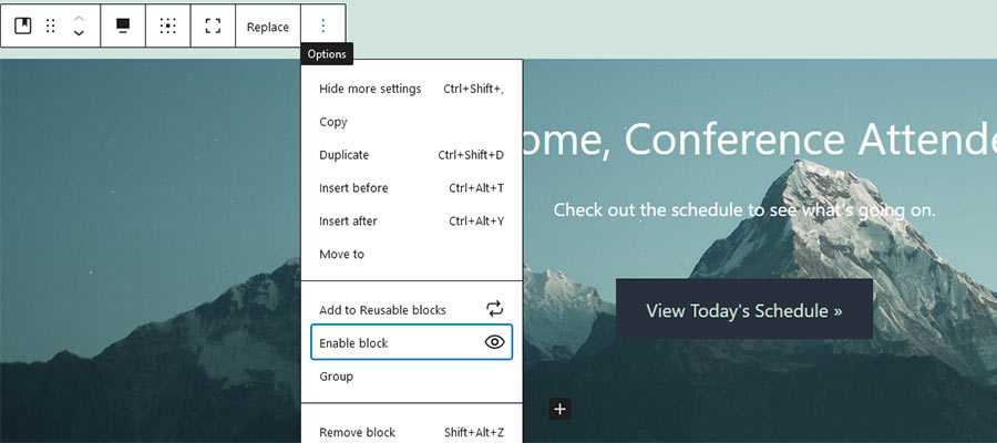
First, within each block’s Options menu, there is a “Hide block” entry. It does exactly what it says – no need for a lot of explanation. Although, we’ll provide a demonstration below.
Then, on block editor’s Settings sidebar, there is a “Visibility” panel. This is where things get a bit more detailed.
This section allows you to hide or display a block based on a number of scenarios. Criteria such as user role, screen size and date/time are available. In addition, block visibility can be controlled based on the value of custom fields as well.
Plugin Settings
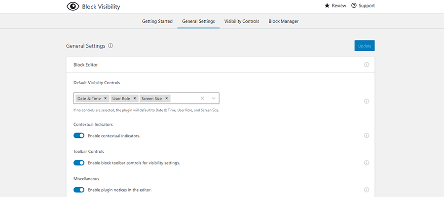
We should also note that you can further tweak what Block Visibility can do via its settings screen, Settings > Block Visibility.
The settings screen lets you choose which block types have visibility controls, the types of visibility criteria available and which user roles can make changes. You can even set breakpoints for controlling visibility via screen size.
If you need a helping hand, the included “Getting Started” tab will fill you in on common tasks.
A Multitude of Ways to Hide a Gutenberg Block
Now that we’ve covered the basics of Block Visibility, it’s time to see it in action. The plugin’s functionality ranges from super-simple to semi-complex, depending on your needs.
Here are a few examples of the various ways to hide a Gutenberg block.
Just Hide a Block
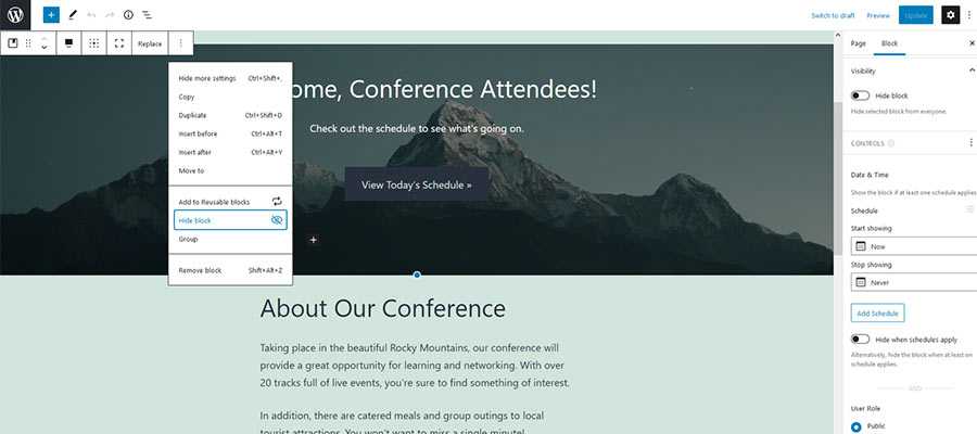
To hide a block from the front end of your website, click on the “Hide block” entry on the block’s Options menu.
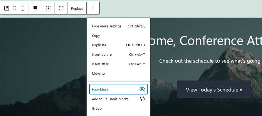
A dialog will appear confirming that the block has been hidden. In addition, the block in question will be shaded so as to look inactive. A decorative icon will also appear on the upper right corner. Just remember to save your changes!
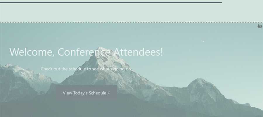
On the front end, our example Cover block has indeed been hidden. In fact, the block is not rendered at all. Thus, there’s no negative impact on performance.
As an aside, the only time a hidden block will appear in the source code is when you’ve chosen to hide it based on screen size. In all other scenarios, it will be completely removed from the front end.
Conditionally Hide or Display a Block
To hide or display a block based on conditional criteria, you’ll want to utilize the “Visibility” panel. It can be found within the Settings sidebar on the right of the screen. Click on the block you want to modify and open up the panel to get started.
Inside, there are a number of ways to set the visibility of a block:
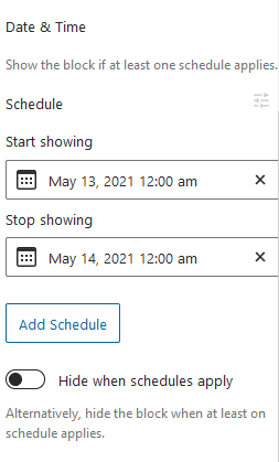
Date & Time
This setting allows you to display (or hide) a block within a specific date and time range. On our fictional conference website, we’ve chosen to display the selected Cover block for just 24 hours. Note that multiple schedules can be set per block.
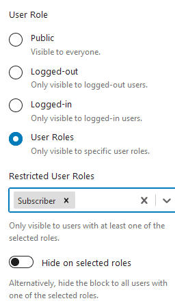
User Roles
It’s also possible to display a block based on a user’s role or login status. The default setting is “Public”, which displays to everyone. However, you may also choose to display a block to logged-in or logged-out users, or just to those who belong to a specific user role.
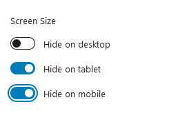
Screen Size
For occasions when you want to target only specific screen sizes, Block Visibility makes it easy to do so. You can choose to hide blocks on desktop, tablet or mobile devices. Custom breakpoints can be set in the aforementioned Settings > Block Visibility screen within WordPress.
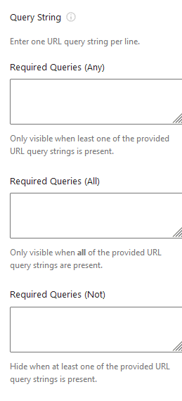
Query String
Hidden by default, the Query String setting can display a block based on the presence of any particular query strings in the post’s URL. You can enable this setting via the settings screen (Settings > Block Visibility) or by clicking on the “Controls” link within the Visibility panel. The plugin documentation has a quick tutorial on the subject.
It’s also worth mentioning that you can combine one or more of the above conditions to exercise fine-grain control over a block’s visibility. For instance, you might schedule a block to display within a specific time range AND only on desktop devices. That’s just one of many possibilities, however.
Display a Hidden Block
Whenever you want display a hidden block, go back to its Options menu and select “Enable block”. Alternatively, you may also uncheck the “Hide block” setting within the Visibility panel.
Take Control of Your WordPress Gutenberg Blocks
On the surface, Block Visibility may seem like a fairly simple WordPress plugin. Yet it can help you perform some advanced functions with only a few clicks. Previously, it would have taken quite a bit of custom code to pull off similar feats with your site’s content.
Plus, hiding a block is one of those things that might be considered a missing feature of Gutenberg itself. Thankfully, this is just another example of the developer community coming in to fill the gap.
The post An Easy Way to Edit Block Visibility in the WordPress Gutenberg Editor appeared first on Speckyboy Design Magazine.
Package:
Summary:
Perform network queries using the SNMP protocol
Groups:
Author:
Description:
This package can perform network queries using the SNMP protocol...
Read more at https://www.phpclasses.org/package/12083-PHP-Perform-network-queries-using-the-SNMP-protocol.html#2021-05-17-20:43:54

What are responsive images? These types of images change in size to adapt to different screen sizes, like on a desktop, tablet or different cell phones. With the infinite types of screen displays and sizes, it’s essential that you have responsive images. In this tutorial, you will learn the simplest technique to learn how to make images responsive.
![Responsive images demo page]()
View Demo
Download Source
There are many responsive image techniques, and they vary in complexity and level of browser support.
An example of a complicated way of implementing responsive images is using the srcset attribute, which requires multiple images, more markup, and the reliance on a new HTML attribute that’s not well-supported outside of modern browsers.
In contrast, the method covered in this tutorial is simple and relies only on the CSS width and height properties, which means the method will work on virtually all browsers and devices. It will, however, require that the web design’s layout is a fluid/responsive layout.
You’ll get to see several variations of the responsive image technique discussed in this tutorial, but the foundational concept is the same: Using CSS, give images a percentage-length unit (or any relative-length unit, e.g. ems) for their width property and then give their height property a value of auto.
img {
  width: 100%;
  height: auto;
}
Basic Responsive Image
Let’s start with a basic example.
We have a div that acts as the container of an <img> element.
HTML
<div class="container">
  <img src="image01.jpg" width="960" height="640" />
</div>
The container has a width property of 96% so that it has left and right margins. It has a max-width of 960px so that the layout is not too wide on large screens.
The <img> element within the container has a width property of 100% so that its width is always equal to its container regardless of the viewport’s size, thus making it responsive. The height is set to auto so that the image proportionally scales.
CSS
div.container {
  width: 96%;
  max-width: 960px;
  margin: 0 auto; /* to center the container */
}
img {
  width: 100%;
  height: auto;
}
View example
Note that the <img> element will be responsive even if it was given fixed width and height HTML attributes in the markup (i.e. width="960" height="640"). This is great because it means that this technique is suitable for legacy content that have fixed dimensions set via HTML.
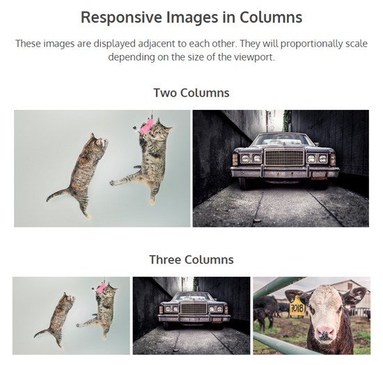
Responsive Images in Columns
Sometimes we want images to display side-by-side in columns. For example, image galleries often display thumbnails on a grid.
To achieve responsive images in columns, the only change we have to do is lower the CSS width property and give <img> elements a display property value of inline-block.
Let’s discuss a couple of layout schemes: A two-column image layout and a three-column image layout.
Two-column Responsive Image Layout
For a two-column responsive image layout, we can set the CSS width property to 48%, or roughly one-half of the container. The reason it’s not set to 50% is to give the images margins on their sides.
HTML
<div class="container">
  <img src="image01.jpg" width="960" height="640" />
  <img src="image02.jpg" width="960" height="640" />
</div>
CSS
img {
  width: 48%;
  display: inline-block;
}
Three-column Responsive Image Layout
For a three-column responsive image layout, the concept is the same, we just need to set the width property to about one-third of the container’s width: 32%.
HTML
<div class="container">
  <img src="image01.jpg" width="960" height="640" />
  <img src="image02.jpg" width="960" height="640" />
  <img src="image03.jpg" width="960" height="640" />
</div>
CSS
.three-columns {
  width: 32%;
  display: inline-block;
}
View example
Images with Conditional Breakpoints
It’s a good idea to have conditional breakpoints for responsive images that are displayed in columns so that when the images get too small, the columns will collapse.
We’ll need media queries to make this happen.
In the following example, the images will display in one column on smartphones, two columns on tablets, and four columns on larger screens.
HTML
<div class="container">
  <img src="image01.jpg" width="960" height="640" />
  <img src="image02.jpg" width="960" height="640" />
  <img src="image03.jpg" width="960" height="640" />
  <img src="image04.jpg" width="960" height="640" />
</div>
CSS
/* For small devices (e.g. smartphones) */
img {
  max-width: 100%;
  display: inline-block;
}
/* For medium devices (e.g. tablets) */
@media (min-width: 420px) {
  img {
    max-width: 48%;
  }
}
/* For large devices (e.g. desktops) */
@media (min-width: 760px) {
  img {
    max-width: 24%;
  }
}
View example
Note: It’s a good idea to set the appropriate media queries for each design you work on. In the demo page, the media query parameters that were chosen worked well for the layout, but they might not work so well in other designs.
Full-width Responsive Image
To have responsive images that are always 100% of the viewport’s size, we just need to remove the container’s max-width property (which is 960px) and give it a width of 100%.
.container {
  width: 100%;
}
img {
  width: 100%;
}
View example
Caveat
Even though this responsive image technique is easy to use and has good browser support, its downside is that it will always serve the full size of the images. This means large, high-res images will still be served to the user even if he/she is on a small mobile device that can’t take advantage of the full dimension and resolution of the images.
If you’d like to conditionally serve different versions of the same image (e.g. smaller sizes for mobile devices and larger versions for desktops) to improve mobile web performance, check out the srcset attribute and/or the picture element. If you would like a polyfill to be able to support today’s browsers, see Scott Jehl’s Picturefill.
Related Content
The post Creating Responsive Images with CSS appeared first on WebFX Blog.
Latest PEAR Releases:
Among the many benefits of becoming a web designer is the chance to be part of a fantastic community. Designers and developers of all stripes take pride in sharing what they know. It’s also a great place to exchange ideas, code, and a meme or two.
And, seeing as how so many of us reap rewards from the web design community, it’s only natural to want to give something back. However, finding a way to do so isn’t always so clear-cut. Maybe you have a desire to do something positive, but what should that be?
Thankfully, there are a number of different avenues you can take. It’s just a matter of finding a way to contribute that is the best fit for both your skills and personality.
That’s where we come in! Let’s look at some things you can do to help out your fellow web designers (and maybe make the world a better place in the process).
The Web Designer Toolbox
Unlimited Downloads: 1,000,000+ Web Templates, Themes, Plugins, Design Assets, and much more!
Lend a Hand in Support Forums
When a web designer runs into a roadblock while working on a project, where do they turn? Quite often, it’s a support forum such as Stack Overflow. Or it may be something a bit more niche, such as the WordPress.org support forums.
These communities are great for getting even the toughest questions answered. Whether it’s a sticky situation with CSS or perplexing PHP, odds are you have been helped by an answer found in one of these resources somewhere along the line.
That is reason enough to pitch in and pay it forward. If you happen to see a fellow developer who has an unanswered query that’s in your area of expertise, feel free to offer a helping hand. Just be sure to respect any community guidelines that are in place.
Even if you don’t have the exact answer, it’s still possible to point someone in the right direction. That alone can lift a huge weight off of their shoulders when problem-solving.

Contribute to an Open-Source Project
Open-source tools are a boon to web designers – and maybe to mankind as a whole. Just the idea of people collaborating on a project that benefits all is inspiring (we’re getting a bit misty-eyed just thinking about it).
These projects run the gamut from large applications like WordPress all the way to tiny CSS frameworks. It seems like there is something to help with virtually every aspect of building or maintaining a website.
The thing is, many of these ventures rely solely on dedicated volunteers. They need people who can contribute code, test out bug fixes, write documentation and handle support. The bigger the app, the greater the need.
If there’s a particular open-source project that you enjoy, why not offer up your talents? Even a small commitment of your time can be a big help in keeping things moving forward.

Create and Share Your Own Resources
Whether your specialty is in code or design, you have something positive to offer the web design community. If you’re feeling especially generous, you might even share something of your own creation.
This can take a number of forms. It could be in building your own open-source app. Or perhaps you let your inner-artist shine by releasing a free UI kit or set of custom icons. If you’re a coder, adding tutorials to your blog or snippets to your GitHub profile can serve as a valuable resource for others as well. Business advice is also a well-received contribution.
You don’t have to necessarily be an expert or commit to something that’s going to take up all of your free time. The point is more about offering up items, however small, that other web designers can benefit from. The fact that it reflects your particular talents makes it all the more meaningful.

Become a Mentor to Other Web Designers
There’s an old adage that says, “each one, teach one”. The idea is that taking the time to teach someone can lead to great things. And, if enough of us participate, the community as a whole will reap the rewards.
That certainly applies when it comes to mentorship. By taking another web designer under your wing, you can help them reach their potential. They, in turn, can do the same for someone else.
Again, you don’t have to be the world’s foremost expert on web design. Sometimes, being a mentor is more about being a good listener. Find out what your mentee’s goals are and offer tidbits of advice where you can.
Of course, this kind of relationship will likely cover things like code or design techniques. But it might also include the experience of dealing with clients, learning new skills or discussing ideas.
Giving a little bit of your time and knowledge can make a difference in someone’s life and career. Plus, it also provides you with a warm and fuzzy feeling. It’s a win-win situation!

Promote Best Practices and Ethics
You may not realize it, but if you’re promoting best practices and ethical behavior – you’re benefitting the entire web design community.
For example, touting the virtues of accessibility and standards-based code on social media does two things: It spreads the good word about these subjects and it can help to convince web designers to adopt them.
Then there’s the way you serve clients. It’s a matter of both putting best practices into action and treating clients in an ethical manner. By doing so, you are helping the industry build and maintain a great reputation.
In the grand scheme of things, these are little steps. But, over time, they add up to something substantial.

Giving Back Is Its Own Reward
We hope that the ideas above have inspired you to give your time and skills to make the web design community a better place. And, if you’re already contributing in some way, hopefully they’ve reinforced why you’re doing so.
Of course, these are but a few potential options. The web is a great big place and there is no shortage of room for innovation. You may find a different way to share your creativity and unique experiences.
It’s a safe bet that each one of us has benefitted from the kindness, generosity and wealth of resources this community has to offer. So, let’s all pitch in and keep it going, shall we?
The post 5 Ways You Can Contribute to the Web Design Community appeared first on Speckyboy Design Magazine.
Package:
Summary:
Compute an atomic number Linus Pauling diagram
Groups:
Author:
Description:
This class can compute an atomic number Linus Pauling diagram...
Read more at https://www.phpclasses.org/package/12081-PHP-Compute-an-atomic-number-Linus-Pauling-diagram.html#2021-05-16-04:00:54

Package:
Summary:
Implements a multilayer perceptron neural network
Groups:
Author:
Description:
This package implements a multilayer perceptron neural network...
Read more at https://www.phpclasses.org/package/12080-PHP-Implements-a-multilayer-perceptron-neural-network.html#2021-05-15-16:49:52


Build your Responsive website without media query – Modern CSS allows you to drastically reduce, or eliminate, the use of media queries.

8 Stunning Examples of CSS & JavaScript 3D Text Effects – If you’re looking to make a visual impact in your web projects, 3D text effects are a surefire way to do so.

Signflow Free WordPress Theme – A free startup & technology WordPress theme that could be used for building startup web sites, web services, businesses, internet services, and so much more.

Bootstrap 5 – The latest stable version of Twitter’s CSS framework is now available for download. Take a look at what it has to offer.

Programmer Humor – Need a laugh? Check out this collection of funnies that only programmers will understand.

HTML Tips – A collection of handy tips and code snippets.

CSS Hell – A resource that lists common CSS mistakes and how to fix them.

The Humble <img> Element And Core Web Vitals – How to load and display images efficiently in order to improve Core Web Vitals.

4 Ways Clients Can Hurt Project Outcomes (and How You Can Save the Day) – Tips for keeping your clients on track during the design and build processes.

Container Queries Explainer & Proposal – Thoughts on styling modular components based on their context within a layout.

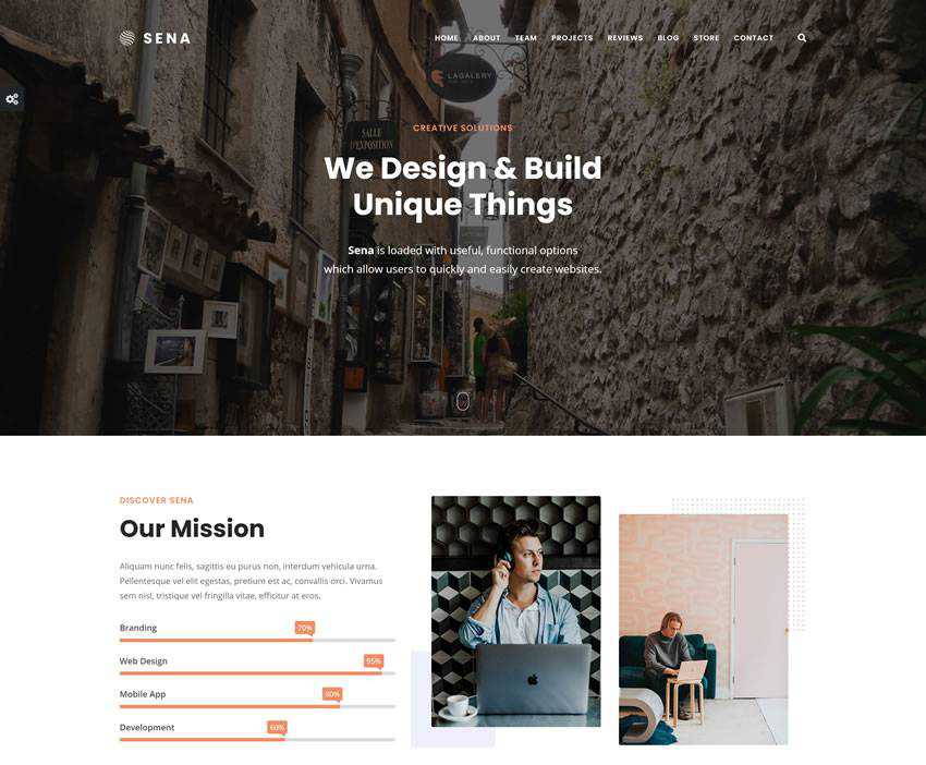
Sena – Free MultiPurpose WordPress Theme – An easy to use versatile and free multi-purpose WordPress that will help you create beautiful multipurpose business websites.
CSS Cuboid Generator w/ React & Prism – Create a 3D cuboid shape with this browser-based tool.

16px or Larger Text Prevents iOS Form Zoom – How applying specific font sizes to form elements impacts accessibility on Safari for iOS.

Presenting Design Ideas is All About Presentation – How a good presentation can force people to take your ideas more seriously and assign more value to them.

CSS-only fluid modular type scales – Learn how to create intentional and harmonious typography sizing.

Screen Sizes – Use this resource to find various screen sizes and which Apple devices use them.

The 50 Best Fonts for Creating Stunning Logos in 2021 – Want to design a perfect logo? One of the fonts in this collection is sure to be just what you need.

WinBox.js – An open-source, modern window manager for the web.

Mantine – Check out this usability-focused, open-source React components and hooks library.

The post Weekly News for Designers № 592 appeared first on Speckyboy Design Magazine.
Package:
Summary:
Log messages to containers compliant with PSR-3
Groups:
Author:
Description:
This package can log messages to containers compliant with PSR-3...
Read more at https://www.phpclasses.org/package/12079-PHP-Log-messages-to-containers-compliant-with-PSR-3.html

        Contributed by
        Jérémy Derussé
        in #39919.
BREACH is a security exploit against HTTPS when using HTTP compression. This
kind of compression side-chann...