Monthly Archiv: April, 2021
Your website is the heart of your digital marketing efforts, so crafting a beautifully designed site is paramount to helping your company grow online. You can use a platform like Shopify to build your ecommerce site.
So, how can you get the most from your Shopify site?
We’ve got six Shopify website design tips to help you get started with designing your site:
- Choose the right theme for your business
- Use apps to build your site
- Make sure your site loads quickly
- Incorporate visuals
- Add elements to connect with leads
- Don’t overdo it
Keep reading to learn more!
For even more digital marketing advice, sign up for the email that more than 150,000 other marketers trust: Revenue Weekly.
Sign up today!
1. Choose the right theme for your business
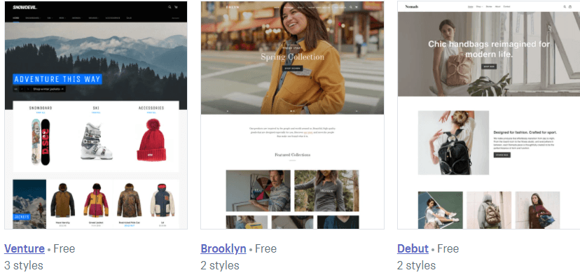
If you want to know how to design a Shopify store, start by choosing the right theme for your business. The theme is the backbone of your website and determines how your site appears to your audience. Considering that 94% of first impressions relate to web design, you want to ensure you choose the right theme to make a good impression.
Shopify offers numerous templates you can use for your site. They offer free and premium templates that cost anywhere from $100 to $180.
![]()
So, how do you choose the right theme for your website?
When you’re trying to craft your Shopify store design, you’ll want to ask yourself questions like:
- How do I want my products displayed on my site?
- What features do I need for my store?
- How do I want users to shop on my site?
- What type of experience do I want to deliver for my audience?
- How much can I spend on my design?
By asking these questions, you can determine which design is best for your ecommerce business.
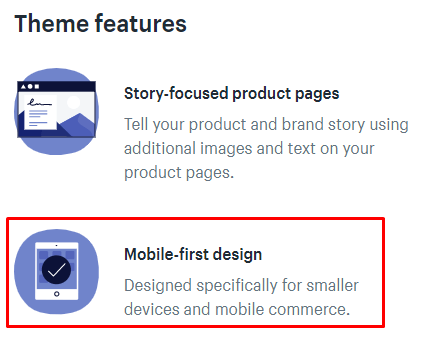
P.S. When you customize your Shopify store, make sure you choose one that’s mobile-friendly! A mobile-friendly theme is crucial if you want to deliver a top-notch browsing experience on your site. You can check in the description of the theme to verify it’s mobile-friendly.
![]()
2. Use apps to build your site
Next on our list of Shopify store design tips is to use apps to build your site. Like WordPress’s plugins, Shopify utilizes apps to help you add features to your site that enhance the audience’s experience.
You can use dozens of apps to build your site. App categories include:
- Finding products
- Places to sell
- Store design
- Marketing
- Sales and conversion
- Orders and shipping
- Inventory management
- Customer support
- Trust and security
- Finances
- Productivity
- Reporting
![]()
Whether you’re looking to optimize your sales process or manage your inventory, you can add an app to help build a better ecommerce site.
3. Make sure your site loads quickly
One of the most critical Shopify website design tips is to make sure your site loads quickly. Users won’t wait for slow-loading sites and will abandon them if they take too long to load. In fact, slow-loading sites cost businesses $2.6 billion in revenue loss each year.
When you use Shopify as your site builder, you want to check your site load time to ensure that you deliver the best experience for your audience.
You can use a tool like Google PageSpeed Insights to help you see your site’s current load time.
If your site loads too slow, you can improve your site load time by:
- Avoiding third-party themes: Shopify enables you to use third-party themes on your site. The risk with this is that they can have additional features that bog down your site. It’s best to stick to Shopify’s themes since you know what you’re getting with them.
- Compressing image file sizes: Adding product photos to your site is a great way to provide a great user experience, but it can also slow down your site. You may need to compress the image file sizes to help your site load faster.
- Analyzing your app and widget usage: When you build your site, you’ll add tons of apps and widgets. If you find your site running slow, you might have too many of them. You’ll want to comb through your apps and widgets to ensure you only use essential ones on your site.
You can also get help with your site load time by investing in page speed services.
4. Use visuals on your site
Next on our list of Shopify website design tips is to add visuals. Since people can’t see the product in person, they need to get as close as possible to seeing it “in person” through your visuals.
You can use both photos and videos to help showcase your products online. When you upload these visuals to your site, you want to ensure you use high-quality visuals that showcase every angle of your product.
5. Add elements to connect with leads
When you do your Shopify store design, you want to create opportunities for leads to link up with your business. You need to customize your Shopify store with elements that enable you to connect with prospects.
One element you’ll want to include is social media buttons. These buttons provide your audience with an opportunity to follow your business on the social media platforms you use. It’s a great way for prospects to connect with your company.
Another element you can add is an email sign-up bar. You can use an email sign-up bar to capture leads for your business. You’ll want to design this bar with a call to action (CTA) button that pops off the page so users see and sign up for your emails.
6. Don’t overdo it
If you want to know how to design a Shopify store, follow this tip: don’t overdo it. One of the biggest mistakes companies make is overloading and over-designing their site.
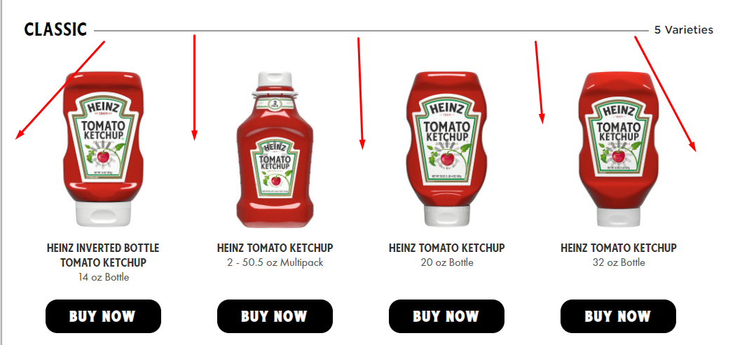
When you have tons of information to share with your audience, you want to include all of it on your site. The problem with this approach is that it can easily lead to overcrowding on your site.
When you do your Shopify store design, make sure that you utilize whitespace throughout. Whitespace enables you to keep your audience focused on your text and photos while scrolling through your site.
![]()
As you add design elements to your site, make sure they don’t make your site look disorganized or overcrowded, so you don’t overwhelm your audience. You can use A/B testing to help you test elements on your site to ensure they’re enriching the audience’s experience.
We don't just want to tell you about the beautiful work we do.
WE WANT TO SHOW YOU
We've built over
1000
Websites in industries like yours
Get started with your Shopify store design today
Now that you have a list of Shopify website design tips, it’s time to get your Shopify store into shape! With a custom Shopify store, you can drive more revenue for your business. But if you’re feeling overwhelmed, WebFX is here to help.
With our Shopify web design services, we can help you craft a site that fits your business and enables you to boost your revenue. We’ve won over 50 design awards, so you can feel confident that we’ll craft an award-winning site for your business.
Want to drive more revenue for your business? Contact us online or call us today at 888-601-5359 to speak with a strategist!
The post 6 Shopify Website Design Tips to Create a Beautiful Site appeared first on WebFX Blog.
Package:
Summary:
Kanboard plugin to add due date to sub-tasks
Groups:
Author:
Description:
This package is a Kanboard plugin to add due date to sub-tasks...
Read more at https://www.phpclasses.org/package/11990-PHP-Kanboard-plugin-to-add-due-date-to-sub-tasks.html

Package:
Summary:
Manage user groups and their access permissions
Groups:
Author:
Description:
This package can manage user groups and their access permissions...
Read more at https://www.phpclasses.org/package/12014-PHP-Manage-user-groups-and-their-access-permissions.html#2021-04-09-10:42:53

Package:
Summary:
Manage a NoSQL database for users and features
Groups:
Author:
Description:
This package can manage a NoSQL database for users and other application features...
Read more at https://www.phpclasses.org/package/12007-PHP-Manage-a-NoSQL-database-for-users-and-features.html#2021-04-09-10:40:59


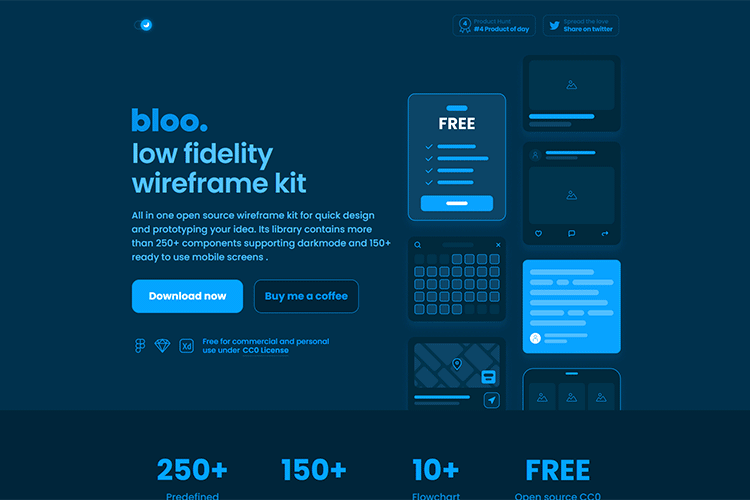
bloo – This open-source “low fidelity” wireframe kit includes over 250 components and support for dark mode.

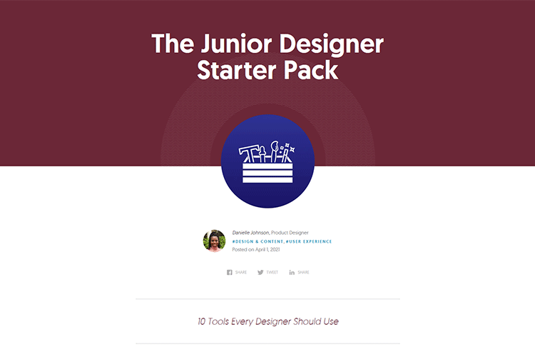
The Junior Designer Starter Pack – This collection of helpful design tools and resources can help junior (and senior) designers get things done.

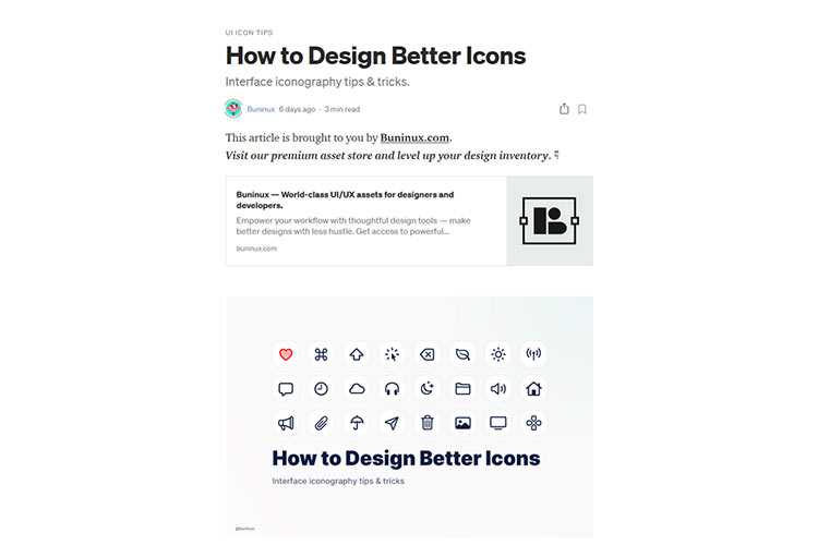
How to Design Better Icons – Tips for creating icons that users can instantly recognize and understand.

How to Gain the Trust of Your Web Design Clients – Trust is vital to the client-designer relationship. Here are some tips on how to build it.

Freebie SWM Icon Pack – Download this free icon collection that includes nearly 300 icons that are available in 3 distinct styles.

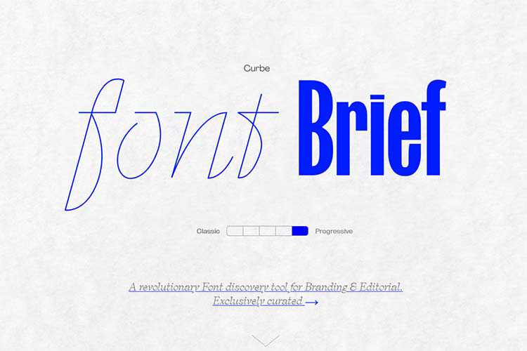
Font Brief – This tool aims to help you find the perfect font based on the attributes of your brand personality.

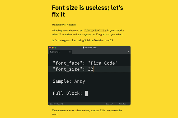
Font size is useless; let’s fix it – A look at why font size is problematic.

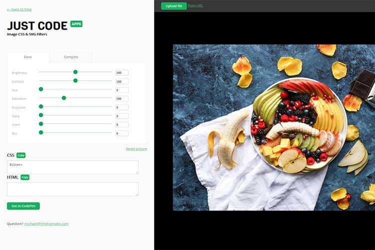
CSS Filters Generator – Add compelling filter effects to your images with this online tool.

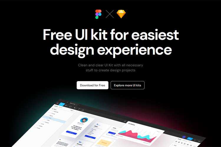
Deca – A free UI kit for Figma and Sketch with 150+ clean and clear components.

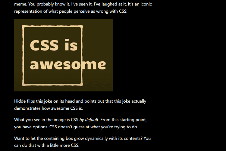
CSS Is, In Fact, Awesome – Why is CSS so awesome? In a word: options.

How a Custom WordPress Plugin Can Help You Manage a Website – Some scenarios where a custom plugin can make maintenance easier.

Container Queries are actually coming – How this long wished-for CSS feature could impact designers.

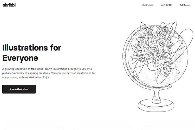
skribbl – A collection of free, hand-drawn illustrations you can use for both personal and commercial projects.

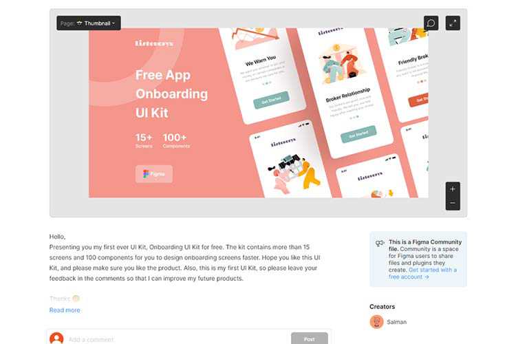
Onboarding UI Kit – Make quick work of your onboarding projects with this free UI kit for Figma.

Overlay Fact Sheet – Everything you need to know about web accessibility overlay technology.

25 High-Quality Free Swirl & Ribbon Photoshop Brushes – Add a touch of elegance to your projects with these beautiful free brushes.

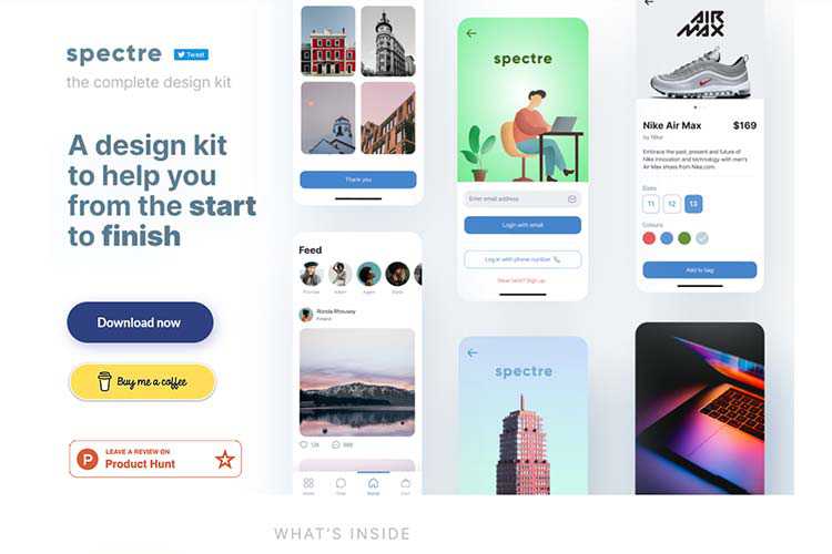
Spectre UI Design Kit – Download this design kit that offers plenty of resources to help you during each step of your project.

The post Weekly News for Designers № 587 appeared first on Speckyboy Design Magazine.
Package:
Summary:
Get formatted time and date in a given timezone
Groups:
Author:
Description:
This package can get formatted time and date in a given timezone...
Read more at https://www.phpclasses.org/package/12045-PHP-Get-formatted-time-and-date-in-a-given-timezone.html

Launching an online magazine is an exciting business venture. Sharing stories and news about topics that interest you is a great way to connect with other like-minded people and build authority in a particular niche.
But, before you launch your online magazine, you will need a magazine or a news theme that will help you share your stories in style. There is no shortage of high quality, free magazine and news themes for WordPress and in this post, we’ve gathered the best of them.
If you’re looking for free WordPress themes for blogging, take a look at this collection.
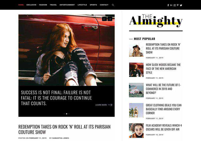
The Almighty theme has a clean and minimal design and offers multiple blog layouts. The theme is fully responsive and comes with tons of options for customizing the theme and making it your own.

The Metz theme is a great choice if you plan on launching a fashion magazine or editorial. You get access to this theme when you sign up for Envato Elements monthly subscription and you will find features such as various listing styles, several blog layouts, and extensive theme customization options.

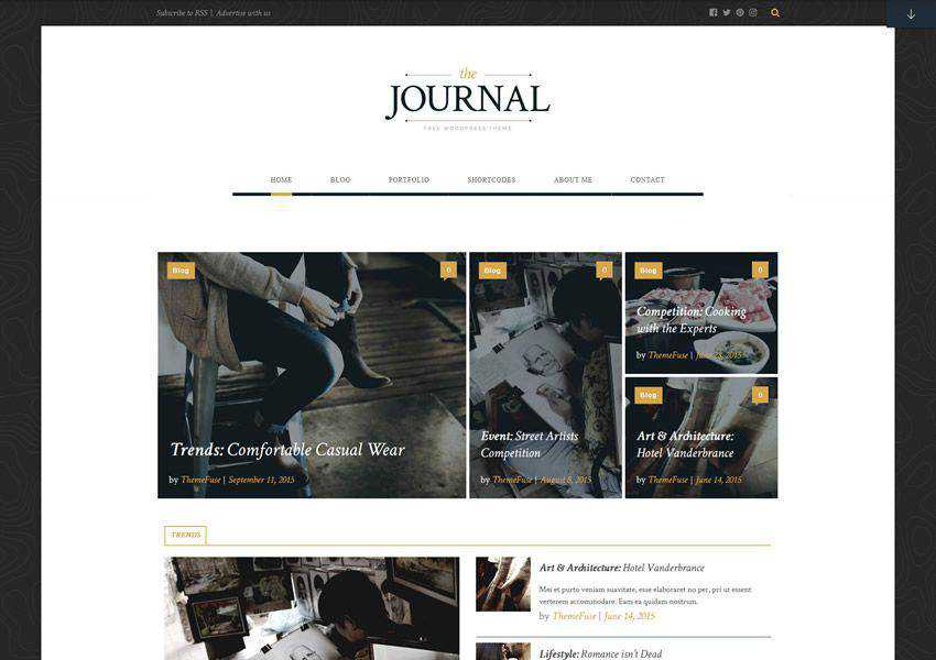
Journal Magazine WordPress Theme (Free)
The Journal is a highly customizable WordPress theme designed with magazines in mind. The theme has a built-in slider option that’s perfect for sharing popular stories, a plethora of customization options, and a unique shortcode generator.

The Crowley theme is suitable for any type of online magazine as well as for personal blogs. You can customize every aspect of the theme using the Live Customizer and you can choose between several column layouts for your archive pages.

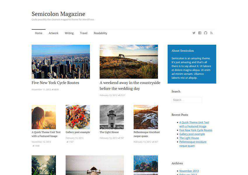
Semicolon is a simple and clean magazine theme for WordPress. It comes with a responsive layout, elegant and easy to read typography, and a unique grid layout with featured posts support. You will also find several widget areas, a menu for your social profiles, and more.

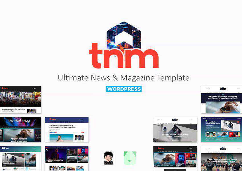
The Next Mag (Envato Elements)
The Next Mag is a feature-rich magazine and news theme for WordPress that comes with your Envato Elements subscription. The theme offers features such as Ajax post loading, several demo options, mega menus, and a responsive design.

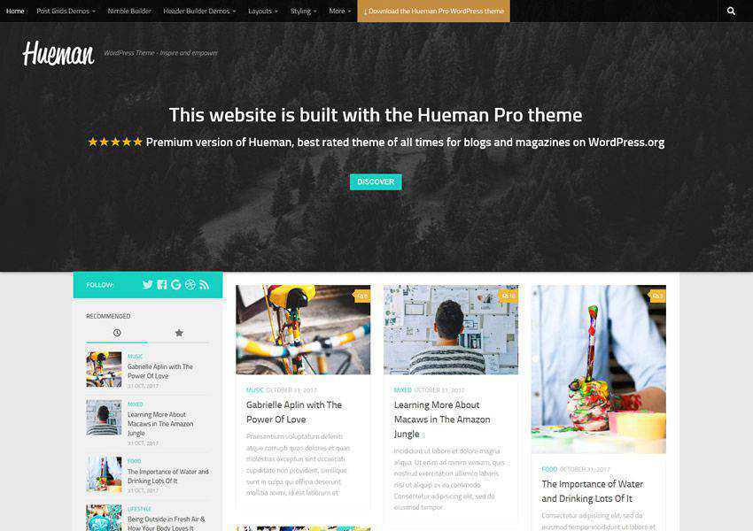
The Hueman theme has a modern design paired with the standard column layout. You can add up to two sidebars and insert widgets such as most popular posts, recent comments, social media icons, and more. It also includes multiple menu locations.

The Brilliant is a stylish WordPress theme that has a stunning slider on the homepage that’s perfect for sharing your latest post. You will also find the ability to showcase your post categories, and there are several customization options to make this theme your own.

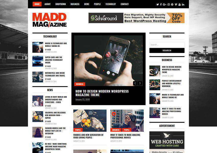
The Madd Magazine offers a traditional online magazine layout with plenty of widgets for popular posts, categories, advertising space, and more. It’s fully responsive and the ability to use videos in sliders.

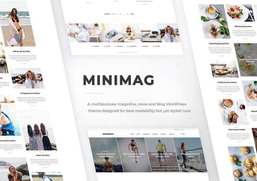
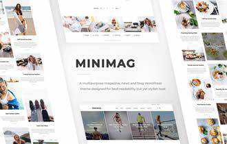
The MiniMag is a minimal magazine theme that can also be used for personal blogs. The theme comes with a number of different demos which can be imported with a single click. It’s fully responsive and offers tons of customization options.

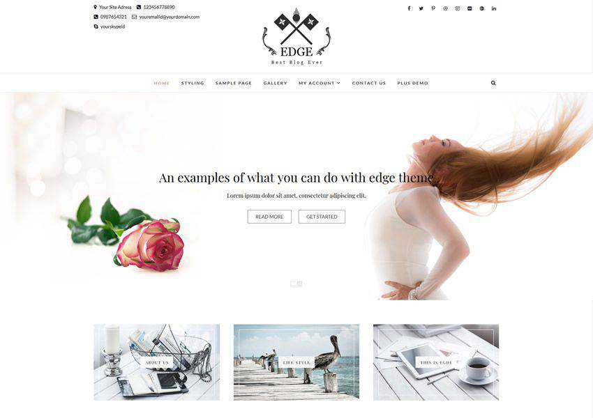
The Edge theme is perfect for blogs and magazines. It was designed to load fast and includes SEO optimization features as well as responsive design and multiple layout options.

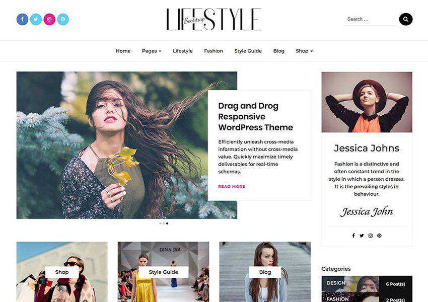
The Bootstrap Blog theme is based on the popular Bootstrap framework which means it will be responsive out of the box. It also offers features such as extensive theme options panel, various layout options, and WooCommerce integration.

Split – Magazine, News & Blog Theme (Removed)
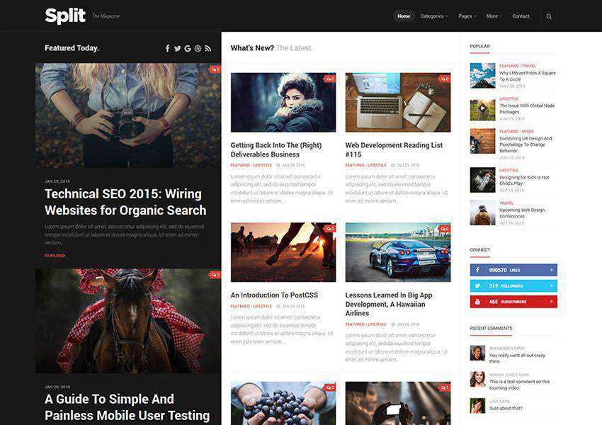
The Split theme offers a unique split layout that makes your featured images stand out. It has an organized grid layout and sticky titles and images that remain visible as you scroll down the page.

When it comes to your online magazine, an attractive design that offers a pleasant reader experience is crucial. Make your magazine the best it can be with one of the themes on this list that offer beautiful layouts, legible and elegant typography, and a responsive design that looks great on all devices.
The post The 10 Best Free Magazine & News WordPress Themes in 2021 appeared first on Speckyboy Design Magazine.
Business cards are a great way to share your contact information during networking events or even when you meet a potential customer or business partner. That’s why it’s important that your business card not only reflects your brand but has a professional design that will help you make a great first impression.
Below, you’ll find the best business card templates and mockups that you can use the next time you need to design a business card for your client.
We also have collections of the best poster templates, social media kits, flyer templates, stationery templates, project proposal templates, and brochure templates.
The first business card template on the list would be perfect for a feminine brand or business. It features a gentle color scheme and comes with four design variations in Adobe Photoshop format.

The Bakery Shop Business Card features a colorful design that’s perfect for any startup or a young business. You will receive a documentation file as well as a Photoshop file that can easily be edited to use your brand colors and fonts.

Business Card (By nicdark, Adobe Photoshop Format)
The Business Card is a feminine business card template with floral and watercolor design. It would be perfect for any feminine or a fashion brand. The template includes well-organized layers and can be edited with Photoshop.

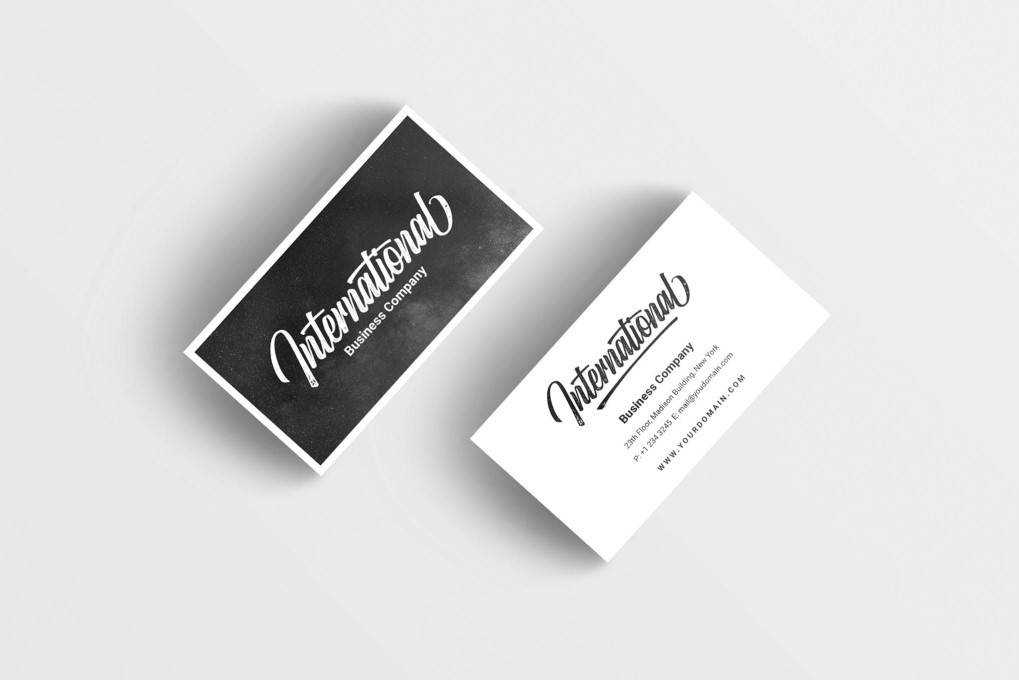
The International Business Card template features a clean and modern design that would be perfect for anybody looking for a more corporate style for a business card. You can easily insert your own images and elements through the use of smart objects.

The Minimalist Business Card template features a combination of solid color background paired with a pattern. The template is easily customizable with Adobe Photoshop and it includes well-organized layers.

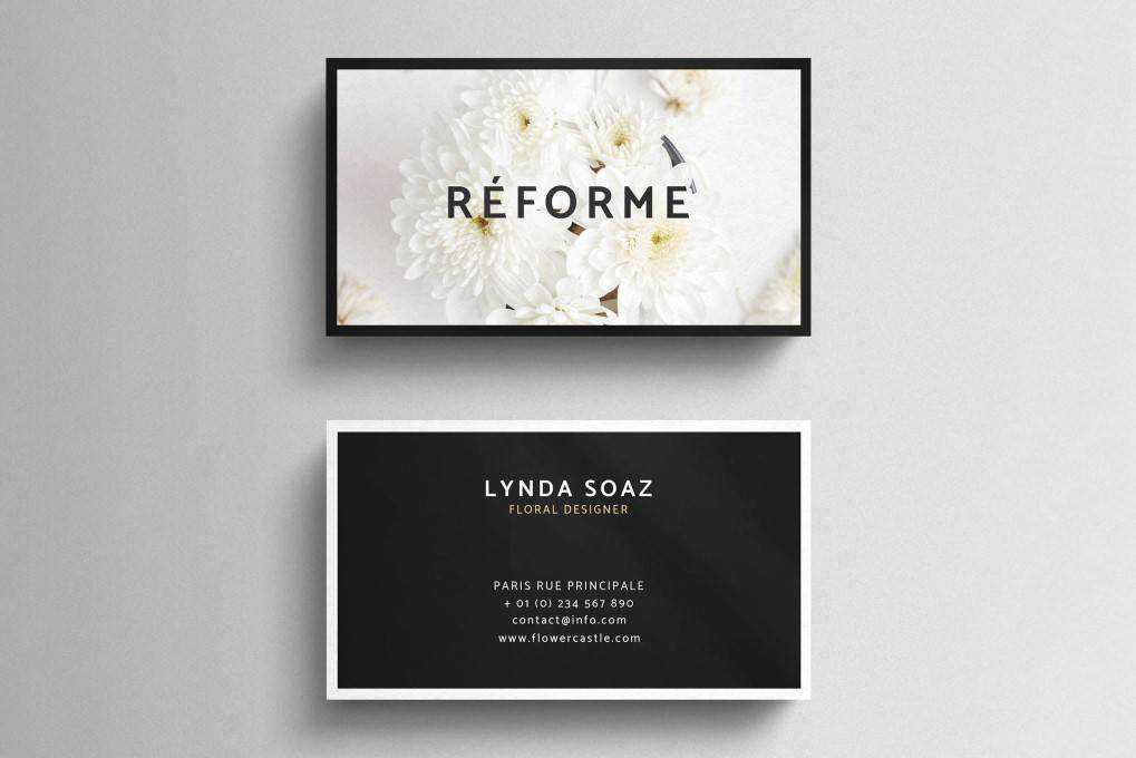
If you’re working on a business card design for a feminine brand than the Floral Business Card Template is a great choice. The Template features gorgeous imagery and elegant typography and it was designed in Adobe Photoshop.

This Floral Business Card features a more playful look with a modern design and a unique layout. You’ll get both the front and the back design and you can use it as a starting point for any fashion, photography or lifestyle brand.

The Creative Writer Business Card template comes with a modern and fun design that’s easy to customize. Use Adobe Photoshop to customize the colors and the fonts, replace the information with your own, and the file is ready to be printed.

The Agency Business Card features an elegant design that can be used by creative agencies, artists or any other high-end businesses. The template includes both the front and the back design and can be edited with Adobe Illustrator.

Minimal Business Card (By EightonesixStudios, Adobe Photoshop Format)
As the name suggests, this Minimal Business Card template features a minimal design with a colorful background, but you can easily change the color or opt for a pure white background. The template is fully editable in Photoshop thanks to well-organized layers.

Business Card (By Boxkayu, Adobe InDesign Format)
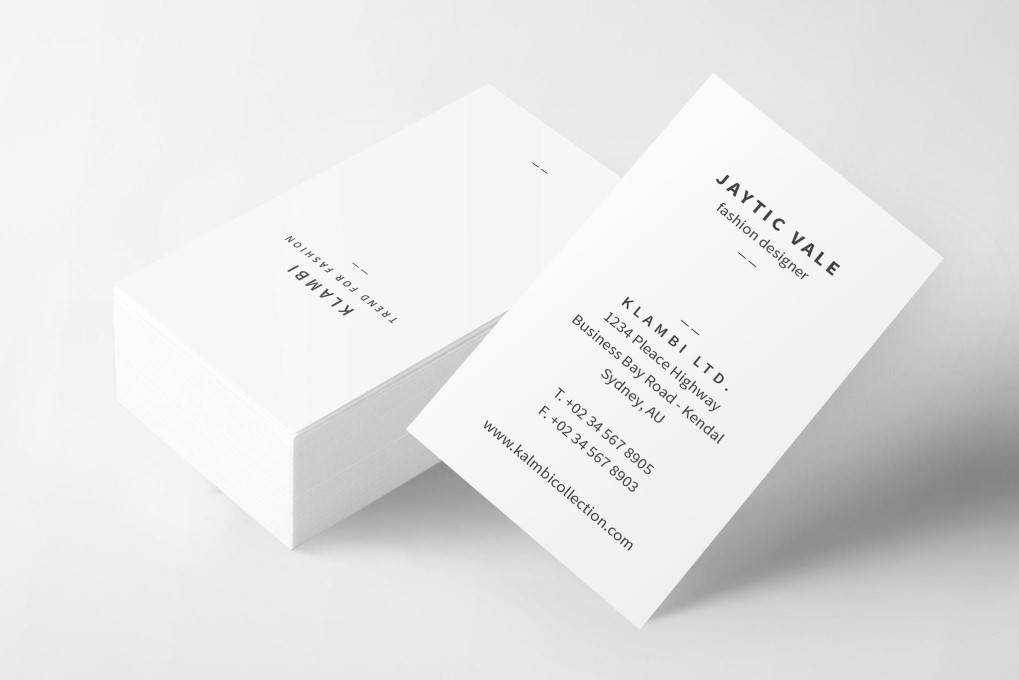
This simple business card template features a vertical layout and elegant typography that makes it a great choice for fashion, lifestyle, architecture or design brands. The template was designed with Adobe InDesign and comes with defind paragraph and character styles for easy editing.

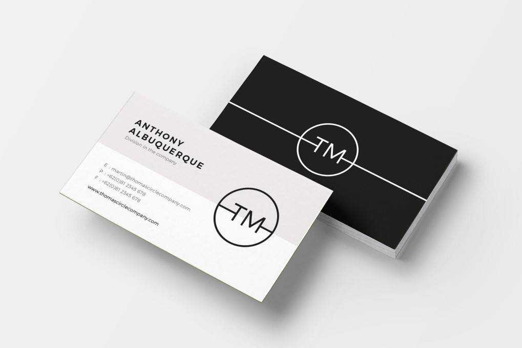
Consider the Minimal Business Card if you want a more unique layout for your business card. This template features a split front in two colors and a solid-colored back paired with a simple sans-serif font that gives it a more high-end look.

If you need a fun and colorful design for a company that sells products oriented towards children, this Colorful Minimal Business Card template is just what you need. Featuring a creative layout that uses geometric shapes, this template is sure to make your business card stand out.

This tropical business card template would be perfect for a florist brand or a travel agency. It was designed in Adobe Photoshop format and includes well-organized layers for quick and easy editing.

Conclusion
An eye-catchy business card design makes your brand and business more memorable in the eyes of potential clients as well as business partners. Luckily, you don’t have to spend hours on the design process. Use one of the templates in this roundup to quickly design a business card for your clients or for yourself.
The post The Best 15 Business Card Mockup Templates appeared first on Speckyboy Design Magazine.
Package:
Summary:
Call named object functions in a queue
Groups:
Author:
Description:
This package can be use to call named object functions in a queue...
Read more at https://www.phpclasses.org/package/12030-PHP-Call-named-object-functions-in-a-queue.html

Everyone knows that education is the best investment a designer can make to further his or her career. But what does that mean, exactly? Should you go back to school (or attend for the first time)? Should you find a mentor or study the greats repeatedly until you perfect your craft?
Perhaps you should do these things… and perhaps not.
Today, we explore specific ways to further educate yourself as a designer, and apply what you learn immediately to becoming better at what you do, as well as being more desirable to clients.
The Web Designer Toolbox
Unlimited Downloads: 1,000,000+ Web Templates, Themes, Plugins, Design Assets, and much more!
Marketing and The Unhappy Freelancer
Let me start off with a story about a person I know. This person is a freelance designer who really wanted to get more quality business. His work was quite good, and he worked hard for his clients, but he was struggling with attracting the kinds of people he really wanted to work with. His clients were the lower-end type, always giving him problems when it came to payment and deciding exactly what they wanted him to design for them.
This designer could have benefited greatly from learning how to properly market his services. There is definitely a right way to reach out to top clients, and there is a wrong way, and making an effort to learn the difference can make an enormous difference in your success as a freelancer.
Market yourself and your work the wrong way enough times and you can do real damage to your potential to earn more and attract better clients.
Learning your niche – knowing the ins and outs of your client base as well as the customers they serve – is the best way to tailor your marketing efforts for maximum effectiveness.

Get A Design Mentor
Mentors can teach you a lot about design, and can help you greatly improve your craft. But they can also provide a critical look into the industry from a veteran’s perspective, something you’re not likely to have if you’ve been working for less than a certain number of years.
Personally, I believe every designer should seek out a mentor – there are tons of experienced designers out there who would love the chance to help guide and foster a future industry rock star. Making time to reach out to people who can help you often costs nothing, yet it’s one of the most important things you can do to grow your career.
The problem is that younger designers often don’t ask to be mentored, believing that more experienced designers are too busy to help them. Nothing could be further from the truth. First of all, you need to know one thing about designers who have reached a certain level of renown: they love it when people give them compliments and ask them stimulating questions about their craft. Especially younger designers.
Try it – email 10 of your favorite design “celebrities” and think of a few short but intriguing questions to ask them. The worst that can happen is that they say no, but if your questions are good enough, they almost certainly won’t.

Test, Then Invest
Sometimes you might have to invest a lot more money, time, or resources into learning something than you initially thought.
If you hate networking, for example, and know you will have to expend a lot of time, money, and energy going to networking events and building relationships with people in the design industry, you may question whether or not you genuinely need to make that investment and expand your network.
Sometimes, you don’t need to make a significant investment to achieve a goal. If you honestly feel that you can get by without making a particular investment, then test this assumption before going any further. This is an excellent way to learn what works and what doesn’t, both in your design work and in the promoting of your freelance business.
In fact, this is my absolute favorite way to learn anything related to my own design career. Research and mentors are great, but in the end, you must test each and every piece of advice you get from your sources. If it doesn’t work on a practical level, there’s no reason to keep playing the guessing game.

In Conclusion
Your design education doesn’t end with college or university. It starts there.
The acquisition of knowledge to further your career is a lifelong pursuit, if you’re doing it correctly. Remember that education, in whatever form it comes, is never a waste of time, money, or effort. When you don’t invest in your own education, you are losing a game you may not even realize you’re playing.
Your competition is certainly busy investing in themselves, and will come out ahead if you aren’t right there with them, putting in the time, money, and energy to improve your edge and win over clients.
The post Why You Should Further Educate Yourself as a Designer appeared first on Speckyboy Design Magazine.
