2020 Web Design Year in Review
A year “like no other” is about to come to a close. 2020 was certainly unique for everyone – web designers included. And it challenged us on several levels.
Our daily grind was complicated by shutdowns, kids invading the home office, and clients who needed our help in rapidly changing their business models. Even though many of us were stuck in the house, there was rarely a dull moment.
All of that aside, the year saw many developments that had nothing to do with pandemics or other chaos. New tools were brought to market, our favorite software saw important updates and the community was as creative and helpful as ever. In other words: 2020 had plenty of positives for designers and developers to celebrate.
Let’s take a look back at some important and interesting developments that impacted web designers this past year.
Modern CSS Thrives
While there were no revolutionary changes to CSS in 2020, that doesn’t mean it didn’t have a great year. Quite the contrary.
The language benefitted from the continued steady evolution of web browsers. As modern versions of Chrome, Edge, Firefox and Safari are released, support for newer CSS standards and specs grow.
In practice, this means web designers can adopt new techniques with confidence. CSS Grid layouts, for example, are a much safer bet than they were a few years ago. And while fallbacks are never a bad idea, they may not need to be as drastic.
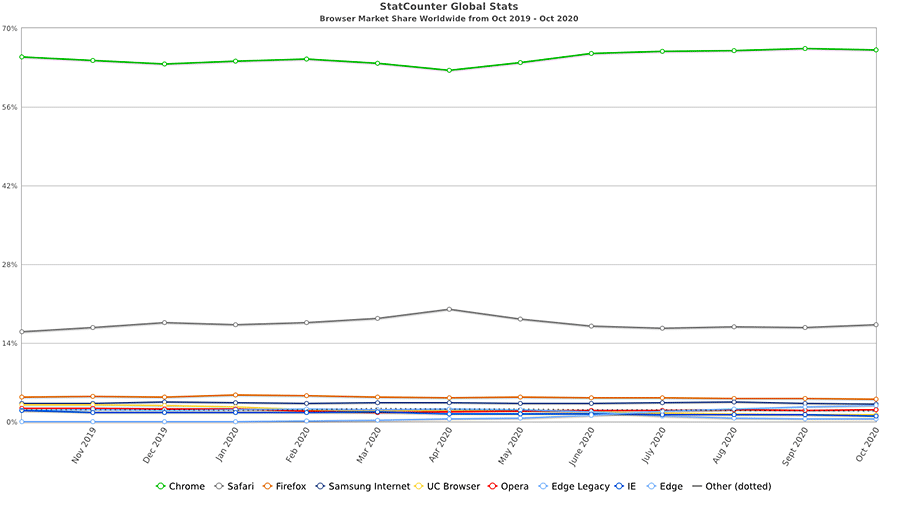
That’s due to the dwindling number of users for legacy browsers such as Internet Explorer. According to StatCounter Global Stats, usage of IE was down to a measly 1.05% of the market as of October 2020. Compare that with the nearly 2% it captured a year earlier.

Chart courtesy of StatCounter Global Stats
The further IE and other outdated browsers are in the rearview, the easier it will be to bring the latest CSS developments to production websites. This allows the language to better fulfill its vast potential. 2020 was a big step in that direction.
Top CSS Articles for 2020
- Avoiding ‘Wasteful’ CSS in Your Projects
- BEM Methodology In CSS: A Quick Start Guide
- Creating 3D Illustrations with CSS
- How CSS Perspective Works
- How CSS Variables Can Improve Efficiency and Consistency
- LCH colors in CSS: what, why, and how?
- Learn CSS Positioning
- Positioning Text Along a Path with CSS
- Styling Layout Wrappers In CSS
- Visualizing CSS Resets
The Headless CMS Develops Its Niche
The utilization of “headless” or “detached” content management systems has continued to gain momentum. This practice involves employing a CMS (such as WordPress) to feed content to an outside application.
This leads to several interesting possibilities. You might send content out to a mobile application – allowing both your app and website to share the same blog posts. Likewise, you could leverage a static website generator such as GatsbyJS or 11ty to create a super-fast user experience – perfect for heavily-trafficked sites. All while keeping a familiar back end UI for your content creators.

And, although this technology is still relatively young, you can see it starting to take hold. GatsbyJS, for one, has come a long way over the past year. GraphQL, its companion query language, is steadily maturing. It aims to be both efficient and high-performing.
Besides, a number of tools are being built to streamline the process of creating a headless configuration. This is vital, as it is not currently a beginner-friendly task. The easier this all becomes, the more widespread and creative its usage will be.
For now, headless CMS configurations are being deployed more and more. Still, unless you’re an expert, diving in head-first and adopting this technology for client projects may not be wise.
Therefore, it’s probably best to start small and experiment. Once you are on solid ground, going headless could be a great solution.
Top Headless CMS Articles for 2020
- An Honest Review of Gatsby
- Building a Headless WordPress Website with GatsbyJS
- Building Serverless Front-End Applications Using Google Cloud Platform
- Don’t Build a Frankenstein Website!
- Going Jamstack with React, Serverless, and Airtable
- Headless CMS: What and Why
- How to Begin Your Journey Developing Headless WordPress Sites
- How To Create A Headless WordPress Site On The JAMstack
- Powering React Native Applications with ButterCMS Headless Engine
- When Does Using Headless WordPress Make Sense?
Prototyping Tools Improve and Evolve
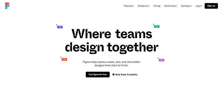
The way we build website and mobile application prototypes continues to change. Many designers are eschewing traditional tools like Photoshop in favor of niche apps like Adobe XD, Figma, and Sketch.
Each of these tools has been built with web and mobile applications in mind. Therefore, designers don’t have to settle for passing along static mockup images to clients. Rather, they can create something fully-interactive that better represents what the final product will do.
Of course, the tools themselves are not new – they’ve been on the market for several years. But in 2020 the argument for using any of these apps has become more compelling.

For one, each has robust developer communities that release helpful goodies such as plugins and UI kits. They help designers extend functionality and increase efficiency. And the apps themselves have released some exciting features, along with smoothing out rough edges.
However, another feature of prototyping apps also became very important: their built-in collaboration tools. They facilitate remote feedback from both clients and team members. With so many of us working from home this year, anything that makes the review process easier is a massive bonus.
Top Prototyping Tool Articles for 2020
- 10 Tutorials to Help You Master Adobe XD
- 20 Free Adobe XD UI Kits for Web & Mobile App Designers
- 20 Free Mobile UI & Wireframe Kits for Sketch App
- 35 Free Web & Mobile UI Templates for Figma
- Adobe XD Has a New Look
- Design To Engineering Handoff
- Gradient angles in CSS, Figma & Sketch
- How to Turbocharge Your Components with Figma Variants
- Part of your World: Why We’re Proud to Build a Truly Native Mac App (Sketch)
- Sketch vs. Figma vs. Adobe XD: Which Design Tool Is Best for Beginners?
The WordPress Gutenberg Block Editor Becomes More Polished
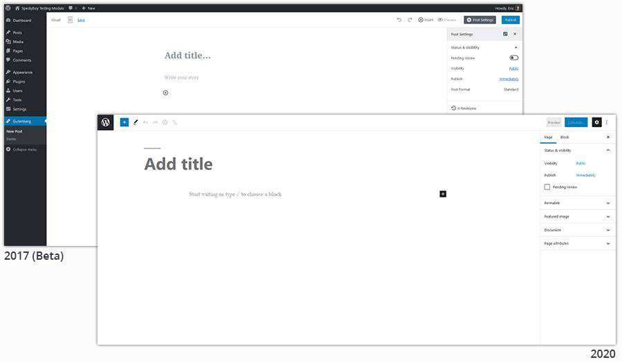
December 2020 marked the Gutenberg block editor’s second birthday. But, unlike most 2-year-olds, it seems like the fits and tantrums are (mostly) a thing of the past. Gutenberg is becoming quite mature for its age.
Looking at the editor’s UI, it’s lightyears ahead of where it was back at the beginning. A lot of development time went into making the interface more intuitive. Getting around is much easier, as is finding and selecting individual blocks.
Accessibility was also a big focus. This particular subject is important in all areas of web development but was also a major criticism of earlier versions of Gutenberg. So, improving both the UI and making it more accessible are big wins for 2020.

The year also saw the introduction of custom block patterns, which make it easier to use and reuse a specific layout. The ability to implement a custom layout anywhere it’s needed is no small achievement. This was one of the missing features that made the block editor a difficult sell for some use cases.
And, while not ready for prime time just yet, Gutenberg-powered full site editing (FSE) is in the works. This will enable users with a compatible theme to edit all aspects of their website through the block editor. The first such theme, Q, was made available for download earlier this year.
All told, WordPress now has a default editing experience that can be seriously considered for just about any project. There are still some advantages to page builders – not to mention the old Classic Editor. But blocks are catching on.
Top WordPress Gutenberg Block Editor Articles for 2020
- Block Navigation Plugin Provides Missing Context-Based Outline for the WordPress Editor
- Create a Custom Color Palette for the WordPress Gutenberg Editor
- Getting the WordPress Block Editor to Look Like the Front End Design
- How to Bulk Convert Classic Blocks to Gutenberg in WordPress
- How to Create a Simple Gutenberg Block Pattern in WordPress
- How to Use the WordPress Gutenberg Cover Block
- Matt Mullenweg and Matías Ventura Demo New Image Editing Tools Coming to Gutenberg
- Styling Wide and Full-Width Gutenberg Blocks in WordPress
- Tips for Converting an Existing WordPress Website to Use the Gutenberg Block Editor
- What is Full Site Editing and how is it shaping a new WordPress?
In 2020, the Focus Was on the Bigger Picture
One thing you may notice about the items above is that they all involve evolutionary change. Nothing here appeared to be a watershed moment for web designers. In fact, posing this subject on Twitter didn’t result in any earth-shattering recommendations either.
Maybe that makes for less-than-compelling headlines. Yet it also means that, in a chaotic year, there was a comforting consistency for the web design industry. The tools and technologies we already use just got better. Nothing to complain about there.
When we look back years from now, a lot of historic events will stand out from 2020. But web designers may see it as a time that set the table for bigger things yet to come.
The post 2020 Web Design Year in Review appeared first on Speckyboy Design Magazine.