Interview with Olatunbosun Egberinde
Audio
This episode is sponsored by
RingCentral Developers
The post Interview with Olatunbosun Egberinde appeared first on Voices of the ElePHPant.
The post Interview with Olatunbosun Egberinde appeared first on Voices of the ElePHPant.
If you want to write applications that are maintainable in the long run, you have to decouple from your framework, ORM, HTTP client, etc. because your application will outlive all of them.
To accomplish framework decoupling you only have to follow these simple rules:
Following rule 1 ensures that you'll never fetch a service ad hoc, e.g. by using Container::get(UserRepository::class).
This is needed for framework decoupling because the global static facility that returns the service for you is by definition framework-specific.
The same is true for fetching configuration values (e.g. Config::get('email.default_sender')).
Sometimes a dependency uses IO, that is, it talks to the database, the filesystem, etc. In that case you should introduce an abstraction for the dependency. If you depend on a concrete class, that class will work only with the specific library or framework that you're working with right now, so in order to stay decoupled you should use your own abstraction, combined with an implementation that uses your current library/framework.
Aside from services there will be several other types of objects like entities, value objects, domain events, and data transfer objects, all of which don't have service responsibilities. None of them should have service responsibilities, because that means they will either invoke services via some global static facility, or they need special framework/ORM-specific setup meaning they can't be used in isolation and won't survive a major framework upgrade or switch. An example of an object that doesn't follow rule 2 is an active record model, which may look like an entity, but is able to save itself, which is in fact a service responsibility.
Contextual information is usually derived from the current web request or the user's session, e.g. the ID of the user who is currently logged in.
Instead of fetching this data whenever you need it (like Auth::getUser()->getId()) you should pass it from method to method as a regular argument.
Combined, rule 1, 2, and 3 ensure that for every method it's totally clear what it's doing, what data it needs, and on what service dependencies it relies to do its work. On top of that, none of the dependencies or method arguments will be framework or library-specific, meaning your application code will be effectively be decoupled from the framework.
If you ask me, these rules are very simple indeed, and they don't require a lot of extra work compared to tightly coupling everything to your project's current set of installed packages. So, why not follow them if you know that your project should still be up-to-date with current standards 3 years from now?
P.S. Following these rules gives you much more than framework decoupling: everything becomes testable in isolation, the tests are fully deterministic and therefore very stable, and they are really fast to run.
Booking new clients for your web design business is challenging. First you have to find someone who is interested in your services. Then it’s a matter of hammering out an agreement so that you can start your journey together.
When read aloud, it sounds easier than it really is. The process can feel a bit like being involved in a reality show competition – even if you’re the only designer involved. Once in a while you’ll run into a prospective client who plays the part of the sly host. They’ll test your limits by asking all sorts of philosophical questions and assorted odd requests.
Frankly, it’s a bit unnerving and sometimes belittling. You’re trying to land a new client but have to endure the third-degree. You might start to wonder if you’ll ever just get to the actual project.
It’s worth considering just how much of this you should tolerate. Where do you finally draw the line and say, “Thanks, but no thanks…”?
This is a subject with a lot of gray area. But in an effort to help you decide, we’ll dive right into the heart of the matter. Let’s get started!
First, let’s get the obvious out of the way: prospective clients have a right to ask questions. It’s their time, money and reputation on the line. Thus, a designer should always be prepared to answer.
Still, it is very possible to go too far. For instance, being asked if you’re available 24/7. Really? We’re web designers, not all-night donut shops. Many of us have set hours, just like other businesses. If a client really wants that type of availability, they’d better be prepared to pay handsomely for it.
Sometimes it’s not just the questions asked – it’s what they imply. There are people out there that seem to think web design isn’t a serious profession. Their queries sound like something you’d ask a teenager in a job interview, probing to see if you can trust them to mind the shop while the boss is away.
After 20+ years in the industry, I still run into this every so often. It makes me think back to landing my first gig back in the 90’s, when the web was a new concept to mainstream businesses. Whether it’s misunderstanding or mistrust, it can be a bit insulting.
When it gets to the point where you feel disrespected, take a step back and think. It’s certainly possible that you’re overreacting. But if that’s not the case, you’re better off walking away with your dignity intact.

Going beyond the interrogation stage, you might also find yourself caught up in long, drawn-out conversations with a prospect.
Again, there’s nothing inherently wrong with engaging in such banter. It can be a nice way to form a relationship, which is beneficial when working together. But that’s not always the case.
In some situations, a prospective client may (figuratively) chew your ear off in an effort to get free advice – even if they have no intention of working with you. Whether it’s constant phone calls or emails, this can quickly get out of hand.
There’s a fine line here between demonstrating common courtesy and allowing someone to waste your time. If a prospect crosses that threshold, it might be wise to politely push back. You could say, for example, that you’re happy to give advice, but to go in-depth you’ll have to charge an hourly fee. This should get the message across.

Another approach taken by some prospects is in angling for free or deeply-discounted work. While none of us like to pay full price (and everyone loves a sale) there aren’t a whole lot of benefits for web designers to play along.
Think of it this way: if someone isn’t willing to pay you what you’re worth, they’re not really valuing what you do. All of your hard work, the successful portfolio and hours of learning don’t particularly matter to them. They simply want something for nothing – or almost nothing.
Early in my career, I fell into the trap of giving away freebies. What I learned is that the working relationship with a client tends to get stuck in a vicious cycle. They start to expect that you’ll leave money on the table in order to please them. And you, being fearful of losing a client, don’t want to push the envelope.
It’s important to remember that you don’t owe a prospect anything at all. Even if they’re friendly and complimentary of your work, it’s unlikely you’d call them an actual friend. Therefore, don’t be sweet-talked into any arrangements that won’t result in your being fairly compensated.
This is one of the more difficult aspects of running a business. You want to offer great service that meets the needs of your clients while attaining your own financial independence. Even if it goes against your nature, you really should make decisions with this philosophy in mind.

Over time, you can develop a keen eye with regards to prospective clients. You’ll start to spot those red flags for projects and people you want to avoid. All told, it’s about understanding the types of clients you want to work with.
One of the telling signs of a project is how you’re treated during that initial process, before you come to any agreements. While perfection shouldn’t be expected, there are some basic tenets that a client should follow.
Are you being valued and respected? Is the person on the other end listening to what you have to say? Pay careful attention, as these characteristics will help you make the right decision.
The post Jumping Through Hoops for Prospective Web Design Clients appeared first on Speckyboy Design Magazine.
Latest PECL Releases:
Another monthly update where I explain what happened with Xdebug development in this past month. These will be published on the first Tuesday after the 5th of each month. Patreon and GitHub supporters will get it earlier, on the first of each month. You can become a patron to support my work on Xdebug. If you are leading a team or company, then it is also possible to support Xdebug through a subscription.
In August, I worked on Xdebug for about 80 hours, with funding being around 70 hours. I worked mostly on the following things:
This month I focussed on making it easier to spot what Xdebug is doing, and how and why it is trying to connect to a debugging client, creating files, etc. For this I reworked Xdebug's logging mechanism. Instead of it just being used for the step debugger, the logging mechanism is now used for everything, and as part of that I've renamed xdebug.remote_log to xdebug.log. The log will contain all messages with levels that match the xdebug.log_level setting, but Xdebug will now also send errors through PHP's standard error mechanism. Errors include not being able to open a log file, to create a profile or trace file, or issues with making debugging connections.
The biggest new addition is the xdebug_info() function , which acts as a Xdebug specific phpinfo() and contains configuration information about Xdebug, but more importantly lists warnings and errors. Where possible, a link to the documentation is included as well, where I set up a new page that includes all the warning and error messages that Xdebug can generate. I have tried to add information about how a specific message is created, and what you can do to resolve the issue if possible.
Xdebug 3 introduces modes that can be configured with the xdebug.mode setting. This setting can only be changed in php.ini, and not in an .htaccess file or equivalent, nor in the script with ini_set. Because Docker and containers are a more common development set-up now, a method was needed to be able to change Xdebug's mode without have to rebuild the containers. Because of that, I added support for configuring the mode through a new environment variable, XDEBUG_MODE, too. This can be used when starting your Docker container, and/or in Compose.
Now PHP 8 is getting closer I have started to pay a little bit more attention to adding support for features, beyond making it compile. PHP 8 introduces named parameters, and also has a project for adding (and updating) names for internal functions. Xdebug's tracing and logging already showed variable names for user-defined functions, and I've now adding support of doing that for built-in functions and methods as well.
Showing argument names in Xdebug 2 is controlled through setting xdebug.collect_params to 4. In Xdebug 3 I have removed this setting altogether, and argument names are now always visible if possible.
My focus in September is to add support for the rest of PHP 8's features and capabilities as well.
The only time I spend in August on Xdebug Cloud is some further conversations with JetBrains. I am going to work on Xdebug Cloud when these conversations mode along a little further.
If you want to be kept up to date with Xdebug Cloud, please sign up to the mailinglist I'll let you know as soon as something can be tried-out.
Truncated by Planet PHP, read more at the original (another 529 bytes)
If you are developing a DirectX 12 game on Windows, take a look at the newest program to be added to the Free Debuggers and Bug Trackers page. This one is from Microsoft, and is both a debugging and profiling/performance tuning tool.
Transcript:
Hey guys, this is John. I’m an Internet marketing consultant with WebFX, and today we’re going to talk about the top three conversion rate optimization tools that I like to use, and some quick ways that you can apply them today.
https://youtu.be/2gqwXtdLGw4
Okay, so what we’re going to do is we’re going to look at three tools:
And we’re going to take a look at what the tool is, some things you can do with it, what I like about it, and something to try today for each tool. So let’s get started.
So first, what Google Optimize is, whether it’s a custom-tailored message at your checkout or a completely revamped homepage, Google Optimize shows you which site experiences are engaging your users the most and gives you solutions you need to deliver those experiences across your site.
What you can do with it…so you can test variations of your web pages, landing pages, your content.
You can configure A/B and A/B neutral tests, as well as multi-variate tests and even configure personalization.
You can also create and test custom landing pages, although that functionality is a bit limited compared to what you might get with another tool.
Here’s what I like about it.
There’s a native integration with Google Analytics, and that makes it easy to see what’s going on and to see the impact of your optimizations.
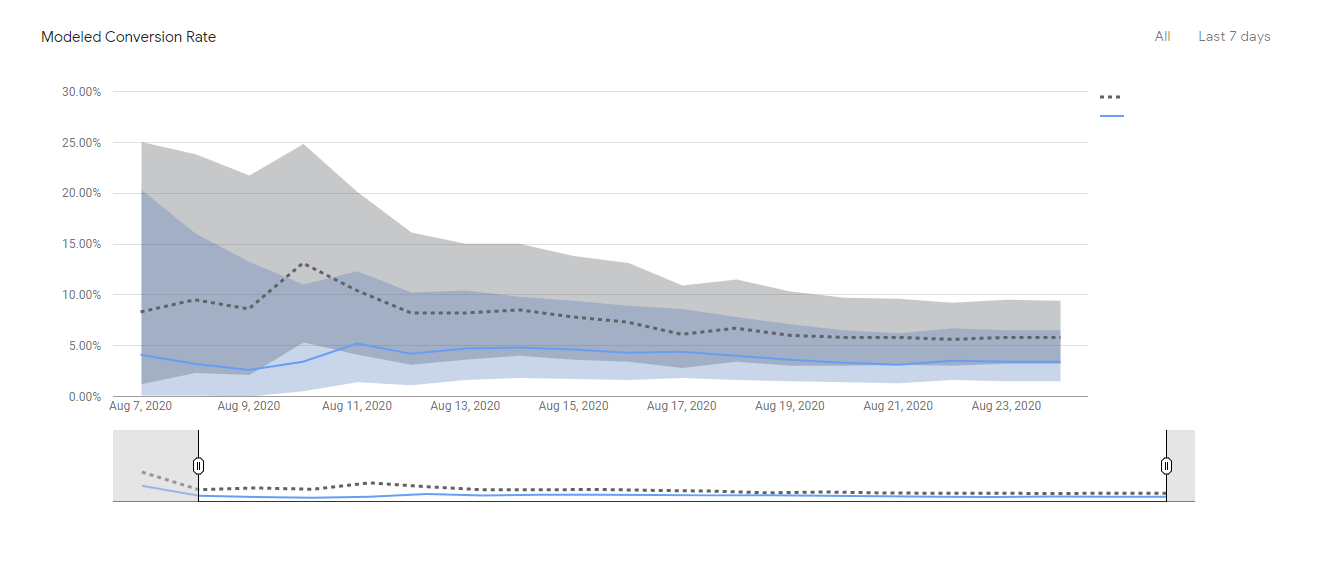
You can also use your existing Analytics data to identify areas of your site that can be improved with Google Optimize.
It’s also easy to get started with. You can set up your first test in just a few minutes, and there’s a whole suite of tools and testing options that are available for free.
Here’s something to try today.
So what is Lucky Orange?
Lucky Orange has the goal of helping you to see everything the user did before they left your site, with the idea that you’re trying to understand why people left without taking action…why they left without converting.
And so here’s what you can do with it.
You can get heat maps, visitor recordings, actually follow individual visits, clickstream data, to see where their eyes are on the screen and what they did first and second and last after reaching your landing page.
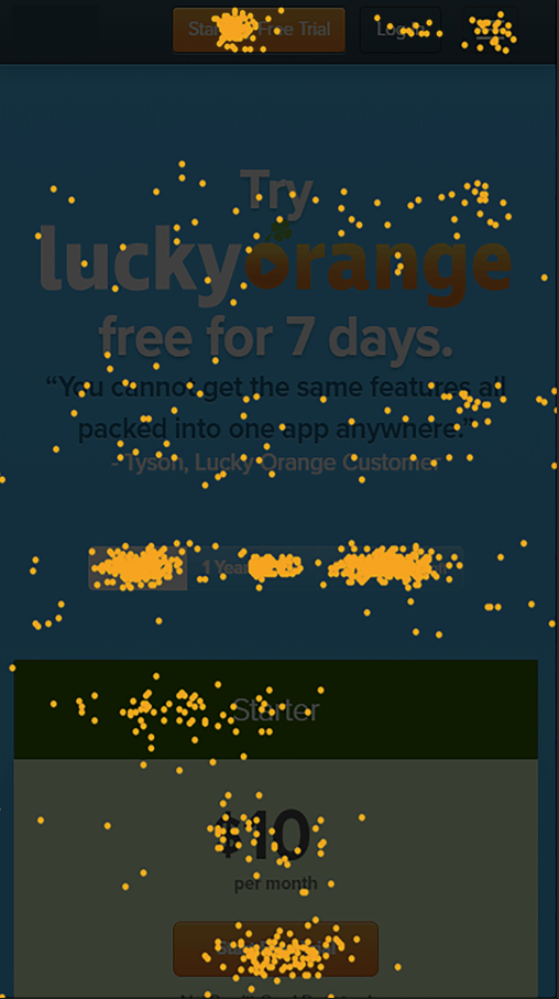
Here’s what I like about it.
These types of maps are super helpful in identifying where the roadblocks are and your user experience and learning what point do visitors lose interest.
How far do they scroll down your page? And is that witty catchphrase supportive of your main goals or does it distract from your main content?
Here’s something to try today with Lucky Orange.
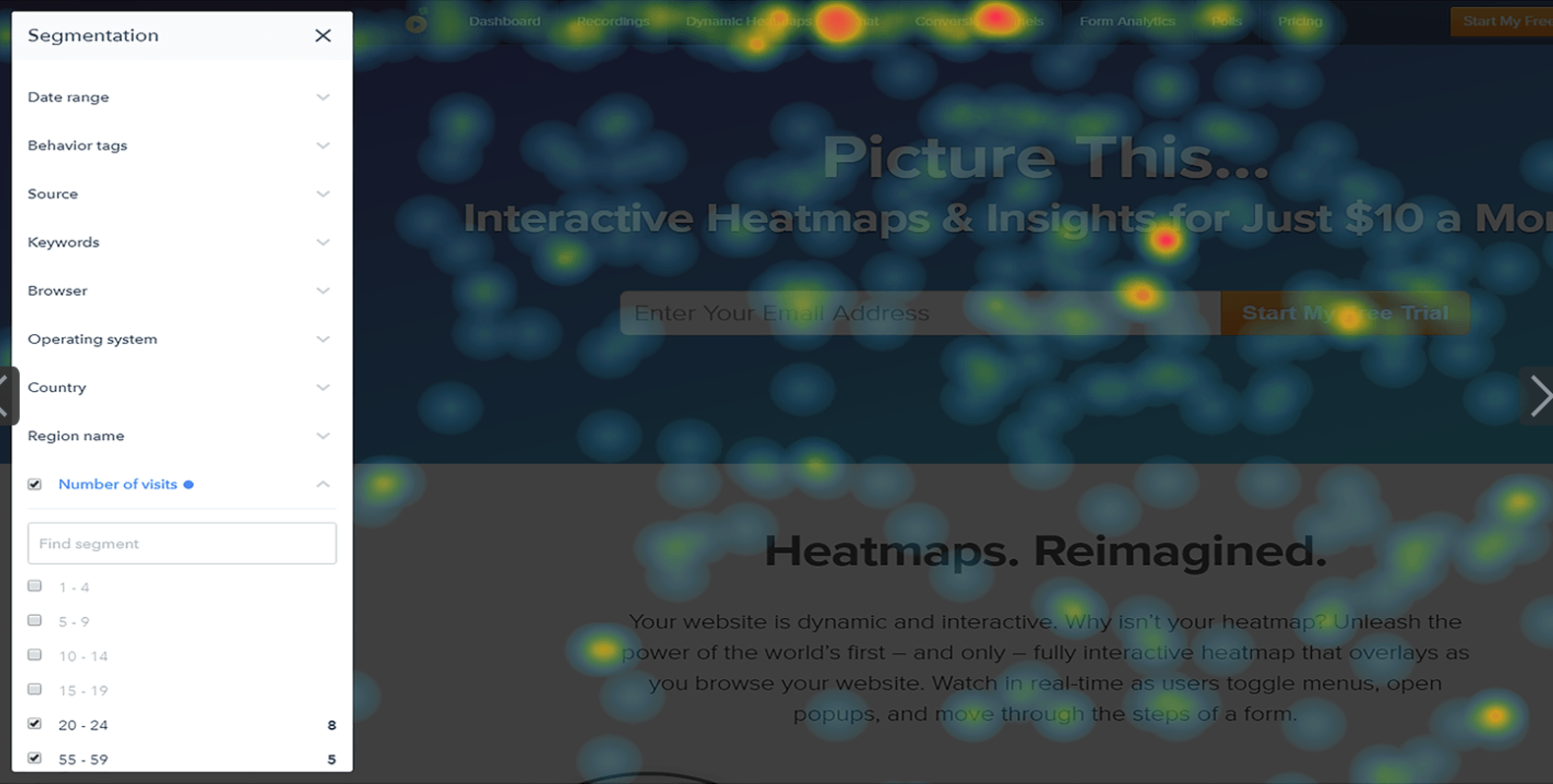
It could be that critical information is never being seen at all.
So I like Userlytics a whole lot because I like to get really raw data.
Here’s what the tool does, right?
If Analytics tells you what happened on your website, Userlytics is going to help you understand why it happened by providing real-time feedback from real people.
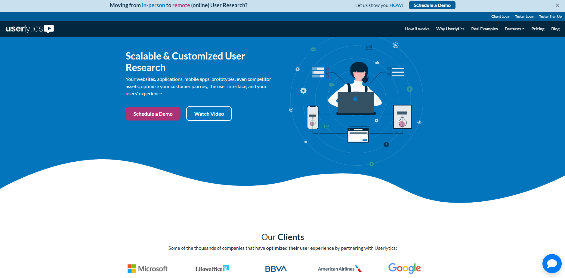
So the premise is that real people visit your website and provide their feedback in real time. The results are eye-opening and frequently surprising.
Both business insiders and marketers can easily miss how real people might perceive or respond to your website.
So it’s great for getting raw, real-time feedback.
It works best, I’ll say, for business to consumer websites where the users taking the test are a rough demographic match for your target audience.
For high capital expenditures and large business-to-business purchases and partnerships and things of that nature, it’s maybe a little bit less easy to use Userlytics for that.
Anyway, so here’s what you can do with Userlytics, though.
So with Userlytics you set up tests where you have users go through your website and complete a series of tasks or provide feedback on a series of elements, and you’ll actually be able to use screener questions to narrow your audience by age, gender, income level, geography, and more.
You can test a single landing page or an entire site. Set up whatever you want to see.
Maybe your entire conversion funnel or a given set of landing pages, then you can choose to have users’ tests where you not only hear the user, but also see them, adding greater depth to the analysis as you can pick up on things like nonverbal cues.

Now, what I like about Userlytics is that it demystifies your website data by adding the voices and faces of human beings.
It also surfaces concrete recommendations for your website that don’t follow the internal agenda of marketing teams or sales teams, and really puts the user at the center of your analysis.
One time I did a Userlytics test and we had maybe three out of five users who said, ‘I would not submit the contact form on this site based on everything I’ve seen. I just don’t trust them’.
That’s an important thing to know for your own site. And it’s great to actually hear that from real people.
So here’s something to try today.
Okay, so those were the three tools that I like to use for conversion rate optimization.
That was again:
If you have any questions about conversion rate optimization, or you’d like to discuss conversion rate optimization more, feel free to reach out to us.
And of course, don’t forget to subscribe.
Thanks and happy tracking!
The post 3 Conversion Rate Optimization Tools Every Marketer Should Try appeared first on WebFX Blog.
When you’re working on post-production for your photographs, it’s vital to have some time savers on hand. With this in mind, Photoshop actions are the most likely choice for achieving the end results you want.
So, if you want to create cool double exposure effects without having manually captured this via camera settings, Photoshop action sets can help you out tremendously. They’re time savers and can help to streamline your workflow.
What we’ve put together here is a set of double exposure effect Photoshop action sets that stand to change your process and help you achieve new looks that might’ve otherwise taken hours.
The Advanced Double Exposure Photoshop Action is easy to use and established in well-organized layers so you can undo your work should you need to. This set comes with 18 mixable color presets and provides a text guide for use.

Another option is the Double Exposure Glow Photoshop Action. This action makes it easy for anyone to add a glowing double exposure effect to their photos with one click. The action has organized layers and comes with full documentation.

This double exposure Photoshop action seamlessly combines two photos to create a beautiful finished product. It’s customizable, includes a vintage effect, light leaks, and color grading options.

Another Photoshop action you might want to consider is this, which includes four variations. It ideally works in medium to high exposure photographs, comes with a help file, and is generally designed to be used quickly and efficiently.

This Double Exposure Photoshop Action is a fantastic effect for your photos. After making that one click, you can add color tone, gradient, and more. It’s easy to use and can make a lasting impression by means of the end result.

The Double Exposure Photoshop Action Kit allows you to create double exposure effects in a wide number of ways. With just one click, you can adjust the brightness, opacity, dodge, masks, gradients, and more. Plus it comes with 30 textures and 1- double exposure gradients, to boot.

This trendy action set is super easy to use and yields results you’re sure to be proud of. It has organized layers for easy use, comes with an illustrated guide and video tutorial, and is all around pleasant to work with.

Another great option is The Double Color Exposure Photoshop Action set. This one makes it possible to add colorful double exposure effects to photos, type, graphics, and more. With one click, you can transform an image using seven different color styles.

This set of double exposure Photoshop actions includes a video tutorial and documentation that make getting started using it easy. It comes with several actions for blending two photos together, for adding effects to a single photos, adding depth of field, and adding chromatic distortion. It also comes with 235 light effects, 33 textures, and more.

Another choice to consider is this set of 80 double exposure Photoshop actions. All of these work with a single click and the set comes with instructions for their precise use.

This set of color double exposure Photoshop actions uses well-organized layers and is easy to edit and use. It’s also non-destructive and comes with 50 color presets so you can readily achieve the effect you’re looking for.
Here’s another great choice. The Animated Parallax Double Exposure Photoshop Action creates a parallax shift effect using two photos. It comes with four different shift styles and can be implemented with just a couple of clicks. It’s also fully layered and can be customized to suit your specific needs.

You might also want to consider the AI Modern Double Exposure Photoshop Actions set. This set makes it easy to create any kind of double exposure artwork. It uses AI to detect faces and creates stunning results. It uses well-organized layers that are completely editable, you can swap textures, and it comes with 30 high resolution textures.

Another option is the Premium Double Exposure Photoshop Action set. Everything is separated and has grouped elements for easier use. And the end result is stunning, offer a professional look that’ll make it seem like you spent hours trying to achieve it.

The last action on our list here is the Duotone Double Exposure Photoshop Actions set. This one requires that you select two images and then play the actions all at once to achieve the desired effect. It comes with 12 duotone effects, on which you can adjust the opacity. It also allows for balance between layers and is non-destructive so your original images stay intact.

With this collection of double exposure effect Photoshop actions on hand, you can create a wide range range of stunning effects that will appeal to everyone who sees them. Take your designs up a notch without having to expend additional effort. Sounds like a winning formula, right?
The post The 12 Best Double Exposure Effect Photoshop Action Sets in 2021 appeared first on Speckyboy Design Magazine.