Monthly Archiv: July, 2020
Did you know that 89% of people shop with a competitor after a poor user experience? If your website isn’t up to par, you risk losing leads to your competition.
Luckily, we’ve created a handy checklist that you can use to make sure your website has everything you need to attract new leads and keep them engaged on your site pages.
Keep reading to get our website best practices checklist and be sure to subscribe to Revenue Weekly to get actionable insights on how to market your website better!
Establish your target audience
Before you dive into the nitty-gritty of your website, you need to ensure that you know exactly who you’re targeting. To create a website that best serves your audience, you should analyze your typical site visitor to collect information like:
- Demographics
- Buying habits
- Income and occupation
- Pain points
- Hobbies/interests
- And more
When you have in-depth information about your audience, you can develop your site to better meet their needs.
Once you know the specific characteristics of your target audience, you can start answering important questions like:
- What does my audience want from my site?
- What site components are fundamental for providing my audience with a better experience?
- What information is more important to my audience, and how can I get it to them?
This tactic is one of the most important web design best practices for building an effective website. When you can answer these questions, you can start building a site that has your audience in mind.
Establish your style guide
As you develop a plan for your site’s design, you must create a style guide. A style guide ensures that your website keeps a consistent brand image and is cohesive across the board.
When you create a style guide, you establish information like:
- Website color scheme (3 or 4 colors)
- Font style
- Image style
- And more
Essentially, your style guide should give details on how pages on your site should look. Not only does it help you establish your brand identity, but it also ensures that no matter who works on your site, they have a guide for how to design different elements on the page.
Create an insightful navigation
Next on our list of best practices for web design is to create organized and functional navigation. Your navigation bar is a critical component of your site.
If users can’t find information fast, they’re likely to leave your site. And after that bad experience, 88% of people are less likely to come back to your site.
When you create your navigation, it’s pivotal that you use the right headings to separate your information effectively.
So, let’s say that you own a clothing store. Instead of having a generic “Clothing” tab to include all your products, you may break it down into tabs like “Men,” “Women,” and “Kids.” Tilly’s navigation bar is a prime example of how you can break down your navigation.
This navigation is simple and easy to follow. Users can find the product category that’s relevant to them and see subcategories of different types of products that fall under the main category.
Create an effective layout for each page type
Page layout is a critical component of your website. You want to ensure that you’re setting up pages in a way that provides a fantastic user experience for your audience.
Your page layouts may differ depending upon the page, but you’ll want to have a general layout for similar page types. It will help you ensure consistency and keep your site cohesive.
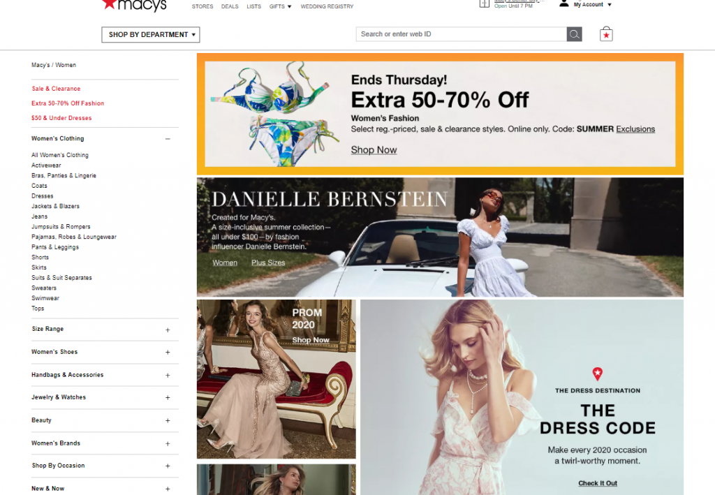
So, for example, if you visit Macy’s women’s clothing page, there is a grid of photos that showcases some of their product categories.
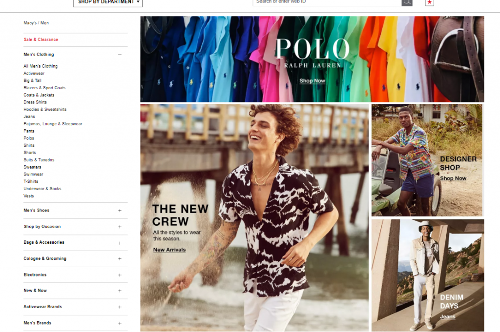
If you navigate to the same page for men’s clothing, you get a similar setup — a photo grid showcasing their product categories.
A similar format helps create a consistent image for these product pages across the board. It also helps users know what to expect as they browse around your site, which makes them feel more comfortable.
Establishing your page layouts is one of the most important web design best practices because it helps you build a consistent and familiar site for your audience that encourages them to continue browsing.
Compress images on your site
Next on our website best practice checklist involves images on your site.
Images are a valuable part of your site. They help create points of interest on your page and break up the text, and you want them to be high-quality images too. Grainy or low-res images make people think your site is less trustworthy.
Integrating all these high-quality images can cause your site’s load time to suffer. If your site doesn’t load quickly, you’ll lose leads. Users expect your website to load within two seconds, so if it doesn’t, you risk losing leads.
The best thing you can do is compress your image file sizes. You can use a tool like Kraken to compress image file sizes without compromising the quality.
Bonus item to check off: In addition to your photos, make sure your videos aren’t bogging your site down, too. Host your videos on third-party platforms, like YouTube or Wistia, and embed the code on your site. It will keep heavy video files from slowing down your site.
Utilize white space
One of the most important web design best practices is that you need to use whitespace. When you’re building your website, you don’t want to overload it with text and visuals. Crowded pages will leave your audience feeling confused and overwhelmed and may even cause them to leave your website altogether.
To keep your site clean and easy to browse, don’t be afraid to use white space. In this example, from Target, you can see how they use white space on their pages to keep users engaged with the important information in the middle.
White space will help you keep your audience focused when visiting your pages and allow them to browse through your site with ease.
Design call to action (CTA) buttons that pop off the page
People will browse through your site to learn more about your products or services and if they like what they see, they’ll want to learn how to take the next steps. Without a call to action (CTA) button, your audience won’t know how to proceed in the buyer journey.
You must create CTA buttons that pop off the page, so your audience doesn’t miss them.
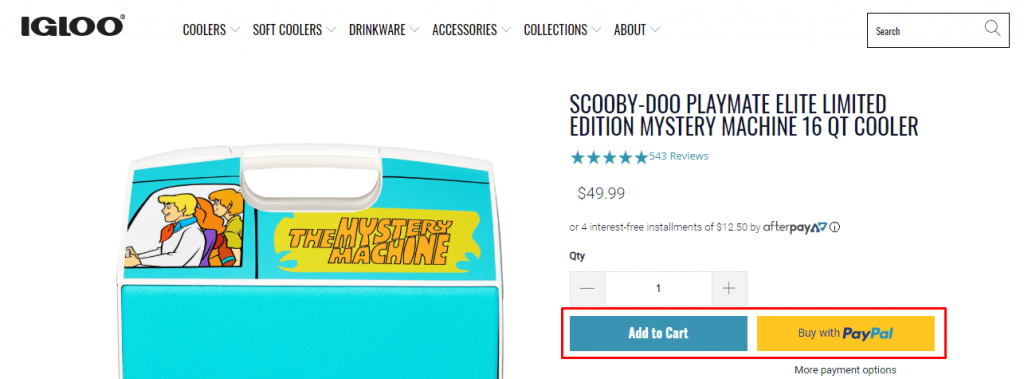
In this example from Igloo, you can see that the blue CTA button stands out on the page, as well as the yellow button to pay with PayPal. Both buttons catch the shopper’s attention and make it easy for them to see how to add the product to their cart or to pay with PayPal.
CTA buttons are extremely valuable for helping you guide your audience to the next step. Whether you want them to sign up for an email list, buy a product, or contact your business, CTAs can help you get people to take that step.
Make sure your website is mobile-responsive
Having a mobile-responsive website is one of the most critical best practices for web design. With over 50% of Internet traffic coming from mobile, you must offer a site that works on handheld devices.
Creating a mobile-friendly website will help you boost user engagement and earn more conversions for your business. In fact, 67% of users are more likely to buy from a mobile-friendly company. So, if you haven’t optimized your site for mobile, you’re missing a prime opportunity to earn conversions.
The best way to make your site look great on mobile is to integrate responsive design. Responsive design enables your site to adapt to whatever device a user uses. Whether it’s a smartphone or tablet, your website will adjust to fit the device’s screen.
As a result, you’ll provide a better experience for your audience and keep them engaged on your site.
Optimize your website for search engine optimization (SEO)
The last item on our website best practices checklist is to optimize your website for search engines. You’ll want to invest in search engine optimization (SEO) to help your site rank in search results.
SEO is the process of optimizing your website to rank in relevant search results. It involves strategies like:
- Researching and optimizing for relevant keywords
- Ensuring your site load quickly
- Making sure your site is mobile-responsive
- Creating content to drive traffic to your site
- And more
If you’re going to put the time and effort into building your beautifully designed site, you want to ensure that it’s optimized to rank in search engines so you can drive valuable traffic to your site.
Put these best practices for web design into action
Now that you’ve seen our website best practices checklist, you’re ready to start optimizing your website for conversions. But if you find you need to make a lot of changes and it feels overwhelming, you don’t need to do it alone.
Our team at WebFX is here and ready to help. We have over a decade of experience in creating websites that engage and delight users. We have a team of award-winning designers and we’ve designed more than 1,100 client websites. Not to mention, web design can help you improve sales — and we can get you started.
Want to get started? Contact us online or call us today at 888-601-5359 to speak with a strategist about our web design services!
The post Website Best Practices Checklist: 9 Web Design Best Practices appeared first on WebFX Blog.
Here's what was popular in the PHP community one year ago today:
PHP Internals News: Episode 62: Saner Numeric Strings
London, UK
Thursday, July 16th 2020, 09:25 BST
In this episode of "PHP Internals News" I talk with George Peter Banyard (Website, Twitter, GitHub, GitLab) about an RFC that he has proposed to make PHP's numeric string handling less complicated.
The RSS feed for this podcast is https://derickrethans.nl/feed-phpinternalsnews.xml, you can download this episode's MP3 file, and it's available on Spotify and iTunes. There is a dedicated website: https://phpinternals.news
Transcript
Derick Rethans 0:17 Hi, I'm Derick, and this is PHP internals news, a weekly podcast dedicated to demystifying the development of the PHP language. This is Episode 62. Today I'm talking with George Peter Banyard about an RFC that he's proposing called saner numeric strings. Hello George, how are you this morning?
- George Peter Banyard 0:36
-
How are you I'm doing fine. I'm George Peter Banyard. I work on PHP, and I'm currently employed by The Coding Machine to work on PHP.
- Derick Rethans 0:46
-
I actually think I have a bug swatter from The Coding Machine, which is hilarious. Huh, I can't show you that okay of course in a podcast and not on TV. But yes, I think I got it in Paris at some point at a conference there, and it's been happily getting rid of flies in my living room. Anyway, that's not what we want to talk about here today, we want to talk about the RFC that is made, what is the problem that is RFC is hoping to address?
- George Peter Banyard 1:09
-
PHP has the concept of numeric strings, which are strings which have like integers or floats encoded as a string. Mostly that would arrive when you have like a get request or post request and you take like the value of a form, which would be in a string. Issue is that PHP makes some kind of weird distinctions, and classifies numeric strings in three different categories mainly. So there are purely numeric strings, which are pure integers or pure floats, which can have an optional leading whitespace and no trailing whitespace.
- Derick Rethans 1:44
-
Does that also include like exponential numbers in there?
- George Peter Banyard 1:48
-
Yes. However trailing white spaces are not part of the numeric string specification in the PHP language. To deal with that PHP has a concept of leading numeric strings, which are strings which are numeric but like in the first few bytes, so it can be leading whitespace, integer or float, and then it can be whatever else afterwards, so it can be characters, it can be any white spaces, that will consider as a leading numeric string. The distinction is important because PHP will sometimes only accept pure numeric strings. But in some other place where we'll accept leading numeric strings. Of casts will accept whatever string possible and will try to coerce it into an integer. In weak mode, if you have a type hint. It will accept leading numeric strings, and it will emit an e_notice that a non well formed string has been encountered. When you use like a purely string string, you'll get a non numeric string encountered warning. So the main issue with that is that like strings which have a leading whitespace are considered more numeric by PHP than strings with trailing whitespaces. It is a pretty odd distinction to make.
- Derick Rethans 3:01
-
For me to get this right, the numeric string in PHP can have whitespace at the start, and then have numbers. There's a leading numeric string that can have optional whitespace in front, numbers and digits, and then rubbish. Then there's a non numeric string which never has any numbers in it.
- George Peter Banyard 3:22
-
No numbers in the begin
Truncated by Planet PHP, read more at the original (another 17435 bytes)
Package:
Summary:
Generate a REST API from a Laravel model
Groups:
Author:
Description:
This package can be used to generate a REST API from a Laravel model...
Read more at https://www.phpclasses.org/package/11719-PHP-Generate-a-REST-API-from-a-Laravel-model.html#2020-07-15-02:06:36

As a food lover, I absolutely adore cookbooks. I have a ton of them – all filled with pages and pages of delicious recipes for me to try and experiment with. Perhaps some of you do as well. My favorite part of a cookbook is the visuals – mouth-watering pictures of food heaven on perfectly arranged plates. It’s enough to send even the casual eater into foodie nirvana.
Most cookbooks I own have wide margins and extra pages in the back to make notes on. Because I’m a total cooking geek, I take full advantage of this feature, making notes of things I’ve tried, adjustments I’ve made to the measurements, different methods of arranging the dish, et cetera. Sometimes I’ll even print out photos I’ve taken of my dinner table to have as a reference.
My favorite method of recording information, though, is sketching. If there’s a complex dessert I have to make that requires a careful assembly, there’s no better way to figure it out than by drawing it. Making a sketch in my recipe allows me to keep a visual record in addition to a written one, so that I can produce an even better outcome next time. In this way, my cookbooks are almost like sketchbooks, and that’s exactly what I’m going to talk about today.

Pancakes by Zhenia Pikul
Sketchbooks – The Designer’s Cookbook
In my opinion, and I’m definitely not alone, designers don’t keep sketchbooks nearly often enough. A sketchbook is possibly the best way to keep track of your ideas and to document your thought process, but many designers – even those who went to school – are afraid of “ruining” a new sketchbook with their “bad” drawings.
This is a silly notion that needs to go away forever. Sketching in a design context is not – I repeat: not – about how well you can draw. It’s a tool to develop your brain. By sketching regularly, you can actually improve your ability to think critically and quickly call up creative solutions whenever you need them.
The earliest cookbooks were simply records of what wealthy, upper-class people ate. They were created not for the wealthy themselves, but for their kitchen staff. Modern recipe books used by chefs serve much the same purpose. They serve as a working guide to help cooks solve their diners’ main problem: they’re hungry and they want a delicious meal.
In this same way, a sketchbook is a visual reference for solving problems. Most cooks I know don’t follow the recipe exactly, and you don’t have to use everything you put down in your sketchbook. It’s simply a reference for you to use – just like a mood board, a wireframe, or a comp or draft.

Sketchbook Doodles by Derek Clark
Share The Wealth
The days of the “secret recipe” are over. Recently, there’s been an explosion of celebrity chefs who have released their own cookbooks full of recipes developed on their television shows or in their restaurants. Scores of non-celebrity chefs and professional food bloggers are also eager to share what they know. In fact, even people who aren’t chefs, such as Gwenyth Paltrow or Martha Stewart, put out recipe books. Why? Because helping others improves your image.
Sharing what you know can put you in a position of authority, even if you’re not a so-called “expert.” It helps you stand out as someone who is looking to provide value and help people help themselves.
Look, I know how many designers feel about their drawing abilities. But as someone who’s hired designers in the past, I can’t tell you how awesome it is to find one who’s willing to share their sketches and expose the inner workings of their brains. Clients love to see your thought process. It makes them more likely to want to do business with you, rather than the next person.
Your sketches don’t have to be beautiful, and okay – you don’t have to share the ones that look like a kindergarten class had a riot across the page. But sketches that show the way you think are immensely valuable to clients. It helps them see how you will apply your brain to their own projects.
If all you ever share on your website are the polished, finished products in their annoyingly perfect glory, you’re missing out on connecting with people on a personal and intellectual level. Showing nothing but the finished product is dry and boring, and it doesn’t solve your clients’ problems. Your client isn’t paying you for work you did for someone else. They’re paying for the way you approach your designs – the way you think.

Sketchbook by Jady Salvatico
Having A Theme
Cookbooks often have a theme – desserts, vegetarian, etc. There are also single-subject cookbooks, dealing with things like pizza, pasta, bread, or any other singular dish. Then there are cookbooks that can instruct you on certain cooking techniques like baking, barbecuing, or cloning recipes for popular commercial foods you would find in a restaurant or grocery store.
It’s not necessary to include every single bit of information related to cooking in every cookbook. No one would ever need or want to buy more than one of them, for one thing. Also, a cookbook that comprehensive, if it existed, would probably be the size of your car.
When sketching and sharing your design “recipes,” it’s a tremendous benefit to pare down the theme of your sketches to whatever is relevant to your project. If you’re coming up with new ways to incorporate animated type in your mobile interface, it’s not really that enlightening if you have a pencil drawing of your dog randomly dropped in.
You don’t need to show every single sketch you do, nor does every sketch have to be inherently useful on its own. Rather, it’s the overall process of keeping records that’s important.
Don’t Forget To Process
If you do start keeping a regular sketchbook, it’s easy to get overwhelmed by the volume of sketches you’ll produce. As a formally trained illustrator, I’ve been keeping sketchbooks for many, many years. I don’t actually throw anything out, but I do have to occasionally put boxes of papers in deep storage because there’s just no room for them in my house.
My reference and inspiration folders are the same way. It’s important to constantly update your resources; if something is no longer useful, get rid of it. Clutter on your hard drive leads to clutter in your work.
The post Sketchbooks – The Designer’s Cookbook appeared first on Speckyboy Design Magazine.
Package:
Summary:
Generate a random string from a template
Groups:
Author:
Description:
This package can generate a random string from a template...
Read more at https://www.phpclasses.org/package/11718-PHP-Generate-a-random-string-from-a-template.html#2020-07-14-19:23:26

Yesterday was my last day at Facebook. After 9 1/2 years it was high time for a change. I dropped the news on twitter/fb and thought now it would be nice to answer the question of "what's next?" that friends are wondering.
The trajectory
I myself have wondered sometimes what the life after Facebook could look like for different folks. FB is one of the best places to be a software engineer, if not the best. To me, the path to FB took 10 years of upwards movement. DIY sites for other folks, then an lonely web dev at an enterprise company (Allianz), then immigration, start over at a web design studio, then enterprise (SAP), another immigration, Yahoo!, finally Facebook. Always moving to a greener pasture. For other engineers, FB is their first ever paid gig out of college. Where do you go from there, once you start at the top?
Moving to another big Silicon Valley company (where engineers are treated better than anywhere else) is at best a lateral move.
The bubble
And then there's the bubble you're inside of, when working for a FAANG company. The bubble of the big tech co and then an even smaller bubble of the specific company with its super advanced tools you learn to rely on. I've read somewhere that ex-Googlers commonly starting a company spent most of the time initially recreating the great tools they're used to use in their work.
Solo
So, if moving up is not an option (there's no up), how about going different? And how different? I'd say as different as possible. What's different from a big Silicon Valley company? Small. Outside Silicon Valley. And not even a company. In other words going solo. Be more entrepreneurial. Explore a few ideas. And step outside the bubble.
More specifically?
teoriamusica.com
I'm taking music classes in Santa Monica College and in UCLA Extension (film scoring program). As part of my journey from self-taught guitarist to someone who can read and write music, I've being cobbling together online exercises at onlinemusictools.com. Usually a quick CRA done in an evening to help me practice for this week's quiz.
While this site will always be out and free, I'd like to take the time to rebuild it properly, with more tools, esprcially for teachers, tracking progress, etc. Explore more of the WebAudio and WebMIDI APIs. I even got a domain for it - teoriamusica.com.
Is this space too crowded? Is it now the best time for online educational aid? Who knows. The thing is building something takes time and the chances of success are higher if you stick with it. And chances of sticking with it are higher if you work on something you love.
sorty.app
A friend has this other startup idea. How can you manage a product (not a project) so that business/design/engineering folks are on the same page throughout the (hopefully long and always messy) life of a product? sorty.app might have an answer. Exciting, isn't it? So I'll join my friend and we'll build this vision together.
Consulting
Leaving the big tech co bubble may end up meaning you move to a smaller bubble after the initial "hello world!" exploratory phase. Your own bubble. Helping other companies OTOH exposes you to exciting new tech. And I want to this too. So if you need Web Perf or JS consulting, hire me.
Books/edu
O'Reilly has been asking me for second editions to React: Up and Running and JavaScript Patterns. The former I've actually started. And there's an early release out there.
And then can I move beyond books and expand to video or other educational products? Possibly. People tell me they've learned a lot from me. Even changed jobs and as a result have better lives after reading (house, marriage, etc). What an honor! I don't think I'm an exceptional teacher, but maybe I'm providing an interesting angle. Often with programming concepts different people need different ways of explaining to grasp a concept.
Web perf community
I've barely maintained calendar.perfplanet.com. It needs love. Podcast episodes need editing.
I want to do more research that hopefully helps more people with various size web sites and skills. And share more with the community. If you're running a conference, talk to me.
...and music.
There is much to study and practice when it comes to music. Expect to see (erm, hear) me finally starting to finish and release music.
So many ideas
Programming is an interesting activity. There are so many options of things to do.
Am I missing something? Sure. Am I oversubscribing? Possibly. But I want to explore various directions and see what happens. And if nothing works and I realize I've made a mistake leaving Facebook? Well, nothing is irreversible. If it turns out self-employment, lifestyle-business, etc. is not my cup of tea, then I'll gladly join a new team with great people building cool tech.
WordPress 5.5 Beta 2 is now available!
This software is still in development, so it’s not recommended to run this version on a production site. Consider setting up a test site to play with the new version.
You can test WordPress 5.5 beta 2 in two ways:
WordPress 5.5 is slated for release on August 11th, 2020, and we need your help to get there!
Thank you to all of the contributors that tested the beta 1 development release and provided feedback. Testing for bugs is an important part of polishing each release and a great way to contribute to WordPress. Here are some of the changes since beta 1 to pay close attention to while testing.
Some highlights
Since beta 1, 48 bugs have been fixed. Here is a summary of a few changes included in beta 2:
- 19 additional bugs have been fixed in the block editor (see #23903 and #23905).
- The Dashicons icon font has been updated (see #49913).
- Broken widgets stemming from changes in Beta 1 have been fixed (see #50609).
- Query handling when counting revisions has been improved (see #34560).
- An alternate, expanded view was added for
wp_list_table (see #49715). - Some adjustments were made to the handling of default terms for custom taxonomies (see #43517)
Several updates have been made to the block editor. For details, see #23903 and #23905.
Developer notes
WordPress 5.5 has lots of refinements to polish the developer experience. To keep up, subscribe to the Make WordPress Core blog and pay special attention to the developers’ notes for updates on those and other changes that could affect your products.
How to Help
Do you speak a language other than English? Help us translate WordPress into more than 100 languages!
If you think you’ve found a bug, you can post to the Alpha/Beta area in the support forums. We’d love to hear from you!
If you’re comfortable writing a reproducible bug report, file one on WordPress Trac, where you can also find a list of known bugs.
Byte-sized functional programming: Pure functions make testing easy
When testing stateful code, you have to first set up all of the explicit and implicit state that a given piece of code depends on. If the object you're testing has many dependencies that could be complex, or references global variables, or calls many other routines with their own dependencies, you may be looking at a lot of complex setup that makes testing hard to do effectively.
Pure functions greatly reduce that problem.
A pure function is a function that:
- has no inputs other than those explicitly specified;
- has no effect on any value other than the value it returns.
That means there is, by definition, only one place to inject dependencies: the call itself. And there's only one effect to validate: the return value of the function. No need to call a function and check what the effect was on some other value or piece of code: by definition, the only effect is the return value.
If one of the parameters you pass in is itself complex, that may make the test complex. But if the parameter is complex, that can serve as an impetus to simplify it. Rather than passing in an object, for example, just pass in a single function. If that function in practice has more complexity behind it, fine, but it makes passing a mock function trivial. Just... make a new (anonymous) function for the one test.
When your code has fewer sneaky interactions, there's less effort involved in testing as well as fewer things to test.
---
Want to know more about functional programming and PHP? Read the whole book on the topic: Thinking Functionally in PHP.
