Community News: Latest PEAR Releases (06.15.2020)
Latest PEAR Releases:
Latest PEAR Releases:
Special effects such as smooth scrolling, page transitions or CSS animations can add some welcome personality to your WordPress website. Use them to call attention to important information, enhance UX and take your designs up a notch.
Here are some free WordPress plugins you can use to add a variety of effects to your site:

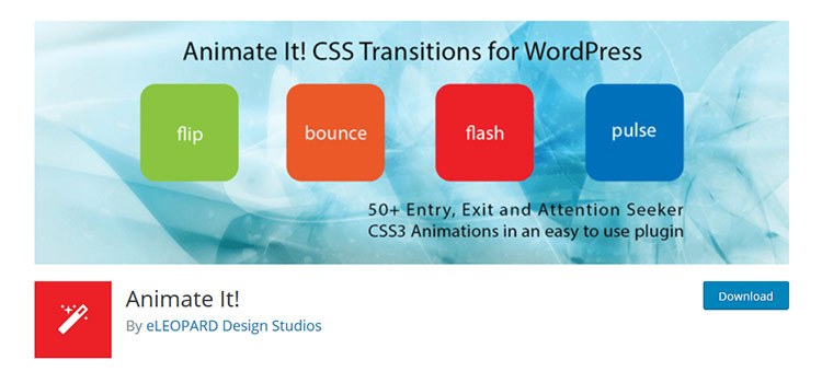
Adding CSS3 animations to your site is easy with Animate It!. The plugin combines the Animate.css and Animo.js libraries in one package containing over 50 animations. Animations can be applied on user events like scroll, hover and click.
Page Animations and Transitions offer a selection of nine different “in” and “out” page transitions. You can also set duration times for transitions.

CSS3 Transitions will automatically add (you guessed it) CSS3 transitions to elements on both the front end and (surprisingly) the back end. The transitions are added to any <a>, <li>, <img> and <input> that have a hover or focus state defined in your theme’s stylesheet. It’s an interesting choice for those who want a very quick solution.

Add animations to any text on your site with Easy Textillate. The plugin includes the textillate.js, animate.css and lettering.js libraries to provide for all sorts of excellent effects for your typography. Generate Shortcodes with the animation styles you want, place them into your content and watch them go!

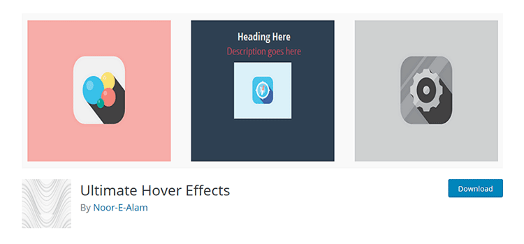
Use Ultimate Hover Effects to add some life to your image captions. Select an image from the WordPress Media Library and set up the hover effects you want to use. Then it’s just a matter of embedding it into a post or page. A Shortcode generator is also included.
Page scroll to id adds smooth-scrolling effects to in-page navigation using CSS ID elements. You can set the scroll duration and easing – with over 30 easing types to choose from. Both vertical and horizontal scrolling is supported and offsets can be configured for individual links.

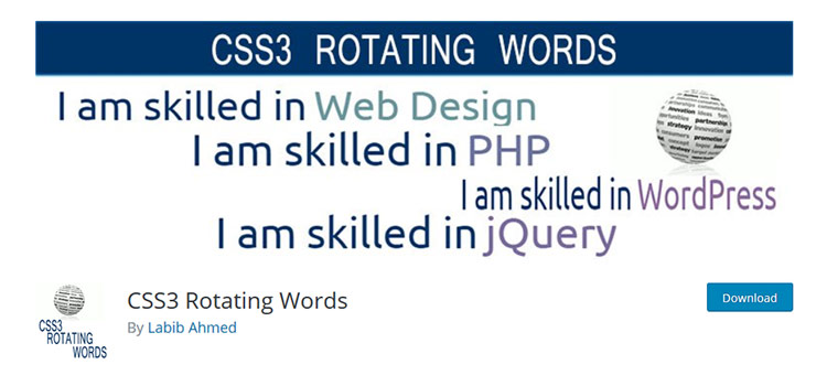
CSS3 Rotating Words is a handy plugin with a simple function: Rotating a word or words in a sentence using animation. For example, you might have a sentence where you want to change one word:
Choose from five animation styles and also set the font color and size.
Use WP Progress Bar to add animated progress bars to your WordPress pages and posts. Bars are added via a Shortcode. Customize with options for text, colors, percentage (the amount at which the bar finishes its animation) and width.

Page Loading Effects lets you choose from a selection of animations while the content from your site loads in. Once loading is complete, the animation will automatically disappear. You can customize colors in the plugin settings or go even further with your own custom CSS.

If you’re looking to add a touch of cool to your text without resorting to using images, SVG Logo and Text Effects is worth a look. The plugin has lots of features, including support for Google Fonts. Text you create will be fully editable and SEO-friendly.

The right mix of special effects can bring elements of both fun and utility to your WordPress website. Of course, it’s best to pick and choose carefully when deciding what to use.
A good rule of thumb is to always keep the best interests of users in mind. If a feature increases usability or makes your site more enjoyable to use, then it might be worth your while.
The post 10 Free Plugins for Adding Animation Effects to WordPress appeared first on Speckyboy Design Magazine.
When a client hires you to design and build a website, they’re making an investment in their organization. And, depending upon their particular sector, that website can play a major role in determining future success.
Yet, it’s not always viewed that way. Some clients will nickel and dime their way through a project, not wanting to spend the funds required to accomplish their goals.
Even worse is when an organization has a website with outstanding potential, but lets it languish. The site’s content and underlying software age out, while previous momentum is lost. It happens again and again, company after company.
You may ask, what is it that these clients are missing? It may just be the most important thing they need to know.
As a young designer, I used to look forward to finishing off a project as if I’d never have to deal with it again. The website, as far as I was concerned, was “done”. Experience has shown me how wrong I was.
In order to stay relevant, websites need to continually evolve. Content must change to reflect what a business is currently doing – not what they did when the site was first built. Technology needs to be upgraded in order to improve functionality and the user experience.
This applies to virtually every type of website. Although, a case can be made that it’s more of a life-or-death situation for an eCommerce or community-based site than the standard five-page brochure variety.
But so often, clients don’t seem to see their websites as an ever-evolving product. Instead, they view it as something they buy once and use forever. And while there may be some relatively small maintenance and hosting fees, it’s a matter of merely keeping things running smoothly. Growth isn’t necessarily considered.
They’re missing the bigger picture.

Part of the issue may stem from how we as web designers communicate. In my own case, I’ve tended to focus on the task at hand when building a website.
First, it’s all about getting the project requirements. Then it’s on to guiding clients through the design and build processes. These are often major challenges that require a lot of attention in order to get things right.
All of this means that talk of the future can get lost in the shuffle. We may not really discuss the need for evolving content and technology until we’re faced with an issue.
For clients, it’s easy to see why this could bring about a misunderstanding. They’re seeing a website that they’ve invested in that, for one reason or another, isn’t keeping up with the times. It might be content, design or functionality-related – or any combination thereof.
This can lead to confusion. Why is the website now outdated? Shouldn’t it be built to last? These are things web designers may inherently understand, but aren’t necessarily obvious to clients.
Part of our job is to educate our clients on the realities of having a website. To stay relevant, a website requires more than just routine maintenance. There has to be both an understanding of and strategy to keep things fresh and vital.
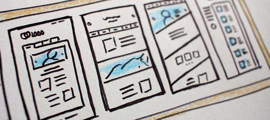
So, what should our clients know about owning a website? Here are a few concepts that will help them better understand what comes along with the territory.
Much of what we build these days relies on third-party software. For example, utilizing a CMS and plugins are a very common practice. We might also include a lot of our own custom code as well.
All of these items require updates. It might be a matter of updating your WordPress installation as usual. However, it may also go well beyond that level of maintenance.
Changes to programming languages such as PHP may require rewriting significant portions of code to stay functional. That comes with a cost of both time and money.
And speaking of money, any commercial software licenses also need to be kept up. Letting them lapse could lead to future problems.
The software that seemed like a perfect fit in the beginning may not last. In the case of third-party apps, they might disappear into thin air without notice. That means finding a suitable alternative and making a switch.
A website that uses a CMS and is more than a year old will probably experience this scenario. A theme or plugin breaks, and updates are nowhere to be found. All of the sudden, you’re back to the drawing board.
It’s frustrating for everyone involved. But it’s also out of our control. While we may try to build with tools we think will be around for the long haul, there’s no guarantee. Clients will need to understand that reality.
It’s probably safe to assume that most people know that technology evolves at break-neck speed. Anyone who has purchased an expensive smartphone has probably figured that out, as it becomes outdated mere months after release.
Websites aren’t much different. Just think of how your favorite CMS might have changed within the last six months to a year. Then think about how it has evolved in the past five years. The differences are likely very noticeable.
As such, user tastes and expectations change right along with technology. Thus, an organization must be ready to adapt as needed.

In the end, this is one more reason why the designer-client relationship is so important. Our experience and knowledge of the industry is something that needs to be shared with those we work with.
If we can better prepare clients for the responsibilities that go along with owning a website, we can tackle these challenges together.
The post The Most Important Thing Your Clients Should Know About Their Website appeared first on Speckyboy Design Magazine.
Dealing with the Low or No-Profit Areas of Your Freelance Web Design Business – Should you jettison that under-performing service? This guide will help you decide.

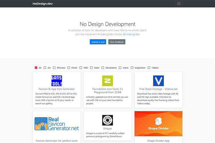
No Design Development – A collection of tools aimed at developers who aren’t artistically-inclined.
CUBE CSS – A CSS methodology oriented towards simplicity and consistency with a heavy dosage of pragmatism. At least, that’s what they say.
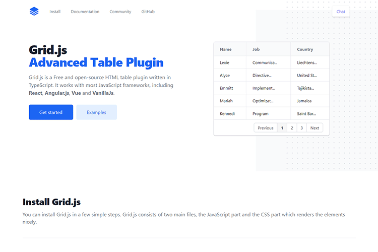
Grid.js – A free, open-source HTML table plugin written in Typescript. Works with most frameworks.
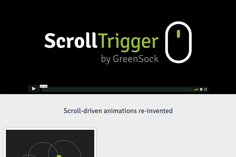
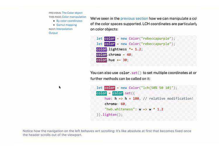
ScrollTrigger – A GSAP plugin that lets you animate any element on scroll.
15 Free Cinema & Movie Lightroom Presets – Make your photos look cinematic with this collection of Lightroom presets.

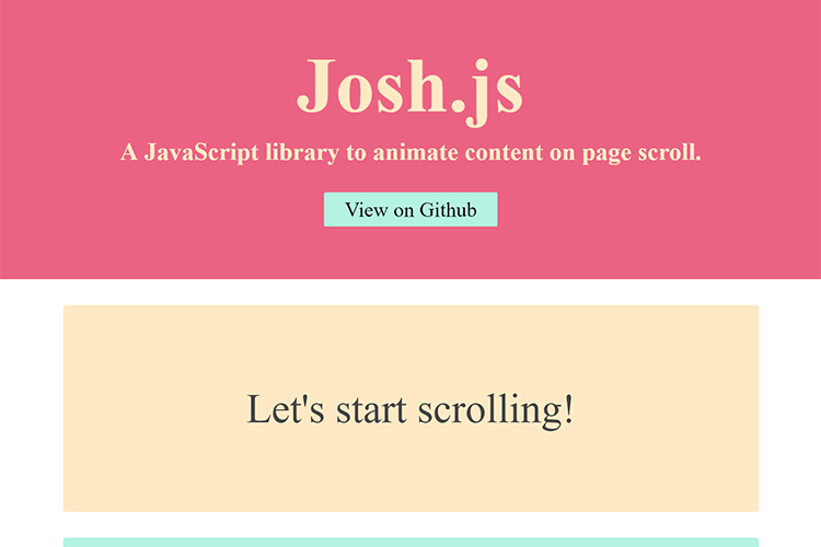
Josh.js – A JavaScript library to animate content on page scroll. Works with Animate.css.
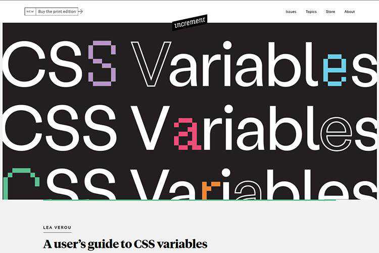
A user’s guide to CSS variables – Learn how CSS variables can help you create more consistent styles.
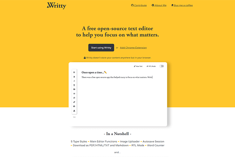
Writty – A free, open-source text editor with multiple styles and export options.
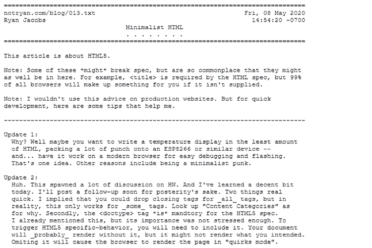
Minimalist HTML – A quick reference for writing minimalist HTML. And yes, it’s written in plain text.
Hybrid positioning with CSS variables and max() – A look at positioning an element based on scroll position.
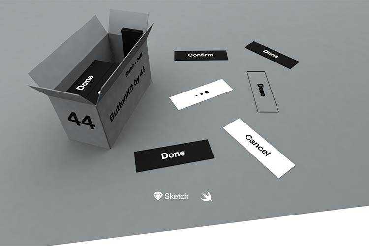
Button Kit – A flexible and easy-to-use toolbox for both designers and iOS developers. It uses both Sketch and Swift.
Why You Should Fire Your Worst Design Clients – How to stop wasting your time with bad clients.

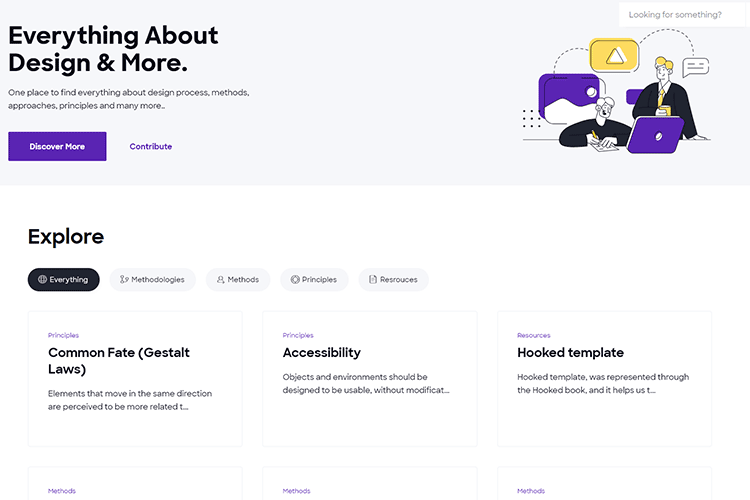
4I.Design – A place to find everything about design process, methods, approaches, principles and more.
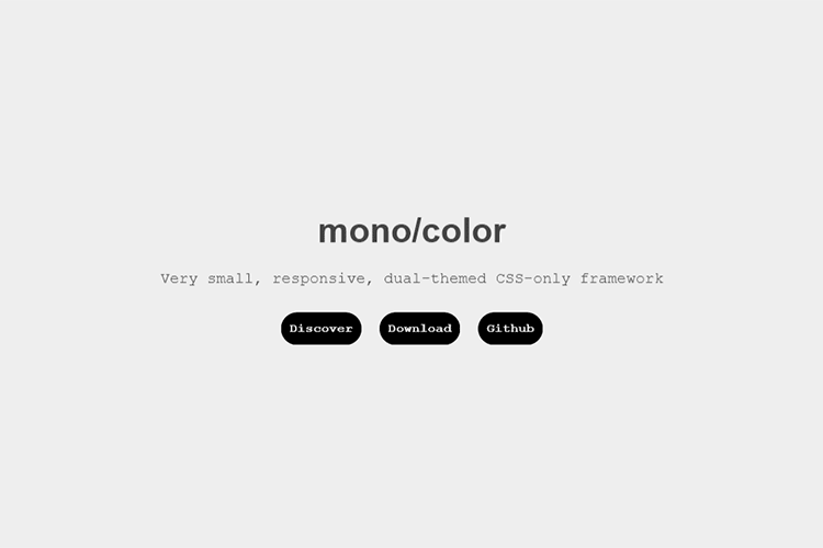
mono/color – A small, responsive, dual-themed CSS-only framework.
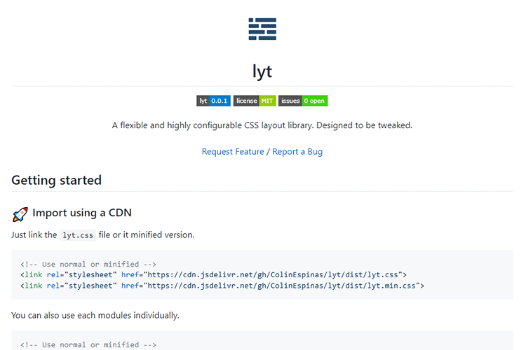
lyt – A flexible and highly configurable CSS layout library. Designed to be tweaked.
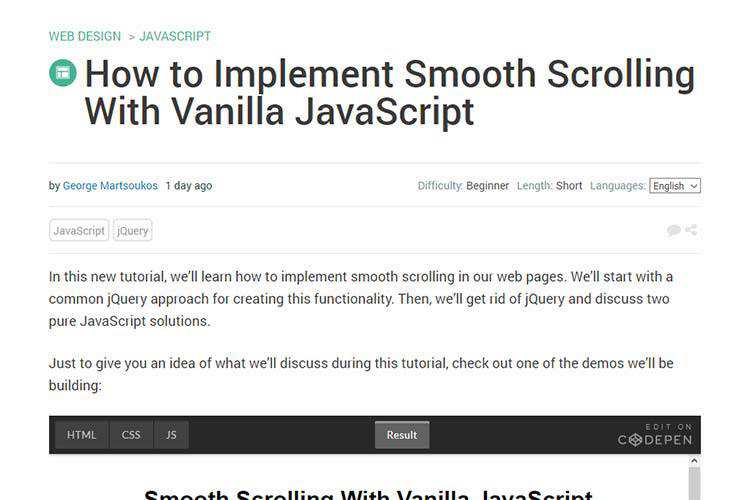
How to Implement Smooth Scrolling With Vanilla JavaScript – You can create a compelling smooth-scroll effect without jQuery.
Thoughts on the Early Adoption of Web Development Tools – Why you might want to put that shiny new tool through its paces before using it on a production website.

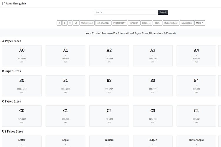
PaperSizes.guide – A handy resource for international paper sizes, dimensions and formats.
The post Weekly News for Designers № 544 appeared first on Speckyboy Design Magazine.