Community News: Latest PEAR Releases (06.08.2020)
Latest PEAR Releases:
Latest PEAR Releases:
It seems like every day new tools aimed at web designers are released. And they tend to generate some buzz, as design blogs are always in search of something new to talk about (guilty as charged).
But, should you actually be using these items? Knowing that they exist is one thing, but trusting them in your projects is quite another.
To be clear, we’re not necessarily talking about design-only tools like code generators or layout apps. Rather, we’re more focused on items built to run on live websites. Things like content management systems, development platforms, plugins and frameworks.
Each of these items can play a crucial role in how a website looks and functions. None are perfect, as even the most trusted options fail some of the time. So, where does that leave us with newer, less-proven tools?
Let’s look at how to vet a new tool and decide whether or not it’s right for a production environment.
Perhaps it sounds like a silly question. But it’s also a really important one to ask.
Tools exist to solve all sorts of problems. For example, a CSS framework may seek to increase and simplify the usage of grid or flexbox. Or there may be a CMS that aims to put eCommerce within reach of non-technical users.
You’ll notice most of these products will proudly mention their core purpose (usually in big, bold type). At the same time, we can’t simply take the author’s word for it. A tool needs to provide some proof that it’s actually an improvement over something that already exists – A.K.A., the market leaders.
Market leaders have attained their position for a reason. Usually it’s because they’ve:
Therefore, if a new tool wants us to abandon the market leader, there had better some good reasons to do so.

If that new tool makes a compelling case, then it’s time to have some fun. But that doesn’t mean using it in a production environment – at least not yet.
Some tools have the potential to be more disruptive than others. Even so, it’s worth making the effort to test them out in a way that makes sense for your project.
For instance, if want to check out that cool new WordPress plugin, use a staging environment. This allows you to replicate your production website while mitigating risk to the live one.
The same can be said for just about any piece of code you want to test drive. If you don’t have a staging site, create a little test project for experimentation. Ideally, the hosting environment would at least be similar to what you typically use.
Regardless of what you’re testing, there are plenty of things to do. See how it adjusts to various browsers and devices. Combine it with other tools you use and look for any potential conflicts. Finally, conduct a number of different tasks to find out if this wunderkind can hold up to everything you throw at it.

There seems to a correlation between a tool’s success and whether or not it is able to build a strong community of users. Many a GitHub repository sits there collecting dust because, for one reason or another, the software just didn’t reach a critical mass.
On the other hand, offerings like WordPress and Bootstrap have found loyal audiences. In the case of WordPress, it even spawned a development community that helps to keep the software thriving through core contributions, plugins and themes. Bootstrap’s depth of features, coupled with the backing of Twitter, has led a number of designers to adopt and customize the framework for their own projects.
The scope of these products is very different, yet they both benefit from highly-active communities. This is something every new tool aims for, but only a few achieve.
Thus, adopting a tool with little or no community around it is a risk. The number of active users and contributors doesn’t have to match the aforementioned powerhouses, but there should be a dedicated group that goes beyond the original developer.
The stronger the community, the more likely a product will be around for years to come.
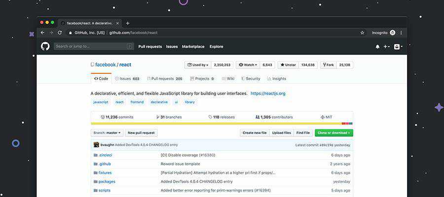
Even if you’re impressed with the results of testing and the fledgling community, there are still some reasons to hold off on using a tool on a production website. The bigger your site is, the more conservative approach you should take.
Perhaps the biggest concern might be the release status. If the tool is in beta, well, that’s a pretty big risk. It’s probably best to wait until a production-ready version is released (and tested). That is, unless you and/or your client are comfortable with a bit of free-spirited experimentation.
The other consideration are any known bugs, incompatibilities or security flaws. This is scary enough with more established software. But for a newer app it screams “WAIT!”
That being said, maybe you find that you really have found something that is a perfect fit. In that case, it may indeed be ready for use in your project.

When something is first released and is generating some buzz, there’s a temptation to start using it right away. But taking this approach on your projects can often leave you with buyer’s remorse.
The overarching theme is that there’s a process behind vetting new tools. Thankfully, it doesn’t have to be very difficult. A little bit of research and testing may be all it takes to figure out if a tool is right for you.
Doing this work beforehand will ensure that you’re making a sound decision for both you and your clients. And if you find a tool isn’t a good fit, that’s OK. Something new and exciting is always just around the corner.
The post Thoughts on the Early Adoption of Web Development Tools appeared first on Speckyboy Design Magazine.
It seems like every day new tools aimed at web designers are released. And they tend to generate some buzz, as design blogs are always in search of something new to talk about (guilty as charged).
But, should you actually be using these items? Knowing that they exist is one thing, but trusting them in your projects is quite another.
To be clear, we’re not necessarily talking about design-only tools like code generators or layout apps. Rather, we’re more focused on items built to run on live websites. Things like content management systems, development platforms, plugins and frameworks.
Each of these items can play a crucial role in how a website looks and functions. None are perfect, as even the most trusted options fail some of the time. So, where does that leave us with newer, less-proven tools?
Let’s look at how to vet a new tool and decide whether or not it’s right for a production environment.
Perhaps it sounds like a silly question. But it’s also a really important one to ask.
Tools exist to solve all sorts of problems. For example, a CSS framework may seek to increase and simplify the usage of grid or flexbox. Or there may be a CMS that aims to put eCommerce within reach of non-technical users.
You’ll notice most of these products will proudly mention their core purpose (usually in big, bold type). At the same time, we can’t simply take the author’s word for it. A tool needs to provide some proof that it’s actually an improvement over something that already exists – A.K.A., the market leaders.
Market leaders have attained their position for a reason. Usually it’s because they’ve:
Therefore, if a new tool wants us to abandon the market leader, there had better some good reasons to do so.

If that new tool makes a compelling case, then it’s time to have some fun. But that doesn’t mean using it in a production environment – at least not yet.
Some tools have the potential to be more disruptive than others. Even so, it’s worth making the effort to test them out in a way that makes sense for your project.
For instance, if want to check out that cool new WordPress plugin, use a staging environment. This allows you to replicate your production website while mitigating risk to the live one.
The same can be said for just about any piece of code you want to test drive. If you don’t have a staging site, create a little test project for experimentation. Ideally, the hosting environment would at least be similar to what you typically use.
Regardless of what you’re testing, there are plenty of things to do. See how it adjusts to various browsers and devices. Combine it with other tools you use and look for any potential conflicts. Finally, conduct a number of different tasks to find out if this wunderkind can hold up to everything you throw at it.

There seems to a correlation between a tool’s success and whether or not it is able to build a strong community of users. Many a GitHub repository sits there collecting dust because, for one reason or another, the software just didn’t reach a critical mass.
On the other hand, offerings like WordPress and Bootstrap have found loyal audiences. In the case of WordPress, it even spawned a development community that helps to keep the software thriving through core contributions, plugins and themes. Bootstrap’s depth of features, coupled with the backing of Twitter, has led a number of designers to adopt and customize the framework for their own projects.
The scope of these products is very different, yet they both benefit from highly-active communities. This is something every new tool aims for, but only a few achieve.
Thus, adopting a tool with little or no community around it is a risk. The number of active users and contributors doesn’t have to match the aforementioned powerhouses, but there should be a dedicated group that goes beyond the original developer.
The stronger the community, the more likely a product will be around for years to come.

Even if you’re impressed with the results of testing and the fledgling community, there are still some reasons to hold off on using a tool on a production website. The bigger your site is, the more conservative approach you should take.
Perhaps the biggest concern might be the release status. If the tool is in beta, well, that’s a pretty big risk. It’s probably best to wait until a production-ready version is released (and tested). That is, unless you and/or your client are comfortable with a bit of free-spirited experimentation.
The other consideration are any known bugs, incompatibilities or security flaws. This is scary enough with more established software. But for a newer app it screams “WAIT!”
That being said, maybe you find that you really have found something that is a perfect fit. In that case, it may indeed be ready for use in your project.

When something is first released and is generating some buzz, there’s a temptation to start using it right away. But taking this approach on your projects can often leave you with buyer’s remorse.
The overarching theme is that there’s a process behind vetting new tools. Thankfully, it doesn’t have to be very difficult. A little bit of research and testing may be all it takes to figure out if a tool is right for you.
Doing this work beforehand will ensure that you’re making a sound decision for both you and your clients. And if you find a tool isn’t a good fit, that’s OK. Something new and exciting is always just around the corner.
The post Thoughts on the Early Adoption of Web Development Tools appeared first on Speckyboy Design Magazine.
Recently, on Facebook, I was asked "Who are you to call anyone a racist?". To be clear, I did not call anyone a racist. But, really, let's say I did call someone a racist? Who am I to call anyone a racist? After all, I am a 47 year old, white, middle class man. I am, quite possibly, in the absolute sweet spot of my life for white privilege.
As a child, I heard older family members say racist things. Luckily, my parents made it clear to me that they were wrong and I should ignore them. So I have for 40+ years. Some of those racist things were said about my childhood best friend, who is black. Were they nasty, ugly, hateful remarks? No. They didn't use the "N" word. It was subtle things that made me question if I should have a best friend that is black. They found it confusing. They found it odd. It was clear they did not approve.
I was fortunate to have lived in a very diverse neighborhood in Huntsville, AL as a child. My next door neighbor was two years older than me. He was my best friend. I don't know if I was his best friend but he was definitely mine. And like I said, he is black. His father pulled the first tooth I lost. I spent so much time at his house as a child and he spent time at mine. We liked his house better because his parents had converted their two car garage into an awesome den/music hall. I was young and innocent as they say. I didn't know any different. I am so glad that was the case. I have not seen him in years as I moved away from Huntsville when I was eleven years old. A year or so ago, I did find his mother and sisters on Facebook and was able to reconnect with them online. He has a career in the Air Force. I am very proud to have called, and still consider, him my friend.
After living in Tuscumbia, AL for four years where racial topics were basically not discussed despite there being a neighborhood named Richman Hills where the road leading into it was named White City Drive, I moved to a suburb of Birmingham, AL. I have lived in the Birmingham area, including some years in the city proper, for all but two years of my life since I was 15 years old. This is the city where police turned fire hoses and dogs on protesters during the Civil Rights movement.
I found things in Birmingham different than they were in Huntsville. The Birmingham area was and still is highly segregated. It's not by law or force. It's mostly white flight which is itself a form of socioeconomic racism. It was a strange thing for me to realize as I grew older. I found the history of racial injustice to be just below the surface in Birmingham. I did not witness any overtly racist behavior in public. But, it was there, kind of like that subtle language my elders used when I was young. There was a lot of use of the words like "those people" or "they" when referring to black people. Again, I ignored the people saying these things and was silent.
Truncated by Planet PHP, read more at the original (another 4018 bytes)
There is no better way to showcase your skills, design aesthetic, and past projects than with a personal portfolio. It’s a great way to get your name out there and allow potential clients and employers to find you.
If you need a little inspiration when it comes to personal portfolios or simply want to speed up your design process, you’re in the right place. We’ve gathered the best personal portfolio templates that you can edit in Adobe Photoshop before coding them into live websites.
We also have free landing page PSD templates, free eCommerce PSD templates, free design agency PSD templates and free blog & magazine PSD templates. If you’re looking for a complete PSD web template round-up, take a look at this post.
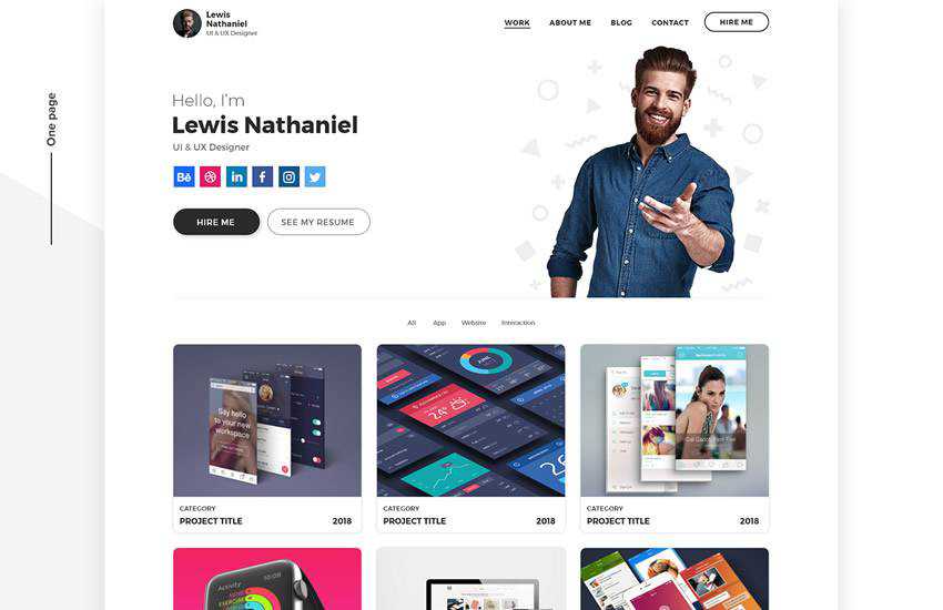
The first template on this list features a minimal design. You’ll notice a large header image that’s perfect for including a call to action. The template has plenty of room to add your projects, client testimonials, and case studies along with your social media profiles.
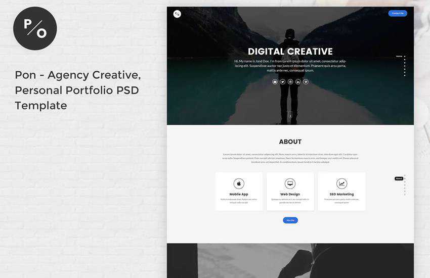
The Pon template is a great choice for creative agencies and freelancers that want to make their portfolio stand out. The template includes a one-page design that’s easy to customize.
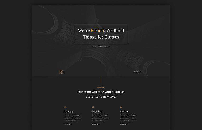
If you prefer a dark color scheme, try the Fusion Dark Portfolio template. This template is sure to make your projects stand out. Another standout feature of this template is the modern and elegant typography.
Pagina is a very minimalistic yet creative PSD template. It’s perfect for freelancers, photographers, and other creative fields. The template includes more than 30 Photoshop files so you can create a truly unique and powerful personal portfolio.
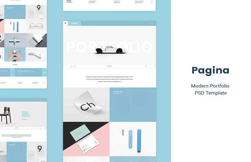
Try the Folio Photoshop template for your next personal portfolio redesign. This template includes several Photoshop files that you can use to create a homepage, a portfolio page, and even a resume page.
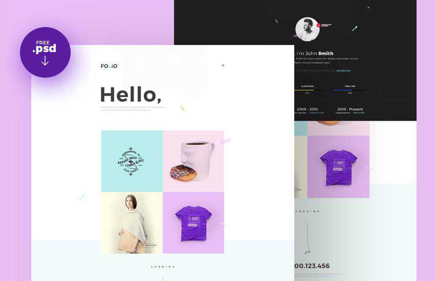
The Livespot HTML is a perfect choice for creative agencies or freelancers. The template includes 14 HTML files as well as Photoshop files that you can use to tweak the initial design concept.

The Discovery Photoshop template features a one-page design with elegant full-width sections that are perfect for showcasing your bio, resume, client testimonials, and more. The template is easy to customize and it even has an app section in case your business has one.
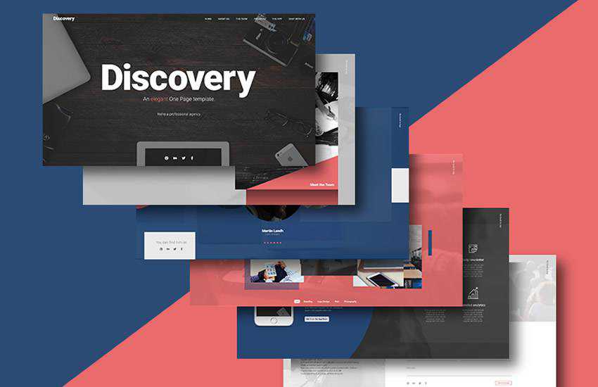
This template is a great choice for a creative agency or anyone looking for a colorful portfolio design. The template can be used for any type of personal portfolio and includes plenty of white space that put your projects in the spotlight.

The Mark is another minimal portfolio template designed in Photoshop. The template features several Photoshop files that are easy to customize and include bold colors and elegant typography.
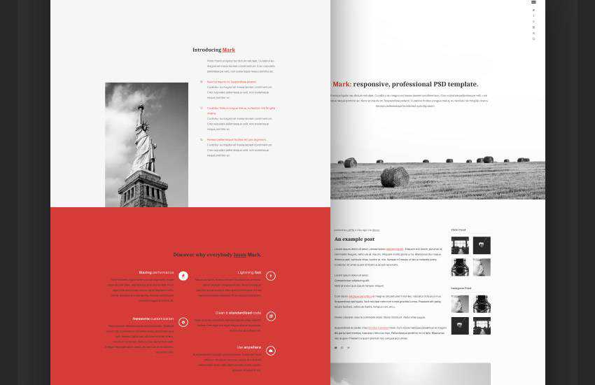
The Poseidon template is a creative portfolio template suitable for agencies and freelancers. The template includes more than 40 individual PSD files that are easy to edit and well-organized.
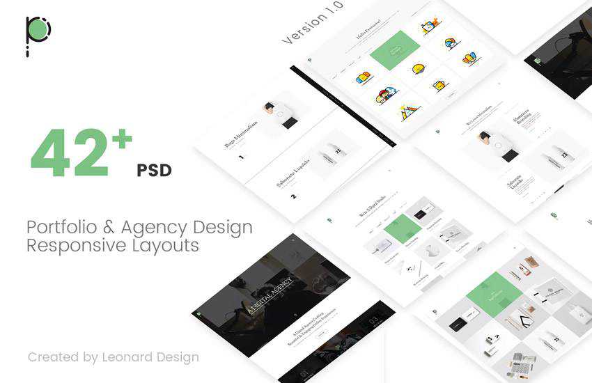
The Waxom template is a Photoshop template that uses a dark color scheme paired with a minimalistic design. The template comes with more than 230 PSD files that you can use as a starting point for your designs.
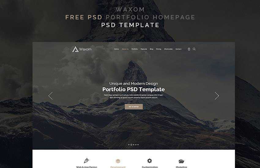
This portfolio template has an elegant look and feel thanks to the dark background and elegant typography that stands out. The template includes a single PSD file that’s perfect for creating a homepage for your portfolio website.
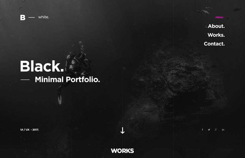
The IK template can be used for a personal portfolio as well as a resume website. You’ll find plenty of sections to feature your past work as well as client testimonials, skills, and education.

This template has easily editable and well-organized layers and it also includes vector elements and icons that were used to create it. The template features a simple and clean design.
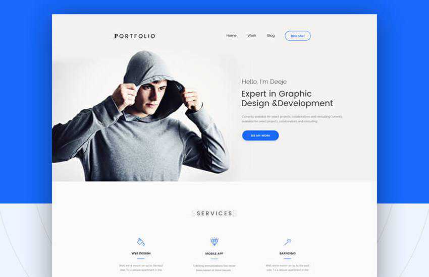
Try the One-Page Portfolio template if you want a creative and bold personal portfolio design. This template makes it easy to showcase your past projects and allow potential clients to get in touch with you.
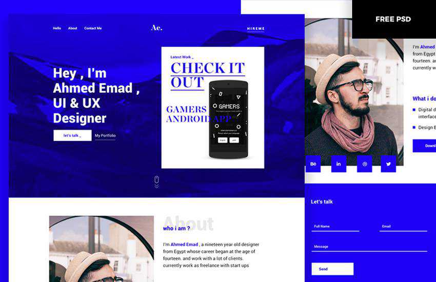
Having a portfolio website and regularly updating the design is the best way to get noticed by potential clients. But if you’re busy with client work and don’t have the time to design your portfolio from scratch, you can use a premade portfolio design as a starting point. Browse through our collection of free personal portfolio web templates and find the perfect one for your portfolio website.
The post 10 Free Personal Portfolio Photoshop PSD Web Templates appeared first on Speckyboy Design Magazine.

More than half of U.S. companies — 73% to be exact — use website design to help their brand stand out from competitors. That number alone says a lot about the importance of a high-quality, aesthetically pleasing web design.
Not only that, but 38% of site visitors will stop engaging with a website if it’s unattractive.
Your website’s design is extremely important to your brand, customer loyalty, and even sales. If you’re unsatisfied with your current site, it’s time to improve your web design.
On this page, we’ll give you seven website improvement ideas to help you improve web design instantly. Although the results can take time to surface, the ideas we provide will immediately improve the overall look of your website.
If you’re ready to learn how to improve website design, keep reading! And don’t forget, if you want to receive a steady flow of tips like these, sign up for our Rev Weekly email!
If you’re unsatisfied with how your current site looks or performs, create a website improvement plan.
When you create a website improvement plan before anything else, you’ll have a blueprint for how you’ll improve your web design, which will make the process run smoothly.
Use the seven website improvement ideas below to help you create an actionable website improvement plan, and if you feel like you need some guidance, WebFX is an award-winning web design agency that’s here to help!
A style guide is a huge piece of the puzzle when it comes to web design. Your style guide contains essential information about the aesthetic of all your marketing materials to keep designs consistent across platforms.
Your guide consistently helps create brand awareness and customer trust.
Style guides should include:
If you’re not satisfied with the aesthetics of your site, your style guide can help you immensely.
If you find that your website uses colors that don’t fit your brand, uses too many fonts (or illegible fonts), or doesn’t have any kind of consistency, it’s time to use that style guide to your advantage.
Action item: Update the colors of your website to fit your style guidelines and ensure that you only use one or two fonts to keep your site organized and clean. If your site doesn’t use a content management system (CMS) theme that lets you easily change things, like color and font, consult a web design agency.
Although these small updates might not improve web design completely, they’re a great first step.
Your website likely features many buttons, forms, and internal links to other areas of your site. Outwardly, these elements might appear fine, but when was the last time you tested them?
Since 89% of users shop with a competitor after a poor user experience, it’s crucial that your site elements function properly to provide users with a memorable, enjoyable visit.
That said, you should set aside time to test your forms and run programs that help you find broken links, like Dead Link Checker.
Your navigation bar helps users get around your site easily. It provides visitors with a map of essential pages on your site and makes it easy for them to find what they’re looking for.
However, if your navigation bar is too complicated or overcrowded, you might overwhelm site visitors instead of helping them.
Try simplifying your navigation bar only to include the most specific umbrella categories covered on your page.
For example, if you’re a landscaping company, you may include tabs like “landscape design,” “landscaping services,” “garden center,” “gallery,” “about us,” and “contact” in your navigation bar.

From there, you can include other important pages that drop down when you hover over each broad category. Keep in mind that there is no need to list every product and service in your navigation bar — it’s only meant to help send users in the right direction based on what they’re looking for.
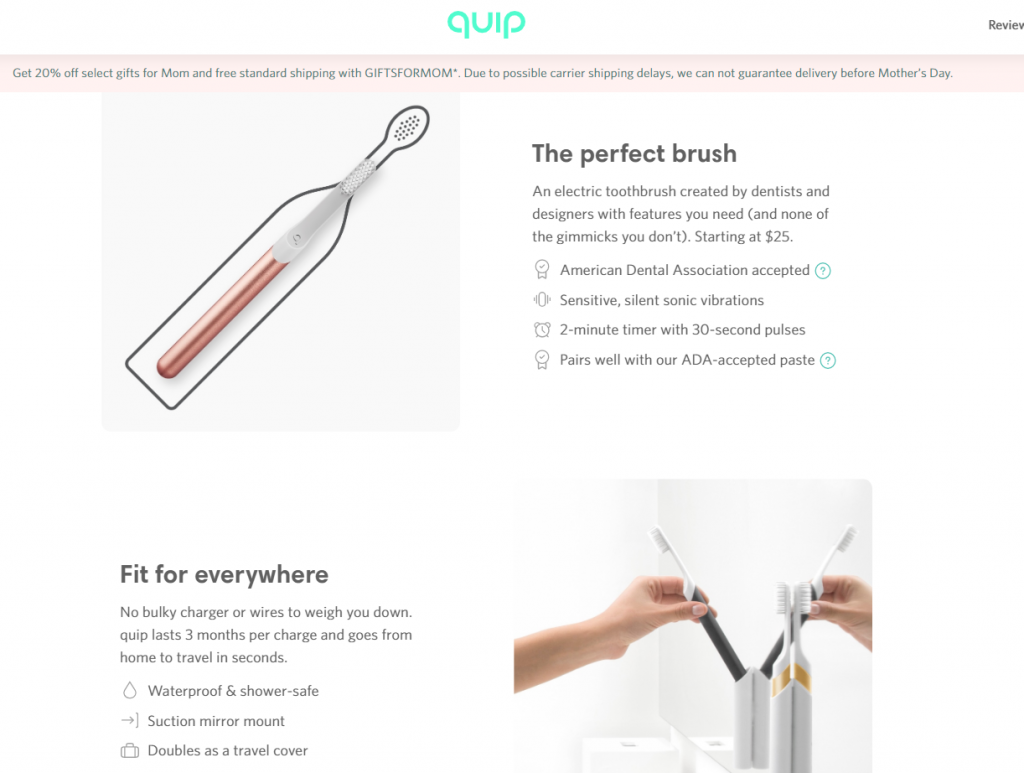
White space is crucial to improving web design. So many businesses feel it’s necessary to cram information into every corner of a page, but that’s ineffective.
Without white space on your site pages, users can feel crowded and overwhelmed and may navigate away from your page.
When you use white space, however, your site elements will have room to breathe, and you won’t overwhelm visitors with your design or your information.
Check out the way toothbrush brand, Quip, uses white space on their website to give a feeling of freedom and space.
To improve web design, you must consider every aspect of your website — not just the aesthetic parts.
Optimizing your website’s pages for speed is one of the best ways to improve user experience on your site, which can make your site more enjoyable to visitors.
Not only that, but your site will have a better chance at ranking highly in search results when Google knows that you provide a fantastic user experience to site visitors.
To improve your site’s page speed, consider the following website improvement ideas:
These are just a few ways to improve your website’s page speed. If you need help implementing them, feel free to check out WebFX’s page speed optimization services and give us a call at 888-601-5359!
Mobile-friendliness is more important than ever — especially because 74% of users are more likely to return to a website with a mobile version.
When you optimize your website to be mobile-friendly, it means that every user, no matter what device they’re using, will have the same great experience on your website.
This makes your brand more trustworthy and helps you increase sales since users shopping on mobile will stay on your site.
Content is crucial for a successful website, but did you know that proper indentation and formatting of your content can help improve web design?
When you take the time to format your content correctly and make proper use of headings, it’ll make it easier for users to consume your content.
Even though content-heavy pages are all about the subject matter, design matters too. So, you should take care to format your content properly so that it fits the organized, aesthetically pleasing design of the rest of your site.
There’s a delicate balance between using just enough graphics and using too many.
To keep your written content from appearing as a long wall of text, you should take care to implement different kinds of multimedia throughout your content to break it up. This could include images, graphics, or videos.
When deciding how many graphics to use, keep in mind that their purpose is to support your content and enhance your design — not overwhelm your readers.
On a page that has about 500 words of content, you should aim to have at least one graphic. On a long-form page of content with upwards of 2500 words, you should aim to have anywhere from 3 to 5 graphics.
We don't just want to tell you about the beautiful work we do.
WE WANT TO SHOW YOU
We've built over
WEBSITES IN INDUSTRIES LIKE YOURS
View Our Past WorkIf you’re unsatisfied with your current web design but aren’t sure what it needs to take it to the next level, WebFX can help.
Not only can we audit your current website to determine issues, but we can also help you brainstorm new design ideas, update your branding, improve your page speed, and so much more.
We can even design a website from scratch in just 30 days with our RainmakerFX program!
We’ve been creating beautiful websites for over a decade, and to date, we’ve designed more than 1100 client websites. Not to mention, we’ve also taken home more than 50 web design awards for our work.
Want to learn more about what clients think of us? Check out our 500+ raving client testimonials to get a better idea of why businesses trust their web designs and their marketing strategies to us.
If you’re ready to work with a web designer that can help improve your web design across the board, contact us online or give us a call at 888-601-5359!
The post Improve Web Design: 7 Site-Enriching Web Improvement Ideas appeared first on WebFX Blog.
Over the past week, I’ve been thinking a lot about George Floyd, Breonna Taylor, and Ahmaud Arbery. I have been thinking about white supremacy, the injustice that Black women and men are standing up against across the world, and all the injustices I can’t know, and don’t see.
The WordPress mission is to democratize publishing, and to me, that has always meant more than the freedom to express yourself. Democratizing publishing means giving voices to the voiceless and amplifying those speaking out against injustice. It means learning things that we otherwise wouldn’t. To me, it means that every voice has the ability to be heard, regardless of race, wealth, power, and opportunity. WordPress is a portal to commerce; it is a canvas for identity, and a catalyst for change.
While WordPress as an open source project may not be capable of refactoring unjust judicial systems or overwriting structural inequality, this does not mean that we, the WordPress community, are powerless. WordPress can’t dismantle white supremacy, but the WordPress community can invest in underrepresented groups (whose experiences cannot be substituted for) and hire them equitably. WordPress can’t eradicate prejudice, but the WordPress community can hold space for marginalized voices in our community.
There is a lot of racial, societal, and systemic injustice to fight. At times, change may seem impossible, and certainly, it’s been too slow. But I know in my heart that the WordPress community is capable of changing the world.
If you would like to learn more about how to make a difference in your own community, here are a few resources I’ve gathered from WordPressers just like you.
If you want to appeal to a wider audience, putting together a brochure can really help. And what better way to create a brochure than by using free brochure templates for Adobe InDesign?
These templates make it so easy to promote your business, services, or products — or even just spread valuable information — without having to go through the hassle of creating a template or brochure from scratch.
The ease-of-use factor, plus the convenience of just having to fill in blank fields, is what really pushes these InDesign templates over the top.
So go ahead and check out this collection of free brochure templates for Adobe InDesign. You’re certain to find something that suits your company or project.
More InDesign Templates:
Learn InDesign:
The Bi-Fold Corporate InDesign template is an excellent choice for those looking for fast results with minimal edits required. It’s built professionally with a fully-layered design and it can be used for multiple purposes. And since it’s easy to add custom text and images, you can export this template to a high-quality PDF in a matter of minutes.

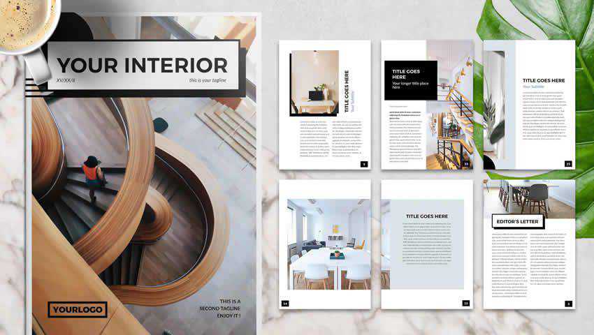
With an easy-to-customize layout and eye-catching sample imagery, the Interior Design Brochure Template provides all the standard features you’d expect from a professional brochure: 30mm bleed, A4 & US Letter sizes, and free font and icon font support while maintaining a modern edge. Drag and drop photos to 12 custom pages.
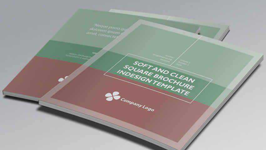
If you’re looking to keep your brochure’s design clean and simple, the Soft and Clean Square InDesign Brochure Template ought to do the trick. Add a custom logo and text to 8-full color pages. The perfect choice for corporate brochures that need to stand out from the rest.
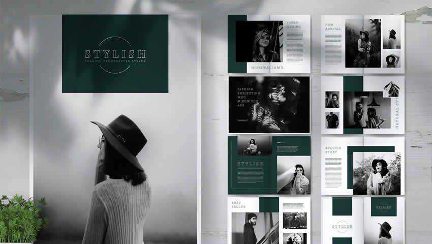
The Stylish Fashion Lookbook Brochure Template has a delicate air of sophistication without being overstated. This template is deal for fashion spreads thanks to a generous 14-page design, well-organized layers, and 1-click color changes. It’s print-ready and immediately elevates your content.
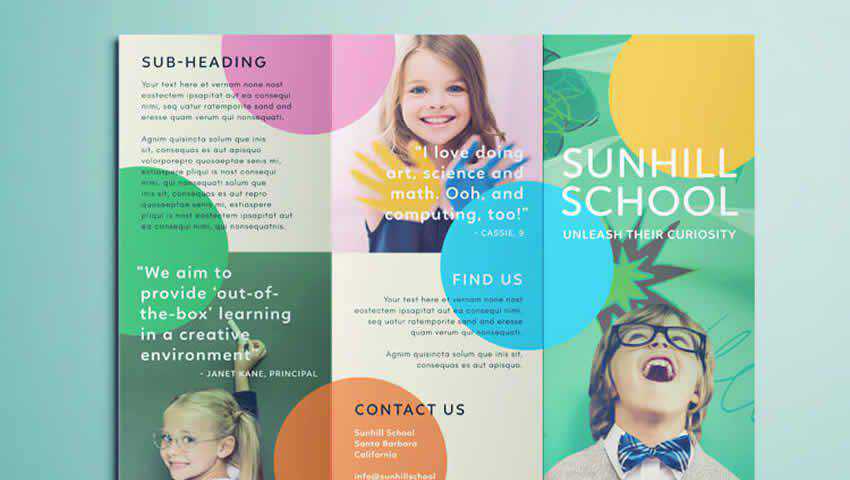
Your nursery, preschool, after school activity, or playgroup will thrive with this brochure template. Though designed with marketed to parents in mind, this brochure template is a colorful trifold that could be used for a brochure in any industry that requires a striking design and pops of color.
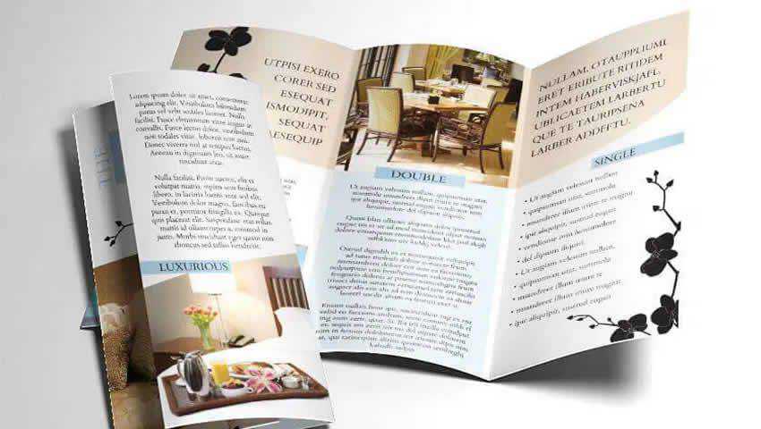
Promote a bed and breakfast, a hotel, or a weekend getaway with this Tri-Fold Hotel InDesign Brochure Template. This template is easy to customize. Just drag-and-drop in your photos, add your text, swap out colors, and you’ll be good to go. It also comes with the Cardo-Regular font, and has been adapted for use in massage and salon service industries as well.
This elegant and modern bifold brochure is perfect for any corporate setting, which covers a wide range of businesses. It’s also recommended for publishing and annual reports. Even company profiles can make use of this template. It has just two page designs but sometimes that’s all you need to get the job done. Sometimes, simple is better, and this brochure template does simple well.

What a cool design this template offers! The Futuristic Event Posters Set for InDesign can be adapted for brochures easily and is easy-to-edit and customize with your own text and images on the fly. It sports an A3, tabloid layout, is fully print-ready, and can make any event or announcement more than stand out.

If you have a specific product you want to promote and catch attention for, this InDesign Product Brochure Template will do the job and then some. This free offering offers a four-page layout with three content pages and front and rear designs. It’s simple, yet bold, allowing for full-page photography and/or pull quotes.
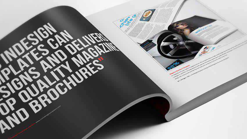
What a lovely template this is! The Blue Business Brochure Layout template is subdued and cool, yet absolutely ready to showcase your latest endeavor, promotion, or work. It’s easy to rearrange things as you see fit to accommodate your images and text. And it comes with 12 unique pages, so you’re certain to find a configuration that works for you.
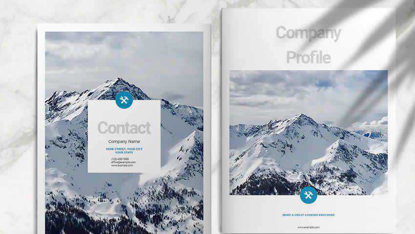
This template is stylish and free-flowing, perfect for naturally-inclined businesses, restaurants, spas, and more. This is perfect for highlight menus or menus of services in a succinct way that gets your point across without overwhelming readers. Think brochures you get for local restaurants on your screen door — only better.

For corporate or industry-based businesses (like coal, oil, or electrical companies) this brochure template will fit the bill. Its simple trifold layout makes it easy to present info about your business in a succinct way, but still offers enough details to engage. Everything is fully customizable and it’s print-ready.
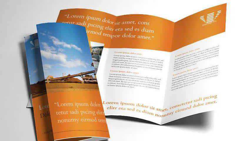
Promote your travel agency, booking agency, or time-share with this travel-inspired trifold brochure template. It can be used for any industry, really, and offers appealing vector images as a part of the deal. This free template can be customized easily and is ready-to-print as soon as you’re done designing.

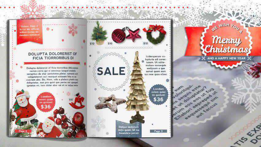
When the festive time is upon us, sometimes it’s nice to embrace it whole-heartedly in your business promotions. This Retro Christmas Brochure Template is great for promoting flash sales, or for simply adding a retro holiday touch to any company’s products, services, or other offerings. This brochure template is print-ready and can be modified to suit any business.
So you see? There are plenty of brochure template options here to help you put together a stunning brochure no matter the industry you’re in. This collection of freebies are so good you can professionally present your company with ease. Which is just pretty great, if you ask us.
The post 10 Beautifully Designed Free Brochure Templates for Adobe InDesign appeared first on Speckyboy Design Magazine.