How to Use Emotion for Better Web Design and UX
Did you know that 94% of a user’s first impression of your business comes from your site’s design?
In this post, we’ll look at how you can use emotion in your web design to create a great impression, enhance user experience (UX), and drive conversions.
Keep reading for my insider tips, or check out our web design services to learn how our award-winning agency can improve your online presence!
Why does emotion matter to web design?
Many times, emotion plays a big role in your site’s conversion process.
Understanding users’ emotions and incorporating empathy into your design allows you to create long-lasting relationships. And people will feel more comfortable working with your business.
Without emotion and empathy, the creative process falls short, and visitors will be less likely to convert and become customers.
We don't just want to tell you about the beautiful work we do. WE WANT TO SHOW YOU We've built over WEBSITES IN INDUSTRIES LIKE YOURS
4 tips for getting started with emotional web design
Now let’s dive into four tips for incorporating design elements that appeal to visitors’ emotions and better meet their needs.
1. Take a qualitative deep dive and develop end user personas
Whenever I’m starting a new web design project (big or small), I research a client’s end users in order to discover opportunities and outline end goals for the project.
You can easily identify your end users by looking at your demographics data in Google Analytics and pairing that with what you know about your user base.
With that information, you can start creating target personas.

Once I identify key personas for a project, I like to put on my “end-user glasses” to help me view a website through their eyes.
Pretending to be the end user, I run through the following steps:
- I arrive on the site with a set goal (for example, to buy a pair of shoes).
- I take note of every emotion and reaction I have while browsing the site.
- I ask, “Does this site provide value to me (the user) at each step of the conversion process?”
- I identify any roadblocks that prevent me from purchasing or submitting a contact form.
- I run through the same steps on a tablet or mobile device to evaluate UX, identify missing steps, and pinpoint unclear information.

I then repeat the same steps while using competitor websites, keeping notes the entire time.
Once I have all of my notes, I take off my “end-user glasses” and start to make sense of the reactions I had on each site.
This is my favorite way to do a qualitative competitive analysis — and putting myself in the end user’s shoes allows me to create designs that better appeal to their needs and emotions.
2. Send online user surveys
Online surveys are a very useful tool when you want direct feedback from end users about their needs and emotions your site evokes.
I like to pair my “qualitative deep dive” above with feedback from end users to create a web design project plan.
Before you start thinking about the questions you want to ask participants, you should clearly identify the goals of your research.
Ask yourself the following questions:
- What do I want to know when this survey is complete?
- Why do I want to know it and what will prove it?
- What do I think the outcome will be?
- How will I analyze my data in order to answer my questions?
- Are there any additional factors that I need to take into account?
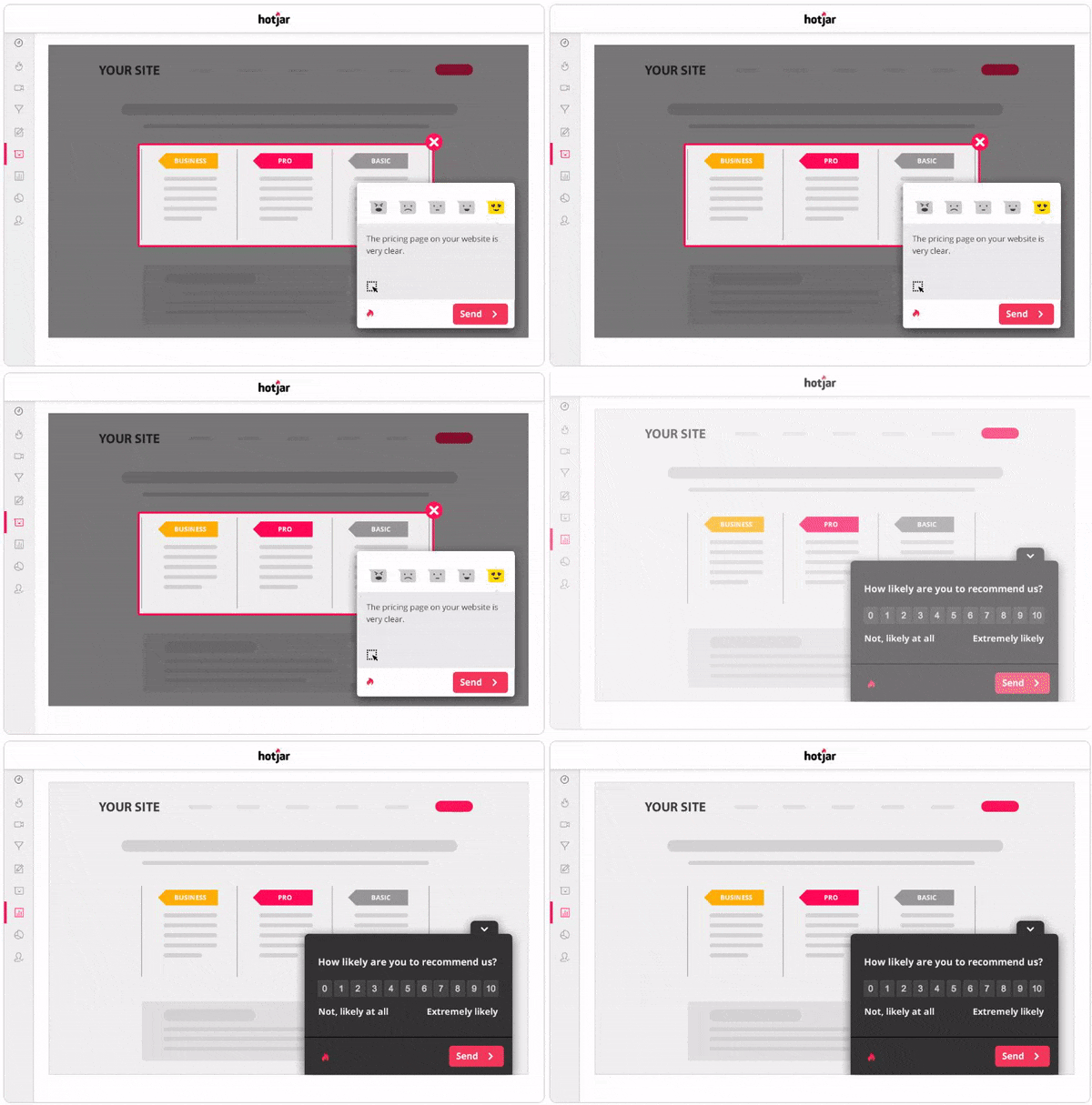
You can easily set up user surveys using Hotjar or Crazy Egg tied with Survey Monkey.

Once you collect responses, you can compare feedback and identify opportunities to better meet users’ needs with your design.
3. Conduct preference tests
Next, preference tests help you tap into audience insights and emotions to refine your website’s design.
Let’s say you started your web design project after conducting initial research, and you’ve entered the wireframing or prototyping phase.
If you would like to get feedback on your prototypes, quick preference tests are a cost-effective way to get insights from fresh eyes.
There are many preference tools out there, like UsabilityHub which can connect you with audiences to validate your web design choices or steer you in a new direction.

4. Add informational, reassuring, and persuasive content to your website
My last tip is not really a test, and it’s completely free if you take the time to pay attention to the details of your design project.
While moving through the tests above, you likely found areas of user tension and potentially some conversion resistance.
User tension is typically due to your website lacking:
- Informative, reassuring, persuasive content
- Visual security or safety signals
- Social proof
- Clear calls to action (CTAs)

After identifying areas of tension, you can write content to address users’ concerns and help them feel confident doing business with you.
Start improving your web design and UX!
Tuning in to the needs of your audience and incorporating emotional design elements will enhance your site’s design and streamline conversions.
If you need help freshening up your site’s design or conducting a UX audit, WebFX is happy to help.
With more than 1000 websites launched for clients and 50+ web design awards, our team can help you create a custom site that supports your business goals.
Contact us today to connect with a web design expert, or give us a call at 888-601-5359!
The post How to Use Emotion for Better Web Design and UX appeared first on WebFX Blog.