Monthly Archiv: March, 2020
Quick, how many flavors are there in food? You’ve probably heard that there are four: sweet, salty, sour, and bitter. But what would you say if I told you that someone had discovered a fifth basic flavor not too long ago?
In 1908, Japanese scientist Dr. Kikunae Ikeda did just that, when he managed to isolate the exact component that makes up the flavor of umami, or, as it’s commonly known in the West: savoriness.
What is umami? Well, um… that’s a tricky question. It’s a totally unique flavor experience, unlike any of the other four basic flavors. Parmesan cheese is loaded with umami, as is Asian fish sauce, aged beef, and perfectly ripened tomatoes.
Since umami is so unique and was discovered so recently, most people have a hard time describing exactly what it is. That weird, indescribable uniqueness is what I’m going to talk about today – how to handle it when it comes up in design, and whether or not it’s necessarily a good thing.
Too Unique For Its Own Good
We all think we want to come up with that totally unique idea, one that no other designer has ever thought of before or that no one would be able to easily copy or steal.
But is that really what we want as designers? Is it even something we should want?
Most of the time, when people talk about ‘innovation’ in the design industry, what they’re really talking about is improving on an idea that already exists.
Don’t get me wrong, that definitely takes skill and creativity. But it usually isn’t a genuinely unique, original idea you’re striving for. It’s mostly a combination of what you’ve already seen before, and what you’re influenced by. Why? Because it’s easier to work that way.
If we all attempted to come up with the next design equivalent of umami, our brains would short-circuit and we’d never get any work done. It’s just not practical, nor is it commercial, to strive for true uniqueness and originality.
When it happens, as was and continues to be the case with umami, people are at a loss to explain it. It becomes something of a curiosity – a conversation starter at a party, perhaps, or a cautionary tale of woe among other creative professionals.
 Image Source: What is Umami?
Anyone who’s been in the industry for any length of time has a story or two about one of their peers who tried to get too creative and found themselves out of a job.
Yes, perhaps they were “ahead of their time.” That’s perfectly valid, but it does you no good when you’re trying to scrape together this month’s rent money.
There’s something to be said about following trends and learning how to reinterpret them.
Making Adjustments
When you stop to think about it, we’ve developed some surprisingly sophisticated methods for adjusting the taste of our food. Our taste buds can detect changes in flavor down to extremely minute quantities. You know, for example, when something is just slightly too salty, too sweet, too sour, or too bitter.
And conversely, you know when something doesn’t quite have enough of any of these flavors. But how do you tell when something is “too umami,” or not “umami enough?”
There are a range of opinions ranging from the mundane (“when you find yourself reaching for the salt shaker”) to the weird (“when your appetite becomes ‘fatigued'” – huh?).
The truth is, since umami is such a newly discovered flavor, we haven’t really come to a consensus on how to tell when it’s too prominent or too lacking in our food.

Completely original designs are the same way. Sometimes we can’t tell when something is too original and when it needs to be more relatable, precisely because it’s so original.
Many designers love to rave about their completely obscure discoveries, myself included. In addition to design, I also studied fine art painting in school. I have plenty of abstract personal projects that I absolutely love, but that are completely unmarketable to anyone except other weirdos like me.
Since there aren’t too many of us out there, I’d have a hard time making ends meet by producing projects like that. But sometimes we just don’t have the perspective to know if something is appropriate for our target market.
In that case, I always find it helpful to call in other people from that market.
Sneaking It In
So, does this mean you should throw in the towel on ever being unique or original? Absolutely not.
There are ways you as a designer can “sneak in” some truly creative, original elements into your designs that won’t detract from their marketability, and that won’t leave people feeling like they’re simply getting a rehash of something they’ve already seen before.
This is the ideal you want to strive for as a designer – that perfect balance between what’s new and what’s familiar to your users.

There’s a common trick used in the culinary world by chefs who like to experiment with umami. Asian fish sauce is typically considered to be the ultimate umami flavor.
On its own, it can be rather unpleasant, but when used in small amounts in other dishes, Asian or not, it can add a special burst of umami that diners won’t be able to quite put their finger on, but that they’ll definitely recognize when they taste it.
When you design something that’s an alternate take on a previous idea, and you sneak in your special “fish sauce” of pure originality, you create something that’s completely relatable and marketable to your target audience, but that also has that strange, wonderful element that people won’t be able to describe, but they’ll definitely love.
Just as umami is not an earth-shattering element in the culinary world, complete and total originality isn’t the ultimate holy grail we should be reaching for as designers.
It’s an important element, which can add a lot to the attempt to balance the different “flavors” of marketability, quality, and relevance which are the backbone of design.
The post How to Handle Indescribable Uniqueness in Design appeared first on Speckyboy Design Magazine.
Package:
Summary:
Handle API calls with parameters passed as JSON
Groups:
Author:
Description:
This class can Handle API calls with parameters passed as JSON...
Read more at https://www.phpclasses.org/package/11569-PHP-Handle-API-calls-with-parameters-passed-as-JSON.html

Need some inspiration to build a high converting website?
Websites that convert persuade visitors to become customers. These websites drive more revenue, so if you want to increase your site’s revenue, use these examples of websites that convert as inspiration!
We’ll go over what makes for the best converting websites and five examples of websites that convert. For more tips on website conversion, sign up for our newsletter, Revenue Weekly!
What kind of web design converts?
A good converting website has a clean design, makes it easy for people to access information, and creates a clear conversion path that people can follow to ultimately convert.
The best converting websites have these things in common:
Attractive web design
Your website is the first impression your audience gets from your business. The websites that convert take advantage of their web design to pull people in and get them to explore their site.
Attractive web design for high converting websites means:
- Fast page load: People want information fast, especially since over half of internet traffic is on the go with mobile, so fast page speed is essential to convert.
- Responsive design: With so many people accessing the Internet via mobile, your site needs a responsive design that encourages Internet users to take the step to convert.
- Intuitive navigation: Websites that convert make it easy for people to find the information they want.
- Engaging layout: High converting websites use layouts that make it easy for people to find information on the page. These websites use white space visitors rest-stops for the eyes. They also use web safe fonts and eye-catching images, graphics, and videos.
Clear concept and value propositions
High converting websites tell visitors right off the bat what their company is about and what makes their products and services unique.
The more your visitors know what your company does upfront, the more consumers who visit will feel like they can make informed purchasing decisions.
Websites that convert also identify what sets their business, products, or services apart from competitors.
Noticeable calls-to-action (CTAs)
Visitors convert best when they know what it is that you want them to do. That’s why high converting websites make use of calls-to-action (CTAs).
People will land on a site and say to themselves, “I’ve checked out some pages and read some information. I’m interested, but what do I do now?”
In other words, because there’s no CTA button, interested users won’t know how to take the next step towards conversion.
The best converting websites display their CTA buttons early on and give visitors plenty of opportunities to convert. CTA buttons help guide users to the next step, whether that step is to check out a pricing page or convert. You could set up a page containing several CTA buttons such as:
- Sign up
- Shop
- Subscribe
- Learn more
- Get started
By using CTA buttons, you’ll help guide more leads towards conversion.
5 high converting website examples
Let’s jump right into our top five examples of websites that convert!
Mint is an all-in-one financial management app that lets you set budgets, manage bills, and check credit scores.
![]()
So, why is Mint an example of a high-converting website?
- Attractive web design: Their elegant web design brings simplicity to a topic that brings many people anxiety. With fast loading and mobile responsive pages, it’s easy to get information fast. Additionally, plenty of white space and sleek infographics make this site a pleasure to visit.
- Clear concept and value propositions: Mint lets you know exactly what you’re getting with their app when you first scroll down. They highlight what their app is and what makes it valuable by targeting the top concerns that people have when managing money. The information cards they display showcase how their app solves these concerns and includes call-to-action (CTA) buttons to help visitors learn more and sign up for free.
![]()
- Noticeable CTAs: Mint places valuable and relevant CTA buttons in visible places throughout their site. They have a few different styles of CTA buttons ranging from a blue outline for their “Sign in” button to a solid eye-catching orange for their “Sign up Free” CTA. These buttons contrast nicely with their overall blue-green color scheme.
![]()
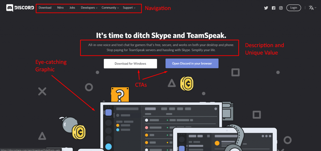
Discord is an app that targets the gaming and streaming industry. The app provides a free all-in-one voice and texting platform where people can interact.
![]()
So, why is Discover one of the examples of websites that convert?
- Attractive web design: Discord knows their market, and they show it with their fun and quirky web design. Discord’s site has plenty of crisp graphics and engaging animations that charm its audience. With fast page load time, responsiveness, and intuitive navigation, this site checks all the appealing web design boxes.
![]()
- Clear concept and value propositions: Discord knows what excites their community. On their site, they highlight both their free and premium (called Nitro) products, as well as providing unique opportunities for streaming influencers and game developers.
![]()
- Noticeable CTAs: Discord’s landing pages have a sleek design and plenty of white space. Their value propositions and CTA buttons stand out. And check out the entertaining animations on these two landing pages!
![]()
![]()
RealSpace makes amazing 3D renders and animations for architectural companies.
![]()
RealSpace fits the bill as an example of websites that convert.
- Attractive web design: With a beautiful portfolio of 3D rendered images (including the one used as the backdrop of their home page), RealSpace makes use of their clean design to attract customers. In addition, they have an awesome blog and plenty of 3D rendering resources for their customers. Their minimalist layout, in addition to these other elements, helps them create an attractive site.
- Clear concept and value propositions: Scroll down a bit on RealSpace’s home page, and you’ll find unique points about their services. With “Learn more” CTAs under each service point, it’s easy to find more information about services if users have an interest in them.
![]()
- Noticeable CTAs: With CTA links to their portfolio, services pages, and simple and easy-to-use contact form, RealSpace makes the conversion process quick and easy.
![]()
Rookwood is a company that makes beautiful pottery and tiles for home use.
![]()
This pottery company is one of the best examples of websites that convert because it hits all the important elements for conversion.
- Attractive web design: Filled with beautiful and eye-catching images of their wares, Rookwood provides a clean and engaging design with their site that includes easy-to-use navigation and white space. Additionally, the muted color scheme brings out the color and appeal of their pottery.
- Clear concept and value propositions: Rookwood shows off their company’s history and what makes them unique in their About page, outlining their intricate pottery crafting process and even providing information on reserving tours.
![]()
- Noticeable CTAs: Visitors can follow Rookwood’s “Learn More About Us” CTA to their About page, learn more about their artisans with the “Meet the Team” CTA, and explore their products with “Shop Now.” They even provide an easy form for users to fill out for information on services for big projects.
![]()
Skillshare is an online learning platform with a wide range of classes subscribers can take covering topics such as business, lifestyle, writing, photo/film, and more.
![]()
Skillshare is one of the best examples of websites that convert because it hits all the marks.
- Attractive web design: With a fun video header and a playful, decorative line that draws the eye down the page, Skillshare’s web design highlights how enjoyable learning can be.
- Clear concept and value propositions: Wander around their site, and you’ll learn that Skillshare promotes learning and creativity sharing among its subscribers. Visitors can explore classes taught by industry icons and experts, and participate in a thriving online inspiration-based community.
- Noticeable CTAs: With dark blue and white color scheme, Skillshare’s mint green accent color makes their CTAs pop. And with actionable CTA’s like “Browse Classes” and “Get Started With 2 Months Free,” Skillshare knows how to make customers act.
![]()
Create high converting websites with WebFX!
Ready to apply inspiration from these five examples of websites that convert? WebFX is here to help with our amazing website conversion design services!
As a full-service web design agency, WebFX has an award-winning team of web designers to help you design a website perfect for converting customers. Check out our awesome web design portfolio to see what we can do for your business.
Need a website quickly? Our RainmakerFX software can help you get a high converting website up and running in 30 days!
Contact us online or call us at 888-601-5359 to speak to one of our web design gurus!
The post 5 Magnificent Examples of Websites That Convert Visitors into Customers appeared first on WebFX Blog.

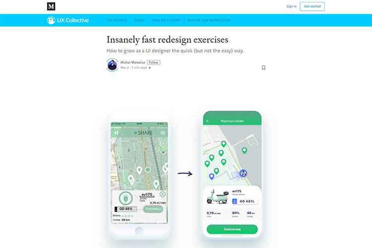
Insanely fast redesign exercises – Learn how to grow as a UI designer the quick (but not the easy) way.

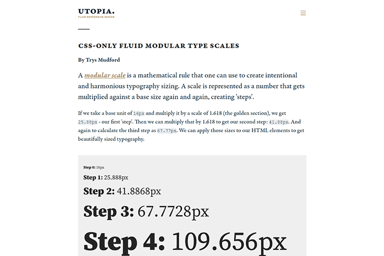
CSS-only fluid modular type scales – Create a type scale that sizes perfectly on both large and small screens.

Why Wrangling User Data in WordPress Can Be a Nightmare – User data can be stored in multiple places. Putting it all together can be difficult.

Google Fonts + Variable Fonts – Google Fonts has a new design and a way to search for variable fonts.

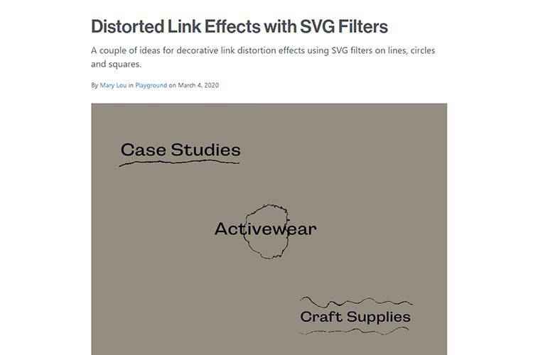
Distorted Link Effects with SVG Filters – Create some unique decorative link effects that stand out.

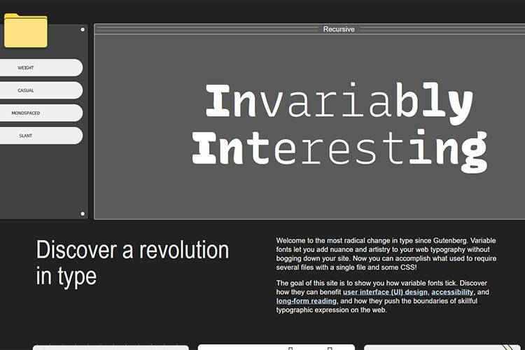
A Variable Fonts Primer – Learn everything you need to take advantage of this typographic phenomenon.

Celestial Code Snippets That Celebrate the Sky and Outer Space – Explore these examples that use the heavens as an interactive design feature.

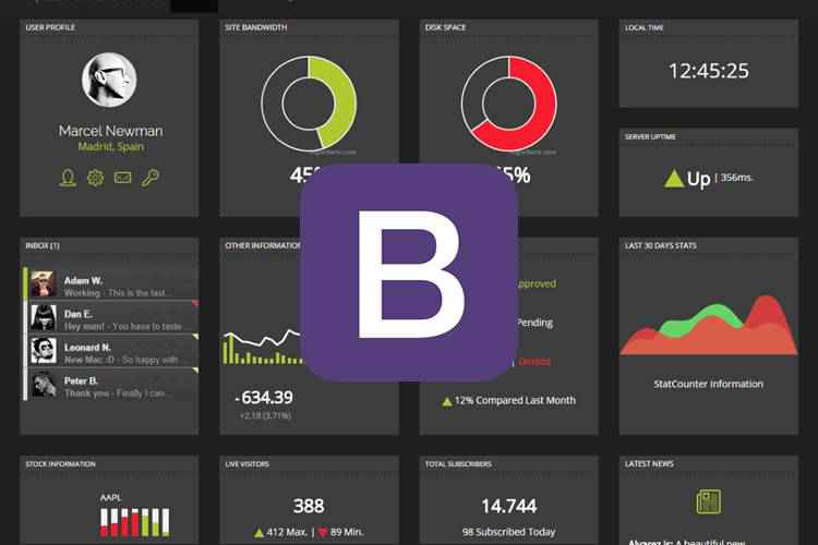
20 Free Bootstrap Admin & Dashboard Templates – Check out this collection of beautiful dashboards for your next project.

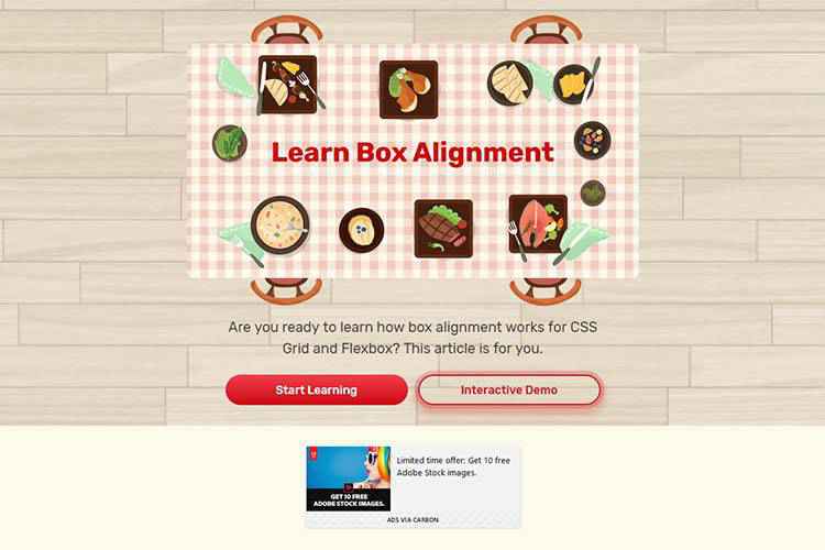
Learn Box Alignment – Get the lowdown on how alignment works for both CSS Grid and Flexbox.

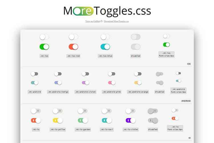
MoreToggles.css – A pure CSS library that provides you with stylish toggles.

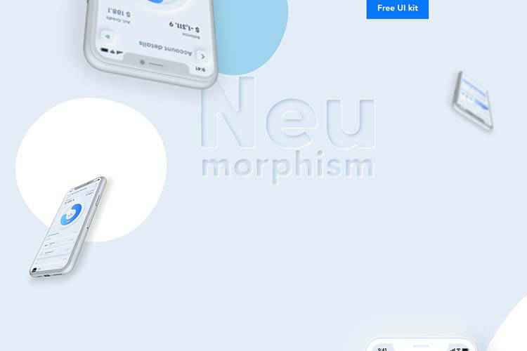
Neumorphism UI kit – Grab this free kit, featuring over 30 screens and that sweet Neumorphism style.

How to Let Go of That Failing Creative Idea – Learn to tell the difference between a bad idea and one worth keeping around.

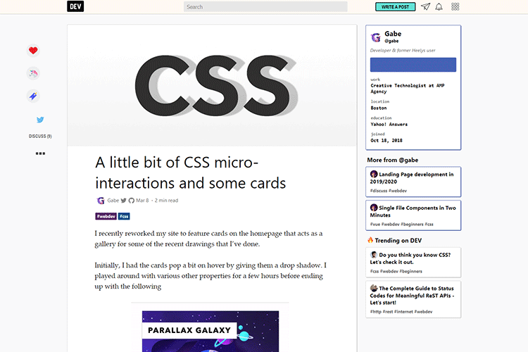
A little bit of CSS micro-interactions and some cards – Follow this tutorial to create a stunning interactive card layout.

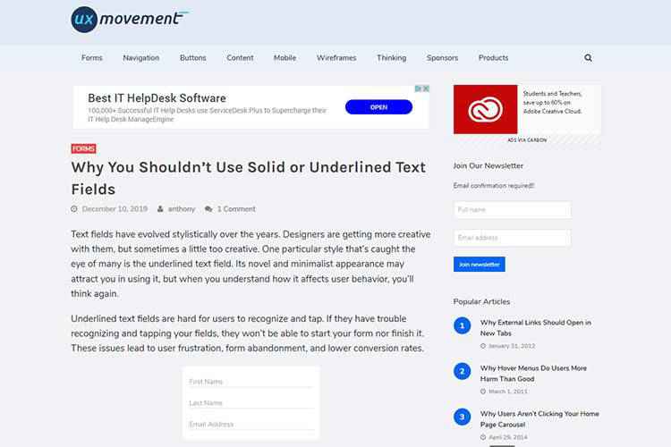
Why You Shouldn’t Use Solid or Underlined Text Fields – Hint: This styling creates real usability concerns.

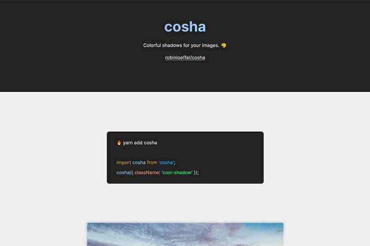
cosha – A collection of colorful shadows for your images.

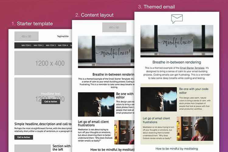
Starter Email Template – Use this modular template to design beautiful emails.

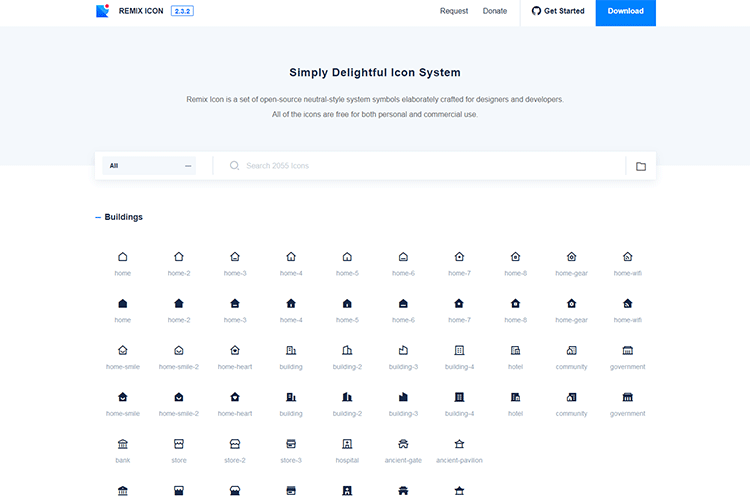
Remix Icon – A free set of open-source neutral-style system symbols elaborately crafted for designers and developers.

20 Free Nature Brushes for Photoshop – Add a natural touch to your images with these free brushes.

The post Weekly News for Designers № 531 appeared first on Speckyboy Design Magazine.
Package:
Summary:
Create objects of given types defined by name
Groups:
Author:
Description:
This package can be used to create objects of given types defined by name...
Read more at https://www.phpclasses.org/package/11570-PHP-Create-objects-of-given-types-defined-by-name.html

Releasing software is inherently risky business. While providing new features is great, it also has the potential to cause unforeseen issues for users. When that happens, you might find yourself scrambling to roll back the update and subsequently head back to the drawing board.
To minimize risk, you need a smarter solution. Enter CloudBees Rollout, an enterprise feature flag management system that separates releases from deployments. Features are released through progressive delivery, resulting in a faster and safer process.
Even better is that your team is in complete control every step of the way. Let’s take a look at what makes CloudBees Rollout a must-have tool for wrangling your app’s features.

The Power to Continuously Release Features
First, let’s talk about the term “feature flag”. It’s a way of determining whether or not a feature in your app will run, based on a specific condition – like user input. Everything from website plugins to complex mobile apps utilize them.
It stands to reason that, the more features your app includes, the more difficult time you’ll have keeping track of them all. CloudBees Rollout is a secure and scalable feature management platform that cuts through the chaos and empowers you. Manage every feature through a single dashboard and turn them on or off as needed.
In addition, you’ll be able to see who created and changed each feature flag, along with vital feature distribution data. This helps you make better decisions and release features in a more well-organized manner.
Target Your Users
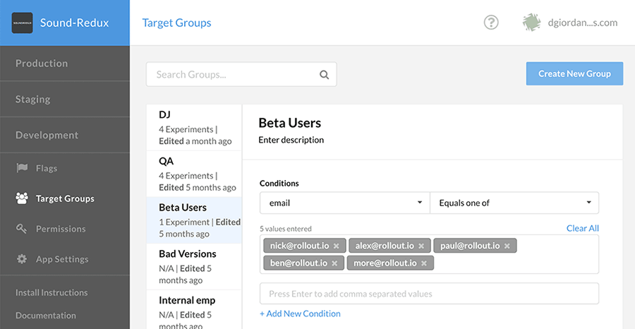
Want to see how a new feature is working with a specific group of users? With CloudBees Rollout, you can create user segments based on things like subscription tier, IP address, email and more via its easy-to-use SDKs and API. Segment rules are highly-flexible and can be static or dynamic.
Segments are also a great way to give your quality assurance or testing teams access to the production version of your app. This helps you spot problems before they impact users.

Control New Releases
It’s important to manage feature releases with precision, and CloudBees Rollout can help. They provide a simple and powerful UI that puts you in the driver’s seat when it comes to new versions. You control who gets access and when they’ll get it.

Analyze Results
Data is crucial to understanding how your releases are faring in the real world. Use CloudBees Rollout’s intuitive dashboard or hook up your Google Analytics account to get the full story. The service also works with a wide variety of additional analytics and APM tools. You’ll be able to analyze data in the format that works for you.

Turn Off Features without Rolling Back Code
If the unexpected does happen, use the handy Kill Switch to turn off features in production. This immediately “kills” the feature and doesn’t require you to roll back code. It’s fast, safe and simple.
Support for Multiple Clients and Platforms
Whatever language or platform you’re working with, odds are that CloudBees Rollout supports it. Client-side SDKs include solutions for iOS, Android, JavaScript and React. Server-side SDKs include kits for Java, Node.js, C#, PHP, Python, Ruby and more. Plus, you’ll also find full native support for IoT and mobile devices.
Start Your Free 14 Day Trial of CloudBees Rollout
As your software grows, it becomes more difficult to manage. That’s where a trusted system like CloudBees Rollout can be a lifesaver.
The platform helps you control each and every aspect of your app’s feature releases. Target users with fine-grain precision, test your features in production and decouple them from code. If a feature isn’t working, simply turn it off – it’s that easy.
It’s time to take control of your feature flags. Sign up with CloudBees Rollout today and receive a free 14 day trial. You’ll be amazed at what it can do for you and your team.
The post Test in Production with CloudBees Rollout Feature Flags <span class="sponsored_text">Sponsored</span> appeared first on Speckyboy Design Magazine.
Package:
Summary:
Prevent users from reusing recently used passwords
Groups:
Author:
Description:
This package can be used to prevent users from reusing recently used passwords...
Read more at https://www.phpclasses.org/package/11571-PHP-Prevent-users-from-reusing-recently-used-passwords.html#2020-03-11-17:38:44

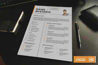
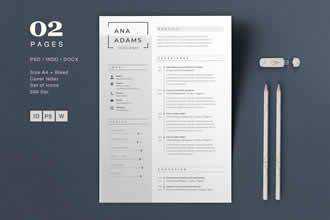
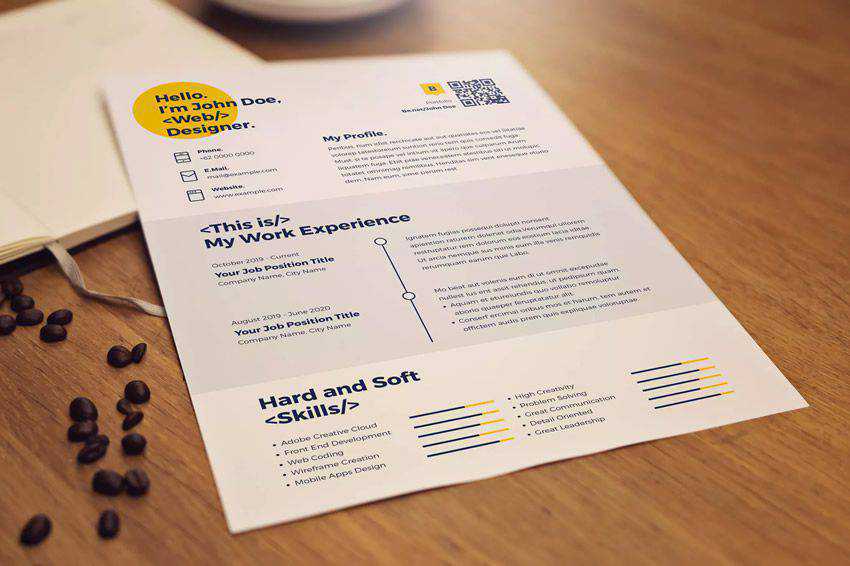
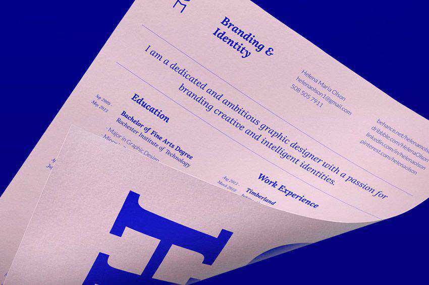
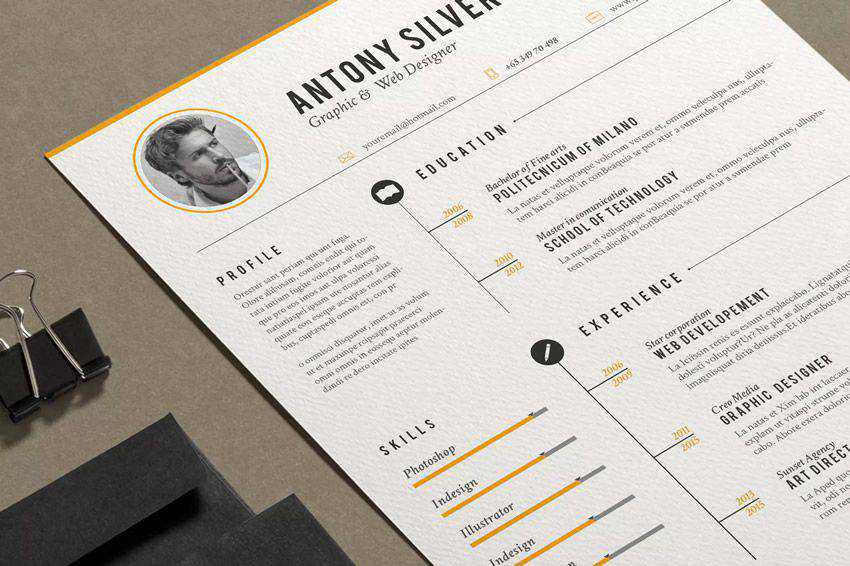
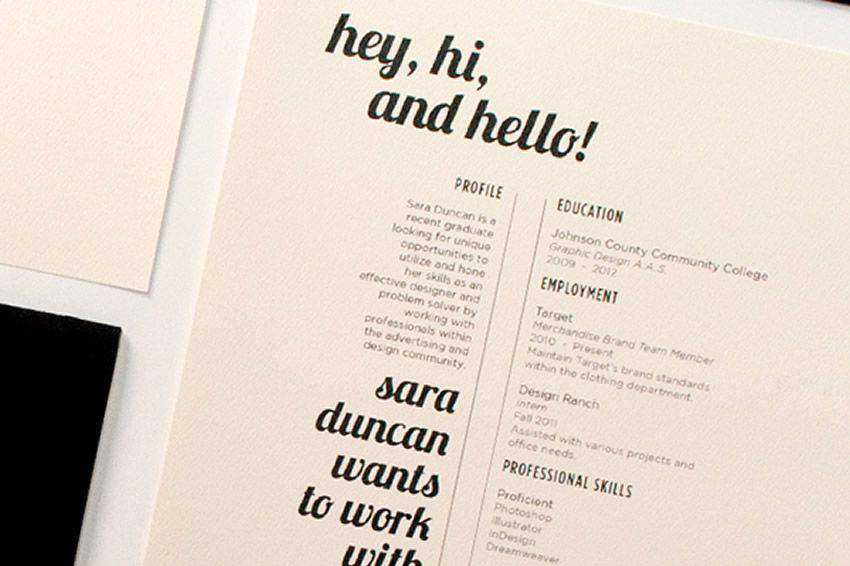
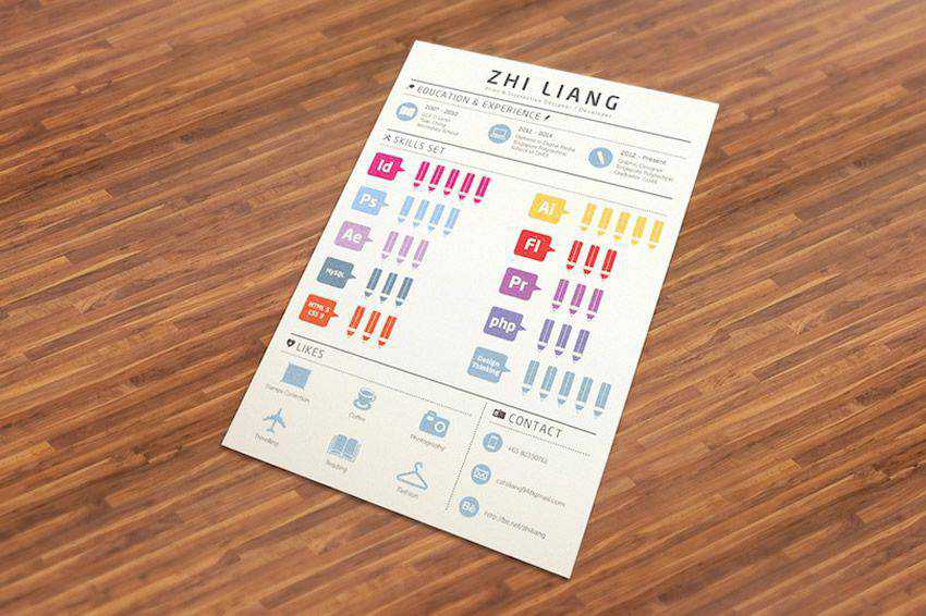
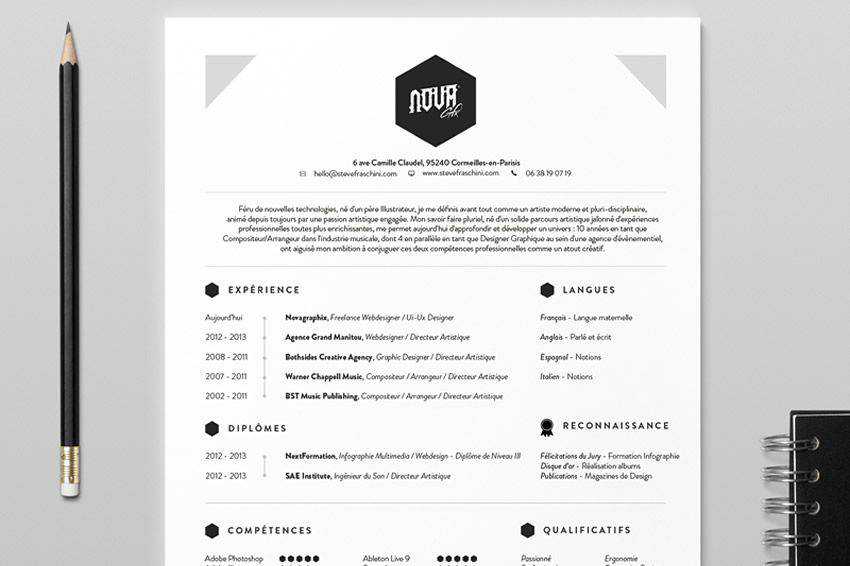
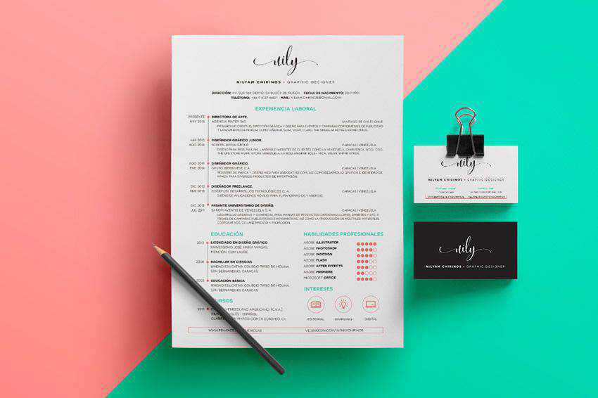
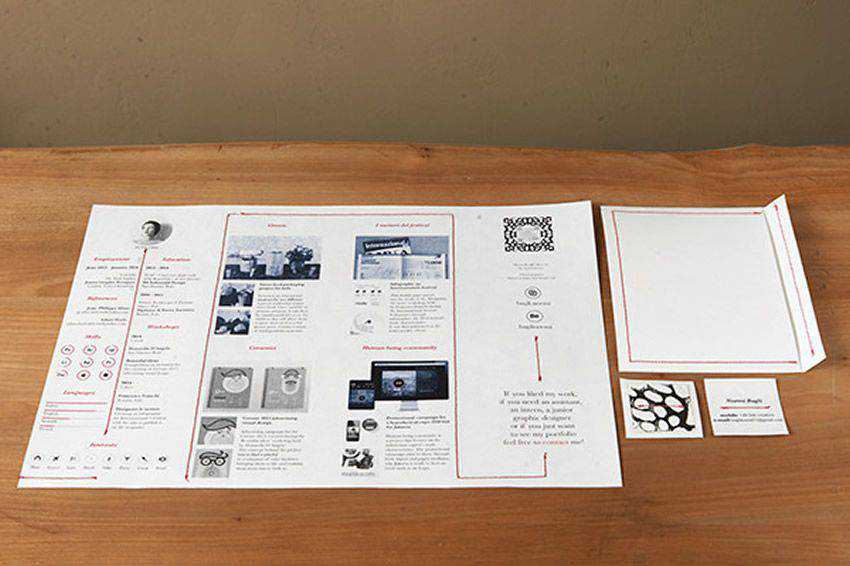
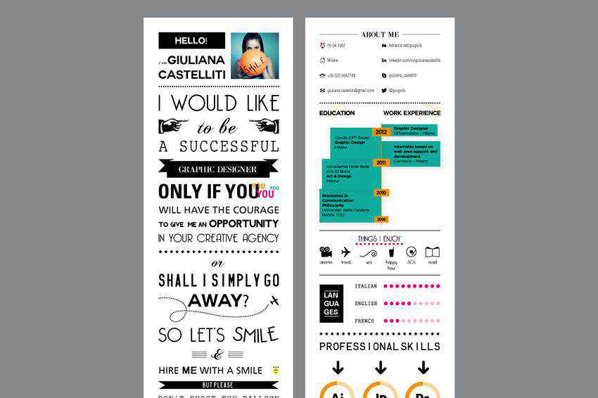
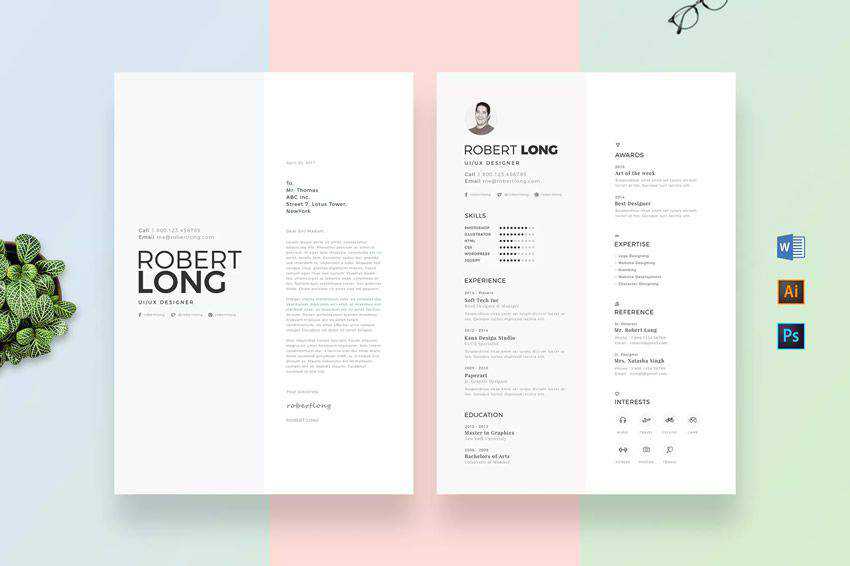
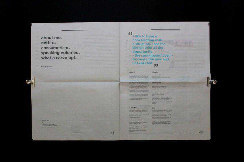
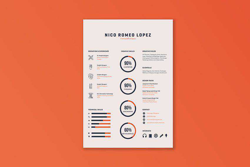
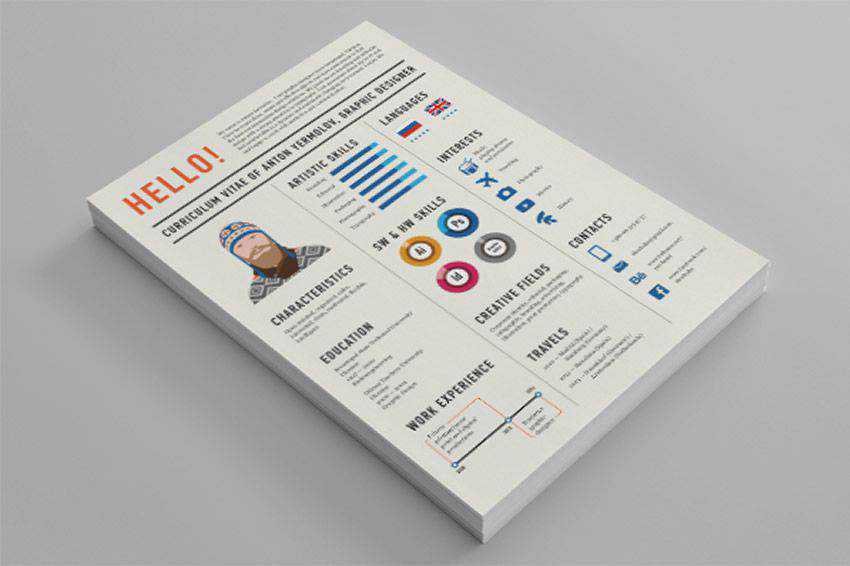
Been a while since you dusted off your resume, added in your most recent work and gave it a facelift? Before you do that, check out these examples for inspiration. A well-crafted resume is a great way to stand out as a candidate, and it’s not the easiest task to balance form and function with the opportunity to show off your design chops.
Have a look at what other designers are doing before you head back to the drawing board, and remember: a resume’s most important function is to give a potential employer a good idea of your experience as quickly as possible. Design acrobatics are secondary to that.
You might also like to take a look at these free PSD resume templates, or these free HTML resume templates, or even these online services for creating resumes.
Unlimited Downloads: 2,600+ Resume & CV Templates
Unlimited Downloads: 1,000,000+ Print Templates, Mockups, Illustrations, Actions, Presets, Brushes & much more!
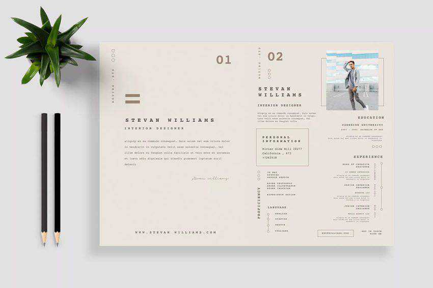
Resume by Paiheme Studio


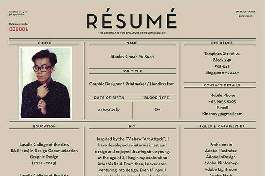
Résumé by Stanlet Cheah


Resume by broluthfi


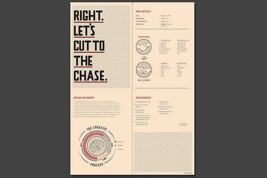
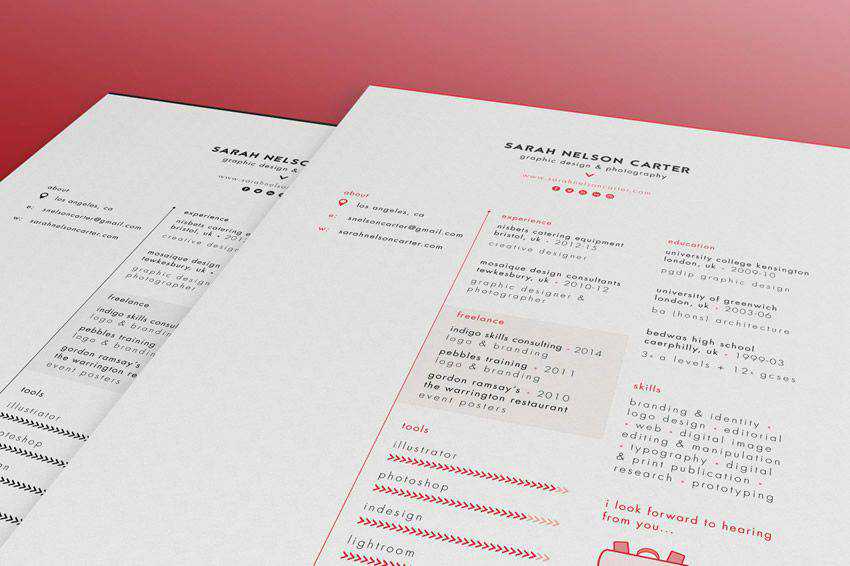
Resume 2015 by Sarah Nelson Carter


Conclusion
I hope that this collection of creative resume designs will inspire you to create your own stunning piece that you’ll be proud to use to represent yourself.
The post The 30 Most Creative Resume Designs Ever appeared first on Speckyboy Design Magazine.
Package:
Summary:
A custom Doctrine data type for UUID v4 values
Groups:
Author:
Description:
This package provides a custom Doctrine data type for UUID v4 values...
Read more at https://www.phpclasses.org/package/11567-PHP-A-custom-Doctrine-data-type-for-UUID-v4-values.html

The second release candidate for WordPress 5.4 is now available!
WordPress 5.4 is currently scheduled to be released on March 31 2020, and we need your help to get there—if you haven’t tried 5.4 yet, now is the time!
There are two ways to test the WordPress 5.4 release candidate:
For details about what to expect in WordPress 5.4, please see the first release candidate post.
RC2 addresses improvements to the new About page and 5 fixes for the following bugs and regressions:
- 49611 – Block Editor: Update WordPress Packages WordPress 5.4 RC 2
- 49318 – Bundled Themes: Twenty Twenty content font CSS selector is too important
- 49585 – REST API: Fix typo in disable-custom-gradients theme feature description
- 49568 – Block Editor: Fix visual regression in editor’s color picker
- 49549 – Bundled Themes: Calendar widget CSS fixes on various Bundled themes
Plugin and Theme Developers
Please test your plugins and themes against WordPress 5.4 and update the Tested up to version in the readme to 5.4. If you find compatibility problems, please be sure to post to the support forums so we can figure those out before the final release.
The WordPress 5.4 Field Guide has also been published, which details the major changes.
How to Help
Do you speak a language other than English? Help us translate WordPress into more than 100 languages!
If you think you’ve found a bug, you can post to the Alpha/Beta area in the support forums. We’d love to hear from you! If you’re comfortable writing a reproducible bug report, file one on WordPress Trac, where you can also find a list of known bugs.
 Image Source: What is Umami?


