20 Company Website Designs to Inspire Your Small Business
As a small or midsize business (SMB), your company website is often the first touchpoint for potential clients — and you want it to make a great first impression.
The secret to hitting home with your audience is to have a sophisticated and lively website design that’s aesthetically pleasing and provides great user experience (UX).
Need some company website examples to inspire your design? We made this corporate website mood board just for you!
With minimalist designs and fun interactive elements like playful cursors and dynamic scrolling, these 20 company website designs will get your creative juices flowing!
And if you’re excited to launch your own custom website, WebFX offers web design plans, tailored to your business goals! With an award-winning portfolio of over 1000 stunning websites, we know our way around effective web design.
Contact us online or call us at 888-601-5359 to start building your dream website!
1. Native Union
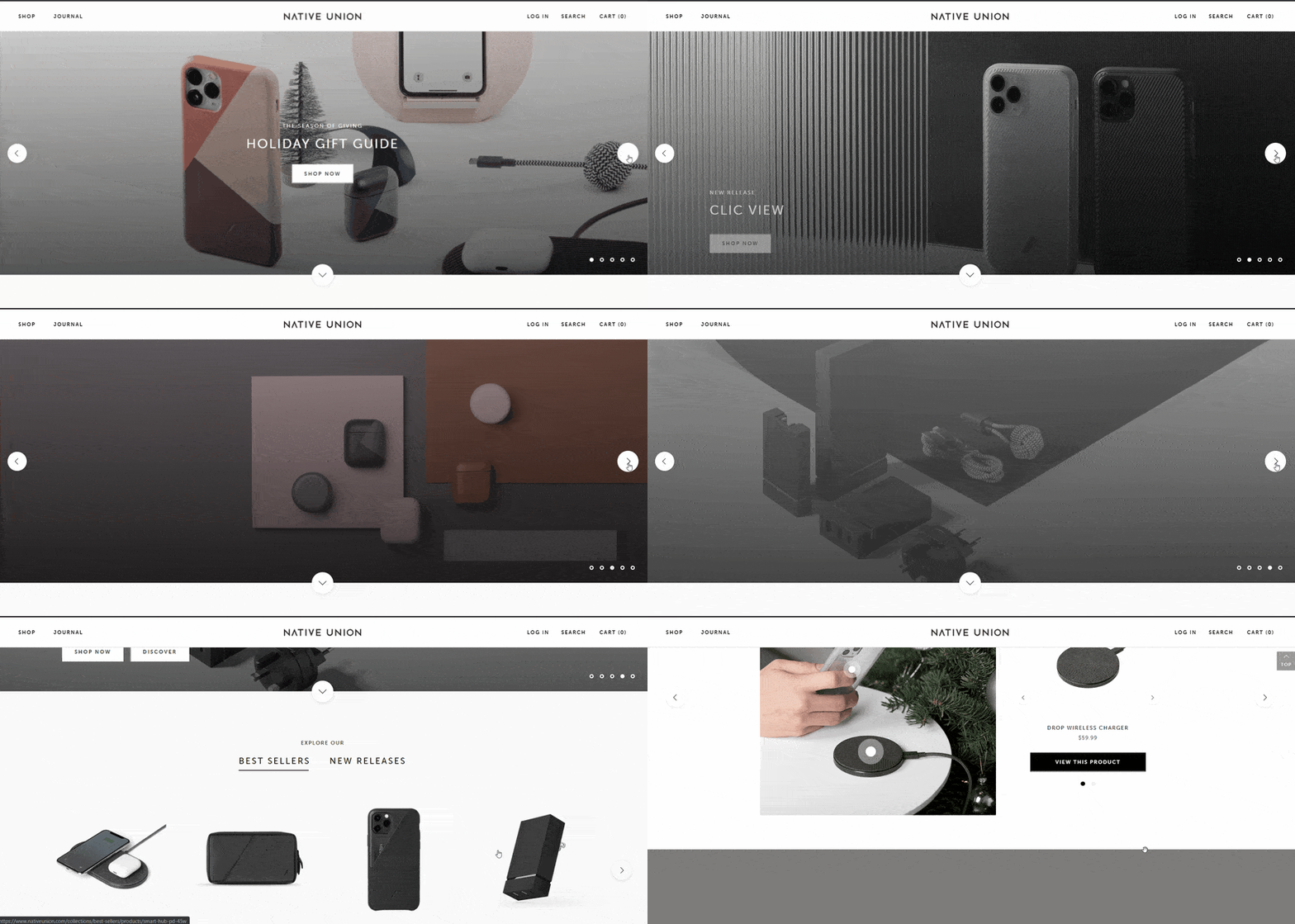
First on the list of inspiring company website examples — Native Union offers tech accessories with a bit of fashion flair.
Why we love it?
- Effective calls-to-action (CTAs) with fun hover animations
- Full-screen header with a carrousel of engaging pictures
- Classy sans-serif type promotes online readability
- Great use of whitespace balances design elements and organizes content
- Fresh organization and easy-to-use navigation menus
2. Cyclemon
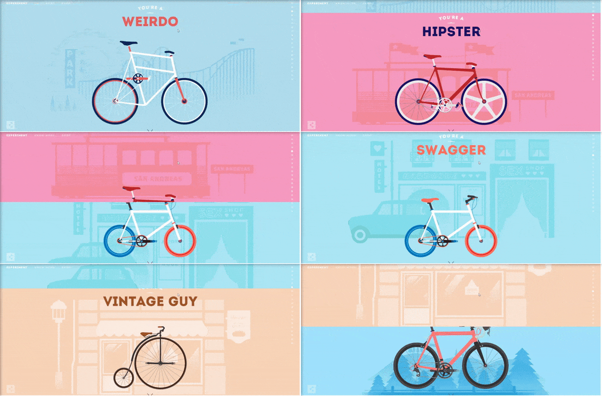
Cyclemon designs illustrative posters of bicycles with a perfect amount of personalization.
Why we love it?
- Fun colors match the brand’s personality
- Stunning illustration style
- Informative website copy
- Exciting, dynamic scrolling with a 3D effect
- Engaging “know more” teaser video keeps people on the site and encourages them to learn more
3. Bellefare
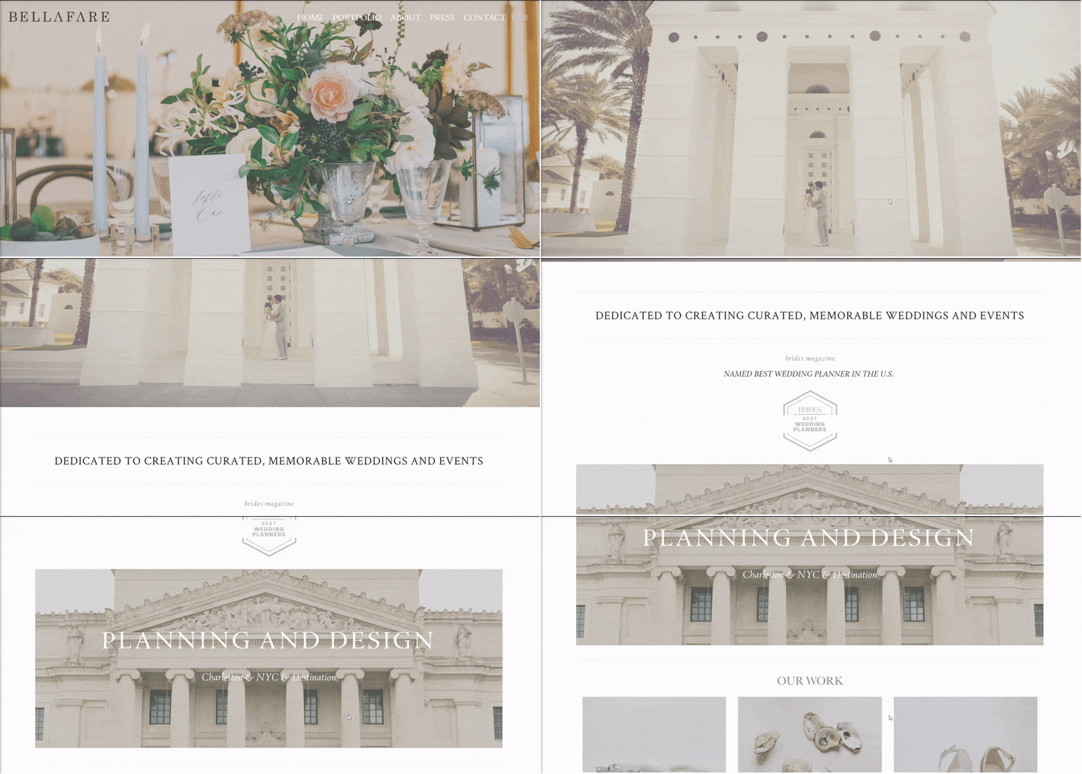
Next on our list of company website examples — Bellefare is a wedding and event architect, designer, and producer.
Why we love it?
- Full-screen slideshow header
- Simple navigation menu with classy hover animations
- Portfolio of images showcases work
- Elegant “About” page with black-and-white photos
- Fun “Press” page adds social proof
4. Eugenius
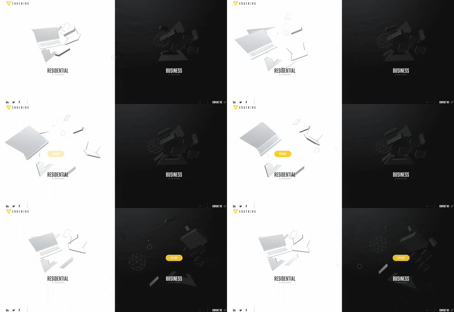
Next on our list of best 2020 corporate website examples is Eugenius — a company that simplifies IT for residential and business clients.
Why we love it?
- Innovative, video game-like design
- Beautiful color contrast
- Captivating loading animation
- Exhilarating, playful cursor hover animations
- Unique navigation sparks interest and makes visitors want to explore the site
- Ambient music with an off switch
5. Andersson / Wise
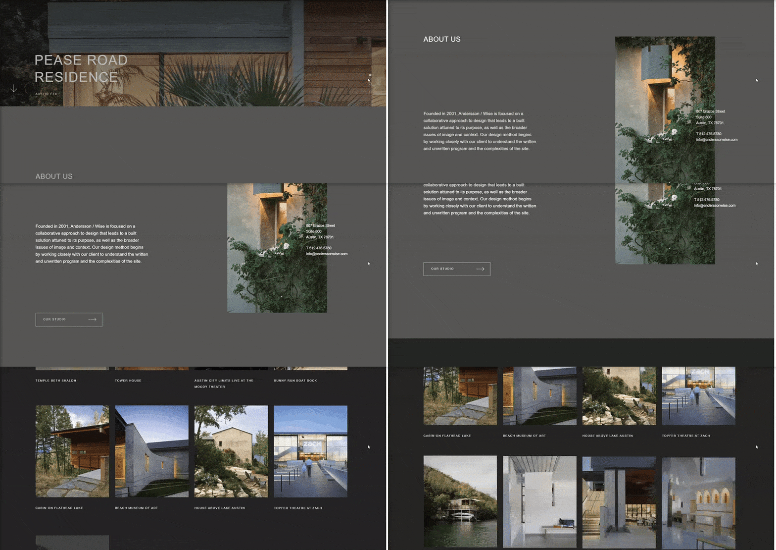
Andersson / Wise designs sleek architecture for residential and commercial use.
Why we love it?
- Cool-toned color pallet matches the industrial nature of the brand
- Pleasant flow and white space
- Beautiful, full-screen image headers with simple animation
- Dynamic scrolling design and overlapping text
- Project portfolio in an animated, scroll-triggered grid
6. HAUS
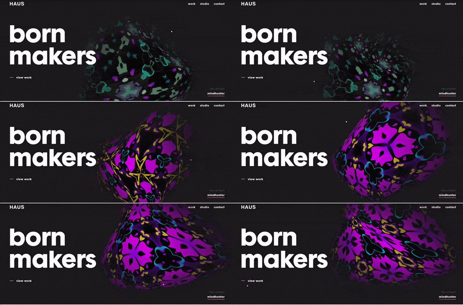
HAUS — our next corporate website example — is an award-winning design studio and full-service creative and technology partner.
Why we love it?
- Entertaining and playful cursor
- Satisfying color, wave, and hover animations
- Fun, chunky type
- Innovative side scroll with background animation
- Engaging videography
7. Woven Magazine
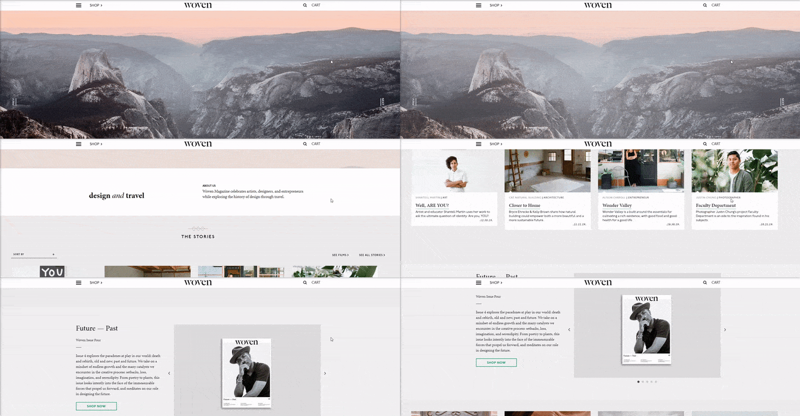
Woven Magazine celebrates artists, designers, and entrepreneurs while exploring the history of design through travel.
Why we love it?
- Smooth navigation allows visitors to quickly find info they need
- Amazing use of white space adds room to breathe
- Crisp, structural layout
- Engaging and effective use of images
- Satisfying videos explore creativity and design
8. Gumption
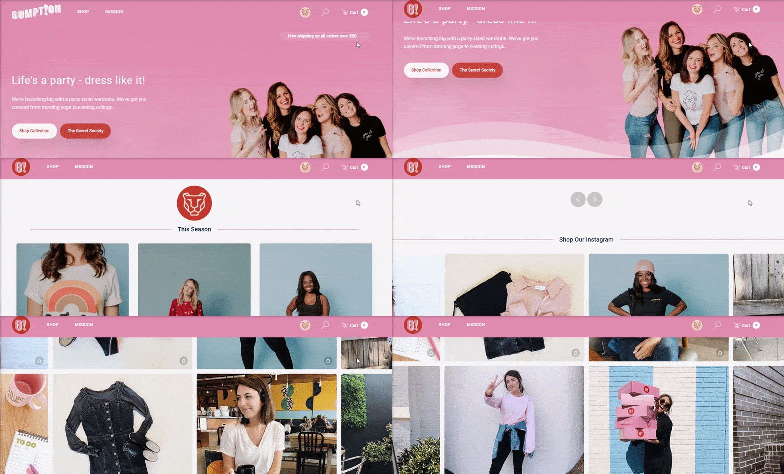
Gumption is an ecommerce store that sells women’s accessories and clothing.
Why we love it?
- Bubbly color pallet and design
- Fun hover animations
- Ecommerce catalog promotes transactions
- Appealing “Secret Society” offers discount products protected by passwords, which makes users feel like they’re a part of something special
- Easy-to-use navigation menus
9. I&You Ceramics
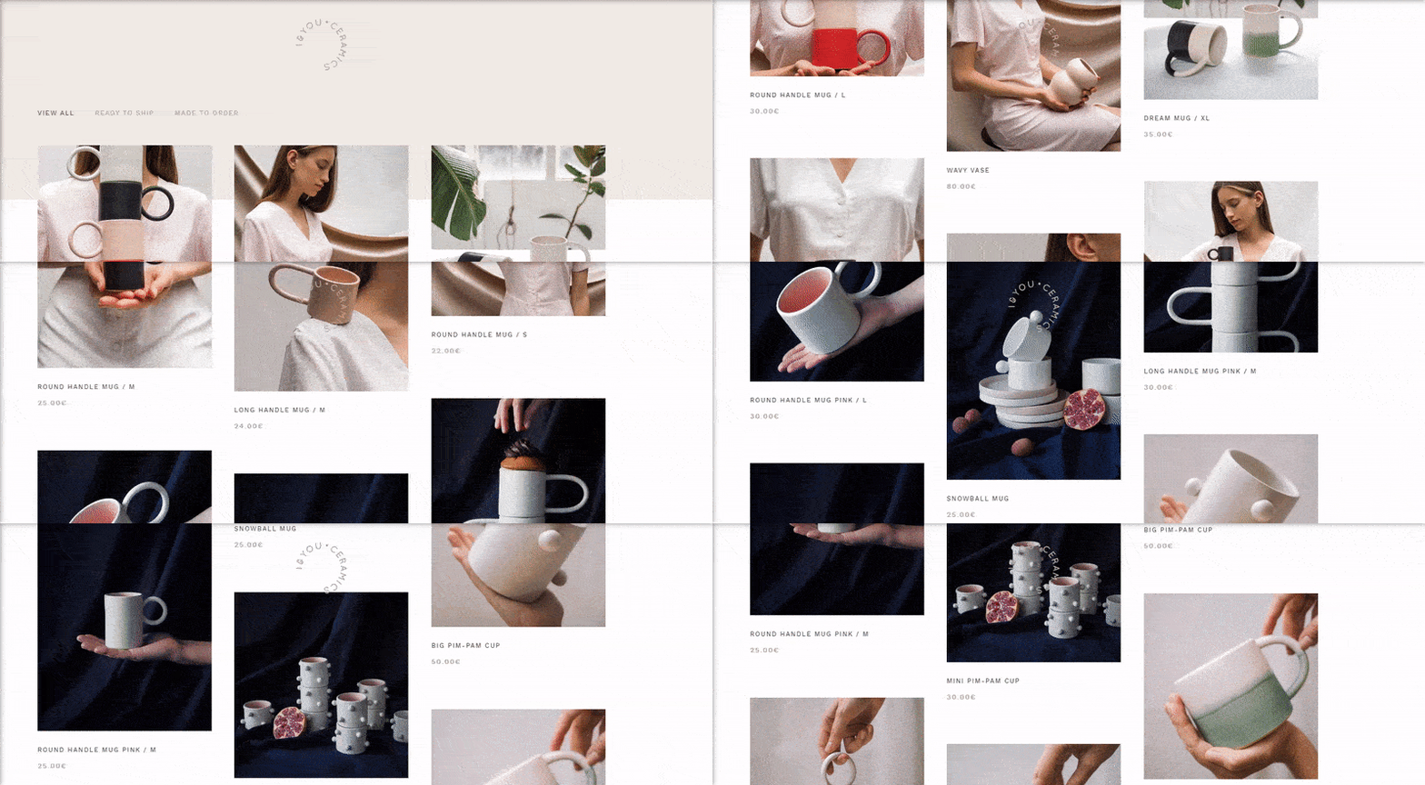
I&You Ceramics is an ecommerce store that offers a collection of handmade modern ceramics.
Why we love it?
- Satisfying pastel color scheme and design
- Classy white space with beautiful pictures
- Minimalistic asymmetrical grids
- Intuitive UX and easy access to gallery and shop
- Smooth checkout process
10. Confluera

Confluera works to protect businesses from cyber attacks in real-time — and we’re inspired by this company’s website design.
Why we love it?
- Tasteful gradient color scheme
- Exciting abstract 2D and 3D illustrations scream “cyber”
- Great about us page with hover animations and social media links
- Simple navigation menu with resources and blog access
- Sleek white space and type
11. Volta
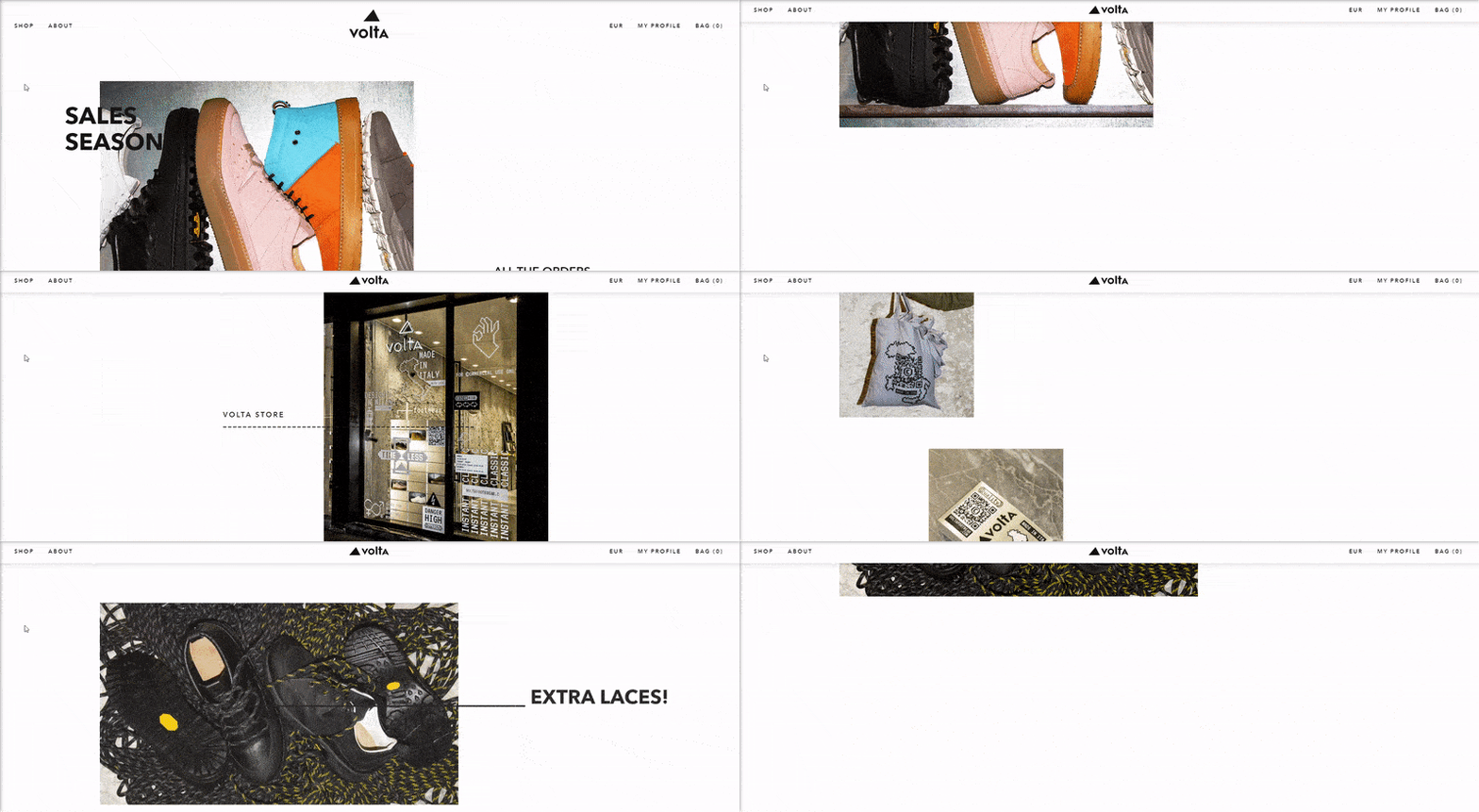
Volta Footwear provides customers with contemporary shoes that withstand the wear and tear of time.
Why we love it?
- Engaging images showcase footwear designs
- Fun catalog design allows users to see multiple product views
- Soothing dynamic scrolling
- Great use of white space
- Elegant, minimalist grid layout
12. Ditto
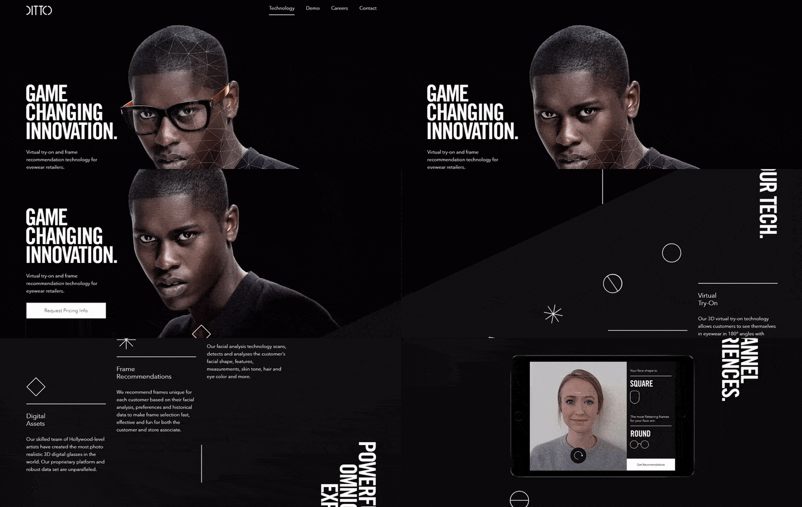
Ditto is a virtual try-on and frame recommendation technology for eyewear retailers.
Why we love it?
- Satisfying design layout with text set to the left for easy reading
- Elegant photos clearly depict how the technology works
- Well-employed white space
- Entertaining, grid-breaking layout
- Innovative and thrilling dynamic scrolling
13. Hello Monday

The next company website example, Hello Monday offers digital ideas, products, and services.
Why we love it?
- Fun and engaging header animation design
- Innovative, full-screen navigation menu animation
- Entertaining, playful cursors and dynamic scrolling
- Engaging image animation and gifs
- Simplistic illustration style
14. Leaf & Clay
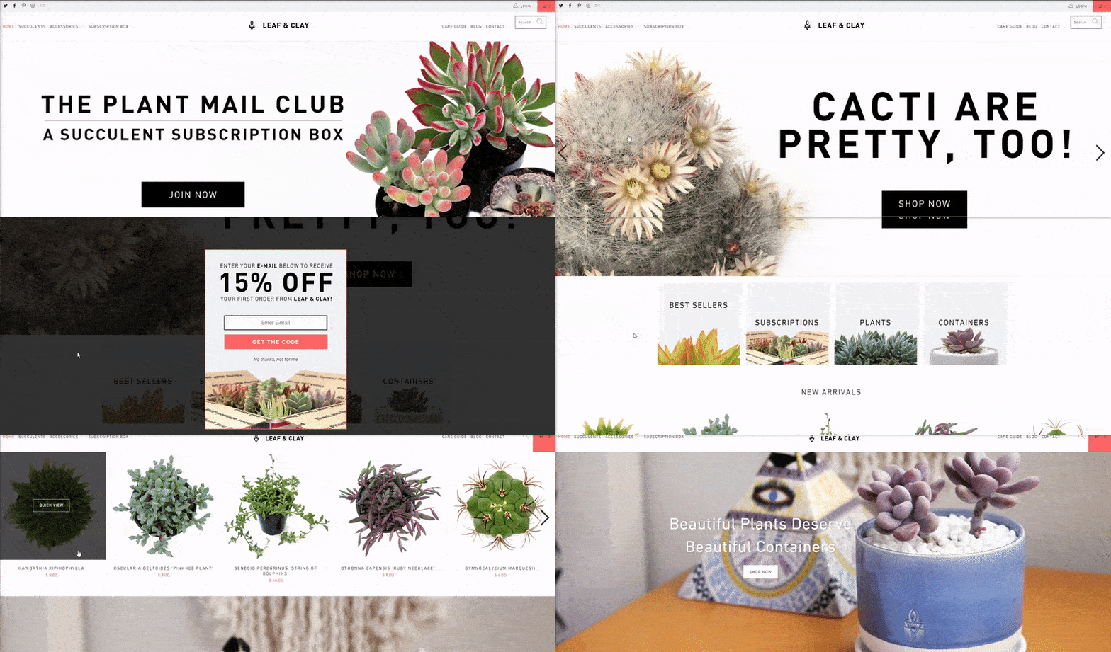
Leaf & Clay is a beautiful ecommerce shop that offers monthly subscription boxes for succulents.
Why we love it?
- Creative catalog lets visitors easily view products
- Fun and captivating images of beautiful succulents
- Easy-to-use navigation menu with social media links
- Engaging white space
- Stylish sans-serif type
15. Signature Kitchen and Bath
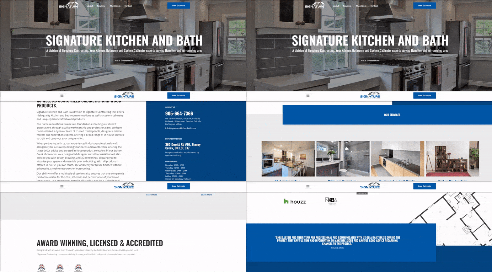
Our next corporate website example, Signature Kitchen and Bath creates custom cabinetry for kitchens and bathrooms.
Why we love it?
- Clean layout
- Fun, animated three-image slideshow header
- Detailed content works great for search engine optimization (SEO)
- Pleasant, overlapping elements and tasteful hover animations
- Simple, easy-to-use navigation menu
16. AQSystem![]()
AQSystem sells weather-proof solar devices to check wind conditions.
Why we love it?
- Great white space
- Overlapping elements for a fresh twist
- Interactive images with animation
- Slick slideshow shows off products in several environments
- Navy blue color scheme matches the brand’s personality and expertise
17. Render
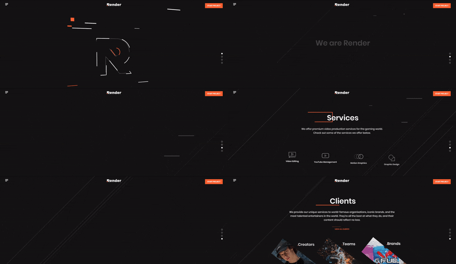
Render is a video production studio specializing in content for streaming, and it’s next on our company website example list.
Why we love it?
- Fun, full-screen animations
- Stylish geometric design
- Satisfying color pallet that’s great for brand association
- Exciting dynamic scrolling and hover animations
- Engaging introductory video
18. Court & Rowe
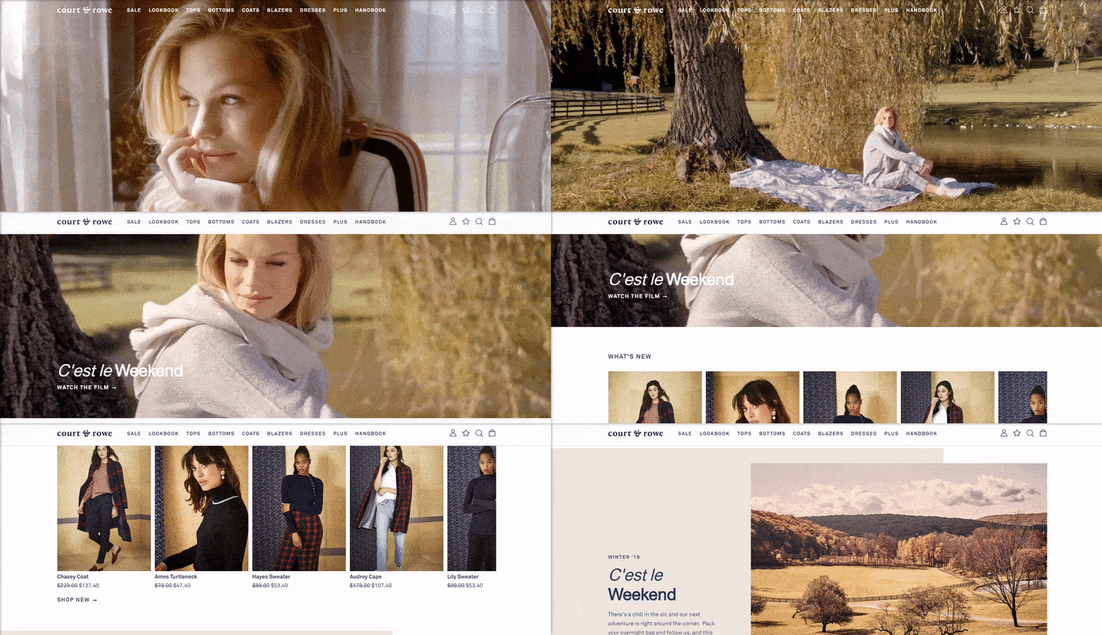
Court & Rowe sells women’s clothing with an old-sport style.
Why we love it?
- Tasteful, full-screen video header
- Great catalog and shopping cart system for max buying power
- Clean, fresh design
- Warm pastel color pallet for an old-time feel
- Great use of overlapping images and white space
19. Oscar Health Insurance
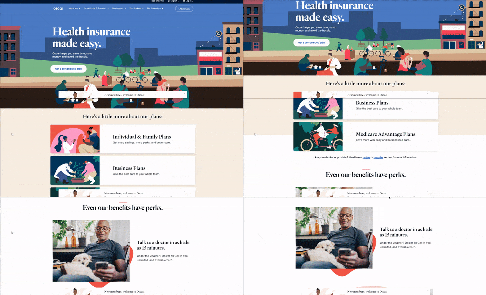
Our next company website example is Oscar Health Insurance — a health insurance company centered around the patient.
Why we love it?
- Bouncy color pallet
- Bubbly illustrations
- Playful design and type
- Great use of overlapping elements
- Pleasant, scroll-triggered animations
- Nice hover animations for buttons
20. Picto
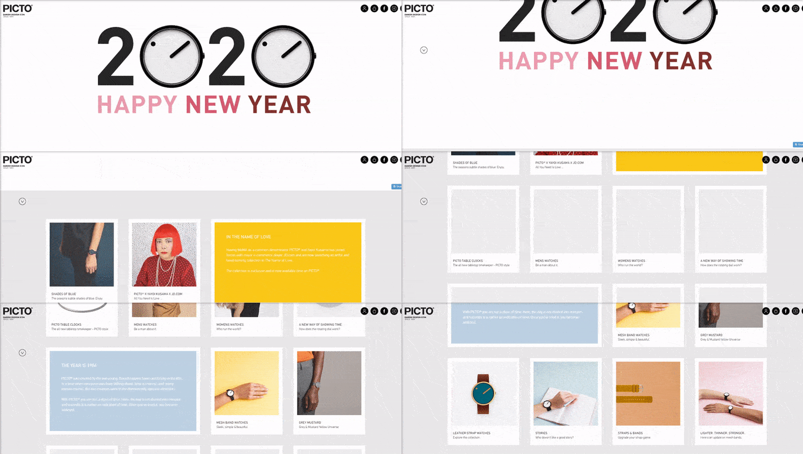
Our final company website example is Picto Watches — a Danish design icon that specializes in building minimalist watches for men and women.
Why we love it?
- Sleek grid layout
- Engaging hover navigation menu helps visitors find the info they need
- Beautiful header images
- Effective use of white space
- Individual pages with vertical image scrolling to showcase products
Create a world-class company website with WebFX!
Ready to get started with your own company website?
Check out our fresh and exciting web design plans. You can use our web design calculator or get a free quote.
For rapid web designs, take a look at our exclusive RainmakerFX! We’ll make you a corporate-ready website in 30 days.
Contact us online or call us at 888-601-5359 for a custom business design for your website.
The post 20 Company Website Designs to Inspire Your Small Business appeared first on WebFX Blog.
