Monthly Archiv: January, 2020
Latest PECL Releases:
- yar 2.0.7
- Attempted to fix windows build
- yac 2.0.3
- Fixed PHP-7.4 Compatiblity
- SeasLog 2.1.0
- Support PHP7.4
- Support getBufferCount function and modify flushBuffer function.
- Support `%B` in log template, support BasePath.
- Enhancement trim_wrap.
- Fixed issue #265.
- Fixed bug trace_performance core dump by performance_frames init.
- Fixed ignore php errors before module initialized.
- Fixed php-stream use update in php7.
- Fixed can`t append to file after stream changed in php7.
- xlswriter 1.3.3.2
- FIX free up stale sheets.
There are a ton of resources out there to help us learn web design. Whether you want to code like a master or create stunning graphics, the opportunity to sharpen your skills is just a few clicks away.
But being a web designer is so much more than just the technical side of things. Depending on your particular situation, it also requires business sense and the ability to work with others.
A career in web design can also be a serious challenge emotionally as well. It’s something we don’t really talk about, but maybe it’s time to start.
There Is No Shield
For many web designers (myself included), their interest in the field starts as a hobby. It’s about learning something new, experimenting and having fun. Maybe a few people see what you’ve created, or perhaps it’s strictly a personal project.
Making it a career out of it, however, takes things to a different level. Once you start putting your design and development work out into the world, any barriers to criticism suddenly go away.
Why? Because it’s no longer a hobby. You’re now being paid for your talents and are working with real-world clients (not to mention bosses). They’re apt to share constructive criticism and request changes – sometimes major ones. And, due to human nature, some people are much more skilled in this area than others.
This can act as a very rude wakeup call for a new designer. You’ve gone from creating something for the joy of it to now having your every choice closely scrutinized.
The result can be a feeling of frustration and a sinking confidence. It’s something that can take a toll on both your enjoyment and belief in what you’re doing.

Project Peaks and Valleys
Finding a steady workload is a goal for many designers. But it can be hard to attain. What’s more likely are alternating cycles of feast and famine. In other words, you’re either too busy to sleep or bored out of your mind.
Both of these situations have their own emotional baggage. Being too busy is stressful and can feel overwhelming. Having too few projects in your queue can be scary in its own right. You may start to wonder if your business will survive.
Then there are the projects themselves. A highly-complex gig, or one that turns out to be completely different than you expected, brings its own rollercoaster of feelings.
In my experience, it only takes one of these to completely disrupt your carefully thought out plans. It can feel like you have a total lack of control. Then, there’s a mad rush to just get things done in order to move on to the next thing.
There’s a hard lesson to be learned. It turns out that, despite a lot of due diligence, projects often have a mind of their own. They aren’t nearly as predictable as we’d like and that can be difficult to deal with. That goes for procurement, scheduling and doing the actual work.

The Weight of Being Responsible
Some web designers care for each site they manage like a baby. If that’s the case, then some of us could have dozens or even hundreds of “kids” to look after.
With this comes a great deal of responsibility. Keeping things running smoothly, ensuring accessibility, staying compatible with new technologies, training clients and managing content are just a few of the things we’re tasked with.
This can be a lot to put on a solo freelancer or even a small agency. Much like a doctor, it requires being on call at all odd hours. And not every client will be satisfied with waiting until the next day to fix a broken website.
Beyond that, great care has to be taken every step of the way. It feels bad enough when something beyond our control happens, but even worse when we’re the cause.
This is a burden that we don’t often think about when going into this business. But it is a challenge we’ll have to face at some point.

Learning to Deal
So, we’ve established that being a web designer can be a real nerve-wrecking experience. But the good news is that, over time, you can learn to deal with the inevitable ups and downs. Here are a few tips for keeping your cool:
Plan Ahead…Even If It Doesn’t Always Work
Yes, plans tend to change. But the act of planning is still a worthwhile endeavor. The key is to prepare yourself while staying flexible.
When discussing project benchmarks and deadlines with clients, try not to speak in absolutes. Instead, start with a time range and a friendly reminder that there are some variables involved. Then, as you make progress, the picture may become that much clearer.
This won’t suit every client, but most should be willing to work with you on it. After all, it’s a bit more realistic than setting hard deadlines without knowing what the future holds.
Let Go of What You Can’t Control
Along with planning is the understanding that some things are just beyond your control. Sometimes, a client fails to hold up their end of the bargain. A trusted plugin could become a buggy nightmare. Aliens could steal your hard drive. Stuff happens.
Hopefully, experience will teach us that we can either grumble about the situation or move on to Plan B. Doing the latter is ultimately the more productive way to go.
Put the Project Ahead of the Personal
This may be the hardest thing of all. Why? Because it’s a bummer when a client or colleague doesn’t like something you’ve poured your heart and soul into. It’s difficult to not take that as a personal slight.
But it’s important to keep things in perspective. When you put your projects first, then criticism becomes a means to the desired end: success. If changing a font, color or even a whole layout is what it takes to make things work, then so be it.
That doesn’t mean you give up your right to make a valid argument in defense of your work. It’s just that the ultimate result is what you’re fighting for – not your ego.

An Education in Emotions
Every job provides plenty of emotional experiences. Web design may be unique in that it can require us to both deal with the emotions of working on our own (like debugging code) and that of dealing with others (like providing customer support). You’re both in and out of a bubble.
Yet, it’s something that can take us by surprise. It’s a reality that forces us to adapt in order to stick around for the long term.
So, if you’re new to the industry, it’s worth taking a little time to consider the types of situations you might face and how they’ll make you feel. If you’ve been around for a while, think back to the emotional ups and downs and how they affected you.
Most importantly, realize that these emotions are all part of the experience. Learning to deal with them is just as vital as writing great code or crafting beautiful designs. They can all help to put you on the path to success.
The post The Emotional Rollercoaster of Being a Web Designer appeared first on Speckyboy Design Magazine.
A new implementation of Common Lisp for Windows, Mac OS X, Linux and FreeBSD has been added to the
Free Common Lisp Compilers
and Interpreters page. This one can create standalone executables for your programs. (For those wondering,
Common Lisp is a general purpose programming language.)
Package:
Summary:
Keep track of employee attendance with fingerprint
Groups:
Author:
Description:
This package can be used to keep track of employee attendance with fingerprint...
Read more at https://www.phpclasses.org/package/11490-PHP-Keep-track-of-employee-attendance-with-fingerprint.html#2020-01-06-15:59:32

Package:
Summary:
Convert URLs and email addresses into HTML links
Groups:
Author:
Description:
This package can convert URLs and email addresses in text into HTML links...
Read more at https://www.phpclasses.org/package/11489-PHP-Convert-URLs-and-email-addresses-into-HTML-links.html#2020-01-05-21:27:57

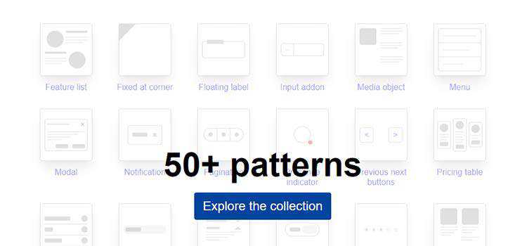
With all of the changes and rapid advancements CSS has gone through over the last few years, we should not be surprised at the vast volume of open-source resources and tools that are continually being released.
These time-saving CSS libraries, frameworks, and tools have been built to make our lives that little bit easier and also offer a learning window into those CSS areas we may not fully understand.
In this collection you will find 50 of our favorite CSS libraries, frameworks, resources and tools that have all been released this year. No doubt, you’ll find something interesting!
Quick Jump: CSS Frameworks, CSS Libraries, CSS Animation, CSS Typography, CSS Tools & Generators and CSS Inspiration.
The Web Designer Toolbox
Unlimited Downloads: 1,000,000+ Web Templates, Themes, Plugins, Design Assets, and much more!
CSS Frameworks
Terminal CSS – Attention terminal lovers, there’s now a CSS framework for you.
xstyled – A consistent theme-based CSS for styled-components.
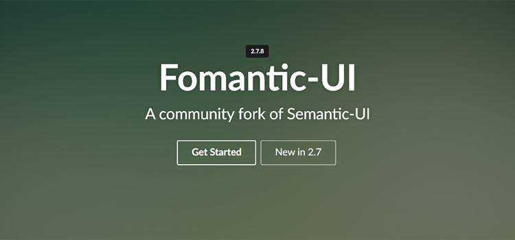
Fomantic-UI – A free, “human-friendly” development framework for creating responsive websites.
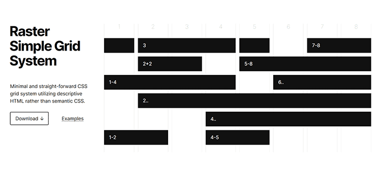
Raster – A simple CSS Grid system that utilizes descriptive HTML.
Diez – A free, open-source design language framework.

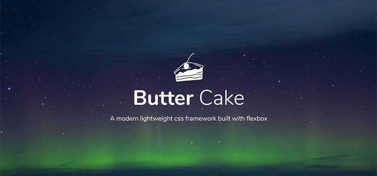
Butter Cake – Check out this modern, lightweight CSS framework.
CSS Libraries
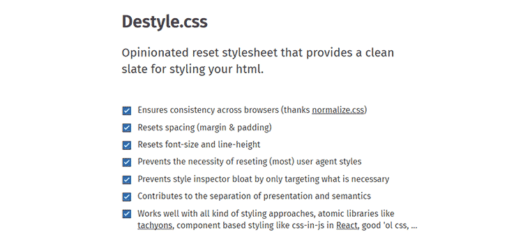
Destyle.css – An “opinionated” CSS reset library.
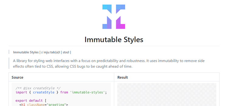
Immutable Styles – A library for styling web interfaces with a focus on predictability and robustness.
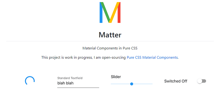
Matter – A collection of Material Design components in pure CSS.
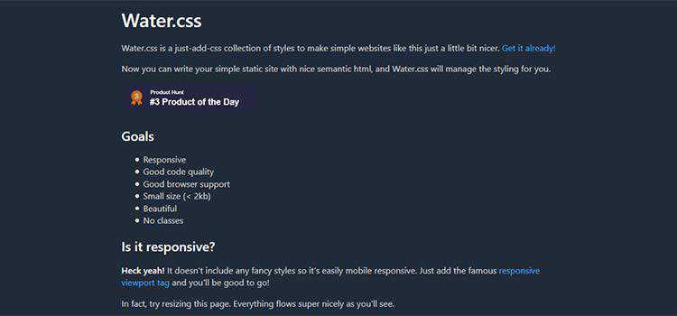
Water.css – Simple styles and semantic code for your static website.
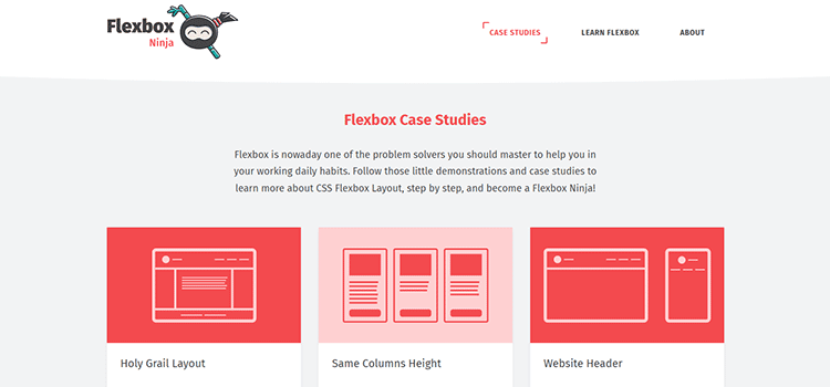
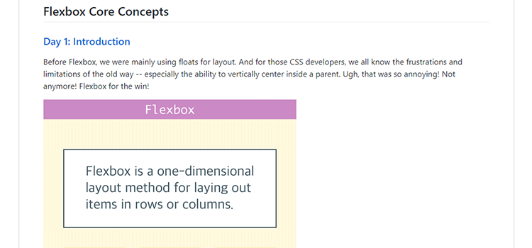
Flexbox Case Studies – Tutorials to help you achieve common Flexbox layouts.
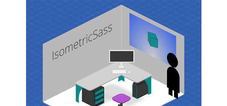
IsometricSass – A Sass library for creating isometric 2D without JavaScript.
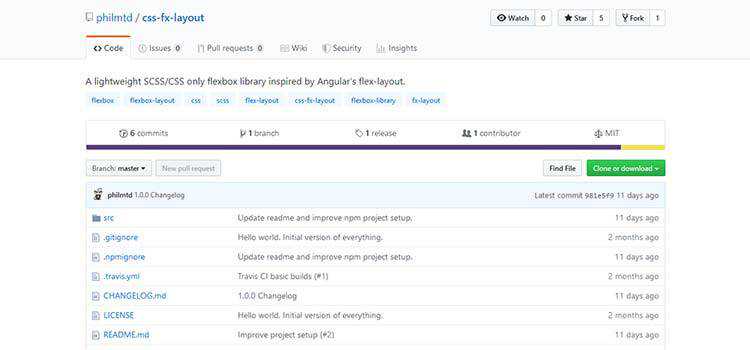
css-fx-layout – A lightweight CSS Flexbox library that includes both classes and HTML data attributes.
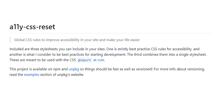
a11y-css-reset – A set of global CSS rules to help improve the accessibility of your projects.
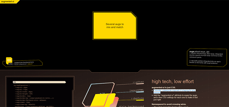
augmented-ui – A tool for creating “futuristic, cyberpunk-inspired UI” with CSS.
CSS Animation
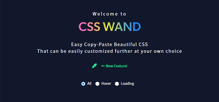
CSS Wand – Copy, paste and customize a variety of useful animation styles.
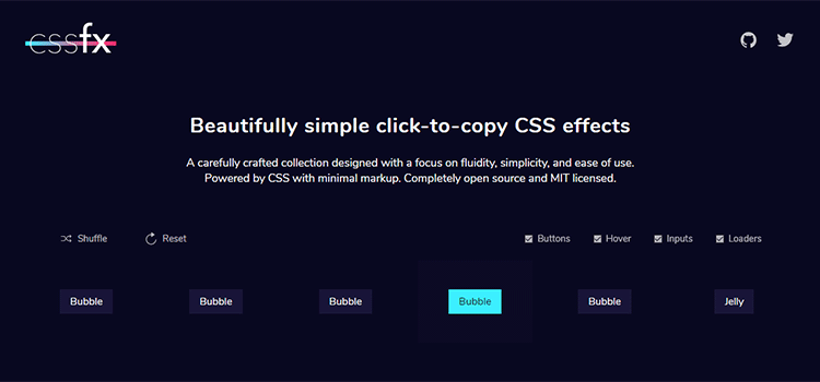
CSSFX – A collection of animated CSS buttons, hover effects, inputs and loaders for use in your projects.
CSSeffectsSnippets. – A collection of handy CSS animations that you can copy and paste.
useAnimations – A free CSS library of icon-based microinteractions.

extra.css – Use this CSS Houdini library to add stunning effects.

Izmir ImageHover CSS Library – A mini CSS library built by Ciaran Walsh for quickly creating beautifully animated image hover elements.
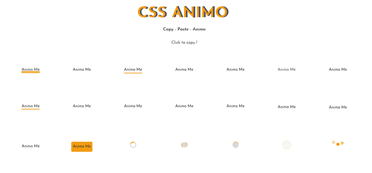
CSS Animo – A collection of copy & paste CSS animation effects.
CSS Typography
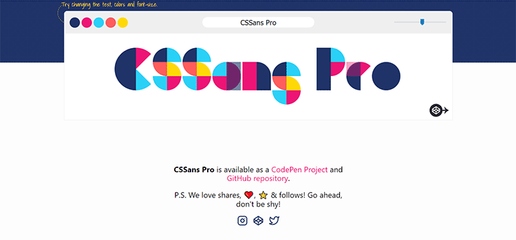
CSSans Pro – A free colorful and sassy font.
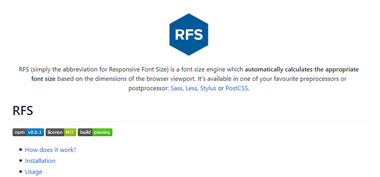
RFS – A responsive font size engine that automatically calculates sizing based on browser viewport.
Typetura – A tool for fluid typesetting, based on screen size.

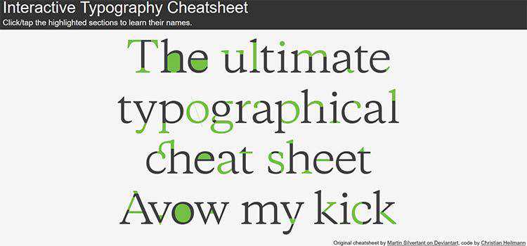
Interactive Typography Cheatsheet – A fun tool for learning the various components of a letterform.
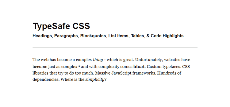
TypeSafe CSS – A tiny (under 1KB) responsive CSS framework with a focus on reading and writing.
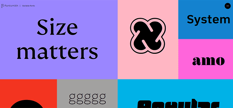
Fontsmith Variable Fonts – Learn about this much-hyped development in typography – complete with examples.
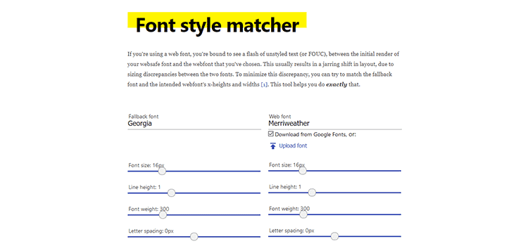
Font style matcher – A tool that helps minimize the discrepancy between a web font and its fallback.
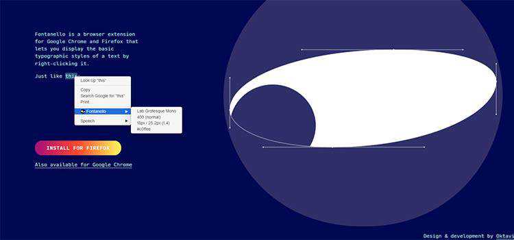
Fontanello – A browser extension that displays typographic styles via right-click.
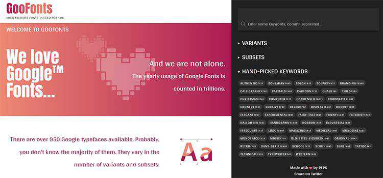
GooFonts – Use this resource to find Google Fonts based on tags. Great for discovering lesser-known items.
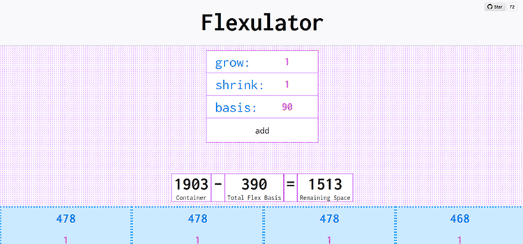
Flexulator – An interactive CSS Flexbox space distribution calculator.
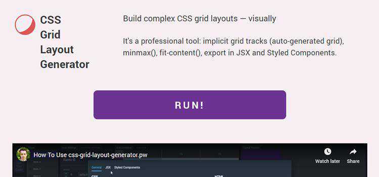
CSS Grid Layout Generator – Create complex grids with this visual tool.
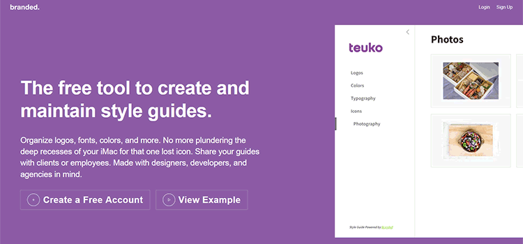
branded. – A free tool for creating and maintaining style guides.
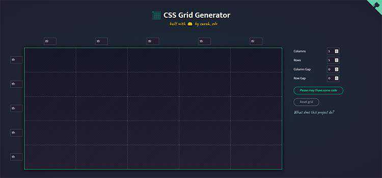
CSS Grid Generator – Build complex grid layouts via drag-and-drop with this tool.
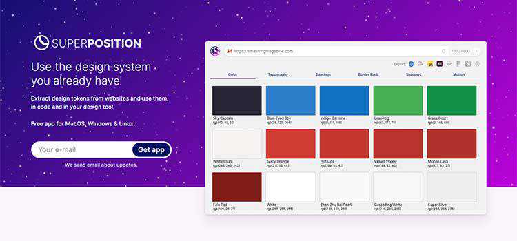
Superposition – An app that extracts the design tokens from your website for use in your favorite design tool.
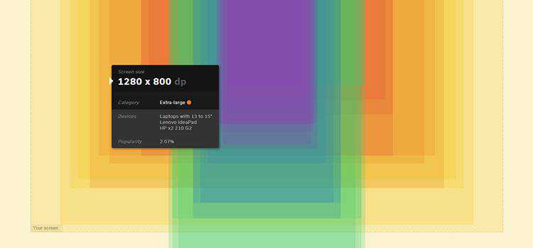
Screen Size Map – An interactive map displaying various screen resolutions and usage statistics.
Animated CSS Background Generator – Use this tool to create stunning backgrounds for your website.
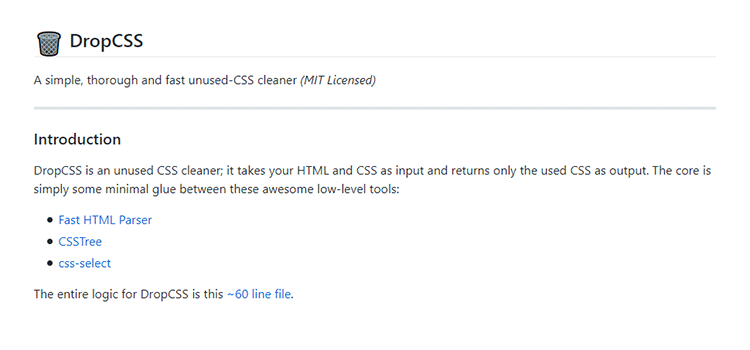
DropCSS – A free tool that quickly and thoroughly cleans your unused CSS.
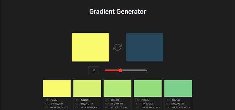
Gradient Generator – Take two colors and create a variety of custom CSS gradients.
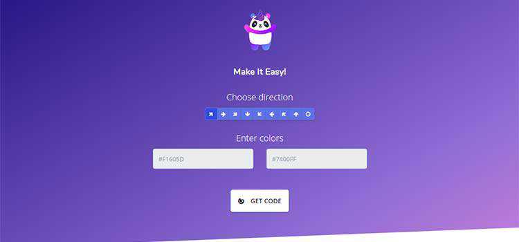
Mycolorpanda – Create CSS gradients in a breeze with this simple tool.
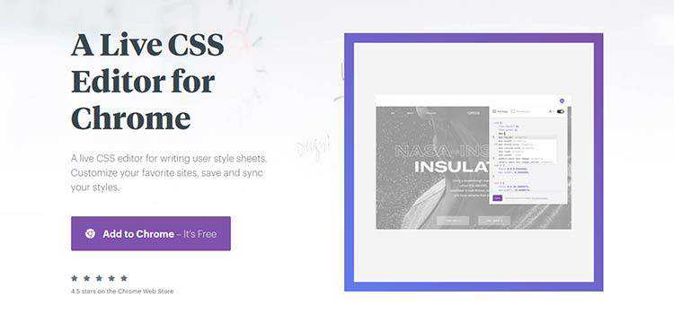
Amino – A live CSS editor for Google Chrome.
CSS Learning Guides & Cheatsheets
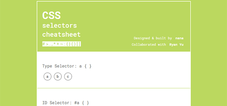
CSS Selectors Cheatsheet – A combination of a game, quick reference guide and printable cheatsheet.
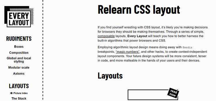
Relearn CSS layout – Learn to harness the algorithms that power browsers and CSS to create better layouts.
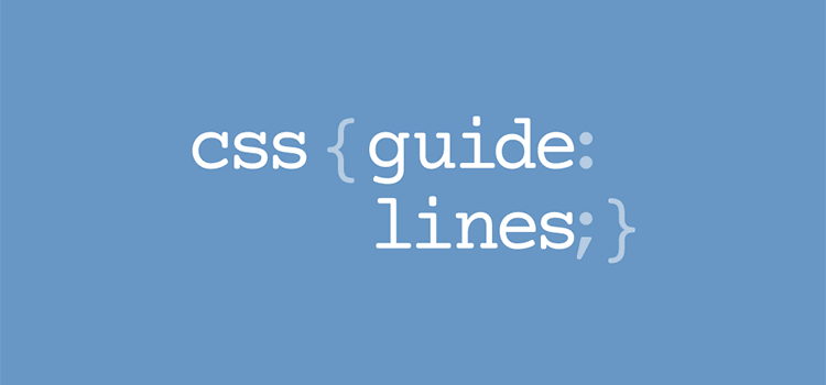
CSS Guidelines – A detailed document to help you write more scalable and manageable CSS.
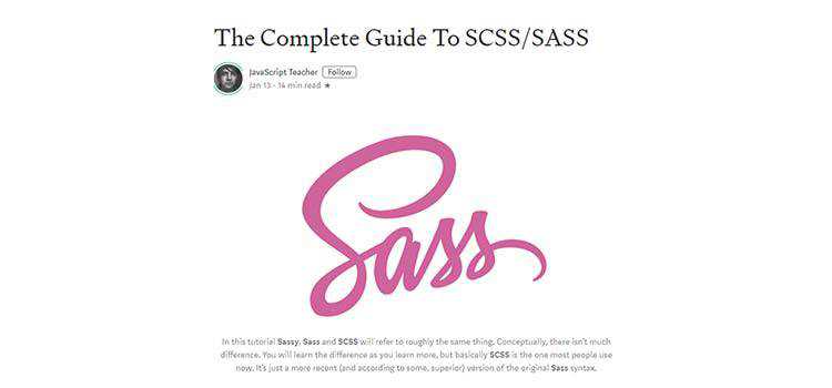
The Complete Guide To SCSS/SASS – The ins and outs of the popular CSS pre-processor.
CSS Layout – A collection of popular CSS layouts and patterns.
Flexbox30 – A guide for learning CSS Flexbox in 30 days via 30 code tidbits.
CSS Inspiration
Print to CSS – Check out a collection of print-inspired layouts recreated with CSS.

And, finally…
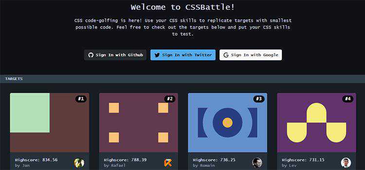
CSSBattle – Use your CSS skills to replicate targets with the smallest possible code in this golf-like game.
Our CSS Snippets Collections
More CSS Resources
You might also like to take a look at our previous CSS collections: 2018, 2017, 2016, 2015, 2014 or 2013.
And if you’re looking for even more CSS frameworks, tools, snippets or templates, you should browse our extensive and continually updated CSS archives.
The post Our 50 Favorite CSS Libraries, Frameworks and Tools from 2019 appeared first on Speckyboy Design Magazine.
Dozens of people find your business when looking for a type of product but aren’t sure which product fits their needs best. With a well-designed and organized category page, you’ll help people browse products easier and find what they want.
To help you get inspired, let’s take a look at some excellent category page design examples that showcase how you can design and develop these pages.
On this page, we’ll explore six inspirational category page design examples to help you get started with your product category pages. Want to get more tips and tricks about web design? Sign up for our newsletter, Revenue Weekly, to stay in the know-how!
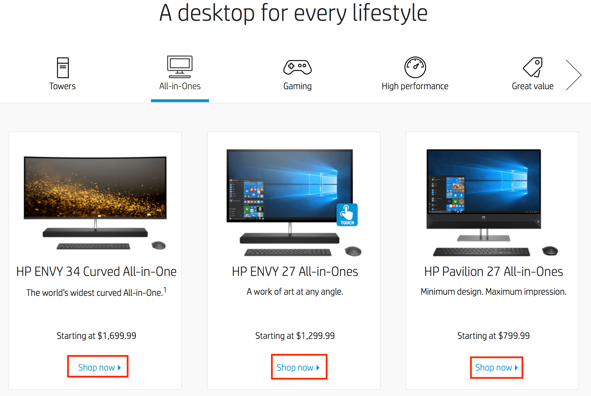
1. HP
HP offers many category pages that provide users with a positive experience.
Let’s look at their desktop computer category page.
On this page, the user immediately sees a collage of desktop computers and accessories HP offers. When a user looks at this page, they can see high-quality photos of the desktop computers HP offers.
From gaming computers to all-in-one computers, users can choose different categories to explore different options.
If you scroll down the page, you’ll see a bar with icons for the different computer categories.
When users click on these different categories, they’ll see options for different desktop computers. If they see something they like, they can click the “Shop Now” button and explore that product.
![]()
Why this category page design works
The design is simple and visually appealing.
Users can easily find their options in one place in a visually appealing format.
Having the option to choose each category and see some products in that category also makes for an A+ shopping experience. This feature streamlines the buying process and guides users to their next click.
Overall, HP provides a great user experience for people just starting to browse computers.
How you can use this category page design for inspiration
When you’re doing category page design, you must think about your audience and how they’ll browse your products. Like HP, you’ll want to use high-quality photos to catch your audience’s attention and get them interested in your products.
Make it easy for people to browse products in a category too. Creating sub-categories within your category pages makes it easy for your audience to focus on what matters most to them.
2. Costco
Costco makes it simple and easy for you to browse products within a specific category.
You can easily see the different types of products they offer within each group.
![]()
Users can look at each category to figure out where they want to shop first. It makes it simple and easy for users to find the products they need in the right category. People also have the option to browse products based on same-day delivery or two-day delivery options.
Why this category page design works
This layout works well for people looking to browse products in different categories. It helps users find the category they need and get straight to the products they want.
How you can use this category page design for inspiration
Creating categories with photos is a great way to guide people to the right product listing pages. By creating a “Shop by category” section, you make it easy for your audience to get straight to what they need.
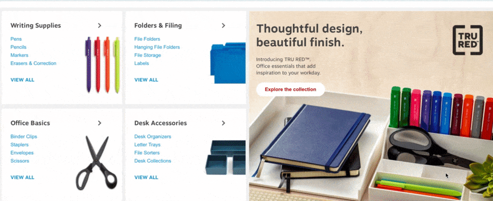
3. Staples
Staples takes a visual approach to their category page design.
Let’s take a look at their office supplies category page.
![]()
When you look at their product category design for office supplies, you immediately see a visual.
This visual element features numerous office supplies that Staples offers. As you scroll down the page, you see categories for different types of office supplies, like writing supplies, desk accessories, and folders.
Within each of these categories, you’ll see different types of products.
For instance, the writing supplies category features pens, pencils, and markers.
If you scroll down the page more, you can see categories for brand names.
This setup makes it easy for people to browse by brand name if they want a specific brand.
Why this category page design works
This category page works because it’s easy to find the information you need. People can find the right category and look at the products underneath it. It makes for a positive user experience that enables people to find products quickly.
How you can use this category page design for inspiration
Creating organized category pages will help your audience navigate your site better. You can break up your category pages into boxes, like Staples, to keep information separated and make it easy for your audience to browse your products.
4. Kohls
Kohl’s category page design allows users to browse the way they want to browse.
We’ll use their bedding and bath page as an example.
![]()
On this page, users see a bedroom filled with different bedding items. It has a slogan, “Create your comfort zone,” on the photo. This visual immediately draws users in and gets them to browse the page.
As you scroll down the page, you see categories for different bedding options.
From comforters to pillows, users can click on the product based on their interests. If you keep scrolling down the page, you can select bedding based on the size of your bed, making it easy to get to relevant products.
Why this category page design works
This product category design works because it allows users to get directly to the products they need. It helps them browse by product type or size. The page contains excellent visuals, so people know what they’re looking at, without reading the category name.
How you can use this category page design for inspiration
One of the best features of this category page design is the ability for users to browse sheets based on size. When you’re creating category pages, consider how you can build a better browsing experience based on this design example.
Think about how users shop for products and create a way to make it easier and faster.
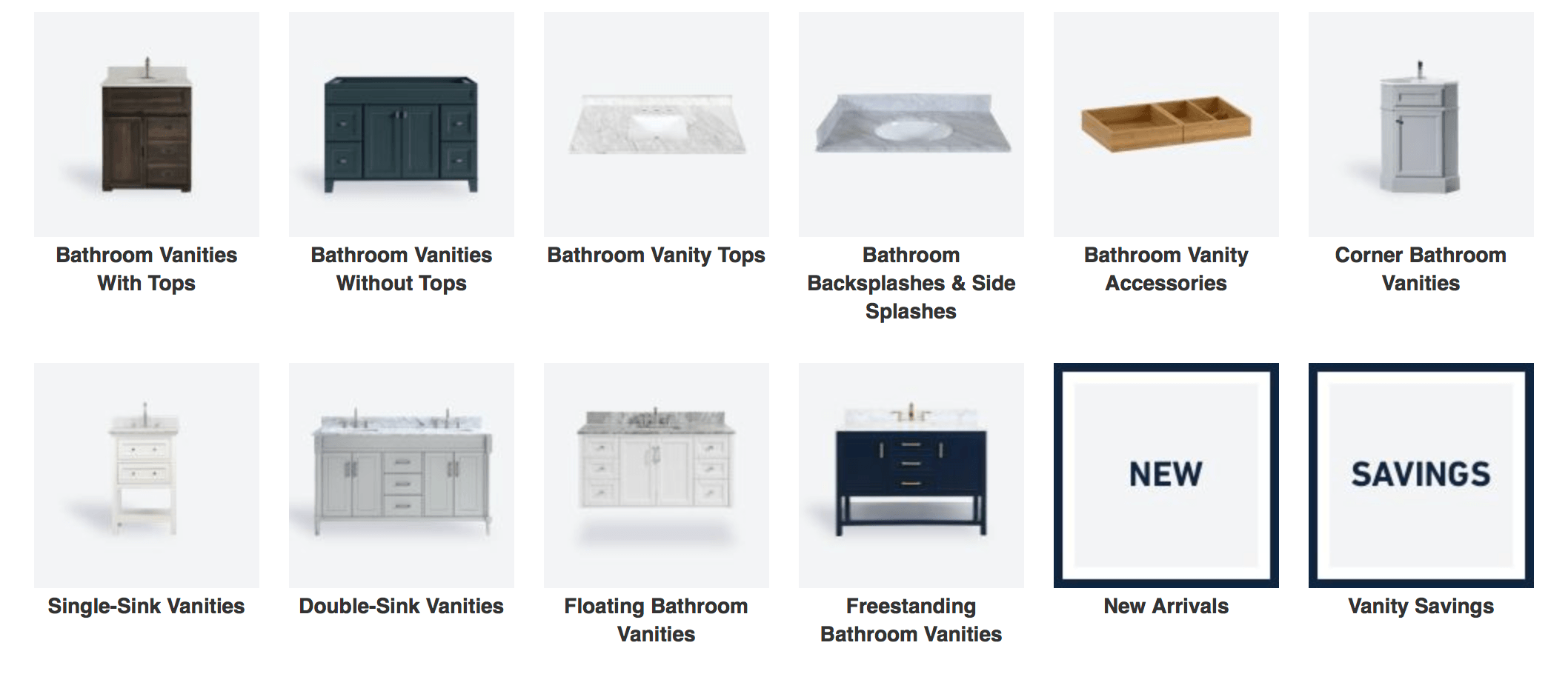
5. Lowes
If you’re looking for simple, yet practical, category page design examples, Lowes’ category pages fit the bill.
Their category pages are organized, clean, and cohesive.
![]()
Lowes’ category pages for bathroom vanities and vanity tops are great examples. The beginning of the page lures people in by showing one of their vanities in a bathroom setting. As you scroll down the page, you see different countertop and vanity options available.
![]()
As you move down the page, you can shop for vanities by color or size. This setup creates a great shopping experience. It allows people to start browsing based on what they need, whether they’re looking for a specific vanity size or color.
Why this category page design works
This category page design example works because it fits with Lowes’ brand and keeps the brand image consistent. All the photos are the same style, creating a cohesive product category design. Additionally, Lowes created different ways to shop (color, size, look), that make it easy for users to find the right product.
How you can use this category page design for inspiration
Similar to Kohls, it’s great to offer multiple ways for your audience to shop so they can find the right product.
When you set up your category page design, think of the different ways people will look for your products.
Create different categories, like “by color,” “by style,” or “by brand,” to help organize your page and build a better browsing experience.
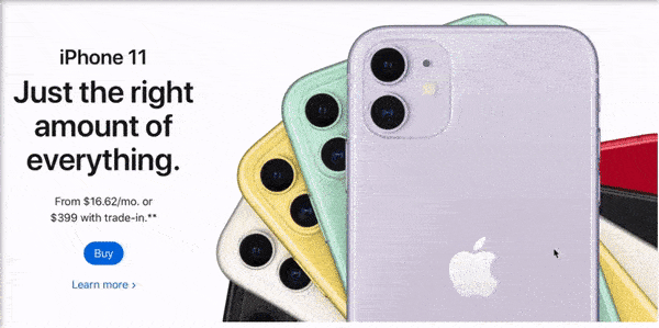
6. Apple
Apple is a pioneer of great design. From their phones to their commercials, every aspect of Apple is sleek, modern, and eye-catching.
Their category page design is no different.
![]()
One of the best category page design examples is their iPhone page. Right at the top of the page, you see icons that allow you to view phone options, as well as accessories that go with their iPhones.
![]()
This design makes it easy for users to see their options for the right product on this product listing page. As you scroll down the page, you see bold, high-quality photos of the iPhone. These visuals get people to stay on the page and browse more.
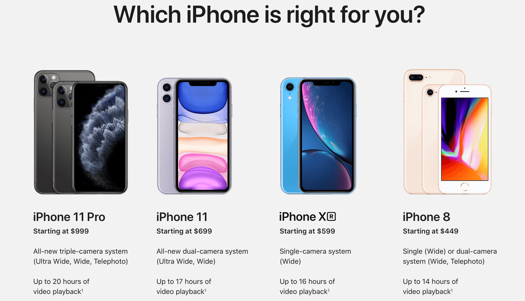
If you scroll further down the page, you’ll get to a section called “Which iPhone is right for you?”
![]()
This feature makes Apple’s design one of the best product listing pages because it allows users to see and compare the different types of phones before deciding which one is the best option for them.
Overall, Apple’s category page design is clean, attention-grabbing, and focused on the user.
Why this category page design works
Apple’s product category design ticks all the boxes. It reflects their brand style, provides stunning visuals, and makes it easy for users to weigh their options. It’s a visually dense product page, which keeps people engaged and gets them to learn more about the iPhone.
How you can use this category page design for inspiration
You can learn a lot from Apple’s approach to their category page design. From using high-quality images to creating product comparison features, there are many opportunities for you. Use this example to create product category pages that offer a better user experience.
Take these category page design examples to inspire your own
Your category page design is an integral part of your website.
Category pages play an essential role in helping guide people to the right products from your business. You’ll keep more people browsing on your site when you invest in designing category pages for your audience.
If you feel overwhelmed by this monumental task, WebFX is here to help.
We have an award-winning, in-house design team that can help you build a category page that wows your audience. Check out our portfolio to see how we can help you create a category page that works for your business!
To learn more about our web design services, contact us online or call us today at 888-601-5359 to speak with a strategist!
The post Category Page Design Examples: 6 Category Page Inspirations appeared first on WebFX Blog.
Package:
Summary:
Send HTTP requests and return responses using Curl
Groups:
Author:
Description:
This package can send HTTP requests and return responses using CURL...
Read more at https://www.phpclasses.org/package/11487-PHP-Send-HTTP-requests-and-return-responses-using-Curl.html#2020-01-04-05:10:10

Package:
Summary:
Manage uploaded files and serve them for download
Groups:
Author:
Description:
This package can manage uploaded files and serve them for download...
Read more at https://www.phpclasses.org/package/11478-PHP-Manage-uploaded-files-and-serve-them-for-download.html#2020-01-03-20:37:07

2020 Copyright – It’s time to update the copyright year on your site!

Flash Grid – A new lightweight (1KB minified and gzipped) grid system based on CSS Grid Layout.
Browser 2020 – A non-exhaustive list of those lesser-known features that have been implemented in today’s browsers.
massCode – A new, free and open source code snippets manager for developers.

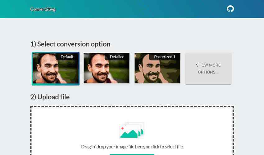
Convert2Svg – A Simple web-based tool for converting multi-colored images to SVG files.
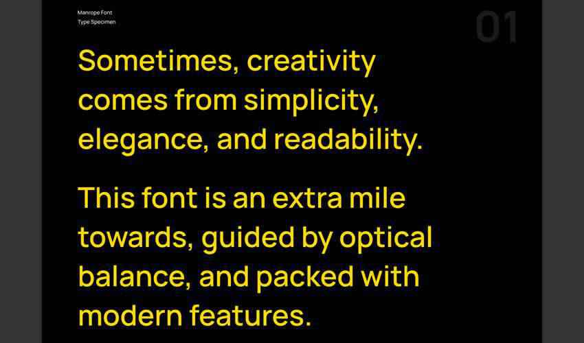
Manrope – A free sans-serif variable font family with seven legacy weights.
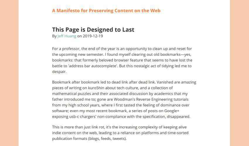
This Page is Designed to Last – A manifesto for preserving content on the web.
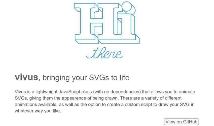
vivus.js – A lightweight JavaScript class (with no dependencies) that allows you to animate SVGs, giving them the appearence of being drawn.
Hamburger ☰ Heaven.
Sketch2Code – A new tool from Microsoft that uses AI to convert hand-written drawings to working HTML prototypes.

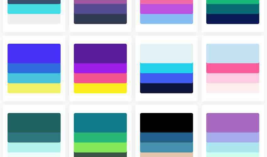
Colorsinspo – Thousands of beautiful color palettes you can use it directly by one click.
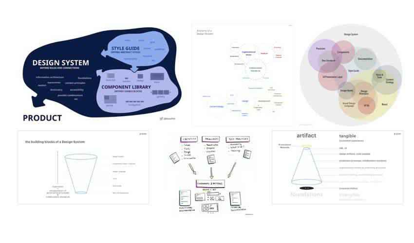
Seven requirements of a holistic Design System.
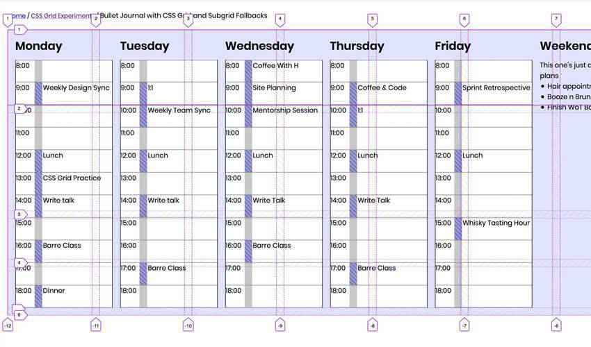
Bullet Journal Layout with CSS Grid & Subgrid & Flexbox.
The post Weekly News for Designers № 521 appeared first on Speckyboy Design Magazine.