PHP SVG to Image Converter
Read more at https://www.phpclasses.org/package/11517-PHP-Parse-and-render-SVG-vectorial-drawing-as-an-image.html#2020-01-31-22:42:47
Discovering the Freedoms of Freelance – There are a lot of freedoms that go with freelancing – but they’re not what you may think.

10 Useful and Hard-To-Remember CSS Selectors – This list of CSS selectors can help you avoid styling via JavaScript.
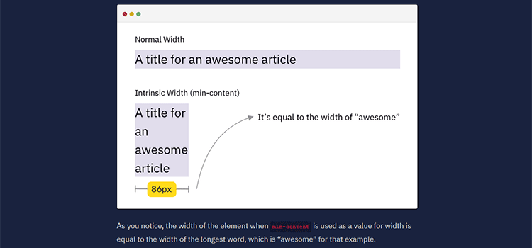
Intrinsic Sizing In CSS – Learn how to size an element based on its content.
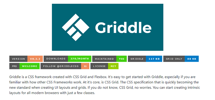
Griddle – A modern CSS framework built with CSS Grid and Flexbox.
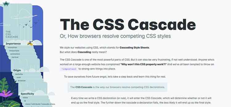
The CSS Cascade – Learn how web browsers resolve competing CSS styles.
Goodbye, Clean Code – Is clean code, at the expense of all else, truly worth it?
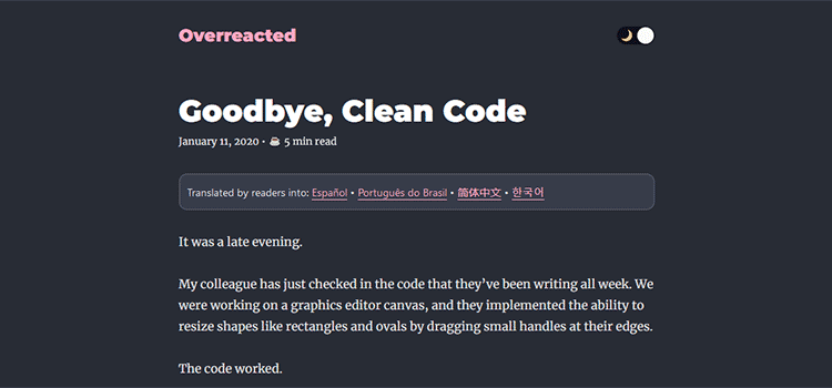
Beyond Money: The Hidden Benefits of Web Design Projects – Every project has value, even if it isn’t stacks of cash.

The Complete Beginner’s Guide to Design Systems – Answers to common questions, along with techniques for building your own design system.

PHP in 2020 – The present and future of PHP look very bright.

Optimising SVGs for the Web – Add these steps to your SVG workflow for top-notch looks and performance.

Some Imaginary CSS – CSS has come so far in recent years. Just imagine what it might do in the future.
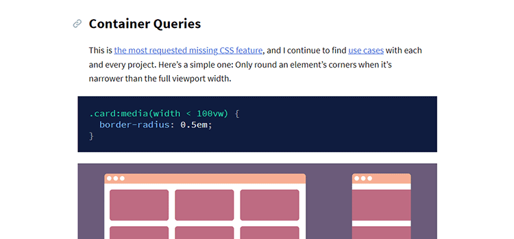
30 Free Logo Mockup PSD Templates for Creatives – Create a stunning logo using one of these free mockup templates.

JetBrains Mono – A free, open source typeface geared toward developers.
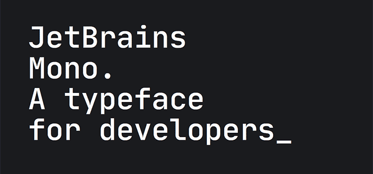
gradientify – A free interactive SVG icon pack.

FontScan – An app that scans your Windows computer and finds all of your custom downloaded fonts.
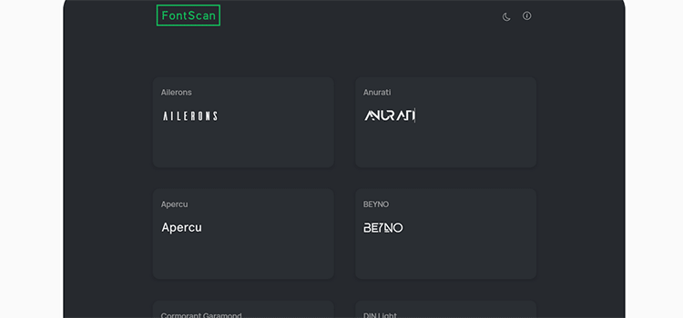
The 35 Best Free Presets for After Effects – Speed up your video editing process with these free presets.

The post Weekly News for Designers № 525 appeared first on Speckyboy Design Magazine.
A free service has been added to the Free Dynamic and Static DNS Services and Name Servers page. This one provides dynamic DNS for those whose websites are hosted on their own computer and who connect to the Internet with an address that changes each time. To avoid confusion, please note that these are not services that give you free domains. You will still need to obtain a domain name from a registrar. In addition, for the average person who wants to create a website the standard way, you don't need these services.
For those of us who experiment with CSS, it’s an exciting time. The advent of CSS Grid and Flexbox have opened up a whole new world of page layout possibilities.
And one of the more interesting uses for these tools is their integration within news and magazine-style websites. They often have more complex and unique layout requirements than other genres. It has led to some very creative solutions.
Today, we’ll show you some exciting examples of both news index page layouts and even a few for individual articles as well. Each one is hosted on CodePen, so you can see exactly how they were created.
Here’s a prime example of CSS Grid’s fitness for a news page. It’s a 12-column layout, with a large feature story up top that takes up two-thirds of the first row. From there, it alternates between one-third and two-thirds stories below and a one-third listing along the right. The look creates a nice balance and allows each story to stand out.
See the Pen
News Layout by Marc Müller
These newfangled CSS techniques are often used to imitate classic print layouts. This magazine layout uses Flexbox to add retro shapes, multicolumn flowing text and a large featured image.
See the Pen
Magazine Layout by Raisa Yang
This article layout looks attractive, yet fairly standard on first glance. A massive image on the left is paired up with nice typography on the right. But start scrolling and you’ll see what makes this one stand out. The first section of text scrolls as the image stays in place. Go further and you’re met with full-width images and multiple columns of text. It’s a clever design that will keep readers interested.
See the Pen
Article Development // Modular CSS Grid Layout Sections by Brian Haferkamp
The modern age of news sites has made visual stories, ones without a lot of text, quite popular. Here’s an interesting layout that could be a great fit for explaining multistep processes or listing the popular posts of the day.
See the Pen
CSS Grid Magazine Layout by Elzette
This CSS Grid-based masonry layout of posts has several things going for it. First, the layout is complex – but without being disorienting. The use of faded background images and legible typography make it easy to distinguish one article from the next. And the stunning hover effects make for a fun and effective user experience.
See the Pen
CSS Grid Layout as Masonry case study by @Kseso by Kseso
So-called “break out” sections are a popular feature within articles. They are great for adding emphasis to important quotes or even images. But the CSS used to require all sorts of hacks in order to get an element to go beyond a fixed-width container. That is, until CSS Grid came along. This example demonstrates just how easy it is to integrate into your layout.
See the Pen
Breaking Out With CSS Grid Layout by Steven Monson
Sometimes it’s nice to see an example layout that eschews content. This makes it easier to grasp, especially if you’re just learning a new technique such as CSS Grid. With a clear outline of each container and helpful terminology, you’ll gain a better understanding of how this one was put together.
See the Pen
CSS Grid Layout – New Terminology by Stacy
Post grids are a terrific solution for both news websites and blogs. A well-designed one is easy to read, provides some whitespace and adds interactivity. All of those traits are well-represented here. The clean card layout is easy on the eyes, while the hover effects give it a high tech feel.
See the Pen
Expandable Post Grid by Daniel Högel
Designing a news-oriented website can be a real challenge. It requires a strategy for getting your best content in front of users while ensuring that it entices them to click. And, once they are reading an article, you want to provide them with the best experience possible.
Thankfully, CSS layouts have never been more capable of helping you achieve these goals. Looks that used to be reserved for desktop publishing software are now easily replicated – as many of the snippets above demonstrate.
The first step is to take some time to think about how you want to present your content. From there, you can use one of these examples as a starting point to make it come to life.
If you’d like to see even more unique layout snippets, check out our CodePen collection.
The post This Just In: Excellent News and Magazine CSS Layouts appeared first on Speckyboy Design Magazine.
If you’re looking to grow your business online, it’s time to start setting up different types of website conversions to help your company succeed. Whether you’re looking to earn more email subscribers or sell more products, you can set conversion goals that grow your business.
On this page, we’ll discuss what a conversion goal is, seven types of website conversions, and four steps for setting up your conversion rate goals.
Keep reading to learn more or give us a call at 888-601-5359 to learn how our conversion rate optimization services will help you drive more leads and sales.
A conversion goal is a website goal that requires a user to take a specific action, like purchasing a product, submitting a form, or signing up for an email newsletter, on your company’s site. You can set multiple types of goals for your strategy.
The important part with goal setting is that you make your goals measurable. If you can’t measure how your campaign’s performing, you won’t know if it’s driving results or needs to change.
When you choose the best types of website conversions for your business, you’ll get better results from your site.
When you create conversion goals, you have multiple options.
Let’s take a look at seven types of website conversion goals you can set for your business:
The most common types of website conversions are sales.
Depending on your business, your kind of sale may differ.
If you’re an ecommerce store, your sales will focus more on people purchasing products. As a service business, your sales consist of people becoming clients or hiring your company for a one-time job.
The next most common goal for a website conversion is a form submission. With form submissions, you entice your audience to sign up and request something. It can be anything, like a seminar, newsletter, or quote request.
To make a successful form, you must keep it short. If you ask users for too much information, it will discourage them from completing the form. You’ll need to test different form lengths to see what your audience responds to the most.
The next conversion goal is joining an email list or getting a text message subscription. While email sign-ups can be considered part of the “submitting a form” goal, it’s essential to keep this one separate because email sign-ups can be as simple as submitting an email address.

With email lists or text message subscriptions, your audience provides you with one piece of information to subscribe to your content.
Whether it’s emails about products or text messages about order shipments, you get connected with your audience and provide them with valuable information.
Conversion goals can be as simple as clicking a button. Whether it’s a button to download a guide, visit a pricing page, or check out a product, you can use clicking a specific button as your conversion goal.
Clicking specific buttons can help you see how well your audience moves towards your goals. For example, if you want more people to visit your pricing pages, you can use buttons that guide them to those pages and track to see how many people click those buttons.
Creating an account is one of the fundamental types of website conversions for ecommerce businesses. When someone creates an account, you get valuable information about your customers and can help improve their shopping experience based on how they browse.
This conversion goal helps you track how many new potential customers you’re obtaining. It’s an effective way for you to track and see if your strategies and tactics are successful at getting people to sign-up and make an account.
A fundamental part of your site is the content you create. If you’re focusing on getting your valuable content in front of more interested eyes, you can set a conversion goal for content shares.
This goal is a great one if you’re looking to expand your reach. You can track how many people share your content with others to see if it’s effectively engaging your audience.
One of the most popular types of website conversions is installing an app. With the growth of mobile, many companies push for people to download their mobile app. If you’re in this situation, you can use app installs as your conversion goal.

This goal is great if people don’t know much about your app or don’t know you have one! You can market your app to your audience and track how many people download and open your app.
Now that you know the different types of conversion goals, you may be eager to start setting up a campaign to track one (or many) of these goals. Let’s take a look at four easy steps for setting up different types of website conversions.
First, know what you’re trying to accomplish with your campaign. Many of these types of website conversions are small goals that add up to your larger goal. To help you know which conversion goals to set, establish your larger goal.
In most cases, businesses aim to earn more conversions as their overall goal, whether it’s buying products or receiving clients. If that’s your goal, too, then you can establish that and start choosing smaller types of website conversions to help you reach your bigger goal.
By setting your overall goal, you’ll set yourself up for success when choosing types of conversions.
When you’re setting goals, you must know your audience well. You need to understand what your audience wants from your business so you can create a conversion path that makes them more likely to convert.
It will benefit your business greatly to segment your audience based on their interests and develop different buyer personas for those segments. A buyer persona is a mock-up of a real-life potential customer. These personas help you understand various members of your audience so that you can create a more suitable path towards conversion.
When you know your target audience, you can set up micro-goals that fit them and lead them towards completing your conversion goals.
For example, let’s say you’re trying to get Group A to sign up for your event.
You know Group A likes feeling informed before making a decision. To move them towards this larger goal, you set up micro-goals, like reading a blog post and watching a video of the event in previous years, that guide them towards your ultimate goal.
As you can see, knowing your audience and what they like allows you to set up a proper path to conversion that will lead to more people converting.
If you want your audience to complete different types of website conversions, you must make your offer clear and enticing for your audience. People want to know what they’re getting when they choose your business.
You must focus on how your offer benefits your audience.
How are you improving their lives or making their lives easier?
Make your offer clear and easy to understand. If you’re advertising an event, state what the event is and what your audience gets from it. Don’t give vague details or spend time talking about your company.
If you want people to convert, be clear about what they will get from converting. It will help your audience feel more informed and motivated to convert.
Calls to action (CTAs) play a fundamental role in getting people to meet your conversion goals. CTAs guide your audience towards the next step and get them to take action. With all the types of website conversions, you must use an enticing CTA to get people to take action.
If you were running an event and wanted people to sign up, for example, a generic CTA like “Sign up” isn’t going to catch your audience’s attention. They’re not going to feel excited to sign up for your event.
Instead, a CTA like “Sign up to meet new people today!” is more enticing. It gets people excited and makes them more likely to follow through on your conversion goals.

With so many types of website conversions available to your business, it’s difficult to know where to start and how to set them up successfully. If you aren’t sure how to get started, our team at WebFX can help.
We have over a decade of experience creating campaigns with different types of website conversions that get people to convert. In the past five years, we’ve driven over $1.5 billion in sales and over 4.6 million leads for our clients. Whether your goal is to earn more sales, gain subscribers, or have more leads submit forms, we’ve got you covered.
To start setting up different types of website conversions for your business, contact us online or call us today at 888-601-5359 to speak with a strategist.
The post Going Beyond Sales: 7 Types of Website Conversions to Optimize for on Your Website appeared first on WebFX Blog.
Latest PECL Releases:
PhalconDbAdapterPdoMysql Tinyint(1) is handled as boolean under MySql #14708
PhalconMvcViewEngineVolt to produce the correct order of variables for the join filter #14771
PhalconStorageAdapterStream::getKeys() bug in the absence of a directory with a prefix name #14725, #14721
PhalconDebug::onUncaughtException Should accept Throwable instead of Exception as an argument #14738
PhalconValidationValidatorFactory Should return PhalconValidationValidatorInterface 14749
PhalconMvcModelBinder to now correctly call has and set on the cache object #14743
PhalconSessionAdapterStream and PhalconStorageAdapterStream to correctly handle simultaneous read/write #14694
PhalconConfigConfigFactory to always add the correct extension #14756
The right tools are what separates businesses that run smoothly from those that don’t. They’re the difference between companies that collaborate to get things done and those who can’t seem to finish off projects. And, it’s also the secret to keeping customers happy.
As business owners, we know we need great tools. But too often we simply collect apps from all types of different vendors – then wonder why they all can’t just work together. The challenge is in finding apps that work in unison.
Thankfully, Bitrix24 has the online tools that every business owner needs – all in one free business management platform. They’ll provide you with solutions to handle client management, tasks and projects, customer support, internal communications and e-commerce. Best of all, you can access it all for free!
Bitrix24 has tools that can help you manage virtually every aspect of your business. Whether it’s building a company website, keeping track of projects or collecting leads – it’s all here. But that’s only scratching the surface of what you can do. Take a look:
Staying in touch with team members is vital. That’s why Bitrix24 offers applications that make collaboration easy. Live chat, intranet, calendars, HR management, documents, videoconferencing, workspaces and more are available. Plus, you can integrate Bitrix24 into the apps you’re already using, like MailChimp, Slack, Office365 and QuickBooks.
It’s easy to lose track of where you stand within a given project. And the more people involved, the more difficult it is to stay on task. Use Bitrix24’s group task management, along with their project and planning management apps to keep an eye on it all. Features like time tracking, reminders, progress tracking and interactive printable Gantt charts simplify the process.
Let the CRM system that is trusted by over 6 million companies turn your sales team into a well-oiled machine. All the essentials are here – including sales funnels, pipeline management, reports, 360-degree customer views and built-in automation. Bitrix24’s CRM will also track your costs and calculate your ROI, so you can find the most bang for your buck.
Give your customers the attention they deserve with the Bitrix24 Contact Center. Integrate live chat into your website or use custom engagement tools for social media services including Facebook, Messenger, Instagram and Skype. You can also utilize more traditional mediums through the included telephony, SMS and email helpdesk apps. Use one or use them all, you’ll meet your customers where they are.
Everyone needs a great website and Bitrix24 can help you make it happen. Create free landing pages or full websites using their visual website builder. Get just the right look by choosing from dozens of free, responsive templates. You can also sell online with a free ecommerce solution that is automatically integrated with the Bitrix24 CRM. It’s everything you need to succeed online.
Thanks to Bitrix24, you don’t have to settle for the old way of collecting tools from all over the place. Instead, you’ll find a massive suite of 35+ free online apps to power your business. Each one has been built to integrate into your daily workflow and help you keep things running smoothly.
And, yes, Bitrix24 really is free to use! You don’t even need a credit card to sign up. Register for their free Starter business tool suite today and take control of your projects, communication, CRM, customer outreach and website needs.
Need even more power? Upgrade to a paid plan and level up your business.
The post Get 35+ Free Business Apps with Bitrix24 <span class="sponsored_text">Sponsored</span> appeared first on Speckyboy Design Magazine.