The Yummy Visual Identity of Food Brands
“People eat with their eyes” is the rule of thumb for every marketing strategy whose goal is to tout and foist goods. Whatever you are planning to do, make it look delicious, and chances are your customers will fall for it. When it comes to restaurants, cafes, food trucks, and other representatives of the food brands segment, it lies at the heart of everything.
This principle guides various visual identities. Therefore, as a rule, they look yummy. Artists prefer to use multiple objects in scenes – not just to create an overall image of a brand or establish the proper atmosphere, but also drum up the appetite and pull some triggers.
Here are a few delicious examples of this practice at work.
Green Up
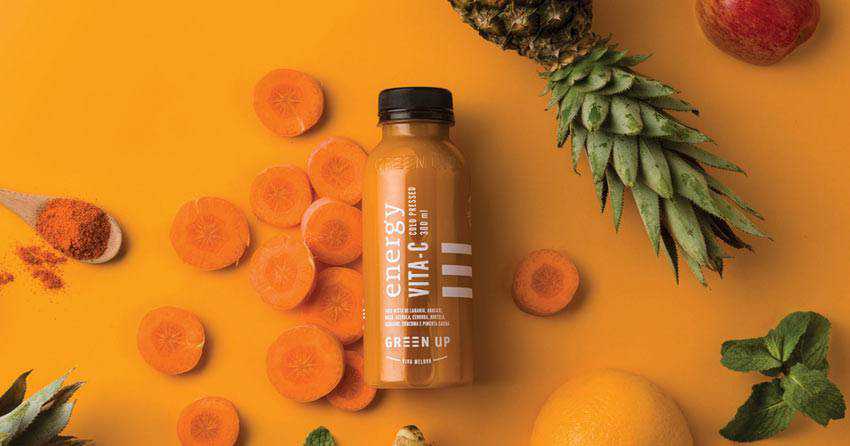
Here is a typical example of a modern visual identity for a food brand. The composition features not only the star of the show (the bottle), but also lots of complementary objects such as pineapple, chopped carrot slices, apple, along with some other fruits and vegetables that fit like a glove. Together they bring home the proper message and at the same time, give an edge to your appetite, unobtrusively making us want to buy one.
Brand Mamut
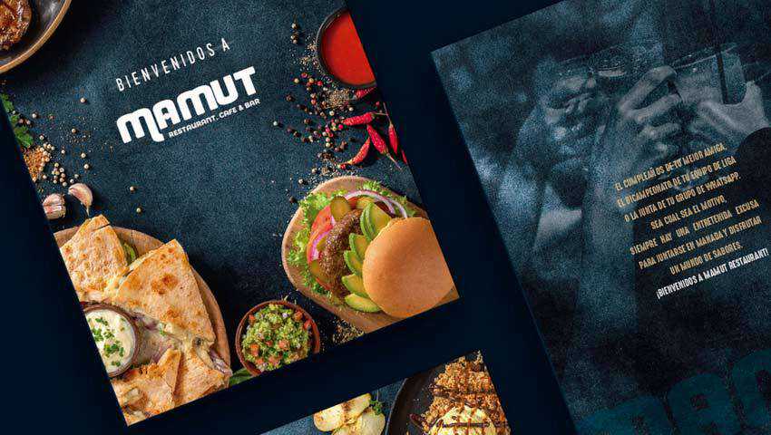
The visual identity of Brand Mamut is another typical example of these days. Much like Green Up, it combines the real types of food that are scattered throughout the scene and spices that are carelessly but graciously sprinkled all over. Also, the promoted products occupy their rightful place.
The key feature of this approach lies in a dark, grainy chalk-like background that gives the entire design an exceptionally sophisticated appeal. It even feels brutal and rustic in some ways that make it an ideal partner for brands that are centered around dishes with fried meat, fish or even vegetables.
Petit Plaisir
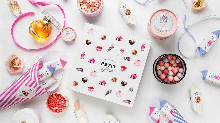
Petit Plaisir stands in stark contrast to the previous example. It is clean, neat, light, and incredibly girlish. In comparison to the visual identity of Brand Mamut it feels even angelic. However, this is precisely what is needed to meet the target audience.
Note how the creative team has managed to weave into the scene, not just confectionery-related elements but also cosmetic makeup items. The perfume bottle and radiance blusher fit the bill here, reinforcing the entire womanish atmosphere. Everything is sweet but not saccharine. The team has found a healthy balance between products and accompanying objects, bringing about a remarkable piece.
Noroshi
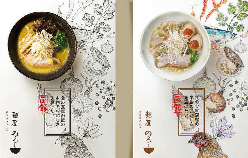
The team behind Noroshi’s visual identity sticks to the same path, yet with a tiny difference. Instead of using objects that characterize the product, they have employed traditional stationery that is encrusted with elements of brand identity. You can see various combinations: pamphlets with dishes, a menu with dishes, etc.
Note how the artwork and the dish echo. There is a fragile balance between these two. As a result, this unique symbiosis gives the scene not just a distinctive look, but also a powerful feeling. And, of course, an appropriate atmosphere.
Coffee Beans
We just could not help but include in our collection a visual identity that is created with the help of fake 3D scenes. This type of approach is incredibly popular these days. It combines the beauty of real objects and artificial ones, bringing about a masterpiece that is worthy of today’s realms.
The theme of this project certainly has gotten some cues from the jungles, because it seems that this bag of coffee beans was found there. The vibrant packaging ideally blends in. It certainly feels at home inside such a picturesque environment.
This approach gives the scene a subtle, natural appeal. Also, note how the team skillfully uses the artificial side of the project. They do not hide it or pretend that it is real: they get the most out of it, winning over the audience with honesty.
Dynasty Dairy Farm
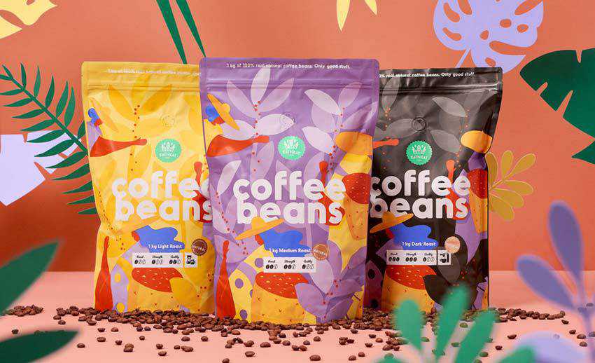
The visual identity of the Dynasty Dairy Farm is an excellent example of a “less is more” solution. It is subtle, polished and exclusive. Even though there are many objects and products involved, it feels compact and even minimal.
Gorgeous light coloring, natural materials, and an airy environment pull this thing together. It is simple, yet straight to the point. The crowd gets what they need in a pleasant and delicious manner. That is enough for anyone.
Riceman
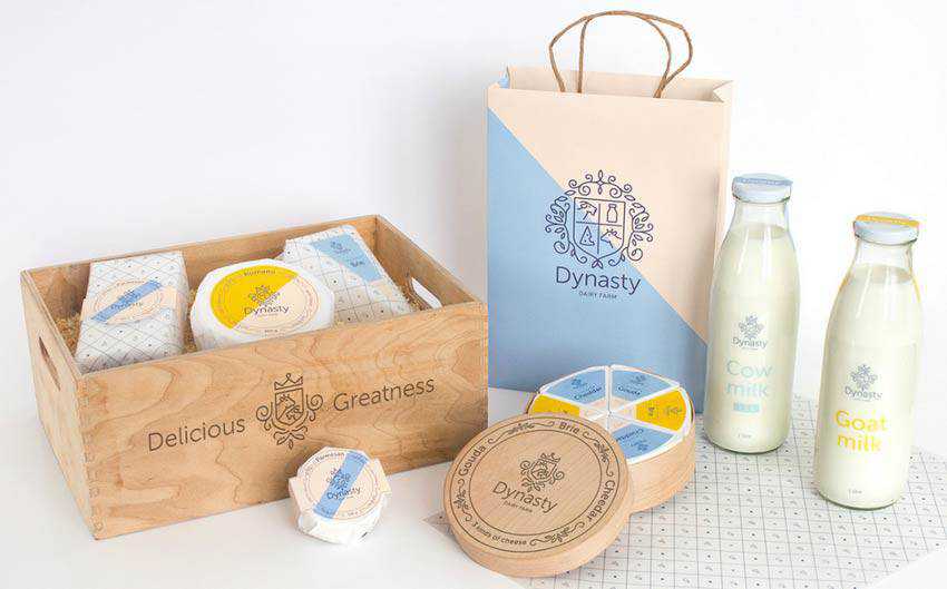
As we mentioned earlier, wrapping sells. And Riceman is vivid proof of that. Here the packaging does all the heavy lifting. It is so brilliant that you want to buy one immediately and bring it home.
However, it does not mean that you should leave everything as it is. The Backbone Branding team, who stands behind this outstanding solution, has created a series of simple yet right-to-the-point scenes that use the human side of the package to their advantage.

Boon Bariq
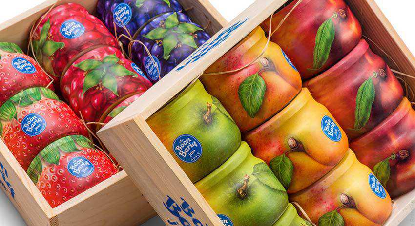
Boon Bariq is another piece of art created by Backbone Branding that we could not leave out. Much like in the previous example, here, packaging, as well as the presentation, are smart and well-thought-out.
The team shows us that it is not enough to create an out-of-the-box packaging. You need to put it inside the surrounding, where it will reveal its hidden potential and trot out the beauty of an idea.
Sal Y Fuego
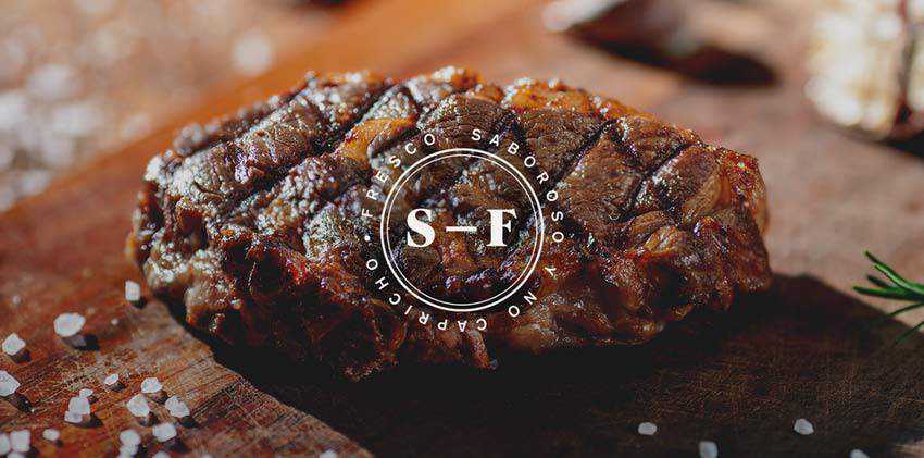
We are going to end our collection with Sal Y Fuego. The deal is that old-school tricks, like old habits, always die hard. Sometimes, all you ever need for creating a yummy visual identity that will instantly ignite the appetite and impress visitors is a close-up photo of a big, delicious steak.
“Bring only meat, do not bring vegetables” is a path to success. After all, we all have learned something from Ron Swanson. The visual identity created by Firmorama instantly catches an eye and proves it in practice. This piece of perfectly grilled meat is all you need to encourage regular onlookers to visit the place and take a bite.
A Tasty Treat for the Eyes
The visual identities of food brands are a colossal, almost immense area to explore. It is incredibly diversified and multi-faceted, serving as a sheer source of inspiration.
Here, you can find scenes that were built with the help of old-school tricks that still work like a charm or modern solutions that give an edge to our appetite with some high-tech extravaganzas. Even though the food industry is famous for its fierce rivalry, somehow artists manage to surprise us and create visual identities that easily stand out from the competition.
The post The Yummy Visual Identity of Food Brands appeared first on Speckyboy Design Magazine.


