Monthly Archiv: December, 2019
Package:
Summary:
API to manage records of budget requests
Groups:
Author:
Description:
This package implements an API to manage records of budget requests...
Read more at https://www.phpclasses.org/package/11466-PHP-API-to-manage-records-of-budget-requests.html

Perhaps no movie franchise has more fans than Star Wars. For over 40 years, each new episode has generated great anticipation – not to mention monster profits.
Both the movies and their long list of unforgettable characters have also served as a great inspiration to popular culture. Web design is no exception, as it seemed like the minute people started building websites, online tributes to the franchise began popping up.
Naturally, CodePen is teeming with Star Wars-related creations. Everything from character representations to quotes to games have been added over the years. Here are a few of our favorites.
The Web Designer Toolbox
Unlimited Downloads: 1,000,000+ Web Templates, Themes, Plugins, Design Assets, and much more!
The Crawl
It all started in 1977, when the original Star Wars debuted with this otherworldly text crawl. It set the scene for what was to become a cultural phenomenon. Here is a pretty faithful recreation, complete with audio.
See the Pen
Star Wars opening crawl from 1977 by Tim Pietrusky
The 80’s in One Snippet
Here’s an example of taking one the most indelible images from the 1980s, a Stormtrooper, and combining it with another – the Moonwalk. Yes, it really is a Stormtrooper doing the Moonwalk. Not only that, but you get the pixelated goodness of the era’s video games as well. The only thing missing may be an old school television.
See the Pen
StarWars Pixel Stormtrooper Moonwalk by Yusuf Bakır
Choose Your Side
Toggle switches are a common element these days. But we don’t usually see them with this much attention to detail. When the switch is to the left, a Death Star is displayed – complete with an unnerving red color scheme. Thankfully, toggling over to the right shows a much more loveable Millennium Falcon. The animation effects are stellar.
See the Pen
Star Wars Toggle by Kasper De Bruyne
Lord Vader’s Helmet
Not only is Darth Vader one of the most recognizable villains in this or any other galaxy, he has also been used (unofficially) to represent the NFL’s Oakland/Las Vegas Raiders. You’ll often see fans dressed up as Darth (a.k.a. Luke’s dad). This snippet actually combines the Raider-like font with Lord Vader’s iconic helmet. Be sure to rotate the helmet and check out those incredible light and shading effects.
See the Pen 3D Darth Vader Mouse Move Animation Star Wars by Kiarash Zarinmehr
Reach Hyperspace on Your Screen
Have you ever driven a car and wished you could put that thing into Hyperspace? Maybe that’s not going to happen in our lifetimes. But, thanks to this nifty use of HTML5 canvas and JavaScript, you can get there by simply holding your mouse down. Nice!
See the Pen
Jump to Hyperspace 🤓⭐️ #CodePenChallenge (Hold click/touch) by Jhey
X-Wing on the Water
The fictional equipment and landscapes are also a key part of the Star Wars story. We get a bit of both here with this X-Wing fighter racing over water at low altitude.
See the Pen
X_WING by Felipe Alfonso
The Galaxy Is Aglow
This scene depicting Star Wars: The Last Jedi offers special effects worthy of the film. It uses SVG masks to create transparency, while particle animation creates an otherworldly starry background. The glow of Kylo Ren’s lightsaber and the afterburner on the Millennium Falcon are icing on the cake.
See the Pen
Star Wars The Last Jedi by Chase
Memorable Words of Wisdom
It seems like there is a Star Wars quote for just about every occasion. If you’re looking for one to drop into your next conversation, try this random quote generator. You’re sure to find either wisdom or a wisecrack worth remembering.
See the Pen
Random Quote Machine by Thomas Vaeth
Tributes Worthy of a Jedi
Browsing the vast number of Star Wars tributes on CodePen, these developers’ talent and passion become apparent. This fictional world has inspired multiple generations and, with the steady stream of new additions to the franchise, that should continue long into the future.
Want to see even more amazing tributes? Check out our CodePen collection for a treasure trove of great code snippets!
The post A Long Time Ago: Code Snippets Inspired by Star Wars appeared first on Speckyboy Design Magazine.
Are you looking to generate more leads and revenue with your website? If so, it’s time to consider web design for lead generation to help you create a website that caters to your audience and encourages them to become leads for your business.
On this page, we’ll provide you with five lead generation website design best practices for building a better site. If you want to get the latest on web design tips and tricks, subscribe to our newsletter, Revenue Weekly.
Or, if you want to learn more about what WebFX can do for you, give us a ring at 888-601-5359!
Otherwise, keep reading to learn more about how to craft an effective lead generation website for your business.
1. Focus on the user experience
If you want to be successful with website lead generation design, you must focus on building a design for your audience. While the site belongs to and advertises your business, it’s crucial that you make it for your audience. After all, they are the ones browsing your site.
You must put the user’s experience first. To successfully drive leads for your company, focus on creating a website that helps your audience find information quickly and easily.
So, how do you create a user-friendly website?
- Get your pages loading fast: Users want information quickly, so slow-loading pages are a no-go. You must analyze your website, with tools like Google PageSpeed Insights to gain insight into how you can improve your site’s load time. If you aren’t sure how to improve your page speed on your own, invest in page speed services from a digital marketing company like WebFX.
![]()
- Utilize white space: Many companies feel like they need to cover every area of their website with text, photos, or multimedia. In reality, having white space on your site is an excellent way to break up a busy page and make it easier to look at and browse. Utilize white space in your design to create a cleaner design that makes it easy for your audience to browse through your site.
- Create simple navigation: A simple and organized navigation will go a long way in enhancing the user experience. When users can easily find what they’re looking for, they’re more likely to remain on your site and become leads. Utilize broad headings and subcategories under each heading to organize your pages and make it easy for your audience to find.
These are just a few elements that will help you create a more user-friendly design for your website. A great lead generation website will focus on adding features that make the user experience better for your audience, keeping them on your site longer to turn into leads for your business.
2. Choose the right design for your website
One of the most essential best practices for lead generation website design is the aesthetics of your site. Your design choices play an important role because 94% of first impressions relate to web design. If you don’t have a killer design that catches your audience’s attention and keeps them on your page, they might turn to competitors instead.
It’s important to remember that users will judge your business based on how it looks, so design it with your target audience in mind.
Follow these lead generation website design best practices to be successful with user-focused web design:
- Establish a style guide: A web design style guide will help you create pages that are consistent across the board. When your site looks cohesive, leads are more likely to trust your brand. Creating brand guidelines guide will help you establish elements like your website colors, font style, image style, and more.
- Make your design reflective of your business: It’s critical that you create a design reflective of your business to helps leads remember your brand. From your color choices to your design style, your aesthetics should be as unique as your business. For example, if you’re a luxury brand that sells plain-colored watches, a black and white color scheme will fit your brand better than a rainbow of colors.
- Opt for a custom design: If you want your brand to be memorable to your audience, opt for a custom design. A custom design will help you stand out from your competitors and provide your audience with a unique and memorable experience.
If you want to generate more leads for your business, focus on building a quality, custom design for your business. It will help you stand out from your competitors and make your brand more memorable for your audience.
3. Add testimonials to boost credibility
Did you know that 92% of users trust recommendations from others over a brand? If you want to turn visitors into leads for your business, you need to get them to trust your brand. A great way to build trust is through sharing others’ experiences with your business.
There are a few ways you can build trust with your audience:
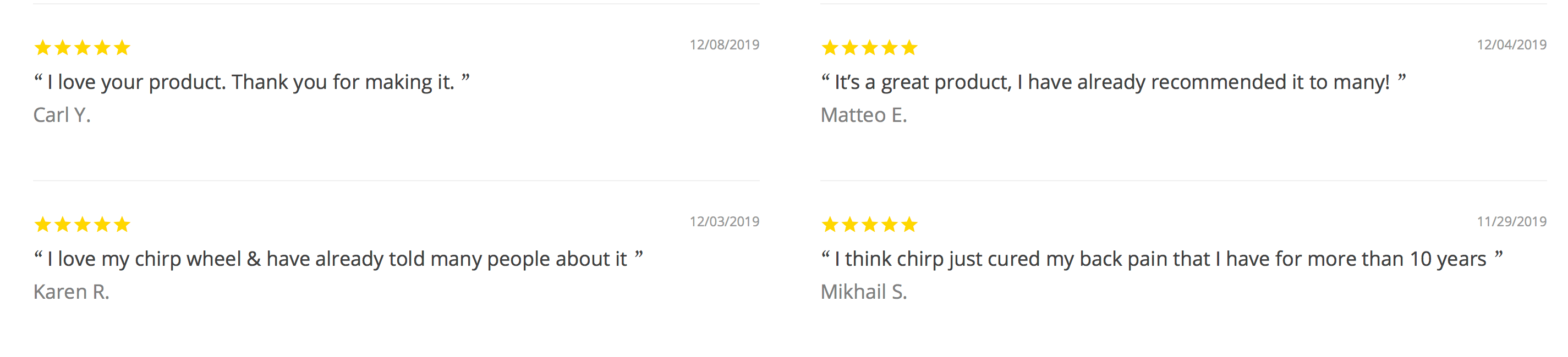
- Add testimonials to your website: Testimonials are an excellent way for you to showcase how people enjoy your brand. You’ll want to integrate these into your site as part of your web design to help give people insight into how previous customers feel about using your services or buying your products.
![]()
- Integrate Google reviews into your website: Another great way to showcase others’ experience with your brand is to integrate Google reviews on your site. Google reviews help users see an authentic experience with your company, which can help them decide if you’re a good fit for their needs.
- Integrate reviews from other sites: There are dozens of different sites where people leave reviews. Sites like Yelp and Consumer Reports are both places where people leave authentic reviews of your business. You can integrate these types of reviews into your site to help site visitors get a fuller picture of what it’s like to work with you or buy your products.
When you add testimonials and reviews to your site, you build trust with your audience. You make them feel confident that, if they choose you, you’ll provide them with the best experience. It’s a great lead generation website design best practice that helps you earn more leads for your business.
Speaking of testimonials, did you know that WebFX has over 420? It’s true! Check them out!
4. Add call to action (CTA) buttons to get users to take the next step
Another essential element of successful website lead generation design is call to action (CTA) buttons. As users peruse your site and look at your products and services, it’s crucial that you provide a way for them to take the next step in the buying process. That’s where CTA buttons come in.
Integrating CTA buttons will help you guide interested users towards becoming leads. To create the most effective CTA buttons, follow these best practices:
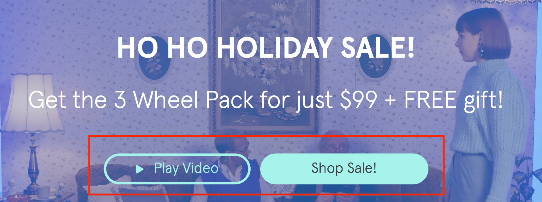
- Make them pop: If you want to create a successful web design for lead generation, you must make your CTA buttons pop off your page. Your audience should be able to find the button easily and proceed to the next step in the buying process with ease. Choose colors that stand out on your website, so the user’s attention is drawn to it.
- Don’t use plain CTAs: To get site visitors to take the next step, you need a compelling CTA copy that entices them to click and take the next step. Don’t stick to generic CTAs like “Click here” or “download now.” Create something more informative and enticing, like “download your free guide now!”
- Choose the right shape: Typically, companies will either choose a rounded rectangular button, rectangular button, or extended oval button. To figure out which button is right for your page, you can test the different shapes to see how your audience responds.
![]()
CTA buttons are critical for getting users to contact your business, sign up for emails, and download content. If you want to help users take the next step and become leads, create compelling and noticeable CTAs that guide your audience.
5. Add visuals to make your site engaging
If someone visits your website and sees walls of text, they might feel overwhelmed which will make them less likely to continue browsing your site. One of the most crucial lead generation website design best practices is adding visuals.
Visuals help break up text on your site and make it easy for your audience to digest information. When your audience has a better browsing experience on your website, they’re more likely to become leads.
Here are some tips for using visuals as part of your site’s design:
- Use authentic photos: Many companies will try to use stock photos on their site as an easy way to add visuals. While stock photos are an easy way to add photos of real people to your site, it’s well worth the effort to snap some genuine pictures of your staff to use instead. Not only does it create a personal experience for site visitors, but it makes them feel closer to your brand.
- Create videos to explain complex topics: Videos are a great addition to any website to boost engagement and get people interested in your business. Use videos as a tool to showcase your products, explain complicated concepts, and help your audience learn more about your business.
- Use infographics to present data: If you have complex data sets or want to highlight facts about your products or services, infographics are a great visual option for showcasing that information. You can use infographics to visually present statistics, essential facts, and more. It’s an excellent way for you to catch your audience’s attention and help them pull valuable information from your site. Not to mention, they’re easily shareable on social media platforms!
Visuals help enhance the user experience on your site and keep your audience engage. If you want to be successful with web design for lead generation, you must add visuals. Visuals keep people on your site longer, which allows people to get to know your business and become leads.
Put these lead generation website design best practices into action
If you want to start growing online, you must invest in web design for lead generation. By following lead generation website design best practices, you’ll help your business build a website that’s made for attracting and capturing leads.
Are you feeling overwhelmed with trying to design the right website to generate leads? Let WebFX take some of that weight off your shoulders! With our award-winning team of designers, we’ll help you build a beautiful, custom website that fits your business’s needs.
Want to learn more about our web design packages? Contact us online or call us today at 888-601-5359 to speak with a strategist.
The post 5 Lead Generation Website Design Best Practices appeared first on WebFX Blog.
Here's what was popular in the PHP community one year ago today:
“People eat with their eyes” is the rule of thumb for every marketing strategy whose goal is to tout and foist goods. Whatever you are planning to do, make it look delicious, and chances are your customers will fall for it. When it comes to restaurants, cafes, food trucks, and other representatives of the food brands segment, it lies at the heart of everything.
This principle guides various visual identities. Therefore, as a rule, they look yummy. Artists prefer to use multiple objects in scenes – not just to create an overall image of a brand or establish the proper atmosphere, but also drum up the appetite and pull some triggers.
Here are a few delicious examples of this practice at work.
The Web Designer Toolbox
Unlimited Downloads: 1,000,000+ Web Templates, Themes, Plugins, Design Assets, and much more!
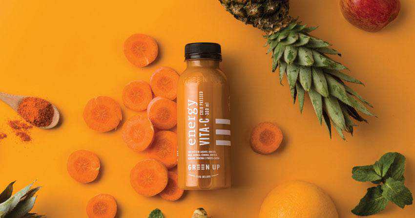
Here is a typical example of a modern visual identity for a food brand. The composition features not only the star of the show (the bottle), but also lots of complementary objects such as pineapple, chopped carrot slices, apple, along with some other fruits and vegetables that fit like a glove. Together they bring home the proper message and at the same time, give an edge to your appetite, unobtrusively making us want to buy one.
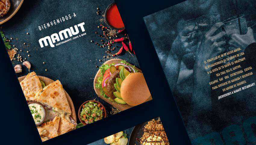
The visual identity of Brand Mamut is another typical example of these days. Much like Green Up, it combines the real types of food that are scattered throughout the scene and spices that are carelessly but graciously sprinkled all over. Also, the promoted products occupy their rightful place.
The key feature of this approach lies in a dark, grainy chalk-like background that gives the entire design an exceptionally sophisticated appeal. It even feels brutal and rustic in some ways that make it an ideal partner for brands that are centered around dishes with fried meat, fish or even vegetables.
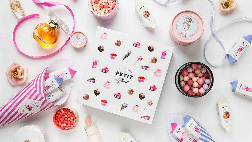
Petit Plaisir stands in stark contrast to the previous example. It is clean, neat, light, and incredibly girlish. In comparison to the visual identity of Brand Mamut it feels even angelic. However, this is precisely what is needed to meet the target audience.
Note how the creative team has managed to weave into the scene, not just confectionery-related elements but also cosmetic makeup items. The perfume bottle and radiance blusher fit the bill here, reinforcing the entire womanish atmosphere. Everything is sweet but not saccharine. The team has found a healthy balance between products and accompanying objects, bringing about a remarkable piece.
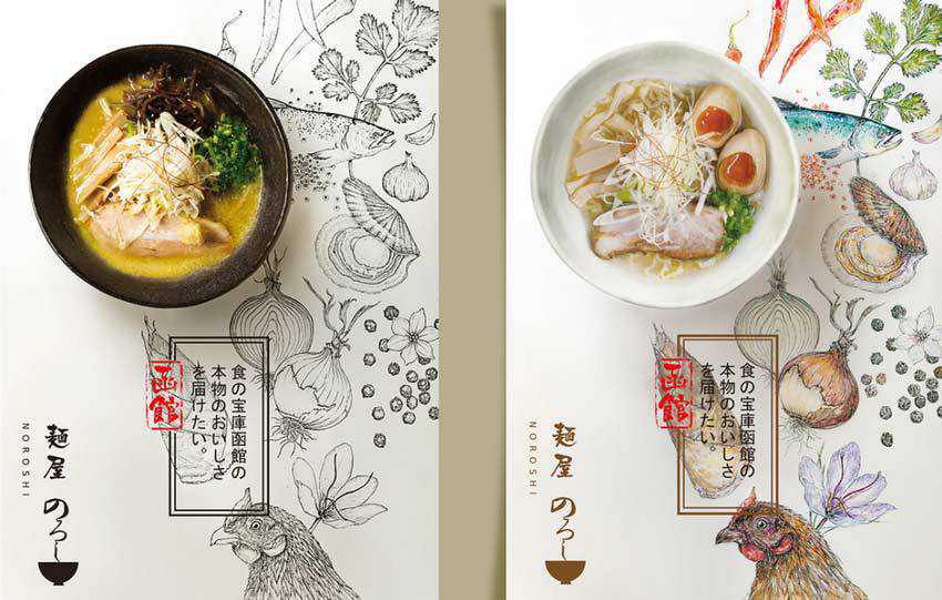
The team behind Noroshi’s visual identity sticks to the same path, yet with a tiny difference. Instead of using objects that characterize the product, they have employed traditional stationery that is encrusted with elements of brand identity. You can see various combinations: pamphlets with dishes, a menu with dishes, etc.
Note how the artwork and the dish echo. There is a fragile balance between these two. As a result, this unique symbiosis gives the scene not just a distinctive look, but also a powerful feeling. And, of course, an appropriate atmosphere.
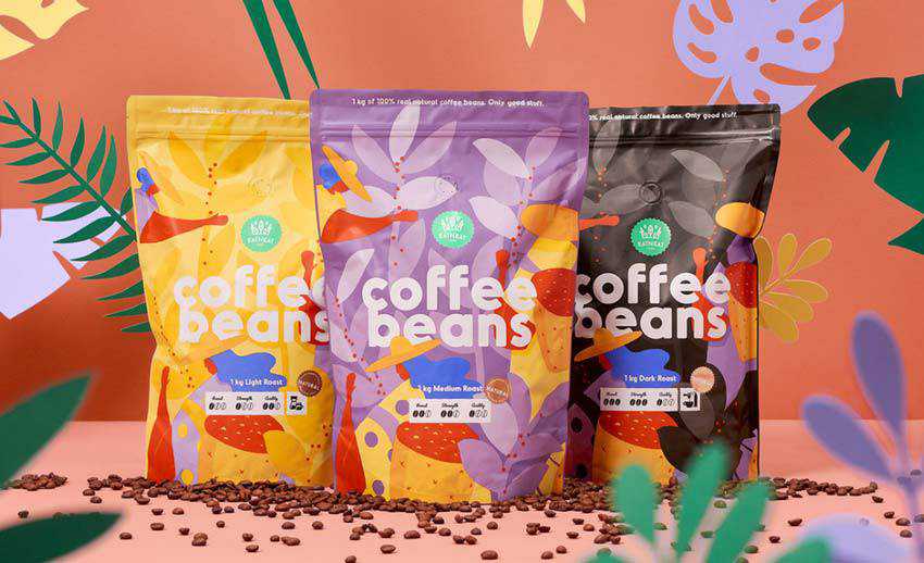
We just could not help but include in our collection a visual identity that is created with the help of fake 3D scenes. This type of approach is incredibly popular these days. It combines the beauty of real objects and artificial ones, bringing about a masterpiece that is worthy of today’s realms.
The theme of this project certainly has gotten some cues from the jungles, because it seems that this bag of coffee beans was found there. The vibrant packaging ideally blends in. It certainly feels at home inside such a picturesque environment.
This approach gives the scene a subtle, natural appeal. Also, note how the team skillfully uses the artificial side of the project. They do not hide it or pretend that it is real: they get the most out of it, winning over the audience with honesty.
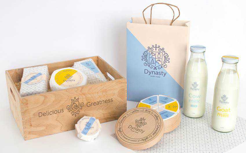
The visual identity of the Dynasty Dairy Farm is an excellent example of a “less is more” solution. It is subtle, polished and exclusive. Even though there are many objects and products involved, it feels compact and even minimal.
Gorgeous light coloring, natural materials, and an airy environment pull this thing together. It is simple, yet straight to the point. The crowd gets what they need in a pleasant and delicious manner. That is enough for anyone.
As we mentioned earlier, wrapping sells. And Riceman is vivid proof of that. Here the packaging does all the heavy lifting. It is so brilliant that you want to buy one immediately and bring it home.
However, it does not mean that you should leave everything as it is. The Backbone Branding team, who stands behind this outstanding solution, has created a series of simple yet right-to-the-point scenes that use the human side of the package to their advantage.

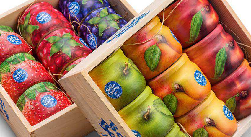
Boon Bariq is another piece of art created by Backbone Branding that we could not leave out. Much like in the previous example, here, packaging, as well as the presentation, are smart and well-thought-out.
The team shows us that it is not enough to create an out-of-the-box packaging. You need to put it inside the surrounding, where it will reveal its hidden potential and trot out the beauty of an idea.
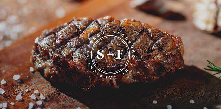
We are going to end our collection with Sal Y Fuego. The deal is that old-school tricks, like old habits, always die hard. Sometimes, all you ever need for creating a yummy visual identity that will instantly ignite the appetite and impress visitors is a close-up photo of a big, delicious steak.
“Bring only meat, do not bring vegetables” is a path to success. After all, we all have learned something from Ron Swanson. The visual identity created by Firmorama instantly catches an eye and proves it in practice. This piece of perfectly grilled meat is all you need to encourage regular onlookers to visit the place and take a bite.
A Tasty Treat for the Eyes
The visual identities of food brands are a colossal, almost immense area to explore. It is incredibly diversified and multi-faceted, serving as a sheer source of inspiration.
Here, you can find scenes that were built with the help of old-school tricks that still work like a charm or modern solutions that give an edge to our appetite with some high-tech extravaganzas. Even though the food industry is famous for its fierce rivalry, somehow artists manage to surprise us and create visual identities that easily stand out from the competition.
The post The Yummy Visual Identity of Food Brands appeared first on Speckyboy Design Magazine.
WordPress 5.3.2 is now available!
This maintenance release features 5 fixes and enhancements.
WordPress 5.3.2 is a short-cycle maintenance release. The next major release will be version 5.4.
You can download WordPress 5.3.2 by clicking the button at the top of this page, or visit your Dashboard → Updates and click Update Now.
If you have sites that support automatic background updates, they’ve already started the update process.
Maintenance updates
Shortly after WordPress 5.3.1 was released, a couple of high severity Trac tickets were opened. The Core team scheduled this quick maintenance release to resolve these issues.
Main issues addressed in 5.3.2:
- Date/Time: Ensure that
get_feed_build_date() correctly handles a modified post object with invalid date. - Uploads: Fix file name collision in
wp_unique_filename() when uploading a file with upper case extension on non case-sensitive file systems. - Media: Fix PHP warnings in
wp_unique_filename() when the destination directory is unreadable. - Administration: Fix the colors in all color schemes for buttons with the
.active class. - Posts, Post Types: In
wp_insert_post(), when checking the post date to set future or publish status, use a proper delta comparison.
For more information, browse the full list of changes on Trac or check out the version 5.3.2 HelpHub documentation page.
Thanks!
Thank you to everyone who contributed to WordPress 5.3.2:
Andrew Ozz, Andrey “Rarst” Savchenko, Dion hulse, eden159, Jb Audras, Kelly Dwan, Paul Biron, Sergey Biryukov, Tellyworth.
Password hashing and migration improvements
        Contributed by Robin Chalas
        in #34020
        and #34139.
In Symfony 4.3 we introduced the native password encoder to let Symfony
select the...
Package:
Summary:
Check the status of circuit breaker conditions
Groups:
Author:
Description:
This package can be used to check the status of circuit breaker conditions...
Read more at https://www.phpclasses.org/package/11468-PHP-Check-the-status-of-circuit-breaker-conditions.html

The PHP development team announces the immediate availability of PHP 7.2.26. This is a security release which also contains several minor bug fixes.All PHP 7.2 users are encouraged to upgrade to this version.For source downloads of PHP 7.2.26 please visit our downloads page, Windows source and binar...
                            Form submission spam seems to be an inevitable problem. As soon as bots find your forms they will start hitting it with spam submissions. In this article, let’s take a look at five common ways of fighting back.

            The post 5 Ways of Battling F...