Branding Heroes: Adding Your Identity into the Hero Area
Brand identity is one of the essential elements of a successful business. Whether you are running a local one-person law firm or you are building a huge empire on the digital expanses, it is your face that speaks volumes.
Every representative office should proudly bear elements of brand identity, and the website is no exception. As a rule, when it comes to online branches, the logo fulfils the role of a company’s uniqueness that visually separates it from the others in consumers’ minds.
Brand colors and mottos quite often underlie the website’s aesthetics as well. However, sometimes that is not enough to create the image of the company and bring home the proper message. Sometimes you need to go the extra mile. And interweaving your brand into the hero area is a way to do it.
Let us consider some characteristic examples.
Fyresite
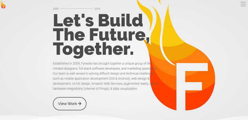
The simplest way to interweave your brand with the hero area is to feature the element of visual identity right in the heart of the welcome section. Take a look at Fyresite.
Although the solution is incredibly simple, it works like a charm here. All the team did was incorporate a bigger version of the logo into the hero area, completely duplicating it. In this way, they managed to make a statement and show the vibrant, dynamic nature of the agency.
One thing to note, even though the big version of logotype does have a considerable visual weight, the introduction still catches an eye. Well played. Whatever you do, always remember the balance between brand identity and content. Do not to sacrifice the latter.
Olympp
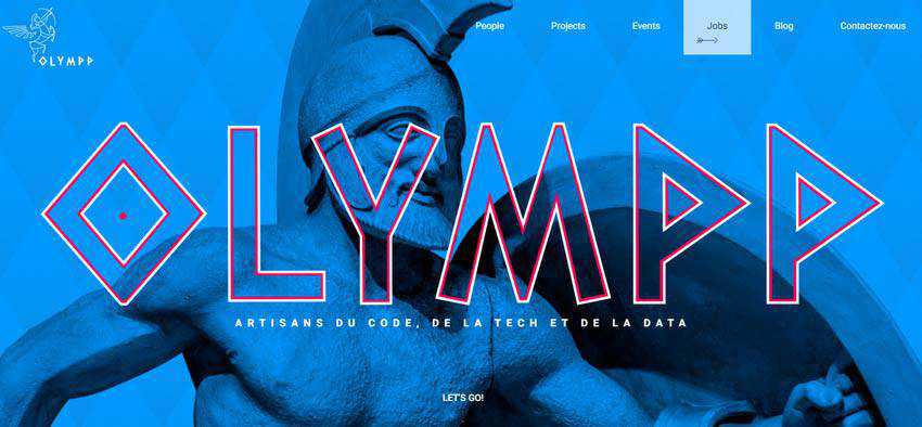
A similar approach is realized on Olympp, though the team has taken it to the next level.
Here, the logo stands behind the entire beauty of the welcome section. It dictates the rules for aesthetics and sets the general tone. You can see how the Greek theme runs through the whole hero area, forcing it mirror the emblem.
The idea is simple. Yet, it not only works, but also impresses.
Davis Malm Attorneys
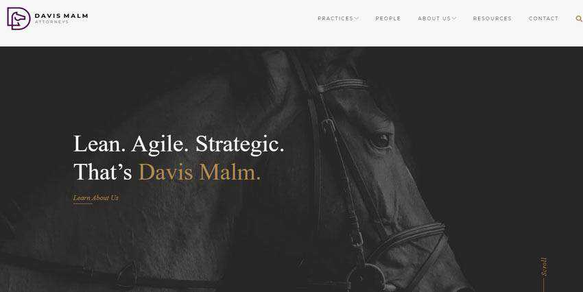
The official website of Davis Malm Attorneys is an absolute classic of brand interweaving. Much like in the previous case, here, the image background takes after the logotype.
However, this time we can see a real image of the mascot. What’s more, the arrangement of the introductory words follow the same path as the nameplate of the firm in the logo. The hero area looks like a logical continuation that contributes to the overall visual identity.
Keyformat
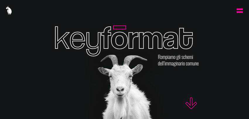
In essence, this is the same approach that we saw with Davis Malm Attorneys. The background features the real image of the main mascot, a goat. However, the hero area has an entirely different aura and certainly a more playful look.
The reason for that lies in the details. You can see the neon color that is quite trendy, and line style typography – another modern trait. They give the design a frisky and zestful look and at the same time favorably dish up the brand piece.
Authenticff
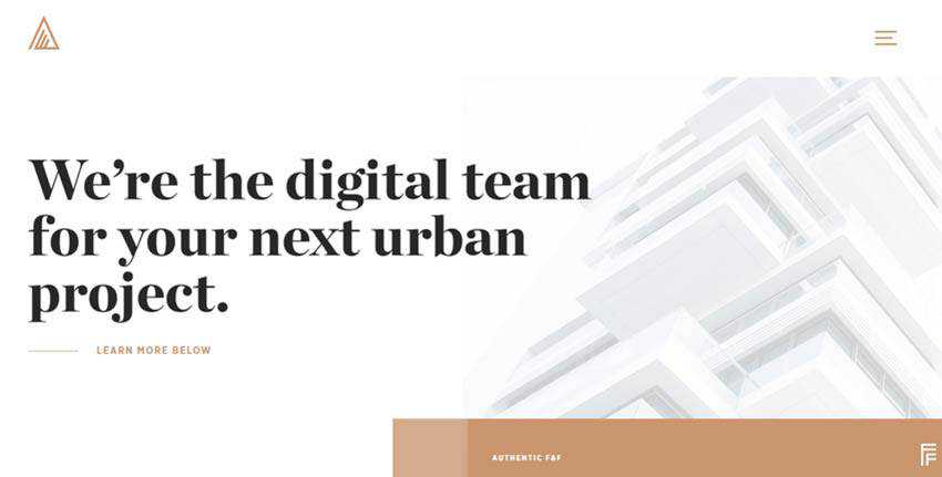
But it’s not only animals that are appropriate for such solutions, anything can do the trick. Even an abstract logo can be coordinated with the hero area. Consider Authenticff as a case in point.
Here, the logo is a simple triangle with several short lines inside. Unlike the first example in our collection, you won’t see an exact replica. Instead, the team has used an alternative version with a distinctive 3D feeling. They have skillfully abstracted from the style yet still saved the nature and charisma of the emblem.
Purple Bunny
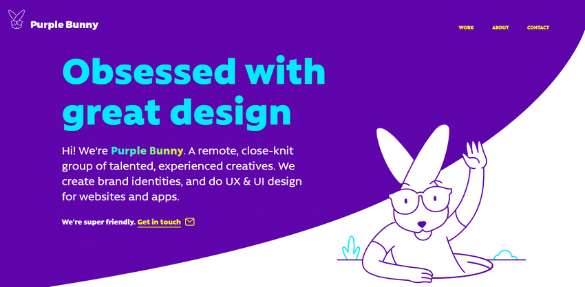
Okay, let us make things a little bit interesting by taking the traditional approach to the next level. We’ll use some creative thinking, a pinch of modern solutions and high-end techniques. Consider Purple Bunny.
The team behind Purple Bunny has gone for the dynamic approach. Their hero area includes not only a full-sized bunny featured in the logo but also a small animation that reveals the playful nature of the mascot.
It occupies the bottom right corner and does not distract the attention from the tagline. It enriches the hero area, contributes to the visual identity and simply lightens up the mood.
Digital Design Days
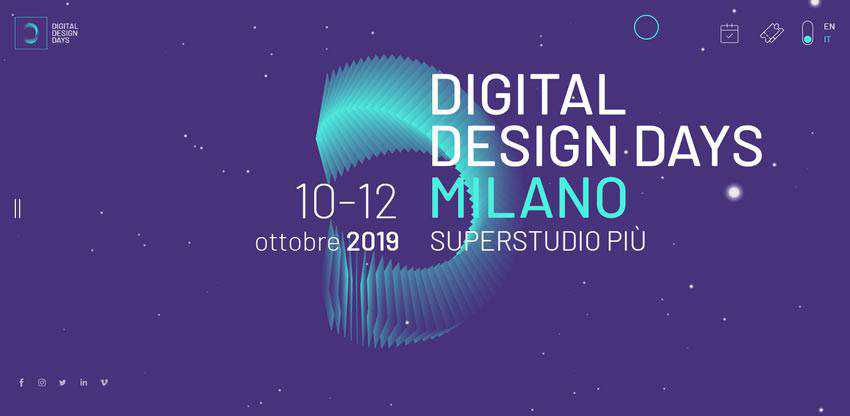
If the cartoonish animation is not your thing, and you are up to a serious, businesslike atmosphere, you can always adapt one of the digitally reproduced techy animations that are increasingly popular these days.
The team behind Digital Design Days shows it in practice. Their logotype can be seen not only in the top left corner but also in the hero area, where it occupies the lion’s share of space. Here, the abstract 3D shape is presented in all its glory, giving users an opportunity to play. What’s more, the nameplate takes up the same position as in the logo. Therefore, you can feel a compositional harmony in every detail.
DDD proves to us that whatever logotype you have; you can quickly build a hero area around it. And, you can end up with an outstanding outcome that will not only contribute to the general aesthetics but also enhance a corporate vision of your company.
The Village Films / Athem
These examples are for those who have an eye to detail and adore subtlety and sophistication. In both cases, you can see a delicate integration of brand identity.
For instance, on the official website of Village Films, the logotype is used as a transparent mask located right at the heart of the scene. It is barely visible, yet it is here, and it adds to the overall user experience.

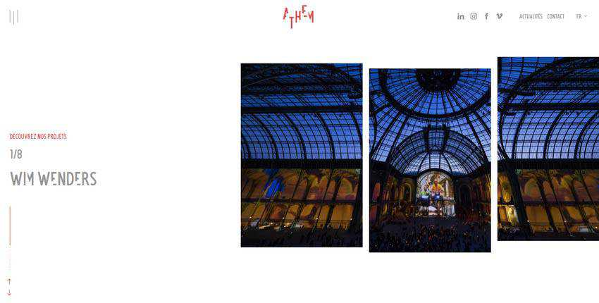
The team behind Anthem does not recreate logotype: they imitate its rhythm. You can see it in the slider, where an image is divided into three slices. Each piece is shifted along the vertical axis to follow the pattern in the logo.
An Introduction to Your Brand
Logos smartly coordinated with the hero area are a perfect way to strengthen the brand identity and force the website to benefit the entire venture. Not only as online real estate, but also as a piece of visual identity.
Whatever logotype you have, there are various ways to reproduce it in the welcome section. You can use the exact replica like Fyresite, take advantage of its image-based version like the team behind Olympp or even create an animation like Purple Bunny.
The post Branding Heroes: Adding Your Identity into the Hero Area appeared first on Speckyboy Design Magazine.


